Don’t Make Me Think, Revisited: A Common Sense Approach to Web Usability (2014)
Part I. Guiding Principles
Chapter 5. Omit  words
words
THE ART OF NOT WRITING FOR THE WEB
Get rid of half the words on each page, then get rid of half of what’s left.
—KRUG’S THIRD LAW OF USABILITY
Of the five or six things that I learned in college, the one that has stuck with me the longest—and benefited me the most—is E. B. White’s seventeenth rule in The Elements of Style:
17. Omit needless words.
Vigorous writing is concise. A sentence should contain no unnecessary words, a paragraph no unnecessary sentences, for the same reason that a drawing should have no unnecessary lines and a machine no unnecessary parts.1
1 William Strunk, Jr., and E. B. White, The Elements of Style (Allyn and Bacon, 1979).
When I look at most Web pages, I’m struck by the fact that most of the words I see are just taking up space, because no one is ever going to read them. And just by being there, all the extra words suggest that you may actually need to read them to understand what’s going on, which often makes pages seem more daunting than they actually are.
My Third Law probably sounds excessive, because it’s meant to. Removing half of the words is actually a realistic goal; I find I have no trouble getting rid of half the words on most Web pages without losing anything of value. But the idea of removing half of what’s left is just my way of trying to encourage people to be ruthless about it.
Getting rid of all those words that no one is going to read has several beneficial effects:
![]() It reduces the noise level of the page.
It reduces the noise level of the page.
![]() It makes the useful content more prominent.
It makes the useful content more prominent.
![]() It makes the pages shorter, allowing users to see more of each page at a glance without scrolling.
It makes the pages shorter, allowing users to see more of each page at a glance without scrolling.
I’m not suggesting that the articles at WebMD.com or the stories on NYTimes.com should be shorter than they are. But certain kinds of writing tend to be particularly prone to excess.
Happy talk must die
We all know happy talk when we see it: It’s the introductory text that’s supposed to welcome us to the site and tell us how great it is or to tell us what we’re about to see in the section we’ve just entered.
If you’re not sure whether something is happy talk, there’s one sure-fire test: If you listen very closely while you’re reading it, you can actually hear a tiny voice in the back of your head saying, “Blah blah blah blah blah....”
A lot of happy talk is the kind of self-congratulatory promotional writing that you find in badly written brochures. Unlike good promotional copy, it conveys no useful information, and it focuses on saying how great we are, as opposed to explaining what makes us great.
Although happy talk is sometimes found on Home pages—usually in paragraphs that start with the words “Welcome to...”—its favored habitat is the front pages of the sections of a site (“section fronts”). Since these pages are often just a list of links to the pages in the section with no real content of their own, there’s a temptation to fill them with happy talk. Unfortunately, the effect is as if a book publisher felt obligated to add a paragraph to the table of contents page saying, “This book contains many interesting chapters about _____, _____, and _____. We hope you enjoy them.”
Happy talk is like small talk—content-free, basically just a way to be sociable. But most Web users don’t have time for small talk; they want to get right to the point. You can—and should—eliminate as much happy talk as possible.
Instructions must die
Another major source of needless words is instructions. The main thing you need to know about instructions is that no one is going to read them—at least not until after repeated attempts at “muddling through” have failed. And even then, if the instructions are wordy, the odds of users finding the information they need are pretty low.
Your objective should always be to eliminate instructions entirely by making everything self-explanatory, or as close to it as possible. When instructions are absolutely necessary, cut them back to the bare minimum.
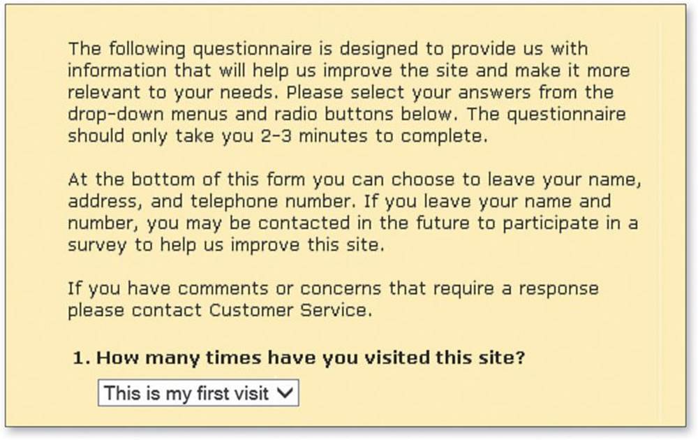
For example, here are the instructions I found at the beginning of a site survey:
I think some aggressive pruning makes them much more useful:
Before: 103 Words
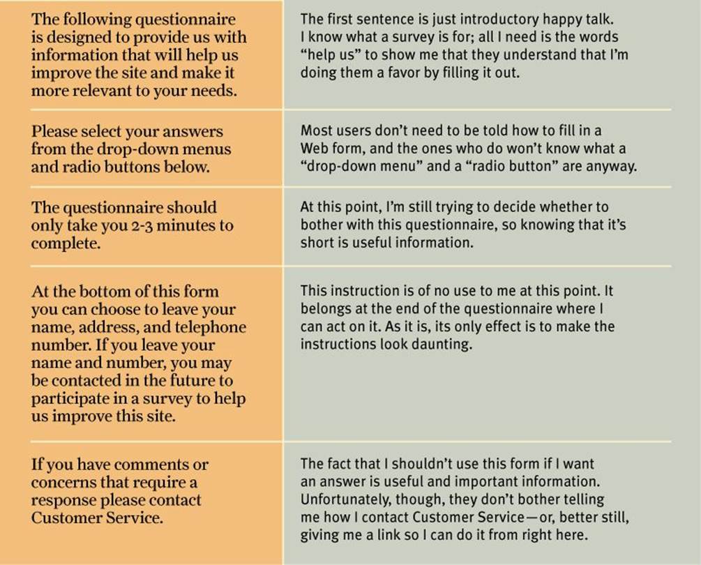
After: 34 Words
Please help us improve the site by taking 2-3 minutes to complete this survey.
NOTE: If you have comments or concerns that require a response, don’t use this form. Instead, please contact Customer Service.
And now for something completely different
In these first few chapters, I’ve been trying to convey some guiding principles that I think are good to have in mind when you’re building a Web site.
Now we’re heading into two chapters that look at how these principles apply to two of the biggest and most important challenges in Web design: navigation and the Home page.
You might want to pack a lunch. They’re very long chapters.
All materials on the site are licensed Creative Commons Attribution-Sharealike 3.0 Unported CC BY-SA 3.0 & GNU Free Documentation License (GFDL)
If you are the copyright holder of any material contained on our site and intend to remove it, please contact our site administrator for approval.
© 2016-2026 All site design rights belong to S.Y.A.