Mining the Social Web (2014)
Part I. A Guided Tour of the Social Web
Chapter 3. Mining LinkedIn: Faceting Job Titles, Clustering Colleagues, and More
This chapter introduces techniques and considerations for mining the troves of data tucked away at LinkedIn, a social networking site focused on professional and business relationships. Although LinkedIn may initially seem like any other social network, the nature of its API data is inherently quite different. If you liken Twitter to a busy public forum like a town square and Facebook to a very large room filled with friends and family chatting about things that are (mostly) appropriate for dinner conversation, then you might liken LinkedIn to a private event with a semiformal dress code where everyone is on their best behavior and trying to convey the specific value and expertise that they could bring to the professional marketplace.
Given the somewhat sensitive nature of the data that’s tucked away at LinkedIn, its API has its own nuances that make it a bit different from many of the others we’ve looked at in this book. People who join LinkedIn are principally interested in the business opportunities that it provides as opposed to arbitrary socializing and will necessarily be providing sensitive details about business relationships, job histories, and more. For example, while you can generally access all of the details about your LinkedIn connections’ educational histories and previous work positions, you cannot determine whether two arbitrary people are “mutually connected” as you could with Facebook. The absence of such an API method is intentional. The API doesn’t lend itself to being modeled as a social graph like Facebook or Twitter, therefore requiring that you ask different types of questions about the data that’s available to you.
The remainder of this chapter gets you set up to access data with the LinkedIn API and introduces some fundamental data mining techniques that can help you cluster colleagues according to a similarity measurement in order to answer the following kinds of queries:
§ Which of your connections are the most similar based upon a criterion like job title?
§ Which of your connections have worked in companies you want to work for?
§ Where do most of your connections reside geographically?
In all cases, the pattern for analysis with a clustering technique is essentially the same: extract some features from data in a colleague’s profile, define a similarity measurement to compare the features from each profile, and use a clustering technique to group together colleagues that are “similar enough.” The approach works well for LinkedIn data, and you can apply these same techniques to just about any kind of other data that you’ll ever encounter.
NOTE
Always get the latest bug-fixed source code for this chapter (and every other chapter) online at http://bit.ly/MiningTheSocialWeb2E. Be sure to also take advantage of this book’s virtual machine experience, as described in Appendix A, to maximize your enjoyment of the sample code.
Overview
This chapter introduces content that is foundational in machine learning and, in general, is a bit more advanced than the two chapters before it. It is recommended that you have a firm grasp on the previous two chapters before working through the material presented here. In this chapter, you’ll learn about:
§ LinkedIn’s Developer Platform and making API requests
§ Three common types of clustering, a fundamental machine-learning topic that applies to nearly any problem domain
§ Data cleansing and normalization
§ Geocoding, a means of arriving at a set of coordinates from a textual reference to a location
§ Visualizing geographic data with Google Earth and with cartograms
Exploring the LinkedIn API
You’ll need a LinkedIn account and a handful of colleagues in your professional network to follow along with this chapter’s examples in a meaningful way. If you don’t have a LinkedIn account, you can still apply the fundamental clustering techniques that you’ll learn about to other domains, but this chapter won’t be quite as engaging since you can’t follow along with the examples without your own LinkedIn data. Start developing a LinkedIn professional network if you don’t already have one as a worthwhile investment in your professional life.
Although most of the analysis in this chapter is performed against a comma-separated values (CSV) file of your LinkedIn connections that you can download, this section maintains continuity with other chapters in the book by providing an overview of the LinkedIn API. If you’re not interested in learning about the LinkedIn API and would like to jump straight into the analysis, skip ahead to Downloading LinkedIn Connections as a CSV File and come back to the details about making API requests at a later time.
Making LinkedIn API Requests
As is the case with other social web properties, such as Twitter and Facebook (discussed in the preceding chapters), the first step involved in gaining API access to LinkedIn is to create an application. You’ll be able to create a sample application at https://www.linkedin.com/secure/developer;you will want to take note of your application’s API Key, Secret Key, OAuth User Token, and OAuth User Secret credentials, which you’ll use to programmatically access the API. Figure 3-1 illustrates the form that you’ll see once you have created an application.
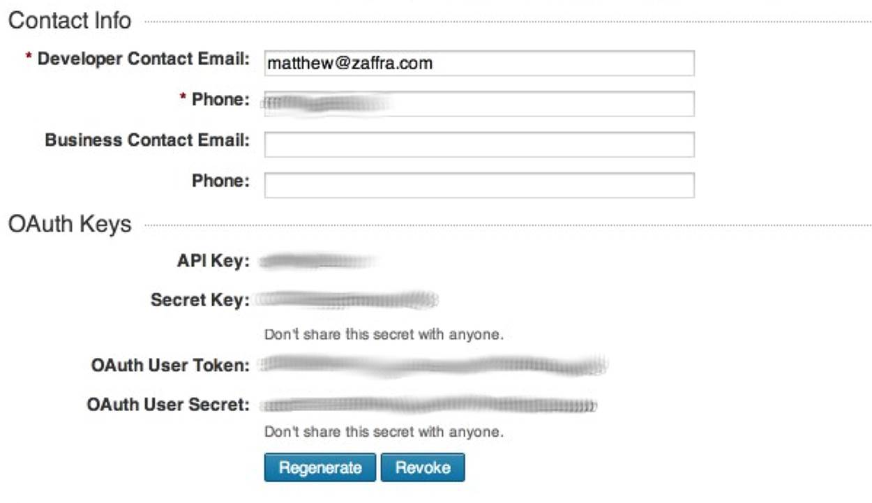
Figure 3-1. To access the LinkedIn API, create an application at https://www.linkedin.com/secure/developer and take note of the four OAuth credentials (shown here as blurred values) that are available from the application details page
With the necessary OAuth credentials in hand, the process for obtaining API access to your own personal data is much like that of Twitter in that you’ll provide these credentials to a library that will take care of the details involved in making API requests. If you’re not taking advantage of the book’s virtual machine experience, you’ll need to install it by typing pip install python-linkedin in a terminal.
NOTE
See Appendix B for details on implementing an OAuth 2.0 flow, which you will need to build an application that requires an arbitrary user to authorize it to access account data.
Example 3-1 illustrates a sample script that uses your LinkedIn credentials to ultimately create an instance of a LinkedInApplication class that can access your account data. Notice that the final line of the script retrieves your basic profile information, which includes your name and headline. Before going too much further, you should take a moment to read about what LinkedIn API operations are available to you as a developer by browsing its REST documentation, which provides a broad overview of what you can do. Although we’ll be accessing the API through a Python package that abstracts the HTTP requests that are involved, the core API documentation is always your definitive reference, and most good libraries mimic its style.
NOTE
Should you need to revoke account access from your application or any other OAuth application, you can do so in your account settings.
Example 3-1. Using LinkedIn OAuth credentials to receive an access token suitable for development and accessing your own data
fromlinkedinimport linkedin # pip install python-linkedin
# Define CONSUMER_KEY, CONSUMER_SECRET,
# USER_TOKEN, and USER_SECRET from the credentials
# provided in your LinkedIn application
CONSUMER_KEY = ''
CONSUMER_SECRET = ''
USER_TOKEN = ''
USER_SECRET = ''
RETURN_URL = '' # Not required for developer authentication
# Instantiate the developer authentication class
auth = linkedin.LinkedInDeveloperAuthentication(CONSUMER_KEY, CONSUMER_SECRET,
USER_TOKEN, USER_SECRET,
RETURN_URL,
permissions=linkedin.PERMISSIONS.enums.values())
# Pass it in to the app...
app = linkedin.LinkedInApplication(auth)
# Use the app...
app.get_profile()
In short, the calls available to you through an instance of LinkedInApplication are the same as those available through the REST API, and the python-linkedin documentation on GitHub provides a number of queries to get you started. A couple of APIs of particular interest are the Connections API and the Search API. You’ll recall from our introductory discussion that you cannot get “friends of friends” (“connections of connections,” in LinkedIn parlance), but the Connections API returns a list of your connections, which provides a jumping-off point for obtaining profile information. The Search API provides a means of querying for people, companies, or jobs that are available on LinkedIn.
Additional APIs are available, and it’s worth your while to take a moment and familiarize yourself with them. The quality of the data available about your professional network is quite remarkable, as it can potentially contain full job histories, company details, geographic information about the location of positions, and more.
Example 3-2 shows you how to use app, an instance of your LinkedInApplication, to retrieve extended profile information for your connections[8] and save this data to a file so as to avoid making any unnecessary API requests that will count against your rate-throttling limits, which are similar to those of Twitter’s API.
WARNING
Be careful when tinkering around with LinkedIn’s API: the rate limits don’t reset until midnight UTC, and one buggy loop could potentially blow your plans for the next 24 hours if you aren’t careful.
Example 3-2. Retrieving your LinkedIn connections and storing them to disk
importjson
connections = app.get_connections()
connections_data = 'resources/ch03-linkedin/linkedin_connections.json'
f = open(conections_data, 'w')
f.write(json.dumps(connections, indent=1))
f.close()
# You can reuse the data without using the API later like this...
# connections = json.loads(open(connections_data).read())
For an initial step in reviewing your connections’ data, let’s use the prettytable package as introduced in previous chapters to display a nicely formatted table of your connections and where they are each located, as shown in Example 3-3. If you’re not taking advantage of this book’s preconfigured virtual machine, you’ll need to type pip install prettytable from a terminal for most of the examples in this chapter to work; it’s a package that produces nicely formatted, tabular output.
Example 3-3. Pretty-printing your LinkedIn connections’ data
fromprettytableimport PrettyTable # pip install prettytable
pt = PrettyTable(field_names=['Name', 'Location'])
pt.align = 'l'
[ pt.add_row((c['firstName'] + ' ' + c['lastName'], c['location']['name']))
for c inconnections['values']
if c.has_key('location')]
print pt
Sample (anonymized) results follow and display your connections and where they are currently located according to their profiles.
+---------------------------------+-------------------------------------------+
| Name | Location |
+---------------------------------+-------------------------------------------+
| Laurel A. | Greater Boston Area |
| Eve A. | Greater Chicago Area |
| Jim A. | Washington D.C. Metro Area |
| Tom A. | San Francisco Bay Area |
| ... | ... |
+---------------------------------+-------------------------------------------+
A full scan of the profile information returned from the Connections API reveals that it’s pretty spartan, but you can use field selectors as outlined in the Profile Fields online documentation to retrieve additional details, if available. For example, Example 3-4 shows how to fetch a connection’s job position history.
Example 3-4. Displaying job position history for your profile and a connection’s profile
importjson
# See http://developer.linkedin.com/documents/profile-fields#fullprofile
# for details on additional field selectors that can be passed in for
# retrieving additional profile information.
# Display your own positions...
my_positions = app.get_profile(selectors=['positions'])
print json.dumps(my_positions, indent=1)
# Display positions for someone in your network...
# Get an id for a connection. We'll just pick the first one.
connection_id = connections['values'][0]['id']
connection_positions = app.get_profile(member_id=connection_id,
selectors=['positions'])
print json.dumps(connection_positions, indent=1)
Sample output reveals a number of interesting details about each position, including the company name, industry, summary of efforts, and employment dates:
{
"positions": {
"_total": 10,
"values": [
{
"startDate": {
"year": 2013,
"month": 2
},
"title": "Chief Technology Officer",
"company": {
"industry": "Computer Software",
"name": "Digital Reasoning Systems"
},
"summary": "I lead strategic technology efforts...",
"isCurrent": true,
"id": 370675000
},
{
"startDate": {
"year": 2009,
"month": 10
}
...
}
]
}
}
As might be expected, some API responses may not necessarily contain all of the information that you want to know, and some responses may contain more information than you need. Instead of making multiple API calls to piece together information or potentially stripping out information you don’t want to keep, you could take advantage of the field selector syntax to customize the response details. Example 3-5 shows how you can retrieve only the name, industry, and id fields for companies as part of a response for profile positions.
Example 3-5. Using field selector syntax to request additional details for APIs
# See http://developer.linkedin.com/documents/understanding-field-selectors
# for more information on the field selector syntax
my_positions = app.get_profile(selectors=['positions:(company:(name,industry,id))'])
print json.dumps(my_positions, indent=1)
Once you’re familiar with the basic APIs that are available to you, have a few handy pieces of documentation bookmarked, and have made a few API calls to familiarize yourself with the basics, you’re up and running with LinkedIn.
Downloading LinkedIn Connections as a CSV File
While using the API provides programmatic access to everything that would be visible to you as an authenticated user browsing profiles at http://linkedin.com, you can get all of the job title details you’ll need for much of this chapter by exporting your LinkedIn connections as address book data in a CSV file format. To initiate the export, select the Connections menu item from the Contacts menu to navigate to your LinkedIn connections page, and then select the “Export connections” link from within your LinkedIn account. Alternatively, you can navigate directly to the Export LinkedIn Connections dialog illustrated in Figure 3-2.
Later in this chapter, we’ll be using the csv module that’s part of Python’s standard library to parse the exported data, so in order to ensure compatibility with the upcoming code listing, choose the Outlook CSV option from the available choices.
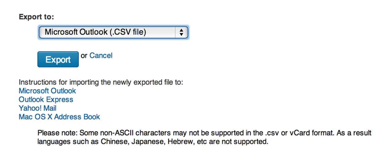
Figure 3-2. A lesser-known feature of LinkedIn is that you can export all of your connections in a convenient and portable CSV format at http://www.linkedin.com/people/export-settings
Crash Course on Clustering Data
Now that you have a basic understanding of how to access LinkedIn’s API, let’s dig into some more specific analysis with what will turn out to be a fairly thorough discussion of clustering,[9] an unsupervised machine-learning technique that is a staple in any data mining toolkit. Clustering involves taking a collection of items and partitioning them into smaller collections (clusters) according to some heuristic that is usually designed to compare items in the collection.
NOTE
Clustering is a fundamental data mining technique, and as part of a proper introduction to it, this chapter includes some footnotes and interlaced discussion of a somewhat mathematical nature that undergirds the problem. Although you should strive to eventually understand these details, you don’t need to grasp all of the finer points to successfully employ clustering techniques, and you certainly shouldn’t feel any pressure to understand them the first time that you encounter them. It may take a little bit of reflection to digest some of the discussion, especially if you don’t have a mathematical background.
For example, if you were considering a geographic relocation, you might find it useful to cluster your LinkedIn connections into some number of geographic regions in order to better understand the economic opportunities available. We’ll revisit this concept momentarily, but first let’s take a moment to briefly discuss some nuances associated with clustering.
When implementing solutions to problems that lend themselves to clustering on LinkedIn or elsewhere, you’ll repeatedly encounter at least two primary themes (see the sidebar The Role of Dimensionality Reduction in Clustering for a discussion of a third) as part of a clustering analysis:
Data normalization
Even when you’re retrieving data from a nice API, it’s usually not the case that the data will be provided to you in exactly the format you’d like—it often takes more than a little bit of munging to get the data into a form suitable for analysis. For example, LinkedIn members can enter in text that describes their job titles, so you won’t always end up with perfectly normalized job titles. One executive might choose the title “Chief Technology Officer,” while another may opt for the more ambiguous “CTO,” and still others may choose other variations of the same role. We’ll revisit the data normalization problem and implement a pattern for handling certain aspects of it for LinkedIn data momentarily.
Similarity computation
Assuming you have reasonably well-normalized items, you’ll need to measure similarity between any two of them, whether they’re job titles, company names, professional interests, geographic labels, or any other field you can enter in as variable-free text, so you’ll need to define a heuristic that can approximate the similarity between any two values. In some situations computing a similarity heuristic can be quite obvious, but in others it can be tricky. For example, comparing the combined years of career experience for two people might be as simple as some addition operations, but comparing a broad professional element such as “leadership aptitude” in a fully automated manner could be quite a challenge.
THE ROLE OF DIMENSIONALITY REDUCTION IN CLUSTERING
Although data normalization and similarity computation are two overarching themes that you’ll encounter in clustering at an abstract level, dimensionality reduction is a third theme that soon emerges once the scale of the data you are working with becomes nontrivial. To cluster all of the items in a set using a similarity metric, you would ideally compare every member to every other member. Thus, for a set of n members in a collection, you would perform somewhere on the order of n2 similarity computations in your algorithm for the worst-case scenario because you have to compare each of the n items to n–1 other items.
Computer scientists call this predicament an n-squared problem and generally use the nomenclature O(n2) to describe it; conversationally, you’d say it’s a “Big-O of n-squared” problem. O(n2) problems become intractable for very large values of n, and most of the time, the use of the term intractable means you’d have to wait “too long” for a solution to be computed. “Too long” might be minutes, years, or eons, depending on the nature of the problem and its constraints.
An exploration of dimensionality reduction techniques is beyond the scope of the current discussion, but suffice it to say that a typical dimensionality reduction technique involves using a function to organize “similar enough” items into a fixed number of bins so that the items within each bin can then be more exhaustively compared to one another. Dimensionality reduction is often as much art as it is science, and is frequently considered proprietary information or a trade secret by organizations that successfully employ it to gain a competitive advantage.
Techniques for clustering are a fundamental part of any legitimate data miner’s tool belt, because in nearly any sector of any industry—ranging from defense intelligence to fraud detection at a bank to landscaping—there can be a truly immense amount of semi-standardized relational data that needs to be analyzed, and the rise of data scientist job opportunities over the previous years has been a testament to this.
What generally happens is that a company establishes a database for collecting some kind of information, but not every field is enumerated into some predefined universe of valid answers. Whether it’s because the application’s user interface logic wasn’t designed properly, because some fields just don’t lend themselves to having static predetermined values, or because it was critical to the user experience that users be allowed to enter whatever they’d like into a text box, the result is always the same: you eventually end up with a lot of semi-standardized data, or “dirty records.” While there might be a total of N distinct string values for a particular field, some number of these string values will actually relate the same concept. Duplicates can occur for various reasons—for example, misspellings, abbreviations or shorthand, and differences in the case of words.
Although it may not be obvious, this is exactly one of the classic situations we’re faced with in mining LinkedIn data: LinkedIn members are able to enter in their professional information as free text, which results in a certain amount of unavoidable variation. For example, if you wanted to examine your professional network and try to determine where most of your connections work, you’d need to consider common variations in company names. Even the simplest of company names has a few common variations you’ll almost certainly encounter. For example, it should be obvious to most people that “Google” is an abbreviated form of “Google, Inc.,” but even these kinds of simple variations in naming conventions must be explicitly accounted for during standardization efforts. In standardizing company names, a good starting point is to first consider suffixes such as LLC and Inc.
Clustering Enhances User Experiences
Simple clustering techniques can create incredibly compelling user experiences by leveraging results even as simple as the job title ones we just produced. Figure 3-3 demonstrates a powerful alternative view of your data via a simple tree widget that could be used as part of a navigation pane or faceted display for filtering search criteria. Assuming that the underlying similarity metrics you’ve chosen have produced meaningful clusters, a simple hierarchical display that presents data in logical groups with a count of each group’s items can streamline the process of finding information and power intuitive workflows for almost any application where a lot of skimming would otherwise be required to find the results.
NOTE
The code for creating a faceted display from your LinkedIn connections is included as a turnkey example with the IPython Notebook for this chapter.
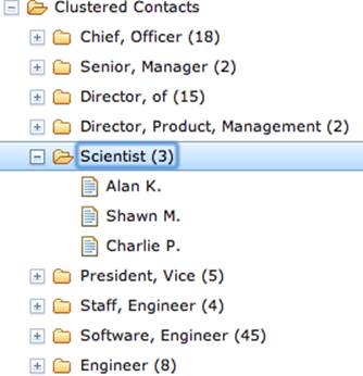
Figure 3-3. Intelligently clustered data lends itself to faceted displays and compelling user experiences
The code to create a simple navigational display can be surprisingly simple, given the maturity of Ajax toolkits and other UI libraries, and there’s incredible value in being able to create user experiences that present data in intuitive ways that power workflows. Something as simple as an intelligently crafted hierarchical display can inadvertently motivate users to spend more time on a site, discover more information than they normally would, and ultimately realize more value in the services the site offers.
Normalizing Data to Enable Analysis
As a necessary and helpful interlude toward building a working knowledge of clustering algorithms, let’s explore a few of the common situations you may face in normalizing LinkedIn data. In this section, we’ll implement a common pattern for normalizing company names and job titles. As a more advanced exercise, we’ll also briefly divert and discuss the problem of disambiguating and geocoding geographic references from LinkedIn profile information. (In other words, we’ll attempt to convert labels from LinkedIn profiles such as “Greater Nashville Area” to coordinates that can be plotted on a map.)
NOTE
The chief artifact of data normalization efforts is that you can count and analyze important features of the data and enable advanced data mining techniques such as clustering. In the case of LinkedIn data, we’ll be examining entities such as companies’ job titles and geographic locations.
Normalizing and counting companies
Let’s take a stab at standardizing company names from your professional network. Recall that the two primary ways you can access your LinkedIn data are either by using the LinkedIn API to programmatically retrieve the relevant fields or by employing a slightly lesser-known mechanism that allows you to export your professional network as address book data, which includes basic information such as name, job title, company, and contact information.
Assuming you have a CSV file of contacts that you’ve exported from LinkedIn, you could normalize and display selected entities from a histogram, as illustrated in Example 3-6.
NOTE
As you’ll notice in the opening comments of code listings such as Example 3-6, you’ll need to copy and rename the CSV file of your LinkedIn connections that you exported to a particular directory in your source code checkout, per the guidance provided in Downloading LinkedIn Connections as a CSV File.
Example 3-6. Simple normalization of company suffixes from address book data
importos
importcsv
fromcollectionsimport Counter
fromoperatorimport itemgetter
fromprettytableimport PrettyTable
# XXX: Place your "Outlook CSV" formatted file of connections from
# http://www.linkedin.com/people/export-settings at the following
# location: resources/ch03-linkedin/my_connections.csv
CSV_FILE = os.path.join("resources", "ch03-linkedin", 'my_connections.csv')
# Define a set of transforms that converts the first item
# to the second item. Here, we're simply handling some
# commonly known abbreviations, stripping off common suffixes,
# etc.
transforms = [(', Inc.', ''), (', Inc', ''), (', LLC', ''), (', LLP', ''),
(' LLC', ''), (' Inc.', ''), (' Inc', '')]
csvReader = csv.DictReader(open(CSV_FILE), delimiter=',', quotechar='"')
contacts = [row for row incsvReader]
companies = [c['Company'].strip() for c incontacts if c['Company'].strip() != '']
for i, _ inenumerate(companies):
for transform intransforms:
companies[i] = companies[i].replace(*transform)
pt = PrettyTable(field_names=['Company', 'Freq'])
pt.align = 'l'
c = Counter(companies)
[pt.add_row([company, freq])
for (company, freq) insorted(c.items(), key=itemgetter(1), reverse=True)
if freq > 1]
print pt
The following illustrates typical results for frequency analysis:
+--------------------------------+------+
| Company | Freq |
+--------------------------------+------+
| Digital Reasoning Systems | 31 |
| O'Reilly Media | 19 |
| Google | 18 |
| Novetta Solutions | 9 |
| Mozilla Corporation | 9 |
| Booz Allen Hamilton | 8 |
| ... | ... |
+--------------------------------+------+
NOTE
Python allows you to pass arguments to a function by dereferencing a list and dictionary as parameters, which is sometimes convenient, as illustrated in Example 3-6. For example, calling f(*args, **kw) is equivalent to calling f(1,7, x=23) so long as args is defined as [1,7] and kw is defined as {'x' : 23}. See Appendix C for more Python tips.
Keep in mind that you’ll need to get a little more sophisticated to handle more complex situations, such as the various manifestations of company names—like O’Reilly Media—that have evolved over the years. For example, you might see this company’s name represented as O’Reilly & Associates, O’Reilly Media, O’Reilly, Inc., or just O’Reilly.[10]
Normalizing and counting job titles
As might be expected, the same problem that occurs with normalizing company names presents itself when considering job titles, except that it can get a lot messier because job titles are so much more variable. Table 3-1 lists a few job titles you’re likely to encounter in a software company that include a certain amount of natural variation. How many distinct roles do you see for the 10 distinct titles that are listed?
Table 3-1. Example job titles for the technology industry
|
Job title |
|
Chief Executive Officer |
|
President/CEO |
|
President & CEO |
|
CEO |
|
Developer |
|
Software Developer |
|
Software Engineer |
|
Chief Technical Officer |
|
President |
|
Senior Software Engineer |
While it’s certainly possible to define a list of aliases or abbreviations that equate titles like CEO and Chief Executive Officer, it may not be practical to manually define lists that equate titles such as Software Engineer and Developer for the general case in all possible domains. However, for even the messiest of fields in a worst-case scenario, it shouldn’t be too difficult to implement a solution that condenses the data to the point that it’s manageable for an expert to review it and then feed it back into a program that can apply it in much the same way that the expert would have done. More times than not, this is actually the approach that organizations prefer since it allows humans to briefly insert themselves into the loop to perform quality control.
Recall that one of the most obvious starting points when working with any data set is to count things, and this situation is no different. Let’s reuse the same concepts from normalizing company names to implement a pattern for normalizing common job titles and then perform a basic frequency analysis on those titles as an initial basis for clustering. Assuming you have a reasonable number of exported contacts, the minor nuances among job titles that you’ll encounter may actually be surprising, but before we get into that, let’s introduce some sample code that establishes some patterns for normalizing record data and takes a basic inventory sorted by frequency.
Example 3-7 inspects job titles and prints out frequency information for the titles themselves and for individual tokens that occur in them.
Example 3-7. Standardizing common job titles and computing their frequencies
importos
importcsv
fromoperatorimport itemgetter
fromcollectionsimport Counter
fromprettytableimport PrettyTable
# XXX: Place your "Outlook CSV" formatted file of connections from
# http://www.linkedin.com/people/export-settings at the following
# location: resources/ch03-linkedin/my_connections.csv
CSV_FILE = os.path.join("resources", "ch03-linkedin", 'my_connections.csv')
transforms = [
('Sr.', 'Senior'),
('Sr', 'Senior'),
('Jr.', 'Junior'),
('Jr', 'Junior'),
('CEO', 'Chief Executive Officer'),
('COO', 'Chief Operating Officer'),
('CTO', 'Chief Technology Officer'),
('CFO', 'Chief Finance Officer'),
('VP', 'Vice President'),
]
csvReader = csv.DictReader(open(CSV_FILE), delimiter=',', quotechar='"')
contacts = [row for row incsvReader]
# Read in a list of titles and split apart
# any combined titles like "President/CEO."
# Other variations could be handled as well, such
# as "President & CEO", "President and CEO", etc.
titles = []
for contact incontacts:
titles.extend([t.strip() for t incontact['Job Title'].split('/')
if contact['Job Title'].strip() != ''])
# Replace common/known abbreviations
for i, _ inenumerate(titles):
for transform intransforms:
titles[i] = titles[i].replace(*transform)
# Print out a table of titles sorted by frequency
pt = PrettyTable(field_names=['Title', 'Freq'])
pt.align = 'l'
c = Counter(titles)
[pt.add_row([title, freq])
for (title, freq) insorted(c.items(), key=itemgetter(1), reverse=True)
if freq > 1]
print pt
# Print out a table of tokens sorted by frequency
tokens = []
for title intitles:
tokens.extend([t.strip(',') for t intitle.split()])
pt = PrettyTable(field_names=['Token', 'Freq'])
pt.align = 'l'
c = Counter(tokens)
[pt.add_row([token, freq])
for (token, freq) insorted(c.items(), key=itemgetter(1), reverse=True)
if freq > 1 andlen(token) > 2]
print pt
In short, the code reads in CSV records and makes a mild attempt at normalizing them by splitting apart combined titles that use the forward slash (like a title of “President/CEO”) and replacing known abbreviations. Beyond that, it just displays the results of a frequency distribution of both full job titles and individual tokens contained in the job titles.
This is not all that different from the previous exercise with company names, but it serves as a useful starting template and provides you with some reasonable insight into how the data breaks down.
Sample results follow:
+-------------------------------------+------+
| Title | Freq |
+-------------------------------------+------+
| Chief Executive Officer | 19 |
| Senior Software Engineer | 17 |
| President | 12 |
| Founder | 9 |
| ... | ... |
+-------------------------------------+------+
+---------------+------+
| Token | Freq |
+---------------+------+
| Engineer | 43 |
| Chief | 43 |
| Senior | 42 |
| Officer | 37 |
| ... | ... |
+---------------+------+
One thing that’s notable about the sample results is that the most common job title based on exact matches is “Chief Executive Officer,” which is closely followed by other senior positions such as “President” and “Founder.” Hence, the ego of this professional network has reasonably good access to entrepreneurs and business leaders. The most common tokens from within the job titles are “Engineer” and “Chief.” The “Chief” token correlates back to the previous thought about connections to higher-ups in companies, while the token “Engineer” provides a slightly different clue into the nature of the professional network. Although “Engineer” is not a constituent token of the most common job title, it does appear in a large number of job titles such as “Senior Software Engineer” and “Software Engineer,” which show up near the top of the job titles list. Therefore, the ego of this network appears to have connections to technical practitioners as well.
In job title or address book data analysis, this is precisely the kind of insight that motivates the need for an approximate matching or clustering algorithm. The next section investigates further.
Normalizing and counting locations
Although LinkedIn includes a general geographic region that usually corresponds to a metropolitan area for each of your connections, this label is not specific enough that it can be pinpointed on a map without some additional work. Knowing that someone works in the “Greater Nashville Area” is useful, and as human beings with additional knowledge, we know that this label probably refers to the Nashville, Tennessee metro area. However, writing code to transform “Greater Nashville Area” to a set of coordinates that you could render on a map can be trickier than it sounds, particularly when the human-readable label for a region is especially common.
As a generalized problem, disambiguating geographic references is quite difficult. The population of New York City might be high enough that you can reasonably infer that “New York” refers to New York City, New York, but what about “Smithville”? There are hundreds of Smithvilles in the United States, and with most states having several of them, geographic context beyond the surrounding state is needed to make the right determination. It won’t be the case that a highly ambiguous place like “Greater Smithville Area” is something you’ll see on LinkedIn, but it serves to illustrate the general problem of disambiguating a geographic reference so that it can be resolved to a specific set of coordinates.
Disambiguating and geocoding the whereabouts of LinkedIn connections is slightly easier than the most generalized form of the problem because most professionals tend to identify with the larger metropolitan area that they’re associated with, and there are a relatively finite number of these regions. Although not always the case, you can generally employ the crude assumption that the location referred to in a LinkedIn profile is a relatively well-known location and is likely to be the “most popular” metropolitan region by that name.
You can install a Python package called geopy via pip install geopy; it provides a generalized mechanism for passing in labels for locations and getting back lists of coordinates that might match. The geopy package itself is a proxy to multiple web services providers such as Bing and Google that perform the geocoding, and an advantage of using it is that it provides a standardized API for interfacing with various geocoding services so that you don’t have to manually craft requests and parse responses. The geopy GitHub code repository is a good starting point for reading the documentation that’s available online.
Example 3-8 illustrates how to use geopy with Microsoft’s Bing, which offers a generous number of API calls for accounts that fall under educational usage guidelines that apply to situations such as learning from as this book. To run the script, you will need to request an API key from Bing.
NOTE
Bing is the recommended geocoder for exercises in this book with geopy, because at the time of this writing the Yahoo! geocoding service was not operational due to some changes in product strategy resulting in the creation of a new product called Yahoo! BOSS Geo Services. Although the Google Maps (v3) API was operational, its maximum number of requests per day seemed less ideal than that offered by Bing.
Example 3-8. Geocoding locations with Microsoft Bing
fromgeopyimport geocoders
GEO_APP_KEY = '' # XXX: Get this from https://www.bingmapsportal.com
g = geocoders.Bing(GEO_APP_KEY)
print g.geocode("Nashville", exactly_one=False)
The keyword parameter exactly_one=False tells the geocoder not to trigger an error if there is more than one possible result, which is more common than you might imagine. Sample results from this script follow and illustrate the nature of using an ambiguous label like “Nashville” to resolve a set of coordinates:
[(u'Nashville, TN, United States', (36.16783905029297, -86.77816009521484)),
(u'Nashville, AR, United States', (33.94792938232422, -93.84703826904297)),
(u'Nashville, GA, United States', (31.206039428710938, -83.25031280517578)),
(u'Nashville, IL, United States', (38.34368133544922, -89.38263702392578)),
(u'Nashville, NC, United States', (35.97433090209961, -77.96495056152344))]
The Bing geocoding service appears to return the most populous locations first in the list of results, so we’ll opt to simply select the first item in the list as our response given that LinkedIn generally exposes locations in profiles as large metropolitan areas. However, before we’ll be able to geocode, we’ll have to return to the problem of data normalization, because passing in a value such as “Greater Nashville Area” to the geocoder won’t return a response to us. (Try it and see for yourself.) As a pattern, we can transform locations such that common prefixes and suffixes are routinely stripped, as illustrated in Example 3-9.
Example 3-9. Geocoding locations of LinkedIn connections with Microsoft Bing
fromgeopyimport geocoders
GEO_APP_KEY = '' # XXX: Get this from https://www.bingmapsportal.com
g = geocoders.Bing(GEO_APP_KEY)
transforms = [('Greater ', ''), (' Area', '')]
results = {}
for c inconnections['values']:
ifnotc.has_key('location'): continue
transformed_location = c['location']['name']
for transform intransforms:
transformed_location = transformed_location.replace(*transform)
geo = g.geocode(transformed_location, exactly_one=False)
if geo == []: continue
results.update({ c['location']['name'] : geo })
print json.dumps(results, indent=1)
Sample results from the geocoding exercise follow:
{
"Greater Chicago Area": [
"Chicago, IL, United States",
[
41.884151458740234,
-87.63240814208984
]
],
"Greater Boston Area": [
"Boston, MA, United States",
[
42.3586311340332,
-71.05670166015625
]
],
"Bengaluru Area, India": [
"Bangalore, Karnataka, India",
[
12.966970443725586,
77.5872802734375
]
],
"San Francisco Bay Area": [
"CA, United States",
[
37.71476745605469,
-122.24223327636719
]
],
...
}
Later in this chapter, we’ll use the coordinates returned from geocoding as part of a clustering algorithm that can be a good way to analyze your professional network. Meanwhile, there’s another useful visualization called a cartogram that can be interesting for visualizing your network.
Visualizing locations with cartograms
A cartogram is a visualization that displays a geography by scaling geographic boundaries according to an underlying variable. For example, a map of the United States might scale the size of each state so that it is larger or smaller than it should be based upon a variable such as obesity rate, poverty levels, number of millionaires, or any other variable. The resulting visualization would not necessarily present a fully integrated view of the geography since the individual states would no longer fit together due to their scaling. Still, you’d have an idea about the overall status of the variable that led to the scaling for each state.
A specialized variation of a cartogram called a Dorling Cartogram substitutes a shape, such as a circle, for each unit of area on a map in its approximate location and scales the size of the shape according to the value of the underlying variable. Another way to describe a Dorling Cartogram is as a “geographically clustered bubble chart.” It’s a great visualization tool because it allows you to use your instincts about where information should appear on a 2D mapping surface, and it’s able to encode parameters using very intuitive properties of shapes, like area and color.
Given that the Bing geocoding service returns results that include the state for each city that is geocoded, let’s take advantage of this information and build a Dorling Cartogram of your professional network where we’ll scale the size of each state according to the number of contacts you have there. D3, the cutting-edge visualization toolkit introduced in Chapter 2, includes most of the machinery for a Dorling Cartogram and provides a highly customizable means of extending the visualization to include other variables if you’d like to do so. D3 also includes several other visualizations that convey geographical information, such as heatmaps, symbol maps, and choropleth maps that should be easily adaptable to the working data.
There’s really just one data munging nuance that needs to be performed in order to visualize your contacts by state, and that’s the task of parsing the states from the geocoder responses. In general, there can be some slight variation in the text of the response that contains the state, but as a general pattern, the state is always represented by two consecutive uppercase letters, and a regular expression is a fine way to parse out that kind of pattern from text.
Example 3-10 illustrates how to use the re package from Python’s standard library to parse the geocoder response and write out a JSON file that can be loaded by a D3-powered Dorling Cartogram visualization. Teaching regular expression fundamentals is outside the current scope of our discussion, but the gist of the pattern '.*([A-Z]{2}).*' is that we are looking for exactly two consecutive uppercase letters in the text, which can be preceded or followed by any text at all, as denoted by the .* wildcard. Parentheses are used to capture (or “tag,” in regular expression parlance) the group that we are interested in so that it can easily be retrieved.
Example 3-10. Parsing out states from Bing geocoder results using a regular expression
importre
# Most results contain a response that can be parsed by
# picking out the first two consecutive upper case letters
# as a clue for the state
pattern = re.compile('.*([A-Z]{2}).*')
def parseStateFromBingResult(r):
result = pattern.search(r[0][0])
if result == None:
print "Unresolved match:", r
return "???"
elif len(result.groups()) == 1:
print result.groups()
return result.groups()[0]
else:
print "Unresolved match:", result.groups()
return "???"
transforms = [('Greater ', ''), (' Area', '')]
results = {}
for c inconnections['values']:
ifnotc.has_key('location'): continue
ifnotc['location']['country']['code'] == 'us': continue
transformed_location = c['location']['name']
for transform intransforms:
transformed_location = transformed_location.replace(*transform)
geo = g.geocode(transformed_location, exactly_one=False)
if geo == []: continue
parsed_state = parseStateFromBingResult(geo)
if parsed_state != "???":
results.update({c['location']['name'] : parsed_state})
print json.dumps(results, indent=1)
Sample results follow and illustrate the efficacy of this technique:
{
"Greater Chicago Area": "IL",
"Greater Boston Area": "MA",
"Dallas/Fort Worth Area": "TX",
"San Francisco Bay Area": "CA",
"Washington D.C. Metro Area": "DC",
...
}
With the ability to distill reliable state abbreviations from your LinkedIn contacts, we can now compute the frequency at which each state appears, which is all that is needed to drive a turnkey Dorling Cartogram visualization with D3. A sample visualization for a professional network is displayed in Figure 3-4. Note that in many cartograms, Alaska and Hawaii are often displayed in the lower-left corner of the visualization (as is the case with many maps that display them as inlays). Despite the fact that the visualization is just a lot of carefully displayed circles on a map, it’s relatively obvious which circles correspond to which states. Hovering over circles produces tool tips that display the name of the state by default, and additional customization would not be difficult to implement by observing standard D3 best practices. The process of generating the final output for consumption by D3 involves little more than generating a frequency distribution by state and serializing it out as JSON.
NOTE
Some of the code for creating a Dorling Cartogram from your LinkedIn connections is omitted from this section for brevity, but it is included as a completely turnkey example with the IPython Notebook for this chapter.
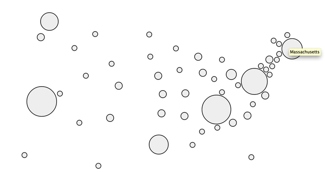
Figure 3-4. A Dorling Cartogram of locations resolved from a LinkedIn professional network—tool tips display the name of each state when the circles are hovered over (in this particular figure, the state of Massachusetts is being hovered over with the mouse)
Measuring Similarity
With an appreciation for some of the subtleties that are required to normalize data, let us now turn our attention to the problem of computing similarity, which is the principal basis of clustering. The most substantive decision we need to make in clustering a set of strings—job titles, in this case—in a useful way is which underlying similarity metric to use. There are myriad string similarity metrics available, and choosing the one that’s most appropriate for your situation largely depends on the nature of your objective.
Although these similarity measurements are not difficult to define and compute ourselves, I’ll take this opportunity to introduce NLTK (the Natural Language Toolkit), a Python toolkit that you’ll be glad to have in your arsenal for mining the social web. As with other Python packages, simply run pip install nltk to install NLTK per the norm.
NOTE
Depending on your use of NLTK, you may find that you also need to download some additional data sets that aren’t packaged with it by default. If you’re not employing the book’s virtual machine, running the command nltk.download() downloads all of NLTK’s data add-ons. You can read more about it at Installing NLTK Data.
Here are a few of the common similarity metrics that might be helpful in comparing job titles that are implemented in NLTK:
Edit distance
Edit distance, also known as Levenshtein distance, is a simple measure of how many insertions, deletions, and replacements it would take to convert one string into another. For example, the cost of converting dad into bad would be one replacement operation (substituting the first d with ab) and would yield a value of 1. NLTK provides an implementation of edit distance via the nltk.metrics.distance.edit_distance function.
The actual edit distance between two strings is quite different from the number of operations required to compute the edit distance; computation of edit distance is usually on the order of M*N operations for strings of length M and N. In other words, computing edit distance can be a computationally intense operation, so use it wisely on nontrivial amounts of data.
n-gram similarity
An n-gram is just a terse way of expressing each possible consecutive sequence of n tokens from a text, and it provides the foundational data structure for computing collocations. There are many variations of n-gram similarity, but consider the straightforward case of computing allpossible bigrams (two-grams) for the tokens of two strings, and scoring the similarity between the strings by counting the number of common bigrams between them, as demonstrated in Example 3-11.
NOTE
An extended discussion of n-grams and collocations is presented in Analyzing Bigrams in Human Language.
Example 3-11. Using NLTK to compute bigrams
ceo_bigrams = nltk.bigrams("Chief Executive Officer".split(), pad_right=True,
pad_left=True)
cto_bigrams = nltk.bigrams("Chief Technology Officer".split(), pad_right=True,
pad_left=True)
print ceo_bigrams
print cto_bigrams
print len(set(ceo_bigrams).intersection(set(cto_bigrams)))
The following sample results illustrate the computation of bigrams and the set intersection of bigrams between two different job titles:
[(None, 'Chief'), ('Chief', 'Executive'), ('Executive', 'Officer'),
('Officer', None)]
[(None, 'Chief'), ('Chief', 'Technology'), ('Technology', 'Officer'),
('Officer', None)]
2
The use of the keyword arguments pad_right and pad_left intentionally allows for leading and trailing tokens to match. The effect of padding is to allow bigrams such as (None, 'Chief') to emerge, which are important matches across job titles. NLTK provides a fairly comprehensive array of bigram and trigram (three-gram) scoring functions via the BigramAssociationMeasures and TrigramAssociationMeasures classes defined in its nltk.metrics.association module.
Jaccard distance
More often than not, similarity can be computed between two sets of things, where a set is just an unordered collection of items. The Jaccard similarity metric expresses the similarity of two sets and is defined by the intersection of the sets divided by the union of the sets. Mathematically, the Jaccard similarity is written as:
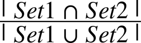
which is the number of items in common between the two sets (the cardinality of their set intersection) divided by the total number of distinct items in the two sets (the cardinality of their union). The intuition behind this ratio is that calculating the number of unique items that are common to both sets divided by the number of total unique items is a reasonable way to derive a normalized score for computing similarity. In general, you’ll compute Jaccard similarity by using n-grams, including unigrams (single tokens), to measure the similarity of two strings.
Given that the Jaccard similarity metric measures how close two sets are to one another, you can measure the dissimilarity between them by subtracting this value from 1.0 to arrive at what is known as the Jaccard distance.
NOTE
In addition to these handy similarity measurements and among its other numerous utilities, NLTK provides a class you can access as nltk.FreqDist. This is a frequency distribution similar to the way that we’ve been using collections.Counter from Python’s standard library.
Calculating similarity is a critical aspect of any clustering algorithm, and it’s easy enough to try out different similarity heuristics as part of your work in data science once you have a better feel for the data you’re mining. The next section works up a script that clusters job titles using Jaccardsimilarity.
Clustering Algorithms
With the prerequisite appreciation for data normalization and similarity heuristics in place, let’s now collect some real-world data from LinkedIn and compute some meaningful clusters to gain a few more insights into the dynamics of your professional network. Whether you want to take an honest look at whether your networking skills have been helping you to meet the “right kinds of people,” you want to approach contacts who will most likely fit into a certain socioeconomic bracket with a particular kind of business inquiry or proposition, or you want to determine if there’s a better place you could live or open a remote office to drum up business, there’s bound to be something valuable in a professional network rich with high-quality data. The remainder of this section illustrates a few different clustering approaches by further considering the problem of grouping together job titles that are similar.
Greedy clustering
Given that we have insight suggesting that overlap in titles is important, let’s try to cluster job titles by comparing them to one another as an extension of Example 3-7 using Jaccard distance. Example 3-12 clusters similar titles and then displays your contacts accordingly. Skim the code—especially the nested loop invoking the DISTANCE function—and then we’ll discuss.
Example 3-12. Clustering job titles using a greedy heuristic
importos
importcsv
fromnltk.metrics.distanceimport jaccard_distance
# XXX: Place your "Outlook CSV" formatted file of connections from
# http://www.linkedin.com/people/export-settings at the following
# location: resources/ch03-linkedin/my_connections.csv
CSV_FILE = os.path.join("resources", "ch03-linkedin", 'my_connections.csv')
# Tweak this distance threshold and try different distance calculations
# during experimentation
DISTANCE_THRESHOLD = 0.5
DISTANCE = jaccard_distance
def cluster_contacts_by_title(csv_file):
transforms = [
('Sr.', 'Senior'),
('Sr', 'Senior'),
('Jr.', 'Junior'),
('Jr', 'Junior'),
('CEO', 'Chief Executive Officer'),
('COO', 'Chief Operating Officer'),
('CTO', 'Chief Technology Officer'),
('CFO', 'Chief Finance Officer'),
('VP', 'Vice President'),
]
separators = ['/', 'and', '&']
csvReader = csv.DictReader(open(csv_file), delimiter=',', quotechar='"')
contacts = [row for row incsvReader]
# Normalize and/or replace known abbreviations
# and build up a list of common titles.
all_titles = []
for i, _ inenumerate(contacts):
if contacts[i]['Job Title'] == '':
contacts[i]['Job Titles'] = ['']
continue
titles = [contacts[i]['Job Title']]
for title intitles:
for separator inseparators:
if title.find(separator) >= 0:
titles.remove(title)
titles.extend([title.strip() for title intitle.split(separator)
if title.strip() != ''])
for transform intransforms:
titles = [title.replace(*transform) for title intitles]
contacts[i]['Job Titles'] = titles
all_titles.extend(titles)
all_titles = list(set(all_titles))
clusters = {}
for title1 inall_titles:
clusters[title1] = []
for title2 inall_titles:
if title2 inclusters[title1] orclusters.has_key(title2) andtitle1 \
inclusters[title2]:
continue
distance = DISTANCE(set(title1.split()), set(title2.split()))
if distance < DISTANCE_THRESHOLD:
clusters[title1].append(title2)
# Flatten out clusters
clusters = [clusters[title] for title inclusters if len(clusters[title]) > 1]
# Round up contacts who are in these clusters and group them together
clustered_contacts = {}
for cluster inclusters:
clustered_contacts[tuple(cluster)] = []
for contact incontacts:
for title incontact['Job Titles']:
if title incluster:
clustered_contacts[tuple(cluster)].append('%s %s'
% (contact['First Name'], contact['Last Name']))
return clustered_contacts
clustered_contacts = cluster_contacts_by_title(CSV_FILE)
print clustered_contacts
for titles inclustered_contacts:
common_titles_heading = 'Common Titles: ' + ', '.join(titles)
descriptive_terms = set(titles[0].split())
for title intitles:
descriptive_terms.intersection_update(set(title.split()))
descriptive_terms_heading = 'Descriptive Terms: ' \
+ ', '.join(descriptive_terms)
print descriptive_terms_heading
print '-' * max(len(descriptive_terms_heading), len(common_titles_heading))
print '\n'.join(clustered_contacts[titles])
The code listing starts by separating out combined titles using a list of common conjunctions and then normalizes common titles. Then, a nested loop iterates over all of the titles and clusters them together according to a thresholded Jaccard similarity metric as defined by DISTANCE, where the assignment of jaccard_distance to DISTANCE was chosen to make it easy to swap in a different distance calculation for experimentation. This tight loop is where most of the real action happens in the listing: it’s where each title is compared to each other title.
If the distance between any two titles as determined by a similarity heuristic is “close enough,” we greedily group them together. In this context, being “greedy” means that the first time we are able to determine that an item might fit in a cluster, we go ahead and assign it without further considering whether there might be a better fit, or making any attempt to account for such a better fit if one appears later. Although incredibly pragmatic, this approach produces very reasonable results. Clearly, the choice of an effective similarity heuristic is critical to its success, but given the nature of the nested loop, the fewer times we have to invoke the scoring function, the faster the code executes (a principal concern for nontrivial sets of data). More will be said about this consideration in the next section, but do note that we use some conditional logic to try to avoid repeating unnecessary calculations if possible.
The rest of the listing just looks up contacts with a particular job title and groups them for display, but there is one other nuance involved in computing clusters: you often need to assign each cluster a meaningful label. The working implementation computes labels by taking the setwise intersection of terms in the job titles for each cluster, which seems reasonable given that it’s the most obvious common thread. Your mileage is sure to vary with other approaches.
The types of results you might expect from this code are useful in that they group together individuals who are likely to share common responsibilities in their job duties. As previously noted, this information might be useful for a variety of reasons, whether you’re planning an event that includes a “CEO Panel,” trying to figure out who can best help you to make your next career move, or trying to determine whether you are really well enough connected to other similar professionals given your own job responsibilities and future aspirations. Abridged results for a sample professional network follow:
Common Titles: Chief Technology Officer,
Founder,
Chief Technology Officer,
Co-Founder,
Chief Technology Officer
Descriptive Terms: Chief, Technology, Officer
---------------------------------------------
Damien K.
Andrew O.
Matthias B.
Pete W.
...
Common Titles: Founder,
Chief Executive Officer,
Chief Executive Officer
Descriptive Terms: Chief, Executive, Officer
---------------------------------------------
Joseph C.
Janine T.
Kabir K.
Scott S.
Bob B.
Steve S.
John T. H.
...
Runtime analysis
NOTE
This section contains a relatively advanced discussion about the computational details of clustering and should be considered optional reading, as it may not appeal to everyone. If this is your first reading of this chapter, feel free to skip this section and peruse it upon encountering it a second time.
In the worst case, the nested loop executing the DISTANCE calculation from Example 3-12 would require it to be invoked in what we’ve already mentioned is O(n2) time complexity—in other words, len(all_titles)*len(all_titles) times. A nested loop that compares every single item to every single other item for clustering purposes is not a scalable approach for a very large value of n, but given that the unique number of titles for your professional network is not likely to be very large, it shouldn’t impose a performance constraint. It may not seem like a big deal—after all, it’s just a nested loop—but the crux of an O(n2) algorithm is that the number of comparisons required to process an input set increases exponentially in proportion to the number of items in the set. For example, a small input set of 100 job titles would require only 10,000 scoring operations, while 10,000 job titles would require 100,000,000 scoring operations. The math doesn’t work out so well and eventually buckles, even when you have a lot of hardware to throw at it.
Your initial reaction when faced with what seems like a predicament that doesn’t scale will probably be to try to reduce the value of n as much as possible. But most of the time you won’t be able to reduce it enough to make your solution scalable as the size of your input grows, because you still have an O(n2) algorithm. What you really want to do is come up with an algorithm that’s on the order of O(k*n), where k is much smaller than n and represents a manageable amount of overhead that grows much more slowly than the rate of n’s growth. As with any other engineering decision, there are performance and quality trade-offs to be made in all corners of the real world, and it can be quite challenging to strike the right balance. In fact, many data mining companies that have successfully implemented scalable record-matching analytics at a high degree of fidelity consider their specific approaches to be proprietary information (trade secrets), since they result in definite business advantages.
For situations in which an O(n2) algorithm is simply unacceptable, one variation to the working example that you might try is rewriting the nested loops so that a random sample is selected for the scoring function, which would effectively reduce it to O(k*n), if k were the sample size. As the value of the sample size approaches n, however, you’d expect the runtime to begin approaching the O(n2) runtime. The following amendments to Example 3-12 show how that sampling technique might look in code; the key changes to the previous listing are highlighted in bold. The core takeaway is that for each invocation of the outer loop, we’re executing the inner loop a much smaller, fixed number of times:
# ... snip ...
all_titles = list(set(all_titles))
clusters = {}
for title1 in all_titles:
clusters[title1] = []
for sample in range(SAMPLE_SIZE):
title2 = all_titles[random.randint(0, len(all_titles)-1)]
if title2 in clusters[title1] or clusters.has_key(title2) and title1 \
in clusters[title2]:
continue
distance = DISTANCE(set(title1.split()), set(title2.split()))
if distance < DISTANCE_THRESHOLD:
clusters[title1].append(title2)
# ... snip ...
Another approach you might consider is to randomly sample the data into n bins (where n is some number that’s generally less than or equal to the square root of the number of items in your set), perform clustering within each of those individual bins, and then optionally merge the output. For example, if you had 1 million items, an O(n2) algorithm would take a trillion logical operations, whereas binning the 1 million items into 1,000 bins containing 1,000 items each and clustering each individual bin would require only a billion operations. (That’s 1,000*1,000 comparisons for each bin for all 1,000 bins.) A billion is still a large number, but it’s three orders of magnitude smaller than a trillion, and that’s a substantial improvement (although it still may not be enough in some situations).
There are many other approaches in the literature besides sampling or binning that could be far better at reducing the dimensionality of a problem. For example, you’d ideally compare every item in a set, and at the end of the day, the particular technique you’ll end up using to avoid an O(n2) situation for a large value of n will vary based upon real-world constraints and insights you’re likely to gain through experimentation and domain-specific knowledge. As you consider the possibilities, keep in mind that the field of machine learning offers many techniques that are designed to combat exactly these types of scale problems by using various sorts of probabilistic models and sophisticated sampling techniques. In k-means clustering, you’ll be introduced to a fairly intuitive and well-known clustering algorithm called k-means, which is a general-purpose unsupervised approach for clustering a multidimensional space. We’ll be using this technique later to cluster your contacts by geographic location.
Hierarchical clustering
Example 3-12 introduced an intuitive, greedy approach to clustering, principally as part of an exercise to teach you about the underlying aspects of the problem. With a proper appreciation for the fundamentals now in place, it’s time to introduce you to two common clustering algorithms that you’ll routinely encounter throughout your data mining career and apply in a variety of situations: hierarchical clustering and k-means clustering.
Hierarchical clustering is superficially similar to the greedy heuristic we have been using, while k-means clustering is radically different. We’ll primarily focus on k-means throughout the rest of this chapter, but it’s worthwhile to briefly introduce the theory behind both of these approaches since you’re very likely to encounter them during literature review and research. An excellent implementation of both of these approaches is available via the cluster module that you can install via pip install cluster.
Hierarchical clustering is a deterministic technique in that it computes the full matrix[11] of distances between all items and then walks through the matrix clustering items that meet a minimum distance threshold. It’s hierarchical in that walking over the matrix and clustering items together produces a tree structure that expresses the relative distances between items. In the literature, you may see this technique called agglomerative because it constructs a tree by arranging individual data items into clusters, which hierarchically merge into other clusters until the entire data set is clustered at the top of the tree. The leaf nodes on the tree represent the data items that are being clustered, while intermediate nodes in the tree hierarchically agglomerate these items into clusters.
To conceptualize the idea of agglomeration, take a look ahead at Figure 3-5 and observe that people such as “Andrew O.” and “Matthias B.” are leaves on the tree that are clustered, while nodes such as “Chief, Technology, Officer” agglomerate these leaves into a cluster. Although the tree in the dendogram is only two levels deep, it’s not hard to imagine an additional level of agglomeration that conceptualizes something along the lines of a business executive with a label like “Chief, Officer” and agglomerates the “Chief, Technology, Officer” and “Chief, Executive, Officer” nodes.
Agglomeration is a technique that is similar to but not fundamentally the same as the approach used in Example 3-12, which uses a greedy heuristic to cluster items instead of successively building up a hierarchy. As such, the amount of time it takes for the code to run for hierarchical clustering may be considerably longer, and you may need to tweak your scoring function and distance threshold accordingly.[12] Oftentimes, agglomerative clustering is not appropriate for large data sets because of its impractical runtimes.
If we were to rewrite Example 3-12 to use the cluster package, the nested loop performing the clustering DISTANCE computation would be replaced with something like the following code:
# ... snip ...
# Define a scoring function
def score(title1, title2):
return DISTANCE(set(title1.split()), set(title2.split()))
# Feed the class your data and the scoring function
hc = HierarchicalClustering(all_titles, score)
# Cluster the data according to a distance threshold
clusters = hc.getlevel(DISTANCE_THRESHOLD)
# Remove singleton clusters
clusters = [c for c inclusters if len(c) > 1]
# ... snip ...
If you’re interested in variations on hierarchical clustering, be sure to check out the HierarchicalClustering class’s setLinkageMethod method, which provides some subtle variations on how the class can compute distances between clusters. For example, you can specify whether distances between clusters should be determined by calculating the shortest, longest, or average distance between any two clusters. Depending on the distribution of your data, choosing a different linkage method can potentially produce quite different results.
Figures 3-5 and 3-6 display a slice from a professional network as a dendogram and a node-link tree layout, respectively, using D3, the state-of-the-art visualization toolkit introduced earlier. The node-link tree layout is more space-efficient and probably a better choice for this particular data set, while a dendogram would be a great choice if you needed to easily find correlations between each level in the tree (which would correspond to each level of agglomeration in hierarchical clustering) for a more complex set of data. If the hierarchical layout were deeper, the dendogram would have obvious benefits, but the current clustering approach is just a couple of levels deep, so the particular advantages of one layout versus the other may be mostly aesthetic for this particular data set. Keep in mind that both of the visualizations presented here are essentially just incarnations of the interactive tree widget from Figure 3-3. As these visualizations show, an amazing amount of information becomes apparent when you are able to look at a simple image of your professional network.
NOTE
The code for creating node-link tree and dendogram visualizations with D3 is omitted from this section for brevity but is included as a completely turnkey example with the IPython Notebook for this chapter.
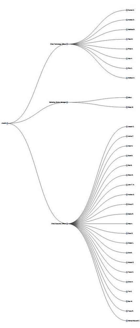
Figure 3-5. A dendogram layout of contacts clustered by job title—dendograms are typically presented in an explicitly hierarchical manner
Figure 3-6. A node-link tree layout of contacts clustered by job title that conveys the same information as the dendogram in Figure 3-5—node-link trees tend to provide a more aesthetically pleasing layout when compared to dendograms
k-means clustering
Whereas hierarchical clustering is a deterministic technique that exhausts the possibilities and is often an expensive computation on the order of O(n3), k-means clustering generally executes on the order of O(k*n) times. For even small values of k, the savings are substantial. The savings in performance come at the expense of results that are approximate, but they still have the potential to be quite good. The idea is that you generally have a multidimensional space containing n points, which you cluster into k clusters through the following series of steps:
1. Randomly pick k points in the data space as initial values that will be used to compute the k clusters: K1, K2, …, Kk.
2. Assign each of the n points to a cluster by finding the nearest Kn—effectively creating k clusters and requiring k*n comparisons.
3. For each of the k clusters, calculate the centroid, or the mean of the cluster, and reassign its Ki value to be that value. (Hence, you’re computing “k-means” during each iteration of the algorithm.)
4. Repeat steps 2–3 until the members of the clusters do not change between iterations. Generally speaking, relatively few iterations are required for convergence.
Because k-means may not be all that intuitive at first glance, Figure 3-7 displays each step of the algorithm as presented in the online “Tutorial on Clustering Algorithms,” which features an interactive Java applet. The sample parameters used involve 100 data points and a value of 3 for the parameter k, which means that the algorithm will produce three clusters. The important thing to note at each step is the location of the squares, and which points are included in each of those three clusters as the algorithm progresses. The algorithm takes only nine steps to complete.
Although you could run k-means on points in two dimensions or two thousand dimensions, the most common range is usually somewhere on the order of tens of dimensions, with the most common cases being two or three dimensions. When the dimensionality of the space you’re working in is relatively small, k-means can be an effective clustering technique because it executes fairly quickly and is capable of producing very reasonable results. You do, however, need to pick an appropriate value for k, which is not always obvious.
The remainder of this section demonstrates how to geographically cluster and visualize your professional network by applying k-means and rendering the output with Google Maps or Google Earth.
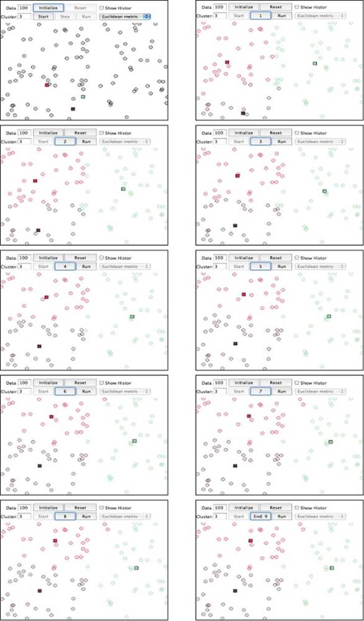
Figure 3-7. Progression of k-means for k=3 with 100 points—notice how quickly the clusters emerge in the first few steps of the algorithm, with the remaining steps primarily affecting the data points around the edges of the clusters
Visualizing geographic clusters with Google Earth
A worthwhile exercise to see k-means in action is to use it to visualize and cluster your professional LinkedIn network by plotting it in two-dimensional space. In addition to the insight gained by visualizing how your contacts are spread out and noting any patterns or anomalies, you can analyze clusters by using your contacts, the distinct employers of your contacts, or the distinct metro areas in which your contacts reside as a basis. All three approaches might yield results that are useful for different purposes.
Recalling that through the LinkedIn API you can fetch location information that describes the major metropolitan area, such as “Greater Nashville Area,” we’ll be able to geocode the locations into coordinates and emit them in an appropriate format (such as KML) that we can plot in a tool like Google Earth, which provides an interactive user experience.
NOTE
Google’s new Maps Engine also provides various means of uploading data for visualization purposes.
The primary things that you must do in order to convert your LinkedIn contacts to a format such as KML include parsing out the geographic location from each of your connections’ profiles and constructing the KML for a visualization such as Google Earth. Example 3-9 demonstrated how to geocode profile information and provides a working foundation for gathering the data we’ll need. The KMeansClustering class of the cluster package can calculate clusters for us, so all that’s really left is to munge the data and clustering results into KML, which is a relatively rote exercise with XML tools.
As in Example 3-12, most of the work involved in getting to the point where the results can be visualized is data-processing boilerplate. The most interesting details are tucked away inside of KMeansClustering’s getclusters method call, toward the end of Example 3-13, which illustrates k-means clustering. The approach demonstrated groups your contacts by location, clusters them, and then uses the results of the clustering algorithm to compute the centroids. Figure 3-8 illustrates sample results from running the code in Example 3-13.
NOTE
The linkedin__kml_utility that provides the createKML function in Example 3-13 is a rote exercise that is omitted for brevity here, but it’s included with the IPython Notebook for this chapter as a turnkey example.
Example 3-13. Clustering your LinkedIn professional network based upon the locations of your connections and emitting KML output for visualization with Google Earth
importos
importsys
importjson
fromurllib2import HTTPError
fromgeopyimport geocoders
fromclusterimport KMeansClustering, centroid
# A helper function to munge data and build up an XML tree.
# It references some code tucked away in another directory, so we have to
# add that directory to the PYTHONPATH for it to be picked up.
sys.path.append(os.path.join(os.getcwd(), "resources", "ch03-linkedin"))
fromlinkedin__kml_utilityimport createKML
# XXX: Try different values for K to see the difference in clusters that emerge
K = 3
# XXX: Get an API key and pass it in here. See https://www.bingmapsportal.com.
GEO_API_KEY = ''
g = geocoders.Bing(GEO_API_KEY)
# Load this data from where you've previously stored it
CONNECTIONS_DATA = 'resources/ch03-linkedin/linkedin_connections.json'
OUT_FILE = "resources/ch03-linkedin/viz/linkedin_clusters_kmeans.kml"
# Open up your saved connections with extended profile information
# or fetch them again from LinkedIn if you prefer
connections = json.loads(open(CONNECTIONS_DATA).read())['values']
locations = [c['location']['name'] for c inconnections if c.has_key('location')]
# Some basic transforms may be necessary for geocoding services to function properly
# Here are a couple that seem to help.
transforms = [('Greater ', ''), (' Area', '')]
# Step 1 - Tally the frequency of each location
coords_freqs = {}
for location inlocations:
ifnotc.has_key('location'): continue
# Avoid unnecessary I/O and geo requests by building up a cache
if coords_freqs.has_key(location):
coords_freqs[location][1] += 1
continue
transformed_location = location
for transform intransforms:
transformed_location = transformed_location.replace(*transform)
# Handle potential I/O errors with a retry pattern...
while True:
num_errors = 0
try:
results = g.geocode(transformed_location, exactly_one=False)
break
except HTTPError, e:
num_errors += 1
if num_errors >= 3:
sys.exit()
print >> sys.stderr, e
print >> sys.stderr, 'Encountered an urllib2 error. Trying again...'
for result inresults:
# Each result is of the form ("Description", (X,Y))
coords_freqs[location] = [result[1], 1]
break # Disambiguation strategy is "pick first"
# Step 2 - Build up data structure for converting locations to KML
# Here, you could optionally segment locations by continent or country
# so as to avoid potentially finding a mean in the middle of the ocean.
# The k-means algorithm will expect distinct points for each contact, so
# build out an expanded list to pass it.
expanded_coords = []
for label incoords_freqs:
# Flip lat/lon for Google Earth
((lat, lon), f) = coords_freqs[label]
expanded_coords.append((label, [(lon, lat)] * f))
# No need to clutter the map with unnecessary placemarks...
kml_items = [{'label': label, 'coords': '%s,%s' % coords[0]} for (label,
coords) inexpanded_coords]
# It would also be helpful to include names of your contacts on the map
for item inkml_items:
item['contacts'] = '\n'.join(['%s %s.' % (c['firstName'], c['lastName'])
for c inconnections if c.has_key('location') and
c['location']['name'] == item['label']])
# Step 3 - Cluster locations and extend the KML data structure with centroids
cl = KMeansClustering([coords for (label, coords_list) inexpanded_coords
for coords incoords_list])
centroids = [{'label': 'CENTROID', 'coords': '%s,%s' % centroid(c)} for c in
cl.getclusters(K)]
kml_items.extend(centroids)
# Step 4 - Create the final KML output and write it to a file
kml = createKML(kml_items)
f = open(OUT_FILE, 'w')
f.write(kml)
f.close()
print 'Data written to ' + OUT
Just visualizing your network can provide previously unknown insight, but computing the geographic centroids of your professional network can also open up some intriguing possibilities. For example, you might want to compute candidate locations for a series of regional workshops or conferences. Alternatively, if you’re in the consulting business and have a hectic travel schedule, you might want to plot out some good locations for renting a little home away from home. Or maybe you want to map out professionals in your network according to their job duties, or the socioeconomic bracket they’re likely to fit into based on their job titles and experience. Beyond the numerous options opened up by visualizing your professional network’s location data, geographic clustering lends itself to many other possibilities, such as supply chain management andtravelling salesman types of problems in which it is necessary to minimize the expenses involved in travelling or moving goods from point to point.
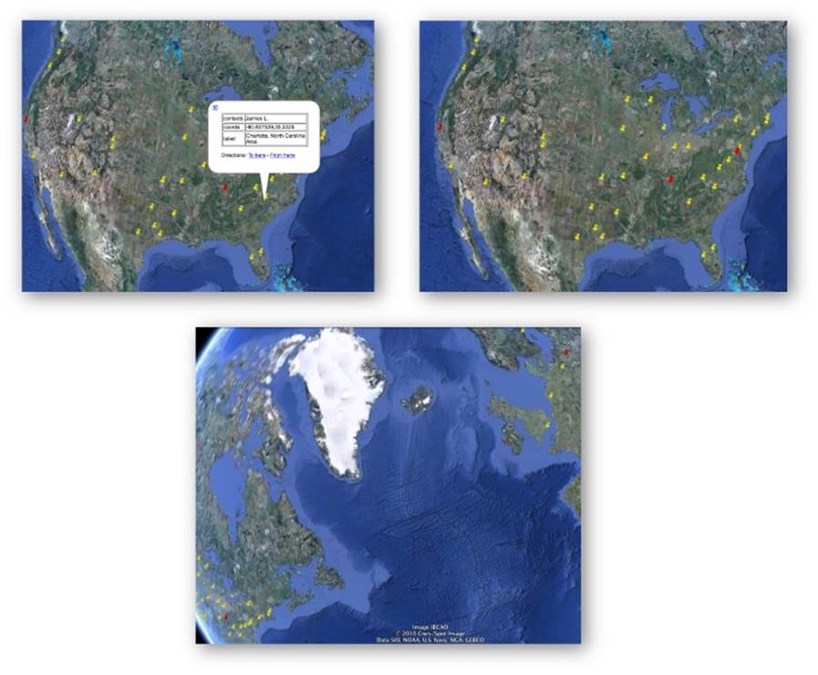
Figure 3-8. Clockwise from top-left: 1) clustering contacts by location so that you can easily see who lives/works in what city; 2) finding the centroids of three clusters computed by k-means; 3) don’t forget that clusters could span countries or even continents when trying to find an ideal meeting location!
Closing Remarks
This chapter covered some serious ground, introducing the fundamental concept of clustering and demonstrating a variety of ways to apply it to your professional network data on LinkedIn. This chapter was without a doubt more advanced than the preceding chapters in terms of core content, in that it began to address common problems such as normalization of (somewhat) messy data, similarity computation on normalized data, and concerns related to the computational efficiency of approaches for a common data mining technique. Although it might be difficult to absorb all of the material in a single reading, don’t be discouraged if you feel a bit overwhelmed. It may take a couple of readings to fully absorb the details introduced in this chapter.
Also keep in mind that a working knowledge of how to employ clustering doesn’t necessarily require an advanced understanding of the theory behind it, although in general you should strive to understand the fundamentals that undergird the techniques you employ when mining the social web. As in the other chapters, you could easily make the case that we’ve just barely touched the tip of the iceberg; there are many other interesting things that you can do with your LinkedIn data that were not introduced in this chapter, many of which involve basic frequency analysis and do not require clustering at all. That said, you do have a pretty nice power tool in your belt now.
NOTE
The source code outlined for this chapter and all other chapters is available at GitHub in a convenient IPython Notebook format that you’re highly encouraged to try out from the comfort of your own web browser.
Recommended Exercises
§ Take some time to explore the extended profile information that you have available. It could be fun to try to correlate where people work versus where they went to school and/or to analyze whether people tend to relocate into and out of certain areas.
§ Try employing an alternative visualization from D3, such as a choropleth map, to visualize your professional network.
§ Read up on new and exciting GeoJSON specification and how you can easily create interactive visualizations at GitHub by generating GeoJSON data. Try to apply this technique to your professional network as an alternative to using Google Earth.
§ Visualize your LinkedIn network with the LinkedIn Labs InMaps. It constructs a graphical representation of your network using some additional information that isn’t directly available to you through the API and produces a compelling visualization.
§ Take a look at geodict and some of the other geo utilities in the Data Science Toolkit. Can you extract locations from arbitrary prose and visualize them in a meaningful way to gain insight into what’s happening in the data without having to read through all of it?
§ Mine Twitter or Facebook profiles for geo information and visualize it in a meaningful way. Tweets and Facebook posts often contain geocodes as part of their structured metadata.
§ The LinkedIn API provides a means of retrieving a connection’s Twitter handle. How many of your LinkedIn connections have Twitter accounts associated with their professional profiles? How active are their accounts? How professional are their online Twitter personalities from the perspective of a potential employer?
§ Apply clustering techniques from this chapter to tweets. Given a user’s tweets, can you extract meaningful tweet entities, define a meaningful similarity computation, and cluster tweets in a meaningful way?
§ Apply clustering techniques from this chapter to Facebook data such as likes or posts. Given a collection of Facebook likes for a friend, can you define a meaningful similarity computation, and cluster the likes in a meaningful way? Given all of the likes for all of your friends, can you cluster the likes (or your friends) in a meaningful way?
Online Resources
The following list of links from this chapter may be useful for review:
§ Bing maps portal
§ Centroid
§ D3.js examples gallery
§ Data Science Toolkit
§ Dendogram
§ Export LinkedIn Connections
§ geopy GitHub code repository
§ Keyhole Markup Language (KML)
§ Levenshtein distance
§ LinkedIn API rate-throttling limits
§ LinkedIn API field selector syntax
§ LinkedIn Developers
§ LinkedIn InMaps
§ Mapping GeoJSON files on GitHub
§ python-linkedin GitHub code repository
§ Travelling salesman problem
§ Tutorial on Clustering Algorithms
[8] If any of your connections have opted out of LinkedIn API access, their first and last names will appear as “private” and additional details will not be available.
[9] Without splitting hairs over technical nuances, it’s also commonly referred to as approximate matching, fuzzy matching, and/or deduplication, among many other names.
[10] If you think this is starting to sound complicated, just consider the work taken on by Dun & Bradstreet, the “Who’s Who” of company information, blessed with the challenge of maintaining a worldwide directory that identifies companies spanning multiple languages from all over the globe.
[11] The computation of a full matrix implies a polynomial runtime. For agglomerative clustering, the runtime is often on the order of O(n3).
[12] The use of dynamic programming and other clever bookkeeping techniques can result in substantial savings in execution time, and one of the advantages of using a well-implemented toolkit is that these clever optimizations often are already implemented for you. For example, given that the distance between two items such as job titles is almost certainly going to be symmetric, you should have to compute only one-half of the distance matrix instead of the full matrix. Therefore, even though the time complexity of the algorithm as a whole is still O(n2), only n2/2 units of work are being performed instead of n2 units of work.
All materials on the site are licensed Creative Commons Attribution-Sharealike 3.0 Unported CC BY-SA 3.0 & GNU Free Documentation License (GFDL)
If you are the copyright holder of any material contained on our site and intend to remove it, please contact our site administrator for approval.
© 2016-2026 All site design rights belong to S.Y.A.