Responsive Web Design, Part 1 (2015)
Content Choreography In RWD
What Structured Content Lets You Do
Breaking content down and storing it as individual components improves my ability to direct content quality, and it also allows me to do two things that are very relevant to RWD: I can recombine content in new forms for different uses, and I can get really picky about how the layout changes across screen sizes.
CONSISTENT CONTENT
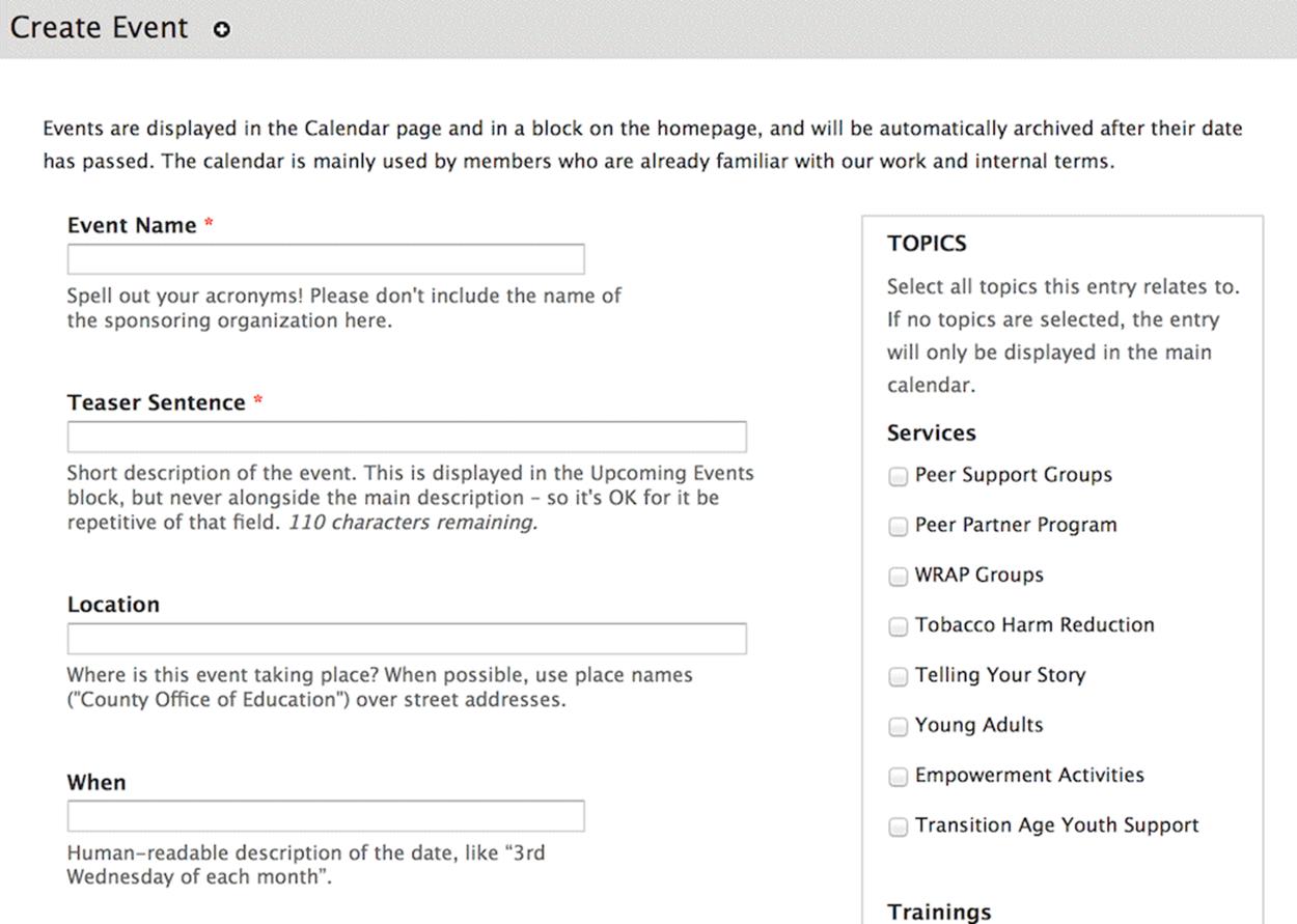
When all the content lives in a single field, there’s really no way to make sure any given entry contains all the pieces of information a user needs. Especially with more complex content types, there may be 15 or 20 pieces of data that need to be included in each entry — think, for example, of all of the various pieces of a product specification. From a data standpoint, it’s very easy for a site author to leave out a few bits of information.
From a quality standpoint, if an author is paying attention to checking off all the data points on a list, asking them to make sure they’re also properly representing the organization’s voice and tone, communicating key messages to a niche audience, and including at least one reference to corporate environmental initiatives — it may just be a bit too much to do consistently well on each entry.
Some of those tasks listed above — speaking to a specific audience, or adhering to a corporate voice — can only be done by humans. To give those humans the space to do their jobs well, structured content lets us offload keeping track of the data-driven tasks (lists of specification numbers, or relationships to related content) to the computer. Computers love keeping track of things!
Where we used to ask authors to start on a blank page, now we’re asking them to start by filling out a form. Important data fields are required, so there’s no way they can get lost in the shuffle. Each field can have its own input validation for format or length. Detailed sets of information are represented in field groups, so authors don’t have to remember how everything interrelates. The labels and help text for each field remind authors what the field is for, what needs to be communicated, and how they can create content that will help the user get their task done.
Filling out a simple form is much easier than remembering how to format elaborate content in a single WYSIWYG field.
DIFFERENT DATA IN DIFFERENT PLACES
Once my content is stored as granular chunks instead of a single blob, I can start recombining the pieces to meet all my different data needs. I recently worked on a site that included event listings, and each entry was displayed in three places:
•Event detail page, including the title, full paragraph description, agenda, and location information.
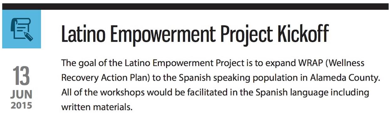
•Upcoming events sidebar, with the title, date and time, and single-sentence description.
•Event calendar, showing just the title and time.
Each event had only one entry in the CMS, and each different display pulled only the relevant information from the database.
I can display different data for different screen sizes as well. On a large screen, I may want to show an event location as a full address with an embedded map. On a smaller screen, I might show a simpler linked version of the address with no map. While it’s important to give users on all screen sizes the same core content (because we can no longer guess context based on device2 ), it’s helpful to be able to tweak the formatting and presentation across different widths.


When space is at a premium, it can be helpful to pare down to the simplest representation of the information needed.
Screen size is of course not the only variable that I want to use to control the display of content. For example, my favorite conference websites adjust the information hierarchy during the event itself, emphasizing which room each presentation is in and downplaying previous days’ schedules. Well-structured content allows me to do things like automatically adding a starting time data- attribute for each talk’s <div>. A bit of JavaScript to attach time-based CSS classes at page load, and voilà! Clever, dynamic event listings that change styling as the day progresses.
Structured content also sets up the information for reuse in other channels. If we’re creating a 100-character version of the headline for display on a small screen, that same headline could be used on Twitter, or pulled to a native app, or displayed on a smartwatch or other micro-display. Breaking content down into facets creates an ecosystem of data that can be used and reused in a wide variety of formats.
A NITPICKER’S PARADISE
Not everyone relishes the work that goes into making a pixel-perfect design. And it’s true that, for the sake of their sanity, a fussy designer is generally well served by embracing a design system philosophy3 on RWD sites. But sometimes a project calls for a bit of obsessive pixel-pushing, especially at the awkward middle breakpoints (I’m looking at you, Nexus 7!), and structured content is what makes that detailed work possible.
Let’s look at an example:

On small screens, the date of each event is shown as a single line just above the title. Once the screen size is large enough, I want the date to display to the side in a stylized tile.
Markup-wise, this isn’t a huge challenge: the entire date is in a <div>, and each unit has its own span with a class name of “day”, “month”, or “year”. At larger breakpoints, CSS kicks in that shifts the date elements to stack on top of one another and floats the whole <div> left.
<div class="event-date">
<span class="day">13</span>
<span class="month">Jun</span>
<span class="year">2015</span>
</div>
In order to style the date properly, I need the markup in every single entry to contain those exact elements, in that order. But chances are that the site admins and authors aren’t comfortable with HTML. If I ask them to use that chunk of code at the top of each block of content, it won’t be long before I end up with a class of “yera”, a <</span>, and the dreaded </div></div>. We shouldn’t require non-developers to work in HTML. It isn’t kind.
Instead, I break out the event date to its own field. There are a few common interface choices for a date widget (a <select> list for each element, a JavaScript mask, pop-up calendar, and so on), and all of them are easier for an author than writing markup.
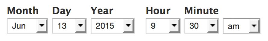
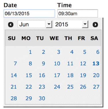
Simple form widgets let authors enter dates consistently without having to remember how to format the information in HTML.
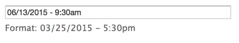
The site author fills out the date field in a human-readable format, and it’s stored in the database in a machine-readable format (UNIX time, usually). When it’s time for the date to be pulled out for display on the front-end, the CMS feeds it through a template that formats and marks up the data exactly in the way that I want. It’s the same code every time, for every date, of every entry.
It’s not hard to see how consistency in markup is one of the keys to the long-term viability of a responsive design. While there are a few different ways to achieve this consistency (individual fields, custom WYSIWYG buttons for marking up long-form content, and so on), the first step to standardizing markup is understanding the structure of the content itself. It’s time to build a content model.
All materials on the site are licensed Creative Commons Attribution-Sharealike 3.0 Unported CC BY-SA 3.0 & GNU Free Documentation License (GFDL)
If you are the copyright holder of any material contained on our site and intend to remove it, please contact our site administrator for approval.
© 2016-2026 All site design rights belong to S.Y.A.