Responsive Web Design, Part 1 (2015)
Mastering SVG For Responsive Web Design
BY SARA SOUEIDAN
You must have come across scalable vector graphics (SVG) in your responsive projects recently. When it comes to resolution-independent assets, SVG is one of the main contenders that we, designers and developers alike, apply in our work. However, SVG isn’t just an image file that scales up and down in a responsive context. With SVG, you can do much more, applying smart and nifty techniques to create both scalable and delightful experiences.
In this chapter, we’re going to go over ways to use SVG in a responsive web design workflow. More specifically, we’ll cover a workflow process from SVG creation, to exporting and optimizing the SVG for the web. Then we’ll look at how we can embed the SVG using the different techniques available. We will explore different techniques for creating SVG sprites and the different ways to provide fallback, consider the performance of some of these techniques, and discover the tools that help us automate the previous tasks. We won’t forget about accessibility and providing alternative content for people with disabilities using SVG’s accessibility features. And finally we’ll go over a few clever techniques using SVG as a tool for delivering better raster graphics, that can take your SVG knowledge to the next level.
Without further ado, let’s get started.
What Is SVG?
SVG is an XML-based, two-dimensional image format with support for interactivity and animation. But don’t let the XML part put you off — SVG is a markup language similar to HTML but is designed for another purpose: rendering shapes and images. These shapes and images are accessible, and can be animated and interactive. This provides us with finer control over the elements making up an SVG image and allows us to group elements, transform them, animate them and interact with them using CSS and JavaScript.
SVG is not a new format. As a matter of fact, the World Wide Web Consortium (W3C) started work on it as far back as 1999. But the rebirth of SVG is a consequence of the rise of mobile devices and the introduction of different screen densities, which required us to look for an image format that would look crisp in all viewing contexts. SVG offers a truly resolution-independent technology for presenting graphics on the web — create the file once and use it anywhere, at any scale and resolution.
Because SVG is vector-based, it is worth making a short detour to look at some of the differences between vector-based and pixel-based graphics.
VECTOR VS. RASTER
Today, the majority of images on the web are pixel-based raster graphics, also known as bitmaps.
Bitmaps are images made up of pixels in a grid that contain the color information for the image rendered on the screen. They come in different formats, of which the most popular and commonly used on the web are PNG, JPEG, and GIF. Bitmap images have advantages, such as their ability to recreate photographic images with high fidelity, but they suffer from a number of limitations.
Obviously, the number one limitation of raster graphics is that they are not scalable — they look blurry when scaled up beyond a certain level. When a bitmap image is zoomed in to, the software or browser needs to create new pixels. It does that by estimating the color values of the new pixels based on the surrounding pixels. This approximation of color values for the new pixels leads to the blurriness of a zoomed image.
A logo in PNG format zoomed in several times looks blurry, and the text content can become illegible. (Logo designed by Freepik.com)
Bitmap formats also tend to be bulky, limited to a single — often low — resolution and consume large amounts of bandwidth on the web.
“Images have been the number one obstacle to implementing truly adaptable and performant responsive pages — pages that scale both up and down, efficiently tailoring themselves to both the constraints and the affordances of the browsing context at hand.”
— “Responsive Images Done Right1,” Smashing Magazine
A lot of solutions2 were introduced, but only recently did we get a responsive images specification that provides us with a “client-side solution for delivering alternate image data based on device capabilities to prevent wasted bandwidth and optimize display for both screen and print.”(The Responsive Images Community Group (RICG)3). Briefly summarized, the responsive images specification introduces two new attributes to the <img> element — namely sizes and srcset — and a brand new <picture> element. Yoav Weiss wrote all about the responsive images solution and how you can use it in his chapter on responsive images (see part 2 of this book).
Raster images also don’t come with the fine control over their content that SVGs offer, so there is no way to style or interact with individual elements of a bitmap image as we can with SVG. That said, bitmaps can be styled using CSS to some extent: CSS filter effects, blending modes, as well as clipping and masking operations can all be used to apply graphics effects to raster images, but the effects are always applied to the image as a whole.
Vector-based graphics are made up of shapes that constitute a set of lines, points, curves and colors that are drawn based on mathematical expressions. This allows SVGs to be scaled up and down while maintaining the spatial relationships between the shapes.
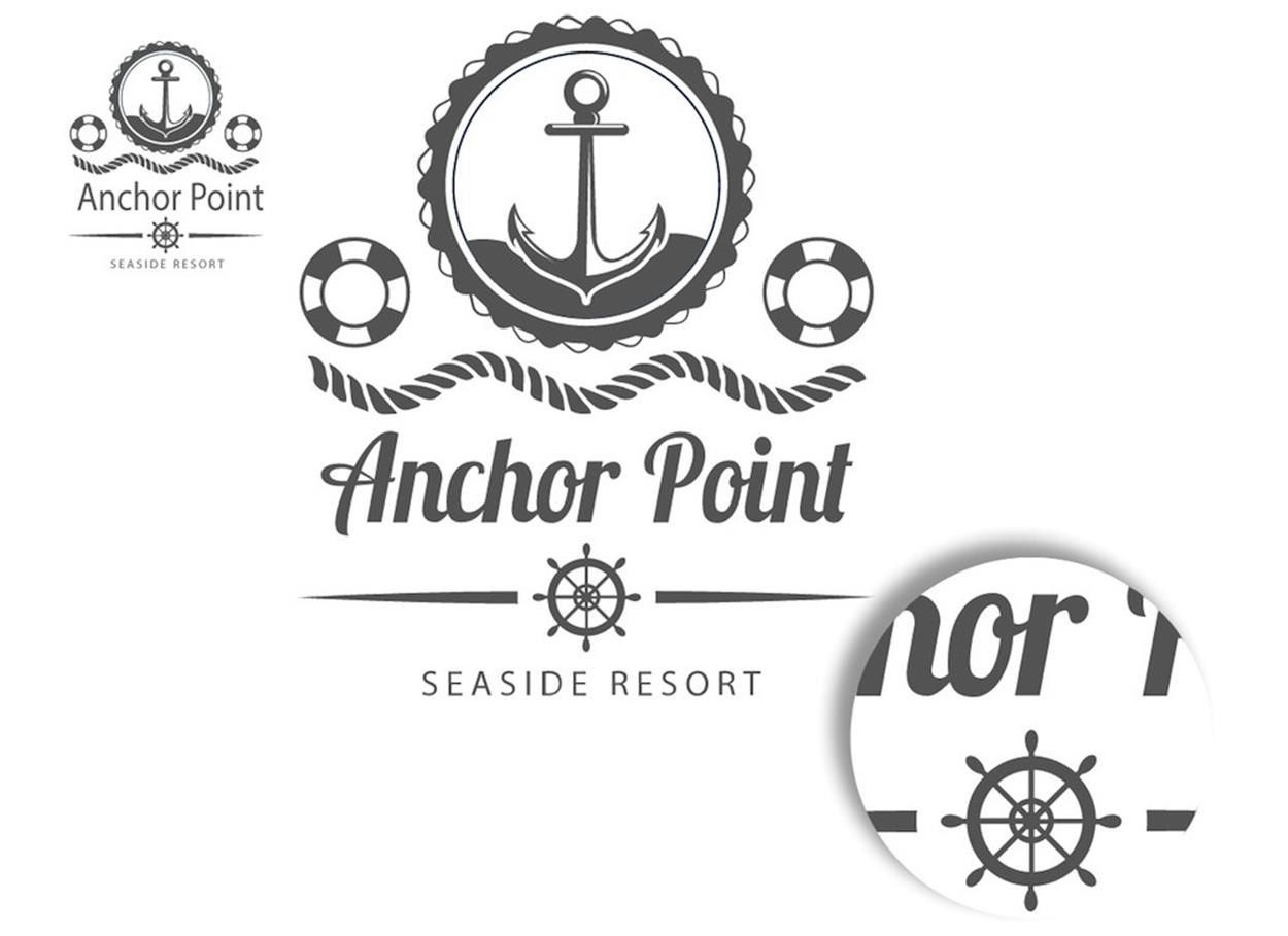
The nautical logo, when used in an SVG format, scales up while preserving the crispness of the image. (Logo designed by Freepik.com)
When using SVGs, you don’t need to know about the number of pixels on the screen. This, in turn, means that you no longer have to provide @2x, @3x and @4x versions of your graphic, because the images are completely resolution-independent. You only need to serve one asset to your users without ever needing to know what their screen or window size is. As a result, SVGs allow us to balance the quality of images with the amount of bandwidth needed to download them.
MORE ADVANTAGES OF SVG
1. SVG IS TEXT-BASED
Being a text-based format makes SVGs easy to edit, transform and track with version control. Their declarative nature means they often have smaller file sizes than their bitmap counterparts, especially after minification and gzipping.
Because they are XML-based, SVGs tend to contain many repeated fragments of text, which makes them a perfect candidate for lossless data compression algorithms. When an SVG image has been compressed using gzip compression, it is referred to as an SVGZ image and uses the corresponding .svgz filename extension.
The compression ratio when the SVG is gzipped can be really high, and there are examples in the SVG specification dedicated to minimizing SVG file sizes4 that show compression ratios as high as 84%. Note that if you host SVG files on a properly configured web server, it will compress files sent to the client by default, so compression of the SVG to SVGZ will then be unnecessary.
If it’s not enabled already, you can enable SVG gzipping in your .htaccess file — thereby making sure you serve SVG/SVGZ the right way — by first adding the SVG and SVGZ media types to the list of media types:
# Add this to the list of media files
AddType image/svg+xml svg svgz
Next, add the gzip encoding:
<IfModule mod_mime.c>
AddEncoding gzip svgz
</IfModule>
Note that this will not gzip your SVGs. It will only make sure the server serves pre-gzipped SVGs correctly.
Then, in order to enable dynamic gzipping, you need to specify AddOutputFilterByType DEFLATE and then add the image/svg+xml type to the list of other types you will probably have. For example, in the HTML5 Boilerplate .htaccess file, it looks like this:
<IfModule mod_filter.c>
AddOutputFilterByType DEFLATE "application/atom+xml" \
"application/javascript" \
"application/json" \
[…]
"image/svg+xml" \
…etc.
</IfModule>
HTML5 Boilerplate’s .htaccess file contains a lot of useful reusable code snippets. To check how SVG gzipping is enabled in it, refer to the compression section of the file on Github5.
2. SVGS HAVE VERY GOOD BROWSER SUPPORT
SVG 1.1 is supported by the vast majority of web browsers on desktop and mobile devices. It works everywhere except in Internet Explorer 8 (and earlier) and Android 2.3 (and earlier). SVGs are safe to use today, and there are a lot of techniques for providing fallback for browsers that don’t support SVG (or even those that do support it but cannot display it for any reason) using simple feature detection techniques. We will cover many different ways of providing fallback later in the chapter.
Note that some SVG features (such as inline SVGs, referencing external SVGs in a <use> element, among others) can have different levels of browser support. Generally speaking, you will need to check support for any specific feature you use to make sure it works in all browsers you intend to reach.
3. SVGS HAVE BUILT-IN GRAPHICS EFFECTS
SVG comes with the ability to apply filter effects, perform clipping and masking operations, and apply background blending modes similar to those available in Photoshop and other graphics editors — all these effects can be applied to shapes and to text alike. It also comes with other advanced features like patterns and gradients.
4. SVG TEXT IS SEARCHABLE AND SELECTABLE
We’ve long used images to display graphical text in techniques for image replacement6. These methods are hacks that we used to get the visual result we wanted while providing alternative text for screen readers. With SVG we no longer need them, since we can apply graphical effects to text residing in a <text> element, and that text not only remains searchable and selectable, but will also be there for screen readers as well.
Having real text inside an SVG means that…
5. SVGS ARE ACCESSIBLE
SVG contains a set of accessibility features including elements that describe the graphic and make it accessible to screen readers. SVG also has a very accessible SVG DOM API that allows you to create, inspect and programmatically manipulate the contents of the SVG, which makes them a great candidate for dynamic graphics, visualizations and infographics.
6. SVGS ARE STYLEABLE AND INTERACTIVE
The SVG DOM API makes interactive behavior scripting using JavaScript a cinch — simply attach an event handler to an SVG node element and you’re all set. It can’t get any simpler than that.
SVGs can also be styled using CSS (or JavaScript). You can select SVG elements using SVG selectors like ID, class or type selectors (and even pseudo-selectors) and then apply styles to them — just like you would with HTML elements. SVGs also respond to CSS media queries, which makes it possible to adapt the graphic to different viewport sizes by controlling individual elements inside the graphic and styling them. What’s more interesting about SVGs is that the viewport sizes defined in the media query conditions correspond to the size of the SVG viewport, not the page viewport (unless the SVG is embedded inline in the document — more about this later in the chapter). This encapsulation of styles inside SVG means that media queries in SVG are actually element queries, which is incredibly useful for creating modular graphics we can use anywhere, knowing that they will adapt as expected no matter where they are embedded. We’ll dive into the details of making SVGs adaptive with media queries later on.
7. SVG IS EASY TO LEARN
As Chris Coyier says, “You can’t learn JPEG”, but you can learn SVG. If you’re a designer who works with HTML, CSS and JavaScript then you probably already know enough to understand and work with SVGs and get up and running with them fairly quickly.
VECTOR OR RASTER: WHICH IS THE BETTER FORMAT FOR YOUR IMAGE?
It depends. Despite all of the advantages of SVG, they are not the best candidate for every kind of image.
SVG is a great way to present vector-based line drawings, but bitmaps are better suited for continuous tone images. Raster images are the preferred format when creating or working with photographs since scanned images and photos taken using a digital camera are raster images by default. If you go with a bitmap, check out Yoav’s chapter (included in part 2 of this book) to find out how to serve the image responsively using the latest standards.
SVG is the preferred format for images like user interface controls, logos, icons and vector-based illustrations. That said, it might not always be the best choice even for those kinds of images. For example, the horse illustration below is an example of a perfect SVG candidate. Despite that, the size of the SVG version of the illustration — even after optimization — is a whopping 123KB, whereas the PNG version (saved to the web from Illustrator) is around 66KB, almost half the size.
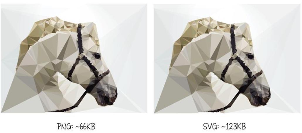
A comparison of the file sizes of an image using two different formats. Horse illustration designed by Freepik.com.
If the difference in file size is too big, and since larger file size means more bandwidth and a negative impact on performance, you may want to prioritize performance and go with the bitmap image instead. An SVG graphic may also contain graphical effects like gradients, drop shadows, glows, and similar advanced effects. But using too many effects in an illustration may increase your SVG’s size so much that a raster graphic would be preferable.
For example, the Smashing Magazine logo is a perfect candidate for the SVG format, and yet Smashing Magazine serves a PNG version. The reason is that the number of gradients and glow effects included increases the file size to more than 300KB. I personally tried optimizing the file and giving up some of the effects while preserving the overall look; the file size dropped down to around 40KB, but that was still much larger than the 5.9KB PNG file they were (and still are) serving. As a matter of fact, by applying more optimizations7, they could even drop the PNG size down to around 3.5KB, compared to which the 40KB size is gigantic.
Glows and the other complex graphical effects have also been proven to affect performance in most browsers at the moment.
Complex SVGs containing a lot of paths and details can sometimes also have large file sizes such that a PNG would be a better alternative. For example, the illustration below weighs around 266KB in PNG format, whereas the optimized SVG weighs around 390KB — this is due to the large amount of detail in the illustration.
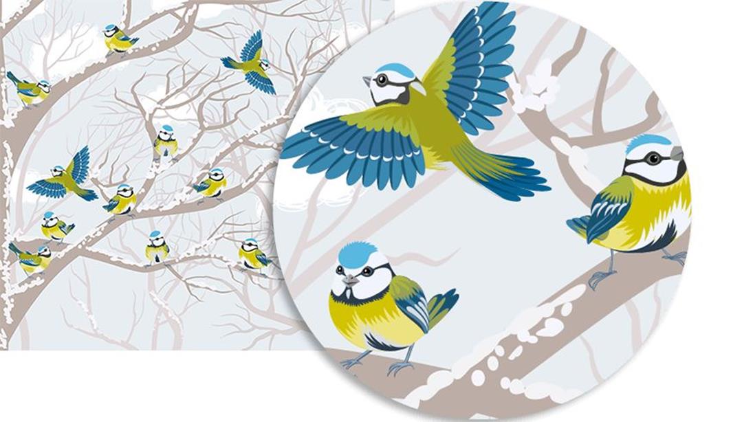
An SVG image containing a lot of details and paths. The illustration is designed by Freepik.com.
It is worth noting at this point that, even though, a PNG file may sometimes be smaller than an SVG file, the table may sometimes be flipped if the dimensions of the image are changed. The same illustration becomes much heavier as a PNG if the dimensions are doubled before it is saved to web; in that case, the SVG format is definitely the better choice. This is particularly relevant when you need to double the size of the image for double- (or even triple-) density screens.
Generally speaking, smaller vector images like icons are best candidates for SVG. If the images contain a lot of details, that’s going to come with a cost, and a high-definition PNG could be a much better choice.
The takeaway here is that sometimes even the format that looks like the obvious go-to choice might not be — I recommend that you test and see. In most cases, you may want to provide a PNG fallback for the SVG you’re working with, so you’re most likely going to have both formats anyway. Also, keep in mind that SVGs can be gzipped, so you might want to take that into account as well before deciding. For some images, especially simple icons and illustrations, SVG is the go-to choice. But in some cases, testing is the only way to find out which format is better. Test, compare and then choose.
There are certain things that can help you generate smaller SVG file sizes. We will cover some tips and techniques in an upcoming section, but before we do, let’s do a quick overview of SVG code so that you can familiarize yourself with how exported SVG code looks. Feel free to skip to the following section if you’re already familiar with SVG code.