Responsive Web Design, Part 1 (2015)
Mastering SVG For Responsive Web Design
Using SVGs To Optimize The Delivery Of Other Image Formats
SVGs have uses that go way beyond simply displaying icons or illustrations. In this section, I want to go over some of the clever techniques and tips that can take your SVG knowledge and usage to the next level.
USING SVG MASKS TO OPTIMIZE RASTER GRAPHICS
JPEGs have better compression rates than PNGs for photographic data. Wouldn’t it be awesome if we could get the compression rate of a JPEG while preserving the transparency of PNGs? Using SVG’s masking capabilities, we can do just that.
The idea behind this technique is to use an SVG mask to clip out or mask the areas of the JPEG that we want to be transparent. We end up serving a JPEG image with simulated alpha channels, thus combining the transparency of a PNG with the compression of a JPEG. The SVG serves as a mere container to display the image and apply the mask to it. This technique was first written about by Dirk Weber63.
Peter Hrynkow also wrote about the same technique64 but in reverse: Hrynkow started out with a PNG without transparent areas (kind of like a JPEG version of the PNG), and then used a PNG mask to achieve the transparency.
Suppose we have the PNG image below. The pigeon PNG with a transparent background weighs around 133KB.
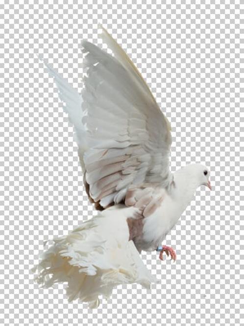
A pigeon photo on a transparent background. Image credit: Francisco de la Vega.
The first step to optimize the image is to convert it into a JPEG. I did that by saving the image in Photoshop as JPEG instead of PNG. By saving to JPEG, the transparent areas become white and the image size drops from 133KB to 19.3KB for a high-quality JPEG, and 10.3KB for medium quality.
The next step is to prepare a luminance mask to use as an SVG mask. The SVG <mask> element that we are going to see uses luminance masks (not alpha masks) to mask elements. To achieve the transparency of the original image, we need to hide the white background and only keep the bird image. Using a luminance mask, we can do that by using a mask as shown below: the white (luminant) areas of the mask represent the areas of the JPEG that we want to keep; black areas in the mask represent areas we want to mask out.
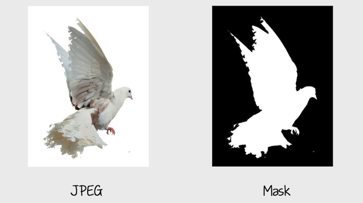
The JPEG image on the left, and the luminance SVG mask on the right.
Now that we have the mask and JPEG ready, we use SVG to apply the mask and serve the JPEG with transparent areas. The JPEG can be included inside the SVG using the SVG <image> element.
<svg version="1.1" xmlns="http://www.w3.org/2000/svg" xmlns:xlink="http://www.w3.org/1999/xlink"
viewBox="0 0 400 530">
<defs>
<mask id="mask">
<image width="400" height="530" xlink:href="pigeon-mask.png"></image>
</mask>
</defs>
<image width="400" height="530" xlink:href="pigeon.jpg" mask="url(#mask)"></image>
</svg>
The <svg>, <mask> and <image> have the same dimensions. And that is all you need to serve a PNG with the high compression rate of a JPEG. The SVG serves as the container holding the masked image.
Of course, since this technique relies on SVG and SVG masks to work, it will only work in browsers that support SVG, which means that it does not work in IE8 (or earlier) and older versions of Android. In addition, it is recommended that you inline the SVG to make it work in most browsers. Referencing an external SVG containing the images, using an <img> tag, for example, does not work in all browsers. You can refer to this CodePen65 for test results loading the SVG in different ways.
USING SVG AS A CONTAINER FOR SERVING RESPONSIVE IMAGES
Another technique that uses SVG as a container for serving raster graphics is the Clown Car Technique by Estelle Weyl.
Weyl’s technique takes advantage of SVG’s ability to include raster images with <image>, and the CSS background-image property’s ability to respond to CSS media queries.
The idea behind the Clown Car Technique is to include multiple images inside the SVG, and then use CSS media queries to display the image we want depending on the size of the viewport.
Using <image> to include the raster images inside the SVG, hiding them with display: none; and showing them on demand has one major drawback: all of the images will be requested and downloaded even if they are not displayed. So, instead of using foreground images, Weyl uses CSS background images to include the images in the SVG.
<svg xmlns="http://www.w3.org/2000/svg" viewBox="0 0 300 329" preserveAspectRatio="xMidYMid meet">
<title>Clown Car Technique</title>
<style>
svg {
background-size: 100% 100%;
background-repeat: no-repeat;
}
@media screen and (max-width: 400px) {
svg {
background-image: url(images/small.png);
}
}
@media screen and (min-width: 401px) and (max-width: 700px) {
svg {
background-image: url(images/medium.png);
}
}
@media screen and (min-width: 701px) and (max-width: 1000px) {
svg {
background-image: url(images/big.png);
}
}
@media screen and (min-width: 1001px) {
svg {
background-image: url(images/huge.png);
}
}
</style>
</svg>
The above SVG is then either included inline or referenced as an external SVG using <img> or any other embedding technique.
<img src="responsiveImage.svg" alt="Responsive image" />
In our responsive SVG, we include all of the images that we might need to serve and then show only the appropriate image based on media queries. Using CSS background images, only the image that is needed is going to be requested and downloaded.
Although clever, this technique has a lot of drawbacks: browser support inconsistencies; security issues that require <object> instead of <img> to load the image; and using conditional comments to provide fallback for Internet Explorer, in addition to performance considerations that make this technique neither as ideal nor simple as it looks. You can read all about the technique, its gotchas, implementation options and drawbacks by reading Weyl’s article on Smashing Magazine66. Make sure you read the comments section below the article for more insight about the technique’s pros and cons.
In light of the advances made in the area of providing responsive images using the responsive images specification (<picture> and srcset) that Yoav talks about in his chapter (see part 2 of this book), we have a more semantic, performance-optimized solution to deliver responsive images today and in the future.
That said, the Clown Car Technique is still worth mentioning as a way to show how SVG can be used to provide alternative solutions, by taking advantage of the encapsulation of resources and styles in an SVG that make it similar to iframes in some of its characteristics. This fact can be leveraged such that SVG becomes a tool and a means to an end, not just another image format.