Responsive Web Design, Part 1 (2015)
Building Advanced Responsive Modules With Flexbox
Using Flexbox With Fallbacks
Until browser support for flexbox becomes universal, or unless you’re working on a site for a specific browser, I recommend using flexbox for progressive enhancement, like the recipe photo example. Your layout should be clear, usable and (hopefully) attractive without flexbox so that users of non-supporting browsers still have a good experience; then you can layer flexbox on top to improve responsiveness even further. So how do you handle the layout for the non-supporting browsers?
I don’t have a single answer to this question. There’s currently no flexbox polyfill that will magically make all your flexbox effects happen with JavaScript instead of CSS. But there are a few ways to provide a good fallback experience for non-supporting browsers, and the one you choose will depend on the way you’re using flexbox.
ONE APPROACH: DO NOTHING
The simplest fallback approach is to do nothing for non-supporting browsers. If I’m using flexbox only for cosmetic enhancements, not essential layout, I think it’s perfectly fine for different browsers to display different things.
That’s already happening anyway. I don’t provide any fallbacks for border-radius, box-shadow, text-shadow, gradients, multi-columns, transitions, or any number of other aesthetic enhancements I can add with CSS3 — you probably don’t either. Most folks in our industry have accepted that all browsers and devices are going to display our webpages somewhat differently no matter how hard we try for things to look identical between browsers. When you’re using flexbox just to fine-tune alignment, change a photo’s placement, or other purely cosmetic enhancements, it’s completely acceptable and sensible to provide no fallback to attempt to imitate the effect in old browsers.
For instance, if I’m using flexbox just to nicely center a couple of items together, it’s not a big deal if instead they’re top-aligned in IE7, 8 and 9. This appearance will be different, but it’s not wrong; it won’t look broken, and it won’t provide a bad experience for users of those browsers. This use of flexbox is progressive enhancement, pure and simple.
COMBINING FLEXBOX WITH ALTERNATIVE LAYOUT METHODS
If you’re using flexbox to control layout, meaning the placement and sizing of items, you might decide this is a more essential part of the design and want to provide a fallback. In this case, you can use any layout CSS you normally would as your flexbox fallback, because most of the time both layout methods can coexist.
Using display:table-cell is a great alternative to flexbox because it affects boxes in much the same way that flexbox does. For instance, it can do equal-height columns, make boxes stretch and shrink to fit their content, vertically center content, and make a single box on a line take up all the remaining space after the fixed-width boxes have been sized.
However, one of the big differences between flexbox and table-cell display is that table-cell doesn’t allow boxes to wrap when needed. At narrow widths, content in adjacent “cells” may overflow and overlap one another. Plus, IE7 doesn’t support display:table-cell, so it won’t work as a fallback for that browser, if you still support it.
If this is a possibility for your content and you need wrapping, inline-block or float are other good fallbacks for flexbox layout. Just as with display:table-cell, you can use either of these layout methods at the same time as flexbox.
In the article header example we looked at earlier, I can use both table-cell and inline-block to control the layout before adding flexbox as a progressive enhancement. I’ll use table-cell to lay out the image and text block beside each other; and then inline-block inside the text block, since the three pieces of content in there have to be able to wrap if needed.
@media (min-width: 70em) {
.article-header {
display: table;
display: flex;
width: 100%;
}
.article-header-image {
display: table-cell;
flex: 1 0 auto;
padding-right: 10px;
}
.article-header-image img {
width: auto;
}
.article-header-text {
display: table-cell;
display: flex;
align-items: baseline;
justify-content: space-between;
align-content: space-between;
width: 100%;
vertical-align: middle;
}
.article-title {
flex: 1 1 100%;
}
.article-category {
display: inline-block;
}
.article-date {
display: inline-block;
text-align: right;
}
}
See how I have both table and flex display values on article-header and article-header-text? Both conflicting values can be declared on the same element, because non-supporting browsers just ignore the flex stuff that they don’t understand, and browsers that do understand it use whatever value comes last to override the earlier value.
The same thing happens with display:inline-block and the float and clear properties. When you use both inline-block or floating as well as flexbox on the same element, flexbox overrides them. This means that non-supporting browsers use the inline-block or float positioning; supporting browsers use the flexbox positioning; and neither layout method needs to be hidden from either set of browsers: they don’t conflict — they coexist.
There are a few other standard CSS properties that get overridden or work differently in conjunction with flexbox; see http://www.w3.org/TR/css3-flexbox/#flex-containers21 for the brief list.
But, there are a few issues you may run into when you combine floating with flexbox.
First, if you’re using the 2009 flexbox syntax for older versions of Safari and the Android browser (by setting display to -webkit-box rather than -webkit-flex), those browsers exhibit a bug where a flex item that is also floated will disappear. Luckily, the fix is simple: just add position:relative to the floated flex item to make it reappear. (Illogical, yes, but that’s a bug fix for you!)
Second, some float containment methods can clash with certain flexbox effects. For instance, the classic clearfix class adds generated content at the end of the parent of the float, and this new piece of content will be counted as a flex item just like the other boxes within that parent. Since it has zero width and height this is normally not a problem, but if you’re using the justify-content property to equally distribute the flex items, this invisible flex item gets distributed too and takes up space. You may want to avoid using the clearfix class when using flexbox in conjunction with your floats, or move it to another container element without display:flex on it.

The invisible piece of content that clearfix adds is at the right edge of the nav bar after Contact Us, thanks to justify-content:space-between pushing it to the end of the line. It takes up no space itself, but since it’s a flex item it gets aligned like the rest of them and ends up with space around it, leaving a big gap and making the nav not appear full-width.
A third issue is that when you float you often give the content following the float a large side margin to get it out of the way. But flex items don’t need this margin to sit side by side, so adding it only introduces a huge gap between flex items. This is when you need to break out the Modernizr feature-detection script22 and have it add the flexbox-supporting or non-supporting classes to the opening <html> element of your page. Then you can use these classes to add the margin only when flexbox isn’t supported and floating is used instead.
.container {
display: -webkit-box;
display: flex;
}
.sidebar {
float: left;
position: relative;
width: 300px;
}
.no-flexbox .main-content {
margin-left: 300px;
}
Most of the time, you don’t need Modernizr to separate out the flexbox and non-flexbox fallback styles, as flexbox can just override in browsers that understand it, but sometimes you do need to isolate certain properties, and luckily Modernizr makes that easy.
The main CSS layout method that doesn’t work in conjunction with flexbox is absolute positioning. Flexbox doesn’t override it, so if you’re using it as your non-flexbox starter styles, you’ll need to isolate it with Modernizr. See http://www.w3.org/TR/css3-flexbox/#abspos-items23 for the details.
Let me give you one final example of using flexbox as progressive enhancement on top of other layout methods, but this time across the entire page layout. My friend Chris Weiher’s existing website, Watch Me Work24, didn’t have a mobile version and wasn’t responsive. He told me that he wanted the mobile version of the site to have live video streams at the top of the page so that users could get viewing right away — the main purpose of the site.
I knew I could do this with responsive web design, rather than creating a separate mobile site, so I first created a wireframe of his existing desktop design with live streams added to the bottom of the page. Then, in the narrow mobile version, I moved the live streams to the very top, even over the hero banner.
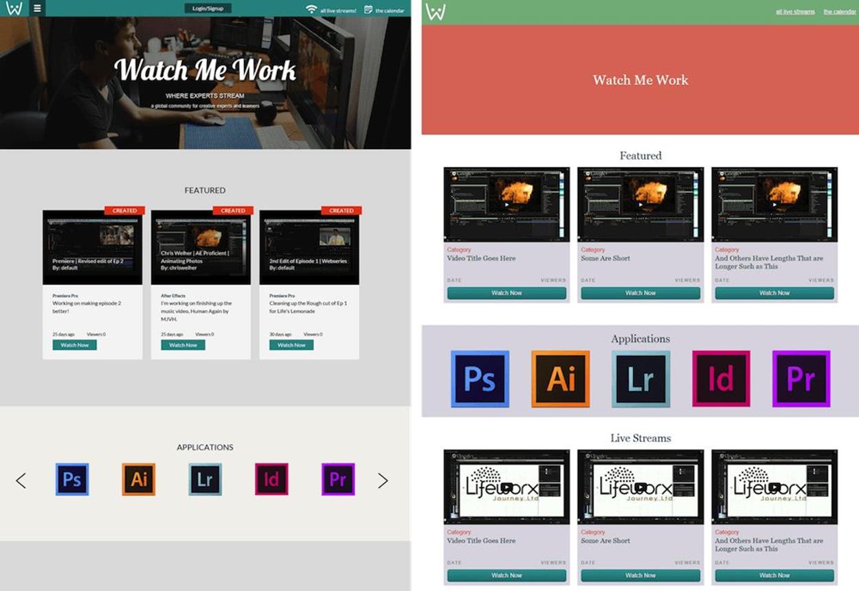
The existing design of Watch Me Work, with no live streams section and no narrow mobile version of the layout (see left). My widescreen wireframe of the revised layout, with a Live Streams section at the bottom so I could make it available for the mobile version (see right).
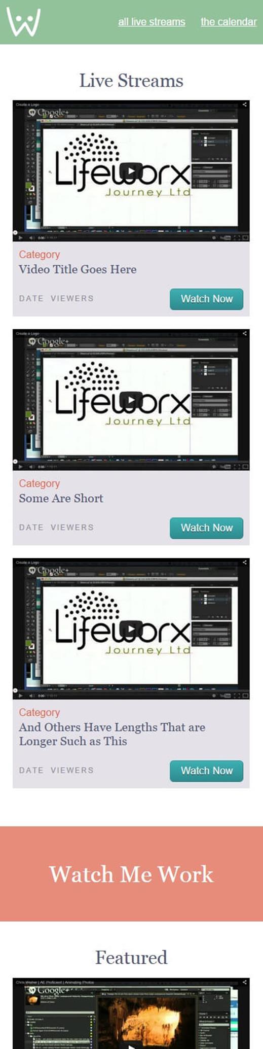
My narrow-screen wireframe reorders the page sections to place Live Streams at the top.
In both versions, the layout was pretty simple — a series of stacked bars — so I could rely on the default block stacking of <div>s to lay out the major page sections. I simply needed to use the order property to move the live streams section up from its native HTML position at the end of the page on narrow screens.
.watch-me-work {
display: flex;
}
.header {
order: 0;
}
.section {
order: 2; /* all of the sections, including Live Streams */
}
.section-live {
order: 1; /* override to move Live Streams above others */
}
@media (min-width: 40em) {
.section {
order: 0; /* back to default source order */
}
}
That was all the flexbox I needed for the overall layout of the major page sections. I then used flexbox (on top of simpler layout CSS) inside these sections to size and align the chunks of content. For instance, to put the video stream blocks (inside the featured and live sections) beside one another in the wider layout, I used floating as a starting layout style, but added flexbox as well so I could make them have equal height. The flex value simply overrides the width value that the floating layout will use.
.stream-list {
display: flex;
flex-direction: column;
}
@media (min-width: 40em) {
.stream-list {
flex-direction: row;
}
.stream-item {
float: left;
width: 32%;
margin-right: 2%;
}
.flexbox .stream-item {
flex: 1 1 33%;
margin-right: 20px;
}
.stream-item:last-child {
margin-right: 0;
}
}
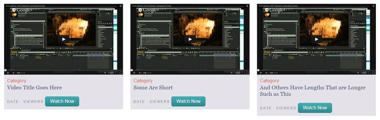
Without flexbox, the stream items are not equal height across their row, but they still look fine as a basic style for older browsers.
With the stream items having equal height across their row on wide screens, I could then pin the date, viewers and button to the bottom of each block, making them align with one another across the row. To do this, I first needed to turn each stream item into a flex container itself and stack the video (stream-video) on top of the gray text block (stream-info). I made the video not flex so stream-info could take up the rest of the height inside stream-item.
.stream-item {
display: flex;
flex-direction: column;
}
.stream-video {
flex: 0 0 auto;
}
.stream-info {
flex: 1 1 auto;
}
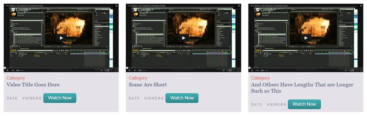
Using flex on the gray box within each stream item makes them stretch to fill the full height, so you can see the stream items are of equal height across the row.
Next, I needed the children of stream-info to be flex items too, so I could use the new auto margin pinning behavior on them. That meant stream-info needed to be a flex container with vertically stacked children.
.stream-info {
display: flex;
flex-direction: column;
flex: 1 1 auto;
}
Finally, I added an auto margin on the top of the wrapper for the date and viewers text (stream-meta), pushing it and everything after it to the bottom of its container. I also made it a flex container so I could use justify-content to push its children, date, and viewers to opposite sides of their line.
.stream-meta {
display: flex;
justify-content: space-between;
margin: auto 0 10px 0;
}
And I didn’t have to do anything to make the button fill the width of its container — it did that by default thanks to align-items:stretch on stream-info, which makes flex items’ widths, not heights, stretch when the flex container is set to vertical alignment.
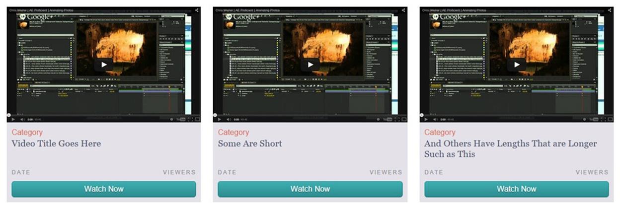
The date, viewers, and button are now pinned to the bottom of their stream item and full-width within it.
In the applications logo list, I used inline-block and text-align:center to lay out the logos in the middle of a single line, but I added flexbox on top to make the logos stretch to fill the line.
.app-list {
display: flex;
text-align: center;
}
.app-item {
display: inline-block;
flex: 1 1 auto;
margin-right: 20px;
text-align: center;
}
.app-item:last-child {
margin-right: 0;
}
.app-item img {
max-width: 100%;
}

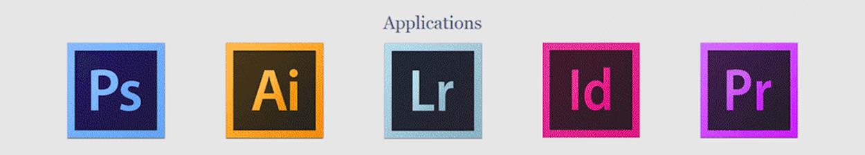
The applications list without flexbox (top) and with flexbox (bottom).
The page is full of small flexbox enhancements like this that make the layout more responsive to the space available, helping it to look more polished in between the breakpoints.
Conclusion
Flexbox is not necessarily a replacement for all the other layout mechanisms that we've been using for a while but rather is an addition to our box of tools to help create responsive layouts. Try layering flexbox on top of simpler layout CSS to enhance the sizing, alignment and ordering of content within your UI components. We’ve looked at real-world examples of components that can be made more responsive, more easily, thanks to flexbox’s powerful and flexible properties.
We’ve looked at lots of code along the way. But using flexbox is about a lot more than memorizing new syntax. It’s about shifting the way you think about web layout problems and visualize their solutions. When I made the switch from table layout to float layout, there was a certain point where I just started thinking in floats, and table layout actually became harder for me because I no longer thought about web layout from that perspective and within its limitations.
You can experience that same sort of mental shift with flexbox today. To start thinking from a direction-neutral flexbox point of view, you just have to use it. So play around with it! The more you use it, the more easily you’ll be able to understand how to manipulate layout with it, and the more ideas you’ll gain of how flexbox can be used to enhance your daily work.