Responsive Web Design, Part 1 (2015)
Responsive Process
Enough Theory
That’s enough theory. Let’s get into the nuts and bolts of this work. I find myself constantly asking three questions throughout our web projects:
1. Who are we building for?
2. What do we want them to gain from the experience?
3. How should we present the experience?
The goal is to find a way to say the right things (what) in the right way (how) to the right people (who). The secret to great communication of any kind is answering these questions. You will, of course, ask many other questions throughout your project. Questions like what kind of navigation patterns should I use on this site, or do we really need an ad at the top of every page? I’m suggesting that having the answers to who, what and how will lead you in the right direction as you answer all the other questions that come up.
The chapter by Eileen Webb is all about content strategy for your responsive project. It’s a thorough chapter, and she answers the questions around what it is we’re trying to communicate better than I ever could.
So, the rest of this chapter is dedicated to answering that third question, “How?” I’ll share with you the kinds of tools that have been the most helpful for me and my team at Sparkbox and trust that they will also help you!
GETTING IT DONE
As I mentioned earlier, understanding the priority of the content and functionality we’re presenting is critical to communicating effectively. Here are a few ways this truth manifests itself in the work we do.
CONTENT PRIORITY GUIDE
A content priority guide is “part content modeling, part stripped-down wireframe” (see “Content Priority Guide19” by Emily Gray20.); like a mini content model, in priority order, and with client collaboration. (See http://bit.ly/content-priority-guide21 for a working example of a content priority guide.)
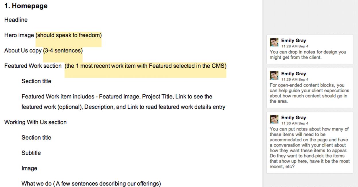
A screenshot of a content priority guide created in Google Documents and shared with a client.
The content priority guide tells you what types of content should exist on each page. These could be simple things like the title, primary image and body copy on a blog post, or they could be much more complex: consider all the content types you might need on the product detail page of an e-commerce site.
It also allows for explanation of each content type. If you have a short description of a product, the priority guide may say, “One sentence describing the product and what makes it unique.” For an item like a hero image, you could provide some details about the art direction of the photo if that was relevant for a specific case.
Content priority guides also help you quickly identify reusable components. This is very helpful as you plan out the management of that content — recognizing reusable patterns means you can build a more efficient system to manage the content.
Most importantly, a priority guide is in priority order. It provokes a discussion about what’s truly important on any specific page. This helps tremendously as you consider how a site will respond across viewport widths. And because it doesn’t contain actual content it facilitates great conversation about the what and why of types of content, which can easily be overlooked if you start writing the copy immediately.
If your clients have difficulty prioritizing (and they probably will), you could place these decisions around what is most important into a spreadsheet and give them options to check — primary, secondary, tertiary, etc. The result is the same: you have a prioritized list of content types for each page, but the process to get there may feel a bit more friendly to the client if they’re given some options.
INFORMATION ARCHITECTURE
Once you have a good understanding of the types and priority of content that needs to exist in the system, it’s critical to consider how that content should be grouped and the paths through the content you want your users to take. This kind of thinking is crucial to the creation of a usable site.
I recently saw Aaron Quinn22 speak about information architecture and he said something that really stuck with me. He suggested that we might be relying too much on our common sense when it comes to grouping information. Instead, he made the case for us to consider consensus over common sense23 when planning how our users will interact with what we build. Let me explain why with a quick story.
We have a client we’ve been working with for over a year now. She has bootstrapped a very successful SAAS product which we helped her build. This woman is incredibly smart; she works on the web every day — it’s how she makes a living. Not too long ago, I was having a conversation with her about what was next for her product and she said this to me: “I think we need to make some changes to the tabs on our site.” I paused because I was desperately trying to remember where we had implemented tabs on her site. Sensing my confusion, she went on to explain more about what she was hoping for. After a few moments, I realized she was talking about the navigation. It was eye-opening that this savvy web entrepreneur referred to her navigation as “tabs.”
I tell you this because I want you to remember how much of a bubble we live in when we allow our instinct to drive the decisions we make. What may seem like common sense to you and me is likely a very different way of thinking about the web than pretty much all of our users. This is what Aaron Quinn was describing. We cannot rely on our instincts; we need to work with our users to find out how they think about the kinds of content we present to them. It’s very difficult to remember this, but it makes a world of difference.
Now, back to planning the information architecture of a site given this context. Instead of grouping content that seems related to you using common sense, Aaron is suggesting we rely on the consensus of users. Information architecture is a very deep field. I can’t pretend to cover the intricacies of this specialty in one section of one chapter. It’s important you understand that it’s impossible to do this kind of work well on an island. You must involve your client and the users of the site. Only then can you know if your intuition is correct.
Remove the Navigation
During some recent usability tests, I noticed that on small screens many users never attempted to locate or use navigation. These days, most of our small-screen navigation experiences are hidden behind obscure icons (hamburger, anyone?). I believe our expectation that users will properly identify, trigger and use our navigation is unfounded.
In an effort to combat this, we’ve begun considering a simple question — can someone use this site without the navigation?
Literally, remove the navigation from your site and see if your users can reach the content they want. In other words, plan out the content in such a way that your users can feel their way through the experience. Chances are, a good number of them will browse this way. We’d better be ready for them.
STYLE COMPARISONS
I learned about style comparisons when I had the opportunity to present with Dan Mall24 and Yesenia Perez-Cruz25 at Artifact Conference26 in Austin, Texas. Dan shared a story about how he was working to build a new office. Here’s the relevant excerpt from his blog post27:
“I could create an illustration or a 3D rendering of what I want my new office to look like, but that doesn’t take advantage of his [the contractor’s] great ideas. It’s dictation, not collaboration. Instead, I show him a Pinterest board my wife and I created. I tell him that I love these beams or this mix of materials, and we can have a conversation. I revise my ideas through his expertise, and vice versa. This is how building a website should go.”
Not only is this a brilliant approach to building a new space, it can be applied directly to what we do each day. Our creative director, Jeremy Loyd28, has been creating super-simple PDFs for our clients that ask them whether they think their brand would best be represented online with:
•A dark or a light site
•A flat or a textured site
•An illustrated or photographic site
•Whatever other style comparisons are relevant
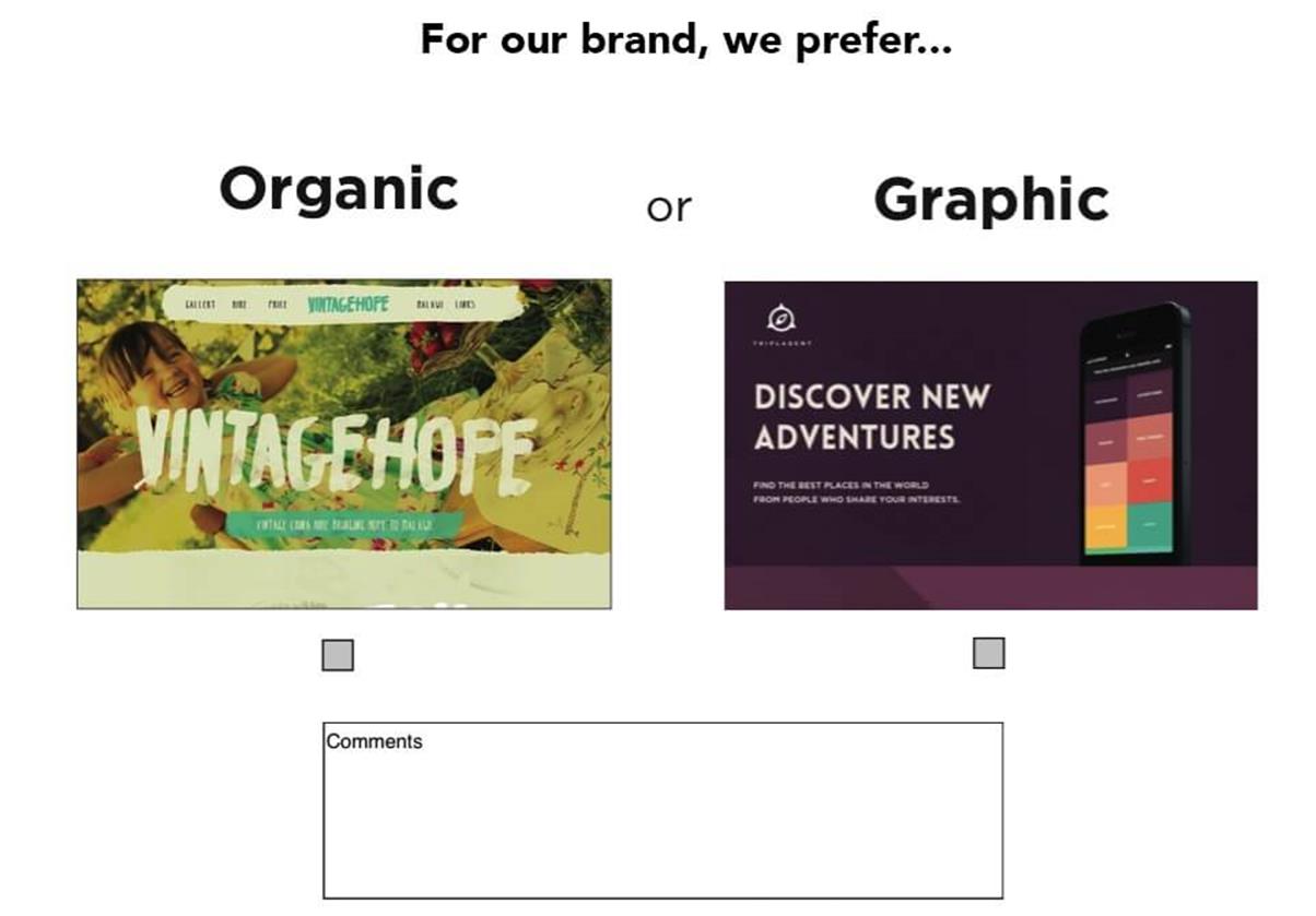
A style comparison allows the customer to share some of their vision for their new design. In this case, we’re asking if they prefer “organic” or “graphic.”
You get the idea. The point is that it only takes a few minutes to put this together, because it doesn’t really require any design. You can use screenshots of existing sites that embody the qualities you have questions about.
An approach like this is very useful when there isn’t much clarity about the design direction up front. It helps us make sure we’re in agreement about the direction we’re headed. Truthfully, this is really just a simple tool to facilitate a conversation, to get people thinking and conversing about design.
One other trick from my friend Dan Mall which you can use to really drive this home is to quickly edit your client’s logo into a screen capture of someone else’s site. There is something about seeing their brand associated with a specific style which provokes a reaction. This makes for very fruitful conversations.
USER EXPERIENCE DESIGN
No title in our industry is more overloaded and misunderstood than “user experience designer.” It means so many different things to so many different people. Recently, I’ve even noticed a trend toward expecting all designers and developers to do this work. And while I believe the best organizations have teams full of people who care about user experience, I also believe it has a deeper role to play.
I think about user experience as the glue that binds our design and our development together. It’s what separates web design from other kinds of design — that our work is intended not only to be observed, but also to be interacted with. That interaction is so important. In my mind, a great user experience designer has an instinct for what will be easy for a user to understand. However, this must be balanced with the idea that design without testing is guesswork. For this reason, a great user experience designer knows how to research their users, how to collaborate with UI designers, how to prototype possible solutions, and how to select and execute usability studies to capture and analyze data which properly informs design and development.
That’s a lot. And since I’m not formally trained in user experience or human factors, I’m probably not qualified to write about each of those things. Instead, I want to focus on one lesson I’ve learned (see “Test the Aggregate”) and then share the kinds of updates we do with our customers to help us all agree on usability decisions across screen sizes and input methods.
TEST THE AGGREGATE
I work with internal user experience teams at larger clients, and one challenge I’m continually presented with is the desire to test the experience they are building at individual breakpoints. In other words, I’ve seen teams create three (or more) separate prototypes — for mobile, tablet and desktop — and then proceed to test each one independently. When this happens, each of these separate experiences will evolve on its own, usually resulting in three unique experiences which will be very difficult (if not impossible) to build in a responsive way.
To combat this, lately I’ve shared how critical it is to test the aggregate experience. Instead of building three separate prototypes for usability studies, build a single prototype with HTML and CSS that actually responds. We usually do this statically with an evolving set of front-end build tools (you can learn more about our front-end stack in the article “We Heart Good Tools: An Update on Our Build Process29”) which means we can work quickly with fake data.
This concept is about letting go of the control you think you have. It’s about making decisions which benefit the whole (the aggregate) even though they may require compromises in certain contexts. It recognizes that changes made at one of the breakpoints in your system will inevitably affect the experience at other breakpoints. It’s about embracing the benefits you get with a single code line and adjusting our usability studies to account for this.
If we’re building responsively, we need to focus on testing a single-site solution across viewport widths. We need to measure the usability of the whole, not just the breakpoints. This will help us create the most usable experience for the most people.
And now, a few updates we use with our clients to help accomplish these goals.
CONTENT PROTOTYPE
You’ve heard it said that a web designer should learn some CSS, right? Well, I agree, and I think a content strategist should learn some HTML. For this reason, and many others, we’ve been building content prototypes pretty early in our web dev process. As soon as we start to get a clear picture of actual content, we start marking up that content with hypertext. This is what we do with HTML, right? Who better to wrap content in semantic tags than the folks who best understand the content? While tools like Markdown can work as well, I think it best to learn some basic HTML before you jump straight to Markdown. Understanding why you’re writing the content in this way is just as important as actually writing the HTML. Tools like Markdown add a layer of abstraction between your actions and the output of those actions — an abstraction that is fine, once you understand what it gives you.
When we create a content prototype, we intentionally leave out almost all styles. We leave them quite ugly, so it’s very clear we have not designed anything. This keeps the conversation focused on the content and the priority of that content. Know that when you show this to a customer, they will immediately home in on the order of things — which is precisely what you want them to do: get that priority right! Also, we usually include just enough CSS to show groupings, like so:
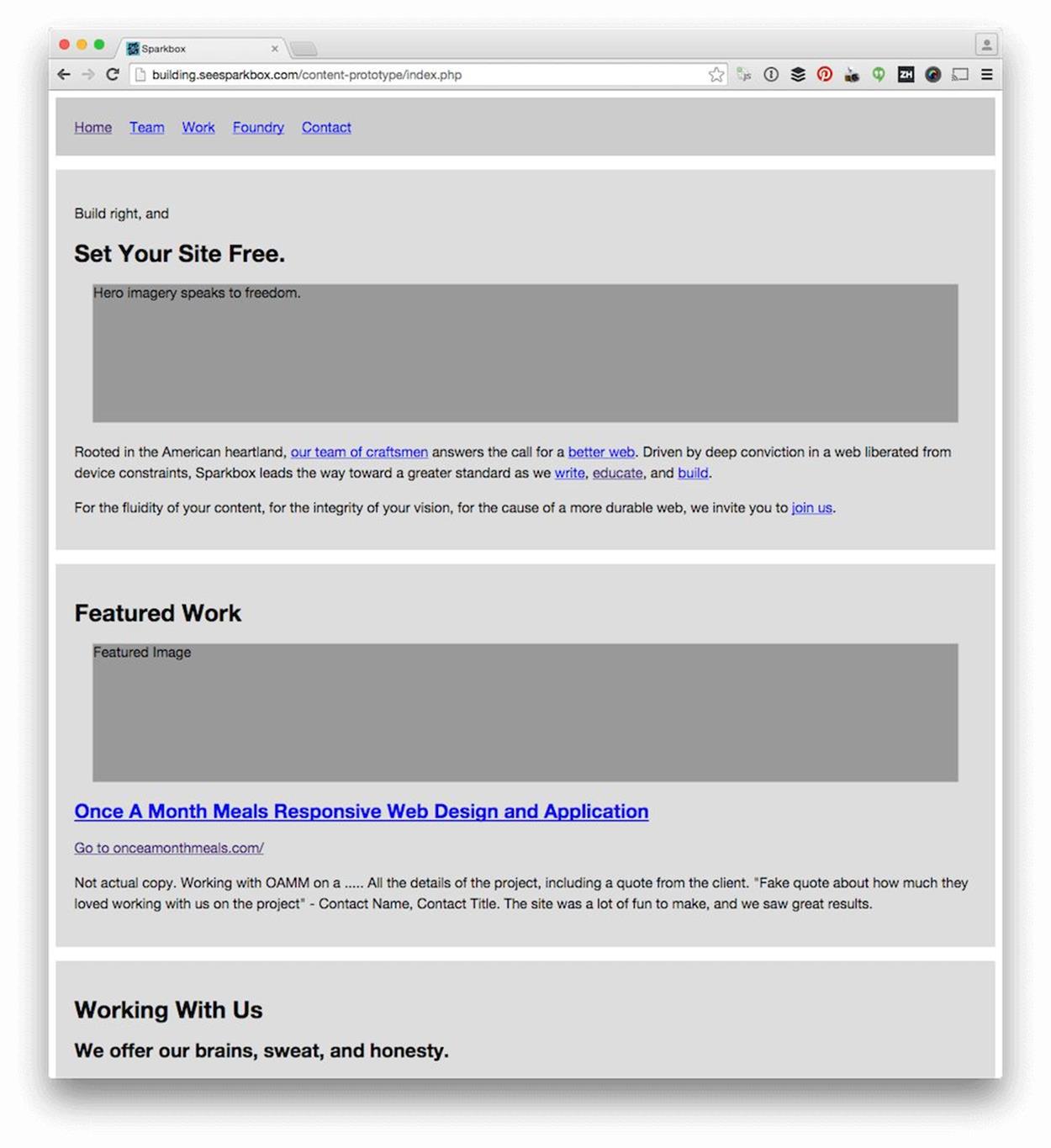
An example content prototype from the recent redesign of the Sparkbox website. You can see this as a working example at building.seesparkbox.com30.
I told you it was ugly.
We also flood our content prototypes with links. One reason we create these is to allow people to navigate from page to page, to see if the flow through the content works.
Remember, you have to prepare your clients for seeing this kind of ugly update. Otherwise, they will certainly have second thoughts about involving you in their project. However, there’s something powerful about seeing raw content marked up in a browser.
One important note: we recognize that purely semantic markup is probably not what will go to production. While this would be ideal, the reality of work on the web today is that it needs to be maintainable and extendable by individuals and teams with wildly varying skill sets. However, starting with this pure version of the markup is a fantastic way of reminding us of our ideals. Then, as we adjust the markup to allow for styling, reusability, extendability and so on, we’re very aware that every change we make moves us away from the ideal. Every change is a compromise and should be deeply considered as such before it’s made.
STATIC WIREFRAMES
The past few years have seen quite a bit of distaste for more traditional static wireframes. I believe they can still add a lot of value. I also believe they may not be needed on every project. When we use them, we typically do them at narrow widths31 — as inconvenient as this is — to help us focus on priority. Limiting our visual real estate forces this focus. We’ve used a lot of tools to do this, everything from Keynote to Balsamiq32. Honestly, any of these tools will do the job. Find one you’re comfortable with and get to work.
We also do a lot of sketching. Whiteboards, pencil and paper, various sketching apps. We take pictures of this stuff and share it with our clients, intentionally keeping it all very raw. The rawness is an important part of what we do. It helps our customers know we’re not wasting time polishing documents that won’t benefit from polish, and it keeps the feedback focused. The last thing we want is someone commenting on the colors of our wireframes.
INTERACTIVE WIREFRAMES
Part of the push away from more traditional wireframes has been in favor of a more interactive approach. Like the Agile Manifesto33 promotes working software over documentation, many in our industry believe that demonstrating your intention for an interaction via a prototype is much more powerful than trying to describe it statically. These days, the tools available for rapid prototyping are tremendously capable: frameworks like Bootstrap34 and Foundation35; CSS (or Sass36 and LESS37) toolkits like Bourbon38 and Pure CSS39; visual prototyping tools like InVision40 and Marvel41. Even visual web design and development tools like Macaw42 or presentation tools like Keynote43 can be used to create very interactive wireframes.
The benefit of this approach is that you can show people the idea instead of trying to explain it to them. If a picture is worth a thousand words, a prototype is worth a thousand pictures.
We’re working with an organization now that understands this. One of their goals is to bring rapid prototyping earlier into their process so they can use the prototypes for usability studies, as well as production code. Our work with them is focused on creating a system of components which can be used across all of their web properties. This system will also eventually be used to allow their team to build interactive wireframes very quickly. Because we will have built it with their brands in mind, the interactive wireframes will look very much like their production releases, which will be tremendously helpful in their UX testing.
This kind of approach focuses on the long-term success of a web property. It embodies the “one deliverable” workflow we talked about earlier by involving all disciplines in the creation of the prototype, and allowing what is learned during its design and development to inform further decisions. I believe we’re seeing a shift toward organizations building mature front-end systems instead of hacking together CSS as an afterthought. Giving an organization the ability to test a static version of their web work with real users is a major step toward cementing this as a norm in the near future.
UI DESIGN AND DEVELOPMENT
“Good design is problem solving.” (Jeffrey Veen)44
For those of you who are designers, this quote rings very true. Many folks see what we do as decoration, but it’s so much more. Over the past few years, I’ve found myself wholeheartedly agreeing with the sentiment of Jeff’s statement, but also intensely aware of designers’ tendency to overrefine their solutions. This leads me to what I call “the switching point.”
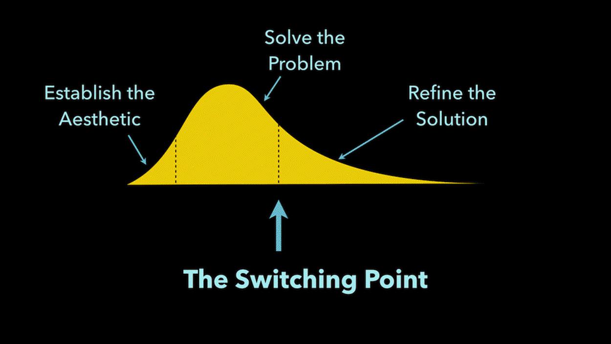
A designer needs to be able to identify when they shift from solving problems to refining solutions. This is the last responsible moment to shift into the medium of delivery: HTML, CSS, and JavaScript.
If you break the activity of design into three phases — establishing the aesthetic, solving the problem, and refining the solution (as indicated above) — the shift from problem-solving to solution refinement is the switching point. This is the last responsible moment to move into the medium of the web. If you don’t do this, you’ll end up performing that refinement phase multiple times — and that is highly inefficient.
If you’ve ever spent hours tweaking a PSD, handed it over to a dev to build, and then checked back in a week or two, you have experienced this pain. All the effort you took to refine and refine by pushing static pixels around is wasted. As soon as the design changes media (from static design in Photoshop or some other tool to HTML and CSS in the browser) another pass of refinement is needed. The idea behind the switching point is to recognize how inefficient this is. Instead of refining with static tools, get the basic design coded as soon as possible and handle the refinement in the end medium — the web.
This often requires design pairing, literally sitting together to make those refinements come to life. Though this can feel slow and painful at times, it is actually tremendously beneficial to all involved. As a designer shares with a front-end dev the kinds of style adjustments they would like to see, the front-end dev learns what is important in a refined design. While the front-end dev makes the requested changes, the designer sees how those changes are made, perhaps learning a little CSS. This process makes everyone smarter. It also means that the next time these two pair, it will go much faster.
These days, we have to be comfortable with a number of tools to get UI conversations started and we need to shift the coding of those designs earlier in the process. Let’s take a look at a few ways to do this.
STYLE TILES
Samantha Warren broke new ground when she introduced style tiles45 as a way to “define a visual language” for the web. Those of us with branding backgrounds immediately saw how valuable style tiles could be.
Style tiles are quite simple. They generally include color palettes, typography choices, textures, and iconography or illustration styles. They are deliberately not a full-page comp. Instead, they represent just enough design to determine if we’re moving in the right direction. For this reason, they work best when your client has expressed what they want, but you aren’t fully convinced you’re on the same page.
I’ve come to appreciate style tiles, mostly because of their speed. Where we used to spend a week designing a homepage and subpage in Photoshop, we can now create a simple style tile in a matter of hours. This can save time and money, and give you confidence that you’re moving in the right direction.
Samantha has a handful of examples on the style tiles site, and there are a few great resources listed below which cover their use in real-world process:
•“Get Your (Visual) Style On46”: Yesenia Perez-Cruz, Dan Mall and my presentation at Artifact Conference in Austin, Texas (May 13, 2013).
•“Faster Design Decisions with Style Tiles47”: Samantha Warren at An Event Apart in Austin, Texas (February 2015).
•The Style Guide Podcast with Samantha Warren48
Because of their static nature, we don’t use them too often. Our initial design direction is typically established with an element collage or a style prototype, both covered next.
ELEMENT COLLAGES
Dan Mall introduced us to element collages49 as “an assembly of disparate pieces without specific logic or order.” Their variegated nature makes it obvious that what you’re looking at is not a finalized design; rather, element collages provide clients with the context of a variety of components that might live in a system together. They help us put some flesh on the bones of a wireframe; they help us picture the direction we’re moving in; they allow us to begin visualizing the building blocks of our site but encourage us not to lose sight of the whole.
One benefit of element collages is that you can choose which components to show. Does your client really care about how search is presented to their users? Great! Maybe you should spend some time addressing that concern — put it in the element collage. Is your client obsessive over the call to action buttons? Put them in the element collage. This pick-and-choose mentality makes it easy to tailor each collage with what’s most important in your project. Your clients will appreciate this tremendously.
On a recent project, we needed to establish the design direction for a redesign of one of our client’s web properties. Katie Kovalcin50 (one of our designers) was leading the design effort of our team, and she opted to create two element collages instead of doing homepage comps.

The first design direction concept we presented to our customer: “trusted and sophisticated.”
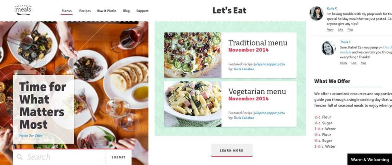
The second design direction concept we presented to our customer: “warm and welcoming.”
The total time we invested in creating these two design concepts was around 16 hours. When I asked Katie how long this would have taken had she been asked to do two homepage comps, she responded:
“In this step, trying to figure out their new aesthetic, it would be hard to juggle finding that aesthetic while trying to lay out the hierarchy of the page and figure out the interactions, too. So, to lay out the whole homepage as a way to figure out the aesthetic could sometimes take up to a week, depending on how much we had to work from. I’d say probably close to 25–30 hours each.
But going off of the element collage, it was pretty easy to move forward with the page layout and all of that other stuff because there’s not a lot of scrambling to figure out what button styles we’re going to use, or fonts, or colors.”
That means, by using an element collage, we quartered the amount of time we put into establishing an aesthetic.
There’s one other really interesting expression in Katie’s quote above; she said “it would be hard to juggle finding that aesthetic while trying to lay out the hierarchy of the page and figure out the interactions, too.” In other words, starting with a homepage comp is trying to accomplish too much, too soon. When we take a smaller step first (by using element collages or style tiles), we’re able to divide and conquer the design challenges before us. This brings our clients into the conversation more frequently and allows us to learn as we go, all resulting in better work.
STYLE PROTOTYPES
You can think of style prototypes as interactive style tiles. The same types of things you might include in a style tile — brand mark, headlines, paragraph styles, button styles, link treatment, color recommendations — are included with a style prototype. The only difference is that we take it one step further and code it.
The beauty of these is that we can show real web type, real colors, real hover states, illustration style with web vectors, and how type and basic layout might respond. We ask our clients to review them in their browser of choice. This opens up conversations about what it means to support a browser. For example, if they use a browser that doesn’t support border-radius, they won’t see rounded corners.
We can also build style prototypes in around a day, which gives us the same efficiency benefits a style tile gives us. Clients love them because they can interact with them. They can see them on their phones and tablets. They can start to play with them.
Finally, in a world where most of us believe web designers should learn to code, style prototypes are a fantastic introduction to writing HTML and CSS. Because of their simplicity, even a non-coding designer can figure out how to build them. Before they know it, they’ll have the confidence to refine production CSS, instead of statically mocking up the changes they want to see.
When we designed the original Sparkbox site, and when we recently redesigned, we used style prototypes to establish a design direction.
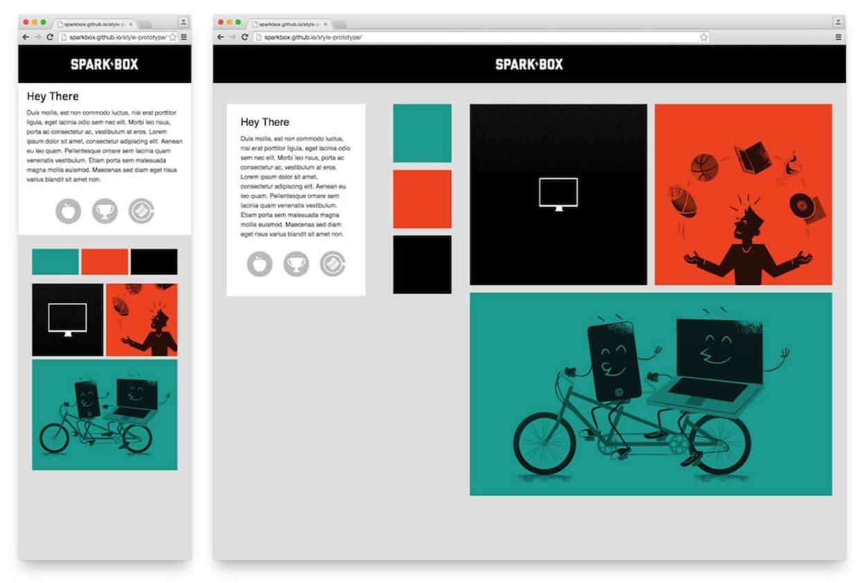
Style Prototype for the first Sparkbox site. See it in the browser at http://sparkbox.github.io/style-prototype/51
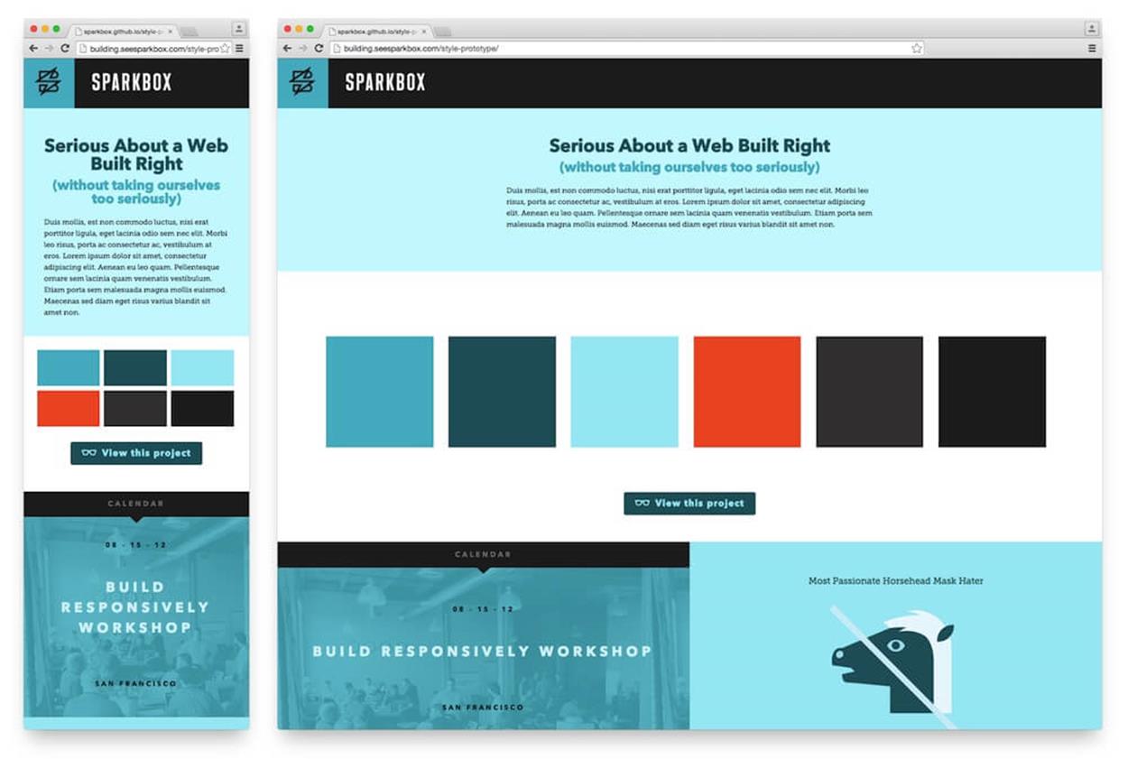
Style Prototype for the second Sparkbox site. See it in the browser at http://building.seesparkbox.com/style-prototype/52
ATOMIC DESIGN
Jeremy Keith53 first introduced me to the idea of starting design with “the atoms of a site” during his Breaking Development54 keynote entitled “There is No Mobile Web55.” Brad Frost56 formalized the term57 back in June 2013 when he outlined a mental model for approaching the design of a “system of components” for the web.
The basic premise is that we should consider five levels of granularity in our work to craft reusable systems of components. The smallest level is called an atom; think of a simple HTML input or a label for an input. These atoms can be combined into molecules; perhaps a search molecule is made up of a button, label, and input. These molecules can be combined to form organisms; maybe the header of a website would contain the search, brand and navigation molecules. These organisms are put together to form templates and pages. Templates are full of generic data; pages are templates which have real data injected into them. All of this theory can help us create more modular, reusable and extendable code.
One thing I’ve learned as we’ve approached our projects along this line of thinking is that atomic design is much easier when you allow it to evolve out of refactoring. A common way for us to work is to build a small component in HTML and CSS without much worry about the atoms, molecules or organisms. Then, once we’ve solved the UX and UI problem with an interface, we can refactor that code into an atomic structure. This reverse approach means we don’t waste time attempting to overthink what should be a molecule versus an organism. Instead, we allow the various levels to evolve as the system itself evolves.
The result of an atomic approach is a library of patterns which can be integrated into a system.
PATTERN LIBRARIES
A pattern library is just what it sounds like — a library of the patterns that exist in your system. There are a lot of people working on pattern library solutions these days; folks like Brad Frost58, Anna Debenham59, Jina Bolton60, and Bermon Painter61 have spoken and written about the topic. In fact, Brad and Dave Olson62 have created one of the more well-known tools available today, Pattern Lab63. Pattern Lab is great because it allows you to separate the specific content from the HTML modules, and it provides an atomic framework which makes it easy to build up a system of patterns. They’ve also added in some great features for testing while you’re in development. The whole thing is very easy to get running locally and has a simple interface that can easily be shown to a client. If you’re looking to get into pattern-driven design, this is a fantastic place to start.
A lot is happening in this space right now, and there are many other resources for those of us interested in learning more. Brad has worked with Anna Debenham and Brendan Falkowski64 (along with a few other folks) to create Website Style Guide Resources65. This is a tremendous collection of many of the examples, articles, talks, podcasts and more that cover pattern-driven design and development.
So far, the biggest challenge is finding a way to keep a pattern library up to date after the patterns have been integrated with a back-end system. I haven’t seen the perfect solution for this yet, but there are a lot of bright minds working on it. Check out Rizzo by Lonely Planet66 as a great example of an organization diligently working to solve this very problem. Even if we don’t have a perfect long-term solution, I’ve seen tremendous benefits from designing this way. It keeps you thinking modularly, and this makes the front-end work we do much easier to integrate and maintain.
WHAT ABOUT BREAKPOINTS?
Whenever I speak or write about process, I’m always asked about selecting breakpoints. Strangely, this conversation almost never arises in our responsive work from day to day. Certainly, some clients come to us having done a ton of work reviewing analytics and prioritizing devices — all in the name of documenting the system’s breakpoints. This line of thinking has never made much sense to me.
I believe it was Stephen Hay who said it first67: “Start small and add a breakpoint when the site breaks.” Our sites often have dozens of breakpoints — most of them don’t align with common device sizes. When you see that your content and your design are no longer working in harmony, fix it.
Now, there is a difference between what Stephanie Rieger68 calls major breakpoints and minor breakpoints. (I’ve also heard them called breakpoints and tweakpoints.) Let me explain each.
Major Breakpoints
When there are shifts in the layout which require separate modules to work together in their design change, we use a common breakpoint (a major breakpoint). Perhaps you have a layout adjustment which moves a stacked list of products at small viewport widths to a two-column layout at larger viewport widths. In this case, you’ll want to keep track of where this layout shift happens because it’s likely that there are many other changes which need to occur at the same viewport width.
Most of the work we do has between three and six major breakpoints. These are often set as Sass variables in our workflow so that we can make changes to them later in one place. It’s also common for us to have a set of major breakpoints for major sections of a site. For example, we may have three major breakpoints in the header of our site and three completely different major breakpoints in the footer. This keeps our work modular and allows for these sections to evolve independently while still maintaining cohesion with the system as a whole.
Minor Breakpoints
When more subtle changes to type or spacing are needed, we can still use a media query to make these adjustments (a minor breakpoint). These are typically one-off style modifications for things like font size (to keep line length in check) or to increase spacing as the viewport width increases. These minor adjustments demonstrate a deep attention to detail that can really set your work apart.
Instead of using preprocessor variables for these, we typically just use hardcoded numbers. We have, on occasion, also used preprocessor calculations to keep these relative to a major breakpoint. For example, if we have a major breakpoint at 30em called $bp_header-show-nav, I might want to adjust the font size of a heading at 5em over the $bp_header-show-nav breakpoint. In this case, that would happen at 35em. Should we shift that major breakpoint to 32em at some point in the future, the minor change would then happen at 37em. Thinking relatively with minor breakpoints can help if you suspect that the major breakpoints might change. You’ll have to use your judgment on a case-by-case basis to make the best decisions.
FURTHER READING
For more on breakpoints, check out these articles:
•“There is no Breakpoint69”
•“The In-Between70” by Mark Boulton
•“Pragmatic Responsive Design71” by Stephanie Rieger