Adobe Creative Suite 6 Design and Web Premium All-in-One For Dummies (2012)
Book III
Illustrator CS6
Chapter 6: Using Type in Illustrator
In This Chapter
![]() Using the Type tools
Using the Type tools
![]() Getting to know text areas
Getting to know text areas
![]() Manipulating text along paths and within shapes
Manipulating text along paths and within shapes
![]() Assigning font styles
Assigning font styles
![]() Discovering the Character, Control, and Paragraph panels
Discovering the Character, Control, and Paragraph panels
![]() Saving time with text utilities
Saving time with text utilities
One of Illustrator’s strongest areas is manipulating text. Whether you’re using Illustrator to create logos, business cards, or type to be used on the web, you have everything you need to create professional-looking text.
In this chapter, you meet the Type tools and discover a few basic (and more advanced) text-editing tricks that you can take advantage of. You then find out about other text tools, such as the Character and Paragraph panels. At the end of this chapter, you get the quick-and-dirty lowdown on the Illustrator text utilities. These utilities can save you loads of time, so don’t skip this section.
Working with Type
You can do all sorts of cool things with type, from the simplest tasks of creating a line of text and dealing with text overflow to more complicated tricks such as placing text along paths and wrapping text around objects.
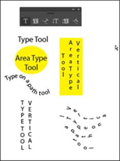
Figure 6-1 shows the Type tools with an example of what you can do with each one. Click and hold the Type tool to see the hidden tools. The different tools give you the ability to be creative and also accommodate foreign languages.
Figure 6-1: The Type tools.
Creating text areas
A text area is a region that you define. Text, when inserted in this region, is constrained within the shape. To create a text area, click and drag with the Type tool.
 As you create and finish typing in a text area, you may want to quickly click and drag to create a new text area elsewhere on your artboard. Unfortunately, Illustrator doesn’t allow you to do that. You do have two options that will help you to create multiple text boxes quickly on your artboard:
![]() Choose Select⇒Deselect and then create another area.
Choose Select⇒Deselect and then create another area.
![]() Hold down the Ctrl (Windows) or
Hold down the Ctrl (Windows) or ![]() (Mac) key, and click anywhere on the artboard outside of the active text area. By clicking, you deactivate the current text box so that you can click and drag out a new text area.
(Mac) key, and click anywhere on the artboard outside of the active text area. By clicking, you deactivate the current text box so that you can click and drag out a new text area.
Creating a line of text
To create a simple line of text, select the Type tool and click the artboard. A blinking insertion point appears. You can now start typing. With this method, the line of type goes on forever (even beyond the end of the Scratch area) until you press Enter (Windows) or Return (Mac) to start a new line of text. This excess length is fine if you just need short lines of text for callouts or captions, for example, but it doesn’t work well if you’re creating a label or anything else that has large amounts of copy.
 Many new users click and drag an ever-so-small text area that doesn’t allow room for even one letter. If you accidentally do this, switch to the Selection tool, delete the active type area, and then click to create a new text insertion point.
Flowing text into an area
Select the Type tool and then drag on the artboard to create a text area. The cursor appears in the text area; text you type flows automatically to the next line when it reaches the edge of the text area. You can also switch to the Selection tool and adjust the width and height of the text area with the handles.
Need an exact size for a text area? With the Type tool selected, drag to create a text area of any size. Then choose Window⇒Transform to view the Transform panel. Type an exact width measurement in the W text field and an exact height measurement in the H text field.
Dealing with text overflow
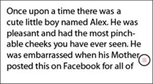
Watch out for excess text! If you create a text area that’s too small to hold all the text you want to put into it, a red plus sign appears in the lower-right corner, as shown in Figure 6-2.
Figure 6-2: The plus icon indicates that text is overflowing.
When Illustrator indicates that you have too much text for the text area, you have several options:
![]() Make the text area larger by switching to the Selection tool and dragging the handles.
Make the text area larger by switching to the Selection tool and dragging the handles.
![]() Make the text smaller until you no longer see the overflow indicator.
Make the text smaller until you no longer see the overflow indicator.
![]() Thread this text area (link it to another), which is a topic covered later in this chapter, in the “Threading text into shapes” section.
Thread this text area (link it to another), which is a topic covered later in this chapter, in the “Threading text into shapes” section.
Creating columns of text with the Area Type tool
The easiest and most practical way to create rows and columns of text is to use the area type options in Adobe Illustrator. This feature lets you create rows and columns from any text area. You can have only rows, only columns (much like columns of text in a newspaper), or even both.
1. Select the Type tool and drag on the artboard to create a text area.
2. Choose Type⇒Area Type Options.
The Area Type Options dialog box appears, as shown in Figure 6-3. At the end of this section, a list explains all options in the Area Type Options dialog box.
Figure 6-3: The Area Type Options dialog box lets you create columns of text.
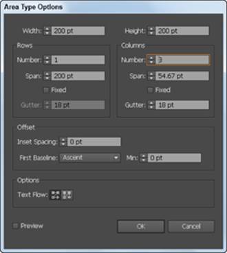
3. In the Area Type Options dialog box, enter a width and height in the Width and Height text fields.
The Width and Height text fields contain the height and width of your entire text area. In Figure 6-3, 200 pt is in the Width text field and 200 pt is in the Height text field.
4. In the Columns area, enter the number of columns you want to create in the Number text field, the span distance in the Span text field, and the gutter space in the Gutter text field.
The span specifies the height of individual rows and the width of individual columns. The gutter is the space between columns and is automatically set for you, but you can change it to any value you like.
5. Click OK.
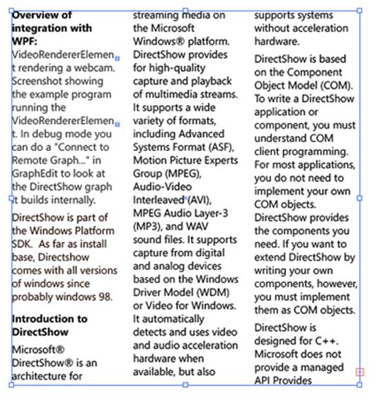
When you create two or more columns of text from the Area Type Options dialog box, text flows to the next column when you reach the end of the previous column, as shown in Figure 6-4.
Figure 6-4:One column of text flows into the next.
The following list breaks down the other options available in the Area Type Options dialog box (refer to Figure 6-3):
![]() Width and Height: The present width and height of the entire text area.
Width and Height: The present width and height of the entire text area.
![]() Number: The number of rows and/or columns that you want the text area to contain.
Number: The number of rows and/or columns that you want the text area to contain.
![]() Span: The height of individual rows and the width of individual columns.
Span: The height of individual rows and the width of individual columns.
![]() Fixed: Determines what happens to the span of rows and columns if you resize the type area. When this check box is selected, resizing the area can change the number of rows and columns but not their width. Leave this option deselected if you want to resize the entire text area and have the columns automatically resize with it.
Fixed: Determines what happens to the span of rows and columns if you resize the type area. When this check box is selected, resizing the area can change the number of rows and columns but not their width. Leave this option deselected if you want to resize the entire text area and have the columns automatically resize with it.
![]() Gutter: The empty space between rows or columns.
Gutter: The empty space between rows or columns.
![]() Inset Spacing: The distance from the edges of the text area.
Inset Spacing: The distance from the edges of the text area.
![]() First Baseline: Where you want the first line of text to appear. The default Ascent option starts your text normally at the top. If you want to put in a fixed size, such as 50 points from the top, select Fixed from the drop-down list and enter 50 pt in the Min text field.
First Baseline: Where you want the first line of text to appear. The default Ascent option starts your text normally at the top. If you want to put in a fixed size, such as 50 points from the top, select Fixed from the drop-down list and enter 50 pt in the Min text field.
![]() Text Flow: The direction in which you read the text as it flows to another row or column. You can choose to have the text flow horizontally (across rows) or vertically (down columns).
Text Flow: The direction in which you read the text as it flows to another row or column. You can choose to have the text flow horizontally (across rows) or vertically (down columns).
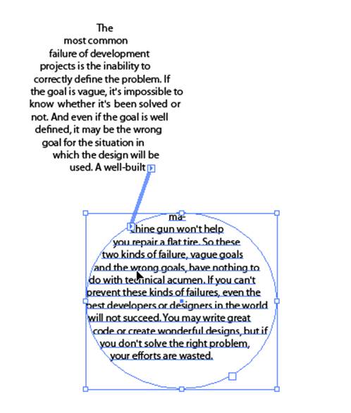
Threading text into shapes
Create custom columns of text that are in different shapes and sizes by threading closed shapes together. This technique, of flowing text from one shape to another, works with rectangles, circles, stars, or any other closed shape and can lead to some creative text areas.
Follow these steps to thread text into shapes:
1. Create any shape, any size.
For this example, we’ve created a circle.
2. Create another shape (it can be any shape) someplace else on the page.
3. With the Selection tool, select one shape and Shift-click the other to make just those two shapes active.
4. Choose Type⇒Threaded Text⇒Create.
A threading line appears, as shown in Figure 6-5, indicating the direction of the threaded text.
5. Select the Type tool, click the top of the first shape to start the threading, and start typing.
Continue typing until the text flows over into the other shape.
Figure 6-5:Threaded text areas flow from one area to another.
If you no longer want the text to be threaded, choose Type⇒Threaded Text⇒Remove Threading, which eliminates all threading from the text shapes. To remove one or more, but not all, shapes from the threading, select the shape you want to remove from the threading and choose Type⇒Threaded Text⇒Release Selection.
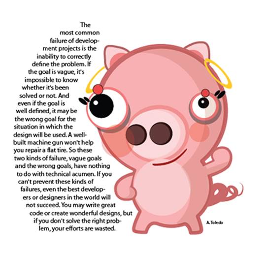
Wrapping text
Wrapping text isn’t quite the same as wrapping a present — it’s easier! A text wrap forces text to wrap around a graphic, as shown in Figure 6-6. This feature can add a bit of creativity to any piece.
Figure 6-6: The graphic is forcing the text to wrap around it.
First, create a text area and either enter text or paste text into it. Then place an image that you can wrap the text around. Follow these steps to wrap text around another object or group of objects:
1. Select the wrap object.
This object is the one you want the text to wrap around.
2. Make sure that the wrap object is on top of the text you want to wrap around it by choosing Object⇒Arrange⇒Bring to Front.
 If you’re working in layers (which we discuss in Chapter 8 of this minibook), make sure that the wrap object is on the top layer.
3. Choose Object⇒Text Wrap⇒Make.
An outline of the wrap area is visible.
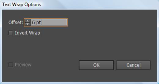
4. Adjust the wrap area by choosing Object⇒Text Wrap⇒Text Wrap Options.
The Text Wrap Options dialog box appears, as shown in Figure 6-7.
You have these options:
• Offset: Specifies the amount of space between the text and the wrap object. You can enter a positive or negative value.
• Invert Wrap: Wraps the text on the inside of the wrap object instead of around it.
Figure 6-7:Adjust the distance of the text wrap from the object.
5. When you finish making selections, click OK.
If you want to change the text wrap at a later point, select the object and choose Object⇒Text Wrap⇒Text Wrap Options. Make your changes and click OK.
If you want to unwrap text from an object, select the wrap object and choose Object⇒Text Wrap⇒Release.
Outlining text
Illustrator gives you the opportunity to change text into outlines or artwork. Basically, you change the text into an object, so you can no longer edit that text by typing. The plus side is that it saves you the trouble of sending fonts to everyone who wants to use the file. Turning text into outlines makes it appear as though your text was created with the Pen tool. You want to use this tool when creating logos that will be used frequently by other people or artwork that you may not have control over.
To turn text into an outline, follow these steps:
1. Type some text on your page.
For this example, just type a word (say, your name) and make sure that the font size is at least 36 points. You want to have it large enough to see the effect of outlining it.
2. Switch to the Selection tool and choose Type⇒Create Outlines.
You can also use the keyboard command Ctrl+Shift+O (Windows) or ![]() +Shift+O (Mac).
+Shift+O (Mac).
The text is now grouped together in outline form.
3. If you’re being creative, or just particular, and want to move individual letters, use the Group Select tool or choose Object⇒Ungroup to separate the letters, as shown in Figure 6-8.
Figure 6-8:Letters converted to outlines.

 When you convert type to outlines, the type loses its hints, which are the instructions built into fonts to adjust their shape so that your system displays or prints them in the best way based on their size. Without hints, letters such as lowercase e or a might fill in as the letter forms are reduced in size. Make sure that the text is the approximate size it might be used at before creating outlines. Because the text loses the hints, try not to create outlines on text smaller than 10 points.
Putting text on a path, in a closed shape, or on the path of a shape
Wow — that’s some heading, huh? You’ve probably seen text following a swirly path or inside a shape. Maybe you think that accomplishing such a task is too intimidating to even attempt. In this section, we show you just how easy these tasks are! Some Type tools are dedicated to putting type on a path or a shape (refer to Figure 6-1), but we think you’ll find that the key modifiers we show you in the following sections are easier to use.
Creating text on a path
Follow these steps to put type on a path:
1. Create a path with the Pen, Line, or Pencil tool.
Don’t worry if it has a stroke or fill applied.
2. Select the Type tool and simply cross over the start of the path.
3. When an I-bar with a squiggle appears (which indicates that the text will run along the path), click.
The stroke and fill of the path immediately change to None.
4. Start typing, and the text runs on the path.
5. Choose Window⇒Type⇒Paragraph and change the alignment in the Paragraph panel to reposition where the text falls on the path.
Alternatively, switch to the Selection tool and drag the first of the three I-bars that appears, as shown in Figure 6-9. This allows you to freely move the text on that path. The path in Figure 6-9 was created with the Pen tool.
 Flip the text to the other side of a path by clicking and dragging the I-bar under or over the path.
Figure 6-9:Use the Selection tool to drag the I-bar to adjust the text.
Creating text in a closed shape
Putting text inside a shape can add spunk to a layout. This feature allows you to custom-create a closed shape with the shape tools or the Pen tool and flow text into it. Follow these steps to add text inside a shape:
1. Create a closed shape — a circle or an oval, for example.
2. Select the Type tool and cross over the path of the closed shape.
3. When you see the I-bar swell or become rounded, click inside the shape.
4. Start typing, and the text is contained inside the shape.
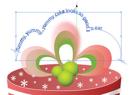
Text on the path of a closed shape
Perhaps you want text to run around the edge of a shape instead of inside it. Follow these steps to have text created on the path of a closed shape:
1. Create a closed shape, such as a circle.
2. Select the Type tool and cross over the path of the circle.
3. Don’t click when you see the I-bar swell up; hold down the Alt (Windows) or Option (Mac) key instead.
The icon changes into the squiggle I-bar you see when creating text on a path.
4. When the squiggle line appears, click.
5. Start typing, and the text flows around the path of the shape, as shown in Figure 6-10.
Figure 6-10:Holding down the Alt or Option key flows text around a closed shape.

To change the origin of the text or move it around, use the alignment options in the Paragraph panel or switch to the Selection tool and drag the I-bar to a new location on the path.
You can drag the I-bar in and out of the shape to flip the text so that it appears on the outside or inside of the path.
Assigning Font Styles
After you have text on your page, you’ll often want to change it to be more interesting than the typical 12-point Times font. Formatting text in Illustrator isn’t only simple, but you can also do it multiple ways. In the following list, we name and define some basic type components (see Figure 6-11):
Figure 6-11:Components of type.
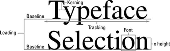
![]() Font: A complete set of characters, letters, and symbols of a particular typeface design.
Font: A complete set of characters, letters, and symbols of a particular typeface design.
![]() X height: The height of type, based on the height of the small x in that type family.
X height: The height of type, based on the height of the small x in that type family.
![]() Kerning: The space between two letters. Often used for letters in larger type that need to be pulled closer together, such as W i. Kern a little to slide the i in a little closer to the W, maybe even moving into the space occupied by the W, as shown in Figure 6-12. Kerning doesn’t distort the text; it only increases or decreases the space between two letters.
Kerning: The space between two letters. Often used for letters in larger type that need to be pulled closer together, such as W i. Kern a little to slide the i in a little closer to the W, maybe even moving into the space occupied by the W, as shown in Figure 6-12. Kerning doesn’t distort the text; it only increases or decreases the space between two letters.
![]() Leading: Space between the lines of text.
Leading: Space between the lines of text.
![]() Tracking: The space between multiple letters. Designers like to use this technique to spread out words by increasing the space between letters. Adjusting the tracking doesn’t distort text; it increases or decreases the space between the letters, as shown in Figure 6-13.
Tracking: The space between multiple letters. Designers like to use this technique to spread out words by increasing the space between letters. Adjusting the tracking doesn’t distort text; it increases or decreases the space between the letters, as shown in Figure 6-13.
Pretty good tracking and kerning has already been determined in most fonts. You don’t need to bother with these settings unless you’re tweaking text for a more customized look.
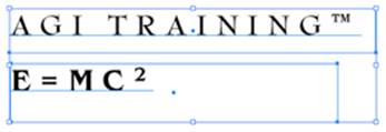
![]() Baseline: The line that type sits on. The baseline doesn’t include descenders, type that extends down, like lowercase y and g. You adjust the baseline for trademark signs or mathematical formulas, as shown in Figure 6-14.
Baseline: The line that type sits on. The baseline doesn’t include descenders, type that extends down, like lowercase y and g. You adjust the baseline for trademark signs or mathematical formulas, as shown in Figure 6-14.
Figure 6-12:Before kerning (left) and after (right).

Figure 6-13:Tracking set at 0 (top) and 300 (bottom).

Figure 6-14:Adjust the baseline for superscript.
The keyboard shortcuts for type shown in Table 6-1 work with Adobe Illustrator, InDesign, and Photoshop.
Table 6-1 Keyboard Shortcuts for Type
|
Command |
Windows |
Mac |
|
Align left, right, or center |
Shift+Ctrl+L, R, or C |
Shift+ |
|
Justify |
Shift+Ctrl+J |
Shift+ |
|
Insert soft return |
Shift+Enter |
Shift+Return |
|
Reset horizontal scale to 100 percent |
Shift+Ctrl+X |
Shift+ |
|
Increase or decrease point size |
Shift+Ctrl+> or < |
Shift+ |
|
Increase or decrease leading |
Alt+ |
Option+ |
|
Set leading to the font size |
Double-click the leading icon in the Character panel |
Double-click the leading icon in the Character panel |
|
Reset tracking or kerning to 0 |
Alt+Ctrl+Q |
Option+ |
|
Add or remove space (kerning) between two characters |
Alt+→ or ← |
Option+→ or ← |
|
Add or remove space (kerning) between characters by 5 times the increment value |
Alt+Ctrl+→ or ← |
Option+ |
|
Add or remove space (kerning) between selected words |
Alt+← or → |
Option+← or → |
|
Add or remove space (kerning) between words by 5 times the increment value |
Shift+Alt+Ctrl+\ or Backspace |
Shift+Option+ |
|
Increase or decrease baseline shift |
Alt+Shift+ |
Option+Shift+ |
Using the Character Panel
To visualize changes you’re making to text and to see characteristics that are already selected, choose Window⇒Type⇒Character or press Ctrl+T (Windows) or ![]() +T (Mac), which opens the Character panel. Click the triangle in the upper-right corner to see a panel menu of additional options. Choose Show Options, and additional type attributes appear, such as baseline shift, underline, and strikethrough.
+T (Mac), which opens the Character panel. Click the triangle in the upper-right corner to see a panel menu of additional options. Choose Show Options, and additional type attributes appear, such as baseline shift, underline, and strikethrough.
Pressing Ctrl+T (Windows) or ![]() +T (Mac) is a toggle switch to either show or hide the Character panel. If you don’t see the Character panel appear at first, you may have hidden it by pressing the keyboard shortcut. Just try it again.
+T (Mac) is a toggle switch to either show or hide the Character panel. If you don’t see the Character panel appear at first, you may have hidden it by pressing the keyboard shortcut. Just try it again.
The following list explains the options in the Character panel (see Figure 6-15):
Figure 6-15:The Character panel shows additional options.
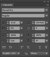
![]() Font: Select the font you want to use from this drop-down list.
Font: Select the font you want to use from this drop-down list.
In the Windows version, you can click and drag across the font name in the Character panel or Control panel, and press the up- or down-arrow key to automatically switch to the next font above or below on the font list. Do this while you have text selected to see the text change live!
![]() Set font style: Select the style (for example, Bold, Italic, or Bold Italic) from this drop-down list. The choices here are limited by the fonts you have loaded. In other words, if you have only Times regular loaded in your system, you don’t have the choice to bold or italicize it.
Set font style: Select the style (for example, Bold, Italic, or Bold Italic) from this drop-down list. The choices here are limited by the fonts you have loaded. In other words, if you have only Times regular loaded in your system, you don’t have the choice to bold or italicize it.
![]() Type size: Set the size of the type in this combo box. Average readable type is 12-point; headlines can vary from 18 points and up.
Type size: Set the size of the type in this combo box. Average readable type is 12-point; headlines can vary from 18 points and up.
![]() Leading: Select how much space you want between the lines of text in this combo box. Illustrator uses the professional typesetting method of including the type size in the total leading. In other words, if you have 12-point and want it double-spaced, set the leading at 24 points.
Leading: Select how much space you want between the lines of text in this combo box. Illustrator uses the professional typesetting method of including the type size in the total leading. In other words, if you have 12-point and want it double-spaced, set the leading at 24 points.
![]() Kerning: To use this combo box, you first need to place the cursor between two letters. Then, to push the letters farther apart from each other, you can click the up arrow or type a value; to decrease the spacing between the letters, type a lower value, even negative numbers, or click the down arrow.
Kerning: To use this combo box, you first need to place the cursor between two letters. Then, to push the letters farther apart from each other, you can click the up arrow or type a value; to decrease the spacing between the letters, type a lower value, even negative numbers, or click the down arrow.
![]() Tracking: Use the Tracking combo box by selecting multiple letters and increasing or decreasing the space between them all at once by clicking the up or down arrows or by typing a positive or negative value.
Tracking: Use the Tracking combo box by selecting multiple letters and increasing or decreasing the space between them all at once by clicking the up or down arrows or by typing a positive or negative value.
![]() Horizontal scale: Distort selected text by stretching it horizontally. Enter a positive number to increase the size of the letters; enter a negative number to decrease the size.
Horizontal scale: Distort selected text by stretching it horizontally. Enter a positive number to increase the size of the letters; enter a negative number to decrease the size.
![]() Vertical scale: Distort selected text vertically. Enter a positive number to increase the size of the letters; enter a negative number to decrease the size.
Vertical scale: Distort selected text vertically. Enter a positive number to increase the size of the letters; enter a negative number to decrease the size.
 Using horizontal or vertical scaling to make text look like condensed type often doesn’t give good results. When you distort text, the nice thick and thin characteristics of the typeface also become distorted and can produce weird effects.
![]() Baseline shift: Use baseline shift for trademark signs and mathematical formulas that require selected characters to be moved above or below the baseline.
Baseline shift: Use baseline shift for trademark signs and mathematical formulas that require selected characters to be moved above or below the baseline.
![]() Character rotation: Rotate just the selected text by entering an angle in this text field or by clicking the up or down arrows.
Character rotation: Rotate just the selected text by entering an angle in this text field or by clicking the up or down arrows.
![]() Rotate: Choose to rotate selected text on any angle.
Rotate: Choose to rotate selected text on any angle.
![]() Underline and strikethrough: These simple text attributes underline and strikethrough selected text.
Underline and strikethrough: These simple text attributes underline and strikethrough selected text.
![]() Language: Select a language from this drop-down list. Note: The language you specify here is used by Illustrator’s spell checker and hyphenation feature. We discuss these features in the later section “Text Utilities: Your Key to Efficiency.”
Language: Select a language from this drop-down list. Note: The language you specify here is used by Illustrator’s spell checker and hyphenation feature. We discuss these features in the later section “Text Utilities: Your Key to Efficiency.”
Using the Control Panel
Use the Control panel to quickly access your Type tools and Type panels. Note in Figure 6-16 that when you have active text, hyperlinked text buttons allow you to quickly access panels, such as the Character and Paragraph panels. You can also use this Control panel as a quick and easy way to select the font, size, alignment, color, and transparency.
Figure 6-16:Control panel type functions.
![]()
Using the Paragraph Panel
Access the Paragraph panel quickly by clicking the Paragraph hyperlink in the Control panel or by choosing Window⇒Type⇒Paragraph. This panel, shown in Figure 6-17, has all the attributes that apply to an entire paragraph (such as alignment and indents, which we discuss in the next two sections, and hyphenation, which we discuss later in this chapter). For example, you can’t flush left one word in a paragraph — when you click the Flush Left button, the entire paragraph flushes left. To see additional options in the Paragraph panel, click the triangle in the upper-right corner of the panel (the panel menu) and choose Show Options.
Figure 6-17:Use this panel to open typographic controls that apply to paragraphs.
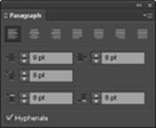
Alignment
You can choose any of the following alignment methods by clicking the appropriate button on the Paragraph panel:
![]() Flush Left: All text is flush to the left with a ragged edge on the right. This is the most common way to align text.
Flush Left: All text is flush to the left with a ragged edge on the right. This is the most common way to align text.
![]() Center: All text is centered.
Center: All text is centered.
![]() Flush Right: All text is flush to the right and ragged on the left.
Flush Right: All text is flush to the right and ragged on the left.
![]() Justify with the Last Line Aligned Left: Right and left edges are both straight, with the last line left-aligned.
Justify with the Last Line Aligned Left: Right and left edges are both straight, with the last line left-aligned.
![]() Justify with the Last Line Aligned Center: Right and left edges are both straight, with the last line centered.
Justify with the Last Line Aligned Center: Right and left edges are both straight, with the last line centered.
![]() Justify with the Last Line Aligned Right: Right and left edges are both straight, with the last line right-aligned.
Justify with the Last Line Aligned Right: Right and left edges are both straight, with the last line right-aligned.
![]() Justify All Lines: In this forced justification method, the last line is stretched the entire column width, no matter how short it is. This alignment is used in many publications, but it can create some awful results.
Justify All Lines: In this forced justification method, the last line is stretched the entire column width, no matter how short it is. This alignment is used in many publications, but it can create some awful results.
Indentation
You can choose from the following methods of indentation:
![]() First Line Indent: Indents the first line of every paragraph. In other words, every time you press the Enter (Windows) or Return (Mac) key, this spacing is created.
First Line Indent: Indents the first line of every paragraph. In other words, every time you press the Enter (Windows) or Return (Mac) key, this spacing is created.
To avoid first-line indents and space after from occurring — if you just want to break a line in a specific place, for example — create a line break or a soft return by pressing Shift+Enter (Windows) or Shift+Return (Mac).
![]() Right Indent: Indents from the right side of the column of text.
Right Indent: Indents from the right side of the column of text.
![]() Left Indent: Indents from the left side of the column of text.
Left Indent: Indents from the left side of the column of text.
![]() Use the Eyedropper tool to copy the character, paragraph, fill, and stroke attributes. Select the text you want, select the Eyedropper tool, and click the text once with the attributes you want to apply to the selected text.
Use the Eyedropper tool to copy the character, paragraph, fill, and stroke attributes. Select the text you want, select the Eyedropper tool, and click the text once with the attributes you want to apply to the selected text.
By default, the Eyedropper affects all attributes of a type selection, including appearance attributes. To customize the attributes affected by these tools, double-click the Eyedropper tool to open the Eyedropper dialog box.
Text Utilities: Your Key to Efficiency
After you have text in an Illustrator document, you may need to perform various tasks within that text, such as search for a word to replace with another word, check your spelling and grammar, save and create your own styles, or change the case of a block of text. You’re in luck because Illustrator provides various text utilities that enable you to easily and efficiently perform all these otherwise tedious tasks. In the following sections, we give you a quick tour of these utilities.
Find and Replace
Generally, artwork created in Illustrator isn’t text heavy, but the fact that Illustrator has a Find and Replace feature can be a huge help. Use the Find and Replace dialog box (choose Edit⇒Find and Replace) to search for words that need to be changed, such as changing Smyth to Smith, or to locate items that may be difficult to find otherwise. This feature works much like all other search-and-replace methods.
Spell checker
Can you believe there was a time when Illustrator didn’t have a spell checker? Thankfully, it does now — and its simple design makes it easy to use.
To use the spell checker, choose Edit⇒Check Spelling and then click the Start button in the dialog box that appears. The spell checker works much like the spell checker in Microsoft Word or other popular applications: When a misspelled word is found, you’re offered a list of replacements. You can choose to fix that instance, fix all instances, ignore the misspelling, or add the word to the dictionary.
If you click the arrow to the left of Options, you can set other specifications, such as whether you want to look for letter case issues or have the spell checker note repeated words.
Note: The spell checker uses whatever language you specify in the Character panel. We discuss this panel in the earlier section “Using the Character Panel.”
If you work in a specialized industry that uses loads of custom words, save yourself time by choosing Edit⇒Edit Custom Dictionary and then adding your own words. We recommend that you do so before you’re ready to spell check a document so that the spell checker doesn’t flag the custom words later (which slows you down).
The Hyphenation feature
Nothing is worse than trying to read severely hyphenated copy. Most designers either use hyphenation as little as possible or avoid it altogether by turning off the Hyphenation feature.
Here are a few things you should know about customizing your hyphenation settings if you decide to use this feature:
![]() Turning the Hyphenation feature on or off: Activate or deactivate the feature in the Hyphenation dialog box (see Figure 6-18); open this dialog box by choosing Window⇒Type⇒Paragraph, clicking the arrow in the upper-right corner of the Paragraph panel to access the panel menu, and then choosing Hyphenation from the list of options that appears. If you won’t use the Hyphenation feature, turn it off by deselecting the Hyphenation check box at the top of the Hyphenation dialog box.
Turning the Hyphenation feature on or off: Activate or deactivate the feature in the Hyphenation dialog box (see Figure 6-18); open this dialog box by choosing Window⇒Type⇒Paragraph, clicking the arrow in the upper-right corner of the Paragraph panel to access the panel menu, and then choosing Hyphenation from the list of options that appears. If you won’t use the Hyphenation feature, turn it off by deselecting the Hyphenation check box at the top of the Hyphenation dialog box.
You can also simply click the Paragraph hyperlink in the Control panel to access the Paragraph panel.
![]() Setting specifications in the Hyphenation dialog box: Set specifications in the dialog box that determine the length of words to hyphenate, the number of hyphens to be used in a single document, whether to hyphenate capitalized words, and how words should be hyphenated. The Before Last setting is useful, for example, if you don’t want to have a word, such as liquidated hyphenated as liquidat-ed. Type 3 in the Before Last text field and Illustrator won’t hyphenate words if it leaves only two letters on the next line.
Setting specifications in the Hyphenation dialog box: Set specifications in the dialog box that determine the length of words to hyphenate, the number of hyphens to be used in a single document, whether to hyphenate capitalized words, and how words should be hyphenated. The Before Last setting is useful, for example, if you don’t want to have a word, such as liquidated hyphenated as liquidat-ed. Type 3 in the Before Last text field and Illustrator won’t hyphenate words if it leaves only two letters on the next line.
Figure 6-18:Customizing hyphenation settings.
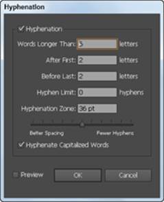
![]() Setting the Hyphenation Limit and Hyphenation Zone: They’re not diets or worlds in another dimension — the Hyphenation Limit setting enables you to limit the number of hyphens in a row. For example, type 2 in the Hyphenation Limit text field so that you never see more than two hyphenated words in a row. The Hyphenation Zone text field enables you to set up an area of hyphenation based on a measurement. For example, you can specify 1 inch to allow for only one hyphenation every inch. You can also use the slider to determine whether you want better spacing or fewer hyphens. This slider works only with the Single-Line Composer (the default).
Setting the Hyphenation Limit and Hyphenation Zone: They’re not diets or worlds in another dimension — the Hyphenation Limit setting enables you to limit the number of hyphens in a row. For example, type 2 in the Hyphenation Limit text field so that you never see more than two hyphenated words in a row. The Hyphenation Zone text field enables you to set up an area of hyphenation based on a measurement. For example, you can specify 1 inch to allow for only one hyphenation every inch. You can also use the slider to determine whether you want better spacing or fewer hyphens. This slider works only with the Single-Line Composer (the default).
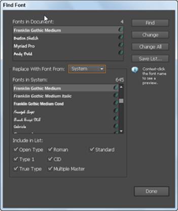
The Find Font feature
If you work in production, you’ll love the Find Font feature, which enables you to list all fonts in a file that contains text and then search for and replace fonts (including the font’s type style) by name. You do so from the Find Font dialog box (see Figure 6-19), opened by choosing Type⇒Find Font. Select the font you want to replace from the Fonts in Document list. Next, select a font from the Replace with Font From list. Note that the font must already appear in the document. Click the Change button to replace the font (or click the Change All button to replace all instances of the font) and then click OK. That’s it!
This cool feature enables you to replace fonts with fonts from the current working document or from your entire system. Select System from the Replace with Font From drop-down list to choose from all fonts loaded in your system.
Figure 6-19:Use the Find Font dialog box to find and replace typefaces.
The Change Case feature
Doesn’t it drive you crazy when you type an entire paragraph before discovering that you somehow pressed the Caps Lock key? Fix it fast by selecting the text, choosing Type⇒Change Case, and then choosing one of these options:
![]() Uppercase: Makes the selected text all uppercase
Uppercase: Makes the selected text all uppercase
![]() Lowercase: Makes the selected text all lowercase
Lowercase: Makes the selected text all lowercase
![]() Title Case: Capitalizes the first letter in each word
Title Case: Capitalizes the first letter in each word
![]() Sentence Case: Capitalizes just the first letter in selected sentences
Sentence Case: Capitalizes just the first letter in selected sentences
In Illustrator, you use the same type engine used by InDesign for high-quality text control. You’re working, as a default, in what’s referred to as Single- Line Composer. Select Single or Every Line composer from the Paragraph panel menu.
The options include the following:
![]() Single-Line Composer: Useful if you prefer to have manual control over how lines break. In fact, this method had been in place in the past. The Single-Line Composer option doesn’t take the entire paragraph into consideration when expanding letter space and word spacing, so justified text can sometimes look odd in its entire form. (See Figure 6-19.)
Single-Line Composer: Useful if you prefer to have manual control over how lines break. In fact, this method had been in place in the past. The Single-Line Composer option doesn’t take the entire paragraph into consideration when expanding letter space and word spacing, so justified text can sometimes look odd in its entire form. (See Figure 6-19.)
![]() Every-Line Composer: A professional way of setting text; many factors are taken into account as far as spacing is concerned, and spacing is based on the entire paragraph. With this method, you see few spacing issues that create strange effects, such as the ones on the left in Figure 6-20.
Every-Line Composer: A professional way of setting text; many factors are taken into account as far as spacing is concerned, and spacing is based on the entire paragraph. With this method, you see few spacing issues that create strange effects, such as the ones on the left in Figure 6-20.
Figure 6-20:Single-Line Composer (left) and Every-Line Composer (right).

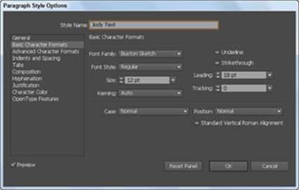
Text styles
A text style is a saved set of text attributes, such as font and size. Creating text styles keeps you consistent and saves you time by enabling you to efficiently implement changes in one step rather than have to select the text attributes for each instance of that style of text (say, a heading or caption). So when you’re finally happy with the way your headlines appear and how the body copy looks or when your boss asks whether the body copy can be a smidgen smaller (hmm, how much is a smidgen?), you can confidently answer, “Sure!”
If you’ve created styles, changing a text attribute is simple. What’s more, the change is applied at once to all text using that style. Otherwise, you would have to make the attribute change to every occurrence of body text, which could take a long time if your text is spread out.
Illustrator offers two types of text styles:
![]() Character: Saves attributes for individual selected text. If you want just the word New in a line of text to be red, 20-point Arial, you can save it as a character style. Then, when you apply it, the attributes apply to only the selected text (and not to the entire line or paragraph).
Character: Saves attributes for individual selected text. If you want just the word New in a line of text to be red, 20-point Arial, you can save it as a character style. Then, when you apply it, the attributes apply to only the selected text (and not to the entire line or paragraph).
![]() Paragraph: Saves attributes for an entire paragraph. A span of text is considered a paragraph until it reaches a hard return or paragraph break. Note that pressing Shift+Enter (Windows) or Shift+Return (Mac) is considered a soft return, and paragraph styles continue to apply beyond the soft return.
Paragraph: Saves attributes for an entire paragraph. A span of text is considered a paragraph until it reaches a hard return or paragraph break. Note that pressing Shift+Enter (Windows) or Shift+Return (Mac) is considered a soft return, and paragraph styles continue to apply beyond the soft return.
You can create character and paragraph styles in many ways, but we show you the easiest and most direct methods in the following subsections.
Creating character styles
Create a character style when you want individual sections of text to be treated differently from other text in the paragraph. So rather than repeatedly apply a style manually, you create and implement a character style. To do so, open a document containing text and follow these steps:
1. Set up text with the text attributes you want included in the character style in the Character and Paragraph panels and then choose Window⇒Type⇒Character Styles.
The Character Styles panel opens.
2.  Select the text from Step 1 and Alt-click (Windows) or Option-click (Mac) the New Style button (the dog-eared page icon) at the bottom of the Character Styles panel.
3. In the Character Styles Options dialog box that appears, name your style and click OK.
Illustrator records which attributes have been applied already to the selected text and builds a style from them.
4. Create another text area by choosing Select⇒Deselect and using the Type tool to drag out a new text area.
We discuss using the Type tool in the earlier section “Creating text areas.”
5. Change the font and size to dramatically different choices from your saved style and type some text.
6. Select some (not all) of the new text and then Alt-click (Windows) or Option-click (Mac) the style name in the Character Styles panel.
Alt-click (Windows) or Option-click (Mac) to eliminate any attributes that weren’t part of the saved style. The attributes of the saved character style are applied to the selected text.
When you create a new panel item (any panel) in Adobe Illustrator, InDesign, or Photoshop, we recommend that you get in the habit of Alt-clicking (Windows) or Option-clicking (Mac) the New Style button. This habit allows you to name the item (style, layer, or swatch, for example) while adding it to the panel.
Creating paragraph styles
Paragraph styles include attributes that are applied to an entire paragraph. What constitutes a paragraph is all text that falls before a hard return (you create a hard return when you press Enter in Windows or Return on the Mac), so this could be one line of text for a headline or ten lines in a body text paragraph.
To create a paragraph style, open a document that contains text or open a new document and add text to it; then follow these steps:
1. Choose Window⇒Type⇒Paragraph Styles to open the Paragraph Styles panel.
2. Find a paragraph of text that has the same text attributes throughout it and put your cursor anywhere in that paragraph.
You don’t even have to select the whole paragraph!
3. Alt-click (Windows) or Option-click (Mac) the Create New Style button (the dog-eared icon at the bottom of the Paragraph panel) to create a new paragraph style; give your new style a name.
Your new style now appears in the Paragraph Styles panel list of styles.
4. Create a paragraph of text elsewhere in your document and make its attributes different from the text in Step 2.
5. Put your cursor anywhere in the new paragraph and Alt-click (Windows) or Option-click (Mac) your named style in the Paragraph Styles panel.
The attributes from the style are applied to the entire paragraph.
Updating styles
When you use existing text to build styles, reselect the text and assign the style. In other words, if you put the cursor in the original text whose attributes were saved as a style, it doesn’t have a style assigned to it in the Styles panel. Assign the style by selecting the text or paragraph and clicking the appropriate style listed in the Styles panel. By doing so, you ensure that any future updates to that style apply to that original text and to all other instances.
To update a style, simply select its name in either the Character or Paragraph Styles panel. Choose Options from the panel menu, which you access by clicking the arrow in the upper-right corner of the panel. In the resulting dialog box (see Figure 6-21), make changes by clicking the main attribute on the left and then updating the choices on the right. After you do so, all tagged styles are updated.
Figure 6-21:Updating a paragraph style.
Documents created in older versions of Adobe Illustrator (Version 10 or earlier) contain legacy text, which is text using the older text engine. When these files are opened, you see a warning dialog box. If you click the Update button, any text on the document will most likely reflow, causing line breaks, leading, and other types of spacing to change.
Click the OK button to update the file after it’s opened to lock down the text. If necessary, you can use the Type tool to click a selected text area to update only the contained text. Another Warning dialog box appears that gives you the opportunity to update selected text, copy the text object, or cancel the text tool selection. This method is the best way to see which changes are occurring so that you can catch any spacing issues right off the bat. See Figure 6-22 for samples of the three options in the warning dialog box.
Figure 6-22:Original text (left), updated text (middle), and text object copied (right).
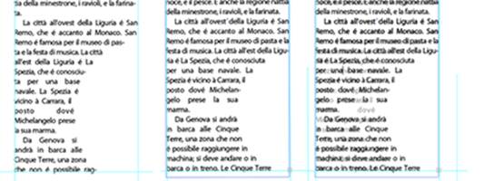
If you click Copy the Text Object, you can use the underlying locked copy to adjust the new text flow to match the old. Throw away the legacy text layer by clicking and dragging it to the trash icon in the Layers panel, or click the visibility eye icon to the left of the Legacy Text layer to hide it when you’re finished.
All materials on the site are licensed Creative Commons Attribution-Sharealike 3.0 Unported CC BY-SA 3.0 & GNU Free Documentation License (GFDL)
If you are the copyright holder of any material contained on our site and intend to remove it, please contact our site administrator for approval.
© 2016-2026 All site design rights belong to S.Y.A.