Adobe Creative Suite 6 Design and Web Premium All-in-One For Dummies (2012)
Book VII
Flash Professional CS6
Chapter 8: Getting Into the (Work)Flow
In This Chapter
 Creating and managing workspace layouts
Setting up grids and guides
Using snap options and the Align panel
Using animation helpers
Creating custom keyboard shortcuts
Using the Movie Explorer panel
Sometimes the difference between a good project and a great project is having a seamless workflow. Visual aids (such as guides and grids), alignment aids, and proper placement of tools and panels are essential parts of creating better movies in less time. The Flash workspace is highly customizable so that you can work in the most efficient way possible and spend more time being creative. Flash CS6 includes a new, easy-to-use interface as well as some helpful workspace presets for most every type of user.
Using Workspace Layouts
Your Flash workspace consists of all the panels and tools you rely on, so why not take some time to customize it? You can save the position and appearance of these essential components by creating custom workspace layouts.
Workspace layouts take a snapshot of the appearance and position of panels you’re using so that you can recall that same configuration at any time. You can save as many workspace layouts as you want for different projects or different designers who may share the same computer with you.
Choose Window⇒Workspace to recall, save, reset, or manage your workspace layouts.
 Flash CS6 comes with several layout presets: Animator, Classic, Debug, Designer, Developer, Essentials, and Small Screen. You can select and use these layouts as a starting point for a new workspace layout or to reset the workspace. The default layouts can’t be deleted or overwritten (even by saving a layout under the same name).
Creating new layouts
Before creating a new workspace layout, open any panels you need, close any panels you don’t use often, and position and size them exactly how you think is best. All panels can be toggled on or off from the Window menu. Grouping options for each panel are available under their respective panel menus, or you can drag and drop panels on top of one another to group them.
To create a new workspace layout, follow these steps:
1. Position all panels and toolbars as you want to see them.
2. Group any panels or resize individual panels and groups.
You can also collapse any panels or groups to Icon mode to maximize the screen area.
3. Choose Window⇒Workspace⇒New Workspace.
A dialog box appears, prompting you to name the new layout.
4. Enter a name for the new layout in the Name text box and click OK.
The new workspace is created.
5. Choose Window⇒Workspace.
You see the new workspace as an available selection.
Managing layouts
After you create workspace layouts, you can rename, delete, or update them as needed. Deleting layouts you no longer use is good practice so that you can keep the list manageable. Also rename layouts to indicate when they were created (for example, MyLayoutFeb2010). You can manage layouts by using the Manage panel.
To delete a layout, choose Window⇒Workspace⇒Manage Workspaces. Select the layout you want to delete and click the Delete button. Click OK to close the Manage Workspaces dialog box. Note: You can’t undo this action, but a dialog box gives you the same warning and a chance to change your mind.
To rename a layout, choose Window⇒Workspace⇒Manage Workspaces. Select the layout you want to rename and click the Rename button. Enter the new name in the Name text box, click OK, and then click OK again to close the dialog box.
To update (or overwrite) an existing layout, recall the layout by choosing it from the Workspace menu. Make any adjustments to your workspace and choose Window⇒Workspace⇒New Workspace. When prompted, assign it the name of the layout you’re trying to update. A warning alerts you that you’re about to replace an existing layout by the same name; click OK to overwrite the layout with the new changes.
To condense right-side panels to Icon view, collapse the entire panel group by using the double arrows in the upper-right corner of the screen. To hide the labels and view the icons alone, hover over the edge of the panel group until you see the double arrows. Click and drag the panel to resize it to be as narrow as possible.
Fine-Tuning with Grids and Guides
Having lots of visual aides at your fingertips is indispensable when you need to line up, arrange, or measure objects on the stage with absolute accuracy. You’ll want some designs to take advantage of the place-it-anywhere flexibility that Flash provides, but other designs demand more precise control over placement and sizing. In these cases, you can take advantage of the large array of Flash visual aids and helpers, many of which you can enable and set from the View menu.
These visual aids don’t appear in any way in your final movie; they’re strictly for your benefit during the design and building process.
Enabling rulers and guides
The Flash built-in rulers appear on the top and left edges of the stage and are used to position and measure objects on the stage. You also use the rulers to create vertical and horizontal guides by dragging them off the ruler bars. Ruler units are in pixels by default, but you can choose Modify⇒Document to change to other measurement units, such as inches, centimeters, or millimeters.
The top ruler represents the X, or horizontal axis, and the left ruler represents the Y, or vertical axis. The upper-left corner of the stage represents absolute 0 for both X and Y, with X increasing as you move right and Y increasing as you move down.
To set up and use rulers and guides, follow these steps:
1. In a new document, choose View⇒Rulers.
The rulers appear on the top and left edges of your stage.
2. Click and drag anywhere on the stage.
Markers on both rulers follow to indicate your X and Y positions and the width of your selection area. Now you can create guides that you can use to position artwork on the stage.
3. Click the top ruler bar and drag down.
You’re carrying a guide with you while you drag.
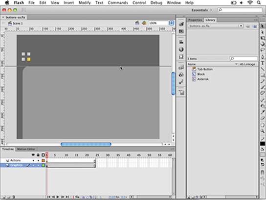
4. Watch the ruler on the left and drop the guide where you want it. (See Figure 8-1.)
Use the left ruler for reference so that you know exactly how far down you’re placing the new guide — for example, at 120 pixels.
Figure 8-1: To create a new, horizontal guide, click and drag from the top ruler and release a guide on the stage.
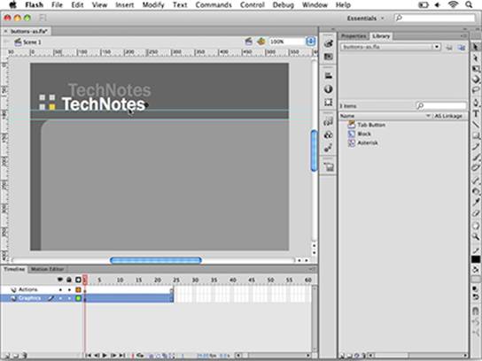
5. Click and drag on the top ruler again to place another guide.
Position this one slightly above the one you previously created — for example, place it at 100 pixels.
6. Use the Type tool to create a single line of type on the stage, as shown in Figure 8-2.
Use a large enough font that you can easily see and drag the new text.
7. Choose the Selection tool; grab the text with it and drag until the bottom of the text snaps in place on the lower guide you’ve created.
Figure 8-2:Create a line of type and position it with the help of guides.
Your text snaps easily to the new guides because of a built-in mechanism — snapping. Think of snapping as turning on a magnetic force that allows objects to adhere to each other or to visual helpers (such as guides) to make positioning easier. By default, Snap Align, Snap to Guides, and Snap to Objects are enabled. (Choose View⇒Snapping.) You can also enable Snap to Pixels and Snap to Grid.
Enabling the grid
If you’ve ever drawn on graph paper, you know how fun it can be to follow the lines and create perfect shapes and drawings. As with good old graph paper, you can enable and use the Flash grid to draw and position objects and create precise layouts by just following the lines. As with guides, you can snap type, drawing objects, and symbols to gridlines. You can also draw along gridlines to easily measure and match shapes.
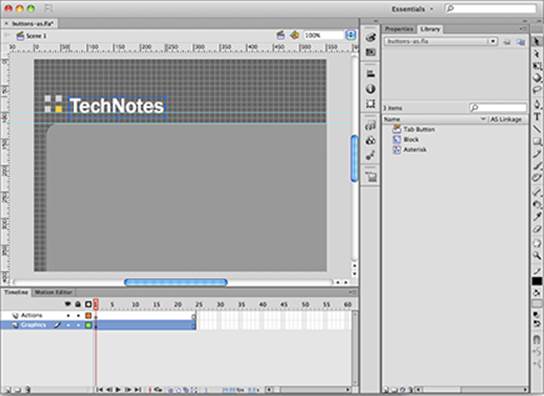
To enable the grid, choose View⇒Grid⇒Show Grid. (See Figure 8-3.) To take full advantage of the grid, choose View⇒Snapping⇒Snap to Grid to make it magnetic.
Figure 8-3: You can position objects and draw on top of the grid.
Follow these steps to draw and position objects with the grid:
1. Choose View⇒Grid⇒Show Grid to make sure the grid is enabled and choose View⇒Snapping⇒Snap to Grid to turn on snapping for the grid.
2. Grab the Rectangle tool, choose a stroke color, and set the fill color to None.
3. Draw a rectangle with the gridlines as a guide.
The shape snaps to the nearest gridline while you draw.
4. Use the Selection tool to click and drag the new shape and snap it into place.
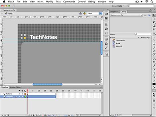
5. If you’d like, disable the grid before moving on to a new task by choosing Choose View⇒Grid⇒Show Grid to uncheck this option on the menu.
When you move objects along the grid, they snap by their registration point to the gridlines. You can use the gridlines to snap objects (including type) to the exact position you want, as shown in Figure 8-4.
Figure 8-4:With snapping enabled, objects snap to the grid while you move them.
To customize the appearance of your grid, choose View⇒Grid⇒Edit Grid. From this dialog box, you can specify the grid’s size and color and the snapping accuracy.
Aligning Artwork
If you need to line up or space out several graphics on the stage, you can use the handy Align panel to assist you. The Align panel lets you line up, distribute, or space two or more objects relative to each other or the stage.
To experiment with the Align options, create a new layer, draw a shape on the stage, and place it on the bottom below any graphics you already have on the stage. Then follow these steps to align and distribute two or more graphics:
1. Select a graphic on the stage and duplicate it two to three times by choosing Edit⇒Copy and then choosing Edit⇒Paste.
2. Loosely position the graphics across the stage from left to right.
3. Select all the new copies you created with the Selection tool and launch the Align panel by choosing Window⇒Align.
The first row contains all the Align buttons, broken down into two groups: vertical and horizontal.
4. Locate the Align to Stage check box at the bottom of the Align panel and uncheck it, if necessary.
You can see in the next section what effect this step has.
5. Click the Align Vertical Center button to align the selected graphics horizontally by their top edge.
The graphics reposition themselves so that they’re all flush by the top edge. Align selected graphics horizontally with each other with the buttons under the Align row. The second row contains buttons that evenly distribute graphics vertically or horizontally by their center, top, or bottom edges.
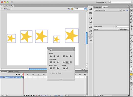
6. Click the middle button of the second group (Distribute Horizontal Center) to distribute graphics based on their center points, as shown in Figure 8-5.
Figure 8-5:Distribute graphics horizontally across the stage.
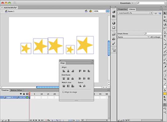
Distributing to the stage
The Align to Stage check box (located on the bottom of the Align panel) can be selected so that any distribution uses the stage as a point of reference. The distribute options are useful if you want to distribute objects across the full width of the stage regardless of their distance from each other.
To distribute objects across the stage, follow these steps:
1. Leave selected the graphics you just distributed on the stage. If they aren’t selected, use the Selection tool to reselect them by dragging a selection area around them on the stage.
2. Locate and select the Align to Stage check box on the Align panel.
3. Click the Distribute Horizontal Center button in the Distribute row.
The graphics redistribute and spread across the full width of the stage, as shown in Figure 8-6.
Figure 8-6:Selecting the Align to Stage check box spreads graphics across the full width of the stage.
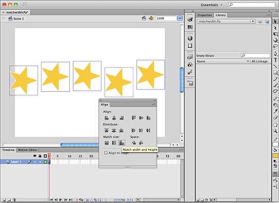
Using Match Size options
If you need to resize two or more objects on the stage so that they’re all the same width and height, you can take advantage of the Match Size options in the Align panel. Match Size options can conform two objects to the same width or height, or both.
To match two objects in size, follow these steps:
1. Select two or more different-size graphics, symbols, or drawing objects on the stage.
2. Choose Window⇒Align to launch the Align panel (if it’s not already open).
3. If it’s selected, deselect the Align to Stage check box at the bottom of the Align panel.
4. Locate the Match Size button group on the bottom of the panel and click the last button of the three (Match Width and Height).
The objects resize to the same width and height, as shown in Figure 8-7.
Note: You can also match only width or height by clicking either the first or second buttons of the group, respectively.
Figure 8-7:Match the width and height of two or more graphics.
With the Stage button enabled, Match Size resizes any selected objects to the full width and height of your stage. Using this feature is an easy way to create a full-size background or to stretch a graphic to fit the entire stage.
 When you use Match Size, the largest of the selected objects always dictates the resizing. All other objects are resized to match the largest selected object.
Experimenting with Animation Helpers
Sitting discretely below the Timeline are some highly useful icons that can be a big help while you’re developing and fine-tuning animations. The Onion Skin, Onion Skin Outlines, and Edit Multiple Frames options let you view, move, and manipulate entire animations at a time to save time and guarantee better results.
When creating animation, you can enable onion skinning to view several frames at a time. With tweened animation, onion skinning can reveal all frames created between the starting and ending keyframes to help you make adjustments and see them in action. You can choose between two types of onion skinning, depending on whether you want to view frames as outlines or full-color previews.
Before you get started, create a new motion tween or open a document with an existing tween that you can use for this example.
To enable onion skinning, follow these steps:
1. Select the Onion Skin icon underneath the Timeline.
A set of brackets appears above the Timeline.
2. Adjust the brackets so that all frames in your tween are selected.
You see a full preview of all frames generated by your tween.
You can’t select the frames shown in between, but you can move the instances on the starting and ending keyframe. Select the symbol instance on the starting keyframe of your tween and move it. The onion skin reveals how the frames in between change when you shift starting or ending instances.
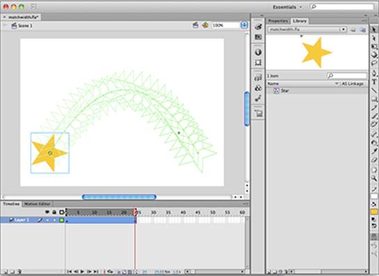
As an alternative to seeing frames in your tween in full color, you can preview them as outlines by using the Onion Skin Outlines option. (See Figure 8-8.) This option works exactly like the Onion Skin option but shows selected frames using a wire-frame-style outline view. The Onion Skin Outlines option can be a better choice if the full-color preview looks cluttered.
Figure 8-8: An animation shown in Onion Skin Outlines mode.
Using Keyboard Shortcuts
Part of creating a smooth and fast work environment is having your favorite commands, panels, and tools at your fingertips. Most Flash menu items and panels are equipped with shortcut key combinations that provide easy access without having to comb through several menus. If you need your own, custom keyboard shortcuts, Flash lets you create and save keyboard shortcut sets that you can fully customize to speed your workflow.
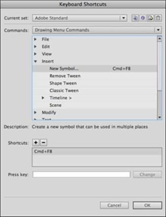
To view the default keyboard shortcuts and create your own, choose Edit⇒Keyboard Shortcuts (Windows) or Flash⇒Keyboard Shortcuts (Mac).
You can map almost any available tool, command, or panel to a keyboard shortcut. You can choose to memorize existing keyboard shortcuts for commonly used items or create custom keyboard shortcuts that are more intuitive for you.
To create a new keyboard shortcut, follow these steps:
1. Choose Edit⇒Keyboard Shortcuts (Windows) or Flash⇒Keyboard Shortcuts (Mac).
The Keyboard Shortcuts dialog box launches. (See Figure 8-9.)
Figure 8-9:Drill down through the menus to select the command you want to create a shortcut for.
2. Scroll down and click the plus sign (Windows) or triangle) to the left of where it reads Control.
You see all menu items on the Control menu and any keyboard shortcuts assigned to them.
3. Locate and select the menu command you want to create a shortcut for. (Refer to Figure 8-9.)
For this example, we selected Insert⇒New Symbol.
The default set can’t be modified, so you need to duplicate the default set and make changes to the new copy.
4. Click the Duplicate Set icon at the top of the dialog box and type My Custom Set in the Name text box when prompted; click OK to create the new set.
5. With the current menu item selected, locate and click the plus sign beside Shortcuts to add a new shortcut for the menu item.
The word <empty> appears, ready for you to enter a keyboard shortcut.
6. Hold down Ctrl+Shift (Windows) or  +Shift (Mac) plus the key you want to assign as the keyboard shortcut (for example, Ctrl+Shift+M or +Shift+M).
Use a letter or a number for a keyboard shortcut. You can also use the Shift, Ctrl, and Alt keys (Windows) or Shift, , and Option keys (Mac) in combination with a letter or a number to create keyboard shortcuts.
 You may receive a warning if the keyboard shortcut you’ve selected is already in use. Make sure the shortcut isn’t assigned to a crucial menu command before you decide to overwrite it.
The Shortcuts text box fills in the keyboard shortcut as you hold it. Note that if the keyboard shortcut already exists, a warning appears.
7. To confirm the shortcut, click the Change button.
8. Click OK to close the dialog box and save the shortcut to your new set.
At any time, you can return to your custom set in the Keyboard Shortcuts dialog box to add new shortcuts or modify existing ones. If at any point you want to switch sets, return to the Keyboard Shortcuts dialog box and select a different set from the Current Set menu.
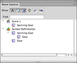
Working with the Movie Explorer
As a Flash project grows and becomes more complex, moving around the document can be a bit of a guessing game. As you add movie clips, ActionScript, media files, and other elements, the project’s inner workings can overwhelm even the most organized designer.
For these cases, the Movie Explorer panel (see Figure 8-10) offers an at-a-glance view of your movie. From this panel, you see exactly what’s being used and where, and you can navigate directly to any item on the list. You can filter the panel to show only the types of items you want, whether it’s ActionScript, movie clips, sounds, or type, by clicking and selecting the icon buttons at the top of the panel. To launch Movie Explorer, choose Window⇒Movie Explorer.
Figure 8-10:The Movie Explorer panel allows you to navigate your movie by symbols, scripts, and other views.
All materials on the site are licensed Creative Commons Attribution-Sharealike 3.0 Unported CC BY-SA 3.0 & GNU Free Documentation License (GFDL)
If you are the copyright holder of any material contained on our site and intend to remove it, please contact our site administrator for approval.
© 2016-2026 All site design rights belong to S.Y.A.