iOS Components and Frameworks: Understanding the Advanced Features of the iOS SDK (2014)
Chapter 20. Collection Views
Collection views were added in iOS 6 to provide a convenient new way to display scrollable cell-based information in a view with arbitrary layouts. Consider the iOS 6 version of Photos.app, which presents thumbnails of images in a scrollable grid. Before iOS 6, implementing a grid view would require setting up a table view with logic to calculate which thumbnail (or “cell”) should go in each position in each table row, or would require custom logic to place thumbnails in a scroll view and manage them all as scrolling occurs. Both approaches are challenging, time-consuming, and error prone to implement. Collection views address this situation by providing a cell management architecture that is very similar to row management in a table view, while abstracting the layout of cells.
There is a default collection view layout called flow layout, which can be used to quickly and easily implement many common grid-style layouts for both horizontal and vertical scrolling. Custom layouts can be created to implement specialized grids or any nongrid layout that can be visualized and calculated at runtime.
Collection views can be organized into sections, with section header and section footer views that depend on section data. In addition, decoration views not related to content data can be specified to enhance the look of the collection view.
Last but not least, collection views support lots of types of animation, including custom states while cells are scrolling, animations for inserting or removing cells, and transitioning between layouts.
The Sample App
The sample app for this chapter is called PhotoGallery. The app demonstrates presenting the user’s photo library in a few different implementations of a collection view:
 The first implementation is a basic collection view of thumbnails, organized by album, that can be scrolled vertically. It has section headers displaying album names, and can be created with a minimum of custom code.
The second implementation uses a custom subclass of the flow layout so that it can display decoration views.
The third implementation uses a custom layout to present items in a nongrid layout, and includes the capability to change to another layout with a pinch gesture.
Introducing Collection Views
A collection view needs a few different classes in order to work. The base class is called UICollectionView and is a subclass of UIScrollView. It will manage the presentation of cells provided by the datasource (which can be any class implementing theUICollectionViewDataSource protocol), according to the layout referenced by the collection view, which will be an instance of UICollectionViewLayout. A delegate conforming to the UICollectionViewDelegate protocol can be specified to manage selection and highlighting of cells.
The class that conforms to the UICollectionViewDataSource protocol will return configured cells to the collection view, which will be instances of UICollectionViewCell. If the collection view is configured to use section headers and/or section footers, the data source will return configured instances of UICollectionReusableView.
In the sample app, refer to the Basic Flow Layout to see these classes all working together as shown in Figure 20.1.
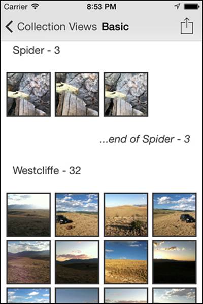
Figure 20.1 Sample app: Basic Flow Layout.
Setting Up a Collection View
The Basic Flow Layout example in the sample app demonstrates setting up a collection view with a minimum of customization, to show how quickly and easily a collection view can be created. Instead of using a basic UIViewController subclass, the basic flow used aUICollectionViewController subclass called PHGBasicFlowViewController, which conforms to the UICollectionViewDataSource and UICollectionViewDelegate protocols. This approach is not required; it is convenient when the collection view is all that is being displayed for a view controller. A collection view can be used with a standard view controller with no issues:
1. In the MainStoryboard, examine the Basic Flow View Controller–Basic Scene.
2. Expand the scene to see the collection view controller, as shown in Figure 20.2.
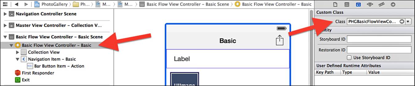
Figure 20.2 Xcode storyboard: specify custom class for collection view controller.
3. With the collection view controller selected, note the custom class specified in the identity inspector.
This ensures that the collection view controller will use the custom subclass PHGBasicFlowViewController.
UICollectionViewController instances have a property called collectionView, which is represented in Interface Builder as the collection view object. With the collection view object selected, note that several settings can be configured: the type of layout, the scrolling direction, and whether a section header and/or section footer should be used, as shown in Figure 20.3.
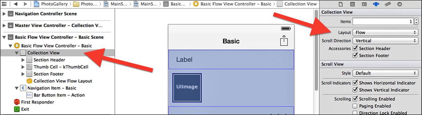
Figure 20.3 Xcode storyboard: custom collection view settings.
Interface Builder will present objects for the section header, collection view cell, and section footer that can be customized as well. For each of these, a custom subclass has been set up to simplify managing the subviews that need to be configured at runtime. This is not required; theUICollectionViewCell and UICollectionReusableView classes can be used directly if preferred.
The collection view cell subclass is called PHGThumbCell, and has one property called thumbImageView, which will be used to display the thumbnail image. The collection view object in Interface Builder is configured to use the custom subclass in the identity inspector, and references a UIImageView object for the thumbImageView property. The key item to set up for the collection view cell is the identifier, as shown in Figure 20.4; this is how the data source method will identify the type of cell to be configured and displayed.
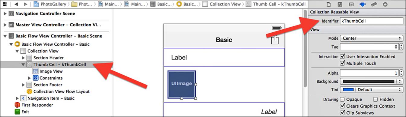
Figure 20.4 Xcode storyboard: collection view cell identifier.
The collection view section header subclass is called PHGSectionHeader, and the section footer subclass is called PHGSectionFooter. Each subclass has a property for a label that will be used to display the header or footer title for the section. Both objects in Interface Builder are configured to use their respective custom subclasses in the identity inspector, and reference UILabel objects for their title properties. Just as the collection view cell “identifier” was specified for the collection view cell, separate identifiers are specified for the section header and section footer.
Implementing the Collection View Data Source Methods
After all the objects are configured in Interface Builder, the data source methods need to be implemented for the collection view to work. Confirm that the collection view object in the storyboard has the data source set to the basic flow view controller, as shown in Figure 20.5.
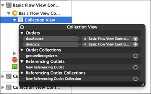
Figure 20.5 Xcode storyboard: collection view data source setting.
The sample app is a gallery app that displays photos from the user’s photo library, so there is logic implemented in the viewDidLoad method that builds an array of image assets (organized as an array containing asset arrays, in which each asset array holds the assets for a group/album) and an array of photo album titles. Refer to Chapter 23, “Accessing Photo Libraries,” for more details on that process.
The collection view needs to know how many sections to present, which is returned in the numberOfSectionsInCollectionView: method. The method is set up to return the count of albums (or groups) from the array of asset groups built in viewDidLoad.
- (NSInteger)numberOfSectionsInCollectionView:(UICollectionView *)collectionView
{
return [self.assetGroupArray count];
}
Next the collection view needs to know how many cells to present in each section. This method is called collectionView:numberOfItemsInSection:. The method has been built to find the correct asset array for the section index, and then return the count of assets in that array.
- (NSInteger)collectionView:(UICollectionView *)view
numberOfItemsInSection:(NSInteger)section;
{
NSArray *sectionAssets = self.assetArray[section];
return [sectionAssets count];
}
After the collection view has the counts of sections and items, it can determine how to lay out the view. Depending on where in the scrollable bounds the current view is, the collection view will request section headers, footers, and cells for the visible area of the view. Section headers and footers are requested from the collectionView:viewForSupplementaryElementOfKind:atIndexPath: method. Section headers and footers both need to be instances (or subclasses) of UICollectionReusableView. The method declares a nil instance ofUICollectionReusableView, which will be populated with either a configured section header or a section footer.
UICollectionReusableView *supplementaryView = nil;
The logic in the method must check the value of the kind parameter (which will be either UICollectionElementKindSectionHeader or UICollectionElementKindSectionFooter) to determine whether to return a section header or section footer.
if ([kind isEqualToString:UICollectionElementKindSectionHeader]) {
PHGSectionHeader *sectionHeader =
[collectionView dequeueReusableSupplementaryViewOfKind:kind
withReuseIdentifier:kSectionHeader forIndexPath:indexPath];
[sectionHeader.headerLabel
setText:self.assetGroupArray[indexPath.section]];
supplementaryView = sectionHeader;
}
To get an instance of the custom PHGSectionHeader, the collection view is asked to provide a supplementary view for the specified index path, using the dequeue with reuse identifier method. Note that the reuse identifier must be the same as specified in Interface Builder previously for the section header. This method will either instantiate a new view or reuse an existing view that is no longer being displayed. Then the title of the section is looked up in the group array, and put in the header’s title label.
For cells, the collectionView:cellForItematIndexPath: method is called. In this method, a cell is dequeued for the reuse identifier specified (this must match the reuse identifier specified for the cell in Interface Builder).
PHGThumbCell *cell =
[cv dequeueReusableCellWithReuseIdentifier:kThumbCell
forIndexPath:indexPath];
The cell is then configured to display the thumbnail image for the asset at the indexPath and returned for display.
ALAsset *assetForPath =
self.assetArray[indexPath.section][indexPath.row];
UIImage *assetThumb =
[UIImage imageWithCGImage:[assetForPath thumbnail]];
[cell.thumbImageView setImage:assetThumb];
return cell;
If setting up the cells and section header/footer object in a storyboard is not the preferred approach, they can be set up in nibs or in code. In that case, it is necessary to register the class or nib for the reuse identifier for cells using either theregisterClass:forCellWithReuseIdentifier: method or the registerNib:forCellWithReuseIdentifier: method. For section headers and footers the methods registerClass:forSupplementaryViewOfKind:withReuseIdentifier: orregisterNib:forSupplementaryViewOfKind:withReuseIdentifier: can be used.
Implementing the Collection View Delegate Methods
The collection view delegate can manage selection and highlighting of cells, can track removal of cells or sections, and can be used to display the Edit menu for items and perform actions from the Edit menu. The basic flow in the sample app demonstrates cell selection and highlighting. Confirm that the delegate for the collection view object is set to the basic flow view controller, as shown in Figure 20.5.
Collection view cells are designed to be able to change visually when they are selected or highlighted. A collection view cell has a subview called contentView where any content to be displayed for the cell should go. It has a backgroundView, which can be customized and which is always displayed behind the contentView. In addition, it has a selectedBackgroundView, which will be placed behind the contentView and in front of the backgroundView when the cell is highlighted or selected.
For the custom PHGThumbCell class, the selectedBackgroundView is instantiated and customized in the cell’s initWithCoder: method, since the cell is instantiated from the storyboard. Be sure to use the appropriate init method to customize the backgroundView andselectedBackgroundView depending on how your cells will be initialized.
- (id)initWithCoder:(NSCoder *)aDecoder
{
self = [super initWithCoder:aDecoder];
if (self) {
self.selectedBackgroundView =
[[UIView alloc] initWithFrame:CGRectZero];
[self.selectedBackgroundView
setBackgroundColor:[UIColor redColor]];
}
return self;
}
By default, collection views support single selection. To enable a collection view to support multiple selection, use the following:
[self.collectionView setAllowsMultipleSelection:YES];
For cell selection, there are four delegate methods that can be implemented. Two methods indicate whether a cell should be selected or deselected, and two methods indicate whether a cell was selected or deselected. For this example only the methods indicating whether a cell was selected or deselected are implemented.
- (void)collectionView:(UICollectionView *)collectionView
didSelectItemAtIndexPath:(NSIndexPath *)indexPath
{
NSLog(@"Item selected at indexPath: %@",indexPath);
}
- (void)collectionView:(UICollectionView *)collectionView
didDeselectItemAtIndexPath:(NSIndexPath *)indexPath
{
NSLog(@"Item deselected at indexPath: %@",indexPath);
}
Note that there is no logic in either method to actually manage the list of items selected—this is handled by the collection view. The selection delegate methods are then needed only for any customizations to manage when cells are selected, or to respond to a selection or deselection. The collection view maintains an array of index paths for selected cells, which can be used for any custom logic. The sample demonstrates tapping an action button in the navigation bar to display how many cells are selected, as shown in Figure 20.6; this could easily be enhanced to display an activity view for the selected cells.
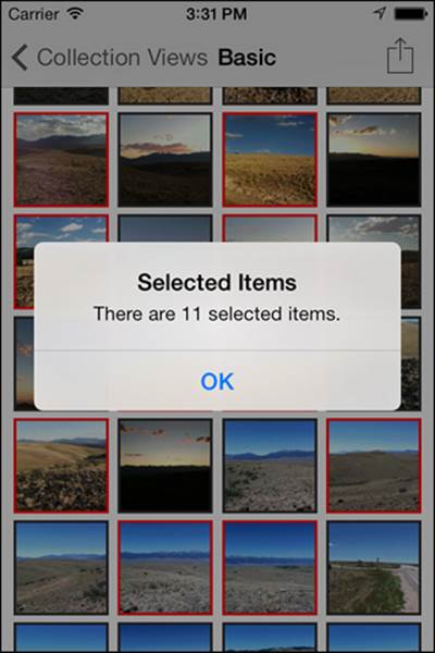
Figure 20.6 Sample app: basic flow demonstrating cell selection.
Customizing Collection View and Flow Layout
Various customizations are possible for a flow layout collection view. The size of each cell can be customized individually, as well as the size of each section header and section footer. Guidelines can be provided to ensure that a minimum amount of spacing is respected between cells, as well as between cells, section headers and footers, and section boundaries. In addition, decoration views, which are views that enhance the collection view aesthetically but are not directly related to the collection view’s data, can be placed anywhere in the collection view.
Basic Customizations
The flow layout provided in the SDK can be customized to provide a wide variety of grid-based layouts. The flow layout has logic built in to calculate, based on scrolling direction and all the parameters set for cell size, spacing and sections, how many cells should be presented per row, and then how big the scroll view should be. When these parameters are manipulated, collection views can be created that display one cell per row (or even per screen), multiple cells packed tightly together in a row (as in iOS7’s Photos.app), or anything in between. These parameters are illustrated in Figure 20.7.
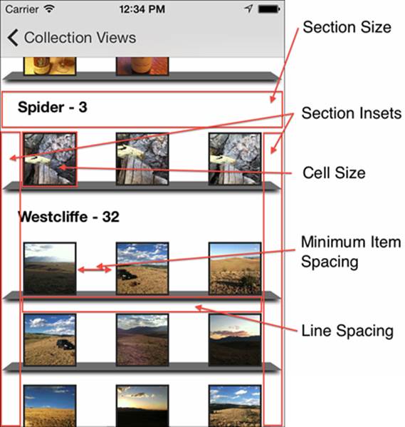
Figure 20.7 Collection view customizable parameters.
There are a few approaches to performing basic customizations on a flow layout collection view. The simplest approach is to set the defaults for the collection view in Interface Builder, by selecting the collection view object (or collection view flow layout object) and using the Size Inspector, as shown in Figure 20.8. Note that adjustments to these values affect the flow layout object associated with the collection view.
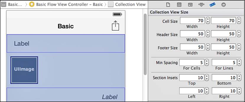
Figure 20.8 Xcode Interface Builder: Size Inspector for the collection view object.
Another approach is to update the items in code, in an instance or a subclass of UICollectionViewFlowLayout. In PHGCustomFlowLayout, the attributes for the custom flow layout are set in the init method.
self.scrollDirection = UICollectionViewScrollDirectionVertical;
self.itemSize = CGSizeMake(60, 60);
self.sectionInset = UIEdgeInsetsMake(10, 26, 10, 26);
self.headerReferenceSize = CGSizeMake(300, 50);
self.minimumLineSpacing = 20;
self.minimumInteritemSpacing = 40;
Finally, the collection view’s delegate can implement methods from the UICollectionViewDelegateFlowLayout protocol. These methods can be used to customize dimensions for individual cells based on data, or individual section headers or footers based on data. For example, photos with a higher user rating could be made bigger, or a section header or footer could be expanded as needed to accommodate an extra row of text for a long title.
Decoration Views
Decoration views can be used to enhance the visual look of the collection view, independently of cells and section headers and footers. They are intended to be independent of collection view data, and as such are not handled by the collection view’s data source or delegate. Since decoration views can be placed anywhere in a collection view, logic must be provided to tell the collection view where the decoration views should go. This necessitates creating a subclass of UICollectionViewFlowLayout to calculate locations for decoration views and to place them in the collection view when they should be visible in the currently displayed area.
In the sample app, tap the Custom Flow Layout option from the top menu to view an example that uses decoration views. The tilted shelf with a shadow below each row of photos is a decoration view, as shown in Figure 20.9.
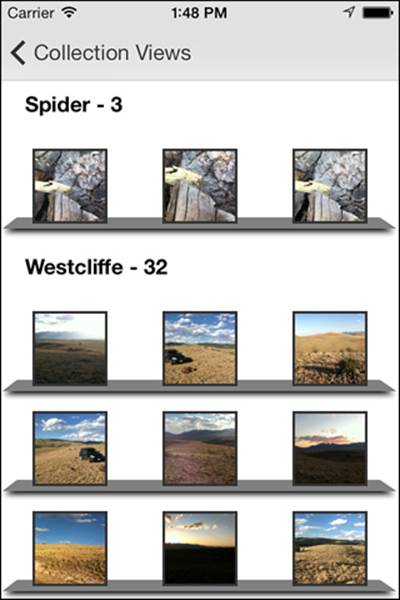
Figure 20.9 Sample App: Custom Flow Layout example.
The first step in using a decoration view is to register a class or nib that can be used for decoration view. In PHGCCustomFlowLayout, a subclass of UICollectionReusableView called PHGRowDecorationView is registered in the init method.
[self registerClass:[PHGRowDecorationView class]
forDecorationViewOfKind:[PHGRowDecorationView kind]];
The PHGCCustomFlowLayout class has custom drawing logic to draw the shelf and shadow. Note that multiple types of decoration views can be registered for a collection view if desired; they can be distinguished using the kind parameter. After a decoration view class or nib is registered, the layout needs to calculate where the decoration views should be placed. To do this, the custom layout overrides the prepareLayout method, which gets called every time the layout needs to be updated. The method will calculate frame rects for each needed decoration view and store them in a property so that they can be pulled as needed.
In the prepareLayout method, [super prepareLayout] is called first to get the base layout. Then some calculations are performed to determine how many cells can fit in each row, presuming that they are uniform in size.
[super prepareLayout];
NSInteger sections = [self.collectionView numberOfSections];
CGFloat availableWidth = self.collectionViewContentSize.width -
(self.sectionInset.left + self.sectionInset.right);
NSInteger cellsPerRow =
floorf((availableWidth + self.minimumInteritemSpacing) /
(self.itemSize.width + self.minimumInteritemSpacing));
A mutable dictionary to store the calculated frames for each decoration is created, and a float to track the current y position in the layout while performing calculations is created.
NSMutableDictionary *rowDecorationWork =
[[NSMutableDictionary alloc] init];
CGFloat yPosition = 0;
With that established, the method will iterate over the sections to find rows needing decoration views.
for (NSInteger sectionIndex = 0; sectionIndex < sections; sectionIndex++)
{
...
}
Within each section, the method will calculate how much space the section header takes up, and how much space is needed between the section and the top of the cells in the first row. Then the method will calculate how many rows there will be in the section based on the number of cells.
yPosition += self.headerReferenceSize.height;
yPosition += self.sectionInset.top;
NSInteger cellCount =
[self.collectionView numberOfItemsInSection:sectionIndex];
NSInteger rows = ceilf(cellCount/(CGFloat)cellsPerRow);
Then the method will iterate over each row, calculate the frame for the decoration view for that row, create an index path for the row and section, store the frame rectangle in the work dictionary using the index path as the key, and adjust the current y position to account for minimum line spacing unless it is the final row of the section.
for (int row = 0; row < rows; row++)
{
yPosition += self.itemSize.height;
CGRect decorationFrame = CGRectMake(0,
yPosition-kDecorationYAdjustment,
self.collectionViewContentSize.width,
kDecorationHeight);
NSIndexPath *decIndexPath = [NSIndexPath
indexPathForRow:row inSection:sectionIndex];
rowDecorationWork[decIndexPath] =
[NSValue valueWithCGRect:decorationFrame];
if (row < rows - 1)
yPosition += self.minimumLineSpacing;
}
Note
The index path for the decoration item does not need to be strictly correct because the layout uses it only for a unique identifier for the decoration view. The developer can use any scheme that makes sense for the decoration view’s index path, and is unique for the decoration views of the same type in the collection view. Non-unique index paths will generate an assertion failure.
The method will then adjust for any space required at the end of the section, including the section inset and footer.
yPosition += self.sectionInset.bottom;
yPosition += self.footerReferenceSize.height;
After all the sections have been iterated, the dictionary of decoration view frames will be stored in the layout’s property for use during layout.
self.rowDecorationRects =
[NSDictionary dictionaryWithDictionary:rowDecorationWork];
Now that the decoration view frames have been calculated, the layout can use them when the collection view asks for layout attributes for the visible bounds in the overridden layoutAttributesForElementsInRect: method. First the method gets the attributes for the cells and section headers from the superclass, and then it will update those attributes to ensure that the cells are presented in front of the decoration views.
NSArray *layoutAttributes =
[super layoutAttributesForElementsInRect:rect];
for (UICollectionViewLayoutAttributes *attributes
in layoutAttributes)
{
attributes.zIndex = 1;
}
The method will set up a mutable copy of the attributes so that it can add the attributes needed for the decoration views. It will then iterate over the dictionary of the calculated decoration view frames, and check to see which frames are in the collection view’s visible bounds. Layout attributes will be created for those decoration views, and adjusted to ensure that they are presented behind the cell views. The updated array of attributes will be returned.
NSMutableArray *newLayoutAttributes =
[layoutAttributes mutableCopy];
[self.rowDecorationRects enumerateKeysAndObjectsUsingBlock:
^(NSIndexPath *indexPath, NSValue *rowRectValue, BOOL *stop) {
if (CGRectIntersectsRect([rowRectValue CGRectValue], rect))
{
UICollectionViewLayoutAttributes *attributes =
[UICollectionViewLayoutAttributes
layoutAttributesForDecorationViewOfKind:
[PHGRowDecorationView kind] withIndexPath:indexPath];
attributes.frame = [rowRectValue CGRectValue];
attributes.zIndex = 0;
[newLayoutAttributes addObject:attributes];
}
}];
layoutAttributes = [NSArray arrayWithArray:newLayoutAttributes];
return layoutAttributes;
With the attributes for the decoration views being included in the whole set of layout attributes, the collection view will display the decoration views, as shown in Figure 20.9.
Creating Custom Layouts
Custom layouts can be created for collection views that do not fit well into a grid format. In the sample app tap Custom Layout from the main menu to see an example of a layout that is more complex than a grid format. This layout presents images from the photo library in a continuous sine curve, even between section breaks as shown in Figure 20.10.
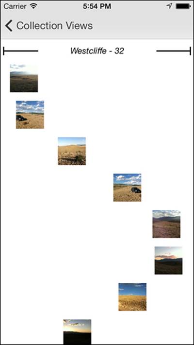
Figure 20.10 Sample app: custom layout example.
To create a subclass of UICollectionViewLayout, several methods need to be implemented:
The collectionViewContentSize method tells the collection view how to size the scroll view.
The layoutAttributesForElementsInRect: method tells the collection view all the layout attributes necessary for cells, section headers and footers, and decoration views in the rectangle specified.
The layoutAttributesForItemAtIndexPath: method returns the layout attributes for a cell at an index path.
The layoutAttributesForSupplementaryViewOfKind:atIndexPath: method returns the layout attributes for a section header or footer at the index path. Does not need to be implemented if section headers or footers are not used in the collection view.
The layoutAttributesForDecorationViewOfKind:atIndexPath: method returns the layout attributes for a decoration view at the index path. Does not need to be implemented if decoration views are not used in the collection view.
The shouldInvalidateLayoutForBoundsChange: method is used for animation of items in the layout. If this method returns yes, the collection view will recalculate all the layout attributes for the visible bounds. This will allow layout attributes to change based on their position on the screen.
The prepareLayout method, though optional, is a good place to calculate the layout since it gets called every time the layout needs to be updated.
In PHGCustomLayout, the prepareLayout method begins by determining the number of sections to be displayed, creates a float variable to track the current y position during the calculations, creates a dictionary to store the center points of the cells, and creates an array to store the frames of the section headers.
NSInteger numSections = [self.collectionView numberOfSections];
CGFloat currentYPosition = 0.0;
self.centerPointsForCells = [[NSMutableDictionary alloc] init];
self.rectsForSectionHeaders = [[NSMutableArray alloc] init];
The method then iterates over the sections. For each section it will calculate and store the frame for the section header, and then update the current y position from the top of the calculated section header to the vertical center of the first cell to be displayed. It will then determine the number of cells to be presented for the section.
for (NSInteger sectionIndex = 0; sectionIndex < numSections;
sectionIndex++)
{
CGRect rectForNextSection = CGRectMake(0, currentYPosition,
self.collectionView.bounds.size.width, kSectionHeight);
self.rectsForSectionHeaders[sectionIndex] =
[NSValue valueWithCGRect:rectForNextSection];
currentYPosition +=
kSectionHeight + kVerticalSpace + kCellSize / 2;
NSInteger numCellsForSection =
[self.collectionView numberOfItemsInSection:sectionIndex];
...
}
Next the method will iterate over the cells. It will calculate the horizontal center of the cell using the sine function, and store the center point in the dictionary with the index path for the cell as the key. The method will update the current vertical position and continue.
for (NSInteger cellIndex = 0; cellIndex < numCellsForSection;
cellIndex++)
{
CGFloat xPosition =
[self calculateSineXPositionForY:currentYPosition];
CGPoint cellCenterPoint =
CGPointMake(xPosition, currentYPosition);
NSIndexPath *cellIndexPath = [NSIndexPath
indexPathForItem:cellIndex inSection:sectionIndex];
self.centerPointsForCells[cellIndexPath] =
[NSValue valueWithCGPoint:cellCenterPoint];
currentYPosition += kCellSize + kVerticalSpace;
}
After all the section header frames and cell center points have been calculated and stored, the method will calculate and store the content size of the collection view in a property so that it can be returned from the collectionViewContentSize method.
self.contentSize =
CGSizeMake(self.collectionView.bounds.size.width,
currentYPosition + kVerticalSpace);
When the collection view is displayed, the layoutAttributesForElementsInRect: method will be called for the visible bounds of the collection view. That method will create a mutable array to store the attributes to be returned, and will iterate over the section frame array to determine which section headers should be displayed. It will call the layoutAttributesForSupplementaryViewOfKind:atIndexPath: method for each section header to be displayed to get the attributes for the section headers, and store the attributes in the work array.
NSMutableArray *attributes = [NSMutableArray array];
for (NSValue *sectionRect in self.rectsForSectionHeaders)
{
if (CGRectIntersectsRect(rect, sectionRect.CGRectValue))
{
NSInteger sectionIndex =
[self.rectsForSectionHeaders indexOfObject:sectionRect];
NSIndexPath *secIndexPath =
[NSIndexPath indexPathForItem:0 inSection:sectionIndex];
[attributes addObject:
[self layoutAttributesForSupplementaryViewOfKind:
UICollectionElementKindSectionHeader
atIndexPath:secIndexPath]];
}
}
The method will then iterate over the dictionary containing index paths and cell center points to determine which cells should be displayed, will fetch the necessary cell attributes from the layoutAttributesForItemAtIndexPath: method, and will store the attributes in the work array.
[self.centerPointsForCells enumerateKeysAndObjectsUsingBlock:
^(NSIndexPath *indexPath, NSValue *centerPoint, BOOL *stop) {
CGPoint center = [centerPoint CGPointValue];
CGRect cellRect = CGRectMake(center.x - kCellSize/2,
center.y - kCellSize/2, kCellSize, kCellSize);
if (CGRectIntersectsRect(rect, cellRect)) {
[attributes addObject:
[self layoutAttributesForItemAtIndexPath:indexPath]];
}
}];
To determine the layout attributes for each section header, the layoutAttributesForSupplementaryViewOfKind:atIndexPath: method will begin by getting a default set of attributes for the section header by calling the UICollectionViewLayoutAttributes class method layoutAttributesForSupplementaryViewOfKind:withIndexPath:. Then the method will update the size and center point of the section header using the frame calculated in the prepareLayout method earlier, and return the attributes.
UICollectionViewLayoutAttributes *attributes =
[UICollectionViewLayoutAttributes
layoutAttributesForSupplementaryViewOfKind:
UICollectionElementKindSectionHeader withIndexPath:indexPath];
CGRect sectionRect =
[self.rectsForSectionHeaders[indexPath.section] CGRectValue];
attributes.size =
CGSizeMake(sectionRect.size.width, sectionRect.size.height);
attributes.center =
CGPointMake(CGRectGetMidX(sectionRect),
CGRectGetMidY(sectionRect));
return attributes;
To determine the layout attributes for each cell, the layoutAttributesForItemWithIndexPath: method will get a default set of attributes for the cell by calling the UICollectionViewLayoutAttributes class methodlayoutAttributesForCellWithIndexPath:. Then the method will update the size and center point of the cell using the point calculated in the prepareLayout method earlier, and return the attributes.
UICollectionViewLayoutAttributes *attributes =
[UICollectionViewLayoutAttributes
layoutAttributesForCellWithIndexPath:path];
attributes.size = CGSizeMake(kCellSize, kCellSize);
NSValue *centerPointValue = self.centerPointsForCells[path];
attributes.center = [centerPointValue CGPointValue];
return attributes;
With all those methods implemented, the collection view is able to calculate the positions for all the items in the view, and properly retrieve the positioning information as needed to display the custom layout shown in Figure 20.10.
Collection View Animations
Collection views have extensive built-in support for animations. A collection view can change layouts, and animate all the cells from the positions in the first layout to the positions in the new layout. Within a layout, collection views can animate each cell individually by adjusting the layout attributes as scrolling occurs. Changes to the cells in the layout, including insertions and deletions, can all be animated.
Collection View Layout Changes
In the sample app, tap the Custom Flow item in the menu. Perform a pinch-out gesture on any image in the view, and observe the layout changing to a new layout with animations. The cells will all move from their original positions to the new positions, and the collection view will be scrolled to display the pinched cell in the center of the view. The logic to do this is set up in the PHGCustomLayoutViewController. When the view controller is loaded, two pinch gesture recognizers are created and stored in properties. The gesture recognizer for a pinch out is added to the collection view. For more information on gesture recognizers, refer to Chapter 22, “Gesture Recognizers.”
self.pinchIn = [[UIPinchGestureRecognizer alloc]
initWithTarget:self
action:@selector(pinchInReceived:)];
self.pinchOut = [[UIPinchGestureRecognizer alloc]
initWithTarget:self
action:@selector(pinchOutReceived:)];
[self.collectionView addGestureRecognizer:self.pinchOut];
When a pinch out is received, the pinchOutReceived: method is called. That method will check the state of the gesture to determine the correct course of action. If the state is UIGestureRecognizerStateBegan, the method will determine which cell the user has pinched over and will store that in order to navigate to it after the transition has occurred.
if (pinchRecognizer.state == UIGestureRecognizerStateBegan)
{
CGPoint pinchPoint =
[pinchRecognizer locationInView:self.collectionView];
self.pinchedIndexPath =
[self.collectionView indexPathForItemAtPoint:pinchPoint];
}
When the pinch gesture is completed, the method will be called again, and the method will check whether the state is ended. If so, the method will remove the pinch recognizer from the view to prevent any additional pinches from accidentally occurring during the transition, and will then create the new layout and initiate the animated transition. The method defines a completion block to execute when the transition to the new layout is complete. This completion block will add the pinch in gesture recognizer so that the user can pinch and return to the previous view, and will perform the animated navigation to the cell that the user pinched over.
[self.collectionView removeGestureRecognizer:self.pinchOut];
UICollectionViewFlowLayout *individualLayout =
[[PHGAnimatingFlowLayout alloc] init];
__weak UICollectionView *weakCollectionView = self.collectionView;
__weak UIPinchGestureRecognizer *weakPinchIn = self.pinchIn;
__weak NSIndexPath *weakPinchedIndexPath = self.pinchedIndexPath;
void (^finishedBlock)(BOOL) = ^(BOOL finished) {
[weakCollectionView scrollToItemAtIndexPath:weakPinchedIndexPath
atScrollPosition:UICollectionViewScrollPositionCenteredVertically
animated:YES];
[weakCollectionView addGestureRecognizer:weakPinchIn];
};
[self.collectionView setCollectionViewLayout:individualLayout
animated:YES
completion:finishedBlock];
Note
All the animations are handled by the collection view. No custom logic was required to perform any calculations for the animations.
Collection View Layout Animations
After a pinch out has occurred on the custom layout, the newly presented layout has a unique feature. The cells in each row are larger the closer they are to the center of the view along the y axis, as shown in Figure 20.11.
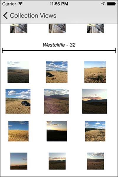
Figure 20.11 Sample app: custom layout example.
As the user scrolls, the size of the cells will change dynamically depending on their proximity to the center of the view. To achieve this effect, some custom logic is implemented in the PHGAnimatingFlowLayout class. The first piece is required to tell the layout that it should recalculate the layout attributes of each cell when scrolling occurs. This is done by returning YES from the shouldInvalidateLayoutForBoundsChange: method.
- (BOOL)shouldInvalidateLayoutForBoundsChange:(CGRect)oldBounds
{
return YES;
}
When the flow layout has invalidated the layout during a scroll, it will call the layoutAttributesForElementsInRect: method to get new layout attributes for each visible cell. This method will determine which layout attributes are for cells in the visible rect so that they can be modified.
NSArray *layoutAttributes =
[super layoutAttributesForElementsInRect:rect];
CGRect visibleRect;
visibleRect.origin = self.collectionView.contentOffset;
visibleRect.size = self.collectionView.bounds.size;
for (UICollectionViewLayoutAttributes *attributes
in layoutAttributes)
{
if (attributes.representedElementCategory ==
UICollectionElementCategoryCell &&
CGRectIntersectsRect(attributes.frame, rect))
{
...
}
}
For each cell, the method will calculate how far away from the center of the view the cell is along the y axis. The method will then calculate how much to scale up the cell based on how far away from the center it is. The layout attributes are updated with the 3D transform and returned.
CGFloat distanceFromCenter =
CGRectGetMidY(visibleRect) - attributes.center.y;
CGFloat distancePercentFromCenter =
distanceFromCenter / kZoomDistance;
if (ABS(distanceFromCenter) < kZoomDistance) {
CGFloat zoom =
1 + kZoomAmount * (1 - ABS(distancePercentFromCenter));
attributes.transform3D =
CATransform3DMakeScale(zoom, zoom, 1.0);
}
else
{
attributes.transform3D = CATransform3DIdentity;
}
Collection View Change Animations
Collection views offer support for animations when items are being inserted or deleted. This animation is not demonstrated in the sample app, but can be covered with some discussion. To build support for animating insertions and deletions, there are a few methods in the collection view layout subclass to implement. First is the prepareForCollectionViewUpdates: method, which can be used for any preparation needed before animations occur. That method receives an array of updates that can be inspected so that the method can be customized to perform preparations by individual items and by type of update.
For insertions, the initialLayoutAttributesForAppearingItemAtIndexPath: method can be implemented. This method can be used to tell the layout where to display the item before putting it in the calculated position in the layout with animation. In addition, any other initial attributes assigned to the item will animate to the final layout attributes, meaning that an item can be scaled, can be rotated, or can make any other change as it flies in.
For deletions, the finalLayoutAttributesForDisappearingItemAtIndexPath: method can be implemented. This method can be used to tell the layout where the final position for an item should be as it is pulled out of the layout with animation. Again, any other final attributes can be assigned to the item for additional animation.
Finally, the finalizeCollectionViewUpdates method can be implemented. This method will be executed when all the inserts and deletes have completed, so it can be used to clean up any state saved during the preparations.
Summary
This chapter covered collection views. It described how to implement a basic collection view with minimal custom code, and then explored some more advanced customizations to collection views, including customizations to the flow layout, decoration views, and completely custom layouts. The chapter discussed what animation options are supported by collection views, and how to implement animations while changing layouts, while scrolling through a collection view, and while inserting or deleting items.
Exercises
1. The sample app demonstrates how to transition from one layout to another with the Custom Flow menu option. Create a new layout that will display an image that fills the full width of the screen, and scrolls horizontally. Set the pinch-in gesture to display the new layout. Hint: Use aUICollectionViewFlowLayout subclass to implement the new layout, and be sure to adjust the logic in the collection view data source to display the full-screen-size image instead of the thumbnail.
2. Implement a method to add and delete items from the collection view (but not the actual asset library). Add support for insert and delete animations.