iOS 6 Application Development For Dummies (2013)
Part II. Building RoadTrip
Chapter 5. Creating the RoadTrip User Interface
In This Chapter
 Seeing how storyboards work
Working in the Utility area
Understanding and adding navigation controllers
Using Interface Builder to add objects to your storyboard
If you’ve read the preceding chapters, you have the foundation for understanding the tools you need to build an app, with particular focus on the example app developed in this book. Now you’re ready to find out how to add a user interface to your app via the storyboard.
In this chapter, I show you how to add items to the TestDriveController’s view using both Interface Builder and the user interface objects available to you in the Library pane in the Utility area. You first add these items to your iPad storyboard and then add similar items to your iPhone storyboard.
Creating Your User Interface in the iPad Storyboard
In the Project navigator, select the MainStoryboard_iPad.storyboard file and you’ll see several view controllers in the Document Outline (Split View Controller, Master View Controller, and Detail View Controller). Each view controller in a storyboard file manages a single scene (a scene, in this sense, is really just a view controller). On the iPad, courtesy of the Split View controller (which I explain in more detail in Chapter 13) or a popover controller, you can have multiple scenes on a screen. (On the iPhone, alas, generally you can see only one scene on a screen at a time). In the Document Outline, select the disclosure triangle next to the Master View Controller in the Master View Controller – Master Scene to expand the view controller and you’ll see its view.
 If you can’t see the Document Outline, you can use the Hide/Show Document Outline control shown in the lower-middle of Figure 5-1. You can also zoom in and out of a storyboard by double-clicking in the storyboard’s Canvas, or by using the zoom control shown in the lower-right in Figure 5-1. The = sign returns the storyboard to full size, which is the only way views are editable.
To add user interface elements, select the view you want to work with under the view controller heading listed in the Document Outline.
It’s about the view controller
Selecting a storyboard file in the Project navigator launches Interface Builder, which is the editor you use to edit the storyboard files for your application. Most applications need only one storyboard file, but because you’re creating a universal app, you’ll have two storyboards, one for the iPad user interface (MainStoryboard_iPad.storyboard) and one for the iPhone user interface (MainStoryboard_iPhone.storyboard). Each storyboard file you create has its own initial view controller, which serves as the entry point into the storyboard. For example, in your application’s main storyboard file, the initial view controller would be the first view controller presented by your application.
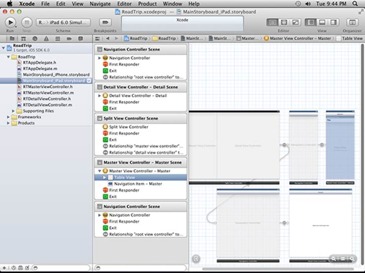
Figure 5-1: The initial MainStoryboard.
The view controller is the big kahuna here, and each view controller in a storyboard file, as I said, manages a single scene. For iPhone applications, a scene manages one screen’s worth of content, but for iPad applications, the content from multiple scenes can be onscreen simultaneously. To add new scenes to your storyboard file, all you have to do is drag a view controller from the Library to the storyboard canvas. You can then add controls and other views (such as Image, Web, or even Table views) to the view controller’s view.
 Besides the ability to lay out your application as a whole, storyboards also reduce the amount of code you have to write. Say you want to create a transition from one view controller to another; all you would need to do is Control-click a button or Table View cell in one view controller and drag it to the other. Dragging between view controllers creates a segue, which appears in Interface Builder as a configurable object. Segues support all the same types of transitions available in UIKit, such as navigation and modal transitions. A segue also enables you to define custom transitions.
I explain more about segues and view controller transitions in Chapter 14, when you add more scenes and segues to the RoadTrip app.
Using Interface Builder to add the user elements
Xcode’s Interface Builder enables you to create a storyboard by letting you lay out your user interface graphically in each view controller. You use Interface Builder to design your app’s user interface and then save what you’ve done as a resource file, which is included in your app and loaded into your app at runtime. This resource file is then used to automatically create the window and your app’s view controllers, as well as all your views and controls.
If you don’t want to use Interface Builder, you can also create your objects programmatically — creating views and view controllers and even things like buttons and labels using your very own application code. I show you an example of creating a button programmatically inChapter 15.
So how do you actually get those cute little controls into the view that lives in the view controller scene? For that, you use another area of the workspace — the Utility area.
As I explain in Chapter 2, you use the View selector on the toolbar to display or hide the Utility area. The Utility area is an optional area on the right side of the Workspace window. To hide or show the Utility area, click the Utility button on the View selector on the right on the Workspace toolbar. (In Figure 5-2, I’m using the View selector to open the Utility area.)
Figure 5-2: The View selector.
 When you hover your mouse pointer over a toolbar button, a tooltip describes its function.
Figure 5-3 shows the Utility area in all its glory. I have resized the Library window and also selected the Icon view in the Library pane’s View selector (the right segmented control selection at the top right of the Library pane). Personally, I find that easier to work with.
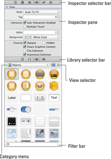
Figure 5-3: The Utility area.
As you can see, this area includes two panes, the top one for Quick Help and other inspectors (the Attributes inspector is selected here), and the bottom one for libraries of resources.
Working within the Utility Area
The Utility area consists of the Inspector and Library panes and their corresponding Inspector and Library selector bars. The idea is to use the Inspector pane to view and access Quick Help and other inspectors, and to scour the Library pane for ready-made resources you want to use in your project. You’ll be using both the Inspector and Library panes in this chapter.
Inspector and Quick Help pane
You use the Inspector selector (shown in Figure 5-4) to toggle on the particular inspector you want to use. (Xcode makes the decision-making process a bit easier by having your choice of Navigator or Content editor predetermine which inspectors in fact show up in the Inspector selector.)
Figure 5-4: The Inspector selector.
Utility area inspectors perform a variety of tasks. Following is a list of important inspectors and what you use them for:

 File inspector (first button): Lets you view and manage file metadata such as its name, type, and path.
 Quick Help (second button): Lets you view (applicable) details about what has been selected in an editor. Details include an abstract or concise description, where and how the selected element is declared, its scope, the parameters it takes, its platform and architecture availability, references, sample code, and so on. Different editors support different elements for selection, as follows:
• Symbols, available for selection in the Source editor
• Interface objects, available for selection in Interface Builder
• Build settings, available for selection in the Project editor
Additional inspectors are available in some editors; for example, Interface Builder offers the following:
 Identity inspector: Lets you view and manage object metadata such as its class, runtime attributes, label, and so forth.
 Attributes inspector: Lets you configure the attributes specific to the selected interface object. For example, some text field attributes include text alignment and color, border type, and editability.
 Size inspector: Lets you specify characteristics such as the initial size and position, minimum and maximum sizes, and autosizing rules for an interface object.
 Connections inspector: Lets you view the outlets and actions for an interface object, make new connections, and delete existing connections. The Connections inspector is where you’ll find things like outlets and targets that I explain in Chapter 9.
Library pane
A selection in the Library selector in the Library pane does the obvious: It selects a particular library of resources that you can then use in your project. Figure 5-5 shows the choices offered by the Library selector; the following list gives the details:
Figure 5-5: The Library selector.
 File templates: Click here to find templates for the common types of files you create using the New File menu. To add a file of that type to your project, simply drag it from the File Templates library to the Project navigator.
 Code snippets: Need just a smidgeon of code? Click here to find short pieces of source code you can then use in your application. Just drag the bit you found directly into your source code file.
 Objects: This library consists of interface objects you can use as part of your user interface. To add one to a particular view, drag it directly into your storyboard or nib file in Interface Builder.
 Media files: Here’s where you’ll find graphics, icons, and sound files. To use one, drag it directly to your storyboard or nib file in Interface Builder.
You can filter out what gets displayed in a selected library by entering your Search text into the text field in the Filter bar at the bottom of the Library pane.
Understanding iPad Navigation
Although the iPhone and iPad are very similar, one area in which they often differ is in how a user can navigate through an application.
For example, in iPhone apps that use a master-detail architecture, a Back button is prominently displayed as the user moves from a detail view to back to the Master view. (Figure 5-6 shows what I mean.) An iPad app that uses Split view functionality for the master-detail architecture will not need that Back button. But there are many other user interface designs on the iPad where a Back button is often used.
Apple has built this ability into the iOS architecture and has made it an integral part of the view controller architecture, as personified in the Navigation controller. (Okay, I know it isn’t a “person,” but you get the idea.)
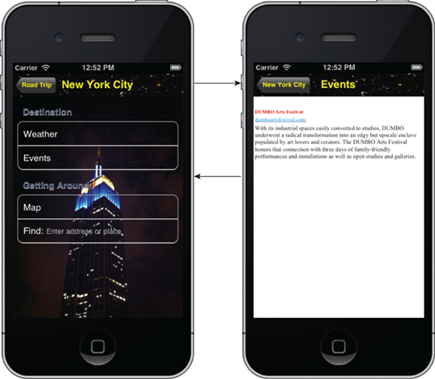
Figure 5-6: An iPhone application sequence.
A Navigation controller is a Container view controller that enables the user to navigate back and forth between view controllers. A Navigation controller is an instance of the UINavigationController class, which is a class you use “as is” and don’t subclass. The methods of this class provide support for managing a stack-based collection of custom view controllers. This stack represents the path taken by the user through the application, with the bottom of the stack reflecting the starting point and the top of the stack reflecting the user’s current position in the application.
 Apple’s UIKit framework (part of the Cocoa Touch frameworks) generally uses class names that begin with UI, such as UIView, UIViewController, UIImageView, UIButton, and many more. To avoid confusion, you should not use the UI prefix for your own class names. Apple also has special prefixes for many other frameworks. For example, the Core Image framework includes classes such as CIColor, CIContext, CIFaceFeature, and so on. These naming conventions provide hints so that when you come across an Apple class named CIImage, you can expect to find it in the Core Image framework.
Some developers adopt their own special prefixes for all their custom classes, including simple schemes such as using the RT prefix, so that class names could be RTMasterViewController (which is used in the RoadTrip sample), RTMapController, RTWeatherController, and so on. It’s not necessary to use a unique prefix for every custom class name, but you should avoid using Apple’s class names for your own classes.
 A stack is a commonly used data structure that works on the principle of “last in, first out.” Imagine an ideal boarding scenario for an airplane: Passengers would start being seated in the last seat in the last row, and they’d board the plane in back-to-front order until they got to the first seat in the first row, which would contain the seat for the last person to board. When the plane reached its destination, everyone would deplane (is that really a word?) in the reverse order. That last person on — the person in row one, seat one — would be the first person off.
A computer stack works on the same concept. Adding an object is called a push — in this case, when you tap the Travel button, for example, the view controller for that view is pushed onto the stack. Removing an object is called a pop — touching the Back button pops the view controller for the view being displayed. When you pop an object off the stack, it’s always the last one you pushed onto it. The controller that was there before the push is still there and now becomes the active one.
Although the Navigation controller’s primary job is to act as a manager of other view controllers, it also manages a few views. Specifically, it manages a Navigation bar that displays information about the user’s current location in the data hierarchy, a Back button for navigating to previous screens, and any custom controls the current view controller needs.
Take another look at Figure 5-6 and notice that, when the user taps Events in the iPhone version of RoadTrip, the Navigation controller (courtesy of the storyboard) pushes the next view controller onto the stack. The new view controller’s view slides into place and the Navigation bar items are updated appropriately. When the user taps the Back button on the Navigation bar, the current view controller pops off the stack, that view slides off the screen, and the user finds himself back in the previous view.
 The Navigation controller maintains the stack of view controllers, one for each of the views displayed. The very first view controller that the Navigation controller pushes onto its stack when a Navigation controller is created is called the Root view controller. It remains active until the user selects the next view to look at.
Navigation bars enable a user to navigate the hierarchy. Here’s what you need to know in order to make that work:
 The view beneath the Navigation bar presents the current level of the application.
A Navigation bar includes a title for the current view.
If the current view is lower in the hierarchy than the top level, a Back button appears on the left side of the bar; the user can tap it to return to the previous level. (Back in Figure 5-6, these buttons are named Road Trip and New York City and are shaped like a left-pointing arrow; the text in the Back button tells the user what the previous level was.)
A Navigation bar may also have an Edit button on the right side — used to enter Editing mode for the current view — or even custom buttons.
On the iPad, the Master-Detail Application template has not one, but two Navigation controllers already included in the storyboard — one for the Master View controller and the other for the Detail View controller, as you can see in Figure 5-7.
The only “problem” right now is that each Navigation controller has only one view controller to manage, which means you won’t be able to select anything and see a new view, with its accompanying Back button.
In this chapter, you get to fix that for the Detail View controller, at least.
As you can see in Figure 5-8, when you tap the first cell in the Master View controller (you’ll add the Test Drive label shortly), a new view controller slides its view into place. If you select the Back button, you slide back to the previous Detail view.
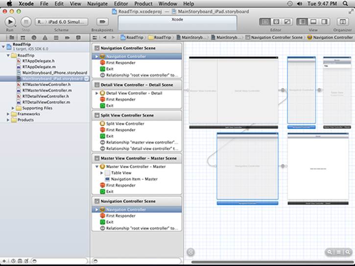
Figure 5-7: The Navigation controllers are already in.
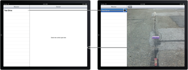
Figure 5-8: Navigating in RoadTrip on the iPad.
 You have other (even slicker) iPad navigation options at your disposal, and I get to them in Chapter 13, where you get a chance to change from navigation that uses the Navigation controller to something a bit more appropriate for the RoadTrip application. For now, though, you’ll go with the Navigation controller approach, just to get you off and running.
So, on your mark, get set, and go. Time to add a new view controller.
Adding a New View Controller
 Your first step in adding a new view controller is to select the iPad storyboard file in the Project navigator. With the storyboard displayed, you then make sure that the Utility area is visible by clicking its icon in the Xcode toolbar’s View selector. With that done, you can now hide the Project navigator by clicking its icon in the Xcode toolbar’s View selector. (See Figure 5-9; remember, the button is a toggle, as I explain in Chapter 2.) Doing so gives you a little more real estate onscreen. (If you are blessed with a large monitor, though, you can keep the Project navigator open.)
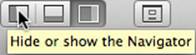
Figure 5-9: Hiding the Navigator area.
Because I have limited space on a book page, I’m hiding the Navigator area, as you can see in Figure 5-10. (When I work on my large-screen monitor, I usually keep the Navigator area shown.)
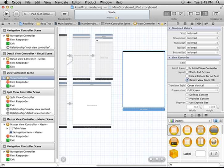
Figure: 5-10: Drag in a view controller.
 As the last step in getting your canvas ready, click the Attributes inspector button in the Inspector selector in the Utility area.
To add the Test Drive controller (which manages the view that will allow you to have RoadTrip’s little car drive up the screen, turn around, and then go back to its original position, all with sound effects), you need to do the following:
1. Select Objects in the Utility area’s Library pane, and then drag a new view controller from the pane into your storyboard.
 If you are using Icon view (like I do), the View Controller object is the first icon in the first row. (Selecting it will display a window describing what it is.)
While you can add controls and other views to views only when the storyboard elements are full size, you can add view controllers (and, as you’ll soon see, segues) at any zoom level.
A new scene is created, as shown in Figure 5-10.
2. Select the Table view in the Master View Controller – Master Scene (as I have in Figure 5-11) and then select the Attributes inspector.
If you look at the Canvas, you see a Table view with Prototype Cells, and a cell with the text of Title.
You’ll notice that, in the Table View section of the Attributes inspector, the Dynamic Prototypes option is selected.
Right now, if you select a cell, nothing happens. That’s because with Dynamic Prototype cells, you have to implement a method in your view controller to do something when a cell is selected (as you will in Chapter 20, where you create cells based on the information for each destination in the Destinations plist).
For now, all I want to do is to be able to launch a Test Drive controller when the first cell is selected (and I really don’t care about the time stamp). To do that in the most expeditious way possible, I’ll have you use the Attributes inspector to change the Master view from Dynamic Prototypes to Static Cells.
Static cells were a new feature in iOS 5.0 — and are used when you know in advance what needs to be displayed in a cell. Instead of having to implement a method in your view controller to return the cell with the text you want, you can format the cells in the storyboard. But more importantly, you can create a segue from a static cell that will launch the Test Drive Controller for you when the cell is tapped.
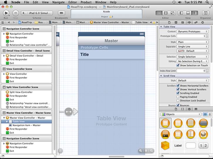
Figure 5-11: The Table view.
That’s all I am going to say about static cells for now — I really want to get on with explaining how to create the user interface in the storyboard using Interface Builder, but I promise I’ll return to static cells in detail in Chapter 12, because they are a feature that you’ll probably be using often.
3. In the Attributes inspector, select Static Cells from the Content drop-down menu, as I have in Figure 5-12.
You’ll notice a change in the Table view. The heading Prototype Cells will disappear and you’ll see three cells each with the text Title.
4. In the Outline view, expand the disclosure triangle next to the table view and you’ll see a Table View section.
Expand the Table View section and you’ll see three Table View cells. Expand the first Table View cell and you’ll find a label. Select the label, and in the Attributes inspector Title field, enter Test Drive as I have in Figure 5-13.
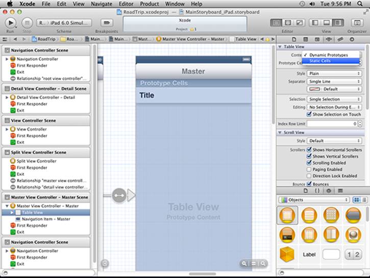
Figure 5-12: Make them static cells.
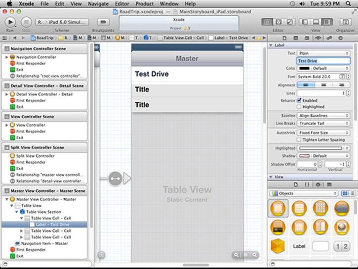
Figure 5-13: Your Test Drive cell.
5. Select the first Table View cell (the cell, not the Test Drive label) in the Document Outline, and Control-drag from the cell in the Master View controller to the view controller you just added, as shown in Figure 5-14. Then release the mouse button.
Control-clicking from a button or Table View cell and dragging to the view controller you want displayed creates a selection segue or an accessory action. When you release the mouse button, you’ll see the Storyboard Segues contextual menu, which pops up onscreen. You’ll learn more about segues in this section and in Chapter 14. We won’t be using an accessory action, but it’s a another way to trigger a segue — from an accessory button in a table view.
6. Select Push from the Selection Segue pop-up menu, as shown in Figure 5-15.
A segue performs the visual transition between two view controllers and supports push (navigation), modal, and custom transitions.
A push segue changes the scene — and the user sees the new view controller’s view (with its Back button) slide into place when the user taps a button; the Navigation bar items are updated appropriately. (See the “Understanding iPad Navigation” section, earlier in this chapter, for more on adding a Navigation controller.)
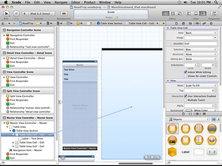
Figure 5-14: Drag from the Test Drive cell to the Table view controller.
In contrast to a push segue, a modal segue presents the view controller modally, with the transition style you specify, and requires the user to do something (tap Save or Cancel, for example) to get back to the previous view controller. As for custom transitions, segues support the standard visual transition styles such as Cover Vertical, Flip Horizontal, Cross Dissolve, and Partial Curl.
Segue objects are used to prepare for the transition from one view controller to another, which means segue objects contain information about the view controllers involved in a transition. When a segue is triggered — but before the visual transition occurs — the storyboard runtime calls the current view controller’s prepareForSegue:sender: method so that it can pass any needed data to the view controller that’s about to be displayed.
You’ll notice that selecting Push from the Storyboard Segue’s pop-up menu causes the Navigation bar to appear but also shrinks the view. I explain that in Chapter 13.
7. Select the Push segue in the Master View Controller scene. After making sure that Push appears on the Style menu in the Attributes inspector, enter TestDrive in the inspector’s Identifier field, as I have in Figure 5-16; then press return (or enter).
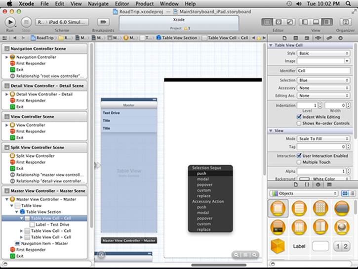
Figure 5-15: Creating a push segue.
You won’t always use the identifier, but it’s good practice to name it so that you can identify the segue.
The field in the storyboard isn’t updated until you press return, or sometimes until you click in another field in that inspector.
8. Choose Detail Split from the Attributes inspector’s Destination drop-down menu, as I have in Figure 5-16.
The size of the view in the Test Drive controller changes.
9. Finally, select the two unused Table View cells in the Document Outline and delete them by pressing Delete. (You won’t be using them.)
The default destination was set to Current, which meant that it was set to the Master view, because that’s where you were dragging from. With that default, the view controller had been resized for the Master view, which is 320 points wide in the standard Split view controller. But you want the destination to be in the Detail view; choosing Detail Split in this step takes care of that for you.
If you look closely at Figure 5-16, you can see that the view has now been sized down and that a Navigation bar has been added to the top of the view. If you expand the view controller in the View Controller Scene in the Document Outline, you can see that a Navigation bar added there as one would expect.
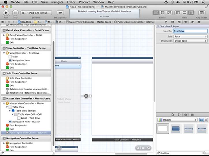
Figure 5-16: Make the destination a Detail view and add an identifier.
You’ll also notice that a Disclosure Indicator (the chevron — a right-arrowhead-like shape on the right side of the Test Drive cell) has also been added. For now we’ll leave it there, but in Chapter 13, I explain how to remove or change it if you’d like.
When you select the Detail cell and create the Push segue with the Detail view as the destination, the new Test Drive controller becomes embedded in the Detail view’s Navigation controller. This Navigation controller manages the view controller stack for everything in the Detail view of the Split view controller.
Danger Will Robinson
If you were to build and run RoadTrip for iPad at this point, the app would crash because Apple’s Master-Detail template has added code for dynamic table cells that can’t be used for our static table cell. You will soon delete that unwanted code, so the app will work properly by the end of this chapter.
Once the unwanted code is deleted, there are two ways to test the app for iPad.
First, you could choose Landscape orientation, and select Test Drive, which would allow a new view controller’s view to slide into place, Back button and all. If you then selected the Back button, the old Detail view would slide back into place.
However, in Portrait orientation, if you selected the Master button and then selected Detail, you’d see the new controller with a Back button as well. The Master button, however, will only appear again after you have selected Back and returned to the Detail View controller (the Root View controller). You’ll find out how to fix that annoying bit of business in Chapter 13.
Before you go any further, take a look at the View Controller – Test Drive in the Attributes inspector, which I have selected in the Inspector selector bar in the Utility area in Figure 5-17. As you can see, the controller has properties that you can set using Interface Builder (including a title and identifier which I explain next).
The Attributes inspector is the place where you’ll set properties of the view controllers, controls, and other view objects you add to the view.
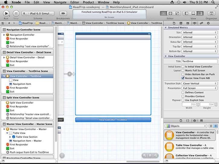
Figure 5-17: Adding a title and identifier.
Adding an identifier to the view controller
If you take another look at Figure 5-17, you can see that I’ve set Interface Builder’s zoom to full size, clicked on the view controller I just created, selected the Attributes inspector in the Inspector selector bar, and then entered TestDrive in the Title field in the View Controller section. I then selected the Identity Inspector tab, and set the Storyboard ID to TestDriveID. The Title string is used in the Outline view, while the Storyboard ID string is used from code in the app.
I did all that for one simple reason: If you want to do anything special with a view controller in a storyboard, you need to be able to find it, and the easiest way to keep tabs on a view controller is by giving it a name using the identifier. While you may not need an identifier for every view controller, it’s a good idea to get in the habit of adding it just in case you do. As for the name you enter in the Title field, it enables you to distinguish which view controller is which in the storyboard. You’ll notice that in the Document Outline, the selected view controller is now named View Controller – TestDrive and the scene now is named View Controller – TestDrive Scene.
Whatever you type in a field isn’t really added until you press Return or click in another field.
Adding the User Interface Objects
At this point, I could continue building out my storyboard by adding more elements such as views and segues, just like I did in the previous section. But by now I’m itching to really do something, which would require me getting some actual objects into the storyboard. When an itch comes, I scratch, so get ready to start editing and adding some objects.
To edit an object in the TestDrive view in the storyboard, select MainStoryboard_iPad.storyboard in the Project editor to open Interface Builder. Expand the View Controller – TestDrive in the View Controller – TestDrive Scene in the Document Outline. Select the View, and then select the Attributes inspector in the Inspector selector.
The Attributes inspector enables you to set various object properties. For example, to change the color of the view’s background, you’d choose the background color from the Background pop-up menu.
If you select Default from the pop-up menu or just click in the current color displayed in the Background field, you see the Colors palette (shown on the right side in Figure 5-18).
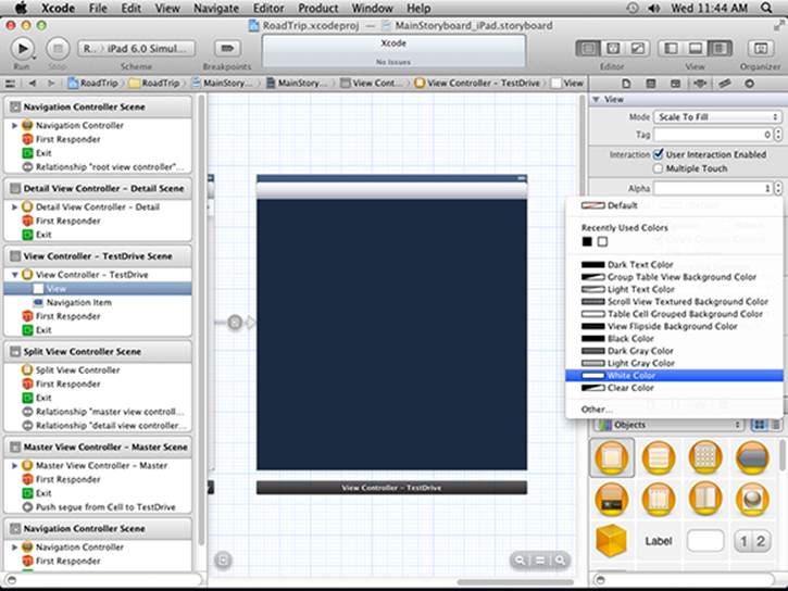
Figure 5-18: Pick a color, any color.
The toolbar at the top of the Colors palette gives you a number of options for selecting a color. These are the standard options available for choosing a color on the Mac, and I’ll leave you to explore them on your own.
Changing the background color for a view is kind of neat, but the real fun comes from your ability to add your own view object as a background image. That’s what you’re going to do next. (Feel the excitement!)
View Layout
Before you start to add another view — which will be a subview of the view that’s already there — it’s necessary to talk about view layout options. View layout is particularly important on mobile devices because the pesky user might rotate her device. So why is that an issue? Let’s take the specific case of the original iPad. When held in Portrait orientation, the screen is 768 pixels wide by 1024 pixels tall. But when rotated to Landscape position, the screen becomes 1024 pixels wide, but only 768 pixels tall.
If your app handles rotation properly, then components such as buttons, text fields, images, and so on usually need to move and resize. In other words, you need a layout strategy, so that subviews are moved and resized correctly when their containing superview is resized.
Here are three strategies for view layout:
Hard-coded layout. Here, you set the location, width, and height of each view yourself, and change those properties when the device is rotated. This is a really bad idea for most apps. It’s difficult, error-prone, and inflexible.
Use iOS Autosizing. Autosizing has existed since early versions of the iOS SDK and provides a mechanism for automatically moving and resizing a view in response to changes in its superview’s position or size. You can set the default Autosizing behavior for your views from the Size pane of the inspector. The Size inspector contains an Autosizing section with springs and struts, which is described later in the chapter. The great advantage to using Autosizing is that it works on older devices running iOS 4.3, iOS 5, and iOS 6, so it is the technique I use in this book for the RoadTrip sample. Apps released before iOS 6 generally used Autosizing.
Use iOS 6 Auto Layout. You use the Auto Layout system to define layout constraints for user interface elements. Constraints represent relationships between user interface elements. Auto layout improves upon Autosizing’s “springs and struts” model in some ways, but is only available in iOS 6. I did not use Auto Layout in the Road Trip sample because of this limitation, but I do show you how to use Auto Layout at the end of this chapter.
Turn off Auto Layout
For now, follow these steps to turn off Auto Layout and use Autosizing:
Turn off Auto Layout by selecting the iPad storyboard file in the project Navigator.
Show the File inspector pane in the Utilities view.
Uncheck the Use Auto Layout checkbox.
Repeat these steps for the iPhone storyboard file.
Back to Adding User Interface Objects
Any view object you end up using has properties such as color (sometimes), a background image, or the ability to interact with the user — respond to touches, in other words. You generally set these properties using either the Attributes inspector in Interface Builder or programmatically.
To see those properties, you need to zoom to full size or select it in the Document Outline (which zooms it to full size). Full size is the only time view objects are editable.
To add a background image, follow these steps:
1. Scroll down in the Library window and drag an Image view (the one selected in the Library in Figure 5-19) from the Library onto the view.
An Image view is a view that’s used to display an image. (See Chapter 4 for more on views.)
If you click an object in the Library, up pops a dialog telling you what it is. The dialog even tells you what class it is, as you can see in Figure 5-19. Click Done to dismiss it.
What you just did is add an Image view as a subview of the RoadTrip controller’s view, the one created for you by the template.
Except for the view controllers up top and a few gesture recognizers scattered around the middle of the gallery, most of the “objects” you see in the Library are derived from the View class.
You can add horizontal and vertical guides to help you line things up by choosing Editor⇒Add Horizontal Guide or Editor⇒Add Vertical Guide, respectively.
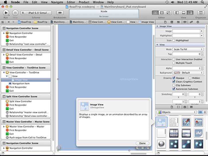
Figure 5-19: Adding an Image view.
2. Select the Image view you just added, either in the Document Outline or on the Canvas.
Doing so changes what you see in the Attributes inspector. It now displays the attributes for the Image view.
3. Using the Attributes inspector’s Image drop-down menu, scroll down to select SeeTheUSA_iPad, as shown in Figure 5-20.
Doing so adds the image you want to use to the Image view, as shown in Figure 5-21. (You added this image in Chapter 3 — it was in the RoadTrip Resources file you downloaded and added to your RoadTrip project.)
The preferred format for the image is .png. Although most common image formats display correctly, Xcode automatically optimizes .png images at build time to make them the fastest and most efficient image type for use in iPad applications.
4. Drag in another Image view and place it at the bottom-center of the Image view you just added, as shown in Figure 5-22.
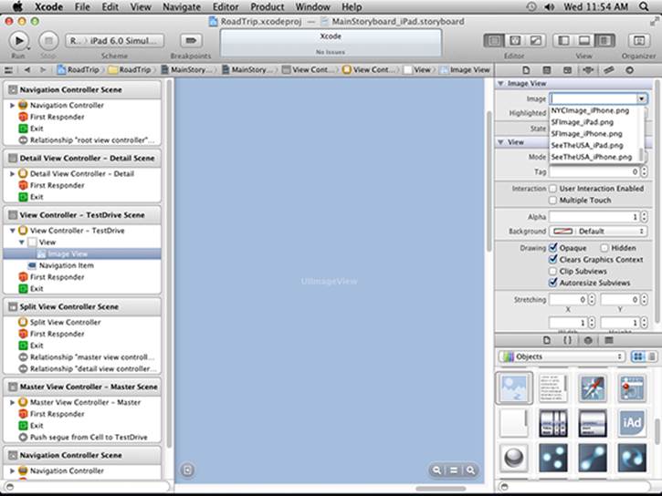
Figure 5-20: Selecting a background image.
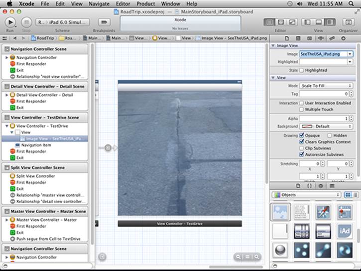
Figure 5-21: The image selected and in place.
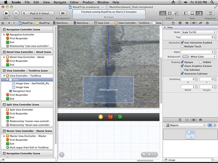
Figure 5-22: Adding another image view.
5. Return to the Attributes inspector’s Image drop-down menu, but this time select CarImage.png.
The image you selected is added to the Image view.
6. Select the Image view you just added and choose Editor⇒Size to Fit Content from the main menu.
The Image view is resized so that it better fits the enclosed content. (See Figure 5-23.) If you look closely, you’ll recognize the vintage pink 1959 Cadillac Eldorado Biarritz convertible my evil twin Skippy plans to drive cross country to New York; the thought of driving it, much less parking it in New York, staggers the imagination.
7. With the car Image view still selected, choose Editor⇒Add Horizontal Guide and Editor⇒Add Vertical Guide.
I’ll take any help I can get when it comes to positioning objects, and these guides can help me keep track of a particular location on the larger scene.
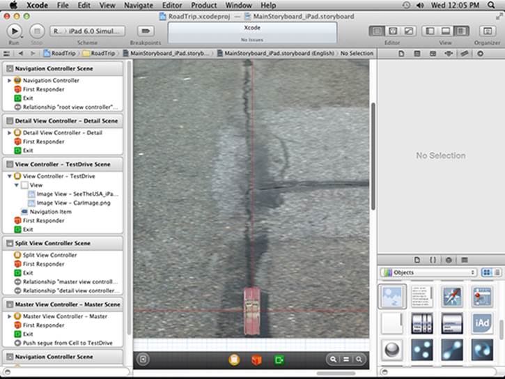
Figure 5-23: The family car — Skippy’s pride and joy.
In Chapter 10, I show you how to animate Skippy’s Eldorado Biarritz so it leisurely drives to the top of the screen, turns around, drives back, and then turns around one more time so that it’s back where it started.
Autosizing
Because you’re sure to decide — as all good app developers have decided and will continue to decide in perpetuity — that the RoadTrip app needs to function well in both Portrait and Landscape orientations, you’ll need to make sure that, when you rotate the view, the car (subview) remains positioned at the bottom of the screen.
Luckily for you, most of that work gets done for you in UIViewController — the class from which we’ve derived TestDriveController. (The technical term for this bit of work is autosizing.) The only thing you have to do is tell the view controller exactly how you want it to move things around when the view changes orientation. You can make such wishes known in the storyboard using the Size inspector.
Figure 5-24 shows what happens when you select the Image view you want to work with and then select the Size inspector. Based on the way the CarImage view is currently configured, it’s set to maintain its distance from the top and left of the SeeTheUSA view. How do I know that? Because that’s what the Autosizing pane tells me.
Take another look at Figure 5-24. The Autosizing pane in the Size inspector has in its outer square a set of four indicators called struts — a line with two perpendicular lines at each end. These struts surround an inner square that contains two indicators referred to as springs (a line with an arrow head at each end). These struts and springs are set and unset with a click; when they’re enabled, they’re solid and bright red, and when disabled, dim and dashed.
You decide which struts to enable. If you do select one, that indicates to the Autosizing mechanism that you want to maintain a fixed distance on that particular side between the edge of this view (the CarImage view) and the edge of the enclosing superview (SeeTheUSA). In Figure 5-24, it’s set up so that the CarImage will maintain a fixed distance to the top and left of the SeeTheUSA Image view (its superview).

Figure 5-24: The current resizer setting.
The springs work similar to the struts, but are designed to indicate to the Autosizing mechanism how to resize the view when it rotates. (You won’t need to use springs here, but you will use them in Chapter 16, which is why I’m giving you the heads-up now.)
With the Autosizing settings the way they’re set up in Figure 5-24, if you built and compiled the app, started it up in Landscape orientation, and then rotated the view, you’d get what you see in Figure 5-25 — a car image no longer correctly lined up at the starting gate, as it were.
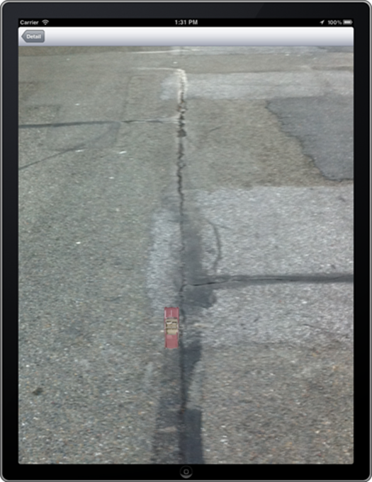
Figure 5-25: But I want to start at the start and be in the middle!
For some technical reasons, when you have the Test Drive view displayed, you won’t be able to rotate the Simulator to Portrait orientation when upside down and have the Test Drive view rotate. In addition, when you have the Test Drive view displayed, you won’t be able to rotate the Simulator back to Portrait orientation and have the Master view and the Test Drive view rotate — you’ll have to select the Detail button and return to the Detail view to have the views rotate correctly.
If you want to have the car maintain the same distance from the bottom and stay nicely centered in the view no matter which orientation you choose, you need to toggle off the top and left struts in the Autosizing pane to disable them, as shown in Figure 5-26.
Now, when you build and run your app and then rotate the view from landscape to portrait, you’ll see the car maintain the position you want. (See Figure 5-27.)
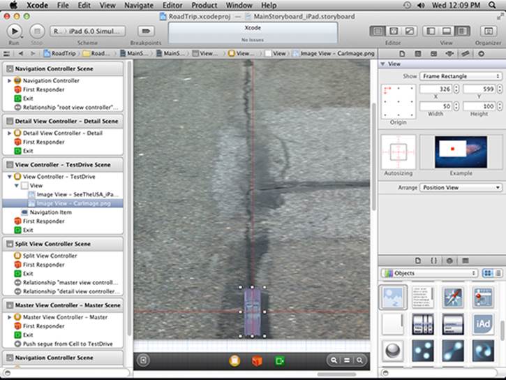
Figure 5-26: Maintaining the distance from the bottom.
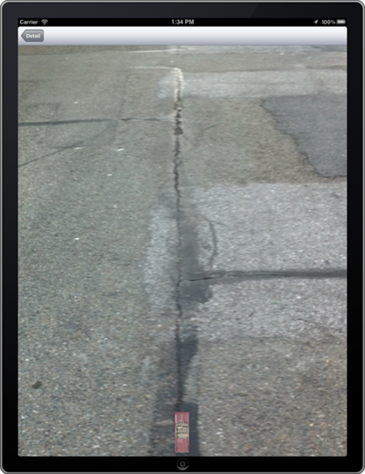
Figure 5-27: Starting at the beginning.
Adding the Test Drive button
I say the more objects, the merrier. I want to add a nice Test Drive button which, when clicked, will send our 1959 Cadillac Eldorado Biarritz convertible on its merry way. Here’s how it’s done:
1. Select the Round Rect button in the Library and drag it onto the view.
2. Click the Attributes Inspector button on the Inspector selector bar.
 The button attributes you’re going to set using the Attributes inspector are all Objective-C properties. Note that you can also set these properties programmatically; I show you how to do that in Chapter 8.
As you can see in Figure 5-28, the Type pop-up menu in the Attributes inspector is set to Rounded Rect — no surprise there. The button is shown in its default State configuration — in this case, unselected and unhighlighted. If you were to click the State Config pop-up menu and choose another configuration, such as Highlighted or Selected, you’d be able to change the font, text color, shadow, background, and other attributes in the Attributes inspector for the selected state.
This particular Rounded Rect button, being distinctly generic, is remarkably unexciting. To liven things up just a tad, I’m going to have you replace the Rounded Rect button with an image I created. (You’ll find that image in the RoadTrip Resources folder that you should have downloaded and added to your project in Chapter 3.)
3. In the Attributes inspector, choose Custom from the Type pop-up menu, as shown in Figure 5-29.
Admittedly, you could just add an image to the Rounded Rect button, but doing so would simply place the image within the generic button, which strikes me as small beer. In this case, I say go for broke and replace the generic button altogether.
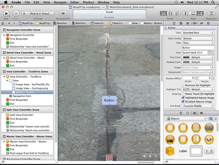
Figure 5-28: Adding a button.
Choosing Custom from the menu causes the image of the button to disappear from the view. Just keep it selected so you can still manipulate the button itself. (It still is selectable, if you can find it.) If you happen to lose track of your (now invisible) button, just select the Button entry under the View subheading in the Document Outline and you’ll see the button’s resize handles.
4. Choose Button.png from the Background drop-down menu, as shown in Figure 5-30.
So why are you using the Background drop-down menu rather than the Image drop-down menu to place an image as your button? When you choose an image from the Background drop-down menu, you’re simply doing that — setting the image for the button. You’ll still add the title and so on using the Attributes inspector. If you were to choose from the Image drop-down menu, you would have included the title as part of the image and you wouldn’t have been able to add it in the Inspector.
5. Using the button’s resize handles, resize the button to 96 points by 37 points.
You can also select the Size inspector, as I have in Figure 5-31, and enter the width and height in the fields provided.
You’ll have to recenter the button after you resize it in the Size inspector.
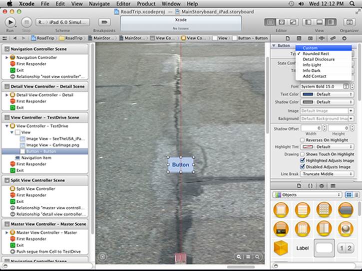
Figure 5-29: Creating a custom button.
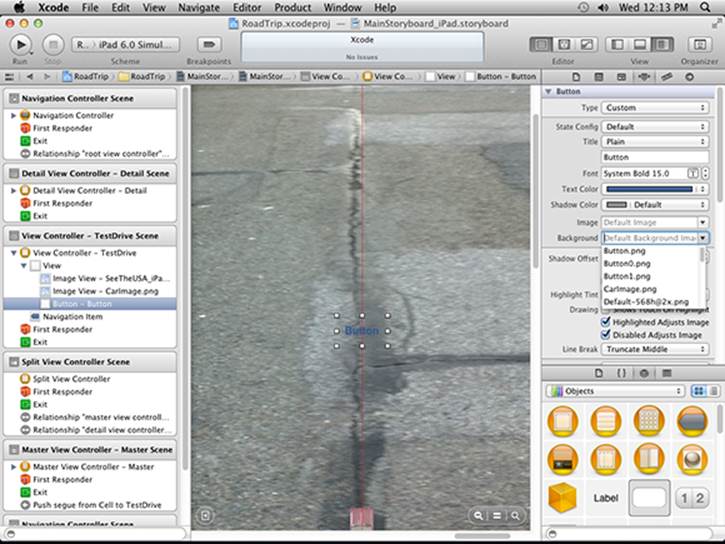
Figure 5-30: Choose a custom image for the button.
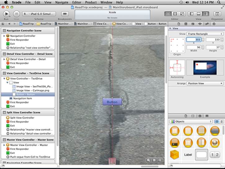
Figure 5-31: Using the Size inspector.
6. Give this button a title (buttons don’t have text; they have titles) by going back to the Attributes inspector, entering Test Drive in the Title field, and pressing Return.
You could double-click the button and enter the Title there and press Return as well. In my experience, though, doing so may cause the button to resize itself.
You could select a different Background image and title for each button state by cycling through the State Config choices and repeating Steps 2 through 5. I’ll leave that for you to explore on your own.
Whenever you enter text, be sure to press Return. Anything you enter won’t change the current setting unless you press Return or click in another field.
Massaging the Template Code
If you have been playing around with the code generated for you by the Master-Detail Application template, you’ve probably discovered that not only can you select the + (plus sign) button to create a timestamp displayed both in the Master and Detail views, but you can also select the Edit button and delete the timestamp entry in the Master (and consequently) Detail views.
All this functionality is built into the template courtesy of the UITableViewController. I explain how Table views work in Chapter 20, but because you are using a segue and static cells in the Master view, you won’t need that functionality in the Master view. But not only don’t you need it, it also actually interferes with the functioning of the segue, which you’ll also understand when I explain Table view (and its UITableViewDelegate and UITableViewDataSource protocols) in detail in Chapter 20.
To deal with this issue, I want you to delete the code in Listing 5-1. Here we’re talking about the code in RTMasterViewController starting with the #pragma mark - Table View statement and up to — but not including — the @end statement. This is the code that implements the Table View functionality, and also another method, prepareForSegue, that lets you pass data to the view controller you are transitioning to — unused here, but explained in detail in Chapter 13.
Listing 5-1: Delete This Code from RTMasterViewController.m
#pragma mark - Table View
- (NSInteger)numberOfSectionsInTableView:(UITableView *)tableView
{
return 1;
}
- (NSInteger)tableView:(UITableView *)tableView numberOfRowsInSection:(NSInteger)section
{
return _objects.count;
}
- (UITableViewCell *)tableView:(UITableView *)tableView cellForRowAtIndexPath:(NSIndexPath *)indexPath
{
UITableViewCell *cell = [tableView dequeueReusableCellWithIdentifier:@”Cell”];
NSDate *object = [_objects objectAtIndex:indexPath.row];
cell.textLabel.text = [object description];
return cell;
}
- (BOOL)tableView:(UITableView *)tableView canEditRowAtIndexPath:(NSIndexPath *)indexPath
{
// Return NO if you do not want the specified item to be editable.
return YES;
}
- (void)tableView:(UITableView *)tableView commitEditingStyle:(UITableViewCellEditingStyle)editingStyle forRowAtIndexPath:(NSIndexPath *)indexPath
{
if (editingStyle == UITableViewCellEditingStyleDelete) {
[_objects removeObjectAtIndex:indexPath.row];
[tableView deleteRowsAtIndexPaths:[NSArray arrayWithObject:indexPath] withRowAnimation:UITableViewRowAnimationFade];
} else if (editingStyle == UITableViewCellEditingStyleInsert) {
// Create a new instance of the appropriate class, insert it into the array, and add a new row to the table view.
}
}
/*
// Override to support rearranging the table view.
- (void)tableView:(UITableView *)tableView moveRowAtIndexPath:(NSIndexPath *)fromIndexPath toIndexPath:(NSIndexPath *)toIndexPath
{
}
*/
/*
// Override to support conditional rearranging of the table view.
- (BOOL)tableView:(UITableView *)tableView canMoveRowAtIndexPath:(NSIndexPath *)indexPath
{
// Return NO if you do not want the item to be re-orderable.
return YES;
}
*/
- (void)tableView:(UITableView *)tableView didSelectRowAtIndexPath:(NSIndexPath *)indexPath
{
if ([[UIDevice currentDevice] userInterfaceIdiom] == UIUserInterfaceIdiomPad) {
NSDate *object = [_objects objectAtIndex:indexPath.row];
self.detailViewController.detailItem = object;
}
}
- (void)prepareForSegue:(UIStoryboardSegue *)segue sender:(id)sender
{
if ([[segue identifier] isEqualToString:@”showDetail”]) {
NSIndexPath *indexPath = [self.tableView indexPathForSelectedRow];
NSDate *object = [_objects objectAtIndex:indexPath.row];
[[segue destinationViewController] setDetailItem:object];
}
}
You’ll also need to delete some code in the viewDidLoad method. This code adds the edit and + (plus) buttons to the Navigation bar. Delete the code in Listing 5-2 that I’ve commented out in bold, underline, and italic in viewDidLoad in RTMasterViewController.m.
Listing 5-2: Delete the Code in viewDidLoad
- (void)viewDidLoad
{
[super viewDidLoad];
// Do any additional setup after loading the view, typically from a nib.
//self.navigationItem.leftBarButtonItem =
self.editButtonItem;
//UIBarButtonItem *addButton = [[UIBarButtonItem alloc]
initWithBarButtonSystemItem:UIBarButtonSystemItemAdd
target:self action:@selector(insertNewObject:)];
//self.navigationItem.rightBarButtonItem = addButton;
//self.detailViewController = (RTDetailViewController *)
[[self.splitViewController.viewControllers lastObject]
topViewController];
}
Finally, in Listing 5-3, delete the insertNewObject: method in RTMasterViewController.m (the action method specified in the + button created in viewDidLoad, which was the selector used).
Listing 5-3: Delete insertNewObject:
- (void)insertNewObject:(id)sender
{
if (!_objects) {
_objects = [[NSMutableArray alloc] init];
}
[_objects insertObject:[NSDate date] atIndex:0];
NSIndexPath *indexPath =
[NSIndexPath indexPathForRow:0 inSection:0];
[self.tableView insertRowsAtIndexPaths:
[NSArray arrayWithObject:indexPath]
withRowAnimation:UITableViewRowAnimationAutomatic];
}
Autosizing the Button
Just as with the car image, you’ll have to specify how you want the button to act when the view rotates.
If you were to select the button and call up the Size inspector right now, you’d see that the button, like the car image before it, is set to keep a fixed left and top margin. (Refer back to Figure 5-31.)
To have the button reposition itself so it stays in the center of the view no matter which orientation is displayed, deselect the top and right struts, as shown in Figure 5-32.
If you compile and run now, and in Landscape orientation, select Test Drive in the Master view, you’ll end up with what you see Figure 5-33.
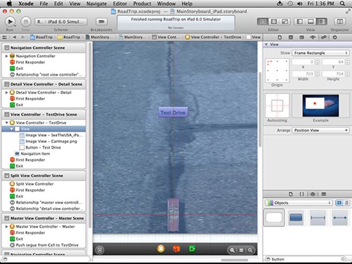
Figure 5-32: Keep it centered.
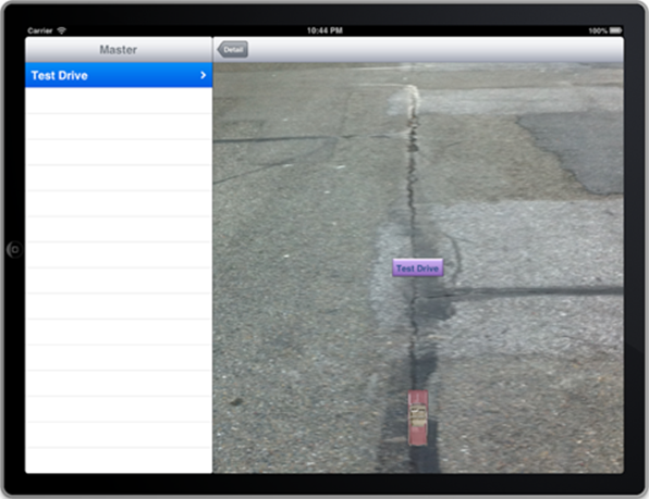
Figure 5-33: Select the Test Drive cell.
Choose Hardware⇒Rotate Left (or whatever direction moves it to Portrait orientation, right side up) in the Simulator menu and you’ll see Figure 5-34, where the button maintains its position at the center of the view.
If you select the Detail button, it will take you back to the originating Detail View controller, which you will then be able to rotate back to Landscape orientation.
After you’ve added an object to your storyboard, you can check the results of your efforts at any time to see how things look. To do so, click Run on the Xcode toolbar and make sure you have the iPad Simulator scheme selected.
Occasionally you might make a change to your app (usually having to do with a resource) and then, when you run your app, nothing seems to have changed. When you click Run, Xcode does only what it needs to do to the parts of your app that have changed, and if it gets “confused” (yes, there are bugs in Xcode), your change won’t be linked into the app. If you think that has happened, choose Product⇒Clean, and Xcode will recompile all the pieces of your app.
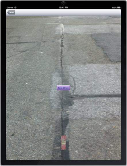
Figure 5-34: The view in Portrait orientation.
Creating the iPhone User Interface
All the code that you write in Chapters 1 through 5 for the iPad will work fine for the iPhone. That will also be true for later chapters in this book.
All you need to do is add the following items to your iPhone storyboard file, in a very similar manner to what you just did for the iPad storyboard:
Drag a UIViewController into the iPhone storyboard. Change its class name to TestDriveController and its Storyboard ID to TestDrive.
Add a UIImageView, using the SeeTheUSA_iPhone.png image.
Add a UIImageView, using the CarImage.png image.
Add a Test Drive button.
Select the Master View Controller scene in the iPhone storyboard.
Select the Table view in the Master View Controller.
Use the Attributes inspector to change the Master view from Dynamic Prototypes to Static Cells.
Select the Label in the first Table View cell, and change its text to Test Drive.
Control-drag from the Table View cell to the TestDriveController; choose a Push segue from the pop-up menu.
Select the unused Table View cells from the Table view and delete them.
Now the iPhone app should work in a similar manner to the iPad app.
A Quick Auto Layout Example.
Follow these steps to try iOS6 Auto Layout:
1. Create a new project from Xcode’s File menu.
2. Choose an iOS Single View Application template.
3. Make the following changes:
a. In the Product Name text field, enter AutoLayout.
b. In the Devices pop-up menu, enter iPhone.
c. Check the Use Storyboards checkbox.
d. Check the Use Automatic Reference Counting checkbox.
e. Make sure the Include Unit Tests checkbox is unchecked.
4. Save the project.
5. Select the Storyboard file in the Project Navigator.
6. Choose a Round Rect Button in the Object library.
7. Drag a button into the View Controller in the Storyboard.
8. Open the view controller outline in the Storyboard, and select the button you just dropped into the scene.
9. With Button selected, click the icon for adding a constraint, as shown in Figure 5-35.
10. Choose Horizontal Center in Container from the pop-up menu, as shown in Figure 5-36.
11. Click the same icon you chose in Step 9, and choose Vertical Center in Container from the pop-up menu.
Now the button has two constraints, so it will always be centered in its enclosing view both horizontally and vertically. Figure 5-37 shows the resulting View Controller Scene with both constraints on the button.
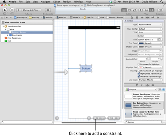
Figure 5-35: Preparing to add a constraint.
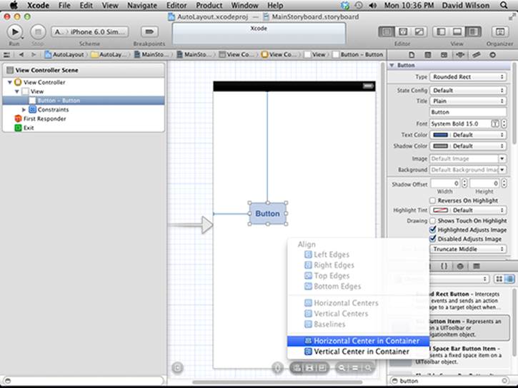
Figure 5-36: Adding a Horizontal constraint.
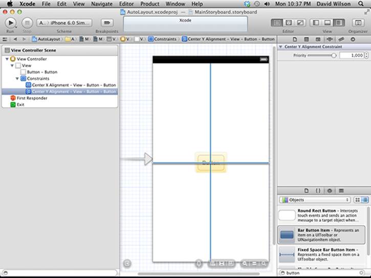
Figure 5-37: The button with two constraints.
12. Add a label near the top, and add a constraint to center it horizontally, with the result shown in Figure 5-38.
The resulting rotation behavior is shown in Figure 5-39.
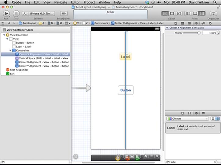
Figure 5-38: A label and a button with their constraints.
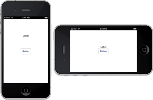
Figure 5-39: Auto Layout in action
Final thoughts
As you can see, Auto Layout can also be easy to use. Just remember that it only works on iOS 6 or later, so you can’t use it for apps intended for older devices, or ones that have not been updated to iOS 6.
Later chapters in this book will stick with trusty Autosizing, rather than using new-fangled Auto Layout.