The Core iOS Developer’s Cookbook, Fifth Edition (2014)
Chapter 10. Collection Views
Introduced in iOS 6, collection views present organized grids that lay out cells. These collections go well beyond standard table views and their vertically scrolling lists of cells. Collection views use many of the same concepts as tables but provide more power and more flexibility. With collection views, you create side-scrolling lists, grids, one-of-a-kind layouts like circles, and more. Plus, this class offers integrated visual effects through layout specifications and lots of great features like snapping into place after scrolling.
As with tables, you can add an enormous range of implementation details to collection views. This chapter introduces you to the basics: to the collection view, its client sources, its special-purpose controller, and its cells. You’ll read about how to develop standard and customized collections, how to start adding special effects to your presentations, and how to take advantage of the built-in animation support to create the most effective interaction possible.
Keep in mind that collection views are more powerful than any single chapter can properly cover. This chapter offers fundamental collection view concepts. From here, how you hone your collection view knowledge and experience is up to you.
Collection Views Versus Tables
UICollectionView instances present an ordered collection of data items. Like table views, collections are made up of cells, headers, and footers powered by data sources and delegates. Unlike tables, collections introduce a layout—a class that specifies how items are placed onscreen. Layouts organize the location of each cell, so items appear exactly where needed.
Table 10-1 compares these two layout families. As you see, each family offers a core view class and a prebuilt controller class. These classes rely on a data source that feeds cells on demand and provides other content information. They use a delegate to respond to user interactions.
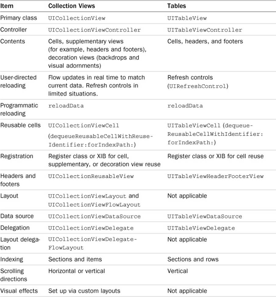
Table 10-1 Collection Views Versus Tables
There are also several fundamental differences, starting with the humble index path. Both classes are organized by section as their primary grouping, and each section contains indexed individual cells. Because collection views can scroll either direction, vertical or horizontal, terminology has changed. Table views use sections and rows; collection views use sections and items. The NSIndexPath class was updated in iOS 6 as well to reflect this scheme.
Collection views introduce a new kind of content called “decoration” views, which provide visual enhancements like backdrops. This class understands that cells and scrolling are just the starting point. You can customize the entire look to create coherent presentations using any metaphor you can imagine. Collection views also rethink headers and footers, transforming them into supplementary views with a little more API flexibility than those found in tables.
Practical Implementation Differences
Expect a few practical differences between building table views and collection views. Collection views are less tolerant of lazy data loading. As a rule, when you create a collection view, make sure the data source that powers that view is fully prepared to go—even if it’s prepared with a minimal or empty set of cells as you load data elsewhere in your application.
You cannot wait until your initialization or loadView or viewDidLoad methods to prepare content. Get content ready and going first, whether in your application delegate or before you instantiate and add your collection view or push a new child collection view controller. If your data is not ready to go, your app will crash; this is not the user experience you should be aiming toward.
Make sure you fully establish your collection view’s layout object before presenting the collection. As you’ll see in recipes in this chapter, you set up all layout details, including the scroll direction and any properties that don’t rely on delegate callbacks. Only then do you create and initialize your collection view, as shown here:
MyCollectionController *mcc = [[MyCollectionController alloc]
initWithCollectionViewLayout:layout];
Passing a nil layout produces an exception.
You are not limited to a single layout for the life of the collection view. The collectionViewLayout property provides direct access to the layout of the collection. Setting this property updates the layout immediately, without animation. iOS 7 provides a simple method to animate the transition between multiple layouts:
- (void)setCollectionViewLayout:(UICollectionViewLayout *)layout
animated:(BOOL)animated completion:(void (^)(BOOL finished))completion
With iOS 7, Apple also introduced a mechanism for creating complex, interactive transitions. Although beyond the scope of this book, more information is available in the UICollectionView Class Reference available at Apple’s iOS Developer Center or in Xcode’s iOS 7 docset.
Establishing Collection Views
As with tables, collections come in two flavors: views and prebuilt controllers. You either build an individual collection view instance and add it to a presentation or use a UICollectionViewController object that conveniently offers a view controller prepopulated with a collection view. The controller automatically sets the view’s data source delegate to itself and declares both protocols. Embed the collection view controller as a child of any container (such as a navigation controller, tab bar controller, split view controller, page view controller, and so on) or present it on its own.
Note
Like table views, collection views have delegate and dataSource properties. The UICollectionViewFlowLayout class expects the collection view’s delegate to also adopt the UICollectionViewDelegateFlowLayout protocol. Your collection view controller can implement the appropriate methods of all three protocols.
Controllers
To build a controller, first create and set up a layout object and then allocate the new instance and initialize it with the prepared layout:
UICollectionViewFlowLayout *layout =
[[UICollectionViewFlowLayout alloc] init];
layout.scrollDirection = UICollectionViewScrollDirectionHorizontal;
MyCollectionController *mcc = [[MyCollectionController alloc]
initWithCollectionViewLayout:layout];
This snippet uses a collection view flow layout in its default form, only setting the scroll direction. As you’ll see through this chapter, you can do a lot more with layouts. Typically, you set additional properties or subclass system-supplied layouts and add your own behavior.
As a rule, you use the UICollectionViewFlowLayout class. It’s the layout workhorse for collection views. Use it to build any basic presentation. In its default form, each section automatically wraps items to fit the screen, and you can specify how much space appears between sections, between lines, between items, and so forth. It’s insanely customizable, as you’ll see in the next section, which details many tweaks you can apply to flow layouts.
The parent class UICollectionViewLayout offers an abstract base class for subclassing (which you mostly avoid; nearly every time, you’ll want to subclass the flow layout version instead) and isn’t meant for direct use.
Note
When looking at subclassing layouts, refer to UICollectionViewLayout. The parent of the UICollectionViewFlowLayout class, its documentation provides the canonical list of customizable methods.
Views
To create a collection view for embedding into another view (without using a UICollectionViewController), establish a layout, create the collection view using the layout, and set the data source and delegate. The flow layout delegate utilizes the object you set as the collection view’s delegate property:
UICollectionViewFlowLayout *layout =
[[UICollectionViewFlowLayout alloc] init];
layout.scrollDirection = UICollectionViewScrollDirectionHorizontal;
collectionView = [[UICollectionView alloc] initWithFrame:CGRectZero
collectionViewLayout:layout];
collectionView.dataSource = self;
collectionView.delegate = self;
Data Sources and Delegates
View controllers coordinating collection views declare UICollectionViewDataSource and UICollectionViewDelegate. Unlike with table views, when using a flow layout, a third protocol is also declared, UICollectionViewDelegateFlowLayout.
The delegate flow layout protocol coordinates layout information with your collection’s layout instance through a series of callbacks. Your collection view’s delegate adopts this protocol—that is, you do not have to specify a third collection view property like delegateFlowLayout.
As with table views, the data source provides section and item information and returns cells and other collection view items on demand. The delegate handles user interactions and provides meaningful responses to user changes. The flow layout delegate introduces section-by-section layout details and is, for the most part, completely optional. You’ll read about flow layouts and their delegate callbacks in the next section.
Flow Layouts
Flow layouts provided by the UICollectionViewFlowLayout class create organized grid presentations in an application. They provide built-in properties that you edit directly or establish via delegate callbacks. These properties specify how the flow sets itself up to place items onscreen. In its most basic form, the layout properties provide you with a geometric vocabulary, where you talk about row spacing, indentation, and item-to-item margins.
Scroll Direction
The scrollDirection property controls whether sections are lined up horizontally (UICollectionViewScrollDirectionHorizontal) or vertically (UICollectionViewScroll-DirectionVertical). Figure 10-1 demonstrates otherwise identical layouts with horizontal (left) and vertical (right) flows. The members of each grouped section wrap to available space, based on the current flow. Because there is more vertical space than horizontal space in the iPhone portrait presentation, section groups are longer and thinner in the horizontal flow than in the vertical flow.
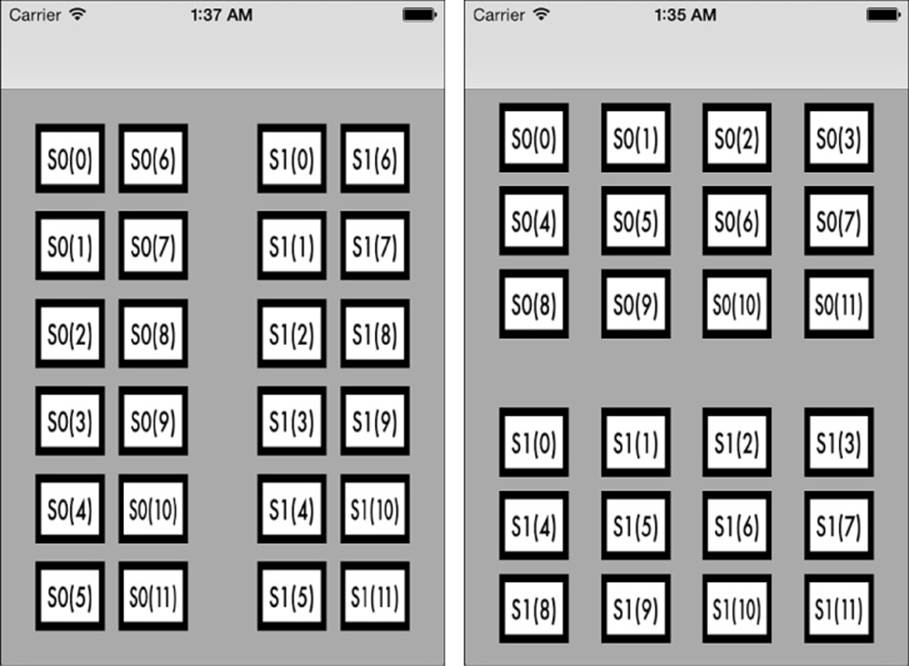
Figure 10-1 Horizontal (left) and vertical (right) flows determine a collection view’s overall scrolling direction. The left image scrolls left–right. The right image scrolls up–down. For each example, a flow layout automatically handles wrapping duties at the end of each line. There are 6 items per line in the left image and 4 per line on the right. Each section includes 12 items.
Item Size and Line Spacing
Use the itemSize property to specify the default size for each onscreen item, like the small squares in Figure 10-1. The minimumLineSpacing and minimumInteritemSpacing properties specify how much space you need wrapped between objects within each section. Line spacing always goes between each line in the direction of flow. For example, line spacing refers to the space between S0(0) and S0(6) in Figure 10-1 (left) or between S0(0) and S0(4) in Figure 10-1 (right). Item spacing is orthogonal (at right angles) to lines, specifying the gap to leave between each consecutive item, such as between S0(0) and S0(1) and between S0(1) and S0(2).
Figure 10-2 shows these properties in action, in this case using a vertical flow. The left figure shows consistent spacing of 10 points. The middle figure expands line spacing to 50 points. This space appears between lines of items, where the flow wraps from one line to the next. The right figure expands item spacing to 30 points. Item spaces appear along each row, adding spacers between each object.
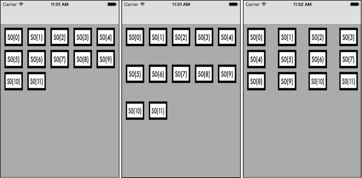
Figure 10-2 Minimum line and inter-item spacing control how items are wrapped within each section. Item sizes specify the dimensions for each cell. The left image uses default spacing. The center image increases line spacing to 50 points. The right image increases inter-item spacing to 30 points.
As with many new layout items introduced in iOS 6 and later, these settings are requests. Specifically, the spacing may exceed whatever value you specify, but the layout tries to respect the minimums you assign.
You can set the mentioned layout properties directly to assign default values applied across an entire collection. You can also use flow layout delegate callback methods to specify values from code. Setting these values at runtime offers far more nuance than the default settings, as they are applied on a section-by-section and item-by-item basis rather than globally. The following methods handle item size and minimum spacing:
 collectionView:layout:sizeForItemAtIndexPath:—Corresponds to the itemSize property, on an item-by-item basis.
collectionView:layout:minimumLineSpacingForSectionAtIndex:—Corresponds to the minimumLineSpacing property but controls it on a section-by-section basis.
collectionView:layout:minimumInteritemSpacingForSectionAtIndex:—Corresponds to the minimumInteritemSpacing property, again on a section-by-section basis.
Of these, the first method for item sizes offers the adaptation most typically used in iOS development. It enables you to build collections whose items, unlike those shown in Figure 10-2, vary in dimension. Figure 10-4, which follows later in this chapter, shows a flow layout that adjusts itself to multisized contents.
Header and Footer Sizing
The headerReferenceSize and footerReferenceSize properties define how wide or how high header and footer items should be. Notice the difference between the extents for these items in Figure 10-3 in the top two and bottom two screen shots. The horizontal flow at the top uses 60-point-wide spacing for these two items. The vertical flow at the bottom uses 30-point-high spacing. Although you supply a full CGSize to these properties, the layout uses only one field at any time, based on the flow direction. For horizontal flow, it’s the width field; for vertical flow, it’s the height.
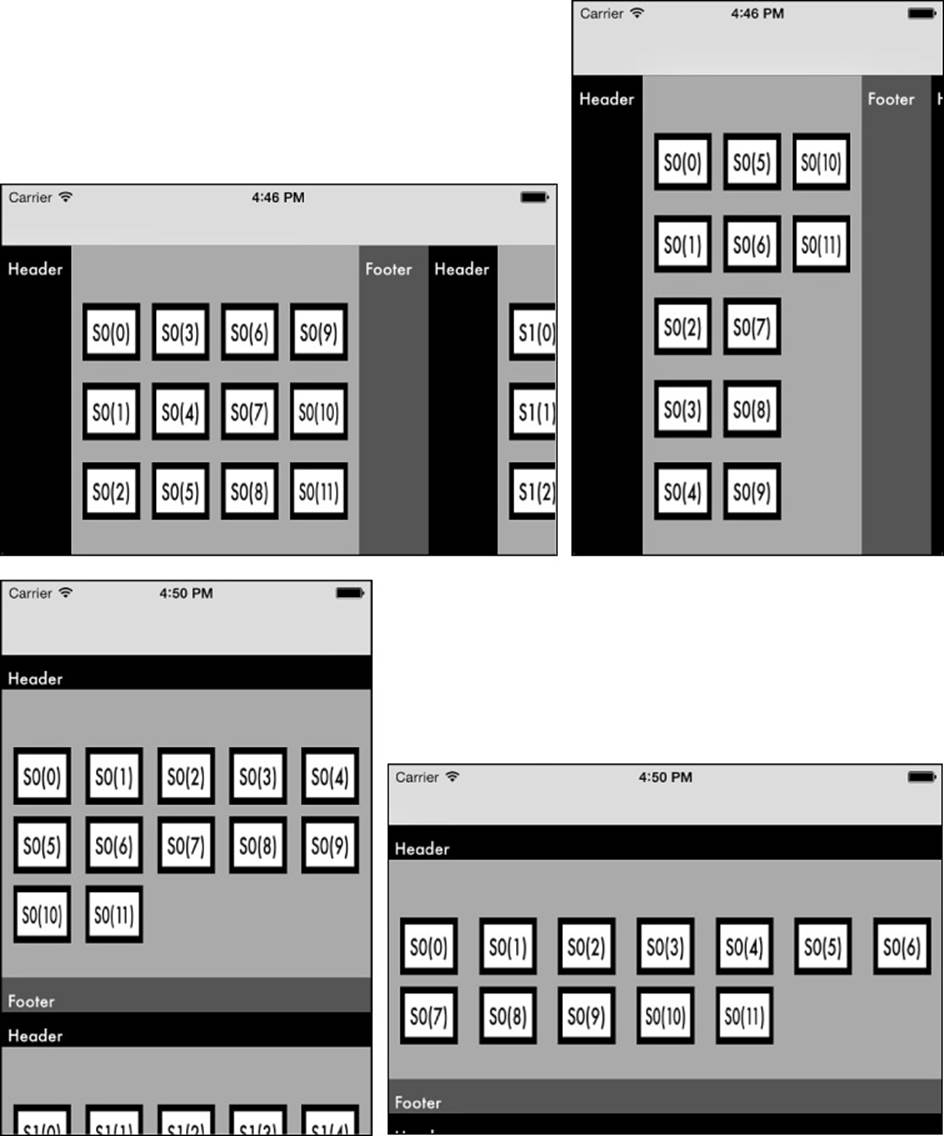
Figure 10-3 Section insets control the space that leads up to and away from a section’s items. The top images show a horizontal flow and the bottom images a vertical flow. All images use a top spacing of 50 points and a bottom spacing of 30 points, along with 10-point left and right spacing.
Here are the two callbacks used to generate the Figure 10-3 layouts. They return complete size structures even though only one field is used at any time. If the delegate does not implement these methods, the flow layout object uses the property values above:
- (CGSize) collectionView:(UICollectionView *)collectionView
layout:(UICollectionViewLayout *)collectionViewLayout
referenceSizeForHeaderInSection:(NSInteger)section
{
return CGSizeMake(60.0f, 30.0f);
}
- (CGSize) collectionView:(UICollectionView *)collectionView
layout:(UICollectionViewLayout *)collectionViewLayout
referenceSizeForFooterInSection:(NSInteger)section
{
return CGSizeMake(60.0f, 30.0f);
}
Insets
The two minimum spacing properties define how each in-section item relates to other items within a section. In contrast, the sectionInset property describes how the outer edges of a section add padding. This padding affects how sections relate to their optional headers and footers and how sections move apart from each other in general.
Edge insets consist of a set of {top, left, bottom, right} values. Figure 10-3 shows how this works with collection views. Each shot in Figure 10-3 presents a flow using the same edge insets of 50 points at the top, 30 points at the bottom, and 10 points left and right:
UIEdgeInsetsMake(50.0f, 10.0f, 30.0f, 10.0f)
The top screens show a horizontal flow and the bottom screens a vertical flow. In each case, you see how the insets affect layout. The insets pad the content items from their enclosing container. In the horizontal flow, the content items adjust vertically from the top of the collection view to allow for the top spacing and horizontally from the header and footer. In the vertical flow, the padding of the content items happens below the header and above the footer. Similarly, the left and right spacing are incorporated between the edges of the collection view and the contained items.
Recipe: Basic Collection View Flows
Recipe 10-1 introduces a basic collection view controller implementation, with support for optional headers and footers. This recipe implements the essential data source and delegate methods you need for a simple grid-based flow layout. Apple provides a number of properties to configure responses for the common collection view and flow layout delegate methods. Use these provided properties and simple modification of the source to adjust the number of sections to be viewed, the items per section, and any other layout details that control the overall flow.
Boolean properties determine whether a collection view uses headers and footers. The size can be configured by implementing the first two reference size requests in Recipe 10-1. You’ll find these two methods, one each for header and footer, just after the Flow Layout pragma mark. Returning a 0 size to the header or footer flow delegate method tells the collection view to omit those features for the section in question. When you return any other size, the collection view moves on to requesting the supplementary views for either a header or footer.
Make sure to register all cell and supplementary view classes before using them in your data source. Recipe 10-1 registers its classes in its viewDidLoad method. Once they are registered, you can dequeue instances on demand. You do not have to check whether a dequeuing request returns a usable instance. The methods create and initialize instances for you when needed.
We encourage you to dive into the sample code for Recipe 10-1 and tweak each layout value and callback (which was done to create the figures you’ve already seen in this section) to see how they affect overall flow and appearance. Recipe 10-1 offers a great jumping-off point for testing collection views and seeing how each property influences the final presentation.
Recipe 10-1 Basic Collection View Controller with Flow Layout
@interface TestBedViewController : UICollectionViewController
// Layout and collection view configuration
@property (nonatomic, assign) BOOL useHeaders;
@property (nonatomic, assign) BOOL useFooters;
@property (nonatomic, assign) NSInteger numberOfSections;
@property (nonatomic, assign) NSInteger itemsInSection;
@end
@implementation TestBedViewController
#pragma mark Flow Layout
- (CGSize)collectionView:(UICollectionView *)collectionView
layout:(UICollectionViewLayout *)collectionViewLayout
referenceSizeForHeaderInSection:(NSInteger)section
{
return self.useHeaders ? CGSizeMake(60.0f, 30.0f) : CGSizeZero;
}
- (CGSize)collectionView:(UICollectionView *)collectionView
layout:(UICollectionViewLayout *)collectionViewLayout
referenceSizeForFooterInSection:(NSInteger)section
{
return self.useFooters ? CGSizeMake(60.0f, 30.0f) : CGSizeZero;
}
#pragma mark Data Source
// Number of sections total
- (NSInteger)numberOfSectionsInCollectionView:
(UICollectionView *)collectionView
{
return self.numberOfSections;
}
// Number of items per section
- (NSInteger)collectionView:(UICollectionView *)collectionView
numberOfItemsInSection:(NSInteger)section
{
return self.itemsInSection;
}
// Dequeue and prepare a cell
- (UICollectionViewCell *)collectionView:
(UICollectionView *)aCollectionView
cellForItemAtIndexPath:(NSIndexPath *)indexPath
{
UICollectionViewCell *cell = [self.collectionView
dequeueReusableCellWithReuseIdentifier:@"cell"
forIndexPath:indexPath];
cell.backgroundColor = [UIColor whiteColor];
cell.selectedBackgroundView =
[[UIView alloc] initWithFrame:CGRectZero];
cell.selectedBackgroundView.backgroundColor =
[[UIColor blackColor] colorWithAlphaComponent:0.5f];
return cell;
}
// If using headers and footers, dequeue and prepare a view
- (UICollectionReusableView *)collectionView:
(UICollectionView *)aCollectionView
viewForSupplementaryElementOfKind:(NSString *)kind
atIndexPath:(NSIndexPath *)indexPath
{
if (kind == UICollectionElementKindSectionHeader)
{
UICollectionReusableView *header = [self.collectionView
dequeueReusableSupplementaryViewOfKind:
UICollectionElementKindSectionHeader
withReuseIdentifier:@"header" forIndexPath:indexPath];
header.backgroundColor = [UIColor blackColor];
return header;
}
else if (kind == UICollectionElementKindSectionFooter)
{
UICollectionReusableView *footer = [self.collectionView
dequeueReusableSupplementaryViewOfKind:
UICollectionElementKindSectionFooter
withReuseIdentifier:@"footer" forIndexPath:indexPath];
footer.backgroundColor = [UIColor darkGrayColor];
return footer;
}
return nil;
}
#pragma mark Delegate methods
- (void)collectionView:(UICollectionView *)aCollectionView
didSelectItemAtIndexPath:(NSIndexPath *)indexPath
{
NSLog(@"Selected %@", indexPath);
}
- (void)collectionView:(UICollectionView *)aCollectionView
didDeselectItemAtIndexPath:(NSIndexPath *)indexPath
{
NSLog(@"Deselected %@", indexPath);
}
#pragma mark Setup
- (void)viewDidLoad
{
[super viewDidLoad];
// Register any cell and header/footer classes for re-use queues
[self.collectionView
registerClass:[UICollectionViewCell class]
forCellWithReuseIdentifier:@"cell"];
[self.collectionView
registerClass:[UICollectionReusableView class]
forSupplementaryViewOfKind:UICollectionElementKindSectionHeader
withReuseIdentifier:@"header"];
[self.collectionView
registerClass:[UICollectionReusableView class]
forSupplementaryViewOfKind:UICollectionElementKindSectionFooter
withReuseIdentifier:@"footer"];
self.collectionView.backgroundColor = [UIColor lightGrayColor];
// Allow users to select/deselect items by tapping
self.collectionView.allowsMultipleSelection = YES;
}
- (instancetype)initWithCollectionViewLayout:(UICollectionViewLayout *)layout
{
self = [super initWithCollectionViewLayout:layout];
if (self)
{
// Set some reasonable defaults
self.useFooters = NO;
self.useHeaders = NO;
self.numberOfSections = 1;
self.itemsInSection = 1;
}
return self;
}
@end
// From the application delegate
- (BOOL)application:(UIApplication *)application
didFinishLaunchingWithOptions:(NSDictionary *)launchOptions
{
_window = [[UIWindow alloc]
initWithFrame:[[UIScreen mainScreen] bounds]];
_window.tintColor = COOKBOOK_PURPLE_COLOR;
// Create the layout and then pass to our collection VC
UICollectionViewFlowLayout *layout =
[[UICollectionViewFlowLayout alloc] init];
TestBedViewController *tbvc = [[TestBedViewController alloc]
initWithCollectionViewLayout:layout];
tbvc.edgesForExtendedLayout = UIRectEdgeNone;
// Configure layout and collection view properties
layout.itemSize = CGSizeMake(50.0f, 50.0f);
layout.sectionInset =
UIEdgeInsetsMake(10.0, 10.0f, 50.0f, 10.0f);
layout.scrollDirection =
UICollectionViewScrollDirectionVertical;
layout.minimumLineSpacing = 10.0f;
layout.minimumInteritemSpacing = 10.0f;
tbvc.numberOfSections = 10;
tbvc.itemsInSection = 12;
tbvc.useHeaders = YES;
tbvc.useFooters = YES;
UINavigationController *nav = [[UINavigationController alloc]
initWithRootViewController:tbvc];
_window.rootViewController = nav;
[_window makeKeyAndVisible];
return YES;
}
Get This Recipe’s Code
To find this recipe’s full sample project, point your browser to https://github.com/erica/iOS-7-Cookbook and go to the folder for Chapter 10.
Recipe: Custom Cells
Recipe 10-1 creates uniformly sized objects, but there’s no reason your collections cannot be filled with items of any dimension. Flow layouts allow you to create far more varied presentations, as shown in Figure 10-4. Recipe 10-2 adapts its collection view to provide this juiced-up presentation by creating custom cells. These cells add image views, and the image’s size powers the “size for item at index path” callback to the collection view’s data source:
- (CGSize) collectionView:(UICollectionView *)collectionView
layout:(UICollectionViewLayout*)collectionViewLayout
sizeForItemAtIndexPath:(NSIndexPath *)indexPath
{
UIImage *image = artDictionary[indexPath];
return image.size;
}
Figure 10-4 Flow layouts work with items that present varying heights and widths, not just basic grids.
To create custom cells, subclass UICollectionViewCell and add any new views to the cell’s contentView. This recipe adds a single image view subview and exposes it through an imageView property. When providing cells, the data source adds custom images to the image view, and the layout delegate specifies their sizes.
Recipe 10-2 Custom Collection View Cells
@interface ImageCell : UICollectionViewCell
@property (nonatomic) UIImageView *imageView;
@end
@implementation ImageCell
- (instancetype)initWithFrame:(CGRect)frame
{
self = [super initWithFrame:frame];
if (self)
{
_imageView = [[UIImageView alloc] initWithFrame:
CGRectInset(self.bounds, 4.0f, 4.0f)];
_imageView.autoresizingMask =
UIViewAutoresizingFlexibleWidth |
UIViewAutoresizingFlexibleHeight;
[self.contentView addSubview:_imageView];
}
return self;
}
@end
Get This Recipe’s Code
To find this recipe’s full sample project, point your browser to https://github.com/erica/iOS-7-Cookbook and go to the folder for Chapter 10.
Recipe: Scrolling Horizontal Lists
Collection views offer the ability to create horizontal scrolling lists, a counterpoint to table views that only scroll vertically. To accomplish this, you need to take a few things into account, primarily that flow layouts in their default state naturally wrap their sections. Consider Figure 10-5. It shows two collection views, both of which scroll horizontally. The top image consists of a single section with 100 items; the bottom has 100 sections of a single item each.
Figure 10-5 Top: A single section with 100 items. Bottom: 100 sections with a single item each.
You could force the top layout not to wrap by adding large left and right section margins, but getting them to work correctly is messy; the margins depend on both device and orientation. Assigning one item per section is a much easier solution and ensures a single line of items, regardless of size.
Recipe 10-3 creates a horizontally scrolling collection as a standalone view rather than as a view controller. This approach allows the view to be inset as a subview, neatly avoiding the big empty area at the bottom of the screen shown in Figure 10-5 (bottom).
This recipe’s InsetCollectionView class provides its own data source and exposes its collection view as a read-only property to allow clients to provide delegation. Figure 10-6 shows this recipe in action, providing an embedded horizontally scrolling list.
Figure 10-6 Recipe 10-3 creates an embeddable horizontally scrolling collection view.
Recipe 10-8, which appears later in this chapter, introduces a fully customized layout subclass that offers true grid layouts. Recipe 10-3 offers a handy shortcut for using the default flow layout, as shipped. Plus, it demonstrates how to create a collection view outside the context of a prebuilt controller.
Recipe 10-3 Horizontal Scroller Collection View
@interface InsetCollectionView : UIView
<UICollectionViewDataSource>
@property (strong, readonly) UICollectionView *collectionView;
@end
@implementation InsetCollectionView
// 100 sections of 1 item each
- (NSInteger)numberOfSectionsInCollectionView:
(UICollectionView *)collectionView
{
return 100;
}
- (NSInteger)collectionView:(UICollectionView *)collectionView
numberOfItemsInSection:(NSInteger)section
{
return 1;
}
// This is a little utility that returns a view showing the
// section and item numbers for an index path
- (UIImageView *)viewForIndexPath:(NSIndexPath *)indexPath
{
NSString *string = [NSString stringWithFormat:
@"S%d(%d)", indexPath.section, indexPath.item];
UIImage *image = blockStringImage(string, 16.0f);
UIImageView *imageView =
[[UIImageView alloc] initWithImage:image];
return imageView;
}
// Return an initialized cell
- (UICollectionViewCell *)collectionView:
(UICollectionView *)_collectionView
cellForItemAtIndexPath:(NSIndexPath *)indexPath
{
UICollectionViewCell *cell = [self.collectionView
dequeueReusableCellWithReuseIdentifier:@"cell"
forIndexPath:indexPath];
cell.backgroundColor = [UIColor whiteColor];
cell.selectedBackgroundView =
[[UIView alloc] initWithFrame:CGRectZero];
cell.selectedBackgroundView.backgroundColor =
[[UIColor blackColor] colorWithAlphaComponent:0.5f];
// Show the section and item in a custom subview
if ([cell viewWithTag:999])
[[cell viewWithTag:999] removeFromSuperview];
UIImageView *imageView = [self viewForIndexPath:indexPath];
imageView.tag = 999;
[cell.contentView addSubview:imageView];
return cell;
}
#pragma mark Setup
- (instancetype)initWithFrame:(CGRect)frame
{
self = [super initWithFrame:frame];
if (self)
{
UICollectionViewFlowLayout *layout =
[[UICollectionViewFlowLayout alloc] init];
layout.scrollDirection =
UICollectionViewScrollDirectionHorizontal;
layout.sectionInset =
UIEdgeInsetsMake(40.0f, 10.0f, 40.0f, 10.0f);
layout.minimumLineSpacing = 10.0f;
layout.minimumInteritemSpacing = 10.0f;
layout.itemSize = CGSizeMake(100.0f, 100.0f);
_collectionView = [[UICollectionView alloc]
initWithFrame:CGRectZero collectionViewLayout:layout];
_collectionView.backgroundColor = [UIColor darkGrayColor];
_collectionView.allowsMultipleSelection = YES;
_collectionView.dataSource = self;
[_collectionView registerClass:[UICollectionViewCell
class] forCellWithReuseIdentifier:@"cell"];
[self addSubview:_collectionView];
PREPCONSTRAINTS(_collectionView);
CONSTRAIN(self, _collectionView,
@"H:|[_collectionView(>=0)]|");
CONSTRAIN(self, _collectionView,
@"V:|-20-[_collectionView(>=0)]-20-|");
}
return self;}
@end
Get This Recipe’s Code
To find this recipe’s full sample project, point your browser to https://github.com/erica/iOS-7-Cookbook and go to the folder for Chapter 10.
Recipe: Introducing Interactive Layout Effects
Flow layouts are fully controllable. When subclassing UICollectionViewFlowLayout, you gain immediate real-time control over how items are sized and placed onscreen. This provides incredible power to you as a developer, letting you specify item presentation with great delicacy. You can use this power to develop flows that seem to work in three dimensions or ones that break the linear mold and transform columns and rows into circles, piles, Bezier curves, and more.
Customizable layout attributes include standard layout elements (frame, center, and size), transparency (alpha and hidden), position on the z-axis (zIndex), and transform (transform3d). You adjust these when the flow layout requests element attributes, as demonstrated inRecipe 10-4.
This recipe creates a flow that zooms items out toward the user in the center of the screen and shrinks them as they move away to the left or right. It calculates how far away each item is from the horizontal center of the screen. It applies its scaling based on a cosine function (that is, one that maxes out as the distance from the center decreases).
Figure 10-7 shows this effect, although it’s much better to run Recipe 10-4 yourself and see the changes in action.
Figure 10-7 The custom layout defined by Recipe 10-4 zooms items as they move toward the horizontal center of the screen.
Recipe 10-4 Interactive Layout Effects
@interface PunchedLayout : UICollectionViewFlowLayout
@end
@implementation PunchedLayout
{
CGSize boundsSize;
CGFloat midX;
}
// Allow the presentation to resize as needed
- (BOOL)shouldInvalidateLayoutForBoundsChange:(CGRect)bounds
{
return YES;
}
// Calculate the distance from the view center
-(void)prepareLayout
{
[super prepareLayout];
boundsSize = self.collectionView.bounds.size;
midX = boundsSize.width / 2.0f;
}
// Lay out elements
- (NSArray *)layoutAttributesForElementsInRect:(CGRect)rect
{
// Retrieve the default layout
NSArray *array = [super layoutAttributesForElementsInRect:rect];
for (UICollectionViewLayoutAttributes* attributes in array)
{
attributes.transform3D = CATransform3DIdentity;
// Only handle layouts for visible items
if (!CGRectIntersectsRect(attributes.frame, rect)) continue;
CGPoint contentOffset = self.collectionView.contentOffset;
CGPoint itemCenter = CGPointMake(
attributes.center.x - contentOffset.x,
attributes.center.y - contentOffset.y);
CGFloat distance = ABS(midX - itemCenter.x);
// Normalize the distance and calculate the zoom factor
CGFloat normalized = distance / midX;
normalized = MIN(1.0f, normalized);
CGFloat zoom = cos(normalized * M_PI_4);
// Set the transform
attributes.transform3D =
CATransform3DMakeScale(zoom, zoom, 1.0f);
}
return array;
}
@end
Get This Recipe’s Code
To find this recipe’s full sample project, point your browser to https://github.com/erica/iOS-7-Cookbook and go to the folder for Chapter 10.
Recipe: Scroll Snapping
Recipe 10-4 focuses user attention at the center of the screen. Why not ensure that the central object moves to the most optimal position? Accomplish this by implementing a layout method that snaps to specific boundaries. Recipe 10-5 shows how.
The targetContentOffsetForProposedContentOffset: method, which is called during scrolling, specifies where the scroll would naturally stop. It iterates through all the onscreen objects, finds the one closest to the view’s horizontal center, and adjusts the offset so that the object’s center coincides with the view’s.
Recipe 10-5 Customizing the Target Content Offset
- (CGPoint)targetContentOffsetForProposedContentOffset:
(CGPoint)proposedContentOffset
withScrollingVelocity:(CGPoint)velocity
{
CGFloat offsetAdjustment = CGFLOAT_MAX;
// Retrieve all onscreen items at the proposed starting point
CGRect targetRect = CGRectMake(proposedContentOffset.x, 0.0,
boundsSize.width, boundsSize.height);
NSArray *array =
[super layoutAttributesForElementsInRect:targetRect];
// Determine the proposed center x-coordinate
CGFloat proposedCenterX = proposedContentOffset.x + midX;
// Search for the minimum offset adjustment
for (UICollectionViewLayoutAttributes* layoutAttributes in array)
{
CGFloat distance =
layoutAttributes.center.x - proposedCenterX;
if (ABS(distance) < ABS(offsetAdjustment))
offsetAdjustment = distance;
}
CGPoint desiredPoint =
CGPointMake(proposedContentOffset.x + offsetAdjustment,
proposedContentOffset.y);
// Workaround for edge conditions. Hat tip, Nicolas Goles.
if ((proposedContentOffset.x == 0) ||
(proposedContentOffset.x >=
(self.collectionViewContentSize.width –
boundsSize.width)))
{
NSNotification *note = [NSNotification
notificationWithName:@"PleaseRecenter" object:
[NSValue valueWithCGPoint:desiredPoint]];
// Notify view controller of modified desired point
[[NSNotificationCenter defaultCenter]
postNotification:note];
return proposedContentOffset;
}
// Offset the content by the minimal amount necessary to center
return desiredPoint;
}
Get This Recipe’s Code
To find this recipe’s full sample project, point your browser to https://github.com/erica/iOS-7-Cookbook and go to the folder for Chapter 10.
Recipe: Creating a Circle Layout
Circle layouts offer an eye-catching way to arrange views around a central area, as shown in Figure 10-8. Recipe 10-6 is heavily based on Apple’s sample code, which was first presented at WWDC 2012. This layout provides an excellent introduction to the way items can animate into place upon creation and deletion.
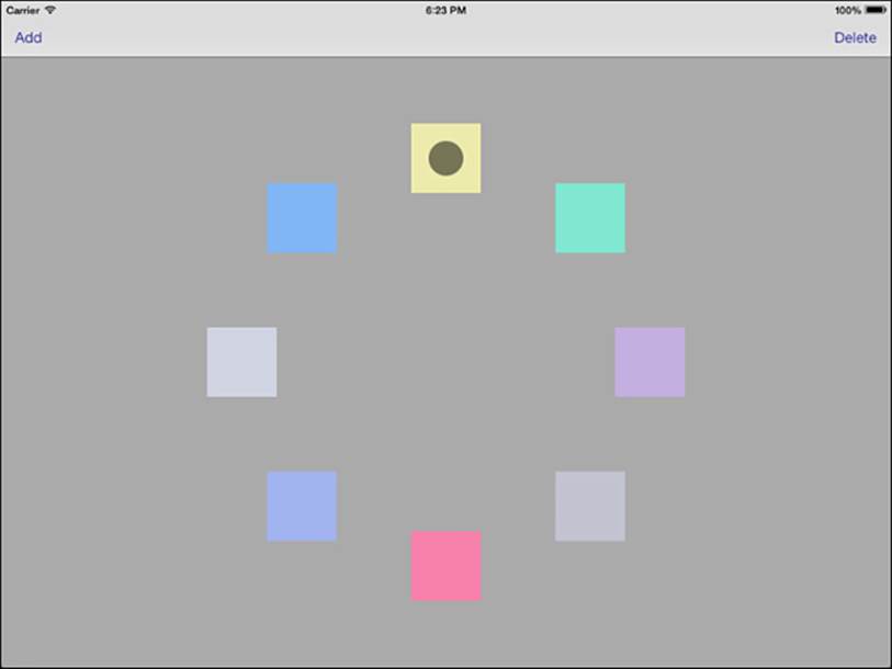
Figure 10-8 This circle layout flow is inspired by sample code provided by Apple and was encouraged by the efforts of developer Greg Hartstein.
Recipe 10-6’s layout flow uses a fixed content size via the collectionViewContentSize method. This prevents collection view scrolling as it creates a layout area with well-understood static geometry. The code further limits its layout to an inset area, calculated in theprepareLayout method. The height or width of the screen, whichever is currently smaller, determines the circle’s radius. This remains fixed, regardless of device orientation.
The layout calculates each item’s position by its index path. This presentation uses a single section, and the order of the item within that section (that is, whether it is the third or fifth item) sets its progress along the circle:
CGFloat progress = (float) path.item / (float) numberOfItems;
CGFloat theta = 2.0f * M_PI * progress;
You can easily extend this to any shape or path whose progress can be normalized within the range [0.0, 1.0]. For a circle, this goes from 0 to 2 pi. A spiral might go out 3, 4, or even 5 pi. For a Bezier curve, you iterate along whatever control points define the curve and interpolate between them as needed.
Creation and Deletion Animation
Of particular interest in Recipe 10-6 are the methods that specify the initial attributes for newly inserted items and final attributes for newly deleted ones. These properties allow your collection views to animate item creation and deletion from the previous layout to the new layout after those items have been added or removed.
In this recipe, as in Apple’s original sample code, new items start off transparent in the center of the circle and fade into view as they move out to their assigned position. Deleted items shrink, fade, and move to the center. When you run the sample code, you’ll see these animations take effect.
The documentation for the initialLayoutAttributesForAppearingItemAtIndexPath and finalLayoutAttributesForDisappearingItemAtIndexPath methods is confusing at best; it implies that these methods are only called on the inserted and deleted items. In reality, the starting and ending attribute requests are called on all items, not just the added and deleted ones. Because of this, Recipe 10-6 sorts items into collections: added index paths and deleted index paths. It limits its custom insertion and deletion attributes to those items.
This mechanism offers a way to animate layout attributes for all items, enabling you to add extra animations as needed. For example, you might animate an object moving from the end of row 3 to the start of row 4 as a new item is inserted into row 3. This approach allows you to animate the cell offscreen to the right of row 3 and then onscreen from the left of row 4 versus the default behavior, which has it move diagonally from its old position to the new one.
Powering the Circle Layout
This recipe makes a number of changes to Apple’s original sample. For one thing, Recipe 10-6 uses Add and Delete bar buttons rather than gestures. For another, each view is distinct and identifiable by its color. Instead of deleting “any item” or adding “some item,” Recipe 10-6 uses selections. The user chooses an item to focus on. That selection controls which item is deleted (the selected item) or where new items should be added (just after the selected item).
The following deletion code retrieves the currently selected item, deletes it, and selects the next item. Then it enables or disables the Add and Delete buttons, depending on how many items are currently onscreen:
- (void)delete
{
if (!count) return;
// Decrement the number of onscreen items
count--;
// Determine which item to delete
NSArray *selectedItems =
[self.collectionView indexPathsForSelectedItems];
NSInteger itemNumber = selectedItems.count ?
((NSIndexPath *)selectedItems[0]).item : 0;
NSIndexPath *itemPath =
[NSIndexPath indexPathForItem:itemNumber inSection:0];
// Perform deletion
[self.collectionView performBatchUpdates:^{
[self.collectionView deleteItemsAtIndexPaths:@[itemPath]];
} completion:^(BOOL done){
if (count)
[self.collectionView selectItemAtIndexPath:
[NSIndexPath indexPathForItem:
MAX(0, itemNumber - 1) inSection:0]
animated:NO
scrollPosition:UICollectionViewScrollPositionNone];
self.navigationItem.rightBarButtonItem.enabled =
(count > 0);
self.navigationItem.leftBarButtonItem.enabled =
(count < (IS_IPAD ? 20 : 8));
}];
}
In the real world, there are very few use cases for adding and deleting interchangeable views, but there are many use cases for views that have meaning. These changes provide a more solid jumping-off point for extending this recipe to practical applications.
The Layout
Figure 10-8 shows the layout that Recipe 10-6 builds. As users add new items, the circle grows more crowded, up to a maximum count of 20 items on the iPad and 8 on the iPhone. You can easily modify these limits in the add and delete methods to match the view sizes for your particular application.
Recipe 10-6 Laying Out Views in a Circle
@implementation CircleLayout
{
NSInteger numberOfItems;
CGPoint centerPoint;
CGFloat radius;
NSMutableArray *insertedIndexPaths;
NSMutableArray *deletedIndexPaths;
}
// Calculate and save off the current state
- (void)prepareLayout
{
[super prepareLayout];
CGSize size = self.collectionView.frame.size;
numberOfItems =
[self.collectionView numberOfItemsInSection:0];
centerPoint =
CGPointMake(size.width / 2.0f, size.height / 2.0f);
radius = MIN(size.width, size.height) / 3.0f;
insertedIndexPaths = [NSMutableArray array];
deletedIndexPaths = [NSMutableArray array];
}
// Fix the content size to the frame size
- (CGSize)collectionViewContentSize
{
return self.collectionView.frame.size;
}
// Calculate position for each item
- (UICollectionViewLayoutAttributes *)
layoutAttributesForItemAtIndexPath:(NSIndexPath *)path
{
UICollectionViewLayoutAttributes *attributes =
[UICollectionViewLayoutAttributes
layoutAttributesForCellWithIndexPath:path];
CGFloat progress = (float) path.item / (float) numberOfItems;
CGFloat theta = 2.0f * M_PI * progress;
CGFloat xPosition = centerPoint.x + radius * cos(theta);
CGFloat yPosition = centerPoint.y + radius * sin(theta);
attributes.size = [self itemSize];
attributes.center = CGPointMake(xPosition, yPosition);
return attributes;
}
// Calculate layouts for all items
- (NSArray *)layoutAttributesForElementsInRect:(CGRect)rect
{
NSMutableArray *attributes = [NSMutableArray array];
for (NSInteger index = 0; index < numberOfItems; index++)
{
NSIndexPath *indexPath =
[NSIndexPath indexPathForItem:index inSection:0];
[attributes addObject:
[self layoutAttributesForItemAtIndexPath:indexPath]];
}
return attributes;
}
// Build insertion and deletion collections from updates
- (void)prepareForCollectionViewUpdates:(NSArray *)updates
{
[super prepareForCollectionViewUpdates:updates];
for (UICollectionViewUpdateItem* updateItem in updates)
{
if (updateItem.updateAction ==
UICollectionUpdateActionInsert)
[insertedIndexPaths
addObject:updateItem.indexPathAfterUpdate];
else if (updateItem.updateAction ==
UICollectionUpdateActionDelete)
[deletedIndexPaths
addObject:updateItem.indexPathBeforeUpdate];
}
}
// Establish starting attributes for added item
- (UICollectionViewLayoutAttributes *)
insertionAttributesForItemAtIndexPath:(NSIndexPath *)itemIndexPath
{
UICollectionViewLayoutAttributes *attributes =
[self layoutAttributesForItemAtIndexPath:itemIndexPath];
attributes.alpha = 0.0;
attributes.center = centerPoint;
return attributes;
}
// Establish final attributes for deleted item
- (UICollectionViewLayoutAttributes *)
deletionAttributesForItemAtIndexPath:(NSIndexPath *)itemIndexPath
{
UICollectionViewLayoutAttributes *attributes =
[self layoutAttributesForItemAtIndexPath:itemIndexPath];
attributes.alpha = 0.0;
attributes.center = centerPoint;
attributes.transform3D = CATransform3DMakeScale(0.1, 0.1, 1.0);
return attributes;
}
// Handle insertion animation for all items
- (UICollectionViewLayoutAttributes*)
initialLayoutAttributesForAppearingItemAtIndexPath:
(NSIndexPath*)indexPath
{
return [insertedIndexPaths containsObject:indexPath] ?
[self insertionAttributesForItemAtIndexPath:indexPath] :
[super initialLayoutAttributesForAppearingItemAtIndexPath:
indexPath];
}
// Handle deletion animation for all items
- (UICollectionViewLayoutAttributes*)
finalLayoutAttributesForDisappearingItemAtIndexPath:
(NSIndexPath*)indexPath
{
return [deletedIndexPaths containsObject:indexPath] ?
[self deletionAttributesForItemAtIndexPath:indexPath] :
[super finalLayoutAttributesForDisappearingItemAtIndexPath:
indexPath];
}
@end
Get This Recipe’s Code
To find this recipe’s full sample project, point your browser to https://github.com/erica/iOS-7-Cookbook and go to the folder for Chapter 10.
Recipe: Adding Gestures to Layout
Recipe 10-7 builds on Recipe 10-6, adding interactive gestures that adjust presentation layout. It uses two recognizers, a pinch recognizer and a rotation recognizer, to enable users to scale and rotate the circle of views. These items are set up to recognize simultaneously, so users can pinch and rotate at the same time.
The rotate recognizer uses a slightly more sophisticated approach than the pinch one. Unlike pinch values, rotations are relative. You rotate by an amount, not to a specific angle. To accommodate this, Recipe 10-7 implements callbacks to handle two states. The first is called as rotations happen, updating the presentation to match each movement. The second resets the rotation baseline as the gesture ends, so the next interaction will take up where the last one left off:
- (void)pinch:(UIPinchGestureRecognizer *)pinchRecognizer
{
CircleLayout *layout =
(CircleLayout *)self.collectionView.collectionViewLayout;
[layout scaleTo:pinchRecognizer.scale];
[layout invalidateLayout];
}
- (void)rotate:(UIRotationGestureRecognizer *)rotationRecognizer
{
CircleLayout *layout =
(CircleLayout *)self.collectionView.collectionViewLayout;
if (rotationRecognizer.state == UIGestureRecognizerStateEnded)
[layout rotateTo:rotationRecognizer.rotation];
else
[layout rotateBy:rotationRecognizer.rotation];
[layout invalidateLayout];
}
Notice how these callbacks invalidate the layout so that the presentation is updated in real time. This recipe is best tested on-device due to the high graphical load.
Recipe 10-7 calculates the effect of user gestures on the layout by adjusting the view radius (it scales from a minimum of 0.5 to a maximum of 1.3 times the original layout) and the layout’s start angle, which is initially at 0 degrees but is adjusted each time the rotation updates. The scaled radius and the adjusted angle value form the basis for the new presentation.
Recipe 10-7 Adding Gestures to Collection View Layouts
// Intermediate rotation
- (void)rotateBy:(CGFloat)theta
{
currentRotation = theta;
}
// Final rotation
- (void)rotateTo:(CGFloat)theta
{
rotation += theta;
currentRotation = 0.0f;
}
// Scaling
- (void)scaleTo:(CGFloat)factor
{
scale = factor;
}
// Calculate position for each item
- (UICollectionViewLayoutAttributes *)
layoutAttributesForItemAtIndexPath:(NSIndexPath *)path
{
UICollectionViewLayoutAttributes *attributes =
[UICollectionViewLayoutAttributes
layoutAttributesForCellWithIndexPath:path];
CGFloat progress = (float) path.item / (float) numberOfItems;
CGFloat theta = 2.0f * M_PI * progress;
// Update the scaling and rotation to match the current gesture
CGFloat scaledRadius = MIN(MAX(scale, 0.5f), 1.3f) * radius;
CGFloat rotatedTheta = theta + rotation + currentRotation;
// Calculate the new positions
CGFloat xPosition =
centerPoint.x + scaledRadius * cos(rotatedTheta);
CGFloat yPosition =
centerPoint.y + scaledRadius * sin(rotatedTheta);
attributes.size = [self itemSize];
attributes.center = CGPointMake(xPosition, yPosition);
return attributes;
}
@end
Get This Recipe’s Code
To find this recipe’s full sample project, point your browser to https://github.com/erica/iOS-7-Cookbook and go to the folder for Chapter 10.
Recipe: Creating a True Grid Layout
The default flow layout wraps its rows to fit into a scrolling view that moves in just one direction. If you’re willing to do the math—there’s quite a bit of it, and it’s not easy—you can create a custom layout subclass that shows a grid of items that scrolls in both directions and doesn’t wrap its lines. Figure 10-9 shows such a layout.
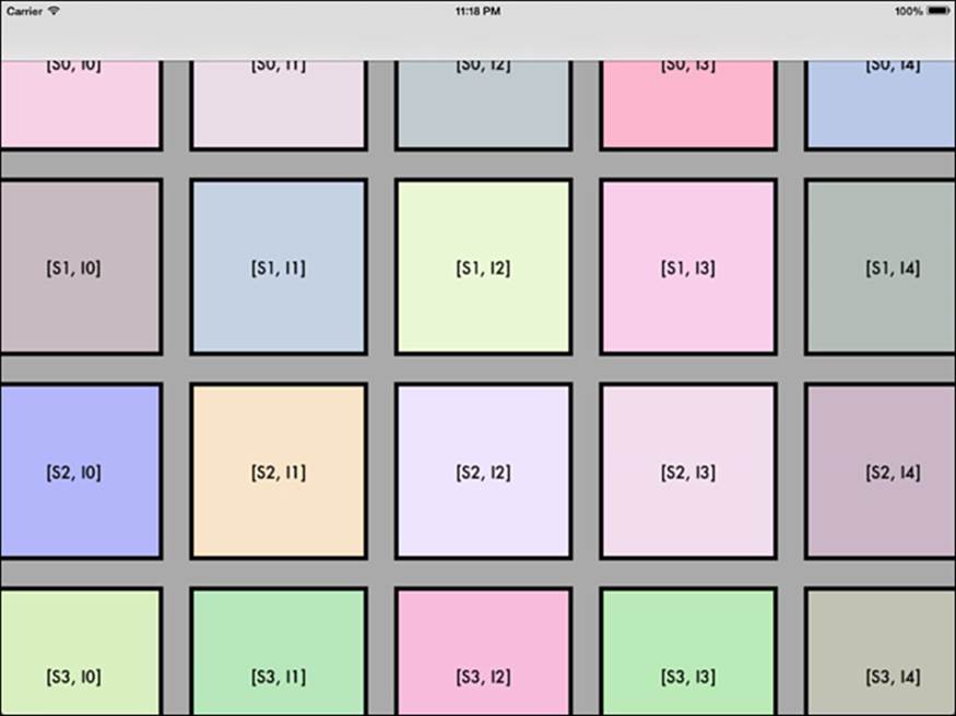
Figure 10-9 This custom layout grid enables users to scroll in both directions.
Recipe 10-8 fully customizes its layout subclass, overriding collectionViewContentSize and layoutAttributesForItemAtIndexPath: to manually place each item. This implementation fully respects all spacing requests and delegate callbacks. In contrast, the normal flow layout attempts to fit items in while meeting various minimum values. This layout uses those values exactly but adjusts the underlying scrolling view’s content size to precisely match sizing needs.
Recipe 10-8 works by exhaustively calculating each layout element. What it doesn’t use, however, is the line-spacing property that describes how to wrap rows. This grid presentation never wraps any rows, so the recipe ignores that entirely.
This recipe also adds a new custom layout property, alignment. This property controls whether each grid row aligns at the top, center, or bottom. It accomplishes this by looking at the overall height for an entire row and then optionally offsetting items that are smaller than that height.
Recipe 10-8 includes the entire layout code to give you a sense of how much effort is involved for a complete custom subclass. The trick is, of course, in the details. Test layouts as thoroughly as possible over a wide range of source objects.
Recipe 10-8 Grid Layout Customization
@implementation GridLayout
#pragma mark Items
// Does a delegate provide individual sizing?
- (BOOL)usesIndividualItemSizing
{
return [self.collectionView.delegate respondsToSelector:
@selector(collectionView:layout:sizeForItemAtIndexPath:)];
}
// Return cell size for an item
- (CGSize)sizeForItemAtIndexPath:(NSIndexPath *)indexPath
{
CGSize itemSize = self.itemSize;
if ([self usesIndividualItemSizing])
itemSize = [(id <UICollectionViewDelegateFlowLayout>)
self.collectionView.delegate
collectionView:self.collectionView
layout:self sizeForItemAtIndexPath:indexPath];
return itemSize;
}
#pragma mark Insets
// Individual insets?
- (BOOL)usesIndividualInsets
{
return [self.collectionView.delegate respondsToSelector:
@selector(collectionView:layout:insetForSectionAtIndex:)];
}
// Return insets for section
- (UIEdgeInsets)insetsForSection:(NSInteger)section
{
UIEdgeInsets insets = self.sectionInset;
if ([self usesIndividualInsets])
insets = [(id <UICollectionViewDelegateFlowLayout>)
self.collectionView.delegate
collectionView:self.collectionView
layout:self insetForSectionAtIndex:section];
return insets;
}
#pragma mark Item Spacing
// Individual item spacing?
- (BOOL)usesIndividualItemSpacing
{
return [self.collectionView.delegate respondsToSelector:
@selector(collectionView:layout:
minimumInteritemSpacingForSectionAtIndex:)];
}
// Return spacing for section
- (CGFloat)itemSpacingForSection:(NSInteger)section
{
CGFloat spacing = self.minimumInteritemSpacing;
if ([self usesIndividualItemSpacing])
spacing = [(id <UICollectionViewDelegateFlowLayout>)
self.collectionView.delegate
collectionView:self.collectionView
layout:self
minimumInteritemSpacingForSectionAtIndex:section];
return spacing;
}
#pragma mark Layout Geometry
// Find the tallest subview
- (CGFloat)maxItemHeightForSection:(NSInteger)section
{
CGFloat maxHeight = 0.0f;
NSInteger numberOfItems =
[self.collectionView numberOfItemsInSection:section];
for (int i = 0; i < numberOfItems; i++)
{
NSIndexPath *indexPath = INDEXPATH(section, i);
CGSize itemSize = [self sizeForItemAtIndexPath:indexPath];
maxHeight = MAX(maxHeight, itemSize.height);
}
return maxHeight;
}
// "Horizontal" row-based extent from the start of the section to its end
- (CGFloat)fullWidthForSection:(NSInteger)section
{
UIEdgeInsets insets = [self insetsForSection:section];
CGFloat horizontalInsetExtent = insets.left + insets.right;
CGFloat collectiveWidth = horizontalInsetExtent;
NSInteger numberOfItems =
[self.collectionView numberOfItemsInSection:section];
for (int i = 0; i < numberOfItems; i++)
{
NSIndexPath *indexPath = INDEXPATH(section, i);
CGSize itemSize = [self sizeForItemAtIndexPath:indexPath];
collectiveWidth += itemSize.width;
collectiveWidth += [self itemSpacingForSection:section];
}
// Take back one spacer, n-1 fence post
collectiveWidth -= [self itemSpacingForSection:section];
return collectiveWidth;
}
// Bounding size for each section
- (CGSize)fullSizeForSection:(NSInteger)section
{
CGFloat headerExtent = (self.scrollDirection ==
UICollectionViewScrollDirectionHorizontal) ?
self.headerReferenceSize.width :
self.headerReferenceSize.height;
CGFloat footerExtent = (self.scrollDirection ==
UICollectionViewScrollDirectionHorizontal) ?
self.footerReferenceSize.width :
self.footerReferenceSize.height;
UIEdgeInsets insets = [self insetsForSection:section];
CGFloat verticalInsetExtent = insets.top + insets.bottom;
CGFloat maxHeight = [self maxItemHeightForSection:section];
CGFloat fullHeight = headerExtent + footerExtent +
verticalInsetExtent + maxHeight;
CGFloat fullWidth = [self fullWidthForSection:section];
return CGSizeMake(fullWidth, fullHeight);
}
// How far is each item offset within the section
- (CGFloat)horizontalInsetForItemAtIndexPath:(NSIndexPath *)indexPath
{
UIEdgeInsets insets = [self insetsForSection:indexPath.section];
CGFloat horizontalOffset = insets.left;
for (int i = 0; i < indexPath.item; i++)
{
CGSize itemSize = [self sizeForItemAtIndexPath:
INDEXPATH(indexPath.section, i)];
horizontalOffset += (itemSize.width +
[self itemSpacingForSection:indexPath.section]);
}
return horizontalOffset;
}
// How far is each item down
- (CGFloat)verticalInsetForItemAtIndexPath:(NSIndexPath *)indexPath
{
CGSize thisItemSize = [self sizeForItemAtIndexPath:indexPath];
CGFloat verticalOffset = 0.0f;
// Previous sections
for (int i = 0; i < indexPath.section; i++)
verticalOffset += [self fullSizeForSection:i].height;
// Header
CGFloat headerExtent = (self.scrollDirection ==
UICollectionViewScrollDirectionHorizontal) ?
self.headerReferenceSize.width :
self.headerReferenceSize.height;
verticalOffset += headerExtent;
// Top inset
UIEdgeInsets insets = [self insetsForSection:indexPath.section];
verticalOffset += insets.top;
// Vertical centering
CGFloat maxHeight =
[self maxItemHeightForSection:indexPath.section];
CGFloat fullHeight = (maxHeight - thisItemSize.height);
CGFloat midHeight = fullHeight / 2.0f;
switch (self.alignment)
{
case GridRowAlignmentNone:
case GridRowAlignmentTop:
break;
case GridRowAlignmentCenter:
verticalOffset += midHeight;
break;
case GridRowAlignmentBottom:
verticalOffset += fullHeight;
break;
default:
break;
}
return verticalOffset;
}
#pragma mark Layout Attributes
// Provide per-item placement
- (UICollectionViewLayoutAttributes *)layoutAttributesForItemAtIndexPath:
(NSIndexPath *)indexPath
{
UICollectionViewLayoutAttributes *attributes =
[UICollectionViewLayoutAttributes
layoutAttributesForCellWithIndexPath:indexPath];
CGSize thisItemSize = [self sizeForItemAtIndexPath:indexPath];
CGFloat verticalOffset =
[self verticalInsetForItemAtIndexPath:indexPath];
CGFloat horizontalOffset =
[self horizontalInsetForItemAtIndexPath:indexPath];
if (self.scrollDirection == UICollectionViewScrollDirectionVertical)
attributes.frame = CGRectMake(horizontalOffset,
verticalOffset, thisItemSize.width, thisItemSize.height);
else
attributes.frame = CGRectMake(verticalOffset,
horizontalOffset, thisItemSize.width,
thisItemSize.height);
return attributes;
}
// Return full extent
- (CGSize)collectionViewContentSize
{
NSInteger sections = self.collectionView.numberOfSections;
CGFloat maxWidth = 0.0f;
CGFloat collectiveHeight = 0.0f;
for (int i = 0; i < sections; i++)
{
CGSize sectionSize = [self fullSizeForSection:i];
collectiveHeight += sectionSize.height;
maxWidth = MAX(maxWidth, sectionSize.width);
}
if (self.scrollDirection ==
UICollectionViewScrollDirectionVertical)
return CGSizeMake(maxWidth, collectiveHeight);
else
return CGSizeMake(collectiveHeight, maxWidth);
}
// Provide grid layout attributes
- (NSArray *)layoutAttributesForElementsInRect:(CGRect)rect
{
NSMutableArray *attributes = [NSMutableArray array];
for (NSInteger section = 0;
section < self.collectionView.numberOfSections; section++)
for (NSInteger item = 0;
item < [self.collectionView
numberOfItemsInSection:section];
item++)
{
UICollectionViewLayoutAttributes *layout =
[self layoutAttributesForItemAtIndexPath:
INDEXPATH(section, item)];
[attributes addObject:layout];
}
return attributes;
}
- (BOOL) shouldInvalidateLayoutForBoundsChange:(CGRect)oldBounds
{
return YES;
}
@end
Get This Recipe’s Code
To find this recipe’s full sample project, point your browser to https://github.com/erica/iOS-7-Cookbook and go to the folder for Chapter 10.
Recipe: Custom Item Menus
Collection views support menus like the one shown in Figure 10-10, using a standard tap-and-hold gesture. The menu provides cut, copy, and paste actions by default. These default actions can be filtered out and custom actions added to build a menu like the one shown.
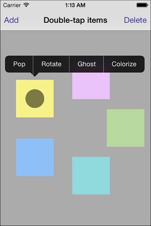
Figure 10-10 These custom item-by-item menus require cells to become the first responder.
Menu support is provided through three delegate methods on UICollectionView:
 collectionView:shouldShowMenuForItemAtIndexPath:—Determines whether an item at the specified index path should show a menu.
collectionView:canPerformAction:forItemAtIndexPath:withSender:—Confirms that the delegate can perform the specified action on the item at the index path. This delegate method can be used to filter out unwanted default actions: cut, copy, and paste.
collectionView:performAction:forItemAtIndexPath:withSender:—Tells the delegate to perform the specified action on the item at the index path.
In addition to returning YES for the first two items and handling the action delegate method, your collection view must be able to become a first responder:
- (BOOL)canBecomeFirstResponder
{
return YES;
}
Once you carefully meet all these requirements, a menu appears when the user taps and holds on a collection view item.
Double-Tap Alternative
Instead of implementing the long-tap gesture menu provided by UICollectionView, Recipe 10-9 creates a custom cell class and adds a double-tap gesture recognizer. When activated, the callback sets the cell as the first responder and presents a standard menu.
Recipe 10-9 shows the relevant details. The cell subclass declares that it can become the first responder, a necessary precondition for presenting menus. It sets the menu items it wants to work with and then adds the canPerformAction:withSender: support that confirms each item’s appearance. Figure 10-10 displays the menu created by this code.
Recipe 10-9 Custom Collection View Cell Menus
- (BOOL)canBecomeFirstResponder
{
return YES;
}
- (BOOL)canPerformAction:(SEL)action withSender:(id)sender
{
if (action == @selector(ghostSelf)) return YES;
if (action == @selector(popSelf)) return YES;
if (action == @selector(rotateSelf)) return YES;
if (action == @selector(colorize)) return YES;
return NO;
}
- (void)tapped:(UIGestureRecognizer *)uigr
{
if (uigr.state != UIGestureRecognizerStateRecognized) return;
[[UIMenuController sharedMenuController] setMenuVisible:NO
animated:YES];
[self becomeFirstResponder];
UIMenuController *menu = [UIMenuController sharedMenuController];
UIMenuItem *pop = [[UIMenuItem alloc]
initWithTitle:@"Pop" action:@selector(popSelf)];
UIMenuItem *rotate = [[UIMenuItem alloc]
initWithTitle:@"Rotate" action:@selector(rotateSelf)];
UIMenuItem *ghost = [[UIMenuItem alloc]
initWithTitle:@"Ghost" action:@selector(ghostSelf)];
UIMenuItem *colorize = [[UIMenuItem alloc]
initWithTitle:@"Colorize" action:@selector(colorize)];
[menu setMenuItems:@[pop, rotate, ghost, colorize]];
[menu update];
[menu setTargetRect:self.bounds inView:self];
[menu setMenuVisible:YES animated:YES];
}
Get This Recipe’s Code
To find this recipe’s full sample project, point your browser to https://github.com/erica/iOS-7-Cookbook and go to the folder for Chapter 10.
Summary
This chapter introduces collection views paired with the powerful flow layout. You’ve read how to create both basic collection view controllers and their standalone views. You’ve discovered how to set critical layout properties. You’ve learned about creating live effect feedback and insertion and deletion dynamic effects. Before moving on to the next chapter, here are a few points to consider about collection views:
Collection views offer an amazing amount of power without requiring a lot of coding. Most things that are maddening and nearly impossible with table views are now possible with a much more powerful set of APIs.
This chapter barely touches on header and footer views, and it doesn’t use decoration views at all. See the sample code included with this chapter for more details on the fine points of creating custom supplementary view classes.
Transform-based updates help bring life to your collection view layouts. Don’t be afraid to let your interfaces animate to respond to user interactions. At the same time, avoid adding effects simply for the sake of adding effects. A little animation goes a long way.
Speaking of animations, the same inserted and deleted attribute methods this chapter uses for items are available for supplementary elements. This feature lets you animate the arrival and departure of new sections in your collection.
On a similar note, integrate gestures meaningfully. If a user isn’t likely to discover your long-press or triple-tap add or delete request, skip it. Instead, use pop-ups, menus, floating overlays, or simple buttons to communicate how items can be managed and changed.
When exploring layout, don’t depend on the flow layout documentation. Look instead through the UICollectionViewLayout abstract parent class. It details all the core methods you override.
Finally, always test on devices. The performance of layouts, especially ones that update frequently or use transforms, cannot be represented accurately on the simulator. Device testing, along with Instruments, will better reflect whether you’re actually asking too much from your presentation.