The Core iOS Developer’s Cookbook, Fifth Edition (2014)
Chapter 9. Creating and Managing Table Views
Tables provide a scrolling list–based interaction class that works particularly well for small GUI elements. Many apps that ship natively with the iPhone and iPod touch center on table-based navigation, including Contacts, Settings, and iPod. On these smaller iOS devices, limited screen size makes using tables, with their scrolling and individual item selection, an ideal way to deliver information and content in a simple, easy-to-manipulate form. On the larger iPad, tables integrate with larger detail presentations, providing an important role in split view controllers. In this chapter, you’ll discover how iOS tables work, what kinds of tables are available to you as a developer, and how you can use table features in your own programs.
iOS Tables
A standard iOS table consists of a simple vertical scrolling list of individual cells. Users may scroll or flick their way up and down until they find an item they want to interact with. On iOS, tables are ubiquitous. Several built-in iOS apps are based entirely on table views, and they form the core of numerous third-party applications.
Most tables you see in iOS are built using UITableView and customized with options provided by its delegate and data source protocols. In addition to a standard scrolling list of cells, which provides the most generic table implementation, you can create specialized tables with custom art, background, labels, and more.
Specialized tables include the kind of tables you see in the Preferences application, with their white cells over a gray background; tables with sections and an index, such as the ones used in the Contacts application; and related classes of wheeled tables, such as those used to set appointment dates and alarms. And, when you need to move beyond tables and their scrolling lists to more grid-like presentations, you can use the related class of collection views, which are introduced in Chapter 10, “Collection Views.”
No matter what type of table you use, they all work in the same general way. Tables are built around the Model–View–Controller (MVC) paradigm. They present cells provided from a data source and respond to user interactions by calling well-defined delegate methods.
A data source provides a class with on-demand information about a table’s contents. It represents the underlying data model and mediates between that model and the table’s view. A data source tells the table about its structure. For example, it specifies how many sections to use and how many items each section includes. Data sources provide individual table cells on-demand and populate those cells with model data that matches each cell’s position within the table.
Data sources express a table’s model; delegates act as controllers. Delegates manage user interactions, letting applications respond to changes in table selections and user-directed edits. For example, users might tap on a new cell to select it, reorder a cell to a new position, or add and delete cells. Delegates monitor these user interaction requests, react by allowing and disallowing them, and update the data model in response to successful actions.
The view, data source, and delegate work together to express an MVC development pattern. This pattern is not limited to table views. You see this view/data source/delegate approach used in a number of key iOS classes. Picker views, collection views, and page view controllers all use data sources and delegates.
Delegation
Table view data sources and delegates are examples of delegation, assigning responsibility for specific activities and information to a secondary object. Several UIKit classes use delegation to respond to user interactions and to provide content. For example, when you set a table’s delegate, you tell it to pass along any interaction messages and let that delegate take responsibility for them.
Table views provide a good example of delegation. When a user taps on a table row, the UITableView instance has no built-in way of responding to that tap. The class is general purpose, and it provides no native semantics for taps. Instead, it consults its delegate—usually a view controller class—and passes along the selection change. You add meaning to the tap at a point of time completely separate from when Apple created the table class. Delegation allows classes to be created without specific meaning while ensuring that application-specific handlers can be added at a later time.
The UITableView delegate method tableView:didSelectRowAtIndexPath: provides a typical delegation example. A delegate object defines this method and specifies how the app should react to a selection change initiated by the user. You might display a menu or navigate to a subview or place a check mark on the tapped row. The response depends entirely on how you implement the delegated selection change method. None of this was known at the time the table class was implemented.
To set an object’s delegate or data source, assign its delegate or dataSource property. This instructs your application to redirect interaction callbacks to the assigned object. You let Objective-C know that your object implements the delegate methods by declaring the protocol or protocols it implements in the class declaration. This declaration appears in angle brackets (for example, <UITableViewDelegate> or <UITableViewDataSource>), to the right of the class inheritance. When declaring multiple protocols, separate them with commas within a single set of angle brackets (for example, <UITableViewDelegate, UITableViewDataSource>). A class that declares a protocol is responsible for implementing all required methods associated with that protocol and may implement any or all of the optional methods as well.
Creating Tables
iOS includes two primary table classes: a prebuilt controller class (UITableViewController) and a direct view (UITableView). The controller offers a view controller subclass customized for tables. It includes an established table view that takes up the entire controller view, and it eliminates repetitive tasks required for working with table instances. Specifically, it declares all the necessary protocols and defines itself as its table’s delegate and data source. When using a table view outside the controller class, you need to perform these tasks manually. The table view controller takes care of them for you.
Table Styles
On the iPhone, tables come in two formats: plain table lists and grouped tables. Plain tables, by default, display on a simple white background with transparent cells. The iOS Settings application uses the grouped style, which displays on a light gray background with each subsection appearing over a white background.
Changing styles requires nothing more than initializing the table view controller with a different style. You can do this explicitly when creating a new instance. This cannot be changed after initialization. Here’s an example:
myTableViewController = [[UITableViewController alloc]
initWithStyle:UITableViewStyleGrouped];
When using controllers from XIBs and storyboards, adjust the Table View > Style property in the Attributes inspector.
Laying Out the View
UITableView instances are, as the name suggests, views that present interactive tables on the iOS screen. The UITableView class descends from the UIScrollView class. This inheritance provides the up and down scrolling capabilities for the table. Like other views, UITableViewinstances define their boundaries through frames, and they can be children or parents of other views. To create a table view, you allocate it, initialize it with a frame or constrain it with Auto Layout, and then add all the bookkeeping details by assigning data source and delegate objects.
UITableViewControllers take care of the view layout work for you. The class creates a standard view controller and populates it with a single UITableView, sets its frame to allow for any navigation bars or toolbars, and so on. You can access that table view via the tableViewinstance variable.
Assigning a Data Source
UITableView instances rely on an external source to feed either new or existing table cells on demand. Cells are small views that populate the table, adding row-based content. This external source is called a data source and refers to the object whose responsibility it is to return a cell on request to a table.
The table’s dataSource property sets an object to act as a table’s source of cells and other layout information. That object declares and must implement the UITableViewDataSource protocol. In addition to returning cells, a table’s data source specifies the number of sections in the table, the number of cells per section, any titles associated with the sections, cell heights, an optional table of contents, and more. The data source defines how the table looks and the content that populates it.
Typically, the view controller that owns the table view acts as the data source for that view. When working with UITableViewController subclasses, you need not declare the protocol because the parent class implicitly supports that protocol and automatically assigns the controller as the data source.
Serving Cells
The table’s data source populates the table with cells by implementing the tableView:cellForRowAtIndexPath: method. Any time the table’s reloadData method is invoked, the table starts querying its data source to load the onscreen cells into your table. Your code can callreloadData at any time to force the table to reload its contents.
Data sources provide table cells based on an index path, which is passed as a parameter to the cell request method. Index paths, objects of the NSIndexPath class, describe the path through a data tree to a particular node—namely their section and their row. You can create an index path by supplying a section and row:
NSIndexPath *myIndexPath = [NSIndexPath indexPathForRow:5 inSection:0];
In tables, use sections to split data into logical groups and rows to index members within each group. It’s the data source’s job to associate an index path with a concrete UITableViewCell instance and return that cell on demand.
Registering Cell Classes
Register any cell type you work with early in the creation of your table view. Registration allows cell dequeuing methods to automatically create new cells for you. Typically, you register cells in your initializer or in loadView or viewDidLoad methods. Be sure that this registration takes place before the first time your table attempts to load its data. Each table view instance registers its own types. You supply an arbitrary string identifier, which you use as a key when requesting new cells.
You can register by class (starting in iOS 6) or by XIBs (iOS 5 and later). Here are examples of both approaches:
[self.tableView registerClass:[UITableViewCell class]
forCellReuseIdentifier:@"table cell"];
[self.tableView registerNib:
[UINib nibWithNibName:@"CustomCell" bundle:[NSBundle mainBundle]]
forCellReuseIdentifier:@"custom cell"];
Register as many kinds of cells as you need. You are not limited to one type per table. Mix and match cells within a table however your design demands.
Dequeuing Cells
Your data source responds to cell requests by building cells from code, or it can load its cells from Interface Builder (IB) sources. Here’s a minimal data source method that returns a cell at the requested index path and labels it with text derived from its data model:
- (UITableViewCell *)tableView:(UITableView *)aTableView
cellForRowAtIndexPath:(NSIndexPath *)indexPath
{
UITableViewCell *cell = [self.tableView
dequeueReusableCellWithIdentifier:@"cell"
forIndexPath:indexPath];
cell.textLabel.text =
[dataModel objectAtIndexPath:indexPath].text;
return cell;
}
If you’re an established iOS developer, you’ll appreciate this: You no longer need to check to see whether the queue already has an existing cell of the type you requested. The queue now transparently creates and initializes new instances as needed.
Use the dequeuing mechanism to request cells. As cells scroll off the table and out of view, the table caches them into a queue, ready for reuse. This mechanism returns any available table cells stored in the queue; when the queue runs dry, the mechanism creates and returns new instances.
Registering cells for reuse provides each instance with an identifier tag. The table searches for that type and pops them off the queue as needed. This saves memory and provides a fast, efficient way to feed cells when users scroll quickly through long lists onscreen.
Assigning a Delegate
Like many other Cocoa Touch interaction objects, UITableView instances use delegates to respond to user interactions and implement meaningful responses. Your table’s delegate can respond to events such as the table scrolling, user edits, or row selection changes. Delegation allows the table to hand off responsibility for reacting to these interactions to the object you specify, typically the controller object that owns the table view.
If you’re working directly with a UITableView, assign the delegate property to a responsible object. The delegate declares the UITableViewDelegate protocol. As with data sources, you can skip setting the delegate and declaring the protocol when working withUITableViewController or its custom subclass.
Recipe: Implementing a Basic Table
A basic table implementation consists of little more than a set of data used to label cells and a few methods. Recipe 9-1 provides about as basic a table as you can imagine. It creates the flat (nonsectioned) table shown in Figure 9-1. Each cell includes a text label and an image consisting of the cell’s row number inside a box.
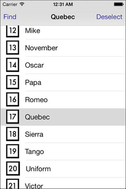
Figure 9-1 Recipe 9-1 builds this basic table view.
Users can tap on cells. When they do so, the controller’s title updates to match the selected item. A Deselect button tells the table to remove the current selection and reset the title; a Find button moves the selection into view, even if it’s been scrolled offscreen.
This implementation attempts to scroll the “found” selection to the top (UITableViewScrollPositionTop), space permitting. Zulu, the last item in this table, cannot scroll any higher than the bottom of the view because you simply run out of table after its cell.
Data Source Methods
To display a table, even a basic flat one like the one that Recipe 9-1 builds, every table data source must implement three core instance methods. These methods define how the table is structured and provide content for the table:
 numberOfSectionsInTableView—Tables can display their data in sections or as a single list. For flat tables, return 1. This indicates that the entire table should be presented as one single list. For sectioned lists, return a value of 2 or higher.
tableView:numberOfRowsInSection:—This method returns the number of rows for a given section. For Recipe 9-1’s flat list, this method returns the number of rows for the entire table. For more complex lists, you need to provide a way to report back per section. Core Data provides especially simple sectioned table integration, as you’ll read about in Chapter 12, “A Taste of Core Data.” As with all counting in iOS, section ordering starts with 0 as the first section.
tableView:cellForRowAtIndexPath:—This method returns a cell to the calling table. Use the index path’s row and section properties to determine which cell to provide and make sure to take advantage of reusable cells where possible to minimize memory overhead.
Responding to User Touches
Recipe 9-1 responds to the user in the tableView:didSelectRowAtIndexPath: delegate method. This recipe’s implementation updates the view controller’s title and enables both bar buttons for searching and deselecting. These buttons remain enabled as long as there’s a valid selection. If the user chooses the Deselect option, this code calls deselectRowAtIndexPath:animated: and disables both buttons.
Note
When you want a table cell to ignore user touches, set the cell’s selectionStyle property to UITableViewCellSelectionStyleNone. This disables the gray overlay that displays on the selected cell. The cell is still selected but will not highlight on selection in any way. If selecting the cell produces some kind of side effect other than presenting information, this may not be the best approach.
Recipe 9-1 Building a Basic Table
@implementation TestBedViewController
{
UIFont *imageFont;
NSArray *items;
}
// Number of sections
- (NSInteger)numberOfSectionsInTableView:(UITableView *)aTableView
{
return 1;
}
// Rows per section
- (NSInteger)tableView:(UITableView *)aTableView
numberOfRowsInSection:(NSInteger)section
{
return items.count;
}
// Return a cell for the index path
- (UITableViewCell *)tableView:(UITableView *)aTableView
cellForRowAtIndexPath:(NSIndexPath *)indexPath
{
UITableViewCell *cell = [self.tableView
dequeueReusableCellWithIdentifier:@"cell"
forIndexPath:indexPath];
// Cell label
cell.textLabel.text = items[indexPath.row];
// Cell image
NSString *indexString =
[NSString stringWithFormat:@"%02d", indexPath.row];
cell.imageView.image =
stringImage(indexString, imageFont, 6.0f);
return cell;
}
// On selection, update the title and enable find/deselect
- (void)tableView:(UITableView *)aTableView
didSelectRowAtIndexPath:(NSIndexPath *)indexPath
{
UITableViewCell *cell =
[self.tableView cellForRowAtIndexPath:indexPath];
self.title = cell.textLabel.text;
self.navigationItem.rightBarButtonItem.enabled = YES;
self.navigationItem.leftBarButtonItem.enabled = YES;
}
// Deselect any current selection
- (void)deselect
{
NSArray *paths = [self.tableView indexPathsForSelectedRows];
if (!paths.count) return;
NSIndexPath *path = paths[0];
[self.tableView deselectRowAtIndexPath:path animated:YES];
self.navigationItem.rightBarButtonItem.enabled = NO;
self.navigationItem.leftBarButtonItem.enabled = NO;
self.title = nil;
}
// Move to the selection
- (void)find
{
[self.tableView scrollToNearestSelectedRowAtScrollPosition:
UITableViewScrollPositionTop animated:YES];
}
// Set up table
- (void)viewDidLoad
{
[super viewDidLoad];
self.view.backgroundColor = [UIColor whiteColor];
self.navigationItem.rightBarButtonItem =
BARBUTTON(@"Deselect", @selector(deselect));
self.navigationItem.leftBarButtonItem =
BARBUTTON(@"Find", @selector(find));
self.navigationItem.rightBarButtonItem.enabled = NO;
self.navigationItem.leftBarButtonItem.enabled = NO;
imageFont = [UIFont fontWithName:@"Futura" size:18.0f];
[self.tableView registerClass:[UITableViewCell class]
forCellReuseIdentifier:@"cell"];
items = [@"Alpha Bravo Charlie Delta Echo Foxtrot Golf \
Hotel India Juliet Kilo Lima Mike November Oscar Papa \
Quebec Romeo Sierra Tango Uniform Victor Whiskey Xray \
Yankee Zulu" componentsSeparatedByString:@" "];
}
@end
Get This Recipe’s Code
To find this recipe’s full sample project, point your browser to https://github.com/erica/iOS-7-Cookbook and go to the folder for Chapter 9.
Table View Cells
The UITableViewCell class offers four utilitarian base styles, which are shown in Figure 9-2. This class provides two text label properties: a primary textLabel and a secondary detailTextLabel, which is used for creating subtitles. The four styles are as follows:
UITableViewCellStyleDefault—This cell offers a single left-aligned text label and an optional image. When images are used, the label is pushed to the right, decreasing the amount of space available for text. You can access and modify detailTextLabel, but it is not shown onscreen.
UITableViewCellStyleValue1—This cell style offers a large black primary label on the left side of the cell and a slightly smaller, gray subtitle detail label to its right.
UITableViewCellStyleValue2—This kind of cell consists of a small primary label on the left, displayed with the current tintColor, and a small black subtitle detail label to its right. The small width of the primary label means that most text will be cut off by an ellipsis. This cell does not support images.
UITableViewCellStyleSubtitle—This cell pushes the standard text label up a bit to make way for the smaller detail label beneath it. Both labels display in black. Like the default cell, the subtitle cell offers an optional image.
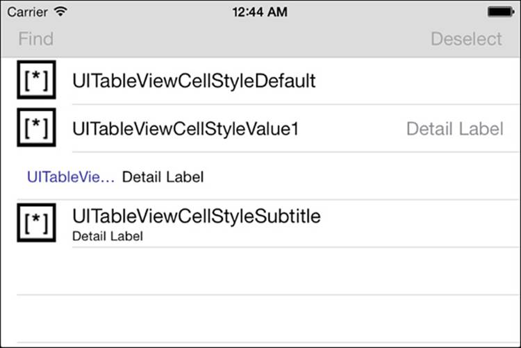
Figure 9-2 Cocoa Touch provides four standard cell types, several of which support optional images.
Selection Style
Tables enable you to set the selectionStyle for the selected cell. In iOS 7, despite the name, UITableViewCellSelectionStyleBlue and UITableViewCellSelectionStyleGray both result in a light gray background for the selected cell. If you’d rather not show a selection, use UITableViewCellSelectionStyleNone. The cell can still be selected, but the gray background will not display.
Adding Custom Selection Traits
When a user selects a cell, Cocoa Touch helps you emphasize the cell’s selection. Customize a cell’s selection behavior by updating its traits to stand out from its fellows. There are two ways to do this.
The selectedBackgroundView property allows you to add controls and other views to just the currently selected cell. This works in a similar manner to the accessory views that appear when a keyboard is shown. You might use the selected background view to add a preview button or a purchase option to the selected cell.
The cell label’s highlightedTextColor property lets you choose an alternative text color when the cell is selected.
Recipe: Creating Checked Table Cells
Accessory views expand normal UITableViewCell functionality. Check marks create interactive one-of-n or n-of-n selections, as shown in Figure 9-3. With these kinds of selections, you can ask your users to pick what they want to have for dinner or choose which items they want to update.
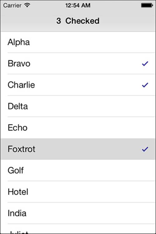
Figure 9-3 Check mark accessories offer a convenient way of making one-of-n or n-of-n selections from a list.
To check an item, use the UITableViewCellAccessoryCheckmark accessory type. Unchecked items use the UITableViewCellAccessoryNone variation. You set these by assigning the cell’s accessoryType property.
Cells have no “memory” to speak of other than their last presentation state. They do not know how an application last used them. They are views and nothing more. Therefore, if you reuse cells without tying those cells to some sort of data model, you can end up with unexpected and unintentional results. This is a natural consequence of the MVC design paradigm.
Consider the following scenario. Say you create a series of cells, each of which owns a toggle switch. Users can interact with that switch and change its value. A cell that scrolls offscreen, landing on the reuse queue, could therefore show an already toggled state for a table element the user hasn’t yet touched.
To fix this problem, always check your cell state against a stored model and fully configure your cell in cellForRowAtIndexPath:. This keeps the view consistent with your application data and avoids lingering “dirty” state from the cell’s last use. It’s the cell that’s being toggled, not the logical item associated with the cell. Reused cells may remain checked or unchecked at next use, so always set the accessory to match the model state, not the cell state.
Recipe 9-2 builds a simple state dictionary to store the on/off state for each index path. Its data source returns cells initialized to match that dictionary. You can easily expand this recipe to store its state to user defaults so it persists between runs. This simple-to-add enhancement is left as an exercise for the reader.
Recipe 9-2 Accessory Views and Stored State
// Return a cell populated with data model state for the index path
- (UITableViewCell *)tableView:(UITableView *)aTableView
cellForRowAtIndexPath:(NSIndexPath *)indexPath
{
UITableViewCell *cell = [self.tableView
dequeueReusableCellWithIdentifier:@"cell"
forIndexPath:indexPath];
// Cell label
cell.textLabel.text = items[indexPath.row];
BOOL isChecked =
((NSNumber *)stateDictionary[indexPath]).boolValue;
cell.accessoryType = isChecked ?
UITableViewCellAccessoryCheckmark :
UITableViewCellAccessoryNone;
return cell;
}
// On selection, update the title
- (void)tableView:(UITableView *)aTableView
didSelectRowAtIndexPath:(NSIndexPath *)indexPath
{
UITableViewCell *cell =
[self.tableView cellForRowAtIndexPath:indexPath];
// Toggle the cell checked state
BOOL isChecked =
!((NSNumber *)stateDictionary[indexPath]).boolValue;
stateDictionary[indexPath] = @(isChecked);
cell.accessoryType = isChecked ?
UITableViewCellAccessoryCheckmark :
UITableViewCellAccessoryNone;
// Count the checked items
int numChecked = 0;
for (NSUInteger row = 0; row < items.count; row++)
{
NSIndexPath *path =
[NSIndexPath indexPathForRow:row inSection:0];
isChecked =
((NSNumber *)stateDictionary[path]).boolValue;
if (isChecked) numChecked++;
}
self.title = [@[@(numChecked).stringValue, @" Checked"]
componentsJoinedByString:@" "];
}
Get This Recipe’s Code
To find this recipe’s full sample project, point your browser to https://github.com/erica/iOS-7-Cookbook and go to the folder for Chapter 9.
Working with Disclosure Accessories
Disclosures refer to the gray, right-facing chevrons and tintColor-imbued info button found on the right of table cells. Disclosures help you link from a cell to a view that supports that cell. In the Contacts list and Calendar applications on the iPhone and iPod touch, these chevrons connect to screens that help you customize contact information and set appointments. Figure 9-4 shows a table view example where each cell displays a disclosure control, showing the two available types.
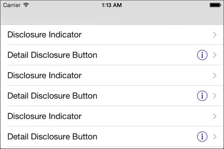
Figure 9-4 The right-pointing chevrons and encircled info buttons indicate disclosure controls, allowing you to link individual table items to another view.
On the iPad, you should consider using a split view controller rather than disclosure accessories. The greater space on the iPad display allows you to present both an organizing list and its detail view at the same time, a feature that the disclosure chevrons attempt to mimic on the smaller iPhone units.
The disclosure accessories play two roles:
The UITableViewCellAccessoryDetailDisclosureButton is an actual button—an encircled i along with a gray chevron. The button responds to touches and is intended to indicate that tapping leads to a full interactive detail view.
The gray chevron of UITableViewCellAccessoryDisclosureIndicator does not track touches and should lead your users to a further options view—specifically, options about that choice.
You see these two accessories in play in the Settings application on the iPhone. The disclosure indicator for the Wi-Fi networks enables you to proceed to the Wi-Fi screen. In the Wi-Fi screen, the detail disclosures lead to specific details about each Wi-Fi network: its IP address, subnet mask, router, DNS info, and so forth.
You find disclosure indicators whenever one screen leads to a related submenu. When working with submenus, stick to the simple gray chevron. Remember this rule of thumb: Submenus use gray chevrons, and object customization uses the info button. Respond to cell selection for disclosure indicators and to accessory button taps for detail disclosure buttons.
The following snippet sets accessoryType for each cell to UITableViewCellAccessoryDetailDisclosureButton. It also sets editingAccessoryType to UITableViewCellAccessoryNone:
- (UITableViewCell *)tableView:(UITableView *)tableView
cellForRowAtIndexPath:(NSIndexPath *)indexPath
{
UITableViewCell *cell =
[tableView dequeueReusableCellWithIdentifier:@"CustomCell"];
cell.accessoryType =
UITableViewCellAccessoryDetailDisclosureButton;
cell.editingAccessoryType = UITableViewCellAccessoryNone;
return cell;
}
// Respond to accessory button taps
-(void)tableView:(UITableView *)tableView
accessoryButtonTappedForRowWithIndexPath:(NSIndexPath *)indexPath
{
// Do something here
}
To handle user taps on the detail disclosure button, the tableView:accessoryButtonTapped-ForRowWithIndexPath: method enables you to determine the row that was tapped and implement some appropriate response. In real life, you’d move to a view that explains more about the selected item and enables you to choose from additional options.
Gray disclosure indicators use a different approach. Because these accessories are not buttons, they respond to cell selection rather than the accessory button tap. Add your logic to tableView:didSelectRowAtIndexPath: to push the disclosure view onto your navigation stack or by presenting a modal view controller or an alert view.
Neither disclosure accessory changes the way the rest of the cell works. Even when sporting accessories, you can select cells, edit cells, and so forth. Accessories add an extra interaction modality; they don’t replace the ones you already have.
Recipe: Table Edits
Bring your tables to life by adding editing features. Table edits transform a static information display into an interactive scrolling control that invites your user to add and remove data. Although the bookkeeping for working with table edits is moderately complex, the same techniques easily transfer from one app to another. Once you master the basic elements of entering and leaving edit mode and supporting undo, you can use these items over and over.
Recipe 9-3 introduces a table that responds meaningfully to table edits. This example creates a scrolling list of random images. Users create new cells by tapping Add and remove cells either by swiping or entering edit mode (by tapping Edit) and using the round red remove controls (seeFigure 9-5).
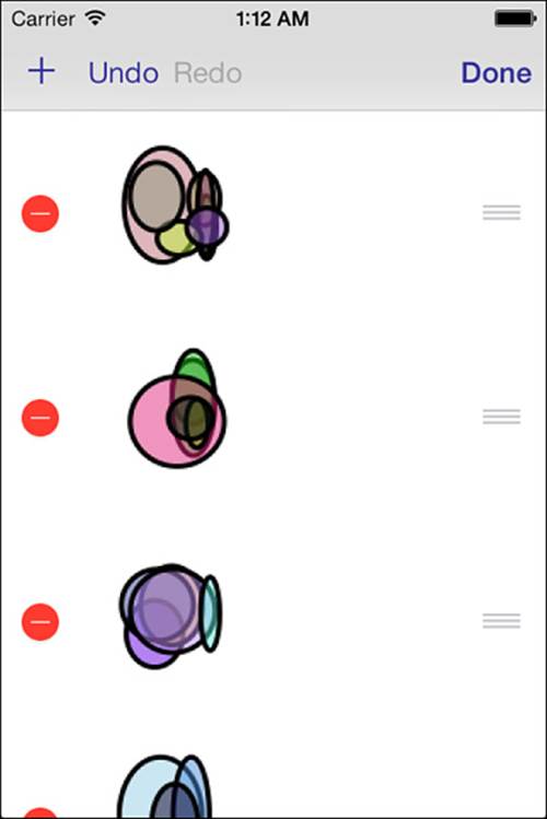
Figure 9-5 Round red remove controls allow your users to interactively delete items from a table.
In day-to-day use, every iOS user quickly becomes familiar with the small red circles used to delete cells from tables. Many users also pick up on basic swipe-to-delete functionality. This recipe also adds move controls, those triplets of small gray, horizontal lines that allow users to drag items to new positions. Users leave edit mode by tapping Done.
Adding Undo Support
Cocoa Touch offers the NSUndoManager class to provide a way to reverse user actions. By default, every application window provides a shared undo manager. You can use this shared manager or create your own.
All children of the UIResponder class can find the nearest undo manager in the responder chain. This means that if you use the window’s undo manager in your view controller, the controller automatically knows about that manager through its undoManager property. This is enormously convenient because you can add undo support in your main view controller, and all your child views basically pick up that support for free.
The manager can store an arbitrary number of undo actions. You may want to specify how deep that stack goes. The bigger the stack, the more memory you use. Many applications allow 3, 5, or 10 levels of undo when memory is tight. Each action can be complex, involving groups of undo activities, or the action can be simple, as in the examples shown in Recipe 9-3.
This recipe uses an undo manager to support user undo and redo actions for adding, deleting, and moving cells. Undo and Redo buttons enable users to move through their edit history. In this recipe, these buttons are enabled when the undo manager supplies actions to support their use.
Implementing Undo
Recipe 9-3 handles both adding and deleting items by using the same method, updateItem-AtIndexPath:withObject:. The method works like this: It inserts any non-nil object at the index path. When the passed object is nil, it instead deletes the item at that index path.
This might seem like an odd way to handle requests, because it involves an extra method and extra steps, but there’s an underlying motive. This approach provides a unified foundation for undo support, allowing simple integration with undo managers.
The method, therefore, has two jobs to do. First, it prepares an undo invocation. That is, it tells the undo manager how to reverse the edits it is about to apply. Second, it applies the actual edits, making its changes to the items array and updating the table and bar buttons.
The setBarButtonItems method controls the state of the Undo and Redo buttons. This method checks the active undo manager to see whether the undo stack provides undo and redo actions. If so, it enables the appropriate buttons.
Although we’re not fans of shake-to-undo, this recipe does support it. Its viewDidLoad method sets the applicationSupportsShakeToEdit property of the application delegate. Also note the first responder calls added to provide undo support. The table view becomes the first responder as it appears and resigns it when it disappears.
Displaying Remove Controls
The table displays remove controls with a single call: [self.tableView setEditing:YES animated:YES]. This updates the table’s editing property and presents the round remove controls shown in Figure 9-5 on each cell. The animation is optional but recommended. As a rule, use animations in your iOS interfaces to lead your users from one state to the next so that they’re prepared for the mode changes that happen onscreen.
Recipe 9-3 uses a system-supplied Edit/Done button (self.editButtonItem) and implements setEditing:animated: to move the table into and out of an editing state. When a user taps the Edit or Done button (it toggles back and forth), this method updates the edit state and the navigation bar’s buttons.
Handling Delete Requests
On row deletion, the table communicates with your application by issuing a tableView:commitEditingStyle:forRowAtIndexPath: callback. A table delete removes an item from the visual table but does not alter the underlying data. Unless you manage the item removal from your data source, the “deleted” item will reappear on the next table refresh. This method offers the place for you to coordinate with your data source and respond to the row deletion that the user just performed.
Delete an item from the data structure that supplies the data source methods (in this recipe, through an NSMutableArray of image items) and handle any real-world action such as deleting files, removing contacts, and so on, that occur as a consequence of the user’s edit.
Recipe 9-3 animates its cell deletions. The beginUpdates and endUpdates method pair allows simultaneous animation of table operations such as adding and deleting rows.
Swiping Cells
Swiping is a clean method for removing items from your UITableView instances. To enable swipes, simply provide the commit-editing-style method. The table takes care of the rest.
To swipe, users drag swiftly from the right side of the cell to the left. The rectangular delete confirmation appears to the right of the cell, but the cells do not display the round remove controls on the left.
After users swipe and confirm, the tableView:commitEditingStyle:forRowAtIndexPath: method applies data updates just as if the deletion had occurred in edit mode.
Reordering Cells
You empower your users when you allow them to directly reorder the cells of a table. Figure 9-5 shows a table that displays the reorder control’s stacked gray lines. Users can apply this interaction to sort to-do items by priority, choose which songs should go first in a playlist, and so on. iOS ships with built-in table reordering support that’s easy to add to your applications.
Like swipe-to-delete, cell reordering support is contingent on the presence or absence of a single method. The tableView:moveRowAtIndexPath:toIndexPath method synchronizes your data source with the onscreen changes, similar to committing edits for cell deletion. Adding this method instantly enables reordering.
Adding Cells
Recipe 9-3 uses an Add button to create new content for the table. This button takes the form of a system bar button item, which displays as a plus sign. (See the top-left corner of Figure 9-5.) The addItem: method in Recipe 9-3 appends a new random image at the end of the items array.
Recipe 9-3 Editing Tables
@implementation TestBedViewController
{
NSMutableArray *items;
}
#pragma mark Data Source
// Number of sections
- (NSInteger)numberOfSectionsInTableView:(UITableView *)aTableView
{
return 1;
}
// Rows per section
- (NSInteger)tableView:(UITableView *)aTableView
numberOfRowsInSection:(NSInteger)section
{
return items.count;
}
// Return a cell for the index path
- (UITableViewCell *)tableView:(UITableView *)aTableView
cellForRowAtIndexPath:(NSIndexPath *)indexPath
{
UITableViewCell *cell = [self.tableView
dequeueReusableCellWithIdentifier:@"cell"
forIndexPath:indexPath];
cell.imageView.image = items[indexPath.row];
return cell;
}
#pragma mark Edits
- (void)setBarButtonItems
{
// Expire any ongoing operations
if (self.undoManager.isUndoing ||
self.undoManager.isRedoing)
{
[self performSelector:@selector(setBarButtonItems)
withObject:nil afterDelay:0.1f];
return;
}
UIBarButtonItem *undo = SYSBARBUTTON_TARGET(
UIBarButtonSystemItemUndo, self.undoManager,
@selector(undo));
undo.enabled = self.undoManager.canUndo;
UIBarButtonItem *redo = SYSBARBUTTON_TARGET(
UIBarButtonSystemItemRedo, self.undoManager,
@selector(redo));
redo.enabled = self.undoManager.canRedo;
UIBarButtonItem *add = SYSBARBUTTON(
UIBarButtonSystemItemAdd, @selector(addItem:));
self.navigationItem.leftBarButtonItems = @[add, undo, redo];
}
- (void)setEditing:(BOOL)isEditing animated:(BOOL)animated
{
[super setEditing:isEditing animated:animated];
[self.tableView setEditing:isEditing animated:animated];
NSIndexPath *path = [self.tableView indexPathForSelectedRow];
if (path)
[self.tableView deselectRowAtIndexPath:path animated:YES];
[self setBarButtonItems];
}
- (void)updateItemAtIndexPath:(NSIndexPath *)indexPath
withObject:(id)object
{
// Prepare for undo
id undoObject =
object ? nil : items[indexPath.row];
[[self.undoManager prepareWithInvocationTarget:self]
updateItemAtIndexPath:indexPath withObject:undoObject];
// You cannot insert a nil item. Passing nil is a delete request.
[self.tableView beginUpdates];
if (!object)
{
[items removeObjectAtIndex:indexPath.row];
[self.tableView deleteRowsAtIndexPaths:@[indexPath]
withRowAnimation:UITableViewRowAnimationTop];
}
else
{
[items insertObject:object atIndex:indexPath.row];
[self.tableView insertRowsAtIndexPaths:@[indexPath]
withRowAnimation:UITableViewRowAnimationTop];
}
[self.tableView endUpdates];
[self performSelector:@selector(setBarButtonItems)
withObject:nil afterDelay:0.1f];
}
- (void)addItem:(id)sender
{
// add a new item
NSIndexPath *newPath =
[NSIndexPath indexPathForRow:items.count inSection:0];
UIImage *image = blockImage(IMAGE_SIZE);
[self updateItemAtIndexPath:newPath withObject:image];
}
- (void)tableView:(UITableView *)aTableView
commitEditingStyle:(UITableViewCellEditingStyle)editingStyle
forRowAtIndexPath:(NSIndexPath *)indexPath
{
// delete item
[self updateItemAtIndexPath:indexPath withObject:nil];
}
// Provide re-ordering support
-(void)tableView:(UITableView *)tableView
moveRowAtIndexPath:(NSIndexPath *)oldPath
toIndexPath:(NSIndexPath *)newPath
{
if (oldPath.row == newPath.row) return;
[[self.undoManager prepareWithInvocationTarget:self]
tableView:self.tableView moveRowAtIndexPath:newPath
toIndexPath:oldPath];
id item = [items objectAtIndex:oldPath.row];
[items removeObjectAtIndex:oldPath.row];
[items insertObject:item atIndex:newPath.row];
if (self.undoManager.isUndoing || self.undoManager.isRedoing)
{
[self.tableView beginUpdates];
[self.tableView deleteRowsAtIndexPaths:@[oldPath]
withRowAnimation:UITableViewRowAnimationLeft];
[self.tableView insertRowsAtIndexPaths:@[newPath]
withRowAnimation:UITableViewRowAnimationLeft];
[self.tableView endUpdates];
}
[self performSelector:@selector(setBarButtonItems)
withObject:nil afterDelay:0.1f];
}
#pragma mark First Responder for undo support
- (BOOL)canBecomeFirstResponder
{
return YES;
}
- (void)viewDidAppear:(BOOL)animated
{
[super viewDidAppear:animated];
[self becomeFirstResponder];
}
- (void)viewWillDisappear:(BOOL)animated
{
[super viewWillDisappear:animated];
[self resignFirstResponder];
}
#pragma mark View Setup
- (void)viewDidLoad
{
[super viewDidLoad];
self.view.backgroundColor = [UIColor whiteColor];
[self.tableView registerClass:[UITableViewCell class]
forCellReuseIdentifier:@"cell"];
self.tableView.rowHeight = IMAGE_SIZE + 20.0f;
self.tableView.separatorStyle =
UITableViewCellSeparatorStyleNone;
self.navigationItem.rightBarButtonItem = self.editButtonItem;
items = [NSMutableArray array];
// Provide shake to undo support
[UIApplication sharedApplication].applicationSupportsShakeToEdit = YES;
[self setBarButtonItems];
}
@end
Get This Recipe’s Code
To find this recipe’s full sample project, point your browser to https://github.com/erica/iOS-7-Cookbook and go to the folder for Chapter 9.
Recipe: Working with Sections
Many iOS applications use sections as well as rows. Sections provide another level of structure to lists, grouping items together into logical units. The most commonly used section scheme is alphabetic, although you are certainly not limited to organizing your data this way. You can use any section scheme that makes sense for your application.
Figure 9-6 shows a table that uses sections to display grouped names. Each section presents a separate header (that is, “Crayon names starting with . . . ”), and an index on the right offers quick access to each of the sections. Notice that there are no sections listed for K, Q, X, and Z in the index because those sections are empty. You generally want to omit empty sections from the index.
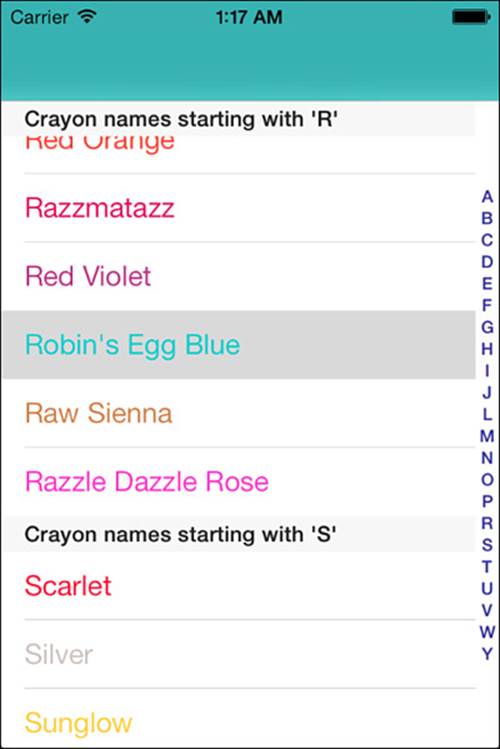
Figure 9-6 Sectioned tables present headers and an index to help users find information as quickly as possible.
Building Sections
When working with groups and sections, think two dimensionally. Section arrays let you store and access the members of data in a section-by-section structure. Implement this approach by creating an array of arrays. A section array can store one array for each section, which in turn contains the titles for each cell.
Predicates help you build sections from a list of strings. The following method alphabetically retrieves items from a flat array. The beginswith predicate matches each string that starts with the given letter:
- (NSArray *)itemsInSection:(NSInteger)section
{
NSPredicate *predicate = [NSPredicate predicateWithFormat:
@"SELF beginswith[cd] %@", [self firstLetter:section]];
return [crayonColors.allKeys
filteredArrayUsingPredicate:predicate];
}
Add these results iteratively to a mutable array to create a two-dimensional sectioned array from an initial flat list:
sectionArray = [NSMutableArray array];
for (int i = 0; i < 26; i++)
[sectionArray addObject:[self itemsInSection:i]];
To work, this particular implementation relies on two things: first, that the words are already sorted (each subsection adds the words in the order they’re found in the array); and second, that the sections match the words. Entries that start with punctuation or numbers won’t work with this loop. You can trivially add an “other” section to take care of these cases, which this (simple) sample omits.
Although, as mentioned, alphabetic sections are useful and probably the most common grouping, you can use any kind of structure you like. For example, you might group people by departments, gems by grades, or appointments by date. No matter what kind of grouping you choose, an array of arrays provides the table view data source that best matches sectioned tables.
From this initial startup, it’s up to you to add or remove items using this two-dimensional structure. As you can easily see, creation is simple, but maintenance gets tricky. Here’s where Core Data really helps out. Instead of working with multileveled arrays, you can query your data store on any object field and sort it as desired. Chapter 12 introduces using Core Data with tables. And as you will read in that chapter, it greatly simplifies matters. For now, this example continues to use a simple array of arrays to introduce sections and their use.
Counting Sections and Rows
To create sectioned tables, customize two key data source methods:
numberOfSectionsInTableView:—This method specifies how many sections appear in your table, establishing the number of groups to display. When using a section array, as recommended here, return the number of items in the section array—that is, sectionArray.count. If the number of items is known in advance (26 in this case, even though some sections have no items), you can hard-code that number, but it’s better to code more generally where possible.
tableView:numberOfRowsInSection:—This method is called with a section number. Specify how many rows appear in that section. With the recommended data structure, just return the count of items at the nth subarray:
sectionArray[sectionNumber].count
Returning Cells
Sectioned tables use both row and section information to find cell data. Earlier recipes in this chapter use a flat array with a row number index. Tables with sections must use the entire index path to locate both the section and row index for the data populating a cell. This method, from a crayon handler helper class, first retrieves the current items for the section and then pulls out the specific item by row. Recipe 9-4 details the helper class methods that work with an array-of-arrays section data source:
// Color name by index path
- (NSString *)colorNameAtIndexPath:(NSIndexPath *)path
{
if (path.section >= sectionArray.count)
return nil;
NSArray *currentItems = sectionArray[path.section];
if (path.row >= currentItems.count)
return nil;
NSString *crayon = currentItems[path.row];
return crayon;
}
A similar method retrieves the color:
// Color by index path
- (UIColor *)colorAtIndexPath:(NSIndexPath *)path
{
NSString *crayon = [self colorNameAtIndexPath:path];
if (crayon)
return crayonColors[crayon];
return nil;
}
Here is the data source method that uses these calls to return a cell with the proper color and name:
// Return a cell for the index path
- (UITableViewCell *)tableView:(UITableView *)aTableView
cellForRowAtIndexPath:(NSIndexPath *)indexPath
{
UITableViewCell *cell =
[self.tableView dequeueReusableCellWithIdentifier:@"cell"
forIndexPath:indexPath];
// Retrieve the crayon name
NSString *crayonName = [crayons colorNameAtIndexPath:indexPath];
// Update the cell
cell.textLabel.text = crayonName;
// Tint the title
if ([crayonName hasPrefix:@"White"])
cell.textLabel.textColor = [UIColor blackColor];
else
cell.textLabel.textColor = [crayons colorAtIndexPath:indexPath];
return cell;
}
Creating Header Titles
It takes little work to add section headers to your grouped table. The optional tableView:titleForHeaderInSection: method supplies the titles for each section. It’s passed an integer. In return, you supply a title. If your table does not contain any items in a given section or when you’re only working with one section, return nil:
// Return the header title for a section
- (NSString *)tableView:(UITableView *)aTableView
titleForHeaderInSection:(NSInteger)section
{
NSString *sectionName = [crayons nameForSection:section];
if (!sectionName) return nil;
return [NSString stringWithFormat:
@"Crayon names starting with '%@'", sectionName];
}
If you aren’t happy using titles, you can return custom header views instead.
Customizing Headers and Footers
Sectioned table views are extremely customizable. Both the tableHeaderView property and the related tableFooterView property can be assigned to any type of view, each with its own subviews. So you might add labels, text fields, buttons, and other controls to extend the table’s features.
Headers and footers aren’t just one each per table. Each section offers a customizable header and footer view as well. You can alter heights or swap elements out for custom views. The optional tableView:heightForHeaderInSection: (or the sectionHeaderHeight property) and tableView:viewForHeaderInSection: methods let you add individual headers to each section. Corresponding methods exist for footers as well as headers.
Creating a Section Index
Tables that implement sectionIndexTitlesForTableView: present the kind of index view that appears on the right in Figure 9-6. This method is called when the table view is created, and the array that is returned determines what items are displayed onscreen. Return nil to skip an index. Apple recommends adding section indexes only to plain table views—that is, table views created using the default plain style of UITableViewStylePlain and not grouped tables:
// Return an array of section titles for index
- (NSArray *)sectionIndexTitlesForTableView:(UITableView *)aTableView
{
NSMutableArray *indices = [NSMutableArray array];
for (int i = 0; i < crayons.numberOfSections; i++)
{
NSString *name = [crayons nameForSection:i];
if (name) [indices addObject:name];
}
return indices;
}
Although this example uses single-letter titles, you are certainly not limited to those items. You can use words or, if you’re willing to work out the Unicode equivalents, symbols, including emoji items, that are part of the iOS character library. Here’s how you could add a small yellow smile:
[indices addObject:@"\ue057"];
Handling Section Mismatches
Touching the table index scrolls the table based on the user touch offset. As mentioned earlier in this section, this particular table does not display sections for K, Q, X, and Z. These missing letters can cause a mismatch between a user selection and the results displayed by the table.
To remedy this, implement the optional tableView:sectionForSectionIndexTitle: method. This method’s role is to connect a section index title (that is, the one returned by the sectionIndexTitlesForTableView: method) with a section number. This overrides any order mismatches and provides an exact one-to-one match between a user index selection and the section displayed:
#define ALPHA @"ABCDEFGHIJKLMNOPQRSTUVWXYZ"
- (NSInteger)tableView:(UITableView *)tableView
sectionForSectionIndexTitle:(NSString *)title
atIndex:(NSInteger)index
{
return [ALPHA rangeOfString:title].location;
}
Delegation with Sections
As with data source methods, the trick to implementing delegate methods in a sectioned table involves using the index path section and row properties. These properties provide the double access needed to find the correct section array and then the item within that array for this example:
// On selecting a row, update the navigation bar tint
- (void)tableView:(UITableView *)aTableView
didSelectRowAtIndexPath:(NSIndexPath *)indexPath
{
UIColor *color = [crayons colorAtIndexPath:indexPath];
self.navigationController.navigationBar.barTintColor = color;
}
Recipe 9-4 Supporting a Table with Sections
/* CrayonHandler.m */
// Return an array of items that appear in each section
- (NSArray *)itemsInSection:(NSInteger)section
{
NSPredicate *predicate = [NSPredicate predicateWithFormat:
@"SELF beginswith[cd] %@", [self firstLetter:section]];
return [[crayonColors allKeys] filteredArrayUsingPredicate:predicate];
}
// Count of available sections
- (NSInteger)numberOfSections
{
return sectionArray.count;
}
// Number of items within a section
- (NSInteger)countInSection:(NSInteger)section
{
return [sectionArray[section] count];
}
// Return the letter that starts each section member's text
- (NSString *)firstLetter:(NSInteger)section
{
return [[ALPHA substringFromIndex:section] substringToIndex:1];
}
// The one-letter section name
- (NSString *)nameForSection:(NSInteger)section
{
if (![self countInSection:section])
return nil;
return [self firstLetter:section];
}
// Color name by index path
- (NSString *)colorNameAtIndexPath:(NSIndexPath *)path
{
if (path.section >= sectionArray.count)
return nil;
NSArray *currentItems = sectionArray[path.section];
if (path.row >= currentItems.count)
return nil;
NSString *crayon = currentItems[path.row];
return crayon;
}
// Color by index path
- (UIColor *)colorAtIndexPath:(NSIndexPath *)path
{
NSString *crayon = [self colorNameAtIndexPath:path];
return crayonColors[crayon];
}
Get This Recipe’s Code
To find this recipe’s full sample project, point your browser to https://github.com/erica/iOS-7-Cookbook and go to the folder for Chapter 9.
Recipe: Searching Through a Table
A search display controller is a kind of controller that enables user-driven searches. These controllers allow users to filter a table’s contents in real time, providing instant responsiveness to a user-driven query. It’s a great feature that lets users interactively find what they’re looking for, with the results updating as each new character is entered into the search field.
You create these controllers by initializing them with a search bar instance and a content controller, normally a table view, whose data source is searched. Recipe 9-5 demonstrates the steps involved in creating and using a search display controller in an application.
Searches are best built around predicates, enabling you to filter arrays to retrieve matching items with a simple method call. Here is how you might search through a flat array of strings to retrieve items that match the text from a search bar. The [cd] after contains refers to case-insensitive and diacritic-insensitive matching. Diacritics are small marks that accompany a letter, such as the dots of an umlaut (¨) or the tilde (~) above a Spanish n:
NSPredicate *predicate =
[NSPredicate predicateWithFormat:@"SELF contains[cd] %@",
searchBar.text];
filteredArray = [[crayonColors allKeys]
filteredArrayUsingPredicate:predicate];
The search bar in question should appear at the top of the table as its header view, as in Figure 9-7 (left). The same search bar is assigned to the search display controller, as shown in the following code snippet:
self.tableView.tableHeaderView = searchBar;
searchController = [[UISearchDisplayController alloc]
initWithSearchBar:searchBar contentsController:self];
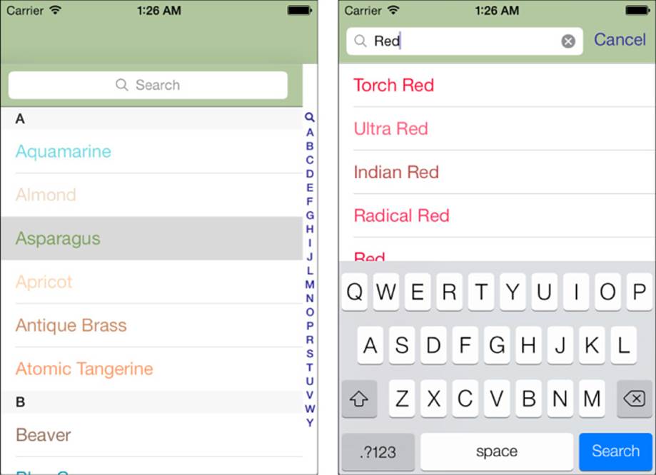
Figure 9-7 The user must scroll to the top of the table to initiate a search. The search bar appears as the first item in the table in its header view (left). Once the user taps within the search bar and makes it active, the search bar jumps into the navigation bar and presents a filtered list of items based on the search criteria (right).
Search bars in iOS 7 now support a style property for configuring the presentation: UISearchBarStyleProminent, UISearchBarStyleMinimal, and UISearchBarStyleDefault. The prominent style, which is the default, provides a translucent background with an opaque search field, matching the style found in previous versions of iOS. The minimal style removes the background and provides a translucent search field. When users tap in the search box, the view shifts, and the search bar moves up to the navigation bar area, as shown in Figure 9-7 (right). A search results table view is presented, temporarily supplanting the original table. The search bar and results table view remain until the user taps Cancel, returning the user to the unfiltered table display.
Creating a Search Display Controller
Search display controllers help manage the display of data owned by another controller (in this case, a standard UITableViewController). A search display controller presents a subset of that data in its own table view, usually by filtering that data source through a predicate. You initialize a search display controller by providing it with a search bar and a contents controller.
Set up the search bar’s text trait features as you would normally do but do not set a delegate. The search bar works with the search display controller without explicit delegation on your part.
When setting up the search display controller, make sure you set both its search results data source and delegate, as shown here. These usually point back to the primary table view controller subclass, which is where you adjust your normal data source and delegate methods to comply with the searchable table:
// Create a search bar
searchBar = [[UISearchBar alloc]
initWithFrame:CGRectMake(0.0f, 0.0f, width, 44.0f)];
searchBar.autocorrectionType = UITextAutocorrectionTypeNo;
searchBar.autocapitalizationType = UITextAutocapitalizationTypeNone;
searchBar.keyboardType = UIKeyboardTypeAlphabet;
self.tableView.tableHeaderView = searchBar;
// Create the search display controller
searchController = [[UISearchDisplayController alloc]
initWithSearchBar:searchBar contentsController:self];
searchController.searchResultsDataSource = self;
searchController.searchResultsDelegate = self;
Registering Cells for the Search Display Controller
When dequeuing, register cell types for each table view in your application. That includes the search display controller’s built-in table. Forgetting this step and assuming you can dequeue a cell from self.tableView sets you up for a rather nasty crash. Here’s how you might register cell classes for both tables:
// Register cell classes
[self.tableView registerClass:[UITableViewCell class]
forCellReuseIdentifier:@"cell"];
[searchController.searchResultsTableView registerClass:[UITableViewCell class]
forCellReuseIdentifier:@"cell"];
A new issue in iOS 7 requires a change in the timing of cell class registration. When retrieving the cells in the tableView:cellForRowAtIndexPath: data source method, the search table provided is freshly created; any previously created registrations are lost. The easiest way to resolve this is to register your cell class at the very beginning of the method. This doesn’t feel like an efficient approach, but it ensures the availability of the cell class registration until Apple provides a more elegant method.
As you can see in the recipe code, workarounds are used for cases where iOS confuses which table it’s requesting cells for.
Building Searchable Data Source Methods
The number of items displayed in a table changes as users search. A shorter search string generally matches more items than a longer one. You report the current number of rows for each table. The number of rows changes as the user updates text in the search field. To detect whether the table view controller or the search display controller is currently in charge, check the passed table view parameter. Adjust the row count accordingly:
- (NSInteger)tableView:(UITableView *)aTableView
numberOfRowsInSection:(NSInteger)section
{
if (aTableView == searchController.searchResultsTableView)
return [crayons filterWithString:searchBar.text];
return [crayons countInSection:section];
}
Use a predicate to report the count of items that match the text in the search box. Predicates provide an extremely simple way to filter an array and return only items that match a search string. The predicate used here performs a case-insensitive contains match. Each string that contains the text in the search field returns a positive match, allowing that string to remain part of the filtered array. Alternatively, you might want to use beginswith to avoid matching items that do not start with that text. The following method performs the filtering, stores the results, and returns the count of items that it found:
- (NSInteger)filterWithString:(NSString *)filter
{
NSPredicate *predicate = [NSPredicate predicateWithFormat:
@"SELF contains[cd] %@", filter];
filteredArray = [[crayonColors allKeys]
filteredArrayUsingPredicate:predicate];
return filteredArray.count;
}
When providing cells, it is especially critical to check the requesting table view. Cell registration calls must be sent to the appropriate table, and, conversely, cells must be dequeued and initialized from the expected table. The following method returns cells retrieved from either the standard set or the filtered set:
- (UITableViewCell *)tableView:(UITableView *)aTableView
cellForRowAtIndexPath:(NSIndexPath *)indexPath
{
[aTableView registerClass:[UITableViewCell class]
forCellReuseIdentifier:@"cell"];
UITableViewCell *cell =
[aTableView dequeueReusableCellWithIdentifier:@"cell"
forIndexPath:indexPath];
NSString *crayonName;
if (aTableView == self.tableView)
{
crayonName = [crayons colorNameAtIndexPath:indexPath];
}
else
{
if (indexPath.row < crayons.filteredArray.count)
crayonName = crayons.filteredArray[indexPath.row];
}
cell.textLabel.text = crayonName;
cell.textLabel.textColor = [crayons colorNamed:crayonName];
if ([crayonName hasPrefix:@"White"])
cell.textLabel.textColor = [UIColor blackColor];
return cell;
}
Delegate Methods
Search awareness is not limited to data sources. Determining the context of a user tap is critical for providing the correct response in delegate methods. As with the previous data source methods, this delegate method checks the callback’s table view parameter to determine which table view was active. Based on the selected table and index, it picks a color with which to tint both the search bar and the navigation bar:
// Respond to user selections by updating tint colors
- (void)tableView:(UITableView *)aTableView
didSelectRowAtIndexPath:(NSIndexPath *)indexPath
{
UIColor *color = nil;
if (aTableView == self.tableView)
color = [crayons colorAtIndexPath:indexPath];
else
{
if (indexPath.row < crayons.filteredArray.count)
{
NSString *colorName =
crayons.filteredArray[indexPath.row];
if (colorName)
color = [crayons colorNamed:colorName];
}
}
self.navigationController.navigationBar.barTintColor = color;
searchBar.barTintColor = color;
}
Using a Search-Aware Index
Recipe 9-5 highlights some of the other ways to adapt a sectioned table to accommodate search-ready tables. When you support search, the first item added to a table’s section index should be the UITableViewIndexSearch constant. Intended for use only in table indexes, and only as the first item in the index, this option adds the small magnifying glass icon that indicates that the table supports searches. Use it to provide a quick jump to the beginning of the list. Update tableView:sectionForSectionIndexTitle:atIndex: to catch user requests. ThescrollRectToVisible:animated: call used in this recipe manually moves the search bar into place when a user taps the magnifying glass. Otherwise, users would have to scroll back from section 0, which is the section associated with the letter A.
Add a call in viewWillAppear: to scroll the search bar offscreen when the view first loads. This allows your table to start with the bar hidden from sight, ready to be scrolled up to or jumped to as the user desires.
Finally, respond to cancelled searches by proactively clearing the search text from the bar.
Recipe 9-5 Using Search Features
// Add Search to the index
- (NSArray *)sectionIndexTitlesForTableView:
(UITableView *)aTableView
{
if (aTableView == searchController.searchResultsTableView)
return nil;
// Initialize with the search magnifying glass
NSMutableArray *indices = [NSMutableArray
arrayWithObject:UITableViewIndexSearch];
for (int i = 0; i < crayons.numberOfSections; i++)
{
NSString *name = [crayons nameForSection:i];
if (name) [indices addObject:name];
}
return indices;
}
// Handle both the search index item and normal sections
- (NSInteger)tableView:(UITableView *)tableView
sectionForSectionIndexTitle:(NSString *)title
atIndex:(NSInteger)index
{
if (title == UITableViewIndexSearch)
{
[self.tableView scrollRectToVisible:searchBar.frame
animated:NO];
return -1;
}
return [ALPHA rangeOfString:title].location;
}
// Handle the Cancel button by resetting the search text
- (void)searchBarCancelButtonClicked:(UISearchBar *)aSearchBar
{
[searchBar setText:@""];
}
// Titles only for the main table
- (NSString *)tableView:(UITableView *)aTableView
titleForHeaderInSection:(NSInteger)section
{
if (aTableView == searchController.searchResultsTableView)
return nil;
return [crayons nameForSection:section];
}
// Upon appearing, scroll away the search bar
- (void)viewDidAppear:(BOOL)animated
{
[super viewDidAppear:animated];
NSIndexPath *path =
[NSIndexPath indexPathForRow:0 inSection:0];
[self.tableView scrollToRowAtIndexPath:path
atScrollPosition:UITableViewScrollPositionTop
animated:NO];
}
Get This Recipe’s Code
To find this recipe’s full sample project, point your browser to https://github.com/erica/iOS-7-Cookbook and go to the folder for Chapter 9.
Recipe: Adding Pull-to-Refresh to Your Table
Pull-to-refresh is a widely used app feature that has become popular in the App Store over the past few years. It lets you refresh tables by pulling down their tops enough to indicate a request. It is so intuitive to use that many wondered why Apple didn’t add it to itsUITableViewController class. In iOS 6, though, Apple created a highly stylized and stretchable animated refresh control. With iOS 7, the stretchable control was replaced with a more traditional activity indicator with a slightly expanded animation to provide feedback on the state of the control (see Figure 9-8).
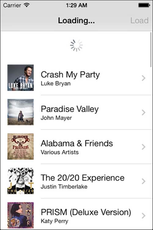
Figure 9-8 You can easily add a pull-to-refresh option to your tables. Users pull down to request updated data.
The new UIRefreshControl class provides an extremely handy control that initiates a table view’s refresh. Recipe 9-6 demonstrates how to add it to your applications. Create a new instance and assign it to a table view controller’s refreshControl property. The control appears directly in the table view, without requiring any further work. When the user pulls down the table view, the pull control is displayed and triggered.
To activate the refresh control programmatically, start a refresh event with beginRefreshing. The refresh control turns into an animated progress wheel. When the new data has been prepared, end the refreshing (endRefreshing) and reload the table view.
Descending from UIControl, instances use target-action to send a custom selector to clients when activated. For some reason, it updates with a value-changed event. Surely, it’s long past time for Apple to introduce a UIControlEventTriggered event for stateless control triggers like this one.
Using pull-to-refresh allows your applications to delay performing expensive routines. For example, you might hold off fetching new information from the Internet or computing new table elements until the user triggers a request for those operations. Pull-to-refresh places your user in control of refresh operations and provides a great balance between information-on-demand and computational overhead.
The DataManager class referred to in Recipe 9-6 loads its data asynchronously, using an operation queue:
- (void)loadData
{
NSString *rss = @"http://itunes.apple.com/us/rss/topalbums/limit=30/xml";
NSOperationQueue *queue = [[NSOperationQueue alloc] init];
[queue addOperationWithBlock:
^{
root = [[XMLParser sharedInstance] parseXMLFromURL:
[NSURL URLWithString:rss]];
[[NSOperationQueue currentQueue] addOperationWithBlock:^{
[self handleData];
}];
}];
}
This approach ensures that data loading won’t block the main thread. The refresh control’s progress wheel won’t be hindered, and the user will be free to interact with other UI elements in your app. After the fetch completes, move control back to the main thread:
if (delegate &&
[delegate respondsToSelector:@selector(dataIsReady:)])
[delegate performSelectorOnMainThread:@selector(dataIsReady:)
withObject:self waitUntilDone:NO];
Recipe 9-6 offers a Load button in addition to the refresh control. Most applications skip this redundancy, but Recipe 9-6 includes it to show how it would interact with the refresh control. When the user taps Load, you still need to perform the refresh control’s startRefreshing andendRefreshing methods. This ensures that the refresh control operates synchronously with the manual reload.
Recipe 9-6 Building Pull-to-Refresh into Your Tables
- (void)dataIsReady:(id)sender
{
// Update the title
self.title = @"iTunes Top Albums";
// Reenable the bar button item
self.navigationItem.rightBarButtonItem.enabled = YES;
// Stop refresh control animation and update the table
[self.refreshControl endRefreshing];
[self.tableView reloadData];
}
- (void)loadData
{
// Provide user status update
self.title = @"Loading...";
// Disable the bar button item
self.navigationItem.rightBarButtonItem.enabled = NO;
// Start refreshing
[self.refreshControl beginRefreshing];
[manager loadData];
}
- (void)viewDidLoad
{
[super viewDidLoad];
self.tableView.rowHeight = 72.0f;
[self.tableView registerClass:[UITableViewCell class]
forCellReuseIdentifier:@"generic"];
// Offer a bar button item and...
self.navigationItem.rightBarButtonItem =
BARBUTTON(@"Load", @selector(loadData));
// Alternatively, use the refresh control
self.refreshControl = [[UIRefreshControl alloc] init];
[self.refreshControl addTarget:self action:@selector(loadData)
forControlEvents:UIControlEventValueChanged];
// This custom data manager asynchronously (nonblocking) loads
// data in a secondary thread
manager = [[DataManager alloc] init];
manager.delegate = self;
}
Get This Recipe’s Code
To find this recipe’s full sample project, point your browser to https://github.com/erica/iOS-7-Cookbook and go to the folder for Chapter 9.
Recipe: Adding Action Rows
Action rows (aka drawer cells) slide open to expose extra cell-specific functionality when users tap the cell associated with them. You may have seen this kind of functionality in commercial apps such as Tweetbot (http://tapbots.com). Recipe 9-7 builds an action row table featuring a pair of buttons in each of its drawers (see Figure 9-9). When tapped, the Title button sets the title on the navigation bar to the cell text; the Alert button displays the same string in a pop-up alert. iOS developer Bilal Sayed Ahmad (@Demonic_BLITZ on Twitter) suggested adding this recipe to theCookbook, and this code is inspired from a sample project he created.
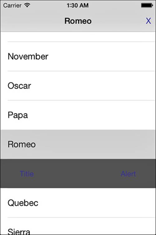
Figure 9-9 Action rows offer cell-specific actions that slide open when a user selects a cell. In this example, the user has tapped the Romeo cell and disclosed a hidden drawer with the Title and Alert buttons.
Recipe 9-7 works by adding a phantom cell to its table view. All other cells adjust around its presence. The implementation starts by adjusting the method that reports the number of rows per section. The drawer lives at actionRowPath. When the phantom cell is present, the number of cells increases by one. When it is hidden, the data source simply reports the normal count of its items.
The viewDidLoad method registers two cell types: one for standard rows and one for the action row. The data source returns a custom cell when passed a path it recognizes as the custom index.
The action cell has other quirks. It cannot be selected. Recipe 9-7’s tableView: willSelectRowAtIndexPath: method ensures this by returning nil when passed the action row path.
Most of this implementation work takes place in the tableView:didSelectRowAtIndexPath: method. It moves the action drawer around by changing its path and performing table updates. Here, the code considers three possible states: The drawer is closed and a new cell is tapped, the drawer is open and the same cell is tapped, and the drawer is open and a different cell is tapped.
The action row path is always nil whenever the drawer is shut. When a cell is tapped, the method sets a path for the new drawer directly after the tapped cell. If the user taps the associated cell above the drawer when it is open, the drawer “closes,” and the path is set back to nil. When the user taps a different cell, this method adjusts its math, depending on whether the new cell is below the old action drawer or above it.
The beginUpdates and endUpdates method pair used here allows simultaneous animation of table operations. Use this block to smoothly introduce all the row changes created by moving, adding, and removing the action drawer.
Recipe 9-7 Adding Action Drawers to Tables
// Rows per section
- (NSInteger)tableView:(UITableView *)aTableView
numberOfRowsInSection:(NSInteger)section
{
return items.count + (self.actionRowPath != nil);
}
// Return a cell for the index path
- (UITableViewCell *)tableView:(UITableView *)aTableView
cellForRowAtIndexPath:(NSIndexPath *)indexPath
{
if ([self.actionRowPath isEqual:indexPath])
{
// Action Row
CustomCell *cell = (CustomCell *)[self.tableView
dequeueReusableCellWithIdentifier:@"action"
forIndexPath:indexPath];
[cell setActionTarget:self];
return cell;
}
else
{
// Normal cell
UITableViewCell *cell = [self.tableView
dequeueReusableCellWithIdentifier:@"cell"
forIndexPath:indexPath];
// Adjust item lookup around action row if needed
NSInteger adjustedRow = indexPath.row;
if (_actionRowPath &&
(_actionRowPath.row < indexPath.row))
adjustedRow--;
cell.textLabel.text = items[adjustedRow];
cell.textLabel.textColor = [UIColor blackColor];
cell.selectionStyle = UITableViewCellSelectionStyleGray;
return cell;
}
}
- (NSIndexPath *)tableView:(UITableView *)tableView
willSelectRowAtIndexPath:(NSIndexPath *)indexPath
{
// Only select normal cells
if([indexPath isEqual:self.actionRowPath]) return nil;
return indexPath;
}
// Deselect any current selection
- (void)deselect
{
NSArray *paths = [self.tableView indexPathsForSelectedRows];
if (!paths.count) return;
NSIndexPath *path = paths[0];
[self.tableView deselectRowAtIndexPath:path animated:YES];
}
// On selection, update the title and enable find/deselect
- (void)tableView:(UITableView *)aTableView
didSelectRowAtIndexPath:(NSIndexPath *)indexPath
{
NSArray *pathsToAdd;
NSArray *pathsToDelete;
if ([self.actionRowPath.previous isEqual:indexPath])
{
// Hide action cell
pathsToDelete = @[self.actionRowPath];
self.actionRowPath = nil;
[self deselect];
}
else if (self.actionRowPath)
{
// Move action cell
BOOL before = [indexPath before:self.actionRowPath];
pathsToDelete = @[self.actionRowPath];
self.actionRowPath = before ? indexPath.next : indexPath;
pathsToAdd = @[self.actionRowPath];
}
else
{
// New action cell
pathsToAdd = @[indexPath.next];
self.actionRowPath = indexPath.next;
}
// Animate the deletions and insertions
[self.tableView beginUpdates];
if (pathsToDelete.count)
[self.tableView deleteRowsAtIndexPaths:pathsToDelete
withRowAnimation:UITableViewRowAnimationNone];
if (pathsToAdd.count)
[self.tableView insertRowsAtIndexPaths:pathsToAdd
withRowAnimation:UITableViewRowAnimationNone];
[self.tableView endUpdates];
}
// Set up table
- (void)viewDidLoad
{
[super viewDidLoad];
self.tableView.rowHeight = 60.0f;
self.tableView.backgroundColor =
[UIColor colorWithWhite:0.75f alpha:1.0f];
[self.tableView registerClass:[UITableViewCell class]
forCellReuseIdentifier:@"cell"];
[self.tableView registerClass:[CustomCell class]
forCellReuseIdentifier:@"action"];
items = [@"Alpha Bravo Charlie Delta Echo Foxtrot Golf \
Hotel India Juliet Kilo Lima Mike November Oscar Papa \
Quebec Romeo Sierra Tango Uniform Victor Whiskey Xray \
Yankee Zulu" componentsSeparatedByString:@" "];
}
Get This Recipe’s Code
To find this recipe’s full sample project, point your browser to https://github.com/erica/iOS-7-Cookbook and go to the folder for Chapter 9.
Coding a Custom Group Table
If alphabetic section list tables are the M. C. Eschers of the iPhone table world, with each section block precisely fitting into the negative spaces provided by other sections in the list, then freeform group tables are the Marc Chagalls. Every bit is drawn as a freeform, handcrafted work of art.
It’s relatively easy to code up all the tables you’ve seen so far in this chapter once you’ve mastered the knack. Perfecting group table coding (which devotees usually call preferences table because that’s the kind of table used in the Settings application) remains an illusion.
Building group tables in code is all about the collage—handcrafting a look, piece by piece. Creating a presentation like this in code involves a lot of detail work.
Creating Grouped Preferences Tables
There’s nothing special involved in terms of laying out a new UITableViewController for a preferences table. You allocate it. You initialize it with the grouped table style. That’s pretty much the end of it. It’s the data source and delegate methods that provide the challenge. Here are the methods you need to define:
numberOfSectionsInTableView:—All preferences tables contain groups of items. Each group is visually contained in an edge-to-edge white background, contrasting with the gray background of the containing table. Return the number of groups you’ll be defining as an integer.
tableView:titleForHeaderInSection:—Add the title for each section into this optional method. Return an NSString with the requested section name.
tableView:numberOfRowsInSection:—Each section may contain any number of cells. Have this method return an integer indicating the number of rows (that is, cells) for that group.
tableView:heightForRowAtIndexPath:—Tables that use flexible row heights cost more in terms of computational intensity. If you need to use variable heights, implement this optional method to specify what those heights will be. Return the value by section and by row.
tableView:cellForRowAtIndexPath:—This is the standard cell-for-row method you’ve seen throughout this chapter. What sets it apart is its implementation. Instead of using one kind of cell, you’ll probably want to create different kinds of reusable cells (with different reuse tags) for each cell type. Make sure you manage your reuse queue carefully and use as many IB-integrated elements as possible.
tableView:didSelectRowAtIndexPath:—You provide case-by-case reactions to cell selection in this optional delegate method, depending on the cell type selected.
Note
The open-source llamasettings project at Google Code (http://llamasettings.googlecode.com) automatically produces grouped tables from property lists meant for iPhone settings bundles. It allows you to bring settings into your application without forcing your user to leave the app. The project can be freely added to commercial iOS SDK applications without licensing fees.
Recipe: Building a Multiwheel Table
Sometimes you’d like your users to pick from long lists or from several lists simultaneously. This is where UIPickerView instances really excel. UIPickerView objects produce tables offering individually scrolling “wheels,” as shown in Figure 9-10. Users interact with one or more wheels to build their selection.
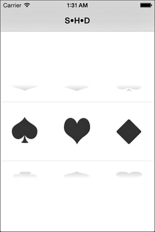
Figure 9-10 UIPickerView instances enable users to select from independently scrolling wheels.
These tables, although superficially similar to standard UITableView instances, use distinct data and delegate protocols:
There is no UIPickerViewController class. UIPickerView instances act as subviews to other views. They are not intended to be the central focus of an application view. You can place a UIPickerView instance onto another view.
Picker views use numbers, not objects. Components (that is, the wheels) are indexed by numbers and not by NSIndexPath instances. It’s a more informal class than UITableView.
You can supply either title strings or views via the data source. Picker views can handle both approaches.
Creating the UIPickerView
When creating the picker, don’t forget to assign the delegate and data source. Without this support, you cannot add data to the view, define its features, or respond to selection changes. Your primary view controller should implement the UIPickerViewDelegate andUIPickerViewDataSource protocols.
Data Source and Delegate Methods
Implement three key data source methods for your UIPickerView to make it function properly at a minimum level. These methods are as follows:
numberOfComponentsInPickerView:—Return the number of columns, as an integer.
pickerView:numberOfRowsInComponent:—Return the maximum number of rows per wheel, as an integer. The number of rows does not need to be identical. You can have one wheel with many rows and another with very few.
pickerView:titleForRow:forComponent or pickerView:viewForRow:forComponent: reusingView:—These methods specify the text or view used to label a row on a given component.
In addition to these data source methods, you might want to supply one further delegate method. This method responds to a user’s wheel selection:
pickerView:didSelectRow:inComponent:—Add any application-specific behavior to this method. If needed, you can query pickerView to return the selectedRowInComponent: for any of the wheels in your view.
Using Views with Pickers
Picker views use a basic view-reuse scheme, caching the views supplied to it for possible reuse. When the final parameter for the pickerView:viewForRow:forComponent:reusingView: method is not nil, you can reuse the passed view by updating its settings or contents. Check for the view and allocate a new one only if one has not been supplied.
The height need not match the actual view. Implement pickerView:rowHeightForComponent: to set the row height used by each component. Recipe 9-8 uses a row height of 120 points, providing plenty of room for each image and laying the groundwork for the illusion that the picker could be continuous rather than having a starting point and an ending point.
Notice the high number of components: 1 million. The reason for this high number lies in a desire to emulate real cylinders. Normally, picker views have a first element and a last, and that’s where they end. This recipe takes another approach, asking “What if the components were actual cylinders, so the last element were connected to the first?” To emulate this, the picker in this recipe uses a much higher number of components than any user will ever be able to access. It initializes the picker to the middle of that number by callingselectRow:inComponent:Animated:. The image shown at each component “row” is derived by the modulo of the actual reported row and the number of individual elements to display (in this case, % 4). Although the code knows that the picker actually has 1 million rows per wheel, the user experience offers a cylindrical wheel of just four rows.
Note
Pickers have traditionally been displayed in a different view from the referencing content. For example, date pickers were often presented in a new view when the user tapped on a date field. In iOS 7, Apple’s apps have begun to embed pickers within the content of the app, including in tables. Apple’s Human Interface Guidelines (HIG) now state that pickers should be inline with the content, without requiring the user to navigate to a different view. This is readily visible in the iOS 7 Calendar app.
Recipe 9-8 Creating the Illusion of a Repeating Cylinder
- (NSInteger)numberOfComponentsInPickerView:
(UIPickerView *)pickerView
{
return 3; // three columns
}
- (NSInteger)pickerView:(UIPickerView *)pickerView
numberOfRowsInComponent:(NSInteger)component
{
return 1000000; // arbitrary and large
}
- (CGFloat)pickerView:(UIPickerView *)pickerView
rowHeightForComponent:(NSInteger)component
{
return 120.0f;
}
- (UIView *)pickerView:(UIPickerView *)pickerView
viewForRow:(NSInteger)row forComponent:(NSInteger)component
reusingView:(UIView *)view
{
// Load up the appropriate row image
NSArray *names = @[@"club", @"diamond", @"heart", @"spade"];
UIImage *image = [UIImage imageNamed:names[row%4]];
// Create an image view if one was not supplied
UIImageView *imageView = (UIImageView *) view;
imageView.image = image;
if (!imageView)
imageView = [[UIImageView alloc] initWithImage:image];
return imageView;
}
- (void)pickerView:(UIPickerView *)pickerView
didSelectRow:(NSInteger)row inComponent:(NSInteger)component
{
// Respond to selection by setting the view controller's title
NSArray *names = @[@"C", @"D", @"H", @"S"];
self.title = [NSString stringWithFormat:@"%@•%@•%@",
names[[pickerView selectedRowInComponent:0] % 4],
names[[pickerView selectedRowInComponent:1] % 4],
names[[pickerView selectedRowInComponent:2] % 4]];
}
- (void)viewDidAppear:(BOOL)animated
{
[super viewDidAppear:animated];
// Set random selections as the view appears
[picker selectRow:50000 + (rand() % 4) inComponent:0 animated:YES];
[picker selectRow:50000 + (rand() % 4) inComponent:1 animated:YES];
[picker selectRow:50000 + (rand() % 4) inComponent:2 animated:YES];
}
- (void)loadView
{
self.view = [[UIView alloc] init];
self.view.backgroundColor = [UIColor whiteColor];
// Create the picker and center it
picker = [[UIPickerView alloc] initWithFrame:CGRectZero];
[self.view addSubview:picker];
PREPCONSTRAINTS(picker);
CENTER_VIEW_H(self.view, picker);
CENTER_VIEW_V(self.view, picker);
// Initialize the picker properties
picker.delegate = self;
picker.dataSource = self;
picker.showsSelectionIndicator = YES;
}
Get This Recipe’s Code
To find this recipe’s full sample project, point your browser to https://github.com/erica/iOS-7-Cookbook and go to the folder for Chapter 9.
Using UIDatePicker
Sometimes you want to ask a user to enter date information. Apple supplies a tidy subclass of UIPickerView to handle several kinds of date and time entry. Figure 9-11 shows the four built-in styles of UIDatePickers you can choose from—for selecting a time, selecting a date, selecting a combination of the two, and a countdown timer.
Figure 9-11 The iPhone offers four stock date picker models. Use the datePickerMode property to select the picker you want to use in your application.
Creating the Date Picker
Lay out a date picker exactly as you would a UIPickerView. The geometry is identical. After that, things get much, much easier. You need not set a delegate or define data source methods. You do not have to declare any protocols. Just assign a date picker mode. Choose fromUIDatePickerModeTime, UIDatePickerModeDate, UIDatePickerModeDateAndTime, and UIDatePickerModeCountDownTimer:
[datePicker setDate:[NSDate date]]; // set date
datePicker.datePickerMode = UIDatePickerModeDateAndTime; // set style
Optionally, add a target for when the selection changes (UIControlEventValueChanged) and create the callback method for the target-action pair.
Here are a few properties you’ll want to take advantage of in the UIDatePicker class:
date—Set the date property to initialize the picker or to retrieve the information set by the user as he or she manipulates the wheels.
maximumDate and minimumDate—These properties set the bounds for date and time picking. Assign each one a standard NSDate. With these, you can constrain your user to pick a date from next year rather than just enter a date and then check whether it falls within an accepted time frame.
minuteInterval—Sometimes you want to use 5-, 10-, 15-, or 30-minute intervals on your selections, such as for applications used to set appointments. Use the minuteInterval property to specify that value. Whatever number you pass, it has to be evenly divisible into 60.
countDownDuration—Use this property to set the maximum available value for a countdown timer. You can go as high as 23 hours and 59 minutes (that is, 86,399 seconds).
Summary
This chapter introduces iOS tables, both simple and complex. You’ve seen all the basic iOS table features—from simple tables, to edits, to reordering and undo. You’ve also learned about a variety of advanced elements—from indexed alphabetic listings, to refresh controls, to picker views. The skills covered in this chapter enable you to build a wealth of table-based applications for the iPhone, iPad, and iPod touch. Here are some key points to take away from this chapter:
When it comes to understanding tables, make sure you know the difference between data sources and delegate methods. Data sources fill up your tables with meaningful content. Delegate methods respond to user interactions.
UITableViewControllers simplify applications built around a central UITableView. Do not hesitate to use UITableView instances directly, however, if your application requires them—especially in popovers or with split view controllers. Just make sure to explicitly support the UITableViewDelegate and UITableViewDataSource protocols when needed.
Index controls provide a great way to navigate quickly through large ordered lists. Take advantage of their power when working with tables that would otherwise become unnavigable. Stylistically, it’s best to avoid index controls when working with grouped tables.
Dive into edits. Giving the user control over the table data is easy to do, and your code can be reused over many projects. Don’t hesitate to design for undo support from the start. Even if you think you may not need undo at first, you might change your mind later.
It’s easy to convert flat tables into sectioned ones. Don’t hesitate to use the predicate approach introduced in this chapter to create sections from simple arrays. Sectioned tables allow you to present data in a more structured fashion, with index support and easy search integration.
Date pickers are highly specialized and very good at what they do: soliciting your users for dates and times. Picker views provide a less-specialized solution but require more work on your end.