The Core iOS Developer’s Cookbook, Fifth Edition (2014)
Chapter 7. Working with View Controllers
View controllers simplify view management for many iOS applications. Each view controller owns a hierarchy of views, which presents a complete element of a unified interface. View controllers enable you to build applications that centralize many tasks, including orientation changes and responding to user actions. This chapter looks at using view controller–based classes and how to apply them to real-world situations for both iPhone/iPod and iPad design scenarios.
View Controllers
As their name suggests, view controllers provide the controller component of iOS’s Model–View–Controller design pattern. Each view controller manages a set of views that comprise a single user-interface component within an application. View controllers coordinate view loading and appearance as well as participate in responding to user interactions.
View controllers also harmonize with the device and underlying operating system. When a user rotates the device, for example, the view controller may update its views’ layout. When the OS encounters a low-memory scenario, controllers respond to memory warnings.
In short, view controllers provide central management. They negotiate with a range of orthogonal development requirements sourced from views, models, iOS, and the device itself.
View controllers also centralize presentation metaphors. The ability to layer view controllers in containers extends the paradigm to exciting custom designs. The most common styles of system-supplied parent/child view controllers include navigation controllers that allow users to move their attention from view to view, page view controllers that present virtual books, tab controllers that offer pushbutton access to multiple child controllers, and split view controllers that offer master-list/detail presentations.
View controllers aren’t views. They are classes with no visual representation except through the views they manage. View controllers help your views live in a larger application design environment.
The iOS SDK offers many view controller classes. These classes range from general to specific. Here’s a quick guide to a subset of the view controllers you’ll encounter while building your iOS application interfaces.
The UIViewController Class
UIViewController is the parent class for view controllers and the one you use to manage your primary views. It is the workhorse of view controllers. You may spend a large part of your time customizing subclasses of this one class. The basic UIViewController class manages each primary view’s lifetime from start to finish and takes into account the changes that the view must react to along the way.
UIViewController instances are responsible for configuring how a view looks and what subviews it displays. Often they rely on loading that information from XIB or storyboard files. Instance methods let you manually create the view layout in code (loadView) or add behavior after a view finishes loading (viewDidLoad).
Reacting to views being displayed or dismissed is another job that view controllers handle. These are the realities of belonging to a larger application. Methods such as viewWillAppear: and viewWillDisappear: let you finish any bookkeeping associated with your view management. You might preload data in anticipation of being presented or clean up once a view will no longer be shown onscreen.
Each of the tasks mentioned here specifies how a view fits into an enveloping application. The UIViewController mediates between views and these external demands, allowing the view to change itself to meet these needs.
Navigation Controllers
As the name suggests, navigation controllers allow you to drill up and down through tree-based view hierarchies, which is an important primary interface design strategy on smaller members of the iOS device family and a supporting one on tablets. Navigation controllers create the translucent navigation bars that appear at the top of many standard iOS applications.
Navigation controllers let you push new views into place onto a stored stack and automatically generate Back buttons that show the title of the calling view controller. All navigation controllers use a “root” view controller to establish the top of their navigation tree, letting those Back buttons lead you back to the primary view. On tablets, you can use a navigation controller–based interface to work with bar button–based menu items, to present popover presentations, or to integrate with UISplitViewController instances for a master/detail presentation experience.
Handing off responsibility to a navigation controller lets you focus design work on creating individual view controller screens. You don’t have to worry about specific navigation details other than telling the navigation controller which view to move to next. The history stack and the navigation buttons are handled for you.
Tab Bar Controllers
The UITabBarController class lets you control parallel presentations in your application. These are like stations on a radio. A tab bar helps users select which view controller to “tune in to,” without there being a specific navigation hierarchy. Each parallel world operates independently, and each can have its own navigation hierarchy. You build the view controller or navigation controller that inhabits each tab, and Cocoa Touch handles the multiple-view details.
For example, when tab bar instances offer more than a certain number of view controller choices at a time (five on the iPhone family of devices, more on tablets), users can customize them through the More > Edit screen. The More > Edit screen lets users drag their favorite controllers down to the button bar at the bottom of the screen. No extra programming is involved. You gain editable tabs for free. All you have to do is request them via the customizableViewControllers property.
Split View Controllers
Meant for use on tablet applications, the UISplitViewController class offers a way to encapsulate a persistent set of data (typically a table) and associate that data with a detail presentation. You can see split views in action in the iPad’s Mail application. When used in landscape orientation, a list of messages appears on the left; individual message content appears on the right. The detail view (the message content in Mail) on the right is subordinate to the master view (Mail’s message list) on the left. Tapping a message updates the right-side view with its contents.
In portrait orientation, the master view is normally hidden. It is accessed via a popover, which is reached by tapping the left button of the split view’s top bar or via a swipe gesture (in iOS 5.1 and later).
Page View Controllers
Like navigation controllers, tab view controllers, and split view controllers, page view controllers are containers for other view controllers. They manage pages of content using either a book-like page curling presentation or a scrolling style. When using the page curling style, you set the book’s “spine,” typically along the left or top of the view. Build your “book” by adding individual content view controllers. Each “page” transitions to the next using page curls or pans.
Popover Controllers
Specific to tablets, popover controllers create transient views that pop over other existing interface content. These controllers present information without taking over the entire screen, the way that modal views normally do. The popovers are usually invoked by tapping a bar button item in the interface (although they can be created using other interaction techniques) and are dismissed either by interacting with the content they present or by tapping outside their main view.
Popovers are populated with view controller instances. Build the view controller and assign it as the popover’s contentViewController property before presenting the popover. This allows popovers to present any range of material that you can design into a standard view controller, offering exceptional programming flexibility.
Note
Starting in iOS 5, you can subclass UINavigationBar and incorporate custom presentations into your app’s navigation interfaces. Use the initWithNavigationBarClass:toolbarClass: initialization method.
Developing with Navigation Controllers and Split Views
The UINavigationController class offers one of the most important ways of managing interfaces on a device that has limited screen space. It creates a way for users to navigate up and down a hierarchy of interface presentations to create a virtual GUI that’s far larger than the device. Navigation controllers fold their GUIs into a neat tree-based scheme. Users travel through that scheme using buttons and choices that transport them around the tree. You see navigation controllers in the Contacts application and in Settings, where selections lead to new screens and Back buttons move to previous ones.
Several standard GUI elements reveal the use of navigation controllers in applications, as shown in Figure 7-1 (left). These include their large navigation bars that appear at the top of each screen, the backward-pointing button at the top left that appears when the user drills into hierarchies, and option buttons at the top right that offer other application functionality such as editing. Many navigation controller applications are built around scrolling lists, where elements in a list lead to new screens, indicated by the disclosure indicator (gray chevron) and the detail disclosure button (encircled i) found on the right side of each table cell.
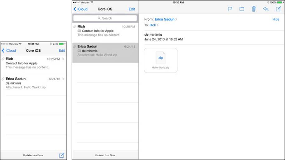
Figure 7-1 The iPhone’s navigation controller (left) uses gray chevrons to indicate that detail views will be pushed onscreen when their parents are selected. On the iPad (right), split view controllers use the entire screen, separating navigation elements from detail presentations.
The iPad, with its large screen size, doesn’t require the kind of space-saving shortcuts that navigation controllers leverage on iPhone-family devices. Tablet applications can use navigation controllers directly, but the UISplitViewController shown in Figure 7-1 (right) offers a presentation that’s better suited for the more expansive device.
Notice the differences between the iPhone implementation on the left and the iPad implementation on the right of Figure 7-1. The iPad’s split view controller contains no chevrons. When items are tapped, their data appears on the same screen, using the large right-side detail area. The iPhone, lacking this space, presents chevrons which indicate that new views will be pushed onscreen. Each approach takes device-specific design into account in its presentation.
Both the iPhone-family and iPad Inbox views use similar navigation controller elements. These include the Back button (< iCloud), an options button (Edit), and the description in the title bar (the current folder, Core iOS). Each element is created using the navigation controller API to present a hierarchy of e-mail accounts and mailboxes.
The difference lies at the bottom of the navigation tree, at the level of individual messages that form the leaves of the data structure. The iPhone-family standard uses chevrons to indicate leaves. When selected, these leaf view controllers are pushed onto the navigation stack. They join the other view’s controllers that trace a user’s progress through the interface. The iPad doesn’t push its leaves. It presents them in a separate view and omits chevrons that otherwise indicate that users have reached the extent of the hierarchy traversal.
iPhone-style navigation controllers play roles as well on the iPad. When iPad applications use standard (iPhone-style) navigation controllers, they usually do so in narrow contexts such as transient popover presentations, where the controller is presented onscreen in a small view with a limited lifetime. Otherwise, iPad applications are encouraged to use the split view approach that occupies the entire screen.
Using Navigation Controllers and Stacks
Every navigation controller owns a root view controller. This controller forms the base of its stack. You can programmatically push other controllers onto the stack as the user makes choices while navigating through the model’s tree. Although the tree itself may be multidimensional, the user’s path (essentially his history) is always a straight line representing the choices already made to date. Moving to a new choice extends the navigation breadcrumb trail and automatically builds a Back button each time a new view controller gets pushed onto the stack.
Users can tap a Back button to pop controllers off the stack. The name of each button is the title of the most recent view controller. As you return through the stack of previous view controllers, each Back button indicates the view controller that can be returned to. Users can pop back until they reach the root. Then they can go no further. The root is the base of the tree, and you cannot pop beyond that root.
This stack-based design lingers even when you plan to use just one view controller. You might want to leverage the UINavigationController’s built-in navigation bar to build a simple utility that uses a two-button menu, for example. This would disregard any navigational advantage of the stack. You still need to set that one controller as the root via initWithRootViewController:.
Pushing and Popping View Controllers
Add new items onto the navigation stack by pushing a new controller with pushViewController:animated:. Each view controller provides a navigationController property. This property points to the navigation controller that this controller is participating in. The property isnil if the controller is not pushed onto a navigation stack.
Use the navigationController property to push a new view controller onto the navigation stack and call the push method on the navigation controller. When pushed, the new controller slides onscreen from the right (assuming that you set animated to YES). A left-pointing Back button appears, leading you one step back on the stack. The Back button uses a chevron along with the title of the previous view controller on the navigation stack. Replace the chevron with a custom image by setting the backIndicatorImage property. Always use caution when overriding Apple standard elements. Be sure to maintain the spirit of the Apple Human Interface Guidelines (HIG).
You might push a new view for many reasons. Typically, these involve navigating to specialty views such as detail views or drilling down a file structure or preferences hierarchy. You can push controllers onto the navigation controller stack after your user taps a button, a table item, or a disclosure accessory.
There’s little reason to ever subclass UINavigationController. Perform push requests and navigation bar customization (such as setting up a bar’s title or buttons) inside UIViewController subclasses. Customization gets passed up to the navigation controller from the child controllers.
For the most part, you don’t access the navigation controller directly. The exceptions to this rule include managing the navigation bar’s buttons, changing the bar’s look, and initializing with a custom navigation bar class. You might change a bar style or its tint color by accessing thenavigationBar property directly, as follows:
self.navigationController.navigationBar.barStyle =
UIBarStyleBlack;
Be aware that in iOS 7, Apple added barTintColor to tint the bar background instead of tintColor. The tintColor property is repurposed to tint bar button items.
Bar Buttons
To add new buttons, you modify your navigationItem, which provides a representational class that describes the content shown on the navigation bar, including its left and right bar button items and its title view. Here’s how you can assign a button to the bar:
self.navigationItem.rightBarButtonItem = [[UIBarButtonItem alloc]
initWithTitle:@"Action" style:UIBarButtonItemStylePlain target:self
action:@selector(performAction:)];
To remove a button, assign the item to nil. Bar button items are not views. They are classes that contain titles, styles, and callback information that navigation items and toolbars use to build actual buttons in to interfaces. iOS does not provide you with access to the button views built by bar button items and their navigation items.
Starting in iOS 5, you can add multiple bar button items to the left and right. Assign an array to the rightBarButtonItems (notice the s) or leftBarButtonItems properties for the navigation item:
self.navigationItem.rightBarButtonItems = barButtonArray;
Edge-to-Edge Layout
The design focus of iOS 7 is your application’s content—more specifically, your user’s content. Borders and shadows have been removed and transparency has been added in navigation bars and other UI elements. This change significantly impacts the layout of your views, especially when you’re using a navigation bar.
Beginning with iOS 7, all view controllers use full-screen layout. The wantsFullScreenLayout property on UIViewController has been deprecated, and setting it to NO will likely lead to very unexpected layout. With full-screen layout, the view controller will size its view to fill the entire screen, passing fully under the translucent system status bar. In addition, by default, all bars in iOS 7 are now translucent to further reveal the underlying content.
The flowing of content under bars will shift your content in ways that are foreign in previous versions. You must actively include the area underneath the status bar and your own bars in your layout.
To provide more control over placement, UIViewController now provides a number of new layout properties. Manage status bar visibility at the view controller level by implementing prefersStatusBarHidden in your subclasses and returning an appropriate Boolean. Many of the new properties allow the positioning or sizing of views based on the currently displayed bars.
For view controllers, you can now specify which edges of the view should be extended under translucent bars by setting edgesForExtendedLayout. By default, this property is UIRectEdgeAll—which means all your edges will extend through the translucent elements as shown inFigure 7-2 (left). You can also specify any specific edge(s) or UIRectEdgeNone, stopping the content view edge when it reaches the bar, as shown in Figure 7-2 (right). By default, edgesForExtendedLayout also includes opaque bars. SetextendedLayoutIncludesOpaqueBars to NO to alter this behavior.
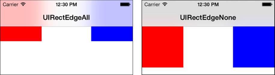
Figure 7-2 In iOS 7, edgesForExtendedLayout on UIViewController controls the edge of the view used for layout. UIRectEdgeAll, the default, extends the edge through the translucent bars (left). UIRectEdgeNone stops the edge at the extent of the bars (right).
Scroll views are also impacted by the system status bar and developer-implemented bars (navigation bar, toolbar, and tab bar). By default, UIScrollViews automatically adjust their content insets to handle these bar elements. To turn off this behavior and manually manage the scroll view insets, set automaticallyAdjustsScrollViewInsets to NO.
Finally, to assist in laying out content within your views, iOS 7 provides the topLayoutGuide and bottomLayoutGuide properties. These properties indicate the top and bottom bar edges in your view controller’s view. The location represented depends on the visible bars.
For topLayoutGuide:
 Status bar but no navigation bar visible—bottom of the status bar.
Navigation bar visible—bottom of the navigation bar.
No status or navigation bar visible—top of the screen.
For bottomLayoutGuide:
Toolbar or tab bar visible—top of the toolbar or tab bar.
No toolbar or tab bar visible—bottom of the screen.
Use these properties to create relative constraints, positioning your subviews relative to the bar edges regardless of the frame location or foreknowledge of bar visibility. Use them with Auto Layout constraints both in Interface Builder (IB) or in your layout code. Outside of Auto Layout, use guides in frame-based positioning. Reference the offset value in the guide’s length property.
Recipe: The Navigation Item Class
The objects that populate the navigation bar are put into place using the UINavigationItem class, which is a class that stores information about those objects. Navigation item properties include the left and right bar button items, the title shown on the bar, the view used to show the title, and any Back button used to navigate back from the current view.
This class enables you to attach buttons, text, and other UI objects in three key locations: the left, the center, and the right of the navigation bar. Typically, this works out to be a regular button on the right, some text (usually the UIViewController’s title) in the middle, and a Back-style button on the left. But you’re not limited to this layout. You can add custom controls to any of three locations: the left, the center (title area), and the right. You might build navigation bars with search fields in the middle instead, or segment controls, toolbars, pictures, and more. Further, you can add multiple items to the left and right button arrays. It’s all easy to modify.
Titles and Back Buttons
The central title area is especially customizable. You can assign a title to the navigation item like this:
self.navigationItem.title = @"My Title"
This is equivalent to setting the view controller’s title property directly. The simplest way to customize the actual title is to use the title property of the child view controller rather than the navigation item:
self.title = @"Hello";
When assigned, the navigation controller uses the title to establish the Back button’s “go back” text. If you push a new controller on top of a controller titled "Hello", the Back button indicates that it links to "Hello".
You could also replace the text-based title with a custom view such as a control. This code adds a custom segmented control, but this could be an image view, a stepper, or anything else:
self.navigationItem.titleView =
[[UISegmentedControl alloc] initWithItems:items];
Macros
Macros simplify your work when building bar buttons because the creation task is so repetitive. The following macro creates a basic button item:
#define BARBUTTON(TITLE, SELECTOR) [[UIBarButtonItem alloc] \
initWithTitle:TITLE style:UIBarButtonItemStylePlain \
target:self action:SELECTOR]
You supply it with a title and a selector to call. Each call to this macro specifies only the title and selector, tightening up the code’s readability:
self.navigationItem.rightBarButtonItem =
BARBUTTON(@"Push", @selector(push:));
This version of the macro assumes that the target is "self", which is quite common, although you could easily adapt this. The following macro adds a target that you specify:
#define BARBUTTON_TARGET(TITLE, TARGET, SELECTOR) \
[[UIBarButtonItem alloc] initWithTitle:TITLE \
style:UIBarButtonItemStylePlain target:TARGET action:SELECTOR]
The vocabulary of bar buttons you use varies by your particular application demands. It’s easy to create macros for system items provided by Apple, image items created from picture resources, and custom view items, which can embed controls and other non-bar button elements.
Recipe 7-1 combines these features to demonstrate how controller titles and navigation items build together during drilling. It offers a super-simple interface: You select the title for the next item you want to push onto the navigation stack, and then you push it on. This allows you to see how the navigation controller stack grows using default behavior.
Recipe 7-1 Basic Navigation Drilling
// Array of strings
- (NSArray *)fooBarArray
{
return [@"Foo*Bar*Baz*Qux" componentsSeparatedByString:@"*"];
}
// Push a new controller onto the stack
- (void)push:(id)sender
{
NSString *newTitle =
[self fooBarArray][seg.selectedSegmentIndex];
UIViewController *newController =
[[TestBedViewController alloc] init];
newController.edgesForExtendedLayout = UIRectEdgeNone;
newController.title = newTitle;
[self.navigationController
pushViewController:newController animated:YES];
}
- (void)loadView
{
self.view = [[UIView alloc] init];
self.view.backgroundColor = [UIColor whiteColor];
// Establish a button to push new controllers
self.navigationItem.rightBarButtonItem =
BARBUTTON(@"Push", @selector(push:));
// Create a segmented control to pick the next title
seg = [[UISegmentedControl alloc] initWithItems:
[self fooBarArray]];
seg.selectedSegmentIndex = 0;
[self.view addSubview:seg];
PREPCONSTRAINTS(seg);
UILabel *label =
[self labelWithTitle:@"Select Title for Pushed Controller"];
[self.view addSubview:label];
PREPCONSTRAINTS(label);
id topLayoutGuide = self.topLayoutGuide;
CONSTRAIN(self.view, label, @"H:|-[label(>=0)]-|");
CONSTRAIN(self.view, seg, @"H:|-[seg(>=0)]-|");
CONSTRAIN_VIEWS(self.view,
@"V:[topLayoutGuide]-[label]-[seg]",
NSDictionaryOfVariableBindings(seg, label, topLayoutGuide));
}
Get This Recipe’s Code
To find this recipe’s full sample project, point your browser to https://github.com/erica/iOS-7-Cookbook and go to the folder for Chapter 7.
Recipe: Modal Presentation
With normal navigation controllers, you push your way along views, stopping occasionally to pop back to previous views. That approach assumes that you’re drilling your way up and down a set of data that matches the tree-based view structure you’re using. Modal presentation offers another way to show a view controller.
After you send the presentViewController:animated:completion: message to a view controller, the specified view controller appears on the screen and takes control until it’s dismissed with dismissViewControllerAnimated:completion:. This enables you to add special-purpose dialogs to your applications that go beyond alert views.
Typically, modal controllers prompt users to pick data such as contacts from Contacts or photos from Photos or perform a short-lived task such as sending e-mail or setting preferences. Use modal controllers in any setting where it makes sense to perform a limited-time task that lies outside the normal scope of the active view controller.
Modal presentations can use four transition styles:
Slide—This transition style slides a new view over the old.
Flip—This transition style turns a view over to the “back” of the presentation.
Fade—This transition style dissolves the new view into visibility.
Curl—This transition style makes the primary view curl up out of the way to reveal the new view beneath it.
Set these styles in the modalTransitionStyle property of the presented view controller. The standard, UIModalTransitionStyleCoverVertical, slides the modal view up and over the current view controller. When dismissed, it slides back down.
UIModalTransitionStyleFlipHorizontal performs a back-to-front flip from right to left. It looks as if you’re revealing the back side of the currently presented view. When dismissed, it flips back, left to right.
UIModalTransitionStyleCrossDissolve fades the new view in over the previous one. On dismissal, it fades back to the original view.
Use UIModalTransitionStylePartialCurl to curl up content (in the way the Maps application does) to reveal a modal settings view “underneath” the primary view controller.
On the iPhone and iPod touch, modal controllers always fully take over the screen. The iPad offers more nuanced presentations. The iPad offers five presentation styles set by the modalPresentationStyle property:
Full screen—A full-screen presentation (UIModalPresentationFullScreen) is the default on the iPhone, where the new modal view completely covers both the screen and any existing content. This is the only presentation style that is legal for curls; any other presentation style raises a runtime exception, crashing the application.
Page sheet—In the page sheet style (UIModalPresentationPageSheet), coverage defaults to a portrait aspect ratio, so the modal view controller completely covers the screen in portrait mode and partially covers the screen in landscape mode, as if a portrait-aligned piece of paper were added to the display.
Form sheet—The form sheet style (UIModalPresentationFormSheet) display covers a small center portion of the screen, allowing you to shift focus to the modal element while retaining the maximum visibility of the primary application view.
Current context—This is the presentation style of the view’s parent view controller (UIModalPresentationCurrentContext).
Custom—This custom presentation style (UIModalPresentationCustom), managed by the Custom Transitions API, was added in iOS 7.
These styles are best experienced in landscape mode to visually differentiate the page-sheet presentation from the full-screen one.
Note
iOS 7 introduces a model for creating custom transitions between view controllers to augment those provided by the system. Custom transitions provide nearly unlimited flexibility in creating creative transitions that can be used nearly anywhere that view controllers currently transition, including modal presentation and navigation controller stack changes.
Presenting a Custom Modal Information View
Presenting a modal controller branches off from your primary navigation path, introducing a new interface that takes charge until your user explicitly dismisses it. You present a modal controller like this:
[self presentViewController:someControllerInstance animated:YES completion:nil];
The controller that is presented can be any kind of view controller subclass, as well. In the case of a navigation controller, the modal presentation can have its own navigation hierarchy built as a chain of interactions. Use the completion block to finish up any tasks you need to perform after the view controller has animated into place.
Always provide a Done option of some kind to allow users to dismiss the controller. The easiest way to accomplish this is to present a navigation controller and add a bar button to its navigation items with an action:
- (IBAction)done:(id)sender
{
[self dismissViewControllerAnimated:YES completion:nil];
}
Storyboards simplify the creation of modal controller elements. Drag in a navigation controller instance, along with its paired view controller, and add a Done button to the provided navigation bar. Set the view controller’s class to your custom modal type and connect the Done button to thedone: method. Name your navigation controller in the Attributes inspector so that you can use that identifier to load it.
You can either add the modal components to your primary storyboard or create them in a separate file. Recipe 7-2 loads a custom file (Modal~DeviceType.storyboard), but you can just as easily add the elements in your MainStoryboard_DeviceType file.
Recipe 7-2 provides the key pieces for creating modal elements. The presentation is performed in the application’s main view controller hierarchy. Here, users select the transition and presentation styles from segmented controls, but these are normally chosen in advance by the developer and set in code or in IB. This recipe offers a toolbox that you can test on each platform, using each orientation to explore how each option looks.
Note
As of the initial iOS 7 release, a well-reported issue exists in the full-screen flip transition presented in Recipe 7-2. The navigation bar contents drop abruptly into position at the end of the animation. Hopefully, this issue will be resolved in a future iOS release.
Recipe 7-2 Presenting and Dismissing a Modal Controller
// Presenting the controller
- (void)action:(id)sender
{
// Load info controller from storyboard
UIStoryboard *storyBoard = [UIStoryboard
storyboardWithName:
(IS_IPAD ? @"Modal~iPad" : @"Modal~iPhone")
bundle:[NSBundle mainBundle]];
UINavigationController *navController =
[storyBoard instantiateViewControllerWithIdentifier:
@"infoNavigationController"];
// Select the transition style
int styleSegment =
[segmentedControl selectedSegmentIndex];
int transitionStyles[4] = {
UIModalTransitionStyleCoverVertical,
UIModalTransitionStyleCrossDissolve,
UIModalTransitionStyleFlipHorizontal,
UIModalTransitionStylePartialCurl};
navController.modalTransitionStyle =
transitionStyles[styleSegment];
// Select the presentation style for iPad only
if (IS_IPAD)
{
int presentationSegment =
[iPadStyleControl selectedSegmentIndex];
int presentationStyles[3] = {
UIModalPresentationFullScreen,
UIModalPresentationPageSheet,
UIModalPresentationFormSheet};
if (navController.modalTransitionStyle ==
UIModalTransitionStylePartialCurl)
{
// Partial curl with any non-full-screen presentation
// raises an exception
navController.modalPresentationStyle =
UIModalPresentationFullScreen;
[iPadStyleControl setSelectedSegmentIndex:0];
}
else
navController.modalPresentationStyle =
presentationStyles[presentationSegment];
}
[self.navigationController presentViewController:navController
animated:YES completion:nil];
}
- (void)loadView
{
self.view = [[UIView alloc] init];
self.view.backgroundColor = [UIColor whiteColor];
self.navigationItem.rightBarButtonItem =
BARBUTTON(@"Action", @selector(action:));
segmentedControl =
[[UISegmentedControl alloc] initWithItems:
[@"Slide Fade Flip Curl"
componentsSeparatedByString:@" "]];
[segmentedControl setSelectedSegmentIndex:0];
self.navigationItem.titleView = segmentedControl;
if (IS_IPAD)
{
NSArray *presentationChoices =
[NSArray arrayWithObjects:@"Full Screen",
@"Page Sheet", @"Form Sheet", nil];
iPadStyleControl =
[[UISegmentedControl alloc] initWithItems:
presentationChoices];
[iPadStyleControl setSelectedSegmentIndex:0];
[self.view addSubview:iPadStyleControl];
PREPCONSTRAINTS(iPadStyleControl);
CENTER_VIEW_H(self.view, iPadStyleControl);
id topLayoutGuide = self.topLayoutGuide;
CONSTRAIN_VIEWS(self.view,
@"V:[topLayoutGuide]-[iPadStyleControl]",
NSDictionaryOfVariableBindings(topLayoutGuide,
iPadStyleControl));
}
}
Get This Recipe’s Code
To find this recipe’s full sample project, point your browser to https://github.com/erica/iOS-7-Cookbook and go to the folder for Chapter 7.
Recipe: Building Split View Controllers
Using split view controllers is the preferred way to present hierarchically driven navigation on the iPad. Such a controller generally consists of a table of contents on the left and a detail view on the right, although the class (and Apple’s guidelines) is not limited to this presentation style. The heart of the class consists of the notion of an organizing section (master) and a presentation section (detail), both of which can appear onscreen simultaneously in landscape orientation, and whose organizing section optionally converts to a popover in portrait orientation. (You can override this default behavior by implementing splitViewController:shouldHideViewController:inOrientation: in your delegate, letting your split view show both sections in portrait mode.)
Figure 7-3 shows the very basic split view controller built by Recipe 7-3 in landscape (left) and portrait (right) orientations. This controller sets the color of the detail view by selecting an item from the list in the root view. In landscape, both views are shown at once. In portrait orientation, the user must tap the upper-left button on the detail view to access the root view as a popover or use an optional swipe gesture. When programming for this orientation, be aware that the popover can interfere with detail view, as it is presented over that view; design accordingly.
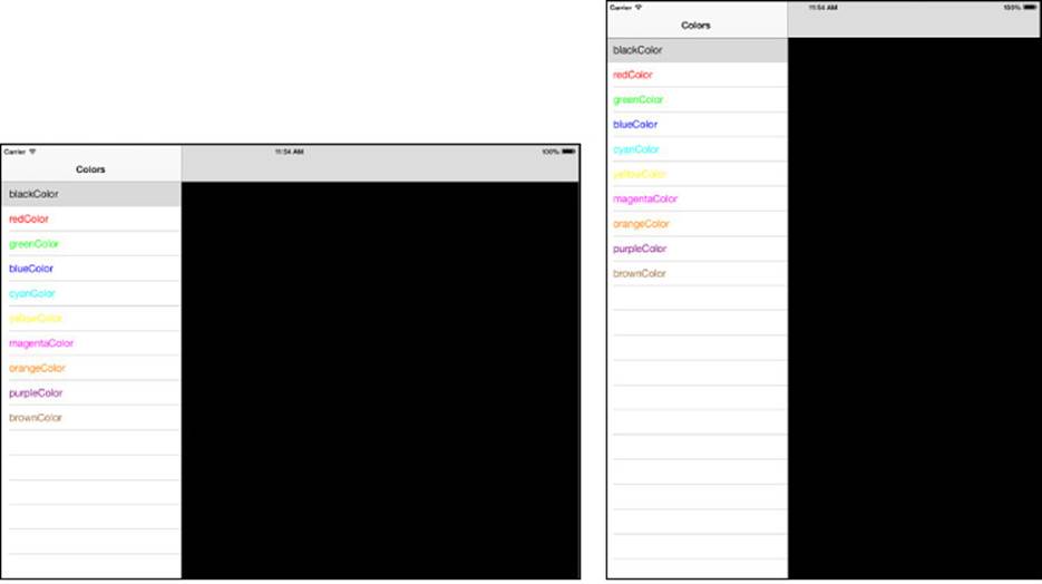
Figure 7-3 At their simplest, split view controllers consist of an organizing pane and a detail view pane. The organizing pane, which you see in this figure, is normally hidden in portrait orientation (right). Users view it via a popover accessed from a navigation bar button or invoke it with a swipe gesture.
The code in Recipe 7-3 builds three separate objects: the master and detail view controllers and the split view controller that owns the first two. The split view controller always contains two children, the master at index 0 and the detail at index 1.
You’ll want to add the master and detail controllers to navigation controller shells, to provide a consistent interface. In the case of the detail controller, this provides a home for the bar button in portrait orientation. The following method builds the two child view controllers, embeds them into navigation controllers, adds them to a view controller array, and returns a new split view controller that hosts those views:
- (UISplitViewController *)splitViewController
{
// Create the navigation-embedded root (master) view
ColorTableViewController *rootVC =
[[ColorTableViewController alloc] init];
rootVC.title = @"Colors"; // make sure to set the title
UINavigationController *rootNav =
[[UINavigationController alloc]
initWithRootViewController:rootVC];
// Create the navigation-run detail view
DetailViewController *detailVC =
[DetailViewController controller];
UINavigationController *detailNav =
[[UINavigationController alloc]
initWithRootViewController:detailVC];
// Add both to the split view controller
UISplitViewController *svc =
[[UISplitViewController alloc] init];
svc.viewControllers = @[rootNav, detailNav];
svc.delegate = detailVC;
return svc;
}
The master view controller is often some kind of table view controller, as is the one in Recipe 7-3. What you see here is pretty much as bare bones as tables get. It is a list of color items (specifically, UIColor method names), each one with a cell title that is tinted to match that color.
When an item is selected, the controller uses its built-in splitViewController property to send a request to its detail view. This property returns the split view controller that owns the root view. From there, the controller can retrieve the split view’s delegate, which has been assigned to the detail view. By casting that delegate to the detail view controller’s class, the root view can affect the detail view more meaningfully. In this extremely simple example, the selected cell’s text tint is applied to the detail view’s background color.
Note
Make sure you set the root view controller’s title property. It is used to set the text for the button that appears in the detail view in portrait mode.
Recipe 7-3’s DetailViewController class is about as skeletal an implementation as you can get. It provides the most basic functionality you need to provide a detail view implementation with split view controllers. This consists of the will-hide/will-show method pair that adds and hides that all-important bar button for the detail view.
When the split view controller converts the master view controller into a popover controller in portrait orientation, it passes that new controller to the detail view controller. It is the detail controller’s job to retain and handle that popover until the interface returns to landscape orientation. In this skeletal class definition, a strong property holds onto the popover for the duration of portrait interaction.
Recipe 7-3 Building Detail and Master Views for a Split View Controller
@interface DetailViewController : UIViewController
<UIPopoverControllerDelegate, UISplitViewControllerDelegate>
@property (nonatomic, strong)
UIPopoverController *popoverController;
@end
@implementation DetailViewController
+ (instancetype)controller
{
DetailViewController *controller =
[[DetailViewController alloc] init];
controller.view.backgroundColor = [UIColor blackColor];
return controller;
}
// Called upon going into portrait mode, hiding the normal table view
- (void)splitViewController:(UISplitViewController*)svc
willHideViewController:(UIViewController *)aViewController
withBarButtonItem:(UIBarButtonItem*)barButtonItem
forPopoverController:(UIPopoverController*)aPopoverController
{
barButtonItem.title = aViewController.title;
self.navigationItem.leftBarButtonItem = barButtonItem;
self.popoverController = aPopoverController;
}
// Called upon going into landscape mode
- (void)splitViewController:(UISplitViewController*)svc
willShowViewController:(UIViewController *)aViewController
invalidatingBarButtonItem:(UIBarButtonItem *)barButtonItem
{
self.navigationItem.leftBarButtonItem = nil;
self.popoverController = nil;
}
// Use this to avoid the popover hiding in portrait.
// When omitted, you get the default behavior.
/* - (BOOL)splitViewController:(UISplitViewController *)svc
shouldHideViewController:(UIViewController *)vc
inOrientation:(UIInterfaceOrientation)orientation
{
return NO;
}*/
@end
@interface ColorTableViewController : UITableViewController
@end
@implementation ColorTableViewController
+ (instancetype)controller
{
ColorTableViewController *controller =
[[ColorTableViewController alloc] init];
controller.title = @"Colors";
return controller;
}
- (NSInteger)numberOfSectionsInTableView:(UITableView *)tableView
{
return 1;
}
- (NSArray *)selectors
{
return @[@"blackColor", @"redColor", @"greenColor", @"blueColor",
@"cyanColor", @"yellowColor", @"magentaColor", @"orangeColor",
@"purpleColor", @"brownColor"];
}
- (NSInteger)tableView:(UITableView *)tableView
numberOfRowsInSection:(NSInteger)section
{
return [self selectors].count;
}
- (UITableViewCell *)tableView:(UITableView *)tableView
cellForRowAtIndexPath:(NSIndexPath *)indexPath
{
UITableViewCell *cell =
[tableView dequeueReusableCellWithIdentifier:@"generic"];
if (!cell) cell = [[UITableViewCell alloc]
initWithStyle: UITableViewCellStyleDefault
reuseIdentifier:@"generic"];
// Set title and color
NSString *item = [self selectors][indexPath.row];
cell.textLabel.text = item;
cell.textLabel.textColor =
[UIColor performSelector:NSSelectorFromString(item)
withObject:nil];
return cell;
}
- (void)tableView:(UITableView *)tableView
didSelectRowAtIndexPath:(NSIndexPath *)indexPath
{
// On selection, update the main view background color
UINavigationController *nav =
[self.splitViewController.viewControllers lastObject];
UIViewController *controller = [nav topViewController];
UITableViewCell *cell = [tableView cellForRowAtIndexPath:indexPath];
controller.view.backgroundColor = cell.textLabel.textColor;
}
@end
Get This Recipe’s Code
To find this recipe’s full sample project, point your browser to https://github.com/erica/iOS-7-Cookbook and go to the folder for Chapter 7.
Recipe: Creating Universal Split View/Navigation Apps
Recipe 7-4 modifies Recipe 7-3’s split view controller to provide a functionally equivalent application that runs properly on both iPhone and iPad platforms. Accomplishing this takes several steps that add to Recipe 7-3’s code base. You do not have to remove functionality from the split view controller approach, but you must provide alternatives in several places.
Recipe 7-4 uses a macro to determine whether the code is being run on an iPad- or iPhone-style device. It leverages the UIKit user interface idiom as follows:
#define IS_IPAD (UI_USER_INTERFACE_IDIOM() == UIUserInterfaceIdiomPad)
This macro returns YES when the device characteristics are iPad-like rather than iPhone-like (such as on the iPhone or iPod touch). First introduced in iOS 3.2, which introduced the iPad as a new hardware platform, idioms allow you to perform runtime checks in your code to provide interface choices that fit with the deployed platform.
In an iPhone deployment, the detail view controller code remains identical to Recipe 7-3, but to be displayed, it must be pushed onto the navigation stack rather than shown side by side in a split view. The navigation controller is set up as the primary view for the application window rather than the split view. A simple check at application launch lets your code choose which approach to use:
- (UINavigationController *)navWithColorTableViewController
{
ColorTableViewController *rootVC =
[[ColorTableViewController alloc] init];
rootVC.title = @"Colors";
UINavigationController *nav = [[UINavigationController alloc]
initWithRootViewController:rootVC];
return nav;
}
- (BOOL)application:(UIApplication *)application
didFinishLaunchingWithOptions:(NSDictionary *)launchOptions
{
window = [[UIWindow alloc] initWithFrame:
[[UIScreen mainScreen] bounds]];
UIViewController * rootVC = nil;
if (IS_IPAD)
rootVC = [self splitViewController];
else
rootVC = [self navWithColorTableViewController];
rootVC.edgesForExtendedLayout = UIRectEdgeNone;
window.rootViewController = rootVC;
[window makeKeyAndVisible];
return YES;
}
The rest of the story lies in the two methods of Recipe 7-4, within the color-picking table view controller. Two key checks decide whether to show disclosure accessories and how to respond to table taps:
On the iPad, disclosure indicators should never be used at the last level of detail presentation. On the iPhone, they indicate that a new view will be pushed on selection. Checking for deployment platform lets your code choose whether to include these accessories in cells.
When you’re working with the iPhone, there’s no option for using split views, so your code must push a new detail view onto the navigation controller stack. Compare this to the iPad code, which only needs to reach out to an existing detail view and update its background color.
In real-world deployment, these two checks would likely expand in complexity beyond the details shown in this simple recipe. You’d want to add a check to your model to determine whether you are, indeed, at the lowest level of the tree hierarchy before suppressing disclosure accessories. Similarly, you might need to update or replace presentations in your detail view controller.
Recipe 7-4 Adding Universal Support for Split View Alternatives
- (UITableViewCell *)tableView:(UITableView *)tableView
cellForRowAtIndexPath:(NSIndexPath *)indexPath
{
UITableViewCell *cell =
[tableView dequeueReusableCellWithIdentifier:@"generic"];
if (!cell) cell = [[UITableViewCell alloc]
initWithStyle:UITableViewCellStyleDefault
reuseIdentifier:@"generic"];
NSString *item = [self selectors][indexPath.row];
cell.textLabel.text = item;
cell.textLabel.textColor =
[UIColor performSelector:NSSelectorFromString(item)
withObject:nil];
cell.accessoryType = IS_IPAD ?
UITableViewCellAccessoryNone :
UITableViewCellAccessoryDisclosureIndicator;
return cell;
}
- (void)tableView:(UITableView *)tableView
didSelectRowAtIndexPath:(NSIndexPath *)indexPath
{
UITableViewCell *cell =
[tableView cellForRowAtIndexPath:indexPath];
if (IS_IPAD)
{
UINavigationController *nav =
[self.splitViewController.viewControllers lastObject];
UIViewController *controller = [nav topViewController];
controller.view.backgroundColor = cell.textLabel.textColor;
}
else
{
DetailViewController *controller =
[DetailViewController controller];
controller.view.backgroundColor = cell.textLabel.textColor;
controller.title = cell.textLabel.text;
[self.navigationController
pushViewController:controller animated:YES];
}
}
Get This Recipe’s Code
To find this recipe’s full sample project, point your browser to https://github.com/erica/iOS-7-Cookbook and go to the folder for Chapter 7.
Recipe: Tab Bars
On the iPhone and iPod touch, the UITabBarController class allows users to move between multiple view controllers and to customize the bar at the bottom of the screen. This is best seen in the music application. It offers one-tap access to different views and a More button that leads to user selection and editing of the bottom bar. Tab bars are not recommended for use as a primary design pattern on the iPad, although Apple supports their use when needed, especially in split views and popovers.
With tab bars, you don’t push views the way you do with navigation bars. Instead, you assemble a collection of controllers (they can individually be UIViewControllers, UINavigationControllers, or any other kind of view controllers) and add them to a tab bar by setting the bar’s viewControllers property. Cocoa Touch does the rest of the work for you. Set allowsCustomizing to YES to enable end-user reordering of the bar.
Recipe 7-5 creates 11 simple view controllers of the BrightnessController class. This class sets the background to a specified gray level—in this case, from 0% to 100%, in steps of 10%. Figure 7-4 (left) shows the interface in its default mode, with the first four items and a More button displayed.
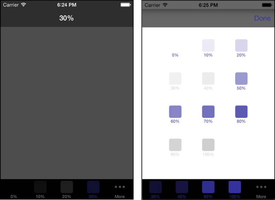
Figure 7-4 Tab bar controllers allow users to pick view controllers from a bar at the bottom of the screen (left) and customize the bar from a list of available view controllers (right).
Users may reorder tabs by selecting the More option and then tapping Edit. This opens the configuration panel shown in Figure 7-4 (right). These 11 view controllers offer options a user can navigate through and select from. Note that the navigation bar in Figure 7-4 (right) has not been converted to the standard flat UI appearance as of the iOS 7 release.
Note that the translucent navigation bar background tint is black throughout the entire interface. Apple provides the UIAppearance protocol, which allows you to customize UI properties for all instances of a given class. Recipe 7-5 uses this functionality to tint its navigation bar’s background black:
[[UINavigationBar appearance] setBarTintColor:[UIColor blackColor]];
Note
Starting with iOS 7, tintColor no longer tints the background of bars, such as the navigation bar. To tint the background, use the barTintColor property.
This recipe adds its 11 controllers twice. The first time it assigns them to the list of view controllers available to the user:
tabBarController.viewControllers = controllers;
The second time it specifies that the user can select from the entire list when interactively customizing the bottom tab bar:
tabBarController.customizableViewControllers = controllers;
The second line is optional; the first is mandatory. After setting up the view controllers, you can add all or some to the customizable list. If you don’t, you still can see the extra view controllers by tapping the More button, but users won’t be able to include them in the main tab bar on demand.
Tab art appears inverted in color on the More screen. According to Apple, this is the expected and proper behavior. Apple has no plans to change this. It does provide an interesting view contrast when your 100% black swatch appears as pure white on that screen. In addition, in iOS 7, the icon and text for items are now tinted with the inherited tintColor for the application.
Recipe 7-5 Creating a Tab Bar View Controller
#pragma mark - BrightnessController
@interface BrightnessController : UIViewController
@end
@implementation BrightnessController
{
int brightness;
}
// Create a swatch for the tab icon using standard Quartz
// and UIKit image calls
- (UIImage*)buildSwatch:(int)aBrightness
{
CGRect rect = CGRectMake(0.0f, 0.0f, 30.0f, 30.0f);
UIGraphicsBeginImageContext(rect.size);
UIBezierPath *path = [UIBezierPath
bezierPathWithRoundedRect:rect cornerRadius:4.0f];
[[[UIColor blackColor]
colorWithAlphaComponent:(float) aBrightness / 10.0f] set];
[path fill];
UIImage *image = UIGraphicsGetImageFromCurrentImageContext();
UIGraphicsEndImageContext();
return image;
}
// The view controller consists of a background color
// and a tab bar item icon
-(BrightnessController *)initWithBrightness:(int)aBrightness
{
self = [super init];
brightness = aBrightness;
self.title = [NSString stringWithFormat:@"%d%%",
brightness * 10];
self.tabBarItem =
[[UITabBarItem alloc] initWithTitle:self.title
image:[self buildSwatch:brightness] tag:0];
self.view.autoresizesSubviews = YES;
self.view.autoresizingMask =
UIViewAutoresizingFlexibleWidth |
UIViewAutoresizingFlexibleHeight;
return self;
}
// Tint the background
- (void)loadView
{
self.view = [[UIView alloc] init];
self.view.backgroundColor =
[UIColor colorWithWhite:(brightness / 10.0f) alpha:1.0f];
}
+ (id)controllerWithBrightness:(int)brightness
{
BrightnessController *controller =
[[BrightnessController alloc]
initWithBrightness:brightness];
return controller;
}
@end
#pragma mark - Application Setup
@interface TestBedAppDelegate : NSObject
<UIApplicationDelegate, UITabBarControllerDelegate>
@property (nonatomic, strong) UIWindow *window;
@end
@implementation TestBedAppDelegate
{
UITabBarController *tabBarController;
}
- (void)applicationDidFinishLaunching:(UIApplication *)application
{
// Globally use a black tint for nav bars
[[UINavigationBar appearance]
setBarTintColor:[UIColor blackColor]];
// Build an array of controllers
NSMutableArray *controllers = [NSMutableArray array];
for (int i = 0; i <= 10; i++)
{
BrightnessController *controller =
[BrightnessController controllerWithBrightness:i];
UINavigationController *nav =
[[UINavigationController alloc]
initWithRootViewController:controller];
nav.navigationBar.barStyle = UIBarStyleBlackTranslucent;
[controllers addObject:nav];
}
tabBarController = [[UITabBarController alloc] init];
tabBarController.tabBar.barTintColor = [UIColor blackColor];
tabBarController.tabBar.translucent = NO;
tabBarController.viewControllers = controllers;
tabBarController.customizableViewControllers = controllers;
tabBarController.delegate = self;
_window = [[UIWindow alloc]
initWithFrame:[[UIScreen mainScreen] bounds]];
_window.tintColor = COOKBOOK_PURPLE_COLOR;
tabBarController.edgesForExtendedLayout = UIRectEdgeNone;
_window.rootViewController = tabBarController;
[_window makeKeyAndVisible];
return YES;
}
@end
Get This Recipe’s Code
To find this recipe’s full sample project, point your browser to https://github.com/erica/iOS-7-Cookbook and go to the folder for Chapter 7.
Remembering Tab State
On iOS, persistence is golden. When starting or resuming your application from termination or interruption, always return users to a state that closely matches where they left off. This lets your users continue whatever tasks they were involved with and provides a user interface that matches the previous session. Listing 7-1 introduces an example of doing exactly that.
This update to Recipe 7-5 stores both the current tab order and the currently selected tab, and it does so whenever those items are updated. When a user launches the application, the code searches for previous settings and applies them if they are found.
To respond to updates, a tab bar delegate must declare the UITabBarControllerDelegate protocol. The approach used here depends on two delegate methods. The first, tabBarController:didEndCustomizingViewControllers:changed:, provides the current array of view controllers after the user has customized them with the More > Edit screen. This code captures their titles (10%, 20%, and so on) and uses that information to relate a name to each view controller.
The second delegate method is tabBarController:didSelectViewController:. The tab bar controller calls this method each time a user selects a new tab. By capturing the selectedIndex, this code stores the controller number relative to the current array.
In this example, these values are stored using iOS’s built-in user defaults system, NSUserDefaults. This preferences system works very much like a large mutable dictionary. Set values for keys by using setObject:forKey:, as shown here:
[[NSUserDefaults standardUserDefaults] setObject:titles
forKey:@"tabOrder"];
Then retrieve them with objectForKey:, like so:
NSArray *titles = [[NSUserDefaults standardUserDefaults]
objectForKey:@"tabOrder"];
Synchronizing your settings ensures that the stored defaults dictionary matches your changes:
[[NSUserDefaults standardUserDefaults] synchronize];
When the application launches, it checks for previous settings describing the last selected tab order and selected tab. If it finds them, it uses these settings to set up the tabs and select a tab to make active. Because the titles contain the information about what brightness value to show, this code converts the stored title from text to a number and divides that number by 10 to send to the initialization method.
Most applications aren’t based on such a simple numeric system. If you use titles to store your tab bar order, make sure you name your view controllers meaningfully and in a way that lets you match a view controller with the tab ordering.
Note
You could also store an array of the view tags as NSNumbers or, better yet, use the NSKeyedArchiver class. Archiving lets you rebuild views using state information that you store on termination. Another option is the state preservation system introduced in iOS 6.
Listing 7-1 Storing Tab State to User Defaults
@implementation TestBedAppDelegate
{
UITabBarController *tabBarController;
}
- (void)tabBarController:(UITabBarController *)tabBarController
didEndCustomizingViewControllers:(NSArray *)viewControllers
changed:(BOOL)changed
{
// Collect and store the view controller order
NSMutableArray *titles = [NSMutableArray array];
for (UIViewController *vc in viewControllers)
[titles addObject:vc.title];
[[NSUserDefaults standardUserDefaults] setObject:titles
forKey:@"tabOrder"];
[[NSUserDefaults standardUserDefaults] synchronize];
}
- (void)tabBarController:(UITabBarController *)controller
didSelectViewController:(UIViewController *)viewController
{
// Store the selected tab
NSNumber *tabNumber =
[NSNumber numberWithInt:[controller selectedIndex]];
[[NSUserDefaults standardUserDefaults]
setObject:tabNumber forKey:@"selectedTab"];
[[NSUserDefaults standardUserDefaults] synchronize];
}
- (BOOL)application:(UIApplication *)application
didFinishLaunchingWithOptions:(NSDictionary *)launchOptions
{
// Globally use a black tint for nav bars
[[UINavigationBar appearance]
setBarTintColor:[UIColor blackColor]];
NSMutableArray *controllers = [NSMutableArray array];
NSArray *titles = [[NSUserDefaults standardUserDefaults]
objectForKey:@"tabOrder"];
if (titles)
{
// titles retrieved from user defaults
for (NSString *theTitle in titles)
{
BrightnessController *controller =
[BrightnessController controllerWithBrightness:
([theTitle intValue] / 10)];
UINavigationController *nav =
[[UINavigationController alloc]
initWithRootViewController:controller];
nav.navigationBar.barStyle = UIBarStyleBlackTranslucent;
[controllers addObject:nav];
}
}
else
{
// generate all new controllers
for (int i = 0; i <= 10; i++)
{
BrightnessController *controller =
[BrightnessController controllerWithBrightness:i];
UINavigationController *nav =
[[UINavigationController alloc]
initWithRootViewController:controller];
nav.navigationBar.barStyle = UIBarStyleBlackTranslucent;
[controllers addObject:nav];
}
}
tabBarController = [[UITabBarController alloc] init];
tabBarController.tabBar.barTintColor = [UIColor blackColor];
tabBarController.tabBar.translucent = NO;
tabBarController.viewControllers = controllers;
tabBarController.customizableViewControllers = controllers;
tabBarController.delegate = self;
// Restore any previously selected tab
NSNumber *tabNumber = [[NSUserDefaults standardUserDefaults]
objectForKey:@"selectedTab"];
if (tabNumber)
tabBarController.selectedIndex = [tabNumber intValue];
_window = [[UIWindow alloc]
initWithFrame:[[UIScreen mainScreen] bounds]];
_window.tintColor = COOKBOOK_PURPLE_COLOR;
tabBarController.edgesForExtendedLayout = UIRectEdgeNone;
_window.rootViewController = tabBarController;
[_window makeKeyAndVisible];
return YES;
}
@end
Recipe: Page View Controllers
The UIPageViewController class builds a book-like interface that uses individual view controllers as its pages. Users swipe from one page to the next or tap the edges to move to the next page or previous page. You can create a book-looking layout with pages, as shown in Figure 7-5(left), or use a flat scrolling presentation, as shown in Figure 7-5 (right). The scrolling presentation offers an optional page indicator presentation, which is shown here at the bottom of the view.
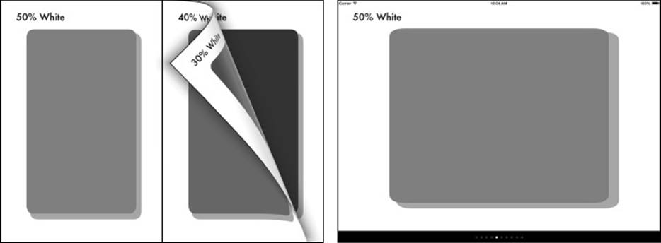
Figure 7-5 The UIPageViewController class creates virtual “books” from individual view controllers. View your books in paged (left) or scrolling (right) presentations.
All of a controller’s pages can be laid out in a similar fashion, as in Figure 7-5, or each page can provide a unique user interaction experience. Apple precooked all the animation and gesture handling into the class for you. You provide the content, implementing delegate and data source callbacks.
Book Properties
Your code customizes a page view controller’s look and behavior. Key properties specify how many pages display simultaneously, the content used for the reverse side of each page, and more. Here’s a rundown of those Apple-specified properties:
The transitionStyle property controls how one view controller transitions to the next. At this writing, the only transition styles supported by the page view controller are the page curl, as shown in Figure 7-5 (left), UIPageViewControllerTransitionStylePageCurl, and the scrolling presentation, UIPageViewControllerTransitionStyleScroll. This latter style was introduced in iOS 6.
The controller’s doubleSided property determines whether content appears on both sides of a page, as shown in Figure 7-5 (left), or just one side (right). Reserve the double-sided presentation for side-by-side layout when showing two pages simultaneously. If you don’t, you’ll end up making half your pages inaccessible. The controllers on the “back” of the pages will never move into the primary viewing space. The book layout is controlled by the book’s spine.
The spineLocation property can be set at the left or right, top or bottom, or center of the page. The three spine constants are UIPageViewControllerSpineLocationMin, corresponding to top or left, UIPageViewControllerSpineLocationMax for the right or bottom, and UIPageViewControllerSpineLocationMid for the center. The first two of these produce single-page presentations; the last, with its middle spine, is used for two-page layouts. Return one of these choices from thepageViewController:spineLocationForInterfaceOrientation: delegate method, which is called whenever the device reorients, to let the controller update its views to match the current device orientation.
Set the navigationOrientation property to specify whether the spine goes left/right or top/bottom. Use either UIPageViewControllerNavigationOrientationHorizontal (left/right) or UIPageViewControllerNavigationOrientationVertical(top/bottom). For a vertical book, the pages flip up and down rather than employing the left and right flips normally used.
Wrapping the Implementation
Like table views, a page view controller uses a delegate and data source to set the behavior and contents of its presentation. Unlike with table views, it’s simplest to wrap these items into a custom class to hide their details from applications. The code needed to support a page view implementation is rather quirky—but highly reusable. A wrapper lets you turn your attention away from fussy coding details to specific content-handling concerns.
In the standard implementation, the data source is responsible for providing page controllers on demand. It returns the next and previous view controllers in relationship to a given one. The delegate handles reorientation events and animation callbacks, setting the page view controller’s controller array, which always consists of either one or two controllers, depending on the view layout. As Recipe 7-6 demonstrates, it’s a bit of a mess to implement, but once built, it’s something you really don’t need to spend much time coming back to.
Recipe 7-6 creates a BookController class. This class numbers each page, hiding the next/previous implementation details and handling all reorientation events. A custom delegate protocol (BookDelegate) becomes responsible for returning a controller for a given page number when sent the viewControllerForPage: message. This simplifies implementation so that the calling app has only to handle a single method, which it can do by building controllers by hand or by pulling them from a storyboard.
To use the class defined in Recipe 7-6, you establish the controller, declare it as a child view controller, and add its view as a subview. Adding BookController as a child view controller ensures that it receives orientation and memory events. This type of view controller relationship will be discussed in more detail in the next recipe. Finally, the initial page number is set. Here’s what that code might look like:
- (void)viewDidLoad
{
[super viewDidLoad];
if (!bookController)
bookController = [BookController bookWithDelegate:self
style:BookLayoutStyleBook];
bookController.view.frame = self.view.bounds;
[self addChildViewController:bookController];
[self.view addSubview:bookController.view];
[bookController didMoveToParentViewController:self];
[bookController moveToPage:0];
}
The book controller creation convenience method also takes a second argument: a style. Recipe 7-6 allows developers to build four styles of books: a traditional book, a vertical book, and two scrolling styles:
typedef enum
{
BookLayoutStyleBook, // side by side in landscape
BookLayoutStyleFlipBook, // side by side in portrait
BookLayoutStyleHorizontalScroll,
BookLayoutStyleVerticalScroll,
} BookLayoutStyle;
The standard book presents one page in portrait (spine vertical and to the left) and a side-by-side presentation in landscape (spine vertical in the middle). This corresponds to a standard Western-style book, with page movement going left to right.
The “flip”-style book uses a horizontal spine. In landscape mode, the spine is at the top, with one page shown at a time. In portrait, that extends to two pages, with the horizontal spine in the middle, halfway between top and bottom.
The two scroll layouts allow you to scroll horizontally and vertically through individual pages. You cannot use multipage (side-by-side) layout with scrolling.
The tear-down process in viewWillDisappear allows the book controller to retire from its superview:
- (void)viewWillDisappear:(BOOL)animated
{
[super viewWillDisappear:animated];
[bookController willMoveToParentViewController:nil];
[bookController.view removeFromSuperview];
[bookController removeFromParentViewController];
}
Exploring the Recipe
Recipe 7-6 handles its delegate and data source duties by tagging each view controller’s view with a page number. It uses this number to know exactly which page is presented at any time and to delegate another class, BookDelegate, to produce a view controller by index.
The page controller itself always stores zero, one, or two pages in its view controller array. Zero pages means the controller has not yet been properly set up. One page is used for spine locations on the edge of the screen, two pages for a central spine. If the page count does not exactly match the spine setup, you will encounter a rather nasty runtime crash.
The controllers presented in those pages are produced by the two data source methods, which implement the before and after callbacks. In the page controller’s native implementation, controllers are defined strictly by their relationship to each other, not by an index. This recipe replaces those relationships with a simple number, asking its delegate for the page at a given index.
Here, given the orientation, the useSideBySide: method determines where to place the spine and thus how many controllers show simultaneously. This implementation sets landscape as side by side and portrait as one page. You may want to change this for your applications. For example, you might use only one page on the iPhone, regardless of orientation, to enhance text readability.
Recipe 7-6 allows both user- and application-based page control. Users can swipe and tap to new pages, or the application can send a moveToPage: request. This allows you to add external controls in addition to the page view controller’s gesture recognizers.
The direction that the page turns is set by comparing the new page number against the old. This recipe uses a Western-style page turn, where higher numbers are to the right and pages flip to the left. You may want to adjust this as needed for countries in the Middle East and Asia.
Recipe 7-6 continually stores the current page to system defaults, so it can be recovered when the application is relaunched. It also notifies its delegate when the user has turned to a given page.
Building a Presentation Index
Page view controllers’ scrolling layouts allow you to add an optional index (utilizing a page control). Any book that uses the scrolling layout style (UIPageViewControllerTransitionStyleScroll) can implement two data source methods. iOS uses them to build the indicator at the bottom of the scrolling book that you saw in Figure 7-5 (right).
As you can see from this snippet, the implementation since its inception is a bit wobbly:
- (NSInteger)presentationIndexForPageViewController:
(UIPageViewController *)pageViewController
{
// Slightly borked in iOS 6 & 7
// return [self currentPage];
return 0;
}
- (NSInteger)presentationCountForPageViewController:
(UIPageViewController *)pageViewController
{
if (bookDelegate &&
[bookDelegate respondsToSelector:@selector(numberOfPages)])
return [bookDelegate numberOfPages];
return 0;
}
Apple’s documentation states that presentationIndexForPageViewController should return the index of the selected item. Unfortunately, this leads to madness (and crashes). Returning 0 from the presentation index and the number of pages for the presentation count produces the most stable indicator. The page count used here is deferred to the book’s delegate, via an optional method called numberOfPages.
Note that you are not limited to a one-to-one correlation between your index and your page count and current page number. For a large book, you can imagine dividing this number down somewhat, so each page dot corresponds to 5 or 10 pages, showing progress through the book without an exact page correspondence.
Note
Apple enables you to access a page view controller’s gesture recognizers to allow or disallow touch-based page turns based on a touch’s location on a page. Don’t do it. First, this approach is not valid for scroll-based controllers. Second, adding recognizer delegate methods tends to mess up app stability.
Recipe 7-6 Creating a Page View Controller Wrapper
// Define a custom delegate protocol for this wrapper class
@protocol BookControllerDelegate <NSObject>
- (id)viewControllerForPage:(NSInteger)pageNumber;
@optional
- (NSInteger)numberOfPages; // for scrolling layouts
- (void)bookControllerDidTurnToPage:(NSNumber *)pageNumber;
@end
// A book controller wraps the page view controller
@interface BookController : UIPageViewController
<UIPageViewControllerDelegate, UIPageViewControllerDataSource>
+ (instancetype)bookWithDelegate:
(id<BookControllerDelegate>)theDelegate
style:(BookLayoutStyle)aStyle;
- (void)moveToPage:(NSUInteger)requestedPage;
- (int)currentPage;
@property (nonatomic, weak)
id <BookControllerDelegate> bookDelegate;
@property (nonatomic, assign) NSUInteger pageNumber;
@property (nonatomic) BookLayoutStyle layoutStyle;
@end
#pragma mark - Book Controller
@implementation BookController
#pragma mark Utility
// Page controllers are numbered using tags
- (NSInteger)currentPage
{
NSInteger pageCheck = ((UIViewController *)[self.viewControllers
objectAtIndex:0]).view.tag;
return pageCheck;
}
#pragma mark Presentation indices for page indicator (Data Source)
- (NSInteger)presentationIndexForPageViewController:
(UIPageViewController *)pageViewController
{
// Slightly borked in iOS 6 & 7
// return [self currentPage];
return 0;
}
- (NSInteger)presentationCountForPageViewController:
(UIPageViewController *)pageViewController
{
if (_bookDelegate && [_bookDelegate
respondsToSelector:@selector(numberOfPages)])
return [_bookDelegate numberOfPages];
return 0;
}
#pragma mark Page Handling
// Update if you'd rather use some other decision strategy
- (BOOL)useSideBySide:(UIInterfaceOrientation)orientation
{
BOOL isLandscape =
UIInterfaceOrientationIsLandscape(orientation);
// Each layout style determines whether side by side is used
switch (_layoutStyle)
{
case BookLayoutStyleHorizontalScroll:
case BookLayoutStyleVerticalScroll: return NO;
case BookLayoutStyleFlipBook: return isLandscape;
default: return isLandscape;
}
}
// Update the current page, set defaults, call the delegate
- (void)updatePageTo:(NSUInteger)newPageNumber
{
_pageNumber = newPageNumber;
[[NSUserDefaults standardUserDefaults]
setInteger:_pageNumber forKey:DEFAULTS_BOOKPAGE];
[[NSUserDefaults standardUserDefaults] synchronize];
SAFE_PERFORM_WITH_ARG(bookDelegate,
@selector(bookControllerDidTurnToPage:),
@(_pageNumber));
}
// Request view controller from delegate
- (UIViewController *)controllerAtPage:(NSInteger)aPageNumber
{
if (_bookDelegate && [_bookDelegate respondsToSelector:
@selector(viewControllerForPage:)])
{
UIViewController *controller =
[_bookDelegate viewControllerForPage:aPageNumber];
controller.view.tag = aPageNumber;
return controller;
}
return nil;
}
// Update interface to the given page
- (void)fetchControllersForPage:(NSUInteger)requestedPage
orientation:(UIInterfaceOrientation)orientation
{
BOOL sideBySide = [self useSideBySide:orientation];
NSInteger numberOfPagesNeeded = sideBySide ? 2 : 1;
NSInteger currentCount = self.viewControllers.count;
NSUInteger leftPage = requestedPage;
if (sideBySide && (leftPage % 2))
leftPage = floor(leftPage / 2) * 2;
// Only check against current page when count is appropriate
if (currentCount && (currentCount == numberOfPagesNeeded))
{
if (_pageNumber == requestedPage) return;
if (_pageNumber == leftPage) return;
}
// Decide the prevailing direction, check new page against the old
UIPageViewControllerNavigationDirection direction =
(requestedPage > _pageNumber) ?
UIPageViewControllerNavigationDirectionForward :
UIPageViewControllerNavigationDirectionReverse;
// Update the controllers, never adding a nil result
NSMutableArray *pageControllers = [NSMutableArray array];
SAFE_ADD(pageControllers, [self controllerAtPage:leftPage]);
if (sideBySide)
SAFE_ADD(pageControllers,
[self controllerAtPage:leftPage + 1]);
[self setViewControllers:pageControllers
direction:direction animated:YES completion:nil];
[self updatePageTo:leftPage];
}
// Entry point for external move request
- (void)moveToPage:(NSUInteger)requestedPage
{
// Thanks Dino Lupo
[self fetchControllersForPage:requestedPage
orientation:(UIInterfaceOrientation)
self.interfaceOrientation];
}
#pragma mark Data Source
- (UIViewController *)pageViewController:
(UIPageViewController *)pageViewController
viewControllerAfterViewController:
(UIViewController *)viewController
{
[self updatePageTo:_pageNumber + 1];
return [self controllerAtPage:(viewController.view.tag + 1)];
}
- (UIViewController *)pageViewController:
(UIPageViewController *)pageViewController
viewControllerBeforeViewController:
(UIViewController *)viewController
{
[self updatePageTo:_pageNumber - 1];
return [self controllerAtPage:(viewController.view.tag - 1)];
}
#pragma mark Delegate Method
- (UIPageViewControllerSpineLocation)pageViewController:
(UIPageViewController *)pageViewController
spineLocationForInterfaceOrientation:
(UIInterfaceOrientation)orientation
{
// Always start with left or single page
NSUInteger indexOfCurrentViewController = 0;
if (self.viewControllers.count)
indexOfCurrentViewController =
((UIViewController *)[self.viewControllers
objectAtIndex:0]).view.tag;
[self fetchControllersForPage:indexOfCurrentViewController
orientation:orientation];
// Decide whether to present side by side
BOOL sideBySide = [self useSideBySide:orientation];
self.doubleSided = sideBySide;
UIPageViewControllerSpineLocation spineLocation = sideBySide ?
UIPageViewControllerSpineLocationMid :
UIPageViewControllerSpineLocationMin;
return spineLocation;
}
// Return a new book controller
+ (instancetype)bookWithDelegate:(id)theDelegate
style:(BookLayoutStyle)aStyle
{
// Determine orientation
UIPageViewControllerNavigationOrientation orientation =
UIPageViewControllerNavigationOrientationHorizontal;
if ((aStyle == BookLayoutStyleFlipBook) ||
(aStyle == BookLayoutStyleVerticalScroll))
orientation = UIPageViewControllerNavigationOrientationVertical;
// Determine transitionStyle
UIPageViewControllerTransitionStyle transitionStyle =
UIPageViewControllerTransitionStylePageCurl;
if ((aStyle == BookLayoutStyleHorizontalScroll) ||
(aStyle == BookLayoutStyleVerticalScroll))
transitionStyle = UIPageViewControllerTransitionStyleScroll;
// Pass options as a dictionary. Keys are spine location (curl)
// and spacing between vc's (scroll).
BookController *bc = [[BookController alloc]
initWithTransitionStyle:transitionStyle
navigationOrientation:orientation
options:nil];
bc.layoutStyle = aStyle;
bc.dataSource = bc;
bc.delegate = bc;
bc.bookDelegate = theDelegate;
return bc;
}
@end
Get This Recipe’s Code
To find this recipe’s full sample project, point your browser to https://github.com/erica/iOS-7-Cookbook and go to the folder for Chapter 7.
Recipe: Custom Containers
Apple’s split view controller was groundbreaking in that it introduced the notion that more than one controller could live onscreen at a time. Until the split view, the rule was one controller with many views at a time. With the split view, several controllers coexist onscreen, all of them independently responding to orientation and memory events.
Apple exposed this multiple-controller paradigm to developers in the iOS 5 SDK, allowing developers to design a parent controller and add child controllers to it. Events are passed from parent to child as needed. This allows you to build custom containers, outside the Apple-standard set of containers such as tab bar and navigation controllers.
Recipe 7-7 builds a reusable container that can hold either one or two children. When loaded with two child view controllers, it lets you flip from one to the other and back. It has quite a lot of conditionality built in. That’s because it can be used as a standalone view controller, as a child view controller itself, and as a modal view controller. Imagine the following situations.
As with a navigation controller, you can create this flip view controller directly and set it as your primary window’s root view controller. In that case, it has no further relationship with any hierarchy. It merely manages its children. You can also use it as a child of some other container, such as in a tab bar controller presentation, a split view controller, and so forth. When used in that way, it acts as both a parent of its children and as a child of the container that holds it. Finally, you can present the controller directly. The flip view container must behave as a solid citizen in all these situations. The controller therefore has two tasks. First, it must manage its children using standard UIKit calls. Second, it must be aware of how it is participating in the view hierarchy. This recipe adds a navigation bar so a Done button becomes available to end users.
Adding and Removing a Child View Controller
In the simplest scenario, adding a child to a container controller takes three steps:
1. Call addChildViewController: on the parent and pass the child as the argument (for example, [self addChildViewController:childvc]).
2. Add the child controller’s view as a subview (for example, [self.view addSubview:childvc.view]).
3. Call didMoveToParentViewController: on the child with the parent as its argument (for example, [childvc didMoveToParentViewController:self]).
To remove a child view controller, the steps are almost (but not quite) mirrored:
1. Call willMoveToParentViewController: on the child, passing nil as the argument (for example, [childvc willMoveToParentViewController:nil]).
2. Remove the child controller’s view (for example, [childvc.view removeFromSuperview]).
3. Call removeFromParentViewController on the child (for example, [childvc removeFromParentViewController]).
Transitioning Between View Controllers
UIKit offers a simple way to animate view features when you move from one child view controller to another. You provide a source view controller, a destination, and a duration for the animated transition. You can specify the kind of transition in the options. Supported transitions include page curls, dissolves, and flips. This method creates a simple curl from one view controller to the next:
- (void)action:(id)sender
{
[redController willMoveToParentViewController:nil];
[self addChildViewController:blueController];
[self transitionFromViewController:redController
toViewController:blueController
duration:1.0f
options:UIViewAnimationOptionLayoutSubviews |
UIViewAnimationOptionTransitionCurlUp
animations:^(void){}
completion:^(BOOL finished){
[redController.view removeFromSuperview];
[self.view addSubview:blueController.view];
[redController removeFromParentViewController];
[blueController didMoveToParentViewController:self];
}
];
}
You can use the same approach to animate UIView properties without the built-in transitions. For example, this method re-centers and fades out the red controller while fading in the blue. These are all animatable UIView features and are changed in the animations: block:
- (void)action:(id)sender
{
[redController willMoveToParentViewController:nil];
[self addChildViewController:blueController];
blueController.view.alpha = 0.0f;
[self transitionFromViewController:redController
toViewController:blueController
duration:2.0f
options:UIViewAnimationOptionLayoutSubviews
animations:^(void){
redController.view.center = CGPointMake(0.0f, 0.0f);
redController.view.alpha = 0.0f;
blueController.view.alpha = 1.0f;
}
completion:^(BOOL finished){
[redController.view removeFromSuperview];
[self.view addSubview:blueController.view];
[redController removeFromParentViewController];
[blueController didMoveToParentViewController:self];
}
];
}
Using transitions and view animations is an either/or scenario. Either set a transition option or change view features in the animations block. Otherwise, they conflict, as you can easily confirm for yourself. Use the completion block to remove the old view and move the new view into place.
Although simple to implement, this kind of transition is not meant for use with Core Animation. If you want to add Core Animation effects to your view-controller-to-view-controller transitions, think about using a custom segue instead. Segues are covered in the following recipe.
As mentioned in Recipe 7-2, a third option is available for animating transitions between UIViewControllers in iOS 7: The custom transitions API allows you to create advanced animations that can even interact dynamically with the user.
Recipe 7-7 Creating a View Controller Container
- (void)viewDidDisappear:(BOOL)animated
{
[super viewDidDisappear:animated];
if (!controllers.count)
{
NSLog(@"Error: No root view controller");
return;
}
// Clean up the child view controller
UIViewController *currentController =
(UIViewController *)controllers[0];
[currentController willMoveToParentViewController:nil];
[currentController.view removeFromSuperview];
[currentController removeFromParentViewController];
}
- (void)flip:(id)sender
{
// Please call only with two controllers
if (controllers.count < 2) return;
// Determine which item is front, which is back
UIViewController *front = (UIViewController *)controllers[0];
UIViewController *back = (UIViewController *)controllers[1];
// Select the transition direction
UIViewAnimationOptions transition = reversedOrder ?
UIViewAnimationOptionTransitionFlipFromLeft :
UIViewAnimationOptionTransitionFlipFromRight;
// Hide the info button until after the flip
infoButton.alpha = 0.0f;
// Prepare the front for removal, the back for adding
[front willMoveToParentViewController:nil];
[self addChildViewController:back];
// Perform the transition
[self transitionFromViewController: front
toViewController:back duration:0.5f options:transition
animations:nil completion:^(BOOL done){
// Bring the Info button back into view
[self.view bringSubviewToFront:infoButton];
[UIView animateWithDuration:0.3f animations:^(){
infoButton.alpha = 1.0f;
}];
// Finish up transition
[front removeFromParentViewController];
[back didMoveToParentViewController:self];
reversedOrder = !reversedOrder;
controllers = @[back, front];
}];
}
- (void)viewWillAppear:(BOOL)animated
{
[super viewWillAppear:animated];
if (!controllers.count)
{
NSLog(@"Error: No root view controller");
return;
}
UIViewController *front = controllers[0];
UIViewController *back = nil;
if (controllers.count > 1) back = controllers[1];
[self addChildViewController:front];
[self.view addSubview:front.view];
[front didMoveToParentViewController:self];
// Check for presentation and for "flippability"
BOOL isPresented = self.isBeingPresented;
// Clean up instance if re-use
if (navbar || infoButton)
{
[navbar removeFromSuperview];
[infoButton removeFromSuperview];
navbar = nil;
}
// When presented, add a custom navigation bar.
// iPhone navbar height must consider status bar.
CGFloat navbarHeight = IS_IPHONE ? 64.0 : 44.0;
if (isPresented)
{
navbar = [[UINavigationBar alloc] init];
[self.view addSubview:navbar];
PREPCONSTRAINTS(navbar);
ALIGN_VIEW_TOP(self.view, navbar);
ALIGN_VIEW_LEFT(self.view, navbar);
ALIGN_VIEW_RIGHT(self.view, navbar);
CONSTRAIN_HEIGHT(navbar, navbarHeight);
}
// Right button is Done when VC is presented
self.navigationItem.leftBarButtonItem = nil;
self.navigationItem.rightBarButtonItem = isPresented ?
SYSBARBUTTON(UIBarButtonSystemItemDone,
@selector(done:)) : nil;
// Populate the navigation bar
if (navbar)
[navbar setItems:@[self.navigationItem] animated:NO];
// Size the child VC view(s)
CGFloat verticalOffset =
(navbar != nil) ? navbarHeight : 0.0f;
CGRect destFrame = CGRectMake(0.0f, verticalOffset,
self.view.frame.size.width,
self.view.frame.size.height - verticalOffset);
front.view.frame = destFrame;
back.view.frame = destFrame;
// Set up info button
if (controllers.count < 2) return; // our work is done here
// Create the "i" button
infoButton = [UIButton buttonWithType:UIButtonTypeInfoLight];
infoButton.tintColor = [UIColor whiteColor];
[infoButton addTarget:self action:@selector(flip:)
forControlEvents:UIControlEventTouchUpInside];
// Place "i" button at bottom right of view
[self.view addSubview:infoButton];
PREPCONSTRAINTS(infoButton);
ALIGN_VIEW_RIGHT_CONSTANT(self.view, infoButton,
-infoButton.frame.size.width);
ALIGN_VIEW_BOTTOM_CONSTANT(self.view, infoButton,
-infoButton.frame.size.height);
}
@end
Get This Recipe’s Code
To find this recipe’s full sample project, point your browser to https://github.com/erica/iOS-7-Cookbook and go to the folder for Chapter 7.
Recipe: Segues
When you use storyboards, IB provides a set of standard segues to transition between your view controllers. With custom containers come their little brother, custom segues. Just as tab and navigation controllers provide a distinct way of transitioning between child view controllers, you can build custom segues that define transition animations unique to your class.
IB doesn’t provide a lot of support for custom containers with custom segues, so it’s best to develop your segue presentations in code for now. Here’s how you might implement code to move a view controller to a new view:
// Informal custom delegate method
- (void)segueDidComplete
{
// Retrieve the two vc's
UIViewController *source =
[childControllers objectAtIndex:vcIndex];
UIViewController *destination =
[childControllers objectAtIndex:nextIndex];
// Reparent as needed
[destination didMoveToParentViewController:self];
[source removeFromParentViewController];
// Update the bookkeeping
vcIndex = nextIndex;
pageControl.currentPage = vcIndex;
}
// Transition to new view using custom segue
- (void)switchToView:(int)newIndex
goingForward:(BOOL)goesForward
{
if (vcIndex == newIndex) return;
nextIndex = newIndex;
// Segue to the new controller
UIViewController *source =
[childControllers objectAtIndex:vcIndex];
UIViewController *destination =
[childControllers objectAtIndex:newIndex];
// Start the reparenting process
[source willMoveToParentViewController:nil];
[self addChildViewController:destination];
RotatingSegue *segue = [[RotatingSegue alloc]
initWithIdentifier:@"segue"
source:source destination:destination];
segue.goesForward = goesForward;
segue.delegate = self;
[segue perform];
}
Here, the code identifies the source and destination child controllers, builds a segue, sets its parameters, and tells it to perform. An informal delegate method is called back by that custom segue on its completion. Recipe 7-8 shows how the segue is built. In this example, it creates a rotating cube effect that moves from one view to the next. Figure 7-6 shows the segue in action.
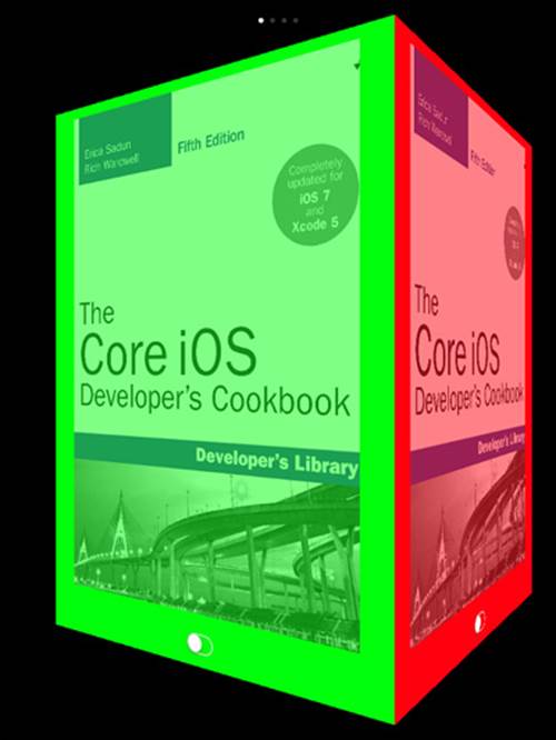
Figure 7-6 Custom segues allow you to create visual metaphors for your custom containers. Recipe 7-8 builds a “cube” of view controllers that can be rotated from one to the next. The switches on each controller update the art alpha value from translucent to solid and back.
The segue’s goesForward property determines whether the rotation moves to the right or left around the virtual cube. Although this example uses four view controllers, as you saw in the code that laid out the child view controllers, that’s a limitation of the metaphor, not of the code itself, which will work with any number of child controllers. You can just as easily build three- or seven-sided presentations with this, although you are breaking an implicit “reality” contract with your user if you do so. To add more (or fewer) sides, you should adjust the animation geometry in the segue away from a cube to fit your virtual n-hedron.
Recipe 7-8 Creating a Custom View Controller Segue
@implementation RotatingSegue
{
CALayer *transformationLayer;
UIView __weak *hostView;
}
// Return a shot of the given view
- (UIImage *)screenShot:(UIView *)aView
{
// Arbitrarily dims to 40%. Adjust as desired.
UIGraphicsBeginImageContext(hostView.frame.size);
[aView.layer renderInContext:UIGraphicsGetCurrentContext()];
UIImage *image =
UIGraphicsGetImageFromCurrentImageContext();
CGContextSetRGBFillColor(UIGraphicsGetCurrentContext(),
0, 0, 0, 0.4f);
CGContextFillRect(UIGraphicsGetCurrentContext(),
hostView.frame);
UIGraphicsEndImageContext();
return image;
}
// Return a layer with the view contents
- (CALayer *)createLayerFromView:(UIView *)aView
transform:(CATransform3D)transform
{
CALayer *imageLayer = [CALayer layer];
imageLayer.anchorPoint = CGPointMake(1.0f, 1.0f);
imageLayer.frame = (CGRect){.size = hostView.frame.size};
imageLayer.transform = transform;
UIImage *shot = [self screenShot:aView];
imageLayer.contents = (__bridge id) shot.CGImage;
return imageLayer;
}
// On starting the animation, remove the source view
- (void)animationDidStart:(CAAnimation *)animation
{
UIViewController *source =
(UIViewController *) super.sourceViewController;
[source.view removeFromSuperview];
}
// On completing the animation, add the destination view,
// remove the animation, and ping the delegate
- (void)animationDidStop:(CAAnimation *)animation
finished:(BOOL)finished
{
UIViewController *dest =
(UIViewController *) super.destinationViewController;
[hostView addSubview:dest.view];
[transformationLayer removeFromSuperlayer];
if (_delegate &&
[_delegate respondsToSelector:
@selector(segueDidComplete)])
{
[_delegate segueDidComplete];
}
}
// Perform the animation
-(void)animateWithDuration:(CGFloat)aDuration
{
CAAnimationGroup *group = [CAAnimationGroup animation];
group.delegate = self;
group.duration = aDuration;
CGFloat halfWidth = hostView.frame.size.width / 2.0f;
float multiplier = goesForward ? -1.0f : 1.0f;
// Set the x, y, and z animations
CABasicAnimation *translationX = [CABasicAnimation
animationWithKeyPath:@"sublayerTransform.translation.x"];
translationX.toValue =
[NSNumber numberWithFloat:multiplier * halfWidth];
CABasicAnimation *translationZ = [CABasicAnimation
animationWithKeyPath:@"sublayerTransform.translation.z"];
translationZ.toValue = [NSNumber numberWithFloat:-halfWidth];
CABasicAnimation *rotationY = [CABasicAnimation
animationWithKeyPath:@"sublayerTransform.rotation.y"];
rotationY.toValue =
[NSNumber numberWithFloat: multiplier * M_PI_2];
// Set the animation group
group.animations = [NSArray arrayWithObjects:
rotationY, translationX, translationZ, nil];
group.fillMode = kCAFillModeForwards;
group.removedOnCompletion = NO;
// Perform the animation
[CATransaction flush];
[transformationLayer addAnimation:group forKey:kAnimationKey];
}
- (void)constructRotationLayer
{
UIViewController *source =
(UIViewController *) super.sourceViewController;
UIViewController *dest =
(UIViewController *) super.destinationViewController;
hostView = source.view.superview;
// Build a new layer for the transformation
transformationLayer = [CALayer layer];
transformationLayer.frame = hostView.bounds;
transformationLayer.anchorPoint = CGPointMake(0.5f, 0.5f);
CATransform3D sublayerTransform = CATransform3DIdentity;
sublayerTransform.m34 = 1.0 / -1000;
[transformationLayer setSublayerTransform:sublayerTransform];
[hostView.layer addSublayer:transformationLayer];
// Add the source view, which is in front
CATransform3D transform = CATransform3DMakeIdentity;
[transformationLayer addSublayer:
[self createLayerFromView:source.view
transform:transform]];
// Prepare the destination view either to the right or left
// at a 90/270 degree angle off the main
transform = CATransform3DRotate(transform, M_PI_2, 0, 1, 0);
transform = CATransform3DTranslate(transform,
hostView.frame.size.width, 0, 0);
if (!goesForward)
{
transform =
CATransform3DRotate(transform, M_PI_2, 0, 1, 0);
transform =
CATransform3DTranslate(transform,
hostView.frame.size.width, 0, 0);
transform =
CATransform3DRotate(transform, M_PI_2, 0, 1, 0);
transform =
CATransform3DTranslate(transform,
hostView.frame.size.width, 0, 0);
}
[transformationLayer addSublayer:
[self createLayerFromView:dest.view
transform:transform]];
}
// Standard UIStoryboardSegue perform
- (void)perform
{
[self constructRotationLayer];
[self animateWithDuration:0.5f];
}
@end
Get This Recipe’s Code
To find this recipe’s full sample project, point your browser to https://github.com/erica/iOS-7-Cookbook and go to the folder for Chapter 7.
Segues and IB
Starting in the iOS 6 SDK, you can apply custom segues in your storyboards. You’ll need to tie those segues to some action item, such as a button or bar button press, or similar actionable element. Figure 7-7 shows how custom segues are listed in IB. The “rotating” segue is from Recipe 7-8.
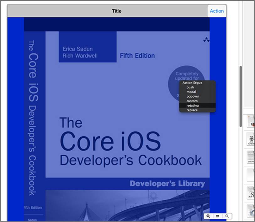
Figure 7-7 Storyboards allow you to apply custom segues in IB. IB scans for UIStoryboardSegue child classes. Here, IB lists the custom “rotating” segue along with system-supplied options.
What’s more, segues can be “unwound.” Unwinding allows you to move back from a new view controller to its logical parent, using a custom segue you provide. You achieve this by implementing a few methods:
Specify whether you can unwind with canPerformUnwindSegueAction:fromViewController:withSender:.
Return a view controller to viewControllerForUnwindSegueAction:fromViewController:withSender:. This controller will be the unwinding destination.
Supply the required unwinding segue instance via segueForUnwindingToView-Controller:fromViewController:identifier:. Typically, you’ll want your unwind to animate in the reverse direction from your original segue.
Finally, you can now allow or disallow any segue by implementing shouldPerformSegue-WithIdentifier:sender:. You return either YES or NO, depending on whether you want the identified segue to proceed.
Summary
This chapter shows many view controller classes in action. You’ve learned how to use them to handle view presentation and user navigation for various device deployment choices. With these classes, you have discovered how to expand virtual interaction space and create multipage interfaces, as demanded by applications, while respecting the HIG on the platform in question. Before moving on to the next chapter, here are a few points to consider about view controllers:
Use navigation trees to build hierarchical interfaces. They work well for looking at file structures or building a settings tree. When you think “disclosure view” or “preferences,” consider pushing a new controller onto a navigation stack or using a split view to present them directly.
Don’t be afraid to use conventional UI elements in unconventional ways, as long as you respect the overall Apple HIG. You can apply innovative approaches for UINavigationController that don’t involve any navigation. The tools are there for you to use.
Be persistent. Let your users return to the same GUI state that they last left from. NSUserDefaults provides a built-in system for storing information between application runs. Use these defaults to re-create the prior interface state. The State Preservation and Restoration API introduced in iOS 6 provides another path for persisting large portions of your UI state.
Go universal. Let your code adapt itself for various device deployments rather than force your app into an only-iPhone or only-iPad design. This chapter touches on some simple runtime device detection and interface updates that you can easily expand for more challenging circumstances. Universal deployment isn’t just about stretching views and using alternate art and XIB files. It’s also about detecting when a device influences the way you interact in addition to the look of the interface.
When working with custom containers, don’t be afraid of using storyboards directly. You do not have to build and retain an array of all your controllers simultaneously. Storyboards offer direct access to all your elements. As with the new page view controller class, just load the controllers you need, when you need them.
All materials on the site are licensed Creative Commons Attribution-Sharealike 3.0 Unported CC BY-SA 3.0 & GNU Free Documentation License (GFDL)
If you are the copyright holder of any material contained on our site and intend to remove it, please contact our site administrator for approval.
© 2016-2026 All site design rights belong to S.Y.A.