iOS Auto Layout Demystified, Second Edition (2014)
Chapter 1. Introducing Auto Layout
Auto Layout re-imagines the way developers create user interfaces. It provides a flexible and powerful system that describes how views and their content relate to each other and to the superviews they occupy. In contrast to older design approaches, this technology offers incredible control over layout, with a wider range of customization than you can get with frames, springs, and struts.
Auto Layout has garnered both a loyal user base and fanatical detractors. Its reputation for difficulty and frustration, particularly when used through Interface Builder (IB), are occasionally merited. Although Xcode 5 vastly improves that situation (by doing away with several baffling and alienating features), this is a technology that continues to evolve toward full maturity.
Auto Layout is a fantastic tool. It does things that earlier technologies could never dream of. From edge case handling to creation of reciprocal relationships between views, Auto Layout introduces immense power. What’s more, Auto Layout is compatible with many of Apple’s most exciting application programming interfaces (APIs), including animations, motion effects, and sprites.
That’s why this book exists. You’re about to learn Auto Layout mastery by example, with plenty of explanations and tips. Instead of struggling with class documentation, you’ll read, in simple steps, how the system works, how to tweak it to make it work better, and why Auto Layout is far more powerful than many developers realize. You’ll discover common design scenarios and discover best practices that make Auto Layout a pleasure rather than a chore to use.
Origins
Auto Layout first debuted on iOS in 2012, as part of the iOS 6 release. It also appeared about a year earlier in OS X 10.7 Lion. Intended to replace the older springs-and-struts-based Autosizing, Auto Layout is a new system that builds relationships between views, specifying how views relate to their superviews and to each other.
Auto Layout is based on the Cassowary constraint-solving toolkit. Cassowary was developed at the University of Washington by Greg J. Badros and Alan Borning to address user interface layout challenges. Here’s what the Cassowary SourceForge project page (http://sourceforge.net/p/cassowary/wiki/Home/) says about it:
Cassowary is an incremental constraint solving toolkit that efficiently solves systems of linear equalities and inequalities. Constraints may be either requirements or preferences. Re-solving the system happens rapidly, supporting UI applications.
Cassowary was developed around an important interface phenomenon: that inequality and equality relationships occur naturally in user interfaces. Cassowary developed a rule-based system that enabled developers to describe these relationships between views. These relationships were described through constraints. Constraints are rules that describe how one view’s layout is limited with respect to another. For example, a view might occupy only the left half of the screen, or two views might always need to be aligned at their bottoms.
Cassowary offers an automatic solver that transforms its system of constraint-based layout rules (essentially a set of simultaneous linear equations, if you’re a math geek) into view geometries that express those rules. Cassowary’s constraint system is powerful and nuanced. Since its debut, Cassowary has been ported to JavaScript, .NET/Java, Python, Smalltalk, C++, and, via Auto Layout, to Cocoa and Cocoa Touch.
In iOS and OS X, the constraint-powered Auto Layout efficiently arranges the views in your interface. You provide rules, whether through IB or through code, and the Auto Layout system transforms those rules into view frames.
Saying “Yes” to Auto Layout
There are many reasons developers want to say “No” to Auto Layout. Maybe it’s too new, too strange, or requires a bit of work to update interfaces. But you should say “Yes.” Auto Layout revolutionizes view layout with something wonderful, fresh, and new. Apple’s layout features make your life easier and your interfaces more consistent, and they add resolution-independent placement for free. You get all this, regardless of device geometry, orientation, and window size.
Auto Layout works by creating relationships between onscreen objects. It specifies the way the runtime system automatically arranges your views. The outcome is a set of robust rules that adapt to screen and window geometry. With Auto Layout, you describe constraints that specify how views relate to one another, and you set view properties that describe a view’s relationship to its content. With Auto Layout, you can make requests such as the following:
 Match one view’s size to another view’s size so that they always remain the same width.
Center a view (or even a group of views) in a superview, no matter how much the superview reshapes.
Align the bottoms of several views while laying out a row of items.
Offset a pair of items by some constant distance (for example, adding a standard 8-point padding space between views).
Tie the bottom of one view to another view’s top so that when you move one, you move them both.
Prevent an image view from shrinking to the point where the image cannot be fully seen at its natural size. (That is, don’t compress or clip the view’s content.)
Keep a button from showing too much padding around its text.
The first five items in this list describe constraints that define view geometry and layout, establishing visual relationships between views. The last two items relate a view to the content it presents. When working with Auto Layout, you negotiate both these kinds of tasks.
Here are some of the strengths that Auto Layout brings to your development.
Geometric Relationships
Auto Layout excels at building relationships. Figure 1-1 shows a custom iOS control built entirely with Auto Layout. This picker enables users to select a color. Each pencil consists of a fixed-size tip view placed directly above a stretchable bottom view. As users make selections, items move up and down together to indicate their current choice. Auto Layout constraints ensure that each tip stays exactly on top of its base, that each “pencil” is sized to match its fellows, and that the paired tip and base items are laid out in a bottom-aligned row.
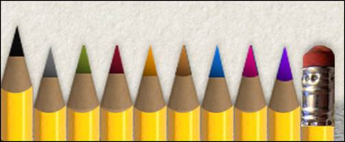
Figure 1-1 This pencil-picker custom control was built entirely with Auto Layout.
This particular pencil picker is built programmatically; that is, a data source supplies the number of pencils and the art for each tip. By describing the relationships between the items, Auto Layout simplifies the process of extending this control. You need only say “place each new item to the right, match its width to the existing pencils, and align its bottom” to grow this picker from 10 items to 11, 12, or more. Best of all, constraint changes can be animated. The pencil tip animates up and down as the base reshapes to new constraint offsets.
The following code shows how these items were laid out in my project:
// This sample extensively uses custom macros to minimize the
// repetition and wordiness of this code, while giving a sense of the
// design choices and layout vocabulary offered by Auto Layout.
// Read more about similar custom macros in Chapter 6.
- (void) layoutPicker
{
for (int i = 0; i < segmentCount; i++)
{
// Add base
UIImageView *base = [[UIImageView alloc] initWithImage:baseArt];
base.tag = i + 1;
[self addSubview:base];
PREPCONSTRAINTS(base);
// Load tip
UIImageView *tip = [[UIImageView alloc] initWithImage:segmentArt[@(i)]];
tip.tag = i + 1001;
[self addSubview:tip];
PREPCONSTRAINTS(tip);
// Constrain tips on top of base
CONSTRAIN_VIEWS(@"V:[tip][base]|", tip, base);
// Left align tip and base
ALIGN_LEFT(tip, base);
// Tips and base have same width so
// match the tip width to the base width
MATCH_WIDTH(tip, base);
}
// Set up leftmost base
UIView *view1 = [self viewWithTag:1];
ALIGN_LEFT(view1, 0);
// Line up the bases
for (int i = 2; i <= segmentCount; i++)
{
// Each base to the right of the previous one
UIView *view1 = [self viewWithTag:i-1];
UIView *view2 = [self viewWithTag:i];
CONSTRAIN_VIEWS(@"H:[view1][view2]", view1, view2);
}
for (int i = 1; i <= segmentCount; i++)
{
// Create base height constraint so the
// base's height (the pencil without the tip) is
// fixed to the value of baseHeight
UIImageView *base = (UIImageView *)[self viewWithTag:i];
baseHeight = base.image.size.height;
CONSTRAIN_HEIGHT(base, baseHeight);
// Create tip size constraints fixing the
// tip's width and height to these values
UIImageView *tip = (UIImageView *)[self viewWithTag:i + 1000];
CONSTRAIN_WIDTH(tip, targetWidth);
CONSTRAIN_HEIGHT(tip, targetHeight);
}
}
Content-Driven Layout
Auto Layout is content driven. That is, it considers a view’s content during layout. For example, imagine a resizable content view with several subviews, like the one shown in Figure 1-2. Suppose that you want to be able to resize this view but don’t want to clip any subview content while doing so. Auto Layout helps you express these desires and rank them so that the system makes sure not to clip when resizing.
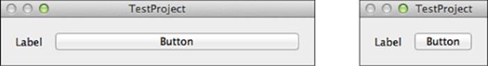
Figure 1-2 Auto Layout can ensure that the stretchable button shown in the original view (left) won’t clip while resizing. The window cannot resize any smaller than the small view (right) because doing so would cause either the label or button to clip.
Figure 1-2 shows a small OS X application whose primary window protects the content of its two subviews. (Throughout this book, I try to add a few OS X examples where possible. Auto Layout is virtually identical on iOS and OS X.) These subviews include a label whose content is the string Label and a resizable button whose content is, similarly, the string Button. The left side of the figure shows the original content view as the application launches; the right side shows the same window after it’s been resized to its minimum extent.
At the right of Figure 1-2, you see the smallest possible version of this view. Because its Auto Layout rules resist clipping (these rules are called compression resistance), the window cannot resize any further. The only way to allow it to shrink beyond this size is to demote or remove one or both of its “do not clip” subview rules. A similar rule, called content hugging, allows a view to resist padding and stretching, keeping the frame of each view close to the natural size of the content it presents.
Keep content in mind and adapt your rules as your views change the data they present. For example, if you were switching from one language to another, you might need the width of each label and button to adapt to different word lengths. For example, localizing English text to Spanish or Portuguese might cause a 20%–25% expansion in word size. Localizing to Hebrew or Arabic can shrink English text by a third.
Prioritized Rules
With prioritized rules, Auto Layout weighs the importance of layout choices and adapts to challenging edge conditions and special cases. Rule balancing is an important part of Auto Layout design work. You not only specify the layout qualities of each view but also prioritize them. When rules come into conflict—and they do quite regularly—the system uses your rankings to select the most important layout qualities to preserve.
In the example of Figure 1-2, the integrity of the label and of the button contents have priority over any request for a smaller window. This forces a natural minimum on the window size and prevents the window from resizing any further than that.
Inspection and Modularization
One of the great things about Auto Layout is how well it can be centralized and inspected. This is, however, a benefit only if you create your layouts in code. While you can browse constraints in IB, and even visualize them with the proper tools, recovering the intent of each layout choice is an intractable issue.
In code, you can compartmentalize your rules to common methods (such as loadView and updateViewConstraints) and freely annotate them. Code trades off review against visualization. You can inspect your layouts with ease to ensure that your logic is properly expressed. You cannot preview those rules, however, except by running the application.
You can easily modularize constraints. Once you’ve built a routine that centers a view in its superview, you can re-use that routine indefinitely. By building a library of common constraint requests (for example, “align this view to the bottom” or “create a row of these views with center-Y alignment”), you cause your layout code to refine over time in both real-world readability and overall reliability. You can see this modularization in the code example that accompanies Figure 1-1.
Incremental Adoption
Auto Layout is backward compatible. Interfaces and nib files built using older Autosizing technology still work in Auto Layout. You are welcome to mix and match autoresizing views with constraint-based layout. For example, you can load a nib whose subviews are laid out using struts and springs and allow that view, in turn, to operate as a first-class member of the Auto Layout world. The key is encapsulation.
As long as rules do not directly conflict (for example, you can’t say “stretch using Autosizing” and “stretch using Auto Layout” at the same time on a single view), you can reuse complex views you have already established in your projects. You can, for example, load Autosizing nibs and seamlessly place them into your Auto Layout scenes.
Constraints
Now that you’ve read about the why of Auto Layout, this section introduces the what. Here’s the basic vocabulary you need to start talking about this technology.
Constraints, as you learned earlier, are rules that allow you to describe view layout. They limit how things relate to each other and specify how they can be laid out. With constraints, you can say “these items are always lined up in a horizontal row” or “this item resizes itself to match the height of that item.” Constraints provide a layout language that you add to views to describe geometric relationships.
The constraints you work with belong to the NSLayoutConstraint class. This Objective-C class specifies relationships between view attributes, such as heights, widths, positions, and centers. What’s more, constraints are not limited to equalities. They can describe views using greater-than-or-equal and less-than-or-equal relations so that you can say that one view must be at least as big as or no bigger than another. Auto Layout development is built around creating and adjusting these relationship rules in a way that fully defines your interfaces.
Together, an interface’s constraints describe the ways views can be laid out to dynamically fit any screen or window geometry. In Cocoa and Cocoa Touch, a well-defined interface layout consists of constraints that are satisfiable and sufficient.
Note
Each individual constraint refers to either one or two views. Constraints relate one view’s attributes either to itself or to another view.
Satisfiability
Cocoa/Cocoa Touch takes charge of meeting layout demands through its constraint satisfaction system. The rules must make sense both individually and as a whole. That is, a rule must be created in a valid manner, and it also must play a role in the greater whole. In logic systems, this is called satisfiability, or validity. A view cannot be both to the left and to the right of another view. So, the key challenge when working with constraints is to ensure that the rules are rigorously consistent.
Any views you lay out in IB can be guaranteed to be satisfiable, as IB offers a system that optionally checks and validates your layouts. It can even fix conflicting constraints. This is not true in code. You can easily build views and tell them to be exactly 360 points wide and 140 points wide at the same time. This can be mildly amusing if you’re trying to make things fail, but it is more often utterly frustrating when you’re trying to make things work, which is what most developers spend their time doing.
When rules fail, they fail loudly. At compile time, Xcode issues warnings for conflicting IB constraints and other IB-based layout issues. At runtime, the Xcode console provides verbose updates whenever the solver hits a rough patch. That output explains what might have gone wrong and offers debugging assistance.
In some cases, your code will raise exceptions. Your app terminates if you haven’t implemented handlers. In other cases (such as the example that follows), Auto Layout keeps your app running by deleting conflicting constraint rules for you. This produces interfaces that can be somewhat unexpected.
Regardless of the situation, it’s up to you to start debugging your code and your IB layouts to try to track down why things have broken and the source of the conflicting rules. This is never fun.
Consider the following console output, which refers to the view I mentioned that attempts to be both 360 points and 140 points wide at the same time:
Note
The boldface in this code is mine. I’ve used it to highlight the sizes for each constraint, plus the reason for the error. In this example, both rules have the same priority and are inconsistent with each other.
2013-01-14 09:02:48.590 HelloWorld[69291:c07]
Unable to simultaneously satisfy constraints.
Probably at least one of the constraints in the following list is one you
don't want. Try this: (1) look at each constraint and try to figure out which
you don't expect; (2) find the code that added the unwanted constraint or
constraints and fix it.
(Note: If you're seeing NSAutoresizingMaskLayoutConstraints that you don't
understand, refer to the documentation for the UIView property
translatesAutoresizingMaskIntoConstraints)
(
"<NSLayoutConstraint:0x7147d40 H:[TestView:0x7147c50(360)]>",
"<NSLayoutConstraint:0x7147e70 H:[TestView:0x7147c50(140)]>"
)
Will attempt to recover by breaking constraint
<NSLayoutConstraint:0x7147d40 H:[TestView:0x7147c50(360)]>
Break on objc_exception_throw to catch this in the debugger.
The methods in the UIConstraintBasedLayoutDebugging category on
UIView listed in <UIKit/UIView.h> may also be helpful.
This unsatisfiable conflict cannot be resolved except by breaking one of the constraints, which the Auto Layout system does. It arbitrarily discards one of the two size requests (in this case, the 360 size) and logs the results.
Sufficiency
Another key challenge is making sure that your rules are specific enough. An underconstrained interface (one that is insufficient or ambiguous) creates random results when faced with many possible layout solutions (see the top portion of Figure 1-3). You might request that one view lies to the right of the other, but unless you tell the system otherwise, you might end up with the left view at the top of the screen and the right view at the bottom. That one rule doesn’t say anything about vertical orientation.
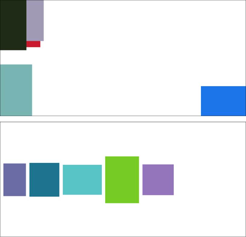
Figure 1-3 Odd layout positions (top) are the hallmark of an underconstrained layout. Although these particular views are constrained to show up onscreen, their near-random layout indicates insufficient rules describing their positions. By default, views might not show up at all, especially when they are underconstrained. Chapter 4, “Visual Formats,” discusses fallback rules, which ensure that views are both visibly sized and onscreen. A sufficient layout (bottom) provides layout rules for each of its views.
A sufficient set of constraints fully expresses a view’s layout, as in the bottom portion of Figure 1-3. In this case, each view has a well-defined size and position.
Sufficiency does not mean “hard coded.” In the layout shown at the bottom of Figure 1-3, none of these positions are specified exactly. The Auto Layout rules say to place the views in a horizontal row, center-aligned vertically to each other. The first view is pinned off of the superview’s left-center. These constraints are sufficient because every view’s position can be determined from its relationships to other views.
A sufficient, or unambiguous, layout has at least two geometric rules per axis, or a minimum of four rules in all. For example, a view might have an origin and a size—as you would use with frames—to specify where it is and how big it is. But you can express much more with Auto Layout. The following sufficient rule examples define a view’s position and extent along one axis, as illustrated in Figure 1-4:
You could pin the horizontal edges (A) of a view to exact positions in its superview. (The two properties defined in this example are the view’s minimum X and maximum X positions.)
You could match the width of one view to another subview (B) and then center it horizontally to its superview (width and center X).
You could declare a view’s width to match its intrinsic content, such as the length of text drawn on it (C), and then pin its right (trailing) edge to the left (leading) edge of another view (width and maximum X).
You could pin the top and bottom of a view to the superview (D) so that the view stretches vertically along with its superview (minimum Y and maximum Y).
You could specify a view’s vertical center and its maximum extent (E) and let Auto Layout calculate the height from that offset (center Y and maximum Y).
You could specify a view’s height and its offset from the top of the view (F) and then hang the view off the top of the superview (minimum Y and height.).
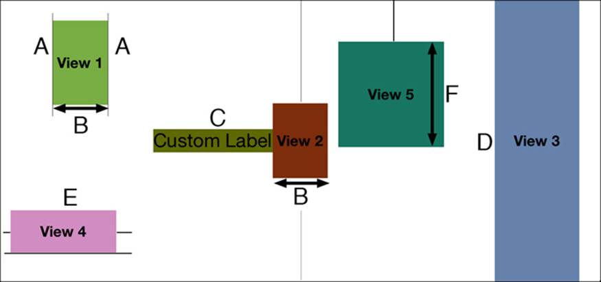
Figure 1-4 Sufficient layout requires at least two rules per axis.
Each of these rules provides enough information along one axis to avoid ambiguity. That’s because each one represents a specific declaration about how the view fits into the overall layout.
When rules fail, they lack this exactness. For example, if you supply only the width, where should the system place the item along the X-axis? At the left? Or the right? Somewhere in the middle? Or maybe entirely offscreen? Or if you only specify a Y position, how tall should the view be? 50 points? 50,000 points? 0 points? Missing information leads to ambiguous layouts.
You often encounter ambiguity when working with inequalities, as in the top image in Figure 1-3. The rules for these views say to stay within the bounds of the superview—but where? If their minimum X value is greater than or equal to their superview’s minimum X value, what should that X value be? The rules are insufficient, and the layout is therefore ambiguous.
Constraint Attributes
Constraints use a limited geometric vocabulary. Attributes are the “nouns” of the constraint system, describing positions within a view’s alignment rectangle. Relations are “verbs,” specifying how the attributes compare to each other.
The attribute nouns (see Figure 1-5) speak to physical geometry. Constraints offer the following view attribute vocabulary:
Left, right, top, and bottom—The edges of a view’s alignment rectangle on the left (A in Figure 1-5), right (B), top (C), and bottom (D) of the view. These correspond to a view’s minimum X, maximum X, minimum Y, and maximum Y values. (The coordinate system used by UIKit and Auto Layout has its origin at the top-left.)
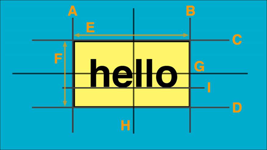
Figure 1-5 Attributes specify geometric elements of a view.
Leading and trailing—The leading and trailing edges of the view’s alignment rectangle. In left-to-right (English-like) systems, these correspond to “left” (leading, A) and “right” (trailing, B). In right-to-left linguistic environments like Arabic or Hebrew, these roles flip; right is leading (B), and left is trailing (A).
Tip
When internationalizing your applications, always prefer leading and trailing over left and right. This allows your interfaces to flip properly when using right-to-left languages, like Arabic and Hebrew.
Width and height—The width (E) and height (F) of the view’s alignment rectangle.
CenterX and CenterY—The X-axis (H) and Y-axis (G) centers of the view’s alignment rectangle.
Baseline—The alignment rectangle’s baseline (I), typically a fixed offset above its bottom attribute.
Relations compare values. Constraint math is limited to three relations: setting equality or setting lower and upper bounds for comparison. You can use the following layout relations:
NSLayoutRelationLessThanOrEqual—For less-than-or-equal inequality
NSLayoutRelationEqual—For equality
NSLayoutRelationGreaterThanOrEqual—For greater-than-or-equal-to inequality
You might not think that these three relations would give you much to work with. However, these three relations cover all the ground needed for user interface layout. They offer ways to set specific values and apply maximum and minimum limits.
About Those Missing Views
It’s common for developers new to Auto Layout to “lose” views. They discover that views they have added end up offscreen or that they have a zero size due to constraints. (Incidentally, Auto Layout works with positive sizes, zero or larger. You cannot create views with negative widths or heights.) The missing views problem catches many devs. This problem happens with both underconstrained views and views with inconsistent rules.
In this section, you’ll see a little bit of constraint code, even before you’ve read about the details of the constraint class and how instances work. Please bear with me. I’ve added highlights to help explain ambiguous and underconstrained scenarios to make a point. If you work with Auto Layout, you should be aware of these situations before you start using the technology.
Underconstrained Missing Views
Underconstrained views don’t give Auto Layout enough information to build from, so it often defaults to a size of zero. Consider the following example. This code creates a new view, prepares it for Auto Layout, and then adds two sets of constraints, which I’ve highlighted in boldface:
// Create a new view and add it into the Auto Layout system
// This view goes missing despite the initWithFrame: size
UIView *view = [[UIView alloc]
initWithFrame:CGRectMake(0.0f, 0.0f, 30.0f, 30.0f)];
[self.view addSubview:view];
view.translatesAutoresizingMaskIntoConstraints = NO;
// Add two sets of rules, pinning the view and setting height
[self.view addConstraints:[NSLayoutConstraint
constraintsWithVisualFormat:@"V:|[view(==80)]" // 80 height
options:0 metrics:nil
views:NSDictionaryOfVariableBindings(view)]];
[self.view addConstraints:[NSLayoutConstraint
constraintsWithVisualFormat:@"H:|[view]"
options:0 metrics:nil
views:NSDictionaryOfVariableBindings(view)]];
The first set of constraints pins the view to the top of its superview and sets the height to 80. The second set pins the view to the superview’s leading edge. (This is the left side in the United States, with English’s left-to-right writing system.) I deliberately did not specify a width. The view’s size is, therefore, underconstrained.
You might expect Auto Layout to default to the initial frame size, which was set to 30 by 30 points. It does not. When this snippet sets translatesAutoresizingMaskIntoConstraints to NO, that initialization is essentially thrown away. As the view appears onscreen, the ambiguous rules passed to Auto Layout result in a width that falls to zero, creating a view that’s not visible:
2013-01-14 10:47:40.460 HelloWorld[73891:c07]
<UIView: 0x884dfc0; frame = (0 0; 0 80); layer = <CALayer: 0x884e020>>
Note
When adding and removing constraints at runtime, order matters. Auto Layout validates its rules at each step. When updating constraints—such as when a device reorients—remove invalid constraints first before adding new rules to avoid raising exceptions.
Missing Views with Inconsistent Rules
Inconsistent rules may also produce views that are missing in action. For example, imagine a pair of rules that say “View A is three times the width of View B” and “View B is twice the width of View A.” The following code snippets implement these rules. I’ve boldfaced the parts of the code that tell the rule story:
NSLayoutConstraint *constraint;
constraint = [NSLayoutConstraint
constraintWithItem:viewA
attribute:NSLayoutAttributeWidth
relatedBy:NSLayoutRelationEqual
toItem:viewB
attribute:NSLayoutAttributeWidth
multiplier:3.0f constant:0.0f];
[self.view addConstraint:constraint];
constraint = [NSLayoutConstraint
constraintWithItem:viewA
attribute:NSLayoutAttributeWidth
relatedBy:NSLayoutRelationEqual
toItem:viewB
attribute:NSLayoutAttributeWidth
multiplier:2.0f constant:0.0f];
[self.view addConstraint:constraint];
Surprisingly, these two rules are neither unsatisfiable nor ambiguous, even though common sense suggests otherwise. That’s because both rules are satisfied when View A and View B have zero width. At zero, View A’s width can be three times the width of View B, and View B twice the width of View A:
0 = 0 * 3 and 0 = 0 * 2
When this code is run and the rules are applied, the views present the zero-width frames expected from this scenario:
2013-01-14 11:02:38.005 HelloWorld[74460:c07]
<TestView: 0x8b30910; frame = (320 454; 0 50); layer = <CALayer: 0x8b309d0>>
2013-01-14 11:02:38.006 HelloWorld[74460:c07]
<TestView: 0x8b32570; frame = (320 436; 0 68); layer = <CALayer: 0x8b32450>>
Tracking Missing Views
You can track down “missing” views with the debugger by inspecting their geometry after you expect them to appear (for example, in viewDidAppear: and awakeFromNib). You may want to add NSAssert statements about their expected size and positions. Some will be, as discussed, zero sized.
The following view, for example, had a zero-sized frame because it was underconstrained in the Auto Layout system:
2013-01-09 14:31:41.869 HelloWorld[29921:c07] View: <UIView: 0x71bb390;
frame = (30 430; 0 0); layer = <CALayer: 0x71bb3f0>>
Other views may simply be offscreen because you haven’t told Auto Layout that the views must appear onscreen. For example, this view had a positive size (20 points by 20 points), but its frame with its (–20, –20) origin lay outside its view controller’s presentation:
2013-01-09 14:33:37.546 HelloWorld[29975:c07] View: <UIView: 0x7125f70;
frame = (-20 -20; 20 20); layer = <CALayer: 0x7125fd0>>
In other cases, you might load a view from a storyboard or nib file and see only part of it onscreen, or it may occupy the entire screen at once. These are hallmarks of an underlying Auto Layout issue.
Ambiguous Layout
During development, you can test whether a view’s constraints are sufficient by calling hasAmbiguousLayout. This returns a Boolean value of YES for a view that could have occupied a different frame or NO for a view whose constraints are fully specified.
These results are view specific. For example, imagine a fully constrained view whose child is underconstrained. The view itself does not have ambiguous layout, even though its child does. You can and should test the layout individually for each view in your hierarchy, as follows:
@implementation VIEW_CLASS (AmbiguityTests)
// Debug only. Do not ship with this code
- (void) testAmbiguity
{
NSLog(@"<%@:0x%0x>: %@",
self.class.description, (int)self,
self.hasAmbiguousLayout ? @"Ambiguous" : @"Unambiguous");
for (VIEW_CLASS *view in self.subviews)
[view testAmbiguity];
}
@end
Note
In this code snippet, and throughout this book, VIEW_CLASS is defined as either UIView or NSView, depending on the deployment system.
This code descends through a view hierarchy and lists the results for each level. Here’s what a simple layout with two subviews returned for the underconstrained layout code originally shown in Figure 1-3 (top):
HelloWorld[76351:c07] <UIView:0x715a9a0>: Unambiguous
HelloWorld[76351:c07] <TestView:0x715add0>: Ambiguous
HelloWorld[76351:c07] <TestView:0x715c9e0>: Ambiguous
The superview does not express ambiguous layout, but its child views do.
You can run tests for ambiguous layout as soon as you like—in loadView or wherever you set up new views and add constraints. It’s generally a good first step to take any time you’re adding new views to your system as well. It ensures that your constraints really are as fully specified as you think they are.
Use these tests during development but do not ship them in App Store code. They help you check your layouts as you incrementally build interfaces.
Exercising Ambiguity
Apple offers a curious tool in the form of its exerciseAmbiguityInLayout view method. This method automatically tweaks view frames that express ambiguous layouts. This is a view method (UIView and NSView) that checks for ambiguous layout and attempts to randomly change a view’s frame.
Figure 1-6 shows this call in action. Here, you see an OS X window with three underconstrained subviews. Their positions have not been set programmatically, so they end up wherever Auto Layout places them. In this example, after you exercise ambiguity (see Figure 1-6, right), the light-colored view, initially at the bottom right, moves to the bottom left.
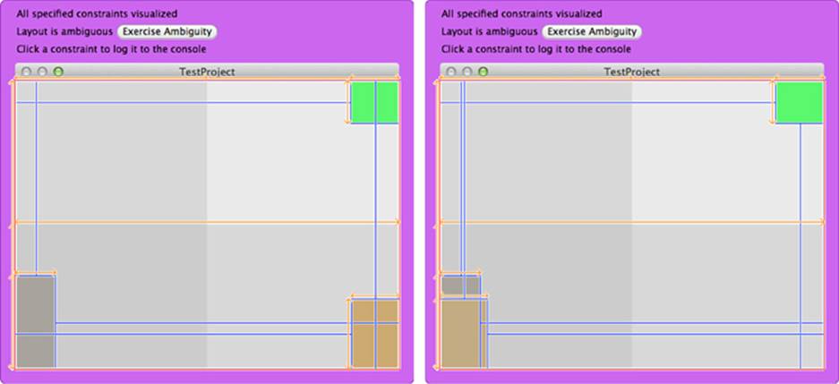
Figure 1-6 Exercising ambiguity allows you to change view frames to other legal values that are allowed under your current set of Auto Layout constraints.
This tells you that (1) this is one of the affected underconstrained views and (2) you can see some of the range that might apply to this view due to its lack of positioning constraints.
Exercising ambiguity is a blunt and limited weapon. In this example, some views are unchanged, even though they also had ambiguous layout. You shouldn’t rely on exercising ambiguity to exhaustively find issues in your project, although it can be a useful tool for the right audience. Exercising ambiguity won’t cure cancer or create world peace, but it has helped me out of a (rare) pickle or two.
Visualizing Constraints
The purple outline that surrounds the window in Figure 1-6 is an OS X–only feature. On OS X, you can visualize constraints by calling visualizeConstraints: on any NSWindow instance. You pass it an array of constraint instances that you want to view.
Here is a simple way to exhaustively grab the constraints from a view and all its subviews, by using simple class extension:
@implementation VIEW_CLASS (GeneralConstraintSupport)
// Return all constraints from self and subviews
- (NSArray *) allConstraints
{
NSMutableArray *array = [NSMutableArray array];
[array addObjectsFromArray:self.constraints];
for (VIEW_CLASS *view in self.subviews)
[array addObjectsFromArray:[view allConstraints]];
return array;
}
@end
Note
Apple can and does regularly extend classes. When creating categories for production code, do not use obvious names (like allConstraints) that may conflict with Apple’s own development. Adding custom prefixes, typically company or personal initials, guards your code against conflicts with potential future updates. This book does not follow this advice in the interest of making the code more readable.
The purple backdrop that appears tells you whether the window’s layout is ambiguous. It tests from the window down its view hierarchy, all the way to its leaves. If it finds any ambiguity, it makes the Exercise Ambiguity button available, which means you don’t have to call the option from your own code.
This visualization option also shows you the constraints you passed as clickable blue lines, helping you locate those constraints in a live application. You can click any item to log it to the Xcode debugging console.
Tip
All these methods—testing for ambiguous layout, exercising layout ambiguity, and visualizing constraints—are meant for development builds only. Don’t ship production code that calls them.
Intrinsic Content Size
With Auto Layout, a view’s content plays as important a role in its layout as its constraints. This is expressed through each view’s intrinsicContentSize, which describes the minimum space needed to express the full view content without squeezing or clipping that data. It derives from the natural properties of the content that each view presents.
For an image view, for example, the intrinsic content size corresponds to the size of the image it presents. A larger image requires a larger intrinsic content size. Consider the following code snippet. It loads an iOS 7 standard Icon.png image into an image view and reports the view’s intrinsic content size. As you’d expect, this size is 60 by 60 points, the size of the image supplied to the view (see Figure 1-7, top):
UIImageView *iv = [[UIImageView alloc]
initWithImage:[UIImage imageNamed:@"Icon-60.png"]];
NSLog(@"%@", NSStringFromCGSize(iv.intrinsicContentSize));
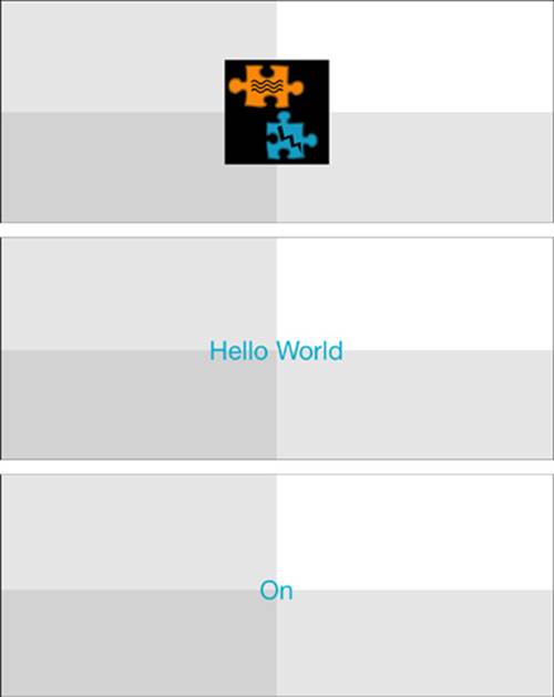
Figure 1-7 A view’s intrinsic content size is the natural size that its contents occupy.
For a button, the intrinsic content size varies with its title (see the button images in Figure 1-7). As a title grows or shrinks, the button’s intrinsic content size adjusts to match. This snippet creates a button and assigns it a pair of titles, and it reports the intrinsic content size after each assignment:
UIButton *button =
[UIButton buttonWithType:UIButtonTypeSystem];
// Longer title, Figure 1-7, middle image
[button setTitle:@"Hello World" forState:UIControlStateNormal];
NSLog(@"%@: %@", [button titleForState:UIControlStateNormal],
NSStringFromCGSize(button.intrinsicContentSize));
// Shorter title, Figure 1-7, bottom image
[button setTitle:@"On" forState:UIControlStateNormal];
NSLog(@"%@: %@", [button titleForState:UIControlStateNormal],
NSStringFromCGSize(button.intrinsicContentSize));
When run, this snippet outputs the following sizes:
2013-07-02 12:16:46.576 HelloWorld[69749:a0b] Hello World: {78, 30}
2013-07-02 12:16:46.577 HelloWorld[69749:a0b] On: {30, 30}
The Hello World version of the button expresses a wider intrinsic content size than the On version, and both use the same height. These values can vary further as you customize a font face and font size and title text.
A view’s intrinsic size allows Auto Layout to best match a view’s frame to its natural content. Earlier, you read that unambiguous layout generally requires setting two attributes in each axis. When a view has an intrinsic content size, that size accounts for one of the two attributes. You can, for example, place a text-based control or an image view in the center of its superview, and its layout will not be ambiguous. The intrinsic content size plus the location combine for a fully specified placement.
When you change a view’s intrinsic contents, you need to call invalidateIntrinsicContentSize to let Auto Layout know to recalculate at its next layout pass.
Compression Resistance and Content Hugging
As the name suggests, compression resistance refers to the way a view protects its content. A view with a high compression resistance fights against shrinking. It won’t allow that content to clip. Consider the buttons on the toolbar in Figure 1-8. Both screenshots show an application responding to a constraint that wants to set that button width to 40 points.
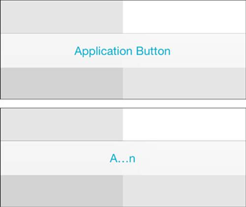
Figure 1-8 Compression resistance describes how a view attempts to maintain its minimum intrinsic content size. The button at the top of this figure has a high compression resistance.
In Figure 1-8, the top version of the button uses a high compression resistance priority value, and the bottom version uses a low value. As you can see, the higher priority ensures that the top button succeeds in preserving its intrinsic content. The resistance of the bottom button is too low. The resizing succeeds, and the button compresses, clipping the text.
The bottom button’s “don’t clip” request (that is, the compression resistance priority) is still there, but it’s not important enough to prevent the “please set the width to 40” constraint from resizing the view to the button’s detriment. Auto Layout often comes across two conflicting requests. When only one of those requests can win, it satisfies the one with the higher priority.
You specify a view’s compression resistance through IB’s Size Inspector (which you open by selecting View > Utilities > Show Size Inspector > View > Content Compression Resistance Priority), as shown in Figure 1-9, or by setting a value in code. Set the value separately for each axis, horizontal and vertical. Values may range from 1 (lowest priority) to 1,000 (required priority), and the default is 750:
[button setContentCompressionResistancePriority:500
forAxis:UILayoutConstraintAxisHorizontal];
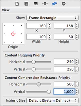
Figure 1-9 Adjust a view’s Content Compression Resistance Priority and Content Hugging Priority settings in IB’s Size Inspector or through code. Although these numbers are presented as a scale of positive integers in IB, they’re actually typed as floats: typedef float UILayoutPriority (iOS) and NSLayoutPriority (OS X). The new Intrinsic Size pop-up enables you to override sizes for placeholder items, so you can test your layout with varied configurations. Compression resistance defaults to 750.
In IB, this is also where you set a view’s content hugging priority. This refers to the way a view prefers to avoid extra padding around its core content (as shown here) or stretching of that core content (as with an image view that uses a scaled content mode). The buttons in Figure 1-10 are being told to stretch. The button at the top has a high content hugging priority, so it resists that stretching. It hugs to the content (in this case, the words Application Button). The button at the bottom has a lower content hugging priority, and the request to stretch wins out. The button pads its contents and produces the wide result you see.
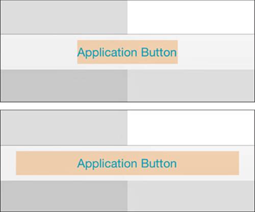
Figure 1-10 Content hugging describes a view’s desire to match its frame to the natural size of its content. A strong hugging priority limits the view from growing much larger than the content it presents. A weak priority may allow a view to stretch and isolate its content among a sea of padding. Because of iOS 7’s borderless buttons, I’ve added a light background tint to the button to highlight extents.
As with compression resistance, you set a view’s hugging priority in IB’s Size Inspector (refer to Figure 1-9) or in code, like this:
[button setContentHuggingPriority:501
forAxis:UILayoutConstraintAxisHorizontal]
Content hugging defaults to 250.
Image Embellishments
When you include embellishments in your pictures such as shadows, sparkles, badges, and other items that extend beyond the image’s core content, an image’s natural size may no longer reflect the way you want Auto Layout to handle layout. In Auto Layout, constraints determine view size and placement, using a geometric element called an alignment rectangle. The UIKit API calls help you control that placement.
Alignment Rectangles
As developers create complex views, they may introduce visual ornamentation such as shadows, exterior highlights, reflections, and engraving lines. As they do, these features are often drawn onto image art rather than being added through layers or subviews. Unlike frames, a view’s alignment rectangle should be limited to a core visual element. Its size should remain unaffected as new items are drawn onto the view. Consider the left side of Figure 1-11. It shows a view drawn with a shadow and a badge. When laying out this view, you want Auto Layout to focus on aligning just the core element—the blue rectangle—and not the ornamentation.
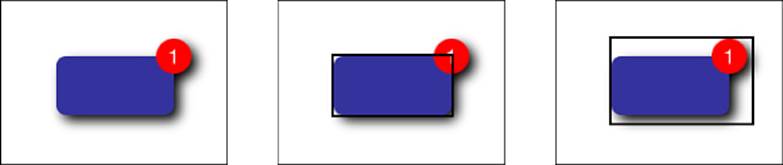
Figure 1-11 A view’s alignment rectangle (center) refers strictly to the core visual element to be aligned, without embellishments.
The center image in Figure 1-11 highlights the view’s alignment rectangle. This rectangle excludes all ornamentation, such as the drop shadow and badge. It’s the part of the view you want Auto Layout to consider when it does its work. Contrast this with the rectangle shown in the right image. This version includes all the visual ornamentation, extending the view’s frame beyond the area that should be considered for alignment.
The right-hand rectangle in Figure 1-11 encompasses all the view’s visual elements. It encompasses the shadow and badge. These ornaments could potentially throw off a view’s alignment features (for example, its center, bottom, and right) if they were considered during layout.
By working with alignment rectangles instead of frames, Auto Layout ensures that key information like a view’s edges and center are properly considered during layout. In Figure 1-12, the adorned view is perfectly aligned on the background grid. Its badge and shadow are not considered during placement.
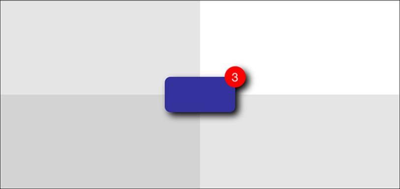
Figure 1-12 Auto Layout only considers this view’s alignment rectangle when laying it out as centered in its superview. The shadow and badge don’t affect its placement.
Visualizing Alignment Rectangles
Both iOS and OS X enable you to overlay views with their alignment rectangles in your running application. You set a simple launch argument from your app’s scheme: UIViewShowAlignmentRects for iOS and NSViewShowAlignmentRects for OS X. Set the argument value toYES and make sure to prefix it with a dash, as shown in Figure 1-13.
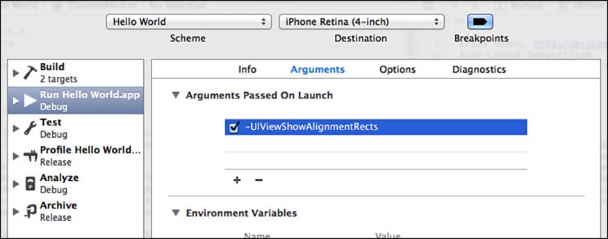
Figure 1-13 Set launch arguments in the scheme editor.
When the app runs, rectangles show over each view. The resulting rectangles are light and can be difficult to see. You will need to look closely at times.
Alignment Insets
Drawn art often contains hard-coded embellishments such as highlights, shadows, and so forth. These items take up little memory and run efficiently. Because of the low overhead, many developers predraw effects to art assets. Figure 1-14 demonstrates a typical problem encountered when using image-based ornamentation with Auto Layout. The left image shows a basic image view, whose art I created in Photoshop. I used a standard drop shadow effect. When added to the image view, the 20-point by 20-point area I left for the shadow throws off the view’s alignment rectangle, causing it to appear slightly too high and left.
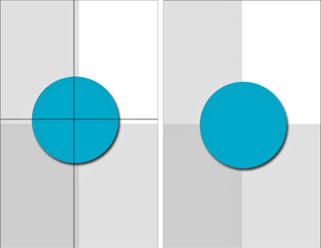
Figure 1-14 Adjust your images to account for alignment when using Auto Layout. At the left, the image view was created with an unadjusted image. It displays slightly too far left and up, which you can see by looking at the points where the circle crosses the background grid. I added lines over the image on the left to emphasize where the centering should have occurred. The image on the right shows the adjusted image view. It centers exactly onto its parent view.
In its default implementation, the image view has no idea that the image contains ornamental elements. You have to tell it how to adjust its intrinsic content so that the alignment rectangle considers just that core material.
To accommodate the shadow, you load and then rebuild the image. This is a two-step process. First, you load the image as you normally would (for example, with imageNamed:). Then you call imageWithAlignmentRectInsets: on that image to produce a new version that supports the specified insets. The following snippet accommodates a 20-point shadow by insetting the alignment rect on the bottom and right:
UIImage *image = [[UIImage imageNamed:@"Shadowed.png"]
imageWithAlignmentRectInsets:UIEdgeInsetsMake(0, 0, 20, 20)];
UIImageView *imageView = [[UIImageView alloc] initWithImage:image];
Insets define offsets from the top, left, bottom, and right of some rectangles. You use them to describe how far to move in (using positive values) or out (using negative values) from rectangle edges. These insets ensure that the alignment rectangle is correct, even when there are drawn embellishments placed within the image. The fields are defined as follows:
typedef struct {
CGFloat top, left, bottom, right;
} UIEdgeInsets;
After specifying the alignment rect insets, the updated version now properly aligns, as you see on the right in Figure 1-14. I logged the pertinent details so that you can compare the view details. Here’s what the view frame looks like (it shows the full 200×200 image size), the intrinsic content size built from the image’s alignment insets (180×180), and the resulting alignment rectangle used to center the image view’s frame:
HelloWorld[53122:c07] Frame: {{70, 162}, {200, 200}}
HelloWorld[53122:c07] Intrinsic Content Size: {180, 180}
HelloWorld[53122:c07] Alignment Rect: {{70, 162}, {180, 180}}
It’s a bit of a pain to construct these insets by hand, especially if you may later update your graphics. When you know the alignment rect and the overall image bounds, you can, instead, automatically calculate the edge insets you need to pass to this method. Listing 1-1 defines a simple inset builder. It determines how far the alignment rectangle lies from each edge of the parent rectangle, and it returns a UIEdgeInset structure that represents those values. Use this function to build insets from the intrinsic geometry of your core visuals.
Listing 1-1 Building Edge Insets from Alignment Rectangles
UIEdgeInsets BuildInsets(
CGRect alignmentRect, CGRect imageBounds)
{
// Ensure alignment rect is fully within source
CGRect targetRect =
CGRectIntersection(alignmentRect, imageBounds);
// Calculate insets
UIEdgeInsets insets;
insets.left = CGRectGetMinX(targetRect) –
CGRectGetMinX(imageBounds);
insets.right = CGRectGetMaxX(imageBounds) –
CGRectGetMaxX(targetRect);
insets.top = CGRectGetMinY(targetRect) –
CGRectGetMinY(imageBounds);
insets.bottom = CGRectGetMaxY(imageBounds) –
CGRectGetMaxY(targetRect);
return insets;
}
Declaring Alignment Rectangles
Cocoa and Cocoa Touch offer several additional ways to report alignment geometry. You may implement alignmentRectForFrame:, frameForAlignmentRect:, baselineOffsetFromBottom, and alignmentRectInsets. These methods allow your views to declare and translate alignment rectangles from code.
For the most part, thankfully, you can ignore alignment rectangles and insets. Things just, for the most part, work. The edge cases you encounter usually happen when Auto Layout comes into conflict with transforms (and other circumstances when the actual frame doesn’t match the visual frame, as with buttons).
A few notes on these items:
alignmentRectForFrame: and frameForAlignmentRect: must always be mathematical inverses of each other.
Most custom views only need to override alignmentRectInsets to report content location within their frame.
baselineOffsetFromBottom is available only for NSView and refers to the distance between the bottom of a view’s alignment rectangle and the view’s content baseline, such as that used for laying out text. This is important when you want to align views to text baselines and not to the lowest point reached by typographic descenders, like j and q.
Here’s some information about alignmentRectForFrame: and frameForAlignmentRect: from the UIView.h documentation:
These two methods should be inverses of each other. UIKit will call both as part of layout computation. They may be overridden to provide arbitrary transforms between frame and alignment rect, though the two methods must be inverses of each other. However, the default implementation uses alignmentRectInsets, so just override that if it’s applicable. It’s easier to get right.
A view that displayed an image with some ornament would typically override these, because the ornamental part of an image would scale up with the size of the frame. Set the NSUserDefault UIViewShowAlignmentRects to YES to see alignment rects drawn.
NSLayoutConstraint.h on OS X adds the following comment:
If you do override these, be sure to account for the top of your frame being either minY or maxY depending on the superview’s flippedness.
You can see this flippedness adjustment made in Listing 1-2, in the next section.
Implementing Alignment Rectangles
Listing 1-2 provides a trivial example of code-based alignment geometry. This OS X app builds a fixed-size view and draws a shadowed rounded rectangle into it. When USE_ALIGNMENT_RECTS is set to 1, its alignmentRectForFrame: and frameForAlignmentRect: methods convert to and from frames and alignment rects. As Figure 1-15 shows, these reporting methods allow the view to display with proper alignment.
Listing 1-2 Using Code-Based Alignment Frames
@interface CustomView : NSView
@end
@implementation CustomView
- (void) drawRect:(NSRect)dirtyRect
{
NSBezierPath *path;
// Calculate offset from frame for 170x170 art
CGFloat dx = (self.frame.size.width - 170) / 2.0f;
CGFloat dy = (self.frame.size.height - 170);
// Draw a shadow
NSRect rect = NSMakeRect(8 + dx, -8 + dy, 160, 160);
path = [NSBezierPath
bezierPathWithRoundedRect:rect xRadius:32 yRadius:32];
[[[NSColor blackColor] colorWithAlphaComponent:0.3f] set];
[path fill];
// Draw fixed-size shape with outline
rect.origin = CGPointMake(dx, dy);
path = [NSBezierPath
bezierPathWithRoundedRect:rect xRadius:32 yRadius:32];
[[NSColor blackColor] set];
path.lineWidth = 6;
[path stroke];
[ORANGE_COLOR set];
[path fill];
}
- (NSSize)intrinsicContentSize
{
// Fixed content size - base + frame
return NSMakeSize(170, 170);
}
#define USE_ALIGNMENT_RECTS 1
#if USE_ALIGNMENT_RECTS
- (NSRect)frameForAlignmentRect:(NSRect)alignmentRect
{
// 1 + 10 / 160 = 1.0625
NSRect rect = (NSRect){.origin = alignmentRect.origin};
rect.size.width = alignmentRect.size.width * 1.06250;
rect.size.height = alignmentRect.size.height * 1.06250;
return rect;
}
- (NSRect)alignmentRectForFrame:(NSRect)frame
{
// Account for vertical flippage
CGFloat dy = (frame.size.height – 170.0) / 2.0;
rect.origin = CGPointMake(frame.origin.x, frame.origin.y + dy);
rect.size.width = frame.size.width * (160.0 / 170.0);
rect.size.height = frame.size.height * (160.0 / 170.0);
return rect;
}
#endif
@end
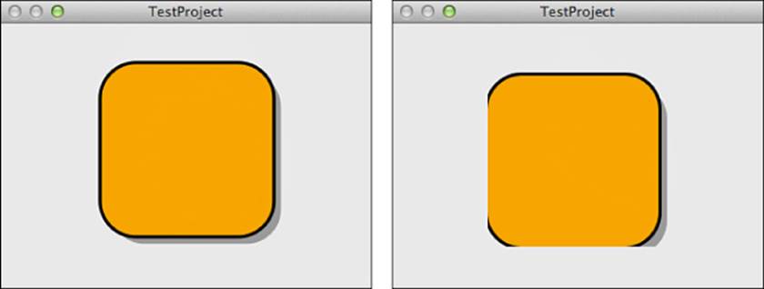
Figure 1-15 Implementing intrinsic content size and frame/alignment rect conversion methods ensures that your view will align and display correctly (as shown on the left) rather than be misaligned and possibly clipped (as shown on the right).
Exercises
After reading this chapter, test your knowledge with these exercises:
1. A label is constrained with 8-point offsets from its superview’s leading and trailing edges. It is 22 points high. Is this label’s layout ambiguous? If so, how can you remove the ambiguity?
2. You create a system-style button and assign it the title Continue. The button’s center is constrained to a point (150, 150) from its superview’s top and leading edges. Is this view’s layout ambiguous? If so, how can you remove the ambiguity?
3. In viewWillAppear: you create a new test view and add it to your view controller:
UIView *testView = [[UIView alloc]
initWithFrame:CGRectMake(50, 50, 100, 30)];
view.backgroundColor = [UIColor blueColor];
[self.view addSubview:view];
view.translatesAutoresizingMaskIntoConstraints = NO;
After these lines, you add constraints that center the test view within its superview. What size will the view be when the app runs? Why?
4. A 54-by-54-point image consists of a 50-by-50-point square, with a drop shadow offset 4 points to the right and 4 points down. (a) Show code that assigns alignment insets to this image. (b) When the image is added to an image view and center-aligned to its superview on both axes, what geometric point within the image lies at the center of the superview?
5. You add a button to your view and constrain it to stretch from side to side at a priority of 500. Will it stretch? Why or why not?
Conclusions
This chapter introduces the core concepts that underpin Auto Layout, Cocoa’s declarative constraint-based descriptive layout system. You have learned that Auto Layout focuses on the relationships between views and between views and their content—instead of on their frames. A logical priority-based framework drives Auto Layout. You have discovered that its rules must be satisfiable, consistent, and sufficient. Here are a few final thoughts to take away from this chapter:
Constraints are fun and powerful. They provide elegant solutions to common layout situations.
Don’t be afraid to mix and match Auto Layout and Autosizing. As long as rules do not conflict, you can port existing layouts to the new Auto Layout world.
Auto Layout is more than just constraints. Its content-protecting features provide a key component that helps specify what to show—and not just where to show it. For example, compression resistance and content hugging adapt graphical user interfaces (GUIs) during internationalization, allowing you to easily accommodate differing label sizes when languages change.
Auto Layout is essentially a linear equation solver that attempts to find a satisfiable geometric expression of its rules. When its equations produce too many solutions, you end up with underconstrained ambiguous layout. When its equations cannot produce any solution, you know that constraints are in conflict.
All materials on the site are licensed Creative Commons Attribution-Sharealike 3.0 Unported CC BY-SA 3.0 & GNU Free Documentation License (GFDL)
If you are the copyright holder of any material contained on our site and intend to remove it, please contact our site administrator for approval.
© 2016-2026 All site design rights belong to S.Y.A.