iOS Auto Layout Demystified, Second Edition (2014)
Chapter 3. Interface Builder Layout
Compared to earlier Xcode releases, Xcode 5 with its redesigned Interface Builder (IB) vastly enhances Auto Layout. Even so, learning constraint-based design in IB can be a frustrating experience for many new developers. This chapter will help reduce that frustration and introduce the tools that IB provides. You’ll read about how Auto Layout integrates with IB and how you can best explore, construct, test, and validate your interfaces.
This is a hands-on chapter. You will gain the most from it by launching Xcode, creating new projects, and following along with these examples in live IB documents. The more you play with the tools, the more the mystery will dissipate, as IB constraints become part of your design workflow.
Note
IB is a constantly evolving product. Details described in this chapter may change as Apple updates Xcode.
Designing in IB
For decades, IB and its antecedents have offered a customizable interface editor. Designers and developers collaborate with tools built around the concept that interface expression is inherently a visual problem. IB enables teams to design interfaces using the same language and expressive space as the product they end up building.
IB’s power and flexibility have grown over time. Until 2011, IB focused on Autosizing, a system that used struts (fixed offsets from a superview) and springs (flexible sizing allowances) to establish placement rules. Although this older system remains part of IB, the new constraint-based Auto Layout greatly enhances visual layout.
With Auto Layout, you express a view’s relationships to itself, to its parent, and to view siblings within the layout hierarchy. These relationships can include both equalities and inequalities and may refer to view attributes such as position, extent, and (for text) baseline offsets. These features enable Auto Layout to implement nuanced boundary conditions in a way that Autosizing never could. For example, you might say, “I want these views to lay out in a line with equal sizing, but they should never come any closer than 20 points to the edges of the superview” or “If there’s a shortage of horizontal space, I want the text in my left-hand labels to clip before any right-hand buttons are affected.”
In Xcode 5, IB lets you establish, tweak, prioritize, and test layout rules in new ways. Constraint settings pop-ups appear with a simple double-click, so you don’t have to keep moving between multiple inspector panes. Preview panes enable you to test how your constraints will look in any orientation. You can validate your rules with just a few clicks using new menu choices, and Auto Layout offers suggestions on how to complete your constraints.
If you’ve been using constraints for a while, you’ll find Xcode 5’s approach to Auto Layout a happy surprise. If you’re new to the technology, you’ll find plenty of assistance for evaluating, verifying, and improving your GUI designs.
Disabling Auto Layout
At times, you may need to disable Auto Layout and use Autosizing in IB instead. Perhaps you have investments in proprietary designs that you’re not ready to migrate. Perhaps you want to stick with familiar and tested tools for production. Perhaps you’re incrementally migrating existing projects and need to keep some portions in the Autosizing world. Fortunately, you can easily switch off Auto Layout on an individual storyboard and nib file basis.
Here’s what you do:
1. In Xcode, select any user interface document (a storyboard or a nib file) from the Project Navigator (View > Navigators > Show Project Navigator).
2. Open the File Inspector (View > Utilities > Show File Inspector).
3. In the File Inspector, locate the Interface Builder Document section. Just below the View As dropdown, uncheck the Use Autolayout check box, which you see in Figure 3-1, to return IB to using Autosizing.
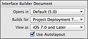
Figure 3-1 Disable Auto Layout by unchecking the Use Autolayout box in Xcode’s File Inspector. This option appears for both iOS and OS X projects.
Note
Although Apple documentation now universally refers to the technology as Auto Layout, some older references still use Autolayout as a single word. Apple encourages you to file bug reports or submit a Feedback form for any out-of-spec use of the older Autolayout name.
Under Autosizing, views use the autoresizingMask property to ensure that they resize correctly, such as when a device reorients or a user resizes a window. With Auto Layout disabled, you work with struts, springs, and autoresizingMasks. Figure 3-2 shows the Size Inspector (View > Utilities > Show Size Inspector) for a view with Auto Layout disabled (right) and enabled (left).
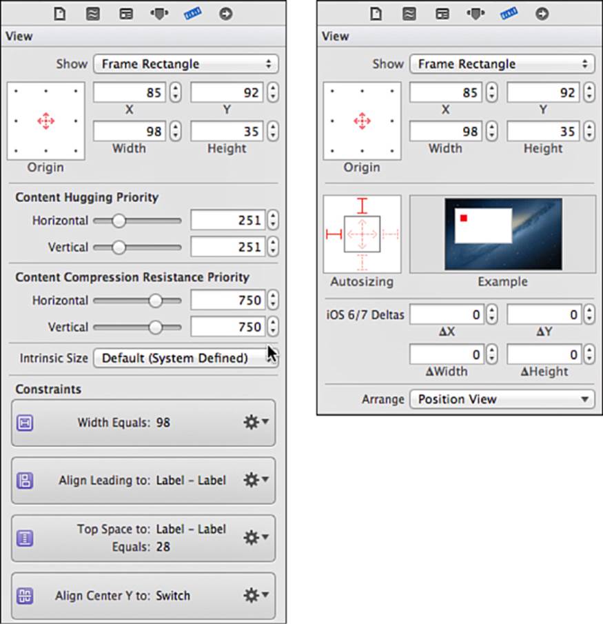
Figure 3-2 When Auto Layout is enabled (left), IB’s Size Inspector offers controls to adjust a view’s layout priorities and provides a list of constraints that mention the view. When Auto Layout is disabled (right), the inspector reverts to the Autosizing struts and springs editor that correspond to a view’s autoresizingMask property.
Opting Out of Auto Layout in Code
Autosizing is the default in code. You opt views out of Autosizing to participate in the new Auto Layout system. All views default to the older behavior, even when modern runtimes use constraint-based layout. That’s because the runtime invisibly handles the translation between your old-style code and the new-style constraint system on your behalf.
When a view’s translatesAutoresizingMaskIntoConstraints property is set to YES (the default), the runtime uses that view’s autoresizing mask to produce matching constraints in the new Auto Layout system. The rules apply like they always did, even though the implementation details have been modernized. Here you create and opt a view into Auto Layout:
// Create a new view. It defaults to autosizing.
UIView *view = [[UIView alloc] initWithFrame:frame];
// Opt view into Auto Layout
view.translatesAutoresizingMaskIntoConstraints = NO;
Here’s what Apple has to say on the matter. This comment is from the UIView.h header file. It’s essentially identical to the text in NSLayoutConstraint.h on OS X:
By default, the autoresizing mask on a view gives rise to constraints that fully determine the view’s position. Any constraints you set on the view are likely to conflict with autoresizing constraints, so you must turn off this property first. IB will turn it off for you.
Autoresizing translation is performed, invisibly, on your behalf. The runtime creates constraints that implement Autosizing rules and adds them to the Auto Layout system.
Combining Autosizing with Auto Layout
You are welcome to mix and match autoresizing views with constraint-based layout as long as their rules don’t clash. For example, you can load a nib whose subviews are laid out using struts and springs and allow that view, in turn, to operate as a first-class member of the Auto Layout world. The key is encapsulation. As long as rules do not conflict, you can reuse complex views you have already established in your projects.
Basic Layout and Auto-Generated Constraints
Constraint-based layout is cooked right into modern versions of IB. Just as IB assists you in creating aligned, centered, and indented object placement, it can create constraints that represent the layout you’ve built. Figure 3-3 shows a switch being added to a new iOS view controller’s layout. Guides ensure that this switch is centered vertically and horizontally within its parent.
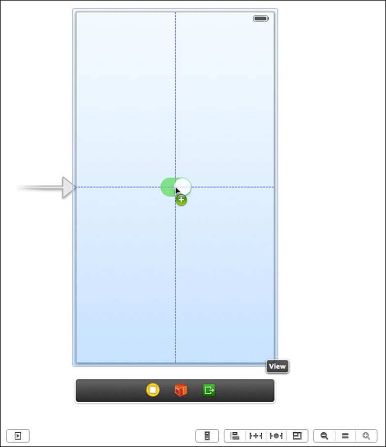
Figure 3-3 Adding a switch in IB.
Inferred Constraints
As of Xcode 5 and iOS 7, IB infers constraints on your behalf. This means you can build interfaces incrementally yet still have a working interface to test. Create a new single view project with a switch, as in Figure 3-3. IB creates two constraints for you that position the switch away from the top and left of the parent view.
On a 4-inch iPhone, this switch lies 268 points from the top and 136 points from the left. As you can see in Figure 3-4, the button is centered in portrait orientation but not in landscape.
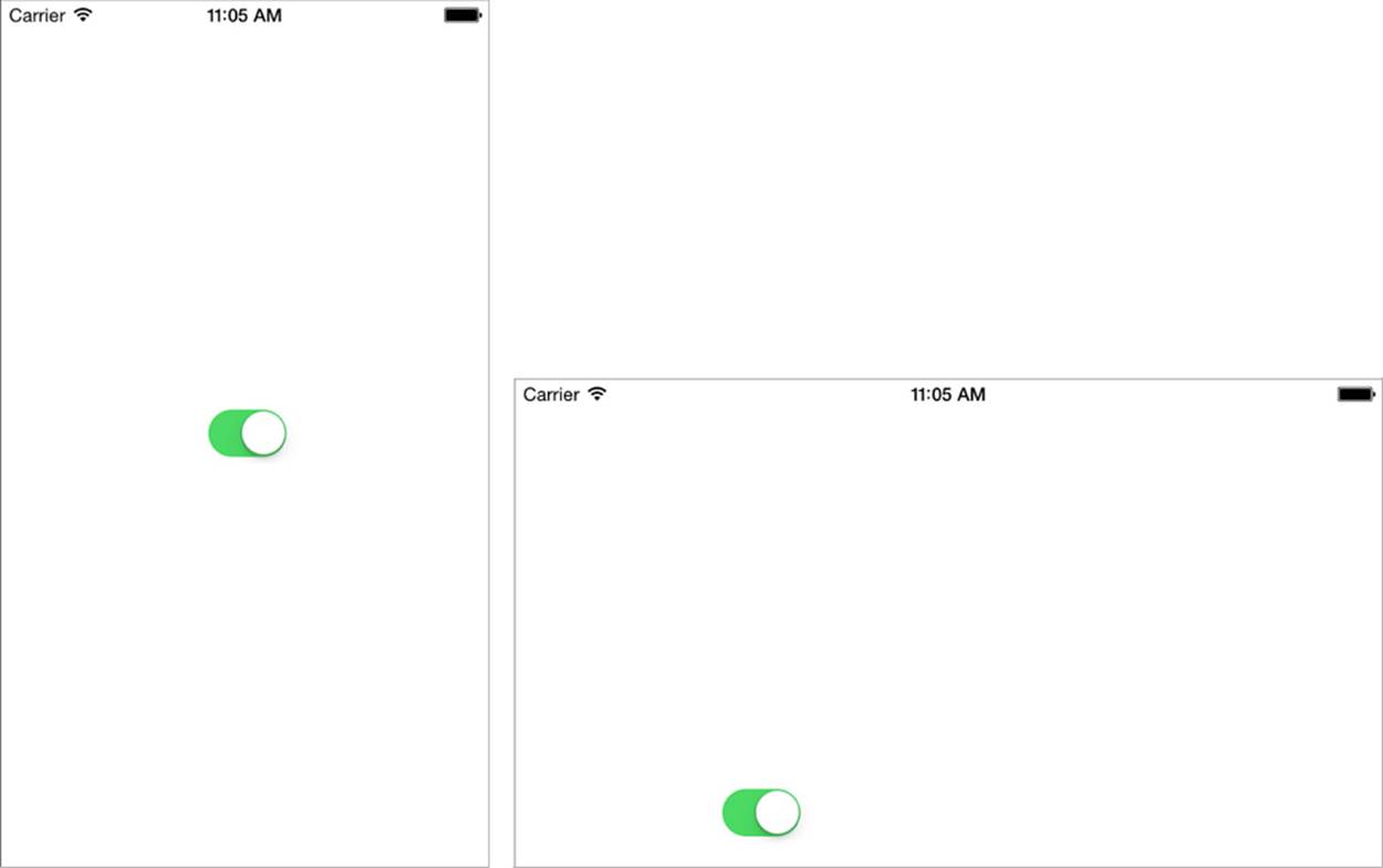
Figure 3-4 IB infers constraints from fixed positions.
You can confirm these inferred items by logging the constraints attached to the view controller’s view at runtime. To do so, save your interface and add the following code to your primary view controller:
- (void) viewDidAppear:(BOOL)animated
{
for (NSLayoutConstraint *constraint in self.view.constraints)
NSLog(@"%@", constraint);
}
When you run this app, the viewDidAppear: message logs all constraints attached to the primary view. Under iOS, you’ll discover constraints that set the left and top edges with respect to the parent view:
2013-08-14 16:09:49.751 test[31487:a0b] <NSIBPrototypingLayoutConstraint:0x8993900
'IB auto generated at build time for view with fixed frame' H:|-(136)-
[UISwitch:0x898fe50](LTR) (Names: '|':UIView:0x898fc70 )>
2013-08-14 16:09:49.753 test[31487:a0b] <NSIBPrototypingLayoutConstraint:0x8993be0
'IB auto generated at build time for view with fixed frame' V:|-(268)-
[UISwitch:0x898fe50] (Names: '|':UIView:0x898fc70 )>
I boldfaced the key text in these log messages to indicate the rationale behind the IB-generated constraints. This example shows what happens when you place views and then save your work without adding constraints. Whenever Xcode detects constraint-less views, it assumes that you’re just starting development. It adds courtesy constraints built from the view frames to provide minimum fallback behavior for interface elements.
In addition to these constraints, you’ll see placeholder constraints for the view controller’s top and bottom layout guides. Under iOS 7, the UIViewController class introduces built-in spacing views at the top and bottom of the scene. Each spacer has an associated length that describes where the controller’s main content begins and ends vertically. These help align your content, ensuring the material you need to remain visible does so without overlapping status bars, navigation bars, tab bars, and other UI features.
In the following debug output, the top guide is 20 points high and the bottom is 0 points high:
2013-08-14 16:09:49.753 test[31487:a0b] <_UILayoutSupportConstraint:0x8993c90
V:[_UILayoutGuide:0x8992ee0(20)]>
2013-08-14 16:09:49.754 test[31487:a0b] <_UILayoutSupportConstraint:0x898f5e0
V:|-(0)-[_UILayoutGuide:0x8992ee0] (Names: '|':UIView:0x898fc70 )>
2013-08-14 16:09:49.754 test[31487:a0b] <_UILayoutSupportConstraint:0x8990cd0
V:[_UILayoutGuide:0x89933f0(0)]>
2013-08-14 16:09:49.754 test[31487:a0b] <_UILayoutSupportConstraint:0x8990ac0
_UILayoutGuide:0x89933f0.bottom == UIView:0x898fc70.bottom>
These lengths vary depending on the container layout you use. Tab bars and navigation bars may raise the bottom or lower the top of the core application space used by a view controller.
IB displays guide proxies associated with the view controller scene, as you see in Figure 3-5. You connect constraints directly to these guides, ensuring that your user interface items lay out with respect to the top and the bottom of the scene rather than the top and the bottom of the screen. In iOS 7’s new edge-to-edge design, your view controller’s frame may extend beyond and under navigation bars, toolbars, tab bars, and so forth. Using layout guides keeps your buttons, labels, and so forth from inadvertently floating up under those items and out of view.
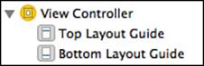
Figure 3-5 New to Xcode 5, top and bottom layout guides enable you to constrain content to your active application space.
Ambiguity Resolution Constraints
As you start building constraints, you may run across another kind of IB-supplied constraint. To discover this type of IB-generated constraints, you add insufficient constraints to your view:
1. Add and center a switch if you have not done so already. Then select the switch.
2. Ctrl+drag (or hold down the right mouse button and drag) from the switch toward the left and release within the superview. The direction you drag influences the choices IB presents.
3. Select Leading Space to Container from the contextual pop-up (see Figure 3-6). IB adds a new constraint, colored orange. This color tells you that the constraints attached to the view are ambiguous. Blue constraints are unambiguous, and red constraints involve conflicted rules.
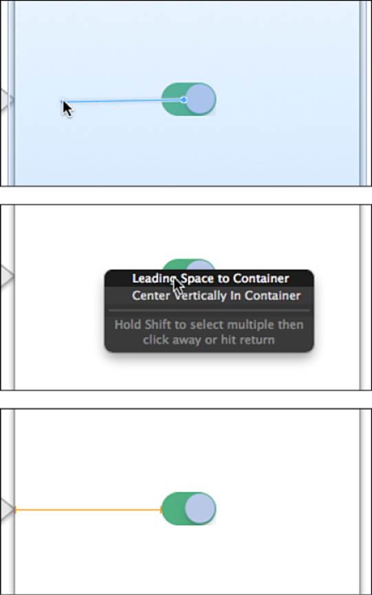
Figure 3-6 Add a leading space constraint by Ctrl+dragging (or holding down the right mouse button and dragging) from the switch to the left.
4. Save and run the updated interface.
This time, the first few log messages from your custom viewDidAppear: method look like this:
2013-08-15 12:25:58.398 test[38829:a0b] <NSLayoutConstraint:0x8c806a0 H:|-(136)-
[UISwitch:0x8c7cc90] (Names: '|':UIView:0x8c7cab0 )>
2013-08-15 12:25:58.400 test[38829:a0b] <NSIBPrototypingLayoutConstraint:0x8c80770
'IB auto generated at build time for view with ambiguity' H:|-(136@251)-
[UISwitch:0x8c7cc90](LTR) priority:251 (Names: '|':UIView:0x8c7cab0 )>
2013-08-15 12:25:58.400 test[38829:a0b] <NSIBPrototypingLayoutConstraint:0x8c80a50
'IB auto generated at build time for view with ambiguity' V:|-(268@251)-
[UISwitch:0x8c7cc90] priority:251 (Names: '|':UIView:0x8c7cab0 )>
You created the first of these three constraints by following Figure 3-6. IB adds the other two constraints on your behalf, to remove ambiguity. The duplicated constraint, the first of the two IB-created items, seems a bit like a bug. I have submitted a bug report (this is also called “filing a radar”) with Apple to that effect. Therefore, by the time you try this example, you might get different output.
Size Constraints
As you read in Chapter 1, “Introducing Auto Layout,” every view requires at least two constraints along each axis to set position and size. So where are the other constraints beyond inferred and direct placement constraints?
Every switch control provides a fixed intrinsic content size. This content size establishes the width and height of its view. To uncover the switch’s “missing” constraints, you can create a new IBOutlet named mySwitch connected to your switch and add the following code to your customviewDidAppear: method:
// Check the intrinsic content size
NSLog(@"Intrinsic content size: %@",
NSStringFromCGSize(mySwitch.intrinsicContentSize));
// Look for constraints stored in the switch
for (NSLayoutConstraint *constraint in mySwitch.constraints)
NSLog(@"%@", constraint);
When you run this updated method, you’ll discover both the intrinsic content size and the two missing constraints IB built for you:
2013-07-05 13:50:12.040 IBTest[16646:a0b] Intrinsic content size: {49, 31}
2013-07-05 13:50:12.040 IBTest[16646:a0b] <NSContentSizeLayoutConstraint:0x8b231d0
H:[UISwitch:0x8b1e240(49)] Hug:750 CompressionResistance:750>
2013-07-05 13:50:12.040 IBTest[16646:a0b] <NSContentSizeLayoutConstraint:0x8b23320
V:[UISwitch:0x8b1e240(31)] Hug:750 CompressionResistance:750>
The default iOS switch is automatically sized at 49×31 points. Switches use a high hugging priority to ensure that they’re not resized larger than their art. The default high compression resistance priority keeps the switch from clipping in tight layout situations.
Between size layout constraints, the one constraint you built in Figure 3-6, and IB-supplied constraints, the switch does indeed contain at least two constraints per axis—setting position and extent.
A Guided Tour of IB Elements
Table 3-1 offers a guided tour of IB elements that you’ll find in the visual editor. Take a few minutes to read through this table and identify the components you use to create constraint-based layouts. Don’t worry about messing up your current project by testing these options. You can easily revert your project to its one-switch, one-constraint state or create a new project when you continue on with this chapter.
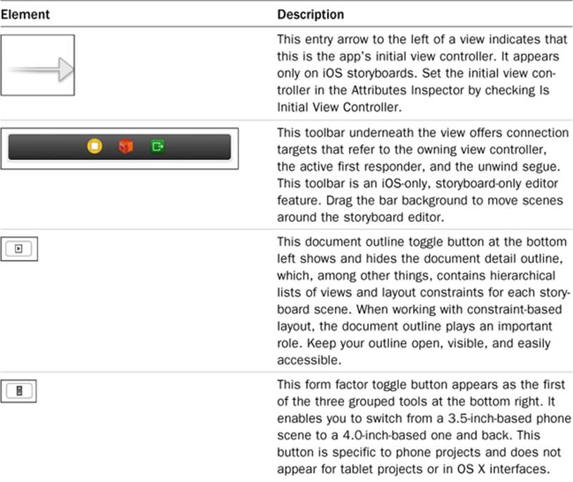
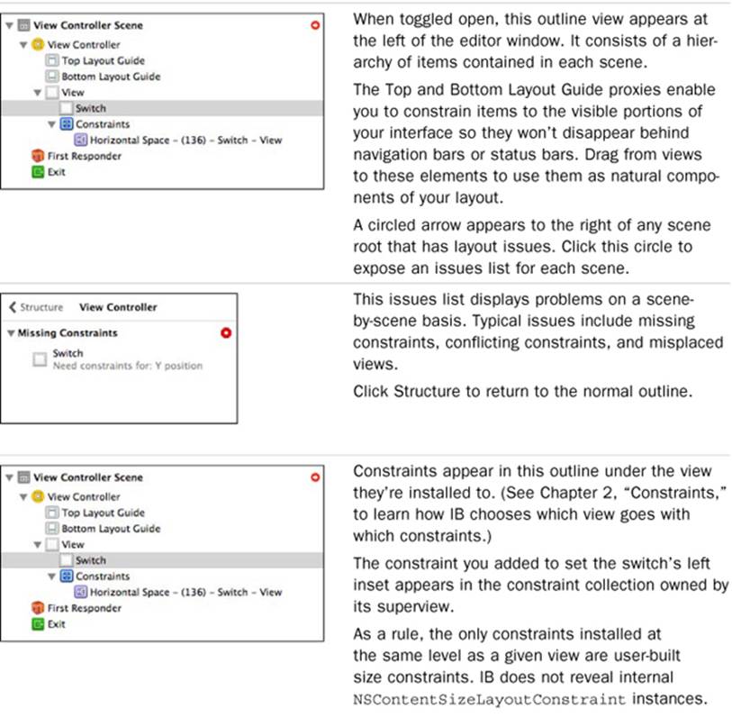
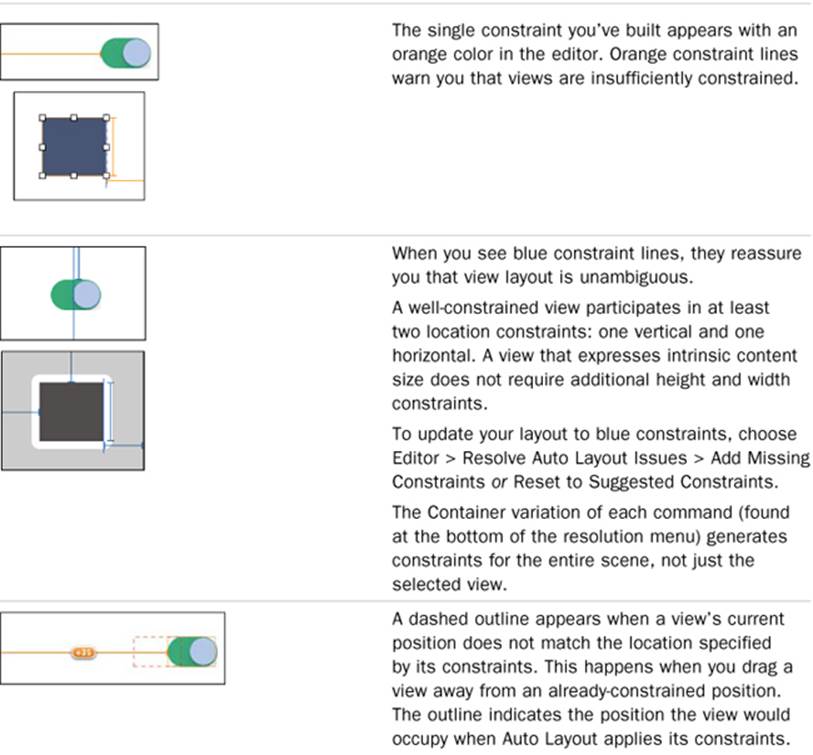
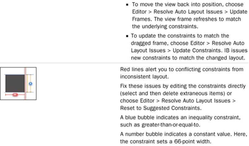
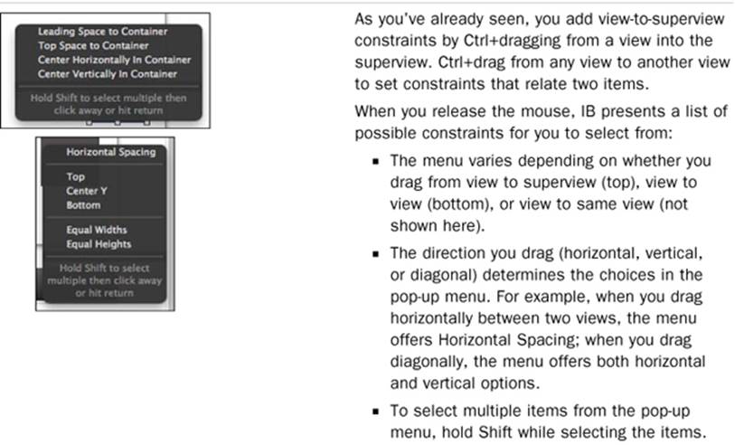
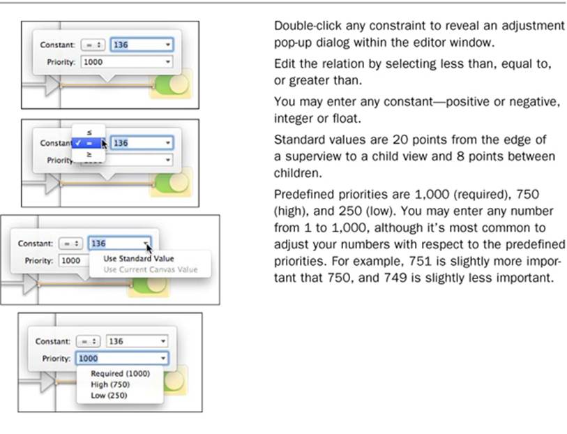
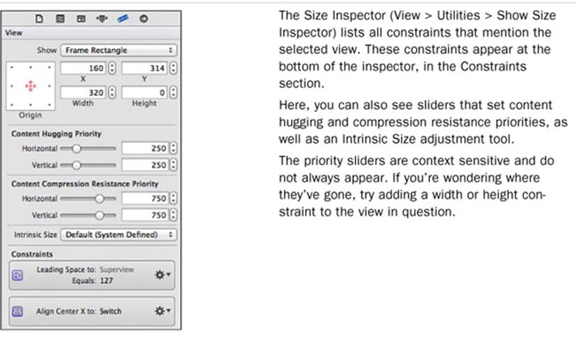
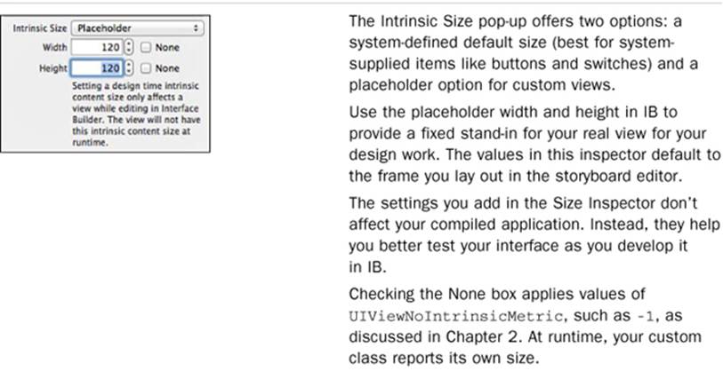
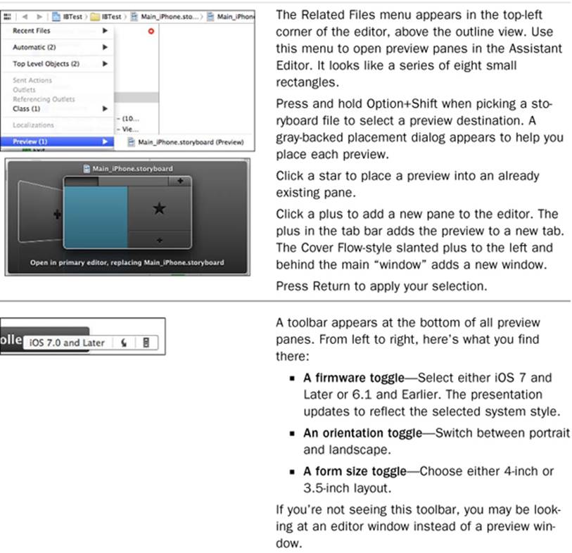
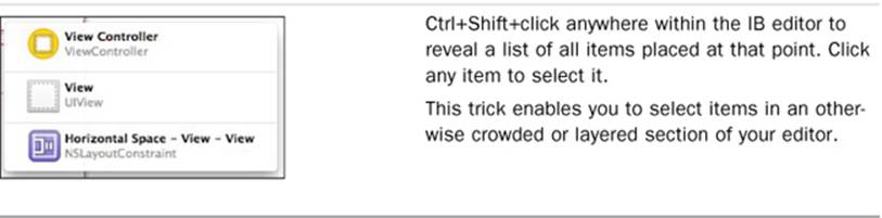
Table 3-1 What’s What in the IB Editor
Constraint Listings
A Constraints section appears in the document outline for all views that store constraints. This section corresponds to each view’s constraints property, which is where layout constraints are normally stored. The way a constraint is listed tells you a lot about it.
In the one-switch example you worked on earlier in this chapter, the single constraint is attached to the view controller’s main view (see Figure 3-7). This view represents the nearest common ancestor between the switch and its parent.
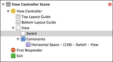
Figure 3-7 The constraints listed in the IB outline correspond to the constraints property for each view.
Constraint icons hint at the role each constraint plays. Table 3-2 provides a basic cheat sheet for these items. It shows the icon for each constraint type, a description of what the constraint does, and the destination where each constraint installs.
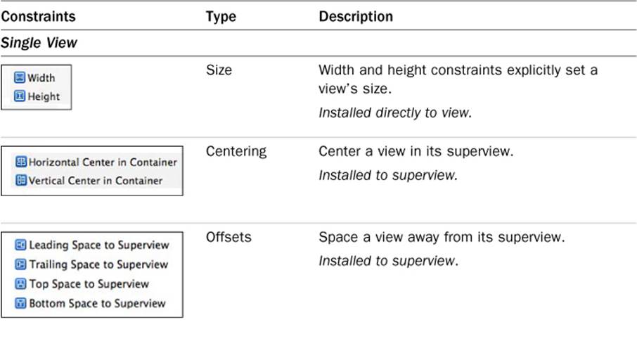
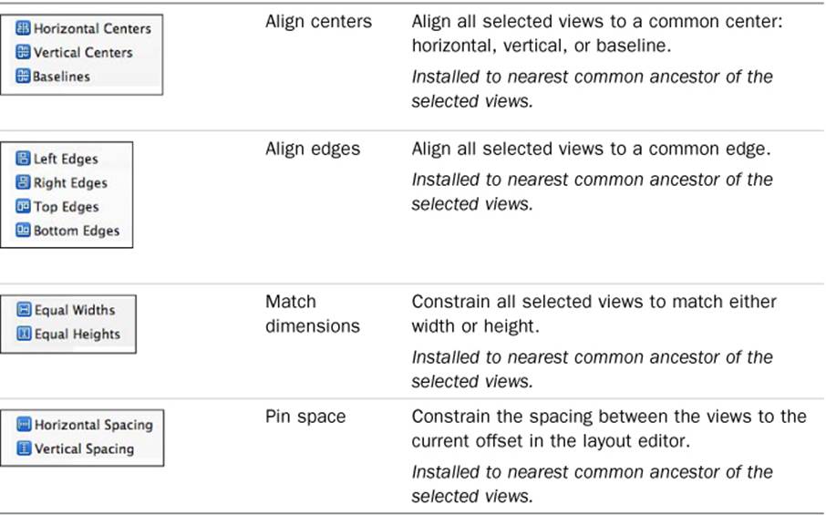
Table 3-2 IB Constraints
If you’re reading this book in electronic format on a color screen, you’ll note the color of the constraint icons in this table is blue. That’s because they are taken from the pop-ups at the bottom of the editor. They appear in purple in constraint listings. These colors no longer have any meaning in Xcode 5, although they once did in Xcode 4.x.
The table’s vocabulary corresponds to the layout constraint attributes you have already read about in this book. These constraint rules may seem somewhat more limited to you than those you can express through code. They are. IB offers a common, but not exhaustive, set of constraints. For example, in IB, you can say “Match the width of this view to that view.” In code, you can say “Set the width of this view to half the width of that view.” IB doesn’t offer the fine-detail constraint edits that allow you to tweak that relationship the way you can in code.
Xcode Labels
IB assigns each new constraint a default name that explains its role. In the switch example, the constraint name (Horizontal Space-(136)) defines what the constraint does in a basic way. If you resize the outline to its full extent, as I did in Figure 3-7, you also see that each constraint description is appended by a list (for example, Switch – View). The items in this list refer to the default IB names for the constraint’s first and second items. In this example, the two items are Switch and View.
If you added a button, its name would be Button – Button. The button’s name derives from its class (Button) and its label (Button), and for an extra bit of fun, IB sticks a hyphen between these items, adding a certain je ne sais quoi of obfuscation. Override default naming by adding an Xcode-specific identity to each view. To do this, select any Xcode object and open the Identity Inspector (View > Utilities > Show Identity Inspector). Enter a name in the Document > Label field, as shown in Figure 3-8. Xcode uses the text you enter to label items.
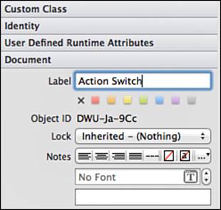
Figure 3-8 You assign Xcode-specific labels to views in the Identity Inspector.
Alternatively, you can select any item in the document outline and press Return to enter edit mode. A text field opens, and you can edit the same document label directly from the outline. This is usually handier than opening the Identity Inspector.
Adding custom view labels improves the readability of the constraint listings. Figure 3-9 shows the document outline after the switch gets a custom name. You can now more easily see that the horizontal spacing constraint applies to a specific switch.
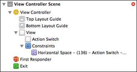
Figure 3-9 Using Xcode labels improves constraint listing readability.
Adding Xcode Identities
Xcode labels play no role in coding and execution, but Xcode identities do, at least to the limited extent that they can make your debugging logs slightly more readable. Unfortunately, at this time, this feature is for OS X only. Figure 3-10 shows the Identity Inspector. This screenshot is taken from an OS X project that’s the equivalent of the one-switch iOS app you’ve already built. It substitutes a check box (an NSButton) for the switch.
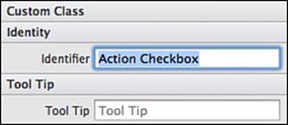
Figure 3-10 Assigning view identities enhances debugging output logs.
The constraints generated by OS X don’t always match the ones produced by iOS. In this example, you end up with five auto-generated constraints instead of three. What’s important is how those constraints are listed in the debugging console. Here’s the default output you see before you add the view identifier:
2013-07-05 13:52:42.437 IBTest OS X[16736:303] <NSLayoutConstraint:0x10050d740 'IB
auto generated at build time for view with ambiguity' H:|-(191@251)-
[NSButton:0x101a0af90'Check'](LTR) priority:251 (Names: '|':NSView:0x101a0a300 )>
And here’s the same constraint, in another run of the application, after you view the name:
2013-07-05 13:47:13.717 IBTest OS X[16510:303] <NSLayoutConstraint:0x10056d810 'IB
auto generated at build time for view with ambiguity' H:|-(191@251)-[Action
Checkbox](LTR) priority:251 (Names: Action Checkbox:0x101b13110,
'|':NSView:0x101b124a0 )>
Custom names enhance the clarity of console output and assist you in debugging. Because this feature is not cross-platform, I ended up writing my own view- and constraint-naming and logging routines. I discuss the technology I used to implement naming in Chapter 5, “Debugging Constraints.”
If you are interested in exploring the identification technology in more depth, I refer you to Apple’s NSUserInterfaceItemIdentification documentation:
The NSUserInterfaceItemIdentification protocol is used to associate a unique identifier with objects in your user interface.
You can set an OS X view’s identifier property in code as well as in IB.
Adding Constraints
In IB, you add constraints in several ways:
• Ctrl+drag from a view to another view or from a view to its superview. IB presents a context-specific pop-up menu based on the direction of the drag and the number of items involved.
• Select one or more items and use the Editor menu or the Pin and Align items in the toolbar at the bottom right of the editor pane to add constraints.
• Use the Editor menu or the toolbar to have IB automatically add constraints on your behalf regardless of the current selection.
Table 3-3 details the kind of requests you can create by using these approaches.
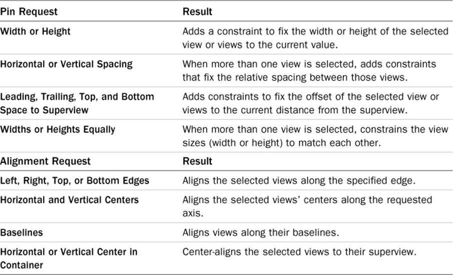
Table 3-3 Adding Layout Requests in IB
Dragging
When you add constraints by dragging, the direction you move your mouse affects the choices IB presents to you. Horizontal drags offer horizontal-axis constraints, such as width, horizontal spacing, or offsets from the leading and trailing edges of the superview. Vertical drags focus on top-to-bottom layout. Diagonal drags offer both choices. This rule applies whether you’re dragging from a view to its superview or between two child views.
To continue the walk-through, follow these steps, starting with a single switch with one constraint and offsetting the switch from the parent’s leading edge:
1. Drag a label into the editor and place it to the left of the existing switch.
2. Ctrl+drag from the label to the switch.
3. Press Shift. Select Horizontal Spacing and Center Y (see Figure 3-11).
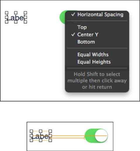
Figure 3-11 Use Shift to add multiple constraints at once. Selecting both Horizontal Spacing and Center Y alignment builds two constraints.
4. Press Return. IB adds the two new constraints. The first constraint sets a fixed space between the label and the switch. The second constraint aligns both views along their vertical centers. Since the label is shorter than the switch, it centers vertically with a little extra space above and below it.
All three constraints you’ve added so far appear attached to the main view controller’s view (see Figure 3-12). In the outline, you can see one Center Y constraint and two Horizontal Space constraints. To determine which constraint is which, click each one to highlight it in the main editor.
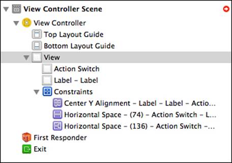
Figure 3-12 You review added constraints in the scene outline. Selecting a constraint in the outline highlights the corresponding constraint in the visual editor.
You also find the constraints in the Size Inspector (View > Utilities > Show Size Inspector). The constraints vary by view. The switch lists all three constraints it participates in (see Figure 3-13), the label lists two constraints, and the controller’s view lists just one constraint.
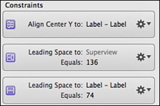
Figure 3-13 The switch participates in three constraints so far.
To select a constraint, either click the constraint listing in the document outline or select a view and then click directly on any of its visualized constraints. Selecting a constraint highlights the constraint. Optionally, you can highlight the associated views as well by enabling Editor > Canvas > Show Involved Views for Selected Constraint (see Figure 3-14).
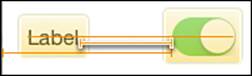
Figure 3-14 Involved views appear with a yellow overlay when you enable Editor > Canvas > Show Involved Views for Selected Constraints.
Continue the walkthrough as follows:
1. Double-click the constraint that sets a horizontal space between the label and the switch. A pop-up editor appears (see Figure 3-15).
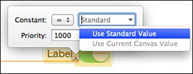
Figure 3-15 Use the constraint pop-up in the visual editor to tweak a constraint’s constant, relation, and priority.
2. Adjust the constraint to use a standard constant. Click the downward arrow in the Constant field to reveal the Use Standard Value option. The label pops to the right, almost (but not quite) meeting up with the switch. Save your changes.
Pinning and Aligning
Both the editor and the bottom-right toolbars offer Pin and Align menus, but the ways they’re presented are quite different. Pinning means fixing a size or offset. Aligning means placing items in a coordinated position with some shared aspect. You might align views along their left sides or bottoms. As you see in Figure 3-16, available options vary by the method you use to apply them.
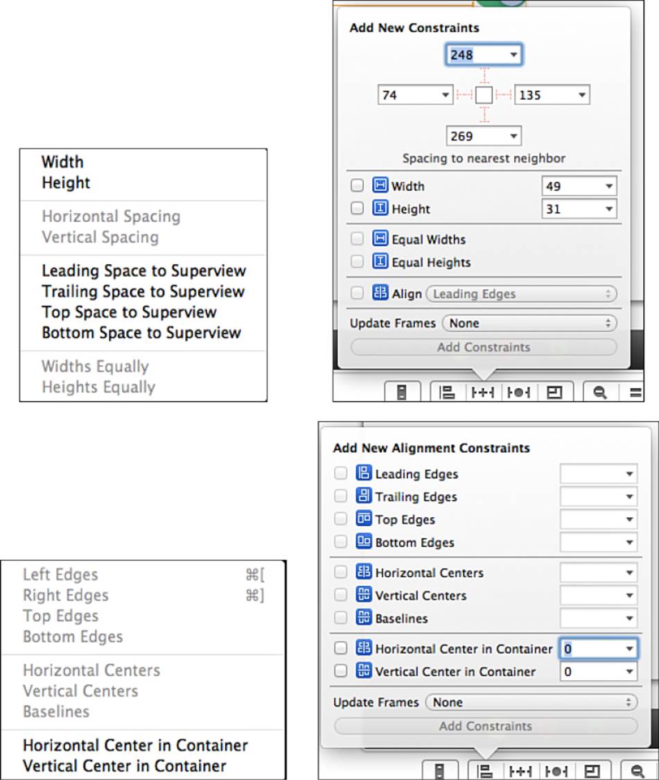
Figure 3-16 Top items: pinning views. Bottom items: aligning views. Left items: Editor menu. Right items: toolbar pop-ups.
For example, to set an item’s width, you can select it and choose Editor > Pin > Width. IB adds a constraint that fixes the view’s width to the current size. If you go the toolbar route, you click the Pin button, which looks like a TIE fighter with a plus in the middle. Check the Width option and, if desired, adjust the target width in the text field. Click Add Constraints to finish.
Or you might want to pin a view to the trailing edge. To do this, you choose Editor > Pin > Trailing Space to Superview, and the new constraint picks up the current offset. Alternatively, you can open the toolbar Pin menu and click the right-hand T-beam strut at the top of the pop-up.
Say that you want to align two views’ bottoms. To do this, select them and either choose Editor > Align > Bottom Edges or use the Align pop-up and check the Bottom Edges choice.
As a rule, the pop-ups offer more powerful ways to add constraints:
 You can build multiple constraints at once by checking several items.
You adjust constants as you’re defining the constraints instead of taking extra editing steps.
The T-beam struts provide a simple interface for adding connections to the superview.
The pop-ups enable you to decide between automatically updating your frames to match the current constraint set (by enabling Update Frames) and just adding the constraints.
Continue the walkthrough with these steps, which use the tools you just read about:
1. Drag the label out of the way for the moment and then select the switch.
2. Open the pop-up Align menu by clicking the bar graph icon in the bottom toolbar of the editor window. Check Vertical Center in Container, select Update Frames > Items of New Constraints, and click Add Constraints. All constraints associated with the switch should now turn blue, as you have now established both a horizontal position and a vertical position.
3. When you dragged away the label, you disengaged its frame from its otherwise fully constrained position. Confirm this by noting the circled yellow arrow at the top-right of the outline. To fix this problem, select the label. Choose Update Frames from either the Editor > Resolve Auto Layout Issues menu or the pop-up resolution menu. When you do this, the layout resolves, and all constraints turn blue as you see in Figure 3-17.
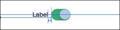
Figure 3-17 After you add a vertical placement constraint to the switch and updating frames, the layout constraints display in blue.
At this point, you have established rules that fix both the switch and the label in place:
The switch is offset 136 points from the leading edge of its superview and is centered vertically in that superview.
The label is vertically aligned with and offset from the switch by a standard spacer.
Previewing Layouts
To fully test an interface, there are certain regular checks every developer performs. For example, do all interaction spots cover at least 44×44 points on the screen? Does the app supply appropriate art for both Retina and non-Retina targets? Is that art sized for most audiences on full-sized iPads, iPad minis, 3.5-inch phones, and 4-inch phones?
In addition to these common checks, you should be thinking of Auto Layout–specific tests. Answer the following questions:
Does the interface adjust appropriately between iPad geometry, 3.5-inch geometry, and 4-inch geometry?
Does the interface re-orient seamlessly when the device rotates?
Does the interface adjust correctly when the user changes font selections in Settings and the app receives a dynamic font update?
Does the interface adapt properly when the text is localized?
At this time, IB offers simple ways to preview layout across device geometry and orientation, which you’ll see in these next few steps. Chapter 5 discusses testing for dynamic fonts and localized text, which are not features you find in IB. The following are IB-specific steps:
1. Close any inspectors and/or the debugging console to make the most possible room in your workspace. Previewing layout takes up a lot of room.
2. Locate the related file’s menu at the very top left of the IB outline. It’s to the left on the Xcode jump bar. Its icon looks like a grid of eight small rectangles.
3. While holding Shift+Option, select Preview and then your iPhone storyboard. A gray destination dialog appears. Click the plus on the right (see the top image in Figure 3-18) to open the preview in a new assistant editor pane and press Return. Repeat to open a second editor pane below the first one.
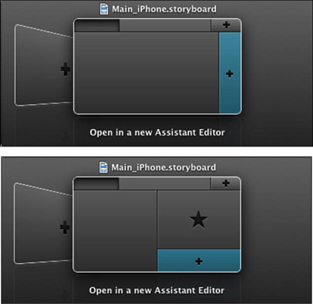
Figure 3-18 If screen space permits, you can add multiple panes to preview your application in both orientations.
4. At this point, your interface should look as shown in Figure 3-19. Locate the rotation toggle in the bottom preview. It’s the middle button in the toolbar and looks like a downward-pointing arrow. Click it to rotate the lower preview to landscape.
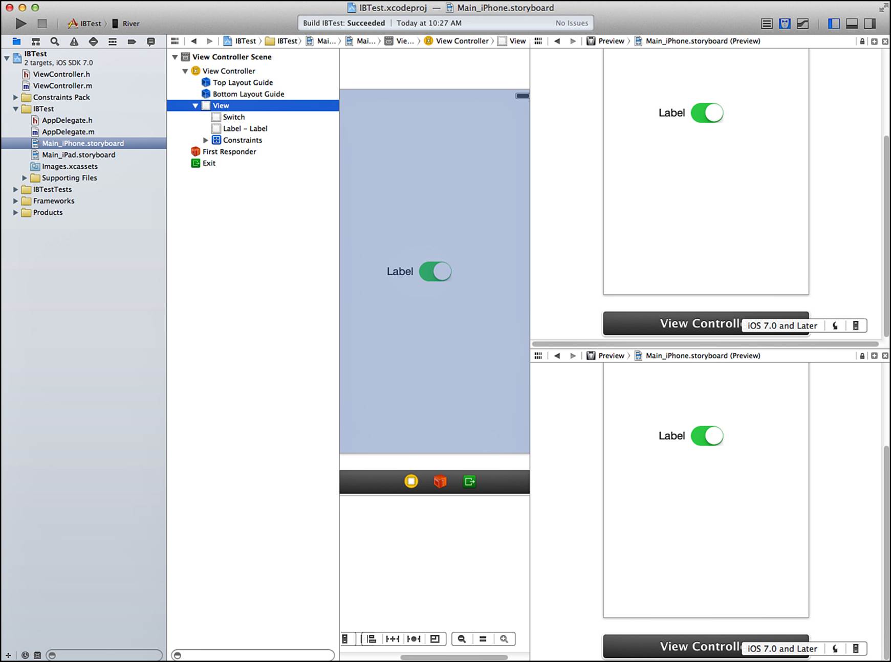
Figure 3-19 The IB interface after you add two preview panes to the assistant editor. What you see in this screenshot from left to right is the gray-backed project navigator, followed by the IB editor, followed by a pair of previews stacked top and bottom. This is an overview screenshot, which is not meant to be read in detail. Rather it shows the basic layout you create after opening both previews.
5. Adjust the panels so you can see your editing space and both previews at once (see Figure 3-20).
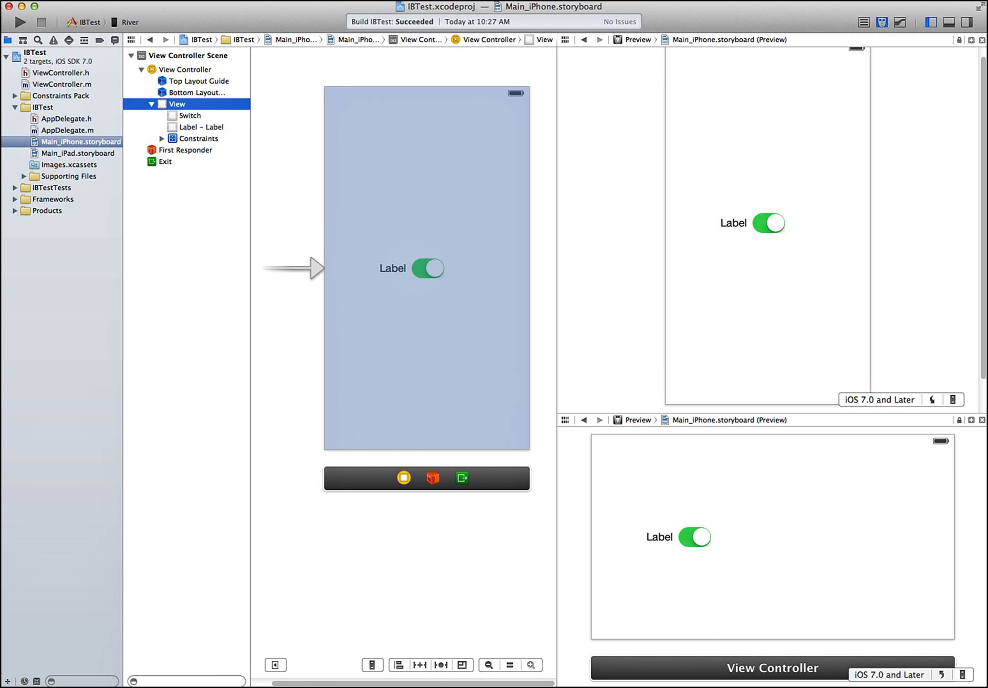
Figure 3-20 Rotating the bottom preview and adjusting the panel sizes helps you see your application in both orientations. You see the change at the bottom-right of the screen, which now takes up much less vertical space than in Figure 3-21. Again, this screenshot is not meant to show fine details.
At this point, IB previews how your interface looks in both portrait and landscape orientations. Any changes you make in your editor are reflected in the previews. From here, you can do the following:
Switch between iOS 7 preview and iOS 6.1 and earlier styles. The newer layout is whiter, starker, and lacking in features such as the black status bar. These are preview-only features and do not affect the editor.
Toggle between 3.5-inch and 4-inch layout (for iPhone previews only). This enables you to see how your layout adjusts from one geometry to the other.
In the sample app, the switch stays at a fixed distance from the left edge, regardless of orientation. Because you see both orientations at once, this detail jumps out in your design, alerting you to the problem.
This switch was placed using a leading-edge constraint rather than a centering constraint. To get a sense of how IB’s preview helps you correct your layout, follow these steps:
1. Locate the Horizontal Space – (136) constraint in the organizer. Select it and delete it.
2. Select the switch and choose Editor > Align > Horizontal Center in Container.
The landscape preview updates immediately. The switch moves to the center, providing a more pleasing layout in both orientations.
Inspecting Constraints
Xcode allows you to inspect any selected constraint by using the Attributes Inspector (View > Utilities > Show Attributes Inspector) or by double-clicking any constraint from the editor. Figure 3-21 shows the Center X constraint you just added to the switch.
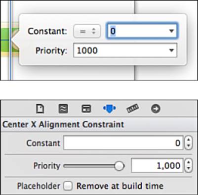
Figure 3-21 This vertical constraint aligns the switch to the center of its container.
The inspectors you see in Figure 3-21 reinforce the y R mx + b relation that underlies all constraints. In this instance, the relation (R) is equal, the constant (b) is 0, and the multiplier (m, which you do not see and cannot adjust here) is 1.
These inspectors enable you to make the following tweaks to constraints:
For constraints that allow it, you can select a different relation. Consider the constraint that offsets the label from the switch. If you edit that constraint to be greater than or equal to 50 points, the visualized constraint adds a ≥ badge, as shown in Figure 3-22. This indicates at a glance that the constraint now refers to an inequality.
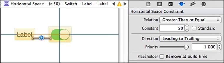
Figure 3-22 This horizontal constraint specifies that the label should be at least 50 points away from the switch. The Placeholder check box enables you to remove a constraint at build time. This is handy when you want to create a fully satisfied layout for design time but need to replace an item with a code-based constraint at runtime.
Second, at least in this example, the IB constraint system would find itself expressing ambiguity. Under this new relation, the label no longer has a certain place to live, so the constraint turns orange.
You change offsets and size extents by editing a constraint’s Constant value. In the example in Figure 3-22, adjustments would move the label closer to or farther away from the switch.
Checking the Standard box updates the constraint to use Aqua spacing—basically, 20-point offsets from edges and 8-point offsets between views. Apple’s Aqua user interface standards are the primary visual theme used in OS X design. Many Aqua patterns also appear in iOS.
When Standard is checked, standard spacing overrides any Constant value you’ve already entered or set through layout.
You adjust constraint priority from its default setting of required (1,000) to another value either by moving the slider or entering a new value into the text box.
View Size Inspector
A view’s Size Inspector (View > Utilities > Show Size Inspector) plays a different role in the constraints story from the constraint editor in the Attributes Inspector. When you select a view, the Size Inspector lists all constraints that mention the view and provides support for editing the view’s content size priorities.
Figure 3-23 shows the Size Inspector for this project’s label. This is where you edit properties that affect a view’s size and where you can see all the constraints that the view participates in.
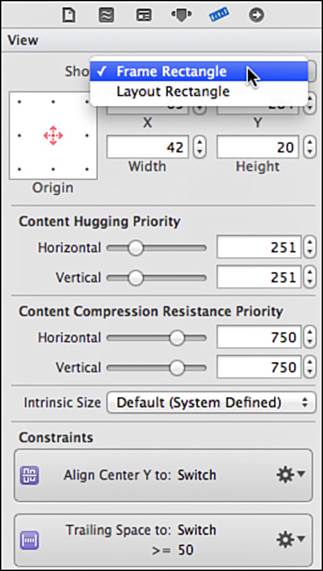
Figure 3-23 A view’s Size Inspector enables you to set its content size priorities and lists its constraints.
Frame and Layout Rectangles
In the top section of the inspector shown in Figure 3-23, you can view and edit either the frame rectangle or the layout rectangle for the view. Layout rectangle is IB-speak for an alignment rectangle, which you read about in earlier chapters. Alignment rectangles define a view’s Auto Layout geometry attributes, like left edge, trailing edge, baseline, top, bottom, and center. For control instances, the rectangles may vary slightly between the frame and the alignment rectangle. You can spot the difference by switching between the two options in the Show pop-up.
To better visualize frames and alignment rectangles, select Editor > Canvas > Show Layout Rectangles or Editor > Canvas > Show Bounds Rectangles. These options add overlays to the visual editor, as shown in Figure 3-24. Bounds rectangles appear in blue, and layout rectangles appear in red.
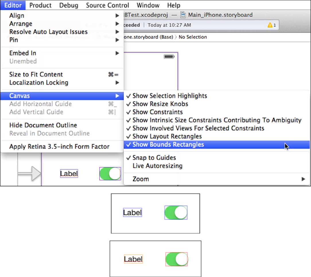
Figure 3-24 The Editor > Canvas menu (top) enables you to visualize bounding rectangles (frames—shown in blue) and layout rectangles (alignment rectangles—shown in red). As you can see, the switch’s layout rectangle slightly clips its right-hand side, forcing centering slightly to the left. Its bounding rectangle completely encloses all art.
Other Size Inspector Items
Next in the inspector, below the rectangle editors, lie two sections in which you can set content hugging and content compression priorities for the view. Auto Layout uses these to generate content size constraints. As you read in earlier chapters, these values allow you to adjust view padding and clipping. Below this you find the Intrinsic Size pop-up, which enables you to set proxy view sizes.
Constraints that mention the view are listed at the bottom of the inspector pane. These constraints are not necessarily owned by the view in question. Always check the document outline—and not the Size Inspector—for ownership.
The Resolution Menu
Xcode 5’s new resolution menu (Editor > Resolve Auto Layout Issues; see Figure 3-25) allows you to manage common constraint issues. The menu consists of two halves. The top half of the menu applies to the currently selected view. The bottom half affects all views within the active scene. The options in the two halves mirror each other.
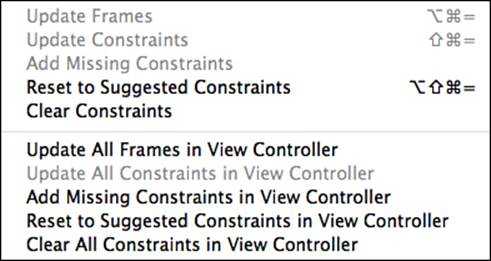
Figure 3-25 Use the resolution menu to address common constraint issues.
Updating Frames and Constraints
When you move an already-constrained view within the IB editor, you encounter the dashed rectangles you read about earlier in this chapter. Orange dashes outline the position that the view would live in if Auto Layout applied its current set of constraints.
Two update options appear at the start of the resolution menu. Update Frames allows you to adjust view frames to match the current set of constraints, and Update Constraints lets you change your constraints to match the current set of view frames.
If your movement was deliberate—as opposed to temporarily nudging a view out of the way—you can go ahead and update your constraints. IB replaces any constraints that set the view’s original position. If the movement was administrative, you can reset the frames. This moves views back into place with respect to the current constraint set.
Adding and Resetting Constraints
The next two options are Add Missing Constraints and Reset to Suggested Constraints. The Add option creates just enough new constraints to remove any ambiguity. It adds these constraints to any constraints you’ve already established. The Reset option replaces the constraints with a full, sufficient set. In both cases, IB must guess at what constraints you want. Sometimes it gets this right. Often it does not.
IB is not a mind-reader. If you centered a view, IB may correctly surmise that you meant that view to be centered when adding its constraints. Or it may center the view along one axis and add a fixed offset along the other.
The constraints you add with the Add and Reset options are not the same as the inferred frame constraints discussed at the start of this chapter. IB’s auto-generated constraints for fixed frame views set position and size exactly as you laid out the view, without guessing intent.
Clearing Constraints
The final menu option is Clear Constraints, and it does exactly what it says on the wrapper: It removes all constraints associated with a view or within the entire scene, depending on which version you select from the menu. This action is the equivalent of opening a view’s Size Inspector and individually deleting each constraint listed there.
Constraints/Resizing Pop-Up Menu
So far, you’ve seen the functionality of the first three of the four items that live in the tools group at the bottom of the editor screen. The first two of these are alignment and pinning options, which you use to add constraints to your layout. The third item provides constraint resolution. The last offers a pair of preferences, as shown in Figure 3-26.
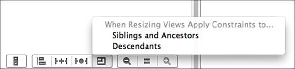
Figure 3-26 IB can apply constraints during resizing.
These global options enable and disable automatic constraint application for siblings/ancestors and children during resizing. When this is enabled, IB maintains constraints as you resize views in the editor. This is best explained through an example. Figure 3-27 shows three views (two siblings and one child) and the constraints that relate them. One constraint separates the top view from the bottom view, using a fixed distance. Additional constraints embed a child view within the parent at the bottom, adding fixed offsets from each edge to the superview.
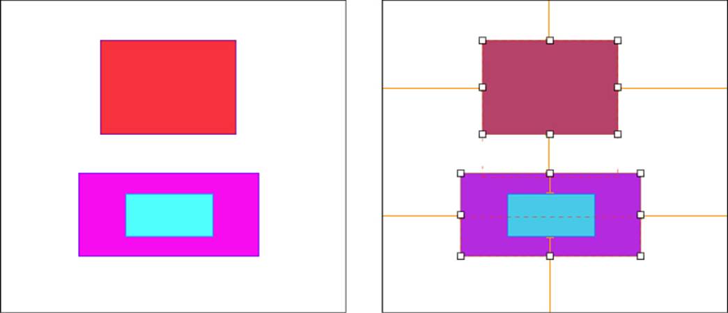
Figure 3-27 Three views consist of two siblings, one with a child view.
You’re about to see how IB enforces these constraints during resizing, using the pop-up menu options. When you allow IB to enforce constraints, it coordinates your resize request with any existing layout rules. First, you’ll see the Descendants option and then the Siblings and Ancestors option.
Descendants
Figure 3-28 shows the bottom view during resizing. The Descendants option is enabled on the left and disabled on the right. In the left example, IB applies its constraints to the child during resizing. The child view updates to match the changes in the bottom view, maintaining the fixed offsets established during layout.
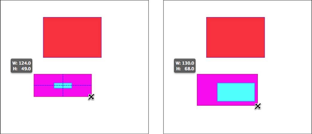
Figure 3-28 Enabling the Descendants option (left) maintains the relationship constraints that offset the child view from its superview. When this option is disabled (right), the constraints have no effect during resizing.
After you revert and disable the Descendants option, the results change. The child view no longer responds to its parent view as it resizes. The constraints are ignored, and the child view remains in place, the same size as it began.
Siblings and Ancestors
The Siblings and Ancestors option works the same way as the Descendants option, but with sibling and ancestor views. Figure 3-29 demonstrates this as the bottom view resizes in an upward direction.
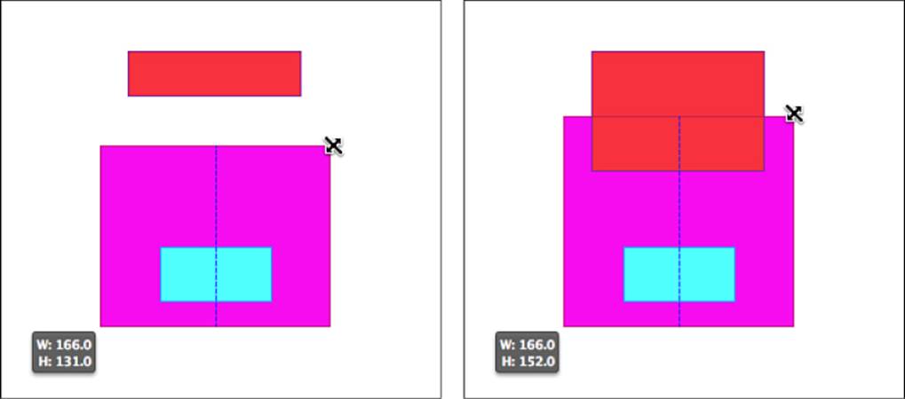
Figure 3-29 Resizing with Siblings and Ancestors enabled on the left and disabled on the right.
With the Siblings and Ancestors option enabled, the top view maintains the offset constraint between the two views, shrinking to accommodate. When the option is disabled, the bottom view resizes without consideration to that constraint, and the top view remains at its original size.
The Missing Views Problem
As in code, conflicting priorities may cause views to “go missing.” Although IB can guarantee a consistent and unambiguous interface, it does not guarantee an interface where every view is visible. Next, you’ll see why this can happen.
For the next example, you need a blank canvas to work with, so create a new single-view application and open the iPhone storyboard. Display it in portrait orientation.
In this example, imagine that you are building a corporate information application as you follow these steps:
1. Drag a label into the view and center-align it just below the top, using constraints. Next, drag in a second label and left-align it with the standard inset, again just below the top of the screen (see Figure 3-30). Use the resolution menu to add missing constraints. IB adds several for you.
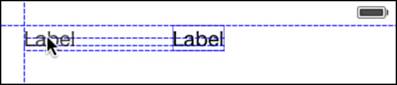
Figure 3-30 Here you add two labels to the portrait view.
2. Double-click the left label to enter edit mode. Update the name of the left label to Department Name. The label should automatically resize to accommodate the new text. The two labels will now overlap when they use the default fonts assigned to labels.
3. Select both labels in the document outline. Choose Editor > Pin > Horizontal Spacing.
4. Select the new Horizontal Spacing constraint. It probably has a negative constant value because the two views overlap, with the start of the second label to the left of the end of the first. Open the Attributes Inspector and check the Standard box. This requests a standard 8-point spacer between the two views. The left label should now clip, as in Figure 3-31.
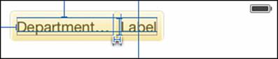
Figure 3-31 Forcing a row with standard spacing squeezes the Department Name label.
5. Select the Department Name label and open the Size Inspector. Adjust the Horizontal Content Compression Resistance Priority setting up, from 750 to 751. Then select Update All Frames in View Controller from the constraint resolution menu. The Department Name label resizes (somewhat), and the Label label (the item on the right) disappears entirely.
6. Select Label – Label from the document outline. (You cannot select it from the IB editor.) Examine its size in the size editor (see Figure 3-32). It will have a 0 width, which is why it disappears from the IB layout.
Figure 3-32 Due to conflicting constraints, a view’s size may slip to 0 and disappear from the layout, even in IB.
In this example, the Auto Layout constraint system could be satisfied but only by squeezing the right label to 0. That’s because several constraints came into conflict. The rightmost label’s compression-resistance rule loses. Its width falls to 0, and the view disappears entirely from the screen.
If you now select the view controller again and switch the orientation to Landscape in Attributes Inspector > Simulated Metrics > Orientation, the missing view springs back. The extra layout space ensures that the view can be presented with these rules. If you flip it to portrait, the view goes away again.
When designing in Auto Layout, you should ensure that your views are laid out properly in every orientation and every legal window size. This example demonstrates how things can go wrong and why you should always consider edge conditions.
Balancing Requests
Whenever you design with Auto Layout, be sure to think about extremes. For example, how should items respond to minimum and maximum sizing? Which objects should take precedence during that resizing? The key to succeeding at Auto Layout is having a gestalt understanding of your desired layout before attempting to express that layout. Next, you’ll explore common layout scenarios.
To get started, create another new one-view iPhone storyboard project with a custom view controller class. In this example, I use a ViewController class, but your class may vary. The key is to use a custom subclass of UIViewController with editable code.
Follow these steps to set up a basic test bed, which you’ll use to explore these Auto Layout issues:
1. Add a navigation controller to your storyboard. Select the default table view controller supplied as the navigation controller’s root view controller and delete it. Select the navigation controller, open the Attributes Inspector, and check Is Initial View Controller.
2. Drag a new view controller into the storyboard editor to replace the now-deleted table view controller. Ctrl+drag from the navigation controller to the view controller. Choose Root View Controller from the IB pop-up.
3. Select the new view controller and open the Identity Inspector. Adjust the class in the Custom Class > Class tool to match your primary view controller class. You now have a navigation controller setup that loads your custom class.
4. Add two labels. In this case, align the labels left and right instead of left and center. Edit the first label to say Department Name. Edit the second label to say Value. Pin the left label a standard distance from the leading edge of its parent and the right label a standard distance from the trailing edge of its parent.
5. Select both labels and choose Editor > Pin > Horizontal Spacing. Select the new constraint and edit the relation to Greater Than or Equal. Then check Standard. Figure 3-33 shows the updated interface with its two labels and its fixed minimum spacing.
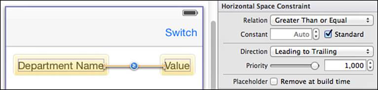
Figure 3-33 Set up the interface so that the two labels cannot grow any closer than standard spacing (8 points).
6. Drag a bar button item to the right side of your root controller navigation bar. Edit the title from Item to Switch. This button adjusts the text displayed in the right label so that you can test a variety of layout conflicts.
7. Open the Assistant Editor (View > Assistant Editor > Show Assistant Editor) so that it shows your primary view controller interface. Ctrl+drag from the Value label into your interface declaration. Create a new Outlet connection named valueLabel.
8. Ctrl+drag from the Switch bar button item into your interface declaration. Create a new Action connection named switch:, as shown in Figure 3-34. (A method name like switchLabelText: would also be a good choice, since switch is a keyword in C.)
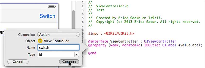
Figure 3-34 You connect an outlet to the right label and add an action to the Switch bar button item.
9. Edit your view controller source code to match the following snippet:
@implementation ViewController
- (IBAction) switch: (id) sender
{
static int numberOfTimes = 1;
NSMutableString *string = [NSMutableString string];
for (int i = 0; i <= numberOfTimes; i++)
[string appendString:@"Value"];
_valueLabel.text = string;
numberOfTimes = (numberOfTimes + 1) % 5;
}
@end
In this code, you add a local instance variable and update the switch method you just created. This method adjusts repetitions of the word Value, growing the right-side label to test constraint behavior.
Compile and run the app, testing it both in portrait orientation and landscape orientation. In portrait orientation, when the Value label contains several repetitions, one of the two labels must get clipped. At this point, it cannot be determined which label will be clipped because both items have identical content compression resistance, and you haven’t added constraints about the two view widths. Your output might look like either sample in Figure 3-35.
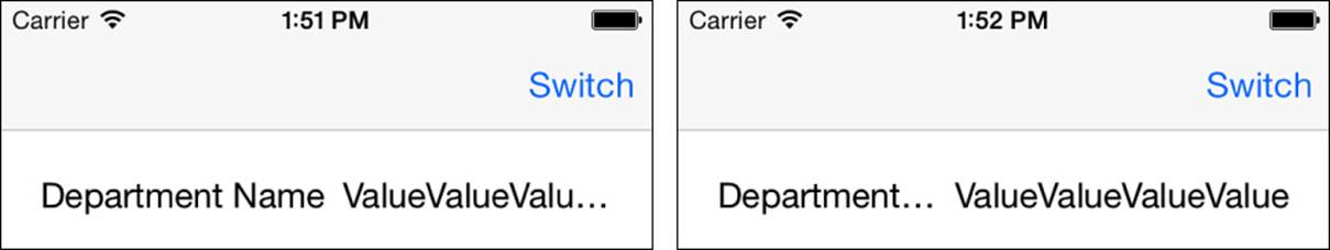
Figure 3-35 Auto Layout helps you balance clipping rules, choosing which item gets clipped first.
In real-world deployment, information often competes for space onscreen, as you see in Figure 3-35. Value labels (that is, data derived from the application model) often compete against field name labels (that is, identifying labels). The identifying labels should usually win out (as shown on the left in Figure 3-35), creating a consistent interface regardless of what data is being presented. This is a good reason to keep your labels short and to the point.
With Auto Layout, you usually specify precedence through rules rather than by declaring explicit widths. In this example, lowering the Value label’s horizontal content compression with respect to the Department Name label allows Auto Layout to unambiguously prefer the first of the two layouts shown in Figure 3-35. Select the Value label, open the Size Inspector, and lower the Content Compression Resistance Priority setting to 749. When you run the app again, the behavior should consistently match the image on the left in Figure 3-35.
Raising and lowering priorities by one are common practices when you’re balancing layout requests. They’re more or less equivalent solutions. You’re either saying “make this layout more important” or “reduce the importance of this other layout.” Both approaches work.
Hybrid Layout
Many developers have invested substantial time in creating Autosizing-based views they want to keep using in Auto Layout projects. In hybrid development, you load Autosizing views from code and arrange them using Auto Layout.
Building a Nib File for Testing
Follow these steps to create a nib file that you’ll use to try using the hybrid layout approach:
1. Create a new iOS single-view project and add a new interface file (File > New > User Interface > View). Choose iPhone and click Next. Name it View and save the file, adding it to your project.
2. In the view’s File Inspector > Interface Builder Document, uncheck Use Auto Layout. IB builds its document using Autosizing.
3. In the view’s Attributes Inspector > Simulated Metrics, change its size to Freeform and remove the status bar.
4. In the Attributes Inspector > View, set the background to some easily viewed color, such as bright yellow.
5. In the view’s Size Inspector, set the size to 200 by 200.
6. Populate the view. For example, you can drag in a new subview and set a contrasting view color, such as blue. Set up the children however you like, using Autosizing struts and springs (see Figure 3-36). It doesn’t really matter how you perform your layout, but be aware that the parent will be resizing, and its child should behave in a known and set manner, using consistent Autosizing rules.
7. Save the file.
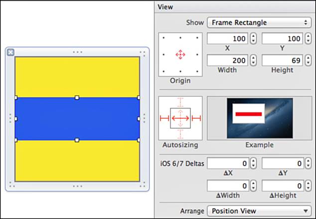
Figure 3-36 Add Autosizing rules in the Size Inspector.
Adding the Nib File in Code
You have now built an Autosizing-based nib file that you can use in Auto Layout. Listing 3-1 demonstrates how you do this: You load the view from its nib file, prepare it for Auto Layout, and then add constraints as you would have if you had built the view in code. The result is an IB-designed view that is leveraged in a code-based Auto Layout implementation.
This example adds several constraints to the custom view. The first five constraints center the view in its parent, ensure that it maintains a 1:1 aspect ratio, and then limit the size to its parent, with a 20-point inset. This produces a view that hugs the parent in either landscape or portrait orientation, without touching its edges.
Strictly speaking, this layout is underconstrained because size inequalities can be ambiguous. Two final constraints address this. Added at low priorities, they request an exact match to the inset-from-parent sizing. This ensures that the view displays at the biggest possible size in both orientations, while respecting insets.
Figure 3-37 shows the resulting interface in both orientations.
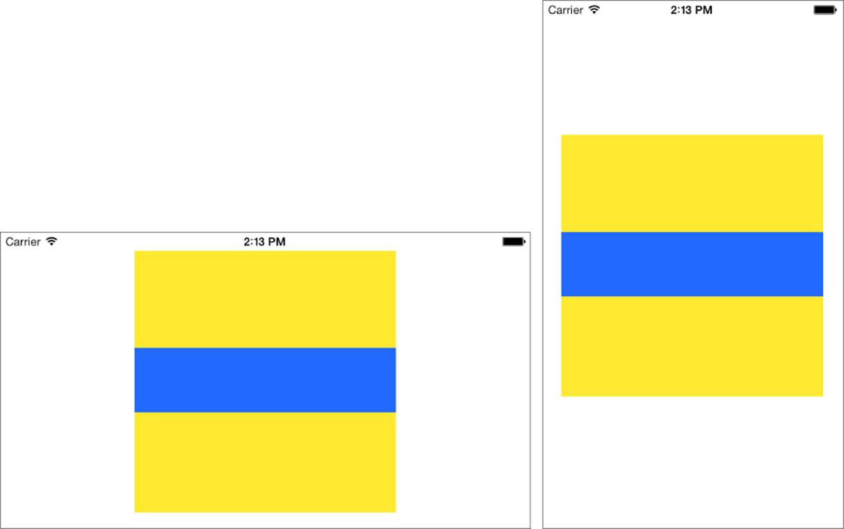
Figure 3-37 The resulting hybrid interface in portrait and landscape orientations.
Advantages of Hybrid Layout
Using both IB and code offers tangible benefits, such as the following:
Orthogonal design—This design pattern compartmentalizes subview details. You can freely return to IB and update the nib you created without affecting code, or you can update the layout code without affecting the subview. All design work within IB is essentially self-contained. The Autosizing and Auto Layout rules don’t cross boundaries.
IB-based layout—This approach fully leverages IB view design. The visual details of the subview remain in IB, which is the preferred design environment for many developers.
Mix-and-match development—You can easily hybridize autoresizing and Auto Layout development. Although this view was created with autoresizing rules, it happily lives in an Auto Layout interface.
Reduced complexity—Even if you were to design in IB using Auto Layout, the constraints you have to manage inside a modular nib file are limited to those directly involved in laying out that view, so the complexity goes way down. Reduced complexity improves readability and inspection. So modular development is as valuable for those working with Auto Layout as for those working with Autosizing.
Listing 3-1 Loading an Autosizing View into Auto Layout
- (void) loadView
{
// Create the view
self.view = [[UIView alloc] init];
self.view.backgroundColor = [UIColor whiteColor];
// Load the subview from the nib file
UIView *subview = [[[NSBundle mainBundle] loadNibNamed:@"View"
owner:self options:nil] lastObject];
[self.view addSubview:subview];
// Prepare it for Auto Layout
// Even though the view was laid out using Autosizing, you're
// adding it *to* Auto Layout. This property only affects the
// subview's relation to its parent, and not its subviews.
subview.translatesAutoresizingMaskIntoConstraints = NO;
// Add constraints
NSLayoutConstraint *constraint;
// Center it along its parent X and Y axes
constraint = [NSLayoutConstraint
constraintWithItem:subview
attribute:NSLayoutAttributeCenterX
relatedBy:NSLayoutRelationEqual
toItem:self.view
attribute:NSLayoutAttributeCenterX
multiplier:1
constant:0];
[self.view addConstraint:constraint];
constraint = [NSLayoutConstraint
constraintWithItem:subview
attribute:NSLayoutAttributeCenterY
relatedBy:NSLayoutRelationEqual
toItem:self.view
attribute:NSLayoutAttributeCenterY
multiplier:1
constant:0];
[self.view addConstraint:constraint];
// Set its aspect ratio to 1:1
constraint = [NSLayoutConstraint
constraintWithItem:subview
attribute:NSLayoutAttributeWidth
relatedBy:NSLayoutRelationEqual
toItem:subview
attribute:NSLayoutAttributeHeight
multiplier:1
constant:0];
[subview addConstraint:constraint];
// Constrain it with respect to the superview's size
constraint = [NSLayoutConstraint
constraintWithItem:subview
attribute:NSLayoutAttributeWidth
relatedBy:NSLayoutRelationLessThanOrEqual
toItem:self.view
attribute:NSLayoutAttributeWidth
multiplier:1
constant:-40];
[self.view addConstraint:constraint];
constraint = [NSLayoutConstraint
constraintWithItem:subview
attribute:NSLayoutAttributeHeight
relatedBy:NSLayoutRelationLessThanOrEqual
toItem:self.view
attribute:NSLayoutAttributeHeight
multiplier:1
constant:-40];
[self.view addConstraint:constraint];
// Add a weak "match size" constraint
constraint = [NSLayoutConstraint
constraintWithItem:subview
attribute:NSLayoutAttributeWidth
relatedBy:NSLayoutRelationEqual
toItem:self.view
attribute:NSLayoutAttributeWidth
multiplier:1
constant:-40];
constraint.priority = 1;
[self.view addConstraint:constraint];
constraint = [NSLayoutConstraint
constraintWithItem:subview
attribute:NSLayoutAttributeHeight
relatedBy:NSLayoutRelationEqual
toItem:self.view
attribute:NSLayoutAttributeHeight
multiplier:1
constant:-40];
constraint.priority = 1;
[self.view addConstraint:constraint];
}
Removing IB-Generated Constraints
At times you may build a storyboard or xib file that’s purposely underconstrained so that you can add custom layout from code. Inferred constraints, created on your behalf, don’t work well with this scenario. Of the possible approaches you may take, only one—using placeholders—is suitable for production work.
The “best practices” solution starts with a fully constrained layout in IB. Unambiguous layout prevents IB from adding inferred constraints on your behalf. The constraints in your storyboard or xib file will match the ones loaded by iOS in your app.
Next, select each constraint you want to remove from your layout and open the Attributes Inspector. Check the Placeholder box, as shown in Figure 3-38. This option enables IB to use the constraint to validate design-time layout but removes that constraint at runtime.
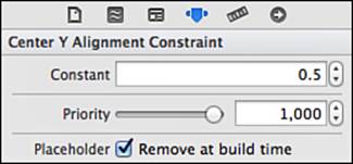
Figure 3-38 The Placeholder check box enables you to choose which constraints will not be added at runtime.
Note
Constraints are first-class objects in IB. You can use the same techniques to build outlets that point to them as you would with views. Ctrl+drag from any constraint to a header file interface to create that outlet. This enables you to refer to specific constraints when you need to. This approach is particularly useful for animating constraints by adjusting their constants.
Exercises
After reading this chapter, test your knowledge with these exercises:
1. Add three buttons to your view. Add constraints so the three buttons remain centered within the view, regardless of orientation and platform, with fixed offsets (see Figure 3-39). Extra credit: Extend this to 5 buttons instead of 3.
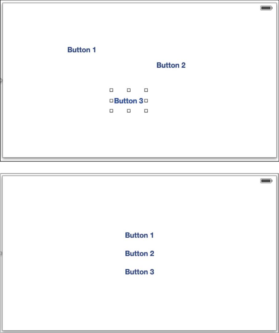
Figure 3-39 Center three buttons.
2. Add a view with a colorful background color to a view controller. Constrain it so it’s inset on each side by 40 points, regardless of orientation (see Figure 3-40).
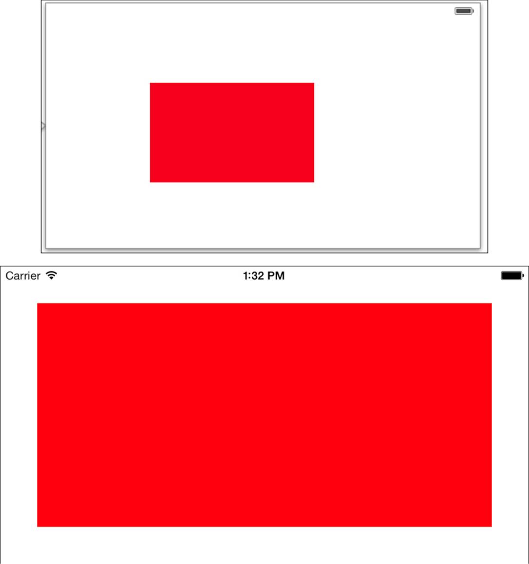
Figure 3-40 Stretch a view with an inset.
3. Add three views to a new view controller (see the top image in Figure 3-41). Using IB alone, create a constraint system, as in the middle image in Figure 3-41, that when applied by updating frames produces the equally sized results you see in the bottom image in Figure 3-41.
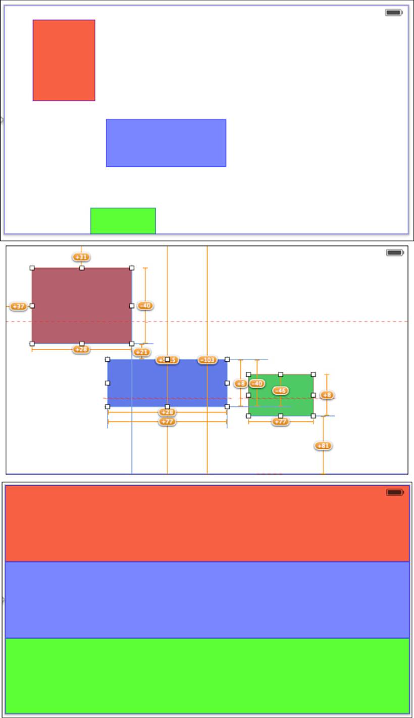
Figure 3-41 Divide and match view areas.
4. Create a table that consists of left-aligned labels and two buttons in a row on the right (see Figure 3-42). Add constraints so the label and buttons remain properly aligned in every orientation, with all three items centered vertically.
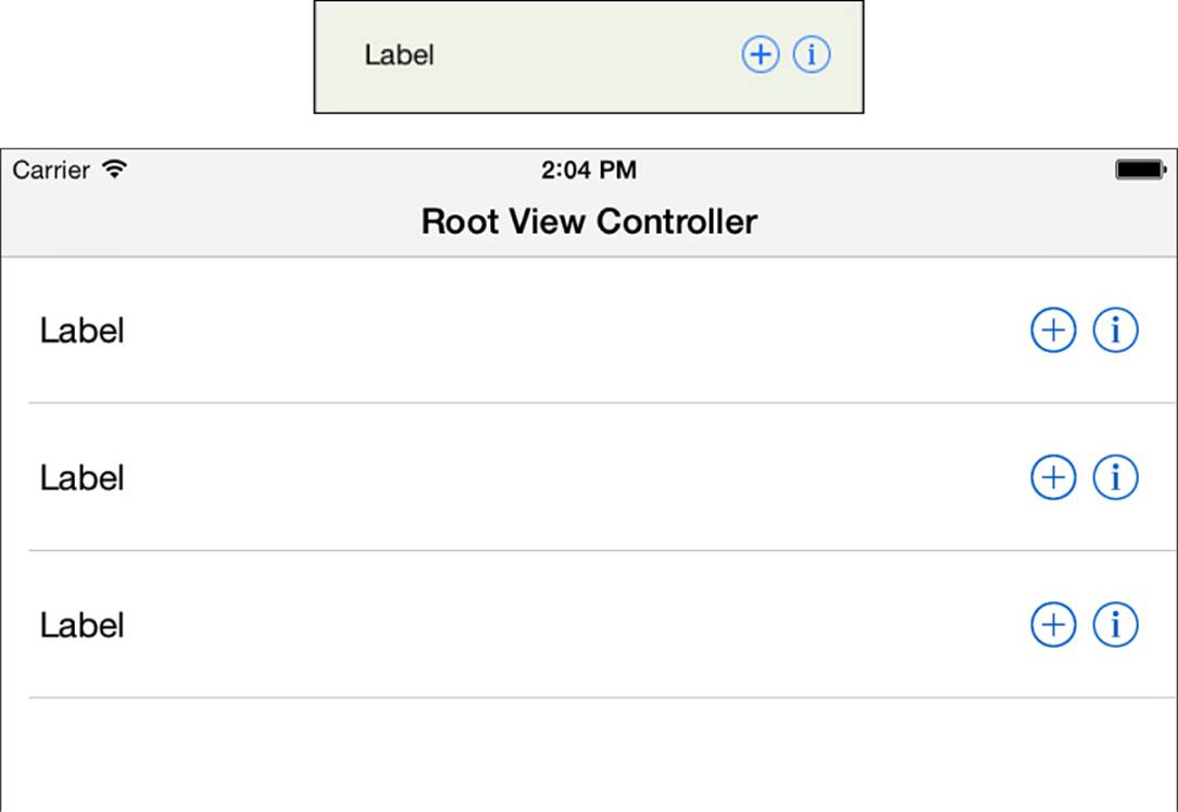
Figure 3-42 Lay out items in cells.
Conclusions
This chapter provides a tour through the world of IB-based Auto Layout. You have seen how to add, delete, and modify constraints in IB, and you have explored the edges of the design space. Before you continue on to other chapters, here are a few final thoughts:
• In the last edition of this book, I wrote, “If I could rewrite IB from the ground up, I’d remove its ambiguity oversight system entirely. I’d rather add constraints iteratively and then test for ambiguity at the end of my layout.” In Xcode 5, IB now does this.
If I had sway with the IB team, I’d now request that they remove constraints from the overview pane entirely and instead add them to their own floating inspector. Here, developers could group related constraints together and freely annotate their design choices. IB should support the visual design process rather than mirror underlying implementation details.
• When testing IB Auto Layout interfaces, you may need to apply deductive reasoning to figure out which constraints are producing the behavior you don’t expect. This problem is especially pronounced when you allow IB to add constraints on your behalf, so proceed cautiously.