Beginning iPhone Development with Swift: Exploring the iOS SDK (2014)
Chapter 5. Rotation and Adaptive Layout
The iPhone and iPad are amazing pieces of engineering. Apple engineers found all kinds of ways to squeeze maximum functionality into a pretty darn-small package. One example of this is how these devices can be used in either portrait (tall and skinny) or landscape (short and wide) mode, and how that orientation can be changed at runtime simply by rotating the device. You can see an example of this behavior, which is called autorotation, in iOS’s web browser, Mobile Safari (see Figure 5-1). In this chapter, we’ll cover rotation in detail. We’ll start with an overview of the ins and outs of autorotation, and then move on to different ways of implementing that functionality in your apps.
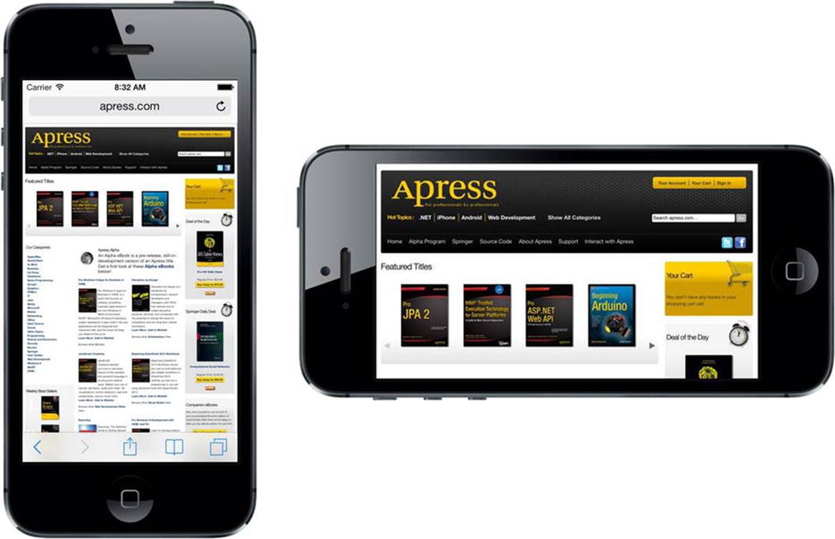
Figure 5-1. Like many iOS applications, Mobile Safari changes its display based on how it is held, making the most of the available screen space
Prior to iOS 8, if you wanted to design an application that would run on both iPhones and iPads, you would have to create one storyboard with a layout for the iPhones and another one with your iPad layout. In iOS 8, that’s all changed. Apple has added APIs to UIKit and tools in Xcode that make it possible to build an application that runs on (or, using their terminology, adapts to) any device—even the new large-screen iPhone 6 Plus—with a single storyboard. You still have to design carefully for the different form factor of each type of device, but now you can do it all in one place. Even better, using the Preview feature that we introduced in Chapter 3, you can see immediately how your application would look on any device without even having to start up the simulator. We’ll take a look at how to build adaptive application layouts in the second part of this chapter.
The Mechanics of Rotation
The ability to run in both portrait and landscape orientations might not be right for every application. Several of Apple’s iPhone applications (such as the Weather app) support only a single orientation. However, iPad applications are different. Apple recommends that most applications (with the exception of immersive apps like games that are inherently designed around a particular layout) should support every orientation when running on an iPad.
In fact, most of Apple’s own iPad apps work fine in both orientations. Many of them use the orientations to show different views of your data. For example, the Mail and Notes apps use landscape orientation to display a list of items (folders, messages, or notes) on the left and the selected item on the right. In portrait orientation, however, these apps let you focus on the details of just the selected item.
For iPhone apps, the base rule is that, if autorotation enhances the user experience, you should add it to your application. For iPad apps, the rule is you should add autorotation unless you have a compelling reason not to. Fortunately, Apple did a great job of hiding the complexities of handling orientation changes in iOS and in the UIKit, so implementing this behavior in your own iOS applications is actually quite easy.
Permission to rotate the user interface is specified in the view controller. If the user rotates the device, the active view controller will be asked if it’s okay to rotate to the new orientation (which you’ll see how to do in this chapter). If the view controller responds in the affirmative, the application’s window and views will be rotated, and the window and view will be resized to fit the new orientation.
On the iPhone and iPod touch, a view that starts in portrait mode will be taller than it is wide—you can see the actual available space for any given device by referring to the Software Size column of Table 1-1 in Chapter 1. Note, however, that the vertical screen real estate available for your app will be decreased by 20 points vertically if your app is showing the status bar, which is the 20-point strip at the top of the screen (see Figure 5-1) that shows information like signal strength, time, and battery charge.
When the device rotates to landscape mode, the vertical and horizontal dimensions switch around, so, for example, an application running on an iPhone 6 would see a screen that’s 375 points wide × 667 points high in portrait, but 667 points wide × 375 points high in landscape. Again though, on iPads the vertical space actually available to your app is reduced by 20 points if you’re showing the status bar, which most apps do. On iPhones, as of iOS 8, the status bar is hidden in landscape orientation.
Points, Pixels, and the Retina Display
You might be wondering why we’re talking about “points” instead of pixels. Earlier versions of this book did, in fact, refer to screen sizes in pixels rather than points. The reason for this change is Apple’s introduction of the Retina display.
The Retina display is Apple’s marketing term for the high-resolution screen on all versions of the iPhone starting with iPhone 4 and later-generation iPod touches, as well as newer variants of the iPad. As you can see by looking back at Table 1-1 again, it doubles the hardware screen resolution for most models and almost triples it for the iPhone 6 Plus.
Fortunately, you don’t need to do a thing in most situations to account for this. When we work with on-screen elements, we specify dimensions and distances in points, not in pixels. For older iPhones, and the iPad, iPad 2, and iPad Mini 1, points and pixels are equivalent. One point is one pixel. On more recent-model iPhones, iPads, and iPod touches, however, a point equates to a 4-pixel square (2 pixels wide × 2 pixels high) and the iPhone 5s screen (for example) still appears to be 320 points wide, even though it’s actually 640 pixels across. On iPhone 6 Plus, the scaling factor is 3, so each point maps to a 9-pixel square. Think of it as a “virtual resolution,” with iOS automatically mapping points to the physical pixels of your screen. We’ll talk more about this in Chapter 16.
In typical applications, most of the work in actually moving the pixels around the screen is managed by iOS. Your application’s main job in all this is making sure everything fits nicely and looks proper in the resized window.
Handling Rotation
To handle device rotation, you need to specify the correct constraints for all of the objects that make up your interface. Constraints tell the iOS device how your controls should behave when their enclosing view is resized. How does that relate to device rotation? When the device rotates, the dimensions of the screen are (more or less) interchanged—so the area in which your views are laid out changes size. If you’ve worked with Cocoa on OS X, you may already be familiar with the basic process because it is the same one used to specify how Cocoa controls behave when the user resizes the window in which they are contained.
The simplest way of using constraints is to configure them in Interface Builder (IB). Interface Builder lets you define constraints that describe how your GUI components will be repositioned and resized as their parent view changes or as other views move around. You did a little bit of this inChapter 4 and will delve further into this subject in this chapter. You can think of constraints as equations that make statements about view geometry and the iOS view system itself as a “solver” that will rearrange things as necessary to make those statements true. You can also add constraints in code, but we’re not going to cover that in this book.
Constraints were added to iOS 6, but have been present on the Mac for a bit longer than that. On both iOS and OS X, constraints can be used in place of the old “springs and struts” system that came before. Constraints can do everything the old technology could do, and a whole lot more.
Let’s get started, shall we? Before we get into the different ways you can configure your GUI to shuffle its views around, we’ll show you how to specify which orientations your app will allow.
Choosing Your View Orientations
We’ll create a simple app to show you how to pick which orientations you want your app to work with. Start a new Single View Application project in Xcode, and call it Orientations. Choose Universal from the Devices pop-up, and save it along with your other projects.
Before we lay out our GUI in the storyboard, we need to tell iOS that our view supports interface rotation. There are actually two ways of doing this. You can create an app-wide setting that will be the default for all view controllers, and you can further tweak things for each individual view controller. We’ll do both of these things, starting with the app-wide setting.
Supported Orientations at the App Level
First, we need to specify which orientations our application supports. When your new Xcode project window appeared, it should have opened to your project settings. If not, click the top line in the Project Navigator (the one named after your project), and then make sure you’re on theGeneral tab. Among the options available in the summary, you should see a section called Deployment Info and, within that, a section called Device Orientation (see Figure 5-2) with a list of check boxes.
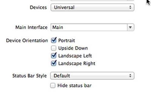
Figure 5-2. The General tab for our project shows, among other things, the supported device orientations
This is how you identify which orientations your application supports. It doesn’t necessarily mean that every view in your application will use all of the selected orientations; but if you’re going to support an orientation in any of your application’s views, that orientation must be selected here.
Have you noticed that the Upside Down orientation is off by default? That’s because, if the phone rings while it is being held upside down, the phone is not likely to remain upside down when you answer it.
Open the Devices drop-down that’s just above the check boxes and you’ll see that you can actually configure separate sets of allowed orientations for the iPhone and the iPad. If you choose iPad, you’ll see that all four check boxes are selected, because the iPad is meant to be used in any orientation.
Note The four check boxes shown in Figure 5-2 are actually just a shortcut to adding and deleting entries in your application’s Info.plist file. If you single-click Info.plist in the Supporting Files folder in the Project Navigator, you should see two entries called Supported interface orientations and Supported interface orientations (iPad), with subentries for the orientations that are currently selected. Selecting and deselecting those check boxes in the project summary simply adds and removes items from these arrays. Using the check boxes is easier and less prone to error, so using the check boxes is definitely recommended. However, you should know what they do.
Now, select Main.storyboard. Find a Label in the Object Library and drag it into your view, dropping it so that it’s horizontally centered and somewhere near the top, as shown in Figure 5-3. Select the label’s text and change it to This way up. Changing the text may shift the label’s position, so drag it to make it horizontally centered again.
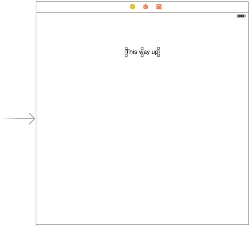
Figure 5-3. A useful reminder in case you lose your sense of gravity
We need to add Auto Layout constraints to pin the label in place before running the application, so Control-drag from the label upward until the background of the containing view turns blue, and then release the mouse. Hold down the Shift key and select Top Space to Top Layout Guideand Center Horizontally in Container in the pop-up, and then press Return. Now, press  R to build and run this simple app on the iPhone simulator. When it comes up in the simulator, try rotating the device a few times by pressing -Left-Arrow or -Right-Arrow. You’ll see that the entire view (including the label you added) rotates to every orientation except upside down, just as we configured it to do. Run it on the iPad simulator to confirm that it rotates to all four possible orientations.
We’ve identified the orientations our app will support, but that’s not all we need to do. We can also specify a set of accepted orientations for each view controller, giving us more fine-grained control over which orientations will work in different parts of our apps.
Per-Controller Rotation Support
Let’s configure our view controller to allow a different, smaller set of accepted orientations. The global configuration for the app specifies a sort of absolute upper limit for allowed orientations. If the global configuration doesn’t include upside-down orientation, for example, there’s no way that any individual view controller can force the system to rotate the display to upside down. All we can do in the view controller is place further limits on what is acceptable.
In the Project Navigator, single-click ViewController.swift. Here we’re going to implement a method, defined in the UIViewController superclass, that lets us specify which orientations we’ll accept:
override func supportedInterfaceOrientations() -> Int {
return Int(UIInterfaceOrientationMask.Portrait.rawValue)
| Int(UIInterfaceOrientationMask.LandscapeLeft.rawValue)
}
This method lets us return a C-style mask of acceptable orientations. This is iOS’s way of asking a view controller if it’s okay to rotate to a specific orientation. In this case, we’re returning a value that indicates that we’ll accept two orientations: the default portrait orientation and the orientation you get when you turn your phone 90° clockwise, so that the phone’s left edge is at the top. We use the Boolean OR operator (the vertical bar symbol) to combine these two orientation masks and return the combined value.
UIKit defines the following orientation masks, which you can combine in any way you like using the OR operator, as shown in the preceding example:
· UIInterfaceOrientationMask.Portrait
· UIInterfaceOrientationMask.LandscapeLeft
· UIInterfaceOrientationMask.LandscapeRight
· UIInterfaceOrientationMask.PortraitUpsideDown
In addition, there are some predefined combinations of these for common use cases. These are functionally equivalent to OR’ing them together on your own, but can save you some typing and make your code more readable:
· UIInterfaceOrientationMask.Landscape
· UIInterfaceOrientationMask.All
· UIInterfaceOrientationMask.AllButUpsideDown
When the iOS device is changed to a new orientation, the supportedInterfaceOrientations() method is called on the active view controller. Depending on whether the return value includes the new orientation, the application determines whether it should rotate the view. Because every view controller subclass can implement this differently, it is possible for one application to support rotation with some of its views but not with others, or for one view controller to support certain orientations under certain conditions.
CODE COMPLETION IN ACTION
Have you noticed that the defined system constants on the iPhone are always designed so that values that work together start with the same letters? One reason why UIInterfaceOrientationMask.Portrait, UIInterfaceOrientationMask.PortraitUpsideDown,UIInterfaceOrientationMask.LandscapeLeft, and UIInterfaceOrientationMask.LandscapeRight all begin with UIInterfaceOrientationMask is to let you take advantage of Xcode’s code completion feature.
You’ve probably noticed that as you type, Xcode frequently tries to complete the word you are typing. That’s code completion in action.
Developers cannot possibly remember all the various defined constants in the system, but you can remember the common beginning for the groups you use frequently. When you need to specify an orientation, simply type UIInterfaceOrientationMask (or even UIInterf), and you’ll see a list of all matches pop up. (In Xcode’s preferences, you can configure the list to pop up only when you press the Esc key.) You can use the arrow keys to navigate the list that appears and make a selection by pressing the Tab or Return key. This is much faster than needing to look up the values in the documentation or header files.
Feel free to play around with this method by returning different orientation mask combinations. You can force the system to constrict your view’s display to whichever orientations make sense for your app, but don’t forget the global configuration we talked about earlier! Remember that if you haven’t enabled upside down there (for example), none of your views will ever appear upside down, no matter what their views say.
Note iOS actually has two different types of orientations. The one we’re discussing here is the interface orientation. There’s also a separate but related concept of device orientation. Device orientation specifies how the device is currently being held. Interface orientation is which way the views on the screen are rotated. If you turn a standard iPhone upside down, the device orientation will be upside down, but the interface orientation will almost always be one of the other three, since iPhone apps typically don’t support portrait upside down.
Designing an Interface Using Constraints
In Xcode, make another new project based on the Single View Application template and name it Layout. Select Main.storyboard to edit the interface file in Interface Builder. One nice thing about using constraints is that they accomplish quite a lot using very little code. We do need to specify which orientations we support in code (unless we plan to support the default set), but the details of the layout are specified right here in Interface Builder.
To see how this works, drag four Labels from the library over to your view, and place them as shown in Figure 5-4. Use the dashed blue guidelines to help you line up each one near its respective corner. In this example, we’re using instances of the UILabel class to show how to use constraints with your GUI layout, but the same rules apply to all kinds of GUI objects.
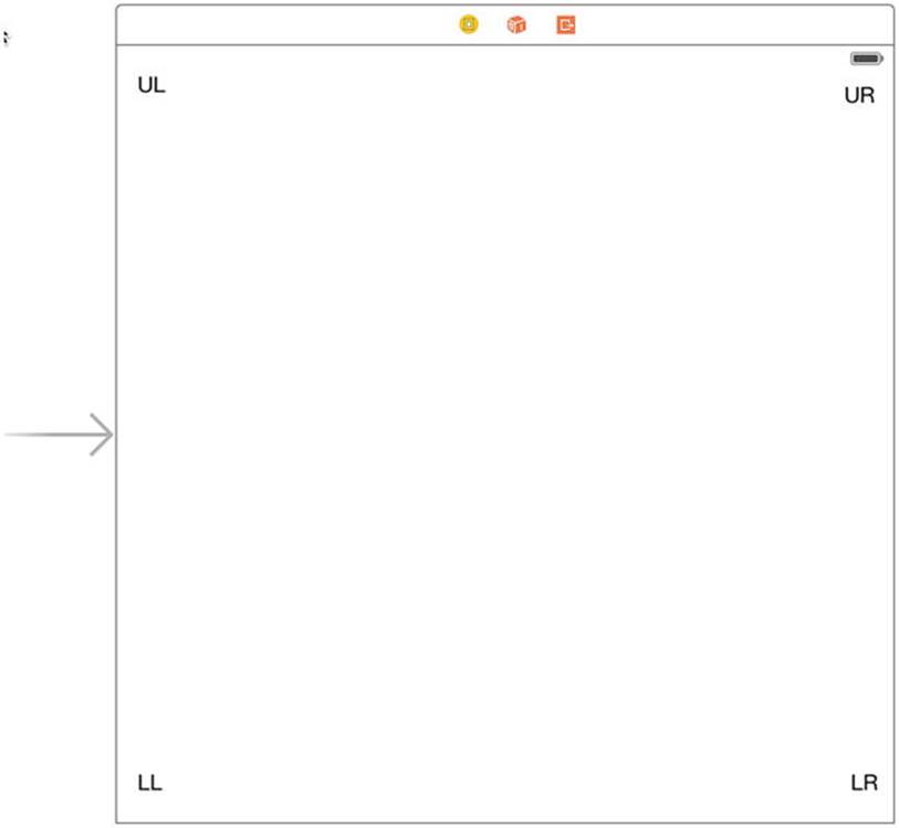
Figure 5-4. Adding four labels to the interface
Double-click each label and assign a title to each one so that you can tell them apart later. We’ve used UL for the upper-left label, UR for the upper-right label, LL for the lower-left label, and LR for the lower-right label. After setting the text for each label, drag all of them into position so that they are lined up evenly with respect to the container view’s corners (see Figure 5-4).
Let’s see what happens now, given that we haven’t set any Auto Layout constraints. Build and run the app on the iPhone 5s simulator. Once the simulator starts up, you’ll find that you can only see the label at the upper left and a small part of the one at lower left—the other two are off-screen to the right. Furthermore, the label that started at the lower left is only just visible. Select Hardware  Rotate Left, which will simulate turning the iPhone to landscape mode, and you’ll find that you can now see the top-left label and part of the one at the top right, as shown in Figure 5-5.
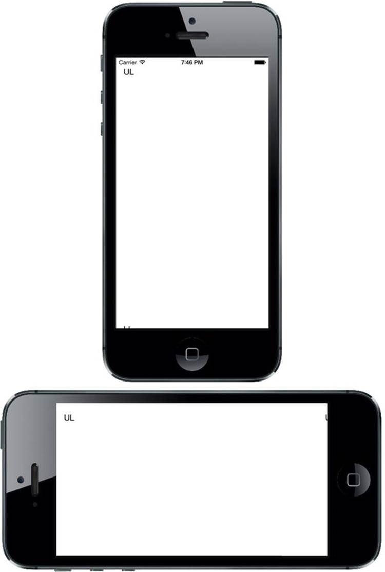
Figure 5-5. So far, not so good. What happened?
As you can see, things aren’t looking so good. The top-left label is in the right spot after rotating, but all of the others are in the wrong places and some of them aren’t visible at all! What’s happened is that every object has maintained its distance relative to the upper-left corner of the view in the storyboard.
What we really want is to have each label sticking tightly to its nearest corner after rotating. The labels on the right should shift horizontally to match the view’s new width, and the labels on the bottom should move vertically to match the new height instead of disappearing off the bottom edge. Fortunately, we can easily set up constraints in Interface Builder to make these changes happen for us.
In fact, as you’ve seen in earlier chapters, Interface Builder is smart enough to examine this set of objects and create a set of default constraints that will do exactly what we want. It uses some rules of thumb to figure out that if we have objects near edges, we probably want to keep them there. To make it apply these rules, first select all four labels. You can do this by clicking one label, and then holding down the Shift or key while clicking each of the other three. With all of them selected, choose Editor Resolve Auto Layout Issues Add Missing Constraints from the menu (you’ll find there are two menu items with this name—in this case, you can use either of them). Next, just press the Run button to launch the app in the simulator, and then verify that it works.
Knowing that this works is one thing, but to use constraints like this most effectively, it’s pretty important to understand how it works, too. So, let’s dig into this a bit. Back in Xcode, click the upper-left label to select it. You’ll notice that you can see some solid blue lines attached to the label. These blue lines are different from the dashed blue guidelines you see when dragging objects around the screen (see Figure 5-6).
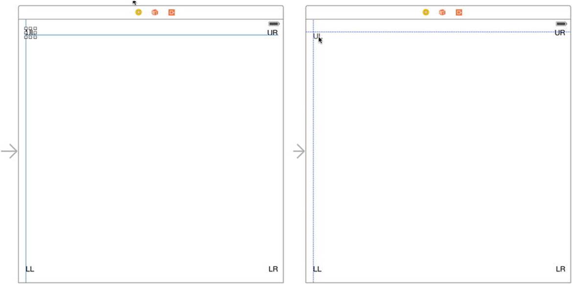
Figure 5-6. On the right, the dashed blue lines help you line up objects while you’re dragging. On the left, the solid blue lines show constraints that are configured for the chosen object
Each of those solid blue lines represents a constraint. If you now press  5 to open the Size Inspector, you’ll see that it contains a list of constraints. Figure 5-7 shows a typical set of constraints, but the constraints that Xcode creates depends on exactly where you placed the labels, so you may see something different.
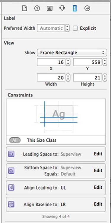
Figure 5-7. Four constraints generated by Xcode to pin a label in its parent view
In this case, two of the constraints deal with this label’s position relative to its superview, the container view: it specifies the leading space, which generally means the space to the left, and the bottom space (i.e., the space below the label). These constraints cause the label to maintain the same distance to the bottom and left edges of its superview when the superview’s size changes, as it does when the device is rotated. The other two constraints are attached to two of the other labels and work to keep them lined up with this label. Examine each of the other labels to see what constraints they have and make sure that you understand how those constraints work to keep the four labels in the corners of their superview.
Note that in languages where text is written and read from right to left, “leading space” is on the right, so a leading constraint may cause a GUI to be laid out in the opposite direction if the user has picked a language such as Arabic for their device. For now, let’s just act as if “leading space” means “left space.”
Overriding Default Constraints
Grab another label from the library and drag it over to the layout area. This time, instead of moving toward a corner, drag it toward the left edge of your view, lining up the label’s left edge with the left edges of the other labels on the left side, and centering it vertically in the view. Dashed lines will appear to help you out. Figure 5-8 shows you what this looks like.
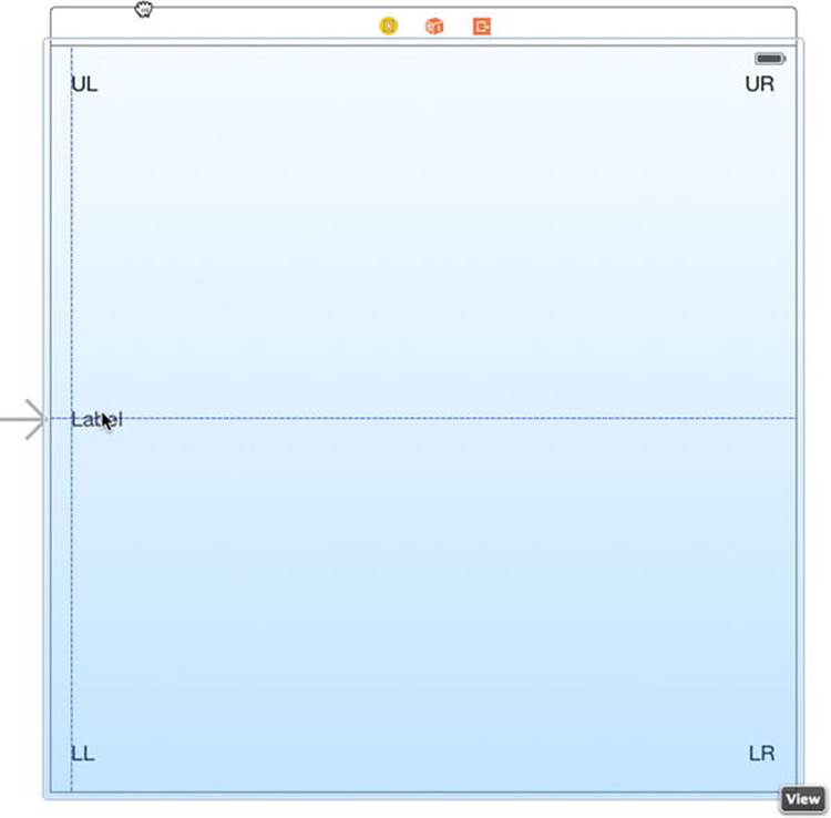
Figure 5-8. Placing the Left label
After placing the left label, give it a title like “Left.” Press R to run your app in the simulator. Rotate it to landscape mode and you’ll see that the left label maintains its distance from the top, placing it a long way below the center (see Figure 5-9). Oops!
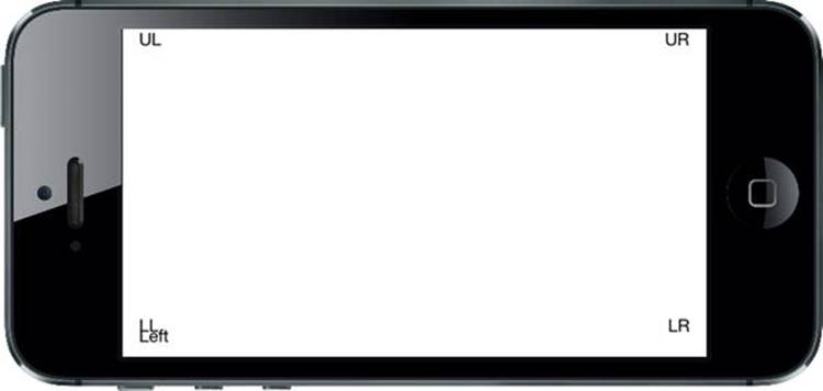
Figure 5-9. The Left label is not where it should be!
We need to create a new constraint to make this work, so go back to Xcode and select the left label in your storyboard. Adding a constraint to force this label to stay vertically centered is really easy—just select Editor Align Vertical Center in Container. When you do this, Xcode creates a new constraint and immediately selects the new constraint itself in the editor view. This is slightly confusing, but don’t worry! Just click the label again to select it. Make sure the Size Inspector is on display by pressing  5, and you’ll see that this label now has a constraint aligning its center Y value to that of its superview. The label also needs a horizontal constraint. You can add this by making sure the label is selected and then choosing Editor Resolve Auto Layout Issues Add Missing Constraints. Press R to run the app again. Do some rotating and you’ll see that all the labels now move perfectly into their expected places. Nice!
Now, let’s complete our ring of labels by dragging out a new one to the right side of the view, lining up its right edge with the other labels on the right, and aligning it vertically with the Left label. Change this label’s title to Right, and then drag it a bit to make sure its right edge is vertically aligned with the right edges of the other two labels, using the dashed blue line as your guide. We want to use the automatic constraints that Xcode can provide us with, so select Editor Resolve Auto Layout Issues Add Missing Constraints to generate them.
Build and run again. Do some rotating again and you’ll see that all the labels stay on the screen and are correctly positioned relative to each other (see Figure 5-10). If you rotate back, they should return to their original positions. This technique will work for a great many applications.
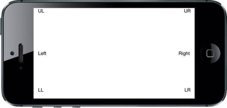
Figure 5-10. The labels in their new positions after rotating
That’s all fine, but we can do a lot more with just a few clicks! Let’s say that we’ve been struck by a great visionary idea and decide that we want the two uppermost labels, UL and UR, to form a sort of header, filling the entire width of the screen. With a bit of resizing and some constraints, we’ll sort that out in no time.
Full-Width Labels
We’re going to create some constraints that make sure that our labels stay the same width as each other, with tight spacing to keep them stretched across the top of the view even when the device rotates. Figure 5-11 shows what we’re shooting for.
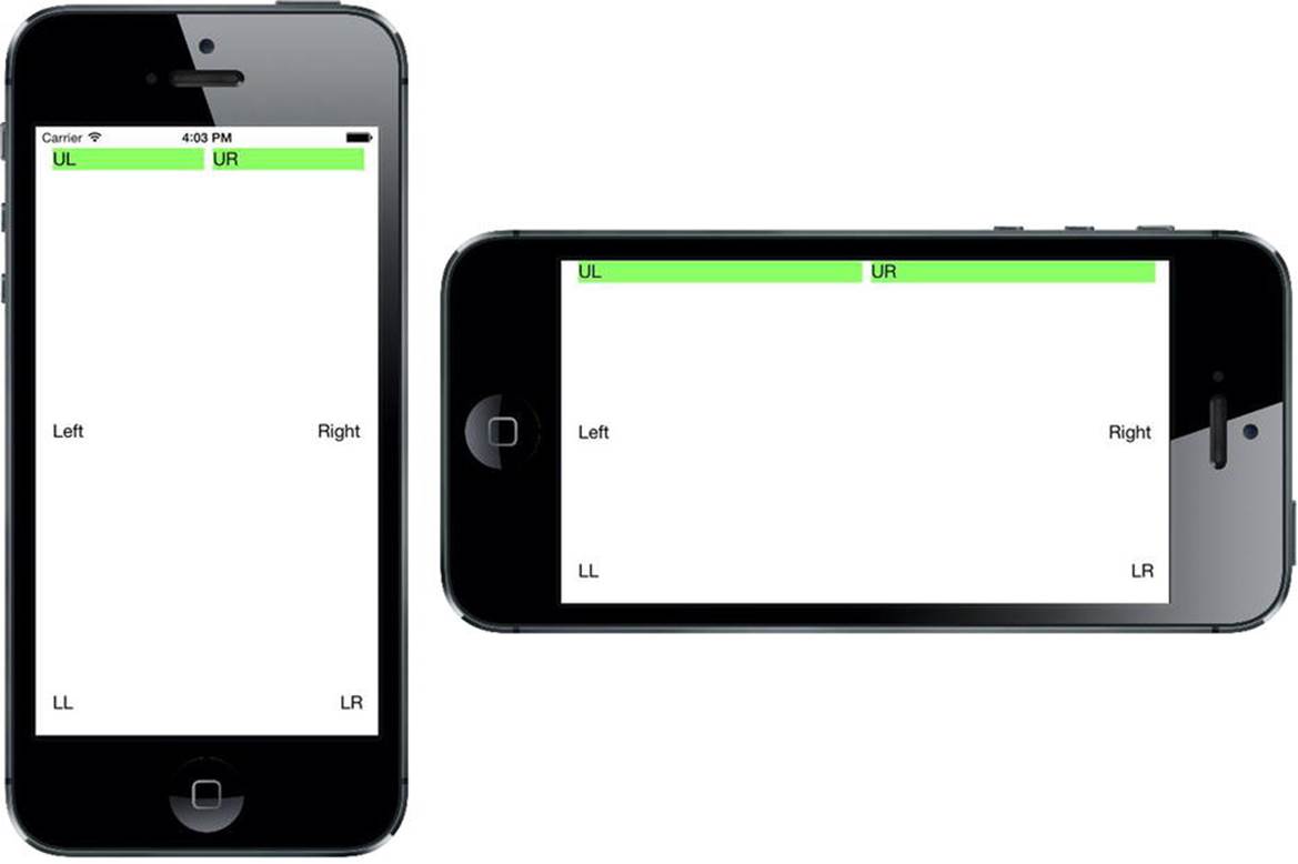
Figure 5-11. The top labels, spread across the entire width of the display, in both portrait and landscape orientations
The hardest part about this is being able to visually verify that we’ve got the result we want, where each label is precisely centered within its half of the screen. In order to make it easier to see whether we’ve got it right, let’s temporarily set a background color for the labels. In the storyboard, select both the UL and UR labels, open the Attributes Inspector, and scroll down to the View section. Use the Background control to select a nice, bright color. You’ll see that the entire frame of each label fills with the color you chose.
Now, direct your attention to the UL label and drag the resizing control on its right edge, pulling it almost to the horizontal midpoint of the view. You don’t have to be exact here, for reasons that will become clear soon. After doing this, resize the UR label by dragging its left-edge resizing control to the left until you see the dashed blue guideline appear, which tells you that it’s the recommended width from the label to its left. Now we’ll add a constraint to make these labels fill the whole width of their superview. Select both the UL and UR labels, and then select Editor Pin Horizontal Spacing from the menu. That constraint tells the layout system to hold these labels beside one another with the same horizontal space they have right now. Build and run to see what happens. You’ll probably see something like Figure 5-12.
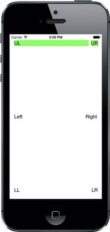
Figure 5-12. The labels are stretched across the display, but not evenly
That’s pretty close, but not really what we had in mind. So what’s missing? We’ve defined constraints that control each label’s position relative to its superview and the allowed distance between the two labels, but we haven’t said anything about the size of the labels. This leaves the layout system free to size them in whatever way it wants (which, as we’ve just seen, can be quite wrong). To remedy this, we need to add one more constraint.
Make sure the UL label is selected, and then hold down the Shift key ( ) and click the UR label. With both labels selected, you can make a constraint that affects both of them. From the menu, select Editor Pin Widths Equally to make the new constraint. You’ll now see a new constraint appear, and just like before, it’s automatically selected, as shown in Figure 5-13. You may also note that if the two labels weren’t exactly the same width before you created this constraint, they certainly are now, as the existence of this new constraint snaps them into place. You’ll also notice that the constraints are colored orange; this means that the current positions of the labels in the storyboard do not match what you will see at runtime. To fix this, select Editor Resolve Auto Layout Issues Update Frames. The constraints should change to blue.
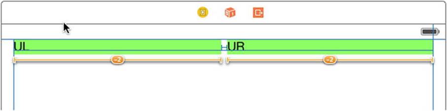
Figure 5-13. The top labels are now made equal in width by a constraint
If you run again at this point, you should see the labels spread across the entire screen, in both portrait and landscape orientations (see Figure 5-11).
In this example, all of our labels are visible and correctly laid out in multiple orientations; however, there is a lot of unused space on the screen. Perhaps it would be better if we also set up the other two rows of labels to fill the width of the view or allowed the height of our labels to change so that there will be less empty space on the interface? Feel free to experiment with the constraints of these six labels and perhaps even add some others. Apart from what we’ve covered so far, you’ll find more actions that create constraints in the Editor Pin menu. And if you end up making a constraint that doesn’t do what you want, you can delete it by selecting it and pressing the Delete key, or try configuring it in the Attributes Inspector. Play around until you feel comfortable with the basics of how constraints work. We’ll use them constantly throughout the book; but if you want the full details, just search for “Auto Layout” in Xcode’s documentation window.
Creating Adaptive Layouts
The layout for the simple example that we just created works well in portrait and landscape orientations and it also works on iPhones and iPads, despite the difference in screen dimensions between these devices. In fact, as already noted, handling device rotation and creating a user interface that works on devices with different screen sizes are really the same problem—after all, from the point of view of your application, when the device rotates, the screen effectively changes size. In the simplest cases, you handle both by assigning Auto Layout constraints to make sure that all of your views are positioned and sized where you want them to be. However, that’s not always possible. Some layouts work well when the device is in portrait mode, but not so well when it’s rotated to landscape; and similarly, some designs suit the iPhone but not the iPad. When this happens, you really have no choice but to create separate designs for each case. Prior to iOS 8, this meant either implementing your whole layout in code, having multiple storyboards, or a combination of the two. Fortunately, with iOS 8 and Xcode 6, Apple has made it possible to design adaptiveapplications that work in both orientations and on different devices while still using only a single storyboard. Let’s take a look at how this works.
The Restructure Application
To set the scene, we’ll design a user interface that works well for an iPhone in portrait mode, but not so well when the phone is rotated or when the application runs on an iPad. Then we’ll see how to use the new tools in Xcode 6 to adapt the design so that it works well everywhere.
Start by making a new Single View project like you’ve done before, naming this one Restructure. We’re going to construct a GUI that consists of one large content area and a small set of buttons that perform various (fictional) actions. We’ll place the buttons at the bottom of the screen and let the content area take up the rest of the space, as shown in Figure 5-14.
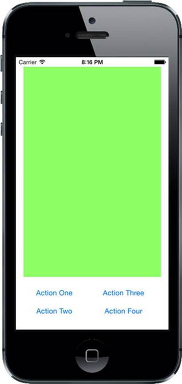
Figure 5-14. The initial GUI of the Restructure app, in portrait orientation on the iPhone
Select Main.storyboard to start editing the GUI. Since we don’t really have an interesting content view we want to display, we’ll just use a large colored rectangle. Drag a single UIView from the Object Library into your container view. You’ll notice as you do so that it expands to fill your container view completely, which is really not what we want. While it’s still selected, resize it so that it fills the top three-quarters or so of the available space, leaving a small margin above it and on both sides, as shown in Figure 5-15. Next, switch over to the Attributes Inspector and use theBackground pop-up to pick some other background color. You can choose anything you like, as long as it’s not white, so that the view stands out from the background. In the storyboard in the example source code archive, this view is green, so from now on we’ll call it the green view.
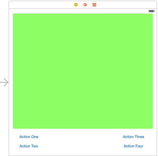
Figure 5-15. The basic portrait layout for the Restructure view
Drag a button from the Object Library and place it in the lower left of the empty space below the green view. Double-click to select the text in its label, and change it to Action One. Now Option-drag three copies of this button and place them in two columns, like those in Figure 5-15. You don’t have to line them up perfectly because we’re going to use constraints to finalize their positions, but you should try to place the two button groups approximately equal distances from their respective sides of the containing view. Change their titles to Action Two, Action Three, and Action Four. Finally, drag the lower edge of the green view downward until it’s a little way above the top row of buttons. Use the blue guidelines to line everything up, as shown in Figure 5-15.
Now let’s set up the Auto Layout constraints. Start by selecting the green view. We’re going to start by pinning this to the top and to the left and right sides of the main view. That’s still not enough to fully constrain it because its height isn’t specified yet; we’re going to fix that by anchoring it to the top of the buttons, once we’ve fixed the buttons themselves. Click the Pin button at the bottom right of the storyboard editor. At the top of the pop-up, you’ll see the now familiar group of four input fields surrounding a small square. Leave the Constrain to margins check box checked. Click the red dashed lines above, to the left, and to the right of the small square to attach the view to the top, left, and right sides of its superview. Click Add 3 Constraints.
Next, hold down the Shift key and click to select both the Action One and Action Two buttons. Click the Align button, check Horizontal Centers in the pop-up, and then click Add 1 Constraint. This fixes these two buttons in a column. Repeat this procedure with the Action Three andAction Four buttons.
Select the Action Two button again and open the Pin pop-up. With Constrain to margins checked, select the red dashed lines to the left of, above, and below the square at the top of the pop-up, and then click Add 3 Constraints. These constraints fix this button in the lower-left corner of the main view and sets the vertical distance between it and the Action One button. The positions of both of these buttons are now fully specified. Now do something similar with the other column of buttons. Leaving Constrain to margins checked, select Action Four, and open the Pin pop-up. Select the dashed lines below, above, and to the right of the square, and then click Add 3 Constraints.
All that’s left is to fix the position of the bottom of the green view relative to the buttons. To do that, Control-drag from the green view to the Action One button and release the mouse. In the pop-up, select Vertical Spacing. That’s all the constraints we need. If there are any warnings in the Activity View, select the view controller in the Document Outline and choose Editor Resolve Auto Layout Issues Update Frames in the menu bar. If this doesn’t work, or the layout isn’t as it should be, go back over the preceding steps to figure out which of your constraints is wrong or missing.
Build and run the application in an iPhone simulator. If you got all your constraints right, you should see something like Figure 5-14. Now rotate the simulator to the right to see what happens to the layout (see Figure 5-16).
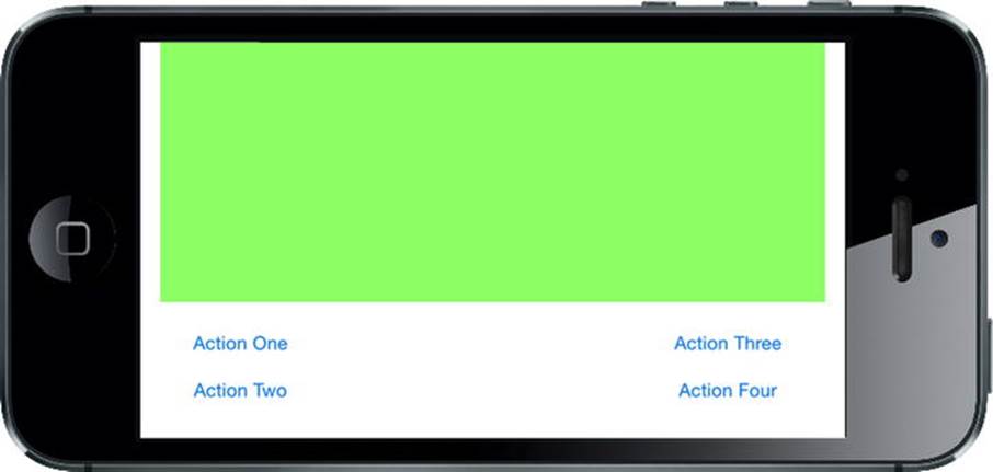
Figure 5-16. Rotating the Restructure application to landscape orientation. Not bad, but could be better
That doesn’t look too bad—the green view resized properly and we can see all of the views. This arrangement might work, but we can do better. There is a lot of white space at the bottom around the buttons. And the long, thin green view might not be so good if it were a UIImageView—either the image would be stretched, or it would be lost in the middle of the view, depending on the mode property of the UIImageView. How about the iPad? Try it out for yourself (see Figure 5-17).
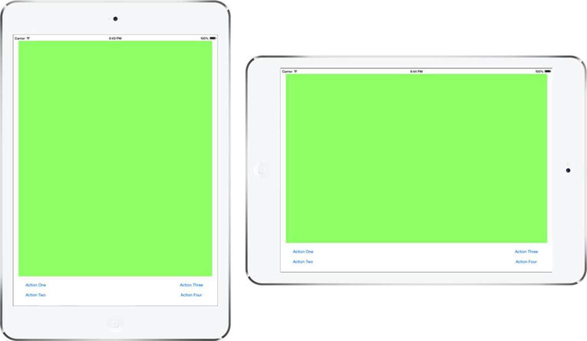
Figure 5-17. Running the Restructure application on the iPad
Once again, the layout adapts very well, but we still have the problem of the extra white space between the buttons. This is a perfect example of a layout that needs to be modified for different screen sizes (and therefore different orientations). We’re actually going to create two extra variants of this layout—one that we’ll use for the iPhone in landscape orientation and the other for the iPad. You can see what we’re aiming for in Figure 5-18.
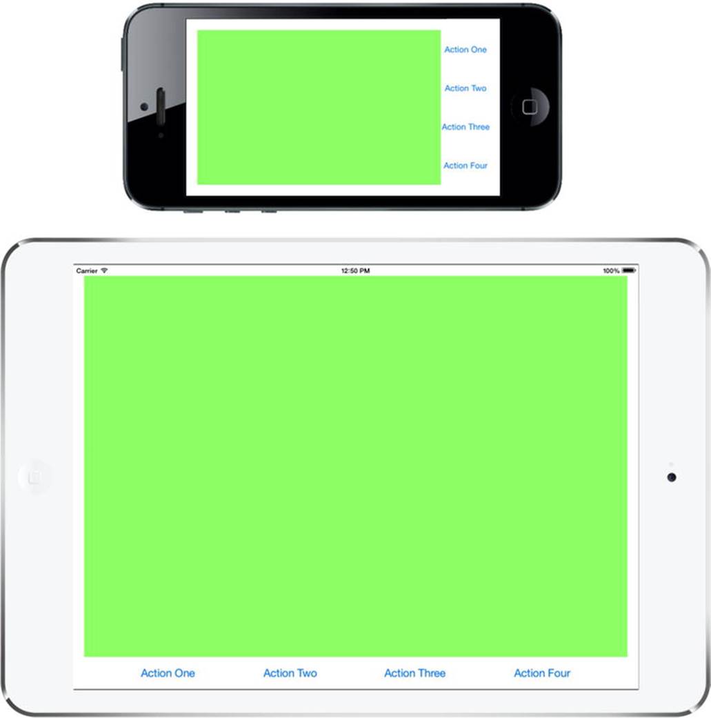
Figure 5-18. Modifying the Restructure application for the iPhone in landscape and for the iPad
To create these two different layouts, we need two more sets of constraints. We can do that while still using only one storyboard, thanks to a new feature in iOS 8 called Size Classes.
Size Classes
Take a look at the bottom of the storyboard editor. In the toolbar, you’ll see a control that we haven’t mentioned so far. It’s called the Size Classes control and it looks like a label with the text “wAny hAny”. Click this control and a pop-up containing a grid with nine cells will appear, as shown in Figure 5-19. We’ll be using this control to help us create our two extra sets of constraints, but first we need to explain what size classes are all about.
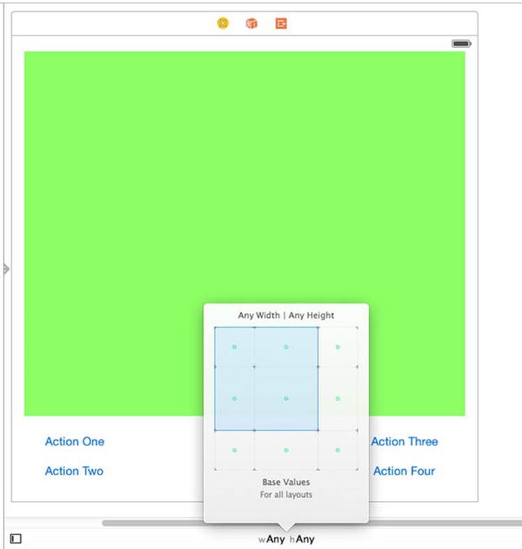
Figure 5-19. The Size Classes control
The cells in the grid correspond to different combinations of horizontal (width) and vertical (height) size classes. A size class is a loose classification of the width or the height of a device. There are two concrete size classes—Compact and Regular—that are used to describe real devices, and a third—Any—that can be used in the designer (and in code) as a wildcard, matching either Compact or Regular. Table 5-1 shows how the four possible combinations of concrete horizontal and vertical size classes map to devices and their orientations.
Table 5-1. Mapping of size classes to device and orientation
|
Width |
Height |
Device and Orientation |
|
Compact |
Compact |
All iPhones apart from iPhone 6 Plus, in landscape. |
|
Compact |
Regular |
All iPhones in portrait. |
|
Regular |
Compact |
iPhone 6 Plus in landscape. |
|
Regular |
Regular |
All iPads in both landscape and portrait. |
In general, Compact implies something smaller than Regular, but there are a couple of interesting points to note:
· In portrait, iPhones have compact width and regular height, which makes sense because the width is less than the height in this orientation. However, when rotated to landscape, the size class of both dimensions is compact, whereas you might have expected regular width and compact height. The exception to this is the larger iPhone 6 Plus, which does indeed have regular width and compact height. This illustrates that you need to consider both size classes when making layout decisions.
· iPads have regular width and height size classes in both landscape and portrait orientations. That means that you can’t use size classes alone to determine the orientation of the iPad. In many cases, however, this won’t matter; because the screen of the iPad is relatively large and much closer to square than that of an iPhone, you can often use the same layout in both portrait and landscape orientations.
Figure 5-20 shows a pictorial representation of the information in Table 5-1, which you may find useful to refer to while we modify the Restructure application.
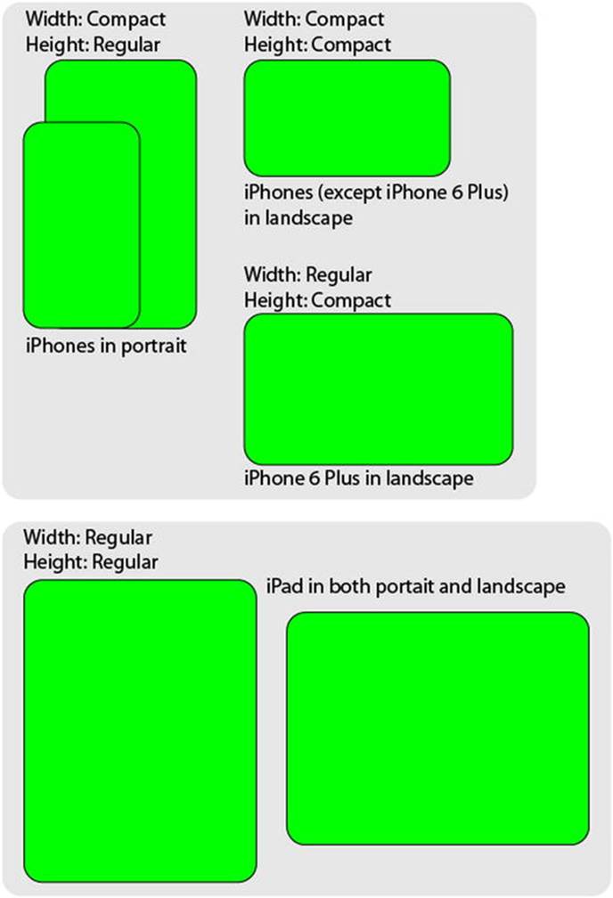
Figure 5-20. A pictorial representation of size class combinations
Size Classes and Storyboards
Now that you know what size classes are, let’s return to the Restructure application. Look again at the Size Classes control in the storyboard editor. By default, it’s set to wAny hAny. That means that the design in the storyboard editor applies to devices with any width and height size classes. We’ll refer to this as the base design. You should always start out by creating the base design. Once you’ve done that, you can derive any other designs you need by modifying the base design. You can modify the design to suit a particular combination of size classes without affecting the base design by selecting that combination in the Size Classes control. We already know that we need two additional designs for the Restructure application—one for iPhones in landscape, the other for iPads. Let’s start by creating the landscape iPhone design, which is shown at the top in Figure 5-18.
The first question to ask is: Which size class combination or combinations correspond to the layout that we’re about to design? For all iPhones—apart from iPhone 6 Plus—that would be compact width, compact height, which translates to a Size Classes control setting of wCompact, hCompact. However, we want to use the same design for the iPhone 6 Plus, which maps to wRegular, hCompact instead. Putting those two together, we need to implement a design that works for any width and compact height. We can do that by using the pseudo size class Any for the width. Click the Size Classes control to open the pop-up, and then move your mouse over the squares in the grid. As you do so, the blue rectangle changes shape and the description changes to indicate the corresponding combination of size classes and the matching devices and orientations. We need to select wAny, hCompact, which corresponds to the leftmost two squares on the top row of the grid, as shown in Figure 5-21. The description at the bottom of the pop-up confirms that we have the correct selection.
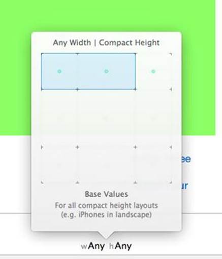
Figure 5-21. Selecting wAny, hCompact in the Size Classes control
To actually make the selection, click the rightmost blue square in the grid. You’ll see that the Size Classes control updates and the toolbar changes color to indicate that you are no longer editing the base design. The shape of the view controller area in the storyboard also changes to look more like a landscape iPhone, as shown in Figure 5-22.
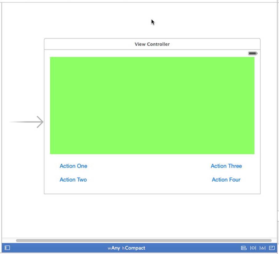
Figure 5-22. The storyboard editor updated to work with the wAny, hCompact size class combination
There are three things that you can do to modify the design for any given combination of size classes. The changes that you make apply only to devices and orientations that map to the current size class combination:
· You can add, remove, or modify constraints.
· You can add or remove views.
· You can change the font of some of the UIKit controls (in iOS 8, UILabel, UITextField, UITextView, and UIButton support this).
The design that we’re working with is so different from the base design that we’ll need to remove all of the existing constraints, since all of the views need to change position. Before we make any changes, with the storyboard selected, open the Assistant Editor and select Preview in the jump bar, and then open a preview of the storyboard, showing the iPhone in portrait orientation. We’ll use this preview to make sure that the changes that we are about to make don’t affect the base design.
Creating the iPhone Landscape Layout
Let’s start making changes. In the storyboard, resize the green view so that it’s positioned on the left side of the main view, leaving room for the column of four buttons that we’re going to build on the right (see Figure 5-23).
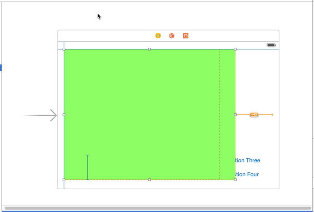
Figure 5-23. Changing the position and size of the green view for iPhones in landscape orientation
Next, we need to move the four buttons into place. As things stand now, you might find it difficult to drag the two buttons on the left, because they may be covered by the green view. So let’s first get the green view out of the way by temporarily resizing it again. Drag the bottom of the green view upward until you can see all of the buttons, and then drag the Action One and Action Two buttons over to the empty area on the right, without worrying too much about exact placement for the moment. Once you’ve done that, select the green view again and drag it back to the location shown in Figure 5-23. Once again, check the Preview Assistant to make sure that the portrait design is unaffected. You should make it a habit to do this every time you make a change, so that you can quickly fix anything that goes wrong.
Warning If something does go wrong, don’t attempt to fix it by making more changes—instead, use Z to undo as many steps as necessary to get back to an earlier version of the layout that was correct, and then try again.
Currently, the green view and the buttons all have constraints that link them to each other and to the sides of the main view. We need to replace all of these constraints with new ones. You might be tempted to do this by selecting them in the Document Outline and deleting them, but that would be a mistake—deleting constraints removes them from the design for all size class combinations. Instead of deleting them, you need to uninstall them for the size class combination that you’re editing.
Select the Action One button in the storyboard and open the Size Inspector, where you’ll find the three constraints that currently apply to this button (see the left of Figure 5-24).
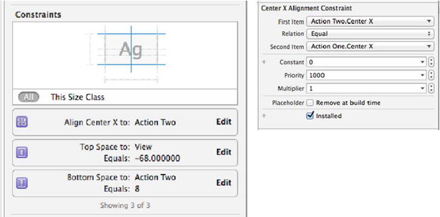
Figure 5-24. Viewing a constraint in the Size Inspector
Double-click the top constraint to show the details (see the right of Figure 5-24). At the bottom, you’ll see an Installed check box that’s currently checked. We need to uninstall the constraint for this design. To do that, press the + button to the left of the check box and select Any Width | Compact Height in the pop-up that appears. This adds a new check box that applies to the wAny hCompact layout only. Clear this check box to uninstall the constraint for this combination of size classes while leaving it installed for the base design, as shown on the left of Figure 5-25.
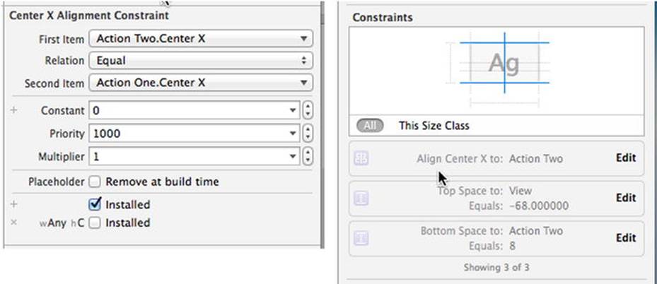
Figure 5-25. Uninstalling a constraint from the wAny hCompact layout
Back in the storyboard, you’ll notice that the constraint disappears and it’s also grayed out in the Document Outline and in the Size Inspector. Repeat this procedure for all of the constraints attached to the four buttons and the green view. You can check that you have cleared all the constraints by selecting each button and checking that they are all grayed out in the Size Inspector (see the right of Figure 5-25).
Now let’s add the constraints that we need for the new design, starting with the green view. We need to pin this view to the top, left, right, and bottom edges of the main view. To do that, select the green view in the Document Outline (it’s the one that has the same level of nesting as the Action buttons) and click the Pin button. In the pop-up menu, uncheck Constrain to margins, and then click the dashed red lines above, below, and to the left of the square, but do not click the line to the right. In the input fields at the above, below, and to the left of the square, enter 20 and then click Add 3 Constraints (see Figure 5-26).
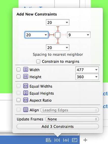
Figure 5-26. Fixing the position of the green view in landscape mode
To fix the right side of the green view, Control-drag from its center to the right until the main view’s background turns blue. Release the mouse and click Trailing Space to Container Margin.
Next, we need to arrange the four buttons in a column, so drag them into roughly the layout that we need (refer back to Figure 5-18 if necessary). At this point, we can’t make the buttons line up exactly in the storyboard because we don’t have all the constraints that we need, so continue to ignore all of the Auto Layout warnings for now. Your layout should now look like Figure 5-27.
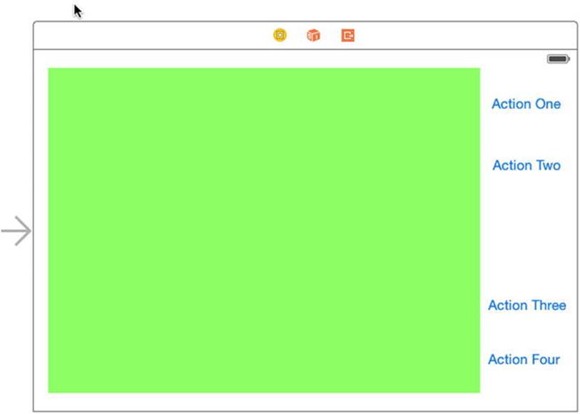
Figure 5-27. The buttons in a column to the right of the green content view
We now need to position the buttons vertically and horizontally. We’d like the buttons to be horizontally centered in their column and to be equally spaced vertically. There’s no easy way to do that by applying constraints to the buttons using Interface Builder, since there’s no way to say something like “make this vertical gap between these two buttons the same height as the gaps between the other buttons,” which is what we really need. However, we can constrain views to be of equal height—and that gives us a way to get what we need. We’re going to add hidden filler views in the gaps between the buttons, and force those hidden views to take up all of the available space and to be of equal heights. That’s the same as making the gaps all the same size. We can use the same hidden views to center the buttons horizontally as well. We’ll make the hidden views occupy all the horizontal space in the button column, and then we’ll make their centers and the centers of the buttons align along the same vertical line. If you don’t have the plan clear in your mind, take a sneak peek ahead at Figure 5-28, where the filler views are shown in gray. Neat, huh?
Let’s get started. I suggest you make a copy of your project at this point so that you can revert to it if things don’t work out as you follow the instructions in the next few paragraphs. Although what we’re doing is quite simple, there are a lot of steps and it’s easy to go wrong.
Let’s first create the filler views. Grab a UIView from the Object Library and drop it on top of the green view. Resize it so that it’s small enough to fit into the gaps between the buttons, both horizontally and vertically. Its height should be no more than 10 pixels. Use the Attributes Inspector to give it a gray background so that we can see it more easily. Now drag and resize this view so that it fits between the top of the Action One button and the bottom of the status bar, as shown on the left of Figure 5-28. Make sure that the top of this view is below the top of the green view and that the bottom is above the top of the Action One button. There must be no overlap at all. Select the Action One button so that you can see its outline to make sure of this. Another way to check this is to make the bounds rectangles of every view visible by selecting Editor Canvas Show Bounds Rectangles. This setting is a toggle, so select it again to switch it off when you have finished.
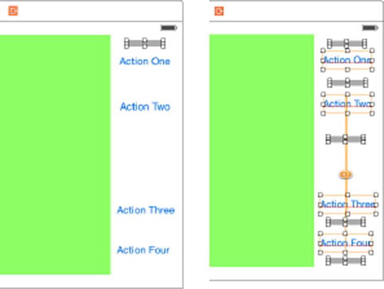
Figure 5-28. Adding filler views to the button column
With the filler view selected, hold down the Option () key and drag downward to create another copy. Place it between the Action One and Action Two buttons, again with no overlap. Repeat the process until you have a filler view between every pair of buttons, and between the bottom button and the bottom of the main view, as shown on the right in Figure 5-28. As before, make sure there is no vertical overlap between each filler view and the buttons above and below it, selecting each button in turn (or enabling Editor Canvas Show Bounds Rectangles again) and inspecting its frame outline to make sure.
Note The filler views that you just added will appear only on the iPhone in landscape mode because we added them while designing for the wAny hCompact combination.
Select all of the filler views and click the Pin button. In the pop-up, check Equal Widths and Equal Heights, and then click Add 8 Constraints. The fillers will now all be the same height and width at runtime.
Next, let’s make the filler views occupy all of the available horizontal space. We only need to make one of them do that, since all the other ones are constrained to be the same width. Select the top filter view and click the Pin button. In the pop-up, click the dashed red lines to the left and right of the square. Enter 0 in the left and right input fields, and then click Add 2 Constraints. These constraints force the filler view to link to the green view on its left and to the right margin of the main view on its right, thereby spanning the whole column.
We also need to align the centers of the filler views and the buttons in one vertical line. That’s easy to do: just select all of the filler views and all of the buttons, press the Align button, check Horizontal Centers, and click Add 8 Constraints.
We are almost done. The final step is to make sure that the filler views take up all the vertical space between the buttons, and between the top and bottom buttons and the main view. We do that by forcing the vertical spacing between each pair of these views to be zero.
Select all of the filler views and click the Pin button. In the pop-up, clear the Constrain to margins check box. Click the red dashed lines above and below the square. Enter 0 in the input fields above and below the square, and then click Add 10 Constraints.
Now we can finally see the results of all this work. In the Document Outline, click the view controller, and then choose Editor Resolve Auto Layout Issues Update Frames. You should see the result shown in Figure 5-29. If you don’t get the correct result, revert to the saved copy of your project and try again. If you see that the filler views overlap vertically, you probably haven’t properly separated them from the buttons.
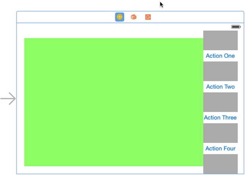
Figure 5-29. The iPhone landscape layout, including the filler views
To finish this layout, select each of the filler views in turn and check the Hidden property in the Attributes Inspector, and then run the example in the iPhone simulator to verify that the layout is correct in both portrait and landscape modes, and that it also works for the iPhone 6 Plus. You can see what it is supposed to look like in Figure 5-18.
Next, we’re going to add the iPad layout, but before we do so, now would be a good time to make another backup copy of your project, in case you need to revert while following the next set of instructions.
Adding the iPad Layout
To add the iPad layout to the storyboard, we need to switch the editor to the correct combination of size classes. Click the Size Classes control and click in the bottom-right corner of the grid to select Regular Width | Regular Height. The view controller in the editing area should switch to a square outline. Before we make any changes, in the Assistant Editor, use the jump bar to open a preview of the storyboard (if it’s not already open) and add another iPhone four-inch preview, this time in landscape mode. We’ll use this and the existing portrait preview to make sure that our changes for iPad do not affect the iPhone layouts.
The constraints for our new layout are inherited from the base design. As was the case when we constructed the iPhone landscape layout, we need to delete all of the inherited constraints. It’s not always necessary to do this—sometimes you can keep some or even all of the constraints from the base design. In this case, though, it’s easier to see what we’re doing if we remove them. To do this, proceed as you did before: open the Size Inspector and then select each of the enable constraints in the Document Outline in turn. For each constraint, add a new entry in the Size Inspector for Regular Width | Regular Height (wR hR), marking it as not installed. You don’t need to make any changes to the constraints that are grayed out because those belong to the iPhone landscape design, and therefore do not apply to this layout.
Next, we’ll pin the top, left, and right sides of the green view in their correct positions. We won’t fix the bottom of the view yet because we’re going to move it downward shortly. Select the green view and click the Pin button. At the top of the pop-up, click the dashed red lines above, to the left, and to the right of the square, and then click Add 3 Constraints.
For the iPad, we’re going to arrange the four buttons in a single row underneath the green view, and because there’s more space available, we’ll make the button text larger. Let’s do that now before we start moving things around.
Select the Action One button, open the Attribut, es Inspector, and locate the Font property. Any changes you make to the font will apply to all size classes, which is not what we want. To make a change for the current design only, click the + button to the left of the Font field and selectRegular Width | Regular Height from the pop-up to add a new Font field labeled wR hR (see Figure 5-30). Click the T in the Font field and change the font size from 15 to 20.
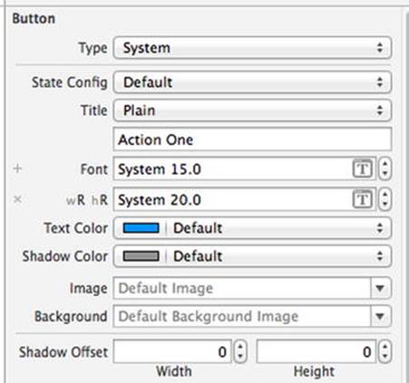
Figure 5-30. Changing the font of a button for iPad only
Apply the same change to the other three buttons. Since we are making this font change while designing for the size class combination wR hR, it applies only to iPads. Check the iPhone previews to see that this is the case.
Next, drag the four buttons to make a single row at the bottom of the main view, aligning the bottom edges of the buttons with the bottom blue layout guide, and resize each button so that you can see all of its text. Make sure that there is plenty of empty space to the left and right of each button. You don’t need to be too exact with this because Auto Layout will ensure that the buttons are properly sized at runtime. When you’ve done that, drag down the bottom of the green view so that it’s close to the tops of the buttons, as shown in Figure 5-31.
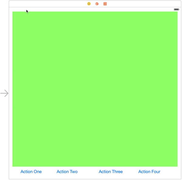
Figure 5-31. The buttons arranged in a single row at the bottom of the view
Now we can add a constraint to fix the bottom of the green view. Control-drag from the green view downward until the background of the main view turns blue, and then release the mouse and select Bottom Space to Bottom Layout Guide. The green view is now in its final position.
The next step is to add the constraints that will position the buttons. This is really the same problem as the one we solved when creating the iPhone landscape layout—we want the buttons to be equally spaced along the row. The only difference is the orientation. We’re going to use the same solution again: create filler views and add constraints that give them equal sizes. Start by dr, agging a UIView onto the green view. Use the Attributes Inspector to give it a gray background and resize it so that it’s small enough to fit into any of the gaps between the buttons, and then drag it so that it’s between the left side of the view and the Action One button, with no overlap. With the filler view selected, hold down the Option () key and drag to create another four filler views, placing one between each pair of buttons and one between the rightmost button and the right side of the main view, as shown in Figure 5-32. As before, select each button in turn to make sure there is overlap between the button frames (which are larger than the area occupied by the text) and the filler views.
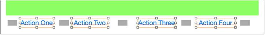
Figure 5-32. The filler views for the iPad layout. The buttons are selected to ensure that there is no overlap between the filler views and the buttons
To make all of the filler views the same size, select all of them and click the Pin button. And then in the pop-up, click Equal Widths and Equal Heights, followed by Add 8 Constraints. To make them all fill the available vertical space, select any filler view and click the Pin button again. At the top of the content menu, click the dashed red lines above the square. Enter 0 in the input fields at the top and bottom, and then click Add 2 Constraints. Since the filler views have the same height, they will now all fill the vertical space between the bottom of the green view and the bottom of the main view.
Next, we need to align the vertical centers of the fillers and the buttons. Select all of the filler views and all of the buttons, and then click the Align button. Check Vertical Centers and Add 8 Constraints.
To complete the layout, we need to make the filler views occupy all of the free horizontal space. This time, select all of the fillers and click the Pin button. At the top of the pop-up, uncheck Constrain to margins, and then click the red dashed lines to the left and right of the square. Enter 0 in the left and right input fields. Click Add 10 Constraints to apply the constraints.
With all the constraints added, we can have Xcode update the positions of the all of the views in the layout so that we can see the result. In the Document Outline, click the view controller, and then choose Editor Resolve Auto Layout Issues Update Frames. You should see the result shown in Figure 5-33.
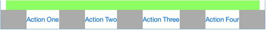
Figure 5-33. The four buttons equally spaced below the green view in the iPad layout
To finish up, select all of the filler views again, open the Attributes Inspector, and make sure that the Hidden property is checked. Run the application on the iPad simulator and verify that you get the correct result in both portrait and landscape orientations (see Figure 5-18). Rerun the application on the iPhone simulator to check that those layouts still work too.
Rotating Out of Here
In this chapter, you learned how to support rotation in your applications. You discovered how to use constraints to define view layout and you also saw how to restructure your views by creating multiple layouts in the storyboard to handle different screen sizes and device rotation.
In the next chapter, we’re going to start looking at true multiview applications. Every application we’ve written so far has used a single view controller and a single content view. A lot of complex iOS applications, such as Mail and Contacts, are made possible only by the use of multiple views and view controllers, and we’re going to look at exactly how that works in Chapter 6.
All materials on the site are licensed Creative Commons Attribution-Sharealike 3.0 Unported CC BY-SA 3.0 & GNU Free Documentation License (GFDL)
If you are the copyright holder of any material contained on our site and intend to remove it, please contact our site administrator for approval.
© 2016-2026 All site design rights belong to S.Y.A.