Practical Auto Layout: Beginning Auto Layout Techniques for iOS8 (2015)
Chapter 5. Size Classes
In our last chapter, We built a user interface that works the same for iPhone and iPad. It also works the same for each device in both landscape and portrait. What if we wanted to customize for different devices? Size classes let us customize certain devices or orientations for a different layout than this generic layout.
If you click the width and height size class button at the bottom you will get a popup with a bunch of squares on it. This allows you to set the size class you want to work with.
Different Size Classes
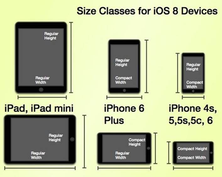
There are three sizes for size classes: compact, any, and regular. Any is the generic size that works with anything. Our current layout, is width:any height:any. This layout is for all cases. In general, compact size tends to describe iPhones and the iPod touch. For both width and height, iPad is the regular size. The width in landscape is regular for an iPhone 6 Plus, which can cause some confusion. iPhone 6 Plus acts like a iPhone in portrait but an iPad in landscape. All iOS devices look like this:
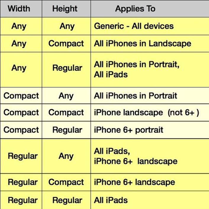
When you add any to compact and regular There are nine size classes the developer can use.
Changing Size Classes
As we'll discuss in the chapters that follow, any makes working with size classes a bit more generic, saving work. Usually our designs start in the width:any height:any size class, covering all cases. If we need a special design, then we use that specific size class.
Size classes change in the storyboard with the size class button found to the left of the auto layout buttons:
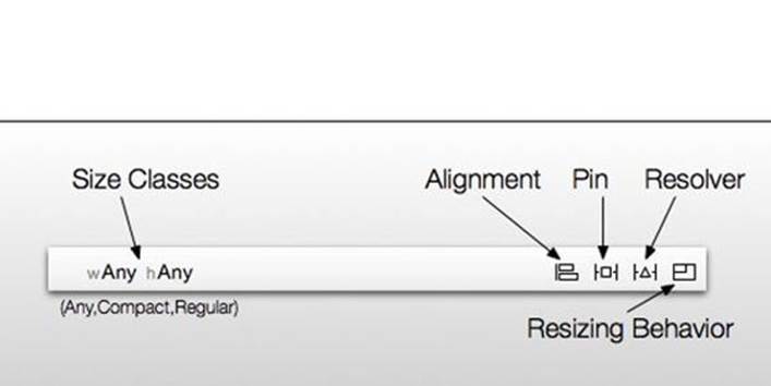
Click the wAny hAny button and you get a popover.
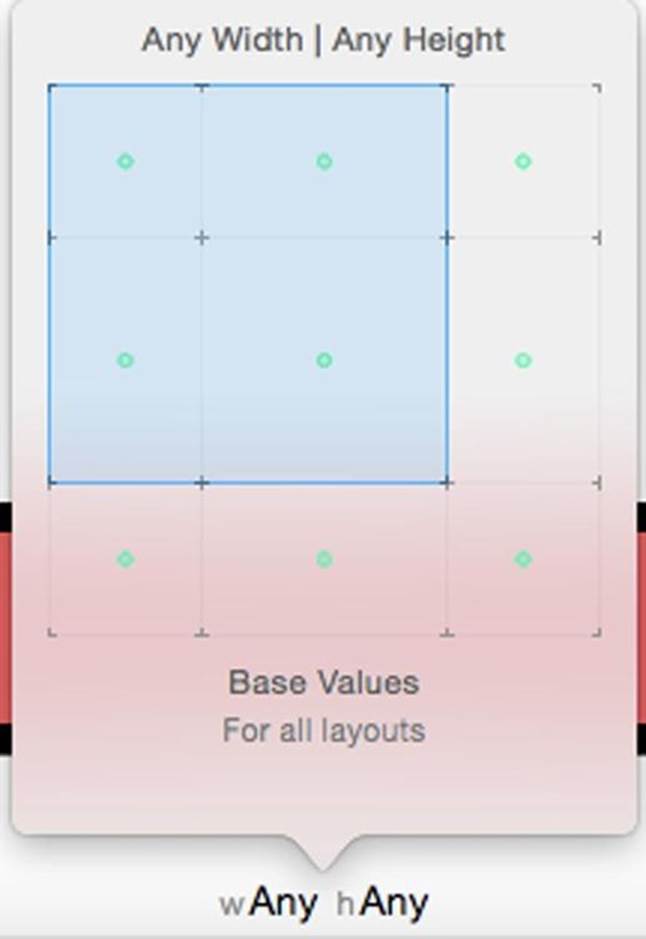
This is the generic default we used last chapter. Work from the most generic case to the most specific. By moving your cursor in the popover you change the shape of the shaded square. Move the cursor to the left side makes this:
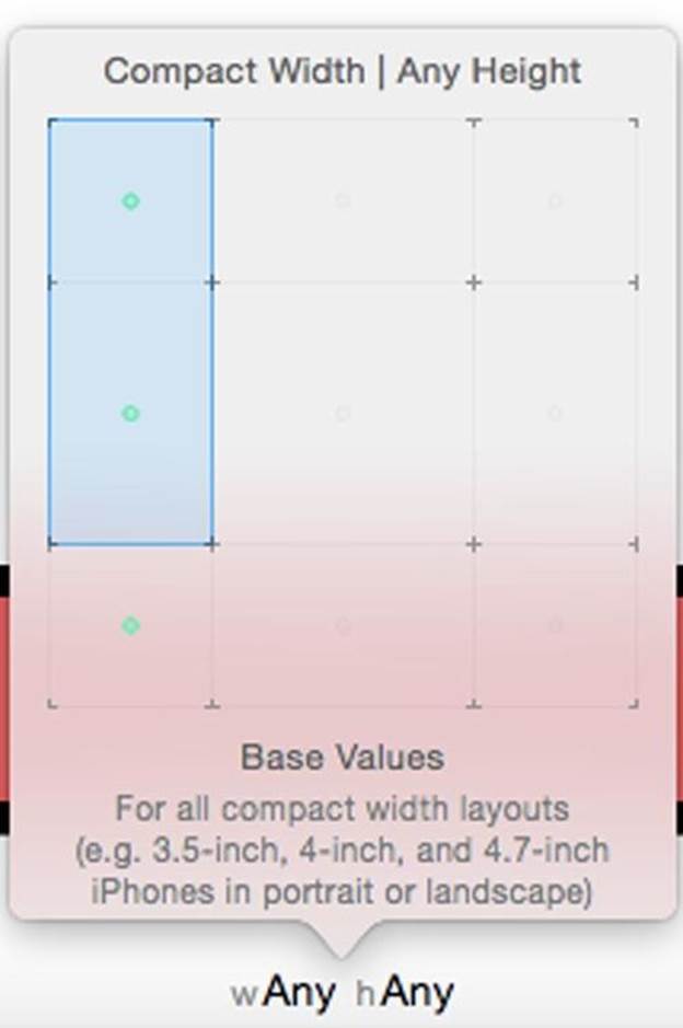
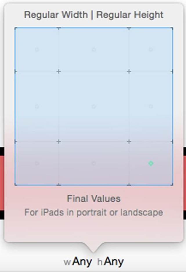
The popover tells you the device described by this size class below the squares. Above the squares the class size selected. This is the iPhone in portrait. Extending the square to the lower right gives us iPads in Portrait and landscape
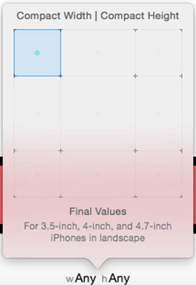
Similarly the smallest square is an iPhone 4,5,or 6,but not 6 plus in landscape:
Each time you use a new size class combination, the system makes a different layout for that case. You can come up with different layouts to fit things differently. While I did not do so in these examples, you can even change which views you add to the view.
Class Size Strategy
We could make a layout for every class size. We want to keep our workload as litte as possible. The wAny,hAny class size is the generic class size. Generally, we think of this as our layout for iPhone or iPad in portrait. If the layout works in landscape, we only have to use this one layout. However, it's likely the iPhone in landscape will need changes to the layout. If the generic layout doens't fit in landscape, Make at least a compact height, any width layout to cover all iPhones in landscape. Regular width devices like the iPad and the iPhone 6 plus in landscape have so much real estate we may end up with too much whitespace, and for this reason might need a few changes. Try to use the least number of variations of your generic view controller as possible. Doing so makes it less likely to get a conflicting constraint.
In the following chapters, we will start getting used to size classes visually on the storyboard, and add more techniques for using auto layout effectively. In each section we will set up a different class size. In the next chapter, we will make a iPhone landscape arrangement. We will change the location of the three buttons from above and below the text file to left side of the text field. In two chapters, we will make a different arrangement on the iPad. We'll move all three buttons to the top of the screen for both orientations. We'll then get specific with the curious case of the iPhone 6 plus and explore the problems of conflicting constraints.