Practical Auto Layout: Beginning Auto Layout Techniques for iOS8 (2015)
Chapter 6. Compact Width Class Size
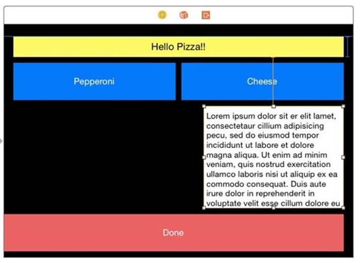
One of the most common variations of your generic layout will be for the iPhone in landscape, which is a compact height size class. Very often items will squeeze together and overlap in that short space if using your generic layout. Continuing the previous project, let's change the arrangement of the buttons in landscape on an iPhone to the left side and the text view on the right.
Setting Up the Project
If not already open, open the project from Section 2. Set up Xcode with the preview mode to have a 4 inch iPhone in landscape so we can check them as we go through the steps. If you have the file browser open, you may want to close it to give yourself more room. If you do not have it open already, open the document outline. Xcode should look like this:
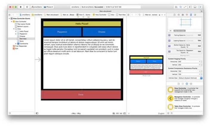
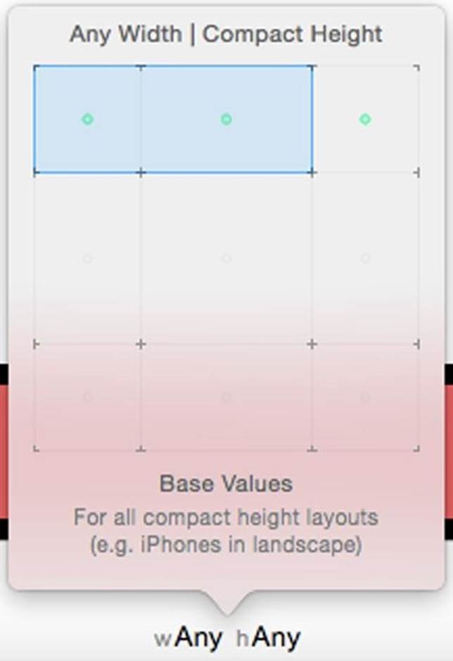
In the storyboard, click the w:Any h:Any button on the bottom of the storyboard. Move the square to any width, compact height for a iPhone in landscape.
Move the Text View
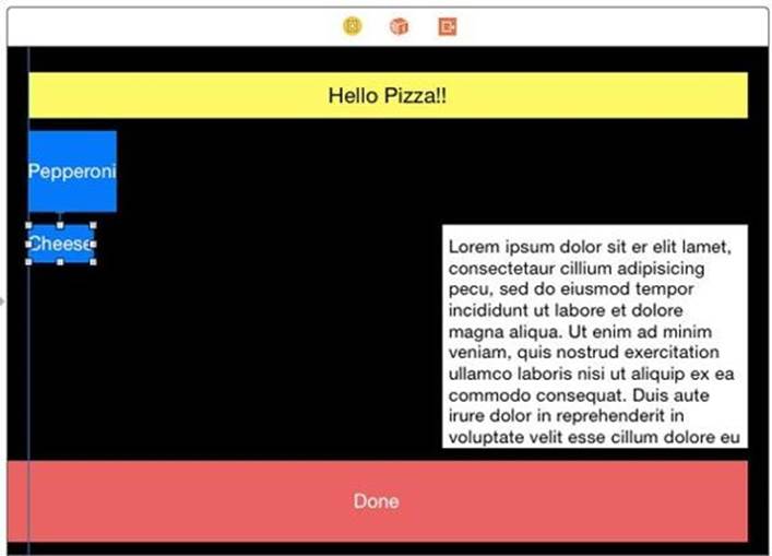
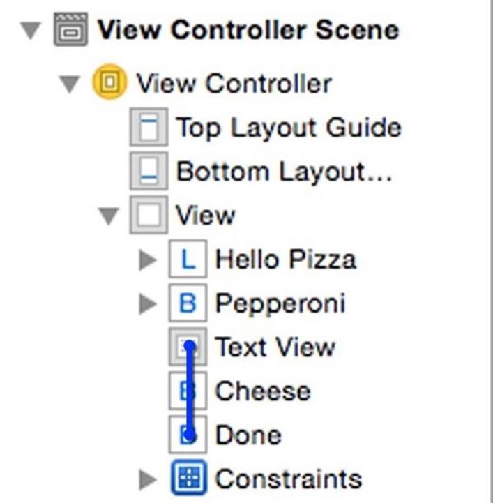
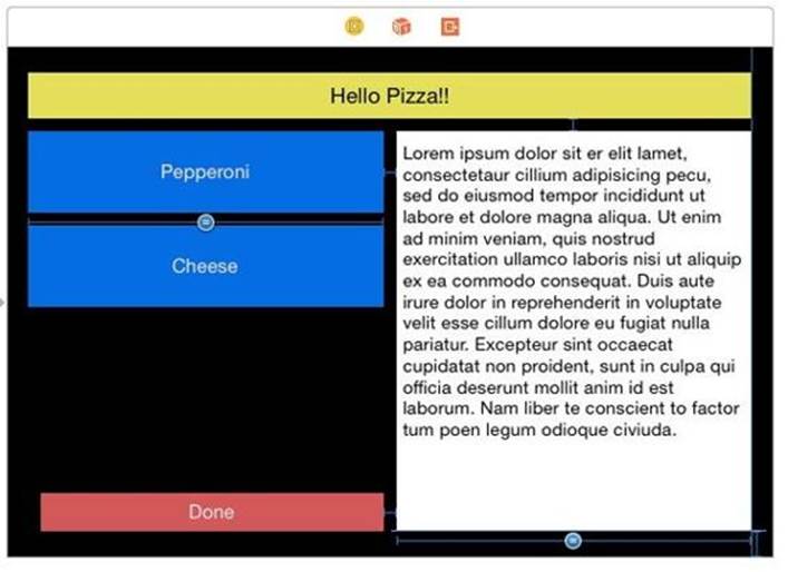
Let's move the text view to the new location. Select the text view in the document outline. Select Clear Constraints in the constraints resolver for the selected view. Drag the left handle so the view is less wide than the cheese button. We want to have a relationship to the pizza label, not the cheese button, so we can't use the pin menu. Control-drag from the text view to the label and release. select Vertical Spacing.
Since we will be moving the Done button, we want a relationship for the text view with the bottom of the container, not the button. We also want a relationship with the right margin. We can do both at once with a diagonal drag. Control-drag from the text view to the bottom right corner. Xcode give us both trailing and bottom constraints.
Shift-click the Bottom space to Bottom Layout Guide and Trailing Space to Container Margin, then press return. Xcode adds both constraints. We still have a warning for a missing constraint. We have yet to set a width or leading space for the text view. We will get to that shortly.
Move the Cheese Button
Clear the constraints on the Cheese button. Move it under the Pepperoni button.
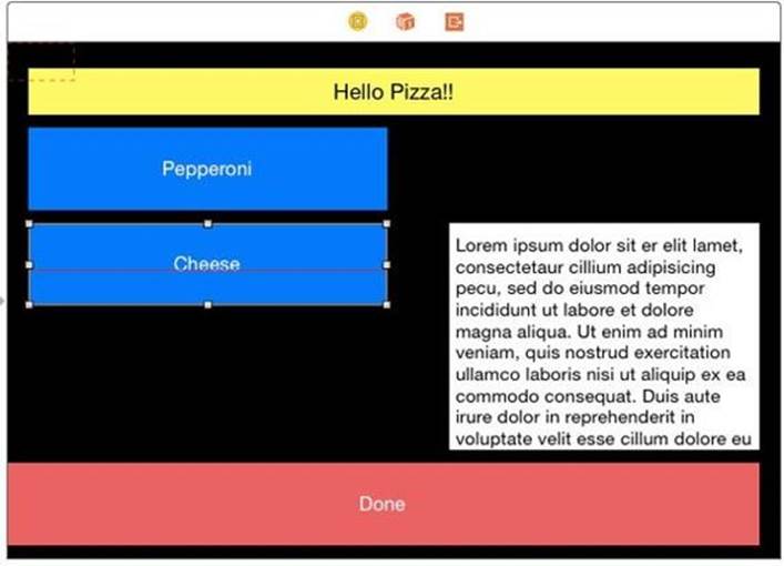
Using the Pin menu, pin the Cheese to 10 points up and 0 points left. Update the frames to the new constraints.
Set Equal Widths
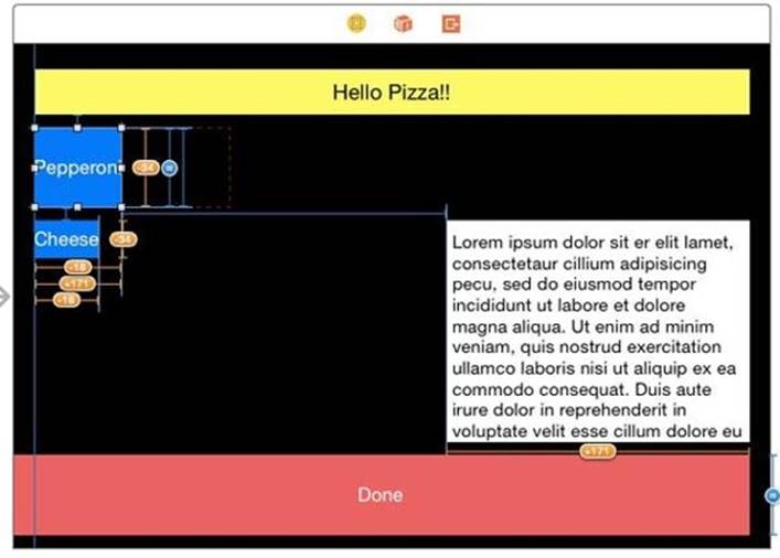
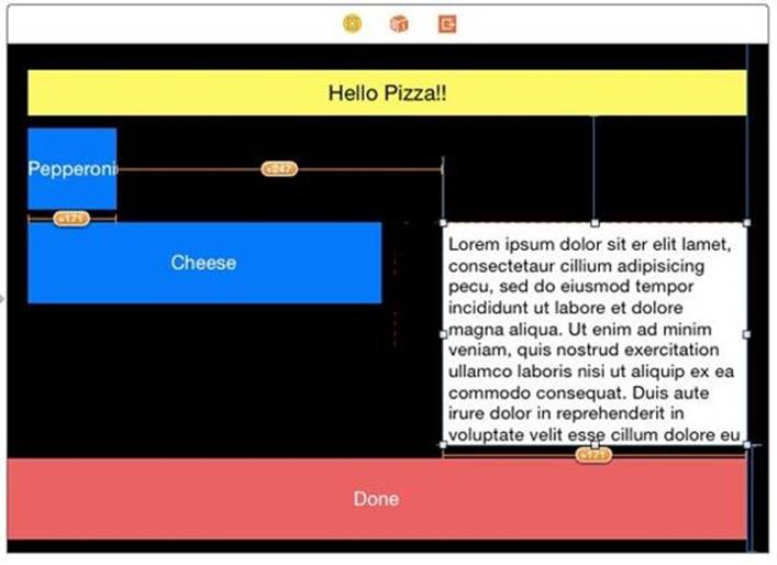
The buttons are now too small and uneven. Control-drag from Cheese to Pepperoni and shift-click Equal Widths and Equal Heights. From our last lesson, Pepperoni has an explicit height of 64. That will make both 64 points high. We get several misplaced view errors. We can see in the preview that they are now the right height.
On the preview, the text view disappeared, though still on the storyboard. We still have not set its width, so auto layout assumes a width of 0 on the preview. We will set the width as an equal width to the buttons, and have a space between them of 10 points.
Control-drag from the Pepperoni button to the text view. Shift select Horizontal Spacing and Equal Widths, then press Return. We get more errors, but first we need to fix the text view's horizontal spacing.
Using The Error Panel
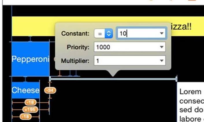
There is another way to change constants beside the size inspector. Select then Double-click on the horizontal spacing constraint we just made, and in the popover change the constant to 10 and press return.
The preview shows we have the correct horizontal spacing but the storyboard shows errors. One way of correcting errors is the error panel. You'll notice a small arrow -in-circle error indicator in the upper right corner of the inspector.

If you click the green arrow, you will see your errors. All are misplaced views.
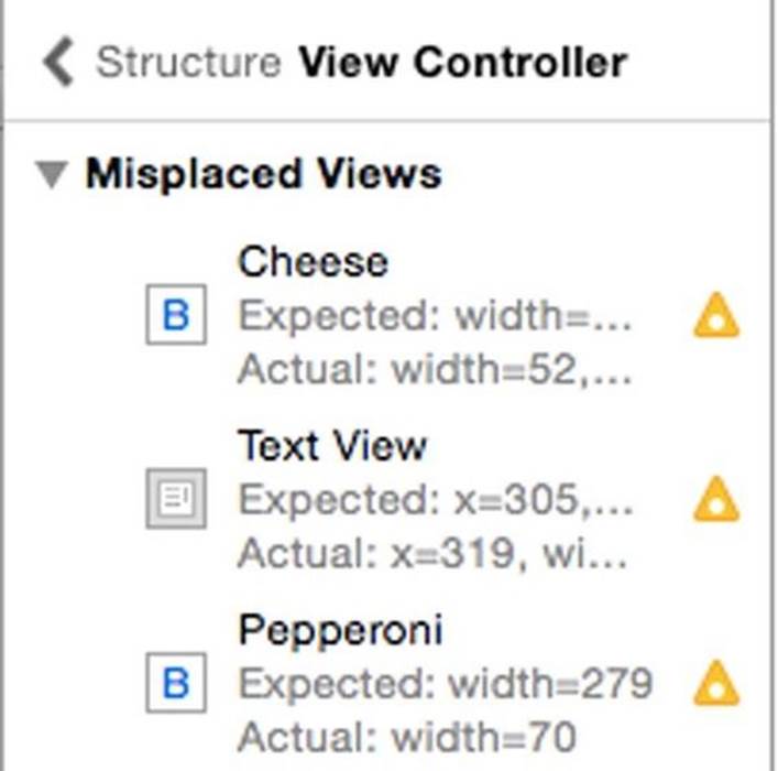
Select Cheese on the Storyboard, and in the selected views resolver, click Update Frames . Many of the errors disappear for the Cheese Button.
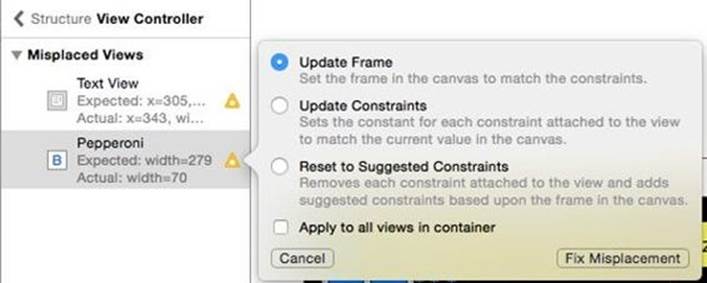
You can also resolve misplaced views in the error panel. Click the triangle warning icon for Pepperoni and a popup lets you update the frame. Select Update Frame and click Fix Misplacement.
Now Pepperoni is correct.
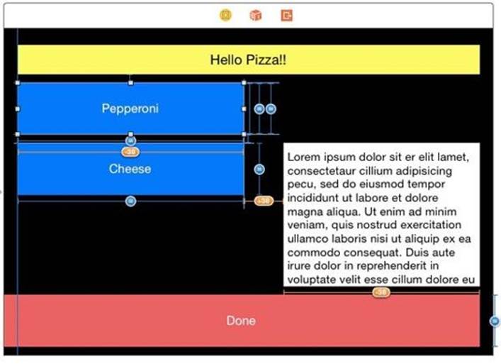
Resizing the Text View
We freed up the space above the text view, Let's use the full height for the text view. Go back to the document outline by clicking the back arrow at the top:

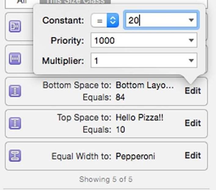
Select the text view. In the size inspector, Scroll to the constraints and change the Top space to 10 Points and the Bottom Space to 20 points.
Select Text View in the outline and in the resolver Update Frames for Selected Views
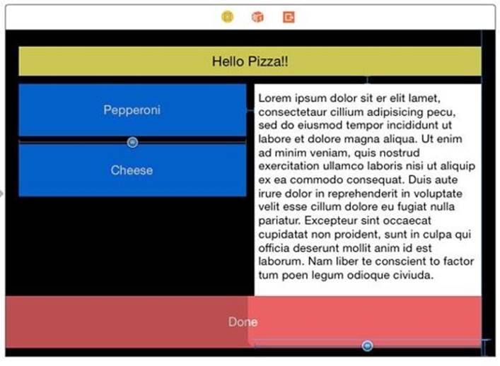
Resizing the Done Button
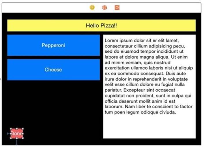
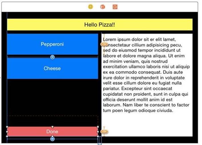
The text view resizing takes up the usable space on the right side. The Done button now overlaps the text view. We need to layout the Done button to be the same as the other two buttons on the left side. In the outline select the Done button. As we have done before, Clear the constraints of the Done button. Starting over is usually the easiest way to modify constraints for a view.
In the Done button, we won't bleed off the edge but align it with the other buttons. Pin the Done button to the Left at 0 points and the Bottom to 20 points. Update items of new constraints in the pin menu.
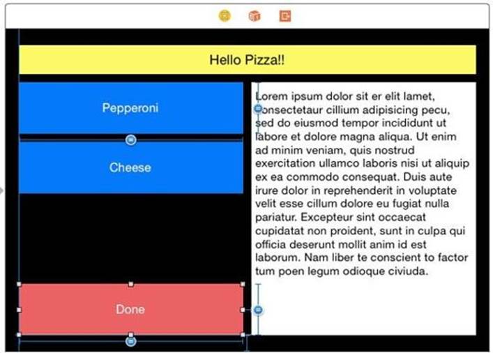
The Done button is pretty small right now. You can control-drag from the outline too, for cases where you can't see your frame. Control-drag from the Done button in the outline to the text view in the outline.
Select Horizontal Spacing. In the size inspector change Trailing Space to Text View to 10
Lets set the size of the button. Control-drag from the Done button to the Pepperoni button. Select Equal Heights. In this case, we don't need the equal widths. We get our width from the text view and left margin. The text view gets its width from the Pepperoni button. All of this leaves a misplaced view error.
Fix the misplacement by updating the frame.
Checking our Work with Preview
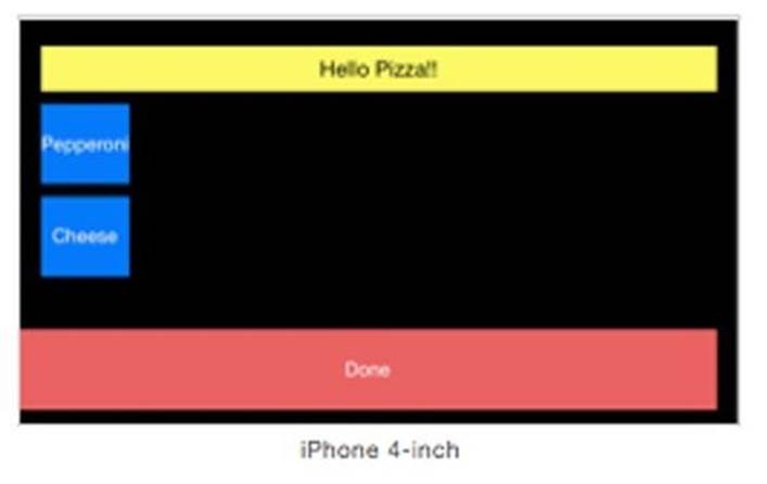
In the preview, rotate various iPhones, and you will see that it only arranges itself like this in landscape.
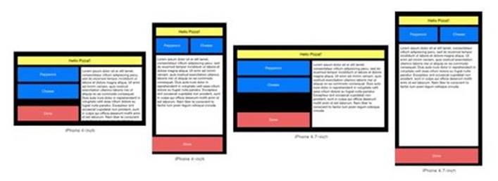
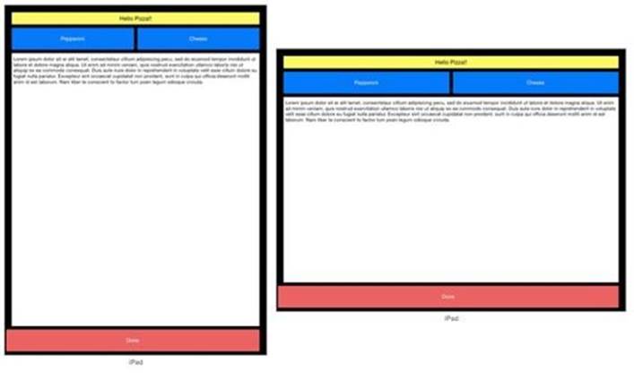
Go over to the iPad, and it ignores this.
Size classes allowed us to change one orientation and size and leave the others alone.