Practical Auto Layout: Beginning Auto Layout Techniques for iOS8 (2015)
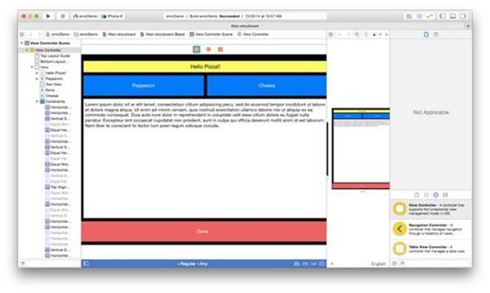
Chapter 8. Regular Size Classes
In its default settings, an iPad in portrait or landscape and an iPhone 6 plus in landscape have regular sized sides. All of these have a larger amount of screen real estate than the iPhones. Changing how we display our views on the larger platforms might make for abetter interface.
In our demo, we'll continue working with the layout from the previous sections. We'd like to have side by side buttons just below the label in regular views. We will also make the Done button proportionally smaller than the rest of the buttons.
We'd like to keep our buttons proportionally sized on different devices. However the actual size of the view changes. There is a few techniques in auto layout we'll use to accomplish equally sized buttons.
The key to equally sized buttons is keeping the beginning and end buttons in a specific place. We then add constraints to keep aligned vertically and the same space away from every other button. Next, we make all the buttons the same size and height as the beginning button and specify the width and height as necessary for the beginning button. Our final step will be to make one button proportionally sized smaller than the rest.
Setting up Xcode
Let's do this for all regular width devices. Change the size class to Regular Width Any Height.
In preview, add an iPad. If you cannot see it, move the preview over to show the iPad preview. Since the storyboard will be big, you may need to adjust a few things on a smaller screen.
Our vertical constraints for the text view are currently set to be 10 points from the Pepperoni button and 10 points from the Done button. Those buttons will be moving and will mess up our text view when moved, so we'll constrain the top and bottom constraints for the text view to the container view's margins instead.
Control-drag the text view to the bottom space and click Bottom space to Bottom Layout Guide to make a new constraint for the bottom view.
Some of you might have expected a conflicting constraint. We have multiple constraints to the bottom of the text view. However, for the moment they have the same value, so Xcode leaves them alone. If we move anything, then the conflicts would start.
Clear Constraints Before Moving
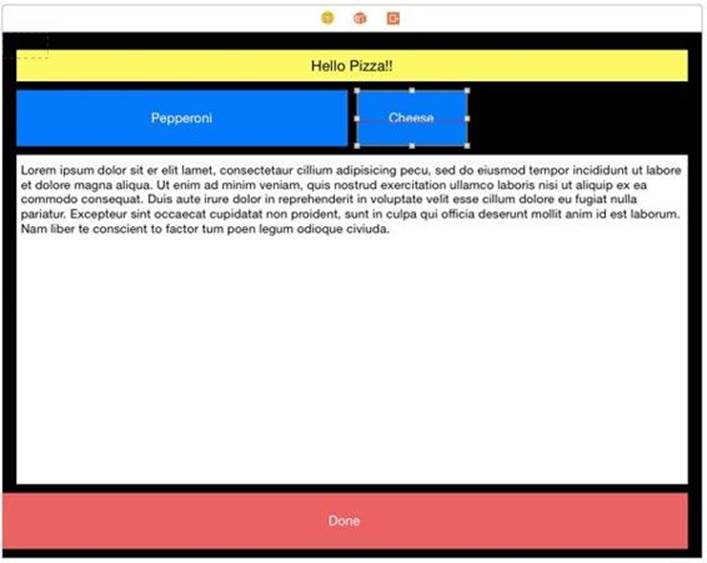
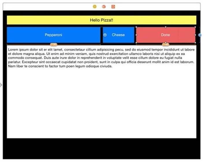
To avoid those conflicts, it's best to clear constrains instead of changing them when making big changes. Clear the constraints on the Done button. This removes our double constraint on the bottom of Text View. Clear the constraints on the Cheese button as well.
Move the Done Button
We will need some space to put the done button. Resize the Cheese button by dragging the right handle over until there is some space for the Done button. Don't worry how much, we will be setting sizes later.
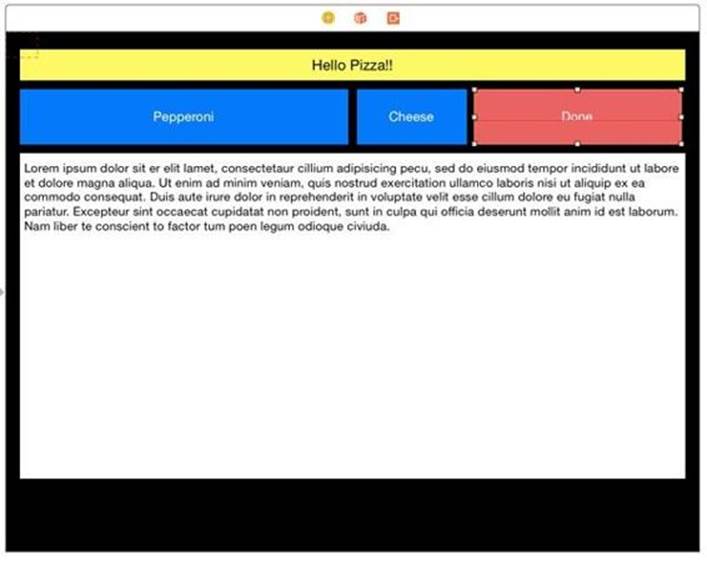
Move the Done button to its new position and resize it to generally fit. Again, we don't have to be anywhere close to perfect, as the constraints will do that for us. You can use the recommended choices from the guides as they show up.
Constrain the Done Button
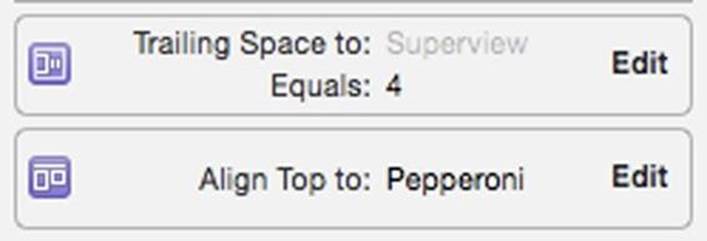
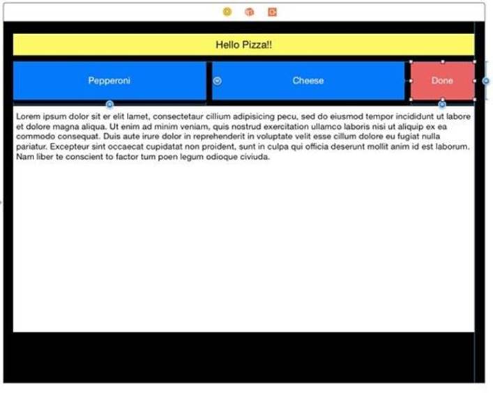
Control-drag the Done button to the right and select Trailing Space to Container to anchor this to the right margin. Once done, control-drag from the Done button to the Pepperoni button. Shift select Top, Equal Heights and Equal Widths.
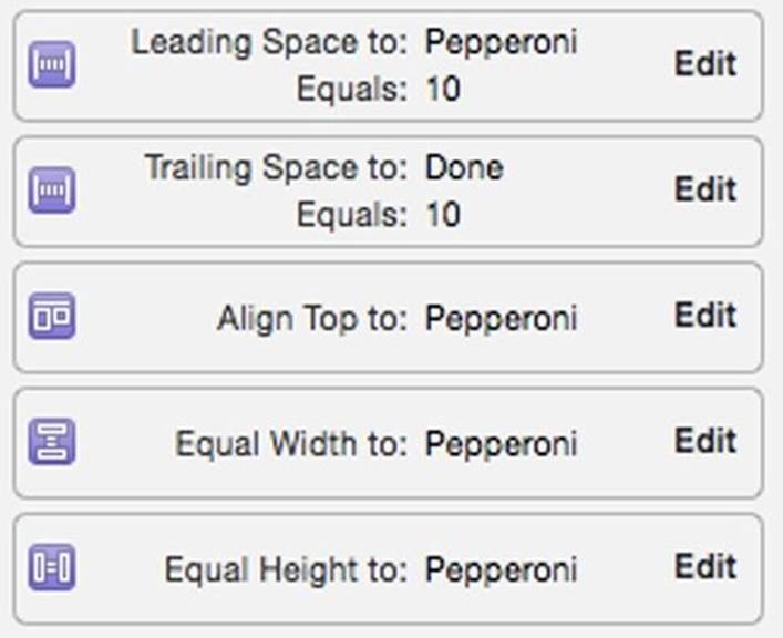
Since we control-dragged the constraint it keeps it old position. Check the Align Top constraint and the Trailing Space to Superview in the size inspector to make sure both have a constant of zero.
I didn't get exactly on the right margin. Click Edit for the constraint, and change the constant to 0 if either is another number than zero.
We still have a few misplaced constraints, but we need to constrain Cheese first.
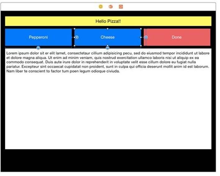
Set the Middle Cheese Button
Since the Pepperoni button is already anchored and sized we don't do anything with it. We now need to set the middle Cheese button. Control-drag the Cheese button to the Pepperoni button. Shift select Horizontal Spacing, Top, Equal Heights, Equal Widths. Now control-drag from theCheese to the Done button. Shift-select Horizontal Spacing. Once again check the constraints in the size inspector. We want a horizontal spacing of 10 points to both Pepperoni and Cheese and a Top Alignment of 0 points.
Update the frames using the All Frames in View section in the resolver. We now have three buttons of equal widths aligned.
Make a Smaller Done Button
We want the Done button to be smaller than the other buttons. Select the Done button and then click Edit for Equal Width to Pepperoni. Change the multiplier to either 1:3 or 3 to make a smaller button.
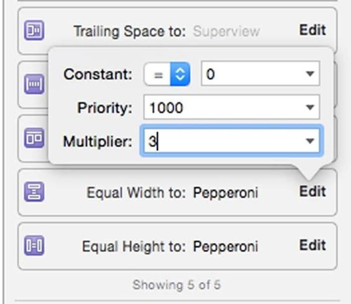
The Done button is now 1/3 as big as a the other two buttons.
Let's make one more change. There is too much space where the Done button was. Click on the text view. Double click on the bottom constraint, and change the constant to 20.

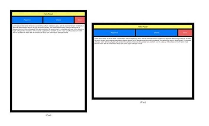
And we're done. It looks good on the iPad.
However the preview in iPhone 6 plus in landscape is not working.
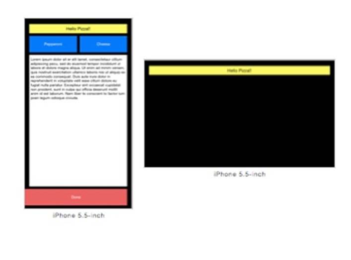
In the next section, we'll figure out why and fix the problem.
All materials on the site are licensed Creative Commons Attribution-Sharealike 3.0 Unported CC BY-SA 3.0 & GNU Free Documentation License (GFDL)
If you are the copyright holder of any material contained on our site and intend to remove it, please contact our site administrator for approval.
© 2016-2026 All site design rights belong to S.Y.A.