Practical Auto Layout: Beginning Auto Layout Techniques for iOS8 (2015)
Chapter 9. Fixing Conflicting Constraints
In the previous sections, we created a generic layout for all devices. We made a different layout for iPhones in landscape and then another for iPads. However the preview in iPhone 6 plus in landscape is not working.
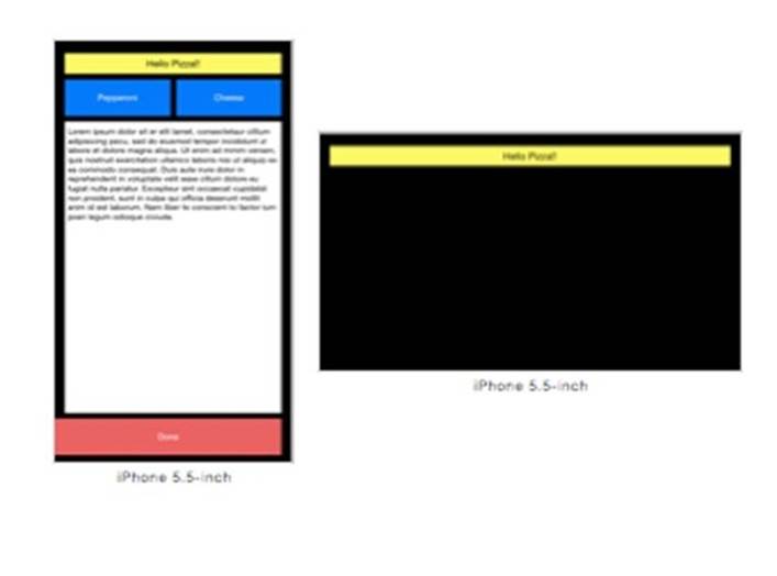
The iPhone 6 plus is an odd device. It acts like a iPhone in portrait and an iPad in landscape. The iPhone 6 plus has a compact width in portrait like a phone and a regular width in landscape like a tablet.
We have built sets of constraints for width:Any height:Any, width:Any height:Compact and width:Regular height:Any. The iPhone 6 plus landscape is width:Regular height:Compact. The phone inherits constraints from both width:Any height:Compact and width:Regular heitght:Any. These constraints between the two sets are not the same, and so we have conflicting constraints making most of our user interface disappear, since Xcode can't figure out what to do
Auto layout can display different results at different times for the same action, especially with constraint conflicts. We have already discussed how the multiplier might be different for a constraint. Depending on too many things to list, you may get different results in the steps leading up to the final step. Do not worry too much about this. If you follow directions here, your final step will be correct.
Finding Constraint Problems
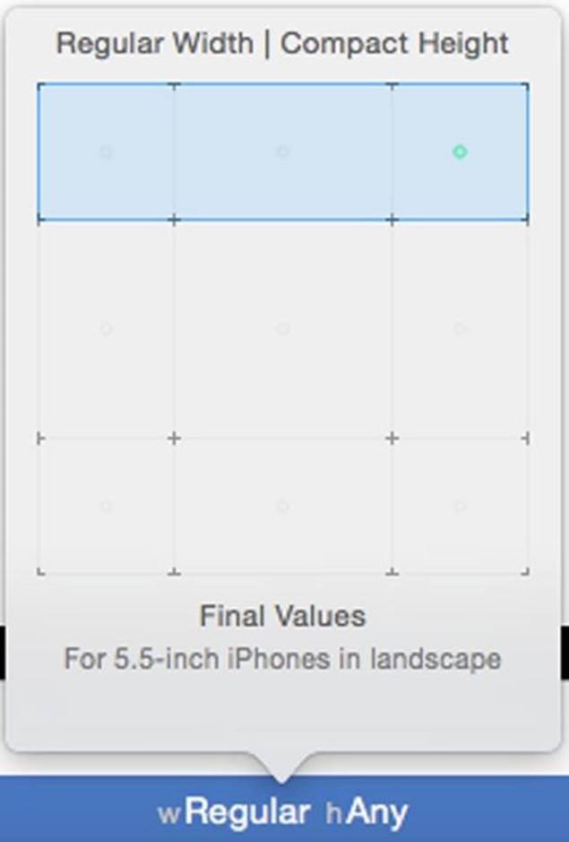
If you do not already have the project open,open the project. Change the size class of the storyboard to Regular Width, Compact Height to get the class size storyboard for the iPhone 6 plus landscape:
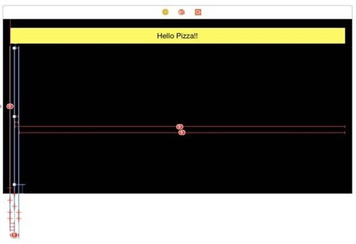
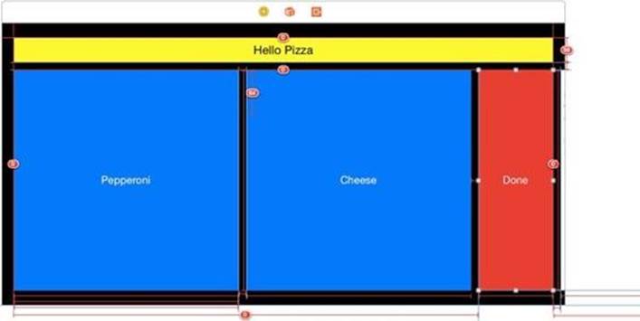
The screen is full of errors with only our label showing:
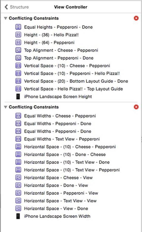
Select the text view button from the outline and the size inspector shows all the constraints:
We have a lot of duplicate entries. Select the Pepperoni button from the outline and you will see many constraints, so many they don't fit on the screen.
Open the error pane and you will see all those problems.
There are several strategies to deal with this mess. The most important one is to plan ahead. One simple change would have prevented this. I could have done the iPhone landscape in wCompact,hCompact. It would only apply to the smaller phones in landscape and ignore the iPhone 6 plus. The wRegular,hAny would have set the landscape for the iPhone 6 plus to the same as the iPad.
However, no one can plan ahead for everything. Someone in your organization might add a new feature to one layout that messes up everything. You might change your mind on a UI feature halfway through implementation. It happens. We need to know how to fix conflicting constraints.
There are two ways to solve constraint errors: Delete all the constraints of a view then start over or delete the conflicting constraints.
Deleting Conflicting Constraints
For our example, we want the regular width constraints to remain and the compact width constraints to disappear, leaving us with the appearance we get on the iPad.
The Cheese Button
You can delete constraints in the error panel, but I find the error panel does not give me enough information about what I am deleting. Go back to the document outline and select the Cheese button. In the size inspector, you will find these constraints among others:
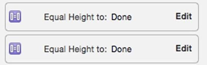
The Equal Widths and Equal Heights have duplicates. Click on the left side of one of the Equal Width duplicates and press Delete on your keyboard. Do the same for the Equal Height duplicate. That's the easy stuff. Above these you will find the serious conflicts.
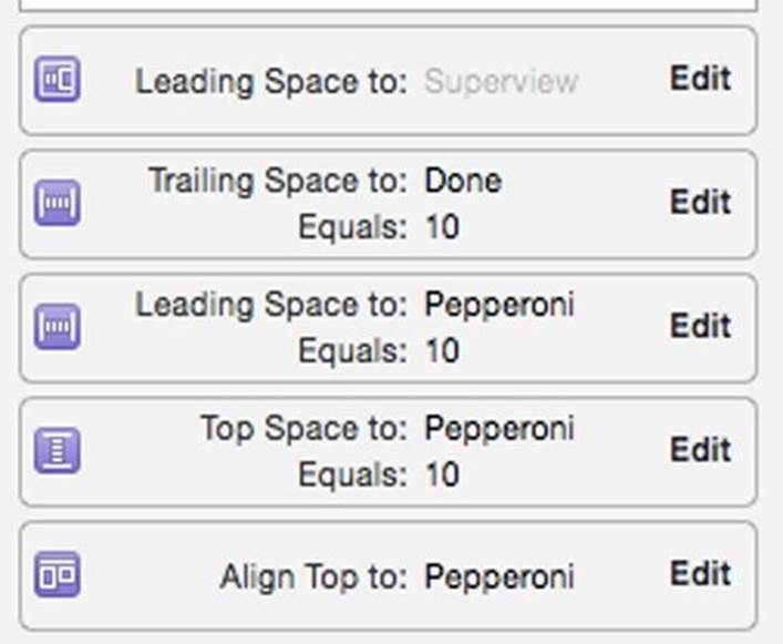
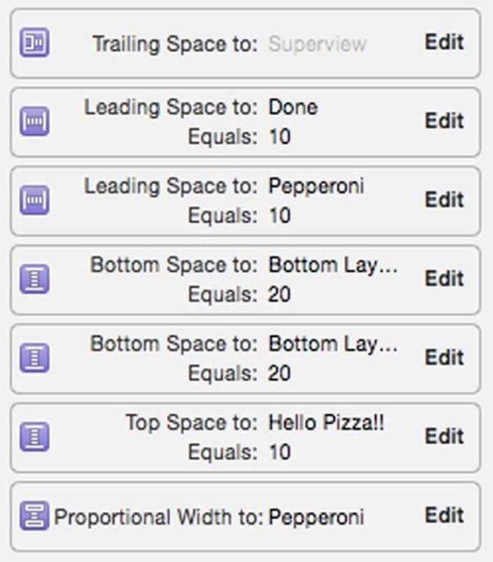
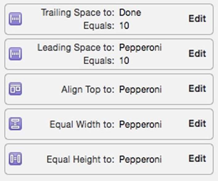
Refer to your previous layout to know what to delete. For example we have two leading space constraints: Leading Space to Superview and Leading Space to Pepperoni Equals 10. We want the regular width,which was 10 points from Pepperoni. Delete the Leading Space to Superview. Similarly we want to align to the top of Pepperoni. We have a choice between Align Top to Pepperoni and Top Space to Pepperoni Equals 10 points. Delete the unwanted Top Space to Pepperoni Equals 10 points. When done it should look like this:
The Pepperoni Button
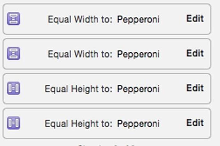
This won't change anything because the Cheese button is dependent for its size information on the Pepperoni button, which is so messed up it has no size information. Fix that next. Select Pepperoni in the document outline. You get that long list of constraints. Start with the easy duplicates. You will find this in the size inspector:
Delete one of these duplicates. Going through the list another conflict is the width:
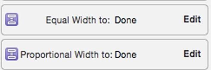
On the regular width version of the layout, we have a proportionally sized button. Delete the Equal Width to Done. With that change, we start to see views in the preview,though not sized right:
There is only one more conflict. Does the Pepperoni button's trailing space go to the Cheese button or the text view?
These are the in-line buttons, so it goes to Cheese. Delete Trailing Space to: Text View Equals 10.
The Done Button
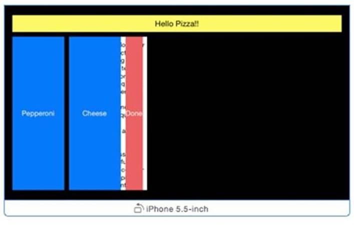
Click on the black background of the superview. In the resolver, click the Update Frames in the All Views in View Controller section. We get our views back, though not quite right yet. Click the Done button and you can see it still has conflicts:
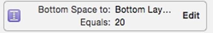
The Done button is to blame for the buttons stretching down the view and losing the text view, which is hiding out on the right side. In the iPhone landscape the Done button was anchored to the bottom of the superview. Delete this constraint:
Update all frames and you get buttons again, though not quite what we wanted:
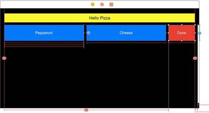
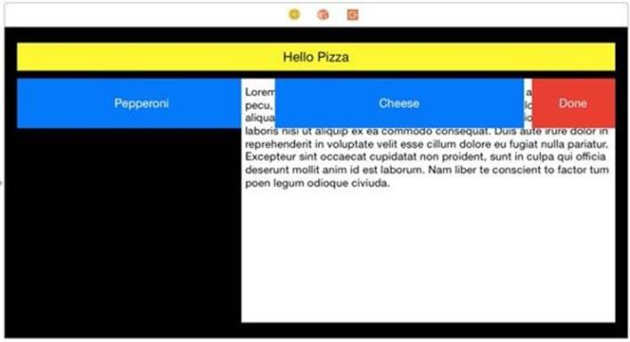
The Text view is also a small thin white line on the right side. If we look at the Done button, we find there are more conflicting constraints.
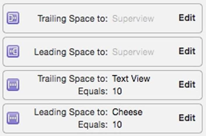
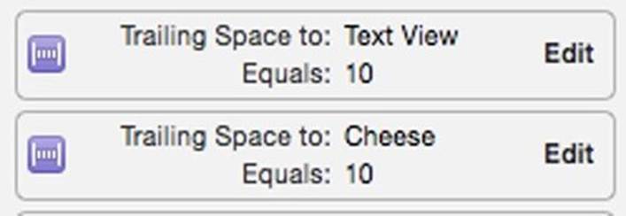
The Done button should have a Leading Space to Cheese Equals: 10 and a Trailing Space to Superview. Delete the Trailing Space to Text View and the Leading Space to Superview. In the Document outline, select the view, and Update Frames for All Views in View Controller.
Clearing Constraints
Often, it is just easier to clear all constraints for a view and start over. Select the text view. In the resolver select the Clear Constraints in the Selected Views part. Resize the text view like this:
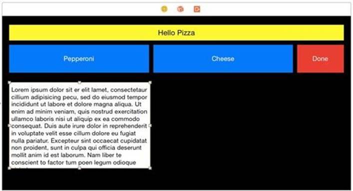
By resizing, the text view has a nearest neighbor on top of the Pepperoni button, and the left,right and bottom margins on the other three sides. We can pin the text view in one step. Pin the text view like this:
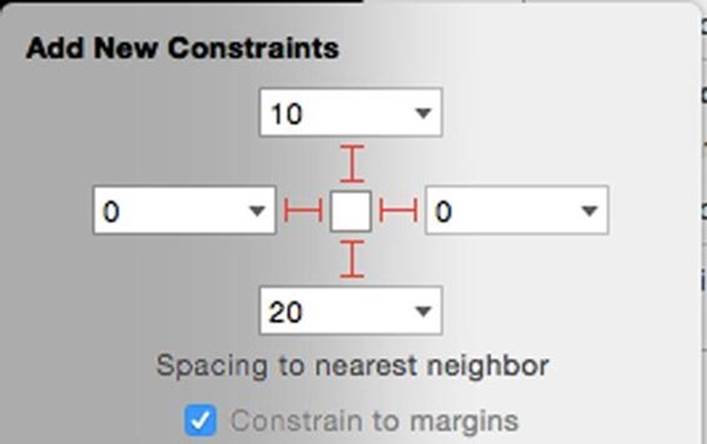
Everything is set up correctly. On the resolve menu, click Update Frames in the All Frames section.
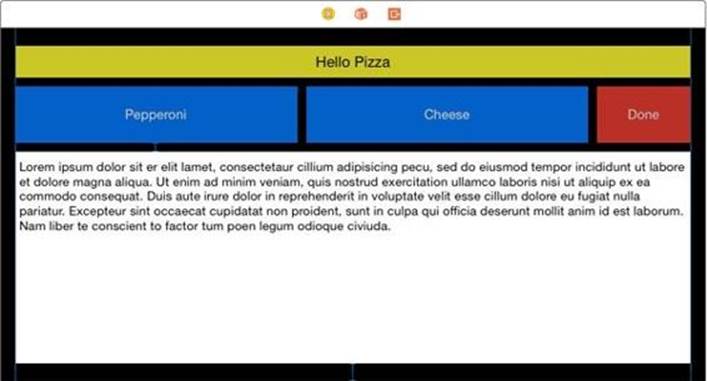
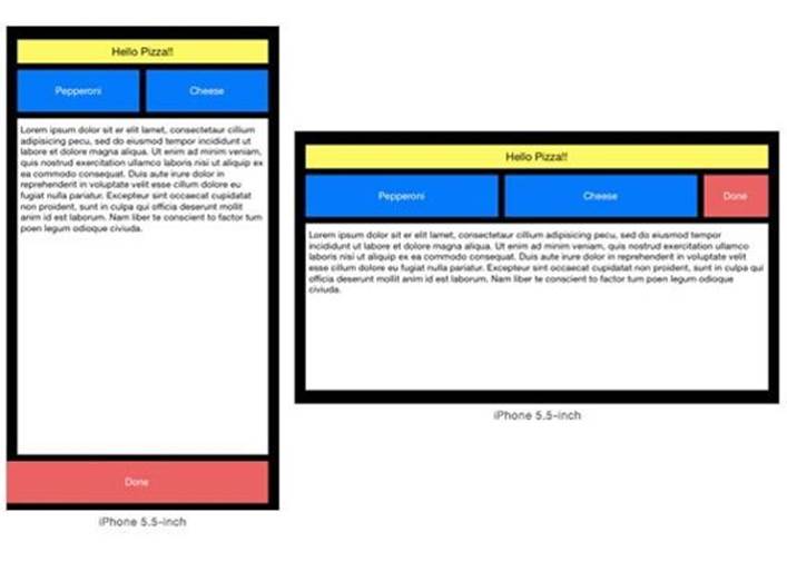
Going over to the preview pane, we see the iPhone 6 plus is now set up correctly.
We've now completed the size class and auto layout of this app's storyboard by getting rid of all the errors.
Some Tips for Class Sizes and Layout
It best to avoid errors. Some planning and knowledge helps a lot to prevent errors. Here's a few tips to help you using auto layout with Size classes:
Plan Ahead with Mockups Have on paper exactly what you want for all the devices you will lay out for.
Avoid Any Width, Compact Height For most layouts you will want what we did in this chapter. The iPhone 6 plus will act like an iPhone in portrait and an iPad in landscape. To avoid the errors we corrected in this section use wCompact hCompact for the iPhone landscape layout.
Think iPad for width:Any height:Any, get specific for iPhone For the generic case start with your layout for iPad. Like above, it avoids conflicts. Make a different width:Compact height: Regular for iPhone Portrait.