Mastering Gephi Network Visualization (2015)
Chapter 10. Putting It All Together
Until this point in the book, we have focused on many aspects of Gephi that can be used to create effective and interactive network visualizations. In many cases, these topics were discussed in isolation within their respective chapters. We have managed to merge multiple functionalities on some occasions, but never the entirety of what Gephi can help us create. In this final chapter, the goal is to pull all of these elements together at a more holistic level and build some Gephi projects from start to finish.
We'll focus on three primary goals in this final chapter as we seek to further develop your own network analysis skills. The first two will make an effort to fully leverage Gephi's considerable capabilities, while the third section will focus on what the future of network graph analysis might encompass. Here's what we'll cover in this chapter:
· In the first section, we'll look at how we can use Gephi to interpret and enhance existing networks
· We'll spend the majority of the chapter creating a couple Gephi projects from start to finish, eventually deploying each to the Web
· Our final section will look at where network analysis stands today and where it is likely to go in the future
Let's begin by using Gephi to interpret an existing network visualization.
Using Gephi to understand existing networks
In previous chapters, we've examined a variety of techniques and functionalities present within Gephi that act on the existing network data. These included topics such as filtering, partitioning, running statistics, styling, and ultimately exporting our projects. As I mentioned in the introduction, much of this has necessarily been done in isolation, with periodic instances where multiple approaches were merged. In this section, we are going to utilize a considerable portion of the Gephi application to understand and potentially improve on some of the existing network graphs.
The hope is that performing many of these operations on existing graphs will prepare us to create better projects when we begin with our own raw data. Think of this as a bit of a warm-up exercise before we tackle the more challenging goal of building our own projects.
So let's begin by exploring a single challenging graph, and begin flexing our creative muscles using a variety of Gephi techniques. It's time to locate an existing project to modify—either .gexf or .net formats should work, or even existing the .gephi files. The Gephi wiki is a good place to start, although you could search for any of these file types on the Web and find some additional resources. Let's get started.
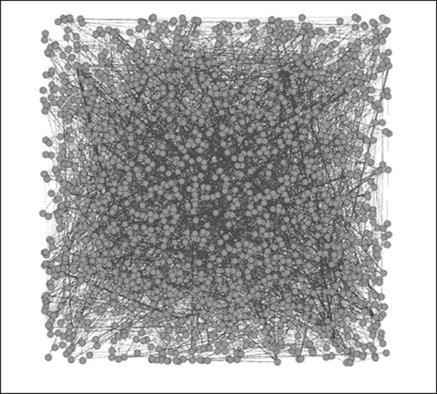
The example we'll walk through, the Marvel Social network, is available in the .gephi format on the Gephi wiki at https://wiki.gephi.org/index.php/Datasets#Social_networks. The network represents thousands of Marvel comic book characters and how they have interacted with one another throughout decades of comic book editions. This is a rather dense network of roughly 10,000 nodes and nearly 180,000 edges, which gives us a graph that is nearly impenetrable at first glance. At a minimum, we would like to take this network and give the user some tools to help them navigate the graph effectively. Beyond that, the ability to make the graph more visually appealing would also be a good idea, as long as it is not simply for aesthetic purposes alone. In other words, let's make it look nicer within the context of increased efficiency for the user.
Here's our starting point of the network graph:
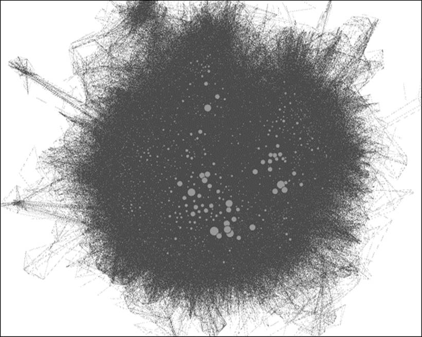
The Marvel hero network graph
A bit overwhelming at first, isn't it? We do have a few visual cues to begin working with—there are clearly some high degree nodes sized accordingly. There also appear to be some outlying clusters at the extreme edges of the graph, and we do have the ability to understand the structure a bit by hovering over selected nodes. Nonetheless, the graph suffers from the infamous hairball effect that we generally seek to avoid in network visualization. So where to begin?
Some of the more obvious opportunities to improve the graph are not available in the data. For instance, there are no categorical variables informing us when or where a character originated. Nor are there any fields indicating in which of the many Marvel comic books the characters appeared. Our best (and only?) option would seem to be to improve the graph by creating our own variables and filters using either statistical measures or created variables. We can do this—it isn't as hopeless as we might have originally feared. Gephi provides some powerful tools to enhance even the most challenging networks.
I'm going to start with a tool that we haven't previously explored in the book, but one that's especially useful when confronted by a dataset with few variables to work from. At the bottom of your Data Laboratory window are a series of icons, including the Merge columns function we previously used and will encounter again later in this chapter. However, for this example, we'll slide to the right of the window and employ one of the useful regex commands to create some new variables for our graph. You might recall theregex (short for Regular Expression) functionality from Chapter 5, Working with Filters, where we used it to create wildcard filters. This time we're going to use it to create some new field values to make network navigation far easier for the end user.
We'll use the second of the two regex functions (Create a boolean column from regex match, Create column with a list of regex matching groups)—the one with the lengthy title of Create column with list of regex matching groups. Click on the Create columnbutton to open the dialog box, where we'll create a new field titled Man. Why Man, you ask? Because our quick perusal of the dataset and slight familiarity with Marvel characters (and comics in general) suggests that there will be many characters with man in their title. For starters, we have Iron Man, Spiderman, and likely dozens of others. We'll have to be careful with the filter so that we don't identify all the characters with Woman in their title as well, since man is also represented within those five letters. For that matter, we don't want portions of a character named Norman (for example). So this can get a little complex, but we'll get there using regex.
For our example, we can use the \b modifier to find only those instances where the term MAN is found in the dataset (this data is in uppercase). This allows us to create a new column using the dialog screen:
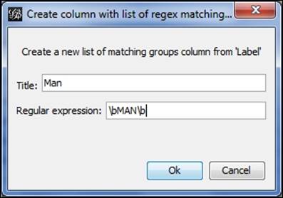
Using regex to create a new column
Now that we've created the column, let's use it to filter the graph by working with the Equal filter and dragging the Man field down to the Queries window. We then need to enter the matching value for the filter to work properly, as follows:
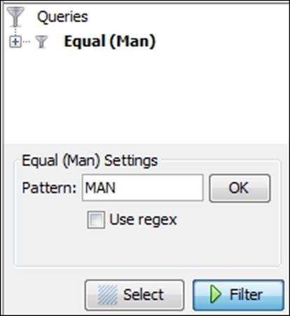
Setting the query pattern with equal filter
Clicking on the Select and Filter buttons results in a network graph that displays only the records that match our criteria, as shown in the following diagram:

The graph results from applying the MAN filter
We can verify the efficacy of the filter by perusing our results in the data laboratory:
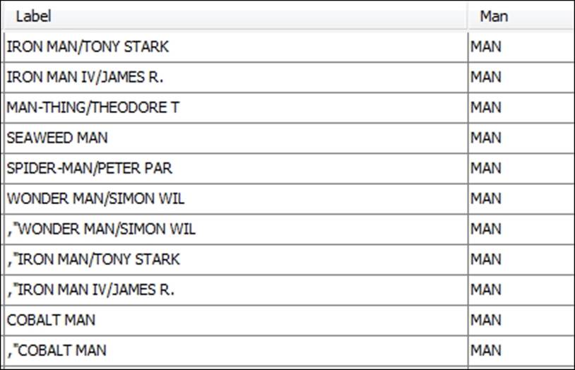
The partial results from application of MAN filter
So we've accomplished something that's potentially very useful as we attempt to create a more easily navigated network. There's clearly more that can be done, including coloring the graph nodes based on our filter. All we have to do here is right-click on the Reset colors icon and select a color that will be applied only to our filtered members (make sure the filter is applied—otherwise the entire graph will be re-colored). We'll choose a dark blue shade to identify the Man characters, and then remove the filter to see the following result:
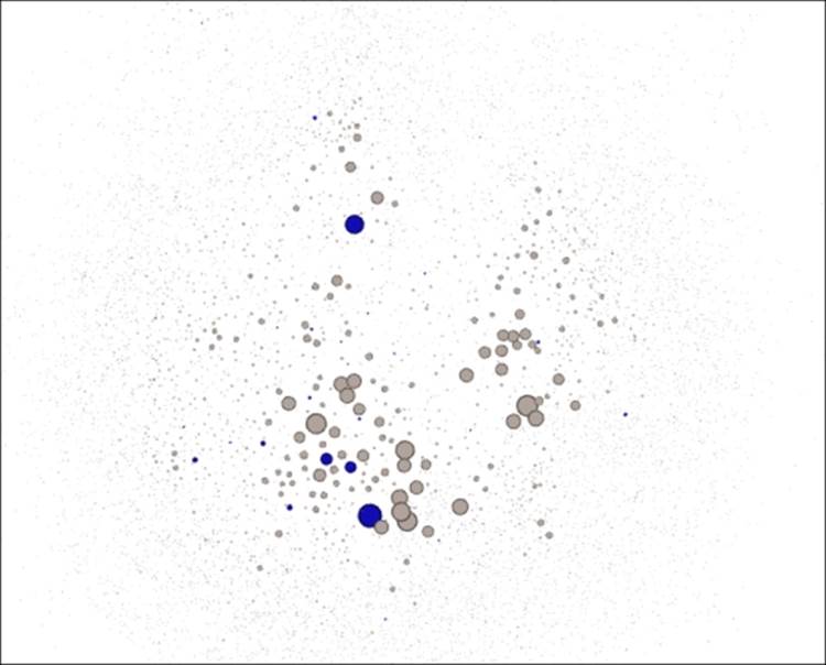
The updated graph with new color for all MAN characters
We can then repeat this series of steps to create other new fields. For example, I created a field titled Woman and another titled Black in recognition of the many cartoon characters (often villains) with black as part of their name. By the way, you might need to hit theReset button to see your new values in the Filter window. Performing the filtering and coloring on each in sequence results in the following graph where we now have three distinct colors beyond the gray for the remaining members of the network:
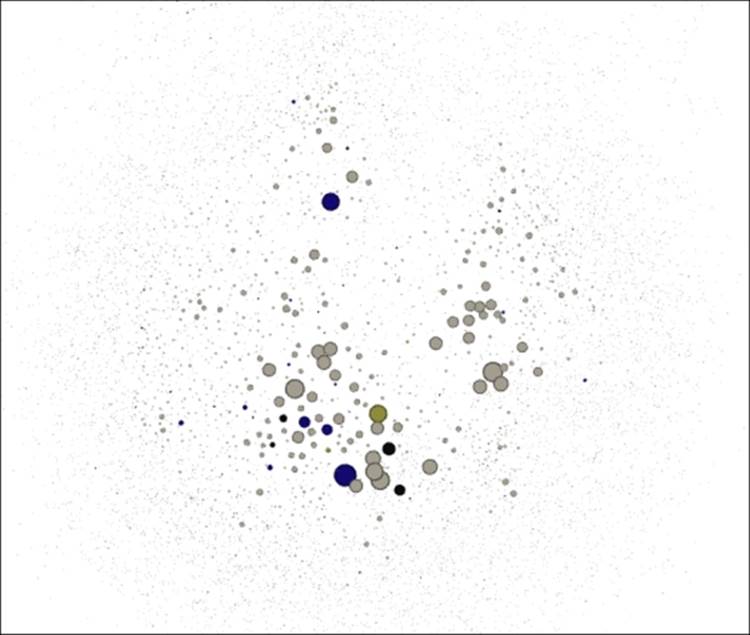
The updated network with distinct colors for Man, Woman, and Black columns
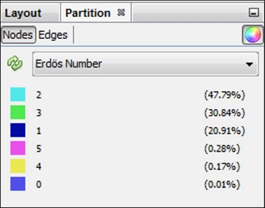
We can also use graph statistics to filter the graph more effectively. Bear in mind that this might take a while given the size and complexity of this graph (it might even fail, depending on your available memory). Memory settings can be adjusted by editing thegephi.conf file found in the Gephi-0.8.2\etc folder, or refer to http://gephi.github.io/users/install/; however, you might be able to calculate some centrality measures, or at the very least we can work with degrees to segment the graph. We could even elect to use anErdos Number (for more details on the Erdos Number Project, refer to http://www.oakland.edu/enp/) to see how close each graph member is to a specific character (say Iron Man). In fact, let's try the Erdos Number approach to partition the graph.
After calculating the Erdos Number for the Tony Stark Iron Man character (as opposed to the various other Iron Man incarnations) we can begin to segment the graph based on how each character relates to Iron Man. The average number turns out to be 2.103, indicating that a typical character is slightly more than two edges away—direct connections would have an Erdos Number of one. We would like to see the distribution of these visually to better understand the role of Iron Man in the Marvel pantheon, and who is most closely identified with him.
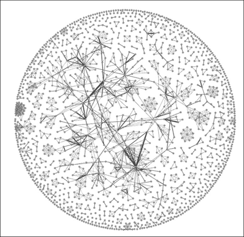
To do this, we will simply select Erdos Number as our partition criteria, which will show us the numbers ranging from 0 (for the central character) through 6, as follows:
Setting an Erdos Number partition
We can then apply the colors (modify these first if you wish to create a personalized color scheme) to see the final result:
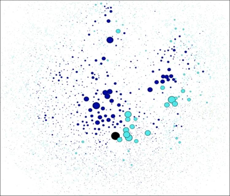
Marvel hero graph partitioned by Iron Man Erdos Number
Looks a lot better than where we started, doesn't it? There are obviously many other ways we could have modified the graph—different field creation, alternative partitioning strategies, new color schemes, or filtering approaches. The point is that Gephi provides a powerful array of tools to help you move in almost any direction when working with an existing network graph.
We'll now move on to create our own projects from start to finish.
Creating new Gephi projects
Now that we've dissected and improved upon some existing network graphs, the time has come to develop our own projects from scratch. This will involve a number of steps, and will allow us to fold in much of what has been covered thus far in this book. Here's a summary level synopsis for everything we'll do to create our projects—it's a long list, but you should be well prepared to handle each of these steps based on what we've covered to this point.
Here are the steps, arranged in a typical order, although some of these steps could be swapped (such as the steps involving statistics and filtering):
1. First, we'll locate a dataset that is suitable for network analysis. The data might or might not be in a suitable format when we find it, which will dictate whether the next step is necessary.
2. We might need to format the data so that Gephi can read it without issues. Remember that Gephi is able to handle a variety of input sources created in various graph file formats. If we are sourcing data that isn't already in one of these formats, then we'll have to create either a pair of .csv files (one each for nodes and edges) or have the data available via some MySQL (or other database) tables.
3. When the data has been imported by Gephi, the first thing we see is a random layout. After a cursory inspection of the data in the data laboratory, we'll want to apply one of the many layout options made available in Gephi. This is typically an iterative process, as your initial selection might not deliver the results you are seeking. Stay with this process until you get something that makes you comfortable.
4. After finding a suitable layout, it's time to do a visual inspection of the graph. Are there obvious patterns such as homophily, or does the network take on a more random appearance? Do we have a single giant component, or are there multiple disconnected subnetworks? Do we see obvious hubs, or are there many alternative ways to traverse the graph? Does the graph have a large or small diameter? These are just a few of the questions we should ask ourselves as we inspect the graph.
5. Now we can further understand the network by employing any of the many filters provided within Gephi. These can be especially helpful when faced with a dense network, but are certainly not limited to just that condition. We can also gain insight by filtering the data based on degree levels, by classifications or partitions, or based on a combination of criteria using an intersect query.
6. It's time to apply some statistical measures to the graph to help confirm our initial impressions. The centrality measures are especially important, as they will apply real numbers that can help identify the network influencers, regardless of their placement within the network. Other statistics will help confirm initial impressions about diameter, clustering, and homophily, among other measures.
7. From here, we can begin segmenting and partitioning the network using a variety of tools in Gephi. This step will often highlight graph patterns through visual means such as sizing and coloring, making it easier for the graph viewer to understand the message.
8. In cases where the network has some sort of time element, we can create dynamic graphs that call out temporal changes in the network. This might come in the form of a node entry and exit as time passes, or it could reflect time-driven changes in status for individual nodes. In either case, dynamic networks can convey a very powerful story to viewers.
9. Our final step in most cases will be to make the graph available for external users, often through deployment to the Web. This then makes the network interactive for all users without requiring any knowledge of Gephi. In other cases, we might elect to simply share an image of the network via a .png file, or we could choose to tell a story using the .svg or .pdf output formats.
Sounds like a lot, but as you become more comfortable with Gephi, much of this will become second nature. We're going to put this into practice by creating a pair of projects, the first a dynamic network that remains within Gephi, and the second a project that we will push to the Web for user interaction.
Project 1 – Newman NetScience dataset
Our first example will use the NetScience dataset created by noted network scientist Mark Newman. Newman's data examines the working relationships between hundreds of academic network science practitioners through a co-authorship network. Nodes represent authors, and edges the connections between co-authors. This data can be found in multiple places on the Web, including Newman's own site. We'll begin with a .gml version of the data, which you can find at https://app.box.com/s/177yit0fdovz1czgcecp.
All that exists at the start of the project are the respective nodes and edges tables, which will give us full control over the ensuing steps. From this raw data, we will create a project that incorporates a wide range of Gephi techniques and methods, resulting in a finished network graph that tells a compelling story. We'll follow the steps outlined a moment ago, although we might make a slight detour here and there.
Exploring the network in Gephi
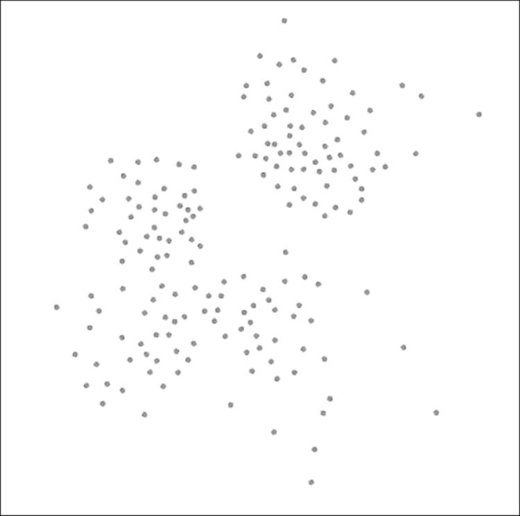
Once the data has been loaded in Gephi, we'll see the following network in a random layout, as provided in detail in our chapter on selecting a layout algorithm. This won't look like much, but it does provide us with enough to get underway:
The Newman network science collaboration network
We need to get the data into some sort of layout that will help us to understand the network structure. The context window tells us that the network has 1,589 nodes and 2,742 edges; fewer than two edges per node on average. Thus, our network is not very dense, which might help point us to a specific sort of layout. We also know that the network has enough nodes to perhaps eliminate some other algorithms from consideration—a circular layout might not work effectively for displaying this network.
Given this information, I am going to begin with the ARF algorithm, which I find to be useful for small- to medium-sized networks of this sort. We'll see whether ARF effectively displays the network; if not, then another option will be considered. For instance, if our network turns out to be highly clustered, the ARF might not distinguish the clusters as well as something like Force Atlas (remember that ARF creates largely circular layouts). We'll need to make that determination after seeing the results.
After running the ARF algorithm for nearly 10 minutes (your time might vary) using the default settings, we will be able to see the following output:
Newman network after applying the ARF layout
Based on these results, I believe we can move forward. The graph quite clearly displays a number of clusters, an indication of network scientists collaborating on projects. We also see some instances where nodes are linked to more distant members of the graph, an indication of some cross-cluster collaborations.
Something else is very clear— this is not a single connected network. Instead, there are multiple cases where smaller subnetworks exist. This is going to influence some of our statistical measures, as we'll see momentarily. For instance, there is no way to calculate a single diameter measure, as it is impossible to traverse the entire graph.
Next, let's begin using some filters to better understand the network. Here are a few questions we can attempt to answer:
· Which nodes are the most influential, as measured by degrees?
· Where are the heaviest edges an indication of frequent collaborations?
· How large is our largest connected component, and who belongs to it?
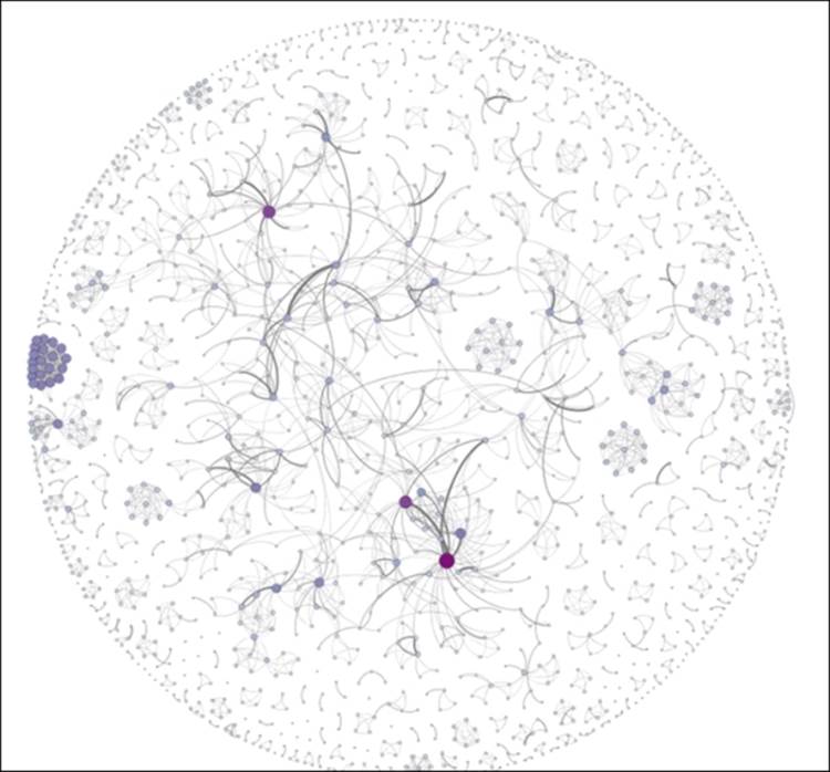
We will quickly discover an issue—there is no explicit degree measurement in our nodes table, as we had in some prior datasets. Fortunately, we have several easy ways to measure degrees. We could take the data outside of Gephi and calculate a degree value for each node, we can use the Gephi ranking function to size all nodes based on their individual degrees, or we could simply use the filters within the Topology folder to look at Degree Range. So even though we don't have an explicit field for degrees, Gephi recognizes the network structure and lets us filter using the degree attributes. We can note that the degree range runs between 0 and 34, so let's examine all the values of 15 or greater. The graph now shows just 34 nodes, roughly 2 percent of the network, clearly concentrated in three distinct areas of the network.
Now let's look at edge weights to see where the most frequent collaborations occur. In this case, the source file does provide the edge weights, making it very easy for us to filter on. We have multiple ways we can go about this, but using a range would be a sensible approach. Let's set the range to 2.0 or greater, which leaves us just 14 edges from our initial total of close to 3,000. We can easily note who the collaborators are by navigating to the edges table in Data Laboratory.
Finally, let's apply the Giant Component filter to the network to understand what proportion of the network is connected in the largest area of the graph and we will get the following result:
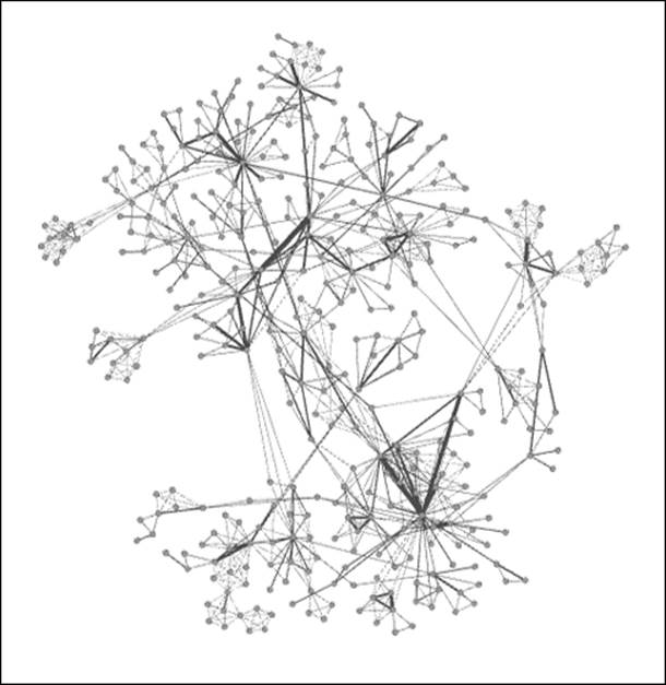
Giant component of Newman network
As you can see, there is a large connected component, but it represents just 24 percent of the entire network, suggesting a very fragmented graph with multiple pockets of isolated activity. So, fully three of every four researchers are not a part of the largest network. This could change significantly if just a few of the external nodes were to collaborate with something in the giant component, and would make for an interesting temporal study to check whether the network evolves significantly over time.
Let's apply some statistical measures to the graph to understand patterns even better. Remember our earlier mention about the difficulty of calculating diameter across the network, due to the many component groups. However, we still have the ability to run many statistical functions, but must recognize their limited meaning in certain contexts (such as a component with just five members). So our primary goal should be to examine the giant component and its member nodes, as this is where the most significant interactions are taking place.
After running a battery of statistical measures, we have the official validation for what we already suspected. Here are a few examples of the official validations:
· Graph density is 0.002, an exceptionally low figure, which confirms what we knew about the low number of connections relative to the node count
· The average clustering coefficient is 0.878, which confirms that the graph is highly clustered, something that is visually apparent
· There are 396 components in the network, which gives further evidence of the fragmented nature of the network
· The average degree is 3.45, which means that a typical member of the network has between three and four collaborations
Everything we note confirms our expectations, with no hidden surprises. Now that we've done our due diligence on the filtering and statistical fronts, it's time to make the graph more accessible and informative for users. We'll do this through the use of partitioning and segmentation, which will bring to our attention the most critical elements and patterns within the network.
For starters, we'll rank the nodes based on their degree level, which will quickly highlight some of the more evident patterns in the network. While we're at it, let's apply color using the same criteria. Set the size range between 2 and 25 and use one of the built-in color themes, and then open the Preview window for improved aesthetics. Let's increase the edge thickness to 2.0 and we see the following result:
Newman network with node size and color customization
These edits call out the high degree nodes in the graph, and also help to highlight unusual patterns like the tight cluster at the left of the graph. So performing the simple ranking exercise has helped make the graph more understandable at first glance. We could have employed some other approaches to segment the graph, such as using one of the available clustering algorithms, or perhaps through the use of a partition. The latter is a bit problematic with this dataset, as we don't have any information about institutional affiliations, professional credentials, or some other unifying characteristic.
Deploying the project to the Web
Our next step at this point is to take the graph beyond Gephi, perhaps as an image or a PDF file, or even an interactive web project. Let's make this one interactive, as it will give end users an opportunity to explore the graph and find answers to many potential questions. For this example, we'll proceed using the Sigma.js Exporter to create a straightforward interactive network for the Web.
If you are unfamiliar with the SigmaExporter process, refer to Chapter 9, Taking Your Graph Beyond Gephi, where we employed it to build our Miles Davis example for the Web. As you can recall, we used the template process to fashion an informative network about the 48 studio albums created by the pioneering musician. For our new instance, we'll need to edit the text to tell a relevant story about the network science collaboration network assembled by Newman.
I've gone ahead and edited the template settings to reflect the data in this particular network and published the graph to the Web. You can find it at:
http://visual-baseball.com/gephi/NetScience/network/
Here's a screenshot that shows the familiar layout using ARF and Sigma.js, hovering over the Mark Newman node:
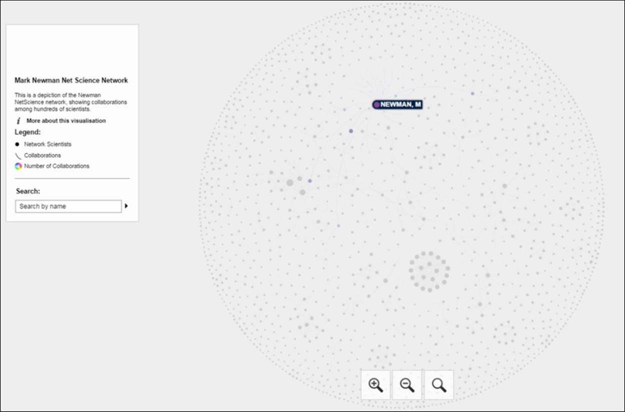
Newman network on the Web using Sigma.js
If we select the same node, we'll see all of Newman's collaborators and then have the ability to view their respective connections through a simple click. This is the same approach we shared with the Miles Davis network in Chapter 9, Taking Your Graph Beyond Gephi. Here's what we get after selecting the Newman node:
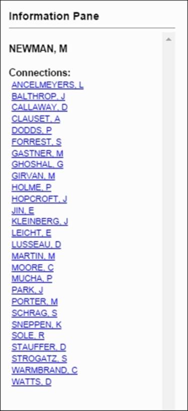
List of collaborators for M. Newman
To recap, we started with a raw graph file and wound up with an engaging, interactive graph out on the Web. Now users have the ability to easily navigate through this network, to learn more about the various collaborations as they go. Had the dataset provided the dates and titles of each of the collaborations, we could have turned this into an incredibly rich experience, but we'll have to be satisfied for the moment with this still powerful visualization.
The output files can be found at https://app.box.com/s/177yit0fdovz1czgcecp.
This gives you the ability to begin playing with the CSS styling and other settings that allow you to personalize the network.
Project 2 – high school network with dynamic edges
For our second project, we're going to have some fun working with a dataset that shows interactions between students at a high school in France over the course of seven school days. The original dataset can be found and downloaded fromhttp://www.sociopatterns.org/datasets/high-school-dynamic-contact-networks/.
The data provides a history of active contacts between individual students within a single high school, measured in 20 second intervals. As you can imagine, mapping the edges in this fashion could lead to a lot of connections appearing, disappearing, and then reappearing, making for some light entertainment without adding a lot of insight into behavioral patterns. Feel free to create your own time intervals in this fashion if you want to explore this; our finished project will take a slightly different approach.
Rather than mapping the slightly spurious 20 second connections, I wanted to view the patterns that build over the duration of the study. To do this, we will add new connections as time elapses while still retaining previously existing ones. This will give us a better idea of how patterns evolve over the course of a day or a week, while simultaneously drawing attention to frequent connections that might highlight a variety of relationships in the network.
We're going to step through the project using a number of Gephi methods to set up our working project. Once everything is in place, we're going to capture images of the network at the end of each school day to note what changes have taken place. We'll also capture some fundamental graph statistics at a macro level (feel free to explore individual students on your own) to confirm our visual impressions. Finally, we'll pull everything together in an Adobe PDF file that tells a useful story for viewers.
If you wish to start from scratch, the source node and edge files can be found at thiers_nodes.csv and thiers_edges.csv at https://app.box.com/s/177yit0fdovz1czgcecp.
Using Gephi to explore the network
Let's begin by opening the node and then the edge file using the Gephi data laboratory import spreadsheet functionality. Once the files have been imported, we need to create a time interval so Gephi can display a dynamic graph. Remember that we covered this process in Chapter 8, Dynamic Networks. In Data Laboratory, select the Merge columns icon, and then select the Start Time and End Time columns, followed by the Create time interval option from the drop-down menu. Click on OK to load this dialog screen:
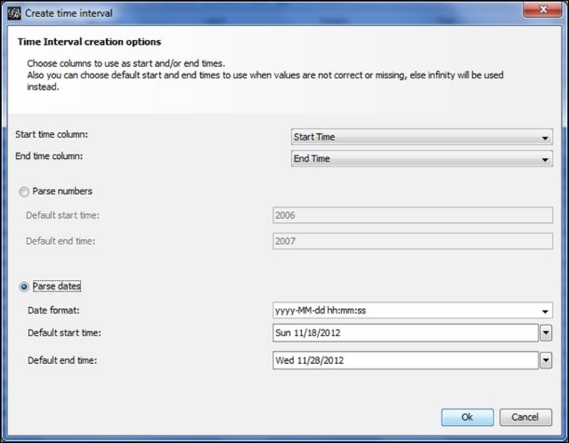
Setting time intervals by merging columns
Select the Parse dates option, and make sure that the format is entered in the same form as in the image. After clicking on the OK button, you should see an Enable Timeline icon at the bottom of the Gephi window. Selecting this will load a timeline that looks like this:
![]()
Timeline after creating time intervals
As you can see, Gephi has identified the day of the month element in the data, giving us the range of days from the 19th through the 27th of the month. You'll also see the typical random layout in the Preview window, waiting anxiously for you to provide a proper layout option. To make the project a bit more fun, hide the edges using the Show edges icon (it toggles the edges on and off) in the preview window. This way, we won't spoil the fun for the dynamic edges we'll see in a moment.
Now move to the Layout tab and select the Yifan Hu option if you wish to follow this example to the letter. Feel free to play with other algorithms if you want to create something a little different from this example—the underlying statistics and network structure will remain the same regardless of your selection. I tinkered slightly with the default settings to spread the network out just a bit:
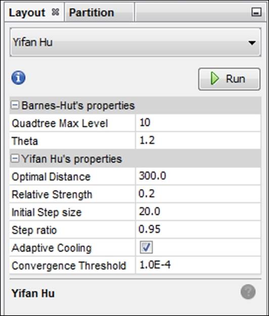
Yifan Hu settings for a dynamic high school network
Here's what the Yifan Hu yields (edges still hidden) using the settings in the prior screenshot:
Network graph after applying the Yifan Hu layout
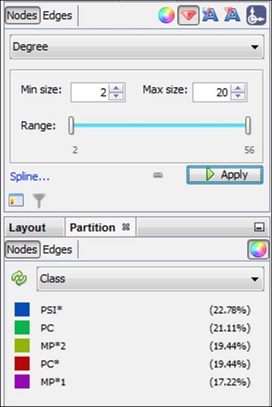
Our next step will be to size the nodes by degree and then to color them according to the Class element in the data. These steps will serve two purposes:
· Sizing will give us an indication for which nodes have the highest contact levels in the network.
· Partitioning by class will provide the formal structure of the network as defined by the school authorities. In this case, we have five classes, so the number of colors in the graph will be quite manageable.
For this example, the nodes have been given a size range of 2 to 20, as shown in the following screenshot, (actual values range from 2 to 56 degrees), which should allow us to see the higher influence members without distorting the graph or obscuring the smaller nodes:
Sizing and partitioning nodes in the high school network
After running each of these steps, we now have a graph that effectively illustrates the formal class structures while also showing the range of influence across all nodes:
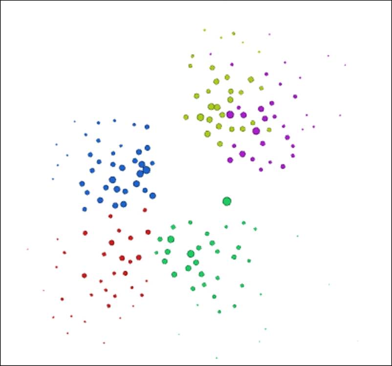
High school network colored by class partitions
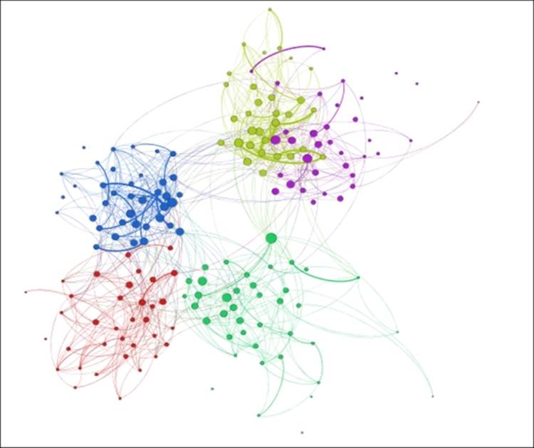
It's now time to show the edges between nodes—toggle the Show edges icon to make the connections visible again. Once that's complete, move to the timeline and drag the bar to the very start of the timeline. Shrink it as far as possible, by grabbing the right edge of the bar with your mouse. This puts us at the start of the first day (the 19th). Notice that there are just a few connections showing in the overview window, that reflect the handful of students already connected early in the school day. Now let the timeline run by clicking on the arrow to the left. Watch how connections build as we move through the school week.
If you find the graph moving a little quicker than you prefer, adjust the timeline settings (covered in Chapter 8, Dynamic Networks) to the left of the arrow. Watching the network build over the course of the study period reveals patterns of how members connect within their own class as well as with nodes in other classes. In some cases, there is little interaction between members of two classes, perhaps due to the physical structure of the school building, or perhaps related to the curriculum constraints. In any case, we have a potentially interesting story we can turn into a sort of time-lapse static presentation.
Creating the project as a PDF
In order to tell a compelling story about a dynamic network in a static format, we're going to have to provide a little more background information than in our interactive web example earlier in the chapter. We cannot afford the luxury of networks where users can zoom and pan for more information. So our approach must be slightly different, in that we have to provide users with enough information to tell the story. Everything is in our hands in this case—the user cannot craft their own story via interaction.
So what will we need to craft a compelling story? Here are a few ideas:
1. Our first step will be to create snapshots of the network at the end of each school day to show how the network evolves over the study period.
2. We'll also want some essential network statistics to help support the graphs, preferably in a visual format that shows the network trends.
3. We might also need to provide more of a narrative than we would in an interactive network situation. As I noted a moment ago, we need to tell the story of this dynamic network.
I'm going to provide a glimpse into what the final visualization will look like. The entire PDF is available at https://app.box.com/s/177yit0fdovz1czgcecp.
Here's one of our visuals that shows the network at the end of day 1 (November 19, 2012):
Dynamic high school network at the end of day 1, November 19, 2012
There will be a series of these visuals (one each for the 19th, 21st, 23rd, and 27th), showing the evolution of the network over the course of the study period. Viewers will be able to detect some of the changes, especially when comparing the first and last day. Yet the story would be incomplete without sharing some of the critical graph statistics that fill in the gaps. So with each end of the day snapshot, I also captured several critical network structure measures and pulled them together in a single page. This allows users to see how the network evolved, and when major changes (if any) took place:
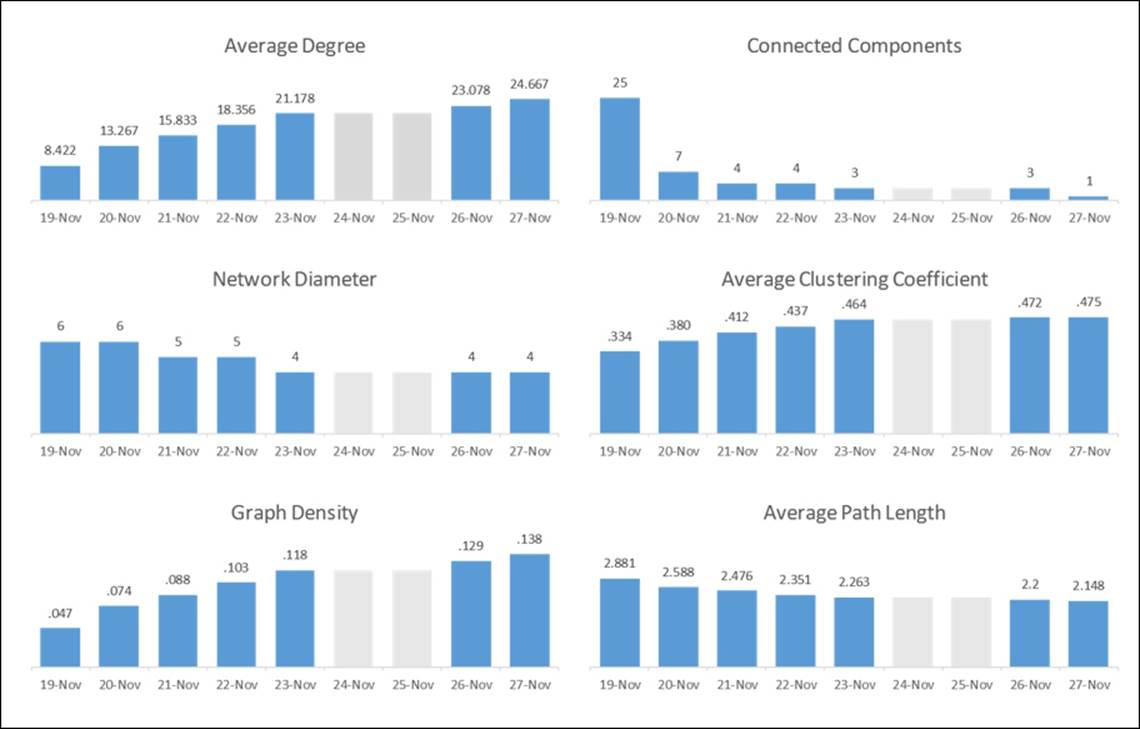
Statistical measures tracking network evolution
Notice that the two weekend days have been grayed out so as not to lead the user to the wrong conclusions. Placing all of these graphs on a single page lets the viewer see the evolution of the network in statistical terms, perhaps confirming their initial visual impression. Key changes in the network are also called out in the final visualization, completing the entire story.
Anticipating the future of network analysis
So we've seen in the course of this book the many wondrous things that can be done using Gephi, and we've still really just scratched the surface. There are now so many opportunities to process, analyze, and visualize network datasets that it can be overwhelming at times. Countless examples of Twitter, Facebook, and other social networks proliferate across the Web, some of them thoughtful and powerful, some others far less so. Likewise, we have all seen many instances of collaboration networks, protein networks, cell structure networks, citation networks, and so on. Where does it all go from here? Will the future look like the present, simply with more examples?
One outcome that seems a near certainty will be the increasing involvement of end users in interacting and perhaps even participating in the creation of the eventual network display. Imagine a case where users can adjust and adapt to the graph on a real-time basis, affecting the outcome of the network. Look no further than many of the massive multiplayer online games for proof of what can be done at the user level. Perhaps game theory examples will involve multiple end users acting according to their own preferences of the moment, with the network adapting and evolving to reflect the instantaneous input of hundreds or even thousands of users. These real-time examples could change much of today's analysis from a dependence on static historical datasets to an environment that is plugged into the ongoing changes in an evolving network.
Imagine also the possibilities of delivering additional insight by providing relevant information behind every node and edge in a network. In today's world, we have the ability to craft templates and provide generally static information to accompany our network graphs. In some cases, this is abetted by external links that provide additional information. This approach, while useful, puts the burden on the user and provides something less than a seamless process. How can we improve this process?
In the near term, are there untapped opportunities where network analysis can work more closely with ontological resources to deliver richer information and interactivity to the end user? In the slightly more distant future could all relevant information be accessed within the bounds of a single network page, enabling users to travel through the network as if they were in a gaming environment? Consider the possibilities of adding relevant information that activates multiple senses, and how users could leverage the power of sight, sound, and touch to examine and understand the network. Users could perhaps access a sort of virtual world, but one that is based totally on the reality of moment to moment interactions, not on some fictional construct created by game designers.
Beyond the evolution of network graph analysis through technological advances there is the question of additional use cases. We have seen the many instances of social media, citation, collaboration, biological, and infrastructure networks, but are there other opportunities to leverage network analysis to understand systems? Could network graph analysis be a powerful tool for exploring topics such as chaos theory, tracking the impact of specific stimuli on a surrounding network? Might we also be able to explore connections within the body that could help combat disease or infection? Are there greater opportunities to use these tools to better predict long-term effects of specific short-term decisions, in a modeling sort of environment?
These are merely a few examples for where network graph analysis could be heading. You no doubt have additional thoughts about the future and where the opportunities will emerge. Regardless of our individual ideas, I believe we can all agree that the future will be filled with exciting opportunities to employ these methods to better understand our world and all of its interactions. The future of network graph analysis and all its manifestations promises to be both challenging and rewarding, and will evolve and grow through the efforts of readers like yourself.
I also invite you to view my personal explorations and discussions at http://visual-baseball.com/wordpress/?gallery=network-graphs as well as the great work of users in the Gephi communities on Facebook and LinkedIn. Some truly exceptional work is being shared in these forums.
Summary
In this final chapter, we covered a few key areas that focused on Gephi and network graph analysis at a more holistic level.
We learned how to understand and ultimately enhance existing network graphs through the use of many of Gephi's capabilities. We learned how to use regex to provide additional insight into an existing network, particularly when the network data provides no obvious starting points for analysis. From there, we employed our more familiar skills of filtering, sizing, and coloring graph elements to create a more accessible user experience.
We then created two projects from scratch using publicly available datasets. In the first example, we took a static network, enhanced its appearance, and made it interactive on the Web. In our second case, we created a dynamic network by building time intervals that documented member patterns, and ultimately created a time lapse project as a PDF output.
In our final section, we took a look at the future of network graph analysis and where it might be heading. We looked at the possibilities enabled by advanced technology as well as opportunities for horizontal expansion through the application of network analysis methods to additional disciplines.
I hope this book has helped provide you with opportunities to leverage Gephi more effectively to address your own network analysis needs. In addition, my hope is that I have triggered some additional ideas that you might pursue as you continue to investigate this fascinating yet largely untapped field.
All materials on the site are licensed Creative Commons Attribution-Sharealike 3.0 Unported CC BY-SA 3.0 & GNU Free Documentation License (GFDL)
If you are the copyright holder of any material contained on our site and intend to remove it, please contact our site administrator for approval.
© 2016-2026 All site design rights belong to S.Y.A.