Mastering Gephi Network Visualization (2015)
Chapter 9. Taking Your Graph Beyond Gephi
After spending a significant amount of time and effort creating an informative, powerful network graph in Gephi, there is a good chance that you would like to share your work with others. Fortunately, one of the best features of Gephi is its ability to export network graphs for others to view using their favorite web browser.
In this chapter, we will explore the capabilities provided by a handful of Gephi plugins, followed by a walk through the typical steps to make sure your graph is ready. Then we'll spend most of the time on the actual export process. We'll cover the following topics:
· Selecting the best tool for your specific use case
· Customizing available options inside the export plugins
· Exporting and viewing an interactive graph using a web browser
I'll also include links to examples of some existing projects created by me, so you get a better feel of what a deployed network might look like. By the end of the chapter you should be very comfortable with each of these steps, and be able to easily create your own compelling projects.
Overview of the available tools
There are three broad categories of export tools provided for Gephi users. Here are some brief descriptions of your available options, with further details later in the chapter:
· Graph file: These exporters simply convert your Gephi project to one of a variety of formats that can be used outside of Gephi, either in other network tools or simply in spreadsheet software. The options here range from simple .csv formats to open formats (.gml), as well as proprietary options for exporting data to Pajek, GUESS, and UCINET protocols.
· Image exporters: These exporters enable you to export views of your graph to .png, .svg, or .pdf formats. This is often the fastest way to share a graph, although it doesn't allow interactivity on the user end. The .svg and .pdf options are also useful if your intent is to do further editing in Adobe Illustrator or Inkscape.
· Web exporters: These are a family of tools that allow you to push your Gephi network graphs to the Web for others to explore. These tools allow varying degrees of interactivity and represent the most effective means for deploying complex networks. This is where we'll spend most of the time during this chapter, given the many options available within each tool to create and deploy interactive networks to the Web.
Graph file exporters
Gephi provides a wide range of available file exports that enable users to move their network data between tools. This open approach alone makes Gephi a highly valuable tool for all network graph creators, as you will not be limited to a single software platform. To find the available selections in Gephi, navigate to the File | Export | Graph file menu. Here's a screenshot of the many options available to you:
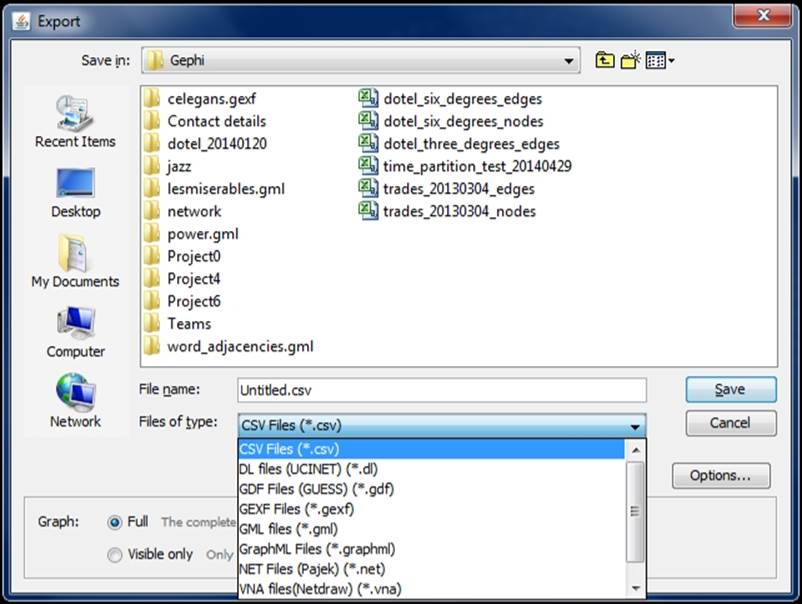
Graph file export options
Let's take a brief walk through each of the available options and their related software tools where applicable.
CSV files
The ubiquitous .csv format is often used for loading data into Gephi, but can also be used on the backend to export data that has been modified inside Gephi. This would enable further exploration using Excel or other spreadsheet tools for statistical analysis.
DL files
This format can be used by the UCINET program (for more information, refer to https://sites.google.com/site/ucinetsoftware/home), a long-standing software used for network analysis. When exporting a file to this format, there are a few simple options that you will get, as shown in this image:
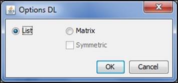
DL file options for UCINET
The data can be exported as a list or matrix, with the symmetric option available for matrix exports. For more information, consult the user guides on the UCINET site.
GDF files
GUESS is another network analysis software (for more information, refer to http://graphexploration.cond.org/). Gephi provides multiple options for this format, as shown in the screenshot:
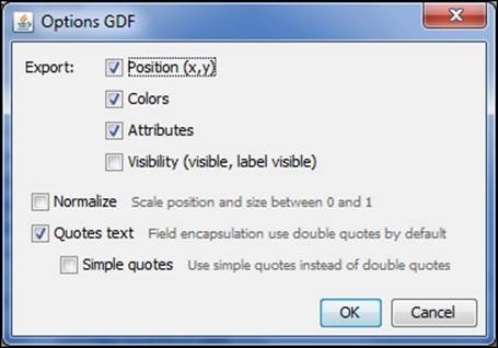
GDF file options for GUESS
We will not go into detail here; to learn more about GUESS and the data options, please visit the GUESS site at http://graphexploration.cond.org.
GEXF files
The Graph Exchange XML Format (GEXF) format is very useful for Gephi users, which is not surprising, since it was created by developers involved with Gephi. In Chapter 8, Dynamic Networks, we provided some code examples from http://gexf.net. One of the beauties of GEXF is that it is essentially XML repurposed for graph formats. This property will make GEXF's layout and logic very familiar to many programmers.
There are a handful of options available for GEXF exports, as shown here:
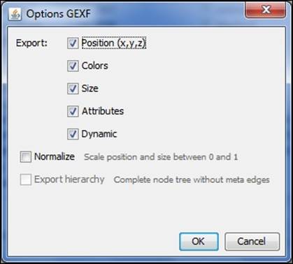
GEXF file options
For additional information, please refer to the GEXF website.
GML files
Graph Modeling Language (GML) is a hierarchical ASCII-based format for describing graphs. The syntax bears a very slight resemblance to JSON. The export options are nearly identical to those of GEXF:
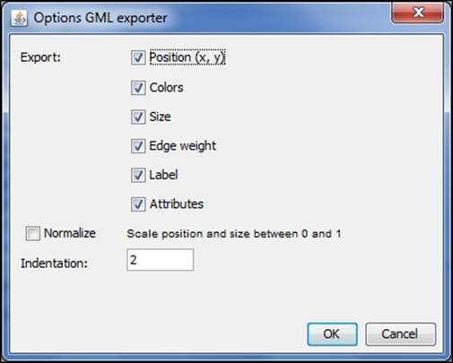
GML file options
GraphML files
GraphML is another XML-based format, so it will look very familiar to some users. There are specific elements (at the graph, node, and edge levels) that make the syntax very easy to interpret. Gephi offers partial support for this format, but once again allows users to export their graph files to GraphML with the following options:
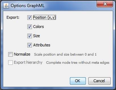
GraphML file options
For the full GraphML specification, visit the GraphML site at http://graphml.graphdrawing.org/.
NET files
One of the most prominent network graph solutions is the Pajek program, found at http://pajek.imfm.si/doku.php?id=pajek. Pajek uses the .NET format, which Gephi provides two simple export options for:
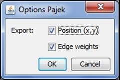
NET file options for Pajek
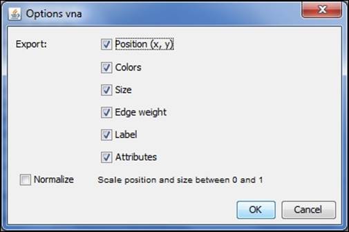
VNA files
The VNA format is used by a program titled NetDraw and resembles the Pajek .net syntax. Gephi provides a number of export options for this, which are as follows:
VNA options for NetDraw
To learn more about .vna and NetDraw, visit https://sites.google.com/site/netdrawsoftware/home.
Before moving to our next section, note that Gephi also provides plugins that enable geo-based data exports for Google Earth (.kml/.kmz data), as well as shapefile exports that can be used in GIS software as QGIS or MapWindow. For more information, visit the Gephi Marketplace and search for the ExportToEarth, Export to SHP, and Google Maps Exporter plugins. The main requirement to use these is the presence of latitude and longitude (lat/lon) attributes in your network data.
Image exporters
In some cases, your goal will be to produce finished graph output that does not require users to view a network using Gephi or other network graph software. In many of these instances, the graph might be intended for a print publication, or you might simply want to create a specific view of your network for sharing via social media or e-mail. For these cases, the three image export options provided by Gephi offer easy solutions to your needs. Let's look at each of these options, with a focus on the benefits and limitations of each.
PNG export
When your goal is to simply share a static version of an existing graph project, creating a .png file is hard to top. This will be the quickest means to share your work with others, with the understanding that the file is not designed for further interaction. On the plus side, .png files scale well and are easily displayed on a blog or website.
Let's have a quick look at the .png export process, which can be initiated by navigating to File | Export | SVG/PDF/PNG file. Alternatively, if you are in the Preview window, there is a SVG/PDF/PNG button near the bottom of the screen that will execute the same process. Suppose we take our example of Miles Davis network and elect to create a .png version for quick sharing on a blog or through social media.
We're going to use the Preview window and set Preview Settings to use the Default Curved option, which will display better in this context (versus the black background I used for the Web). Now refresh the window to display with the new format and then export the data to .png using the advice from the previous paragraph. Save the file and then open it in any program where you can view image files. Here's our output image, which should look precisely like the version from the preview window:
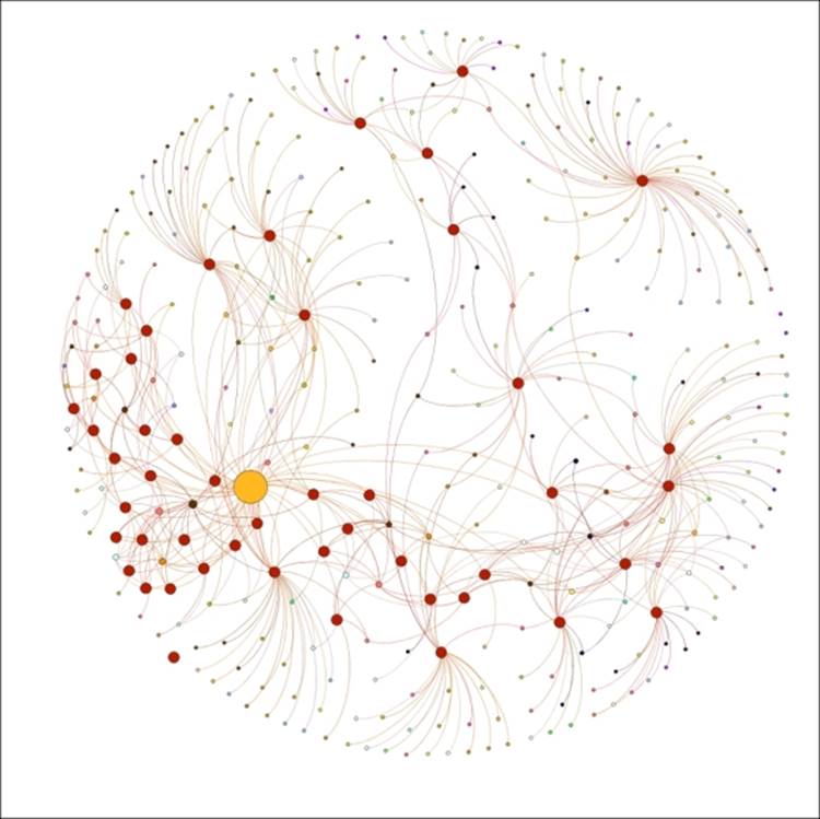
PNG export of Miles Davis network
As you can see, this results in a high-quality image of the network that can be shared through various channels.
SVG export
If you need to move beyond the fixed image provided by a .png export, then you might consider the Scalable Vector Graphics (.svg) option. SVG provides an XML-based format that can be edited using either text editors or the more common, image editing software. SVG is also suitable for the Web, as it scales well when zooming or panning a visualization.
In this section, we'll take the same Miles Davis network, save it as a .svg file, and then do some editing using the open source Inkscape program. Following the steps we take might help you determine whether .svg is the best option for post-Gephi editing, or whether you would prefer .pdf, which will be covered in the next section.
Editing an SVG file with Inkscape
So let's begin by repeating the file saving process, but by electing the SVG option in place of PNG. After saving the file, we're going to open it in Inkscape. Feel free to follow along with your own version of Inkscape, or by following a similar process in Adobe Illustrator or any other image editing software.
We already noted that these programs can be used to finish what we already started in Gephi, especially if we are seeking to create a finished graph for print purposes. We could simply leave the graph alone while adding text and titles in the editing software, or we can use the tool to truly edit the graph itself. I'm going to showcase each of these options.
We'll begin with the actual editing of our graph, which can be done by ungrouping the graph elements. This will allow us to edit each and every element in the graph, although it is far more likely that we will want to call out just a few special highlights. So with the.svg file created, we'll open it in Inkscape, which will give us the same sort of view we saw with the .png output.
The key step comes when we click on the Edit Path by Nodes icon (or the F2 key). This allows us to start selecting individual graph nodes and edges for editing. So we will start with a network like this:
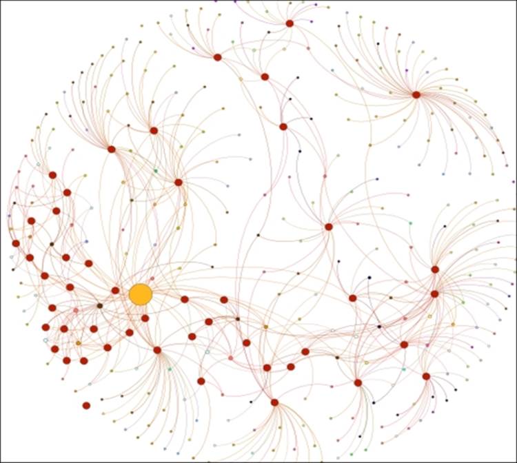
SVG export of Miles Davis network
Suppose that we are not pleased with the yellow shade of the Miles Davis node and would like to change it to blue. All we need to do is select the node using the mouse and then select a new color from the palette at the bottom of the Inkscape window, which will result in the following graph:
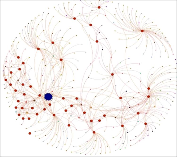
SVG export edited using Inkscape
Let's make a couple more edits to demonstrate how easily text can be added to the graph. Using the Create and Edit text objects icon (or the F8 key) from the Inkscape toolbar, we'll add a small title beneath the network followed by a large label calling out the Miles Davis icon, just in case it isn't obvious enough from the large size and distinct color. We'll also throw in a line as a pointer for the label. Here's our enhanced graph:
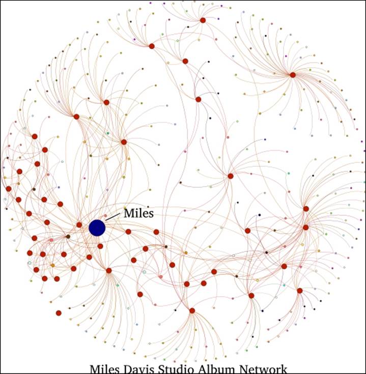
Adding text and titles with Inkscape
This should give you some idea for what can be done to enhance Gephi networks using image editing software. While these were simple edits, there is clearly potential for much more.
PDF export
The Adobe Acrobat PDF format has long been a standard for sharing files on the Web or through e-mail, as it lets all the end users afford the ability to view output without requiring multiple software platforms on their own machine. For the purposes of the Gephi user, it serves as an output option that can produce high quality files for end users to view a network graph. That in itself might be enough to recommend this option, but there is a potentially much more valuable function served by the PDF format, which we'll now discuss.
PDF files can be readily edited using applications such as Adobe Illustrator or its open source alternative, Inkscape. This makes the PDF format highly useful in cases where you wish to tweak your graph beyond Gephi. Much of what you can do within these software platforms is technically possible in Gephi, such as customizing the size and coloring of specific graph elements. However, the ability to add titles and text, strategically position labels, and add images, among a host of other possibilities, makes the PDF export option very useful for Gephi content producers. By the way, there is a Gephi plugin in the early development stages designed for a similar purpose—the Image Preview tool, found at https://marketplace.gephi.org/plugin/image-preview/.
We'll follow a similar process to what we did with the SVG files in Inkscape. One primary difference is the way in which items are ungrouped; whereas all elements were immediately available using the SVG approach, the PDF might differ somewhat, requiring a few steps to ungroup the file (depending on the export settings). Note that there will often be some transparent layers that need to be removed before all elements can be completely ungrouped.
When you elect to use the PDF export, there are some available options, mostly with respect to formatting of the file, as shown in the following screenshot:
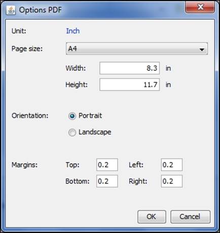
PDF export options
Editing a PDF file in Inkscape
Let's pick it up with the PDF file created and ready for manipulating in Inkscape. When we open the file in Inkscape, another dialog screen pops up, which is as follows:
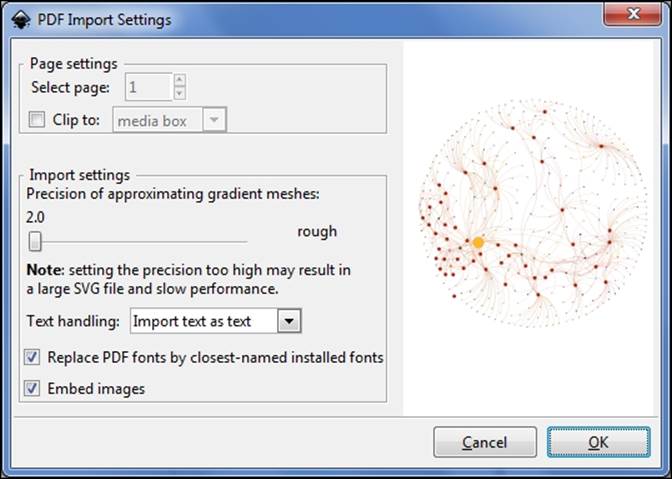
PDF import in Inkscape
Here we can determine how to handle text, whether we should clip the file on import, and how precise we want the file (which will have some cost in the file size).
In this case, I'll go with the default options shown in the preceding screenshot, which will result in a file very similar to what we saw with SVG. We can now begin editing the file in the same fashion we did previously.
Web exporters
Several Gephi plugins can be used to create interactive graphs on the Web. We'll focus on three of these, in order from simplest to most complex:
· Seadragon Web Export: This uses the Seadragon software's zoom capabilities to enable traversing large networks using zoom and pan capabilities
· Sigma.js Exporter: This is based on the Sigma.js software, which facilitates the creation of interactive web-based network graphs using a template-driven approach
· Loxa Web Site Export: This also uses Sigma.js as the basis for a slightly more sophisticated graph implementation that enables user interaction using filtering and zooming plus the possibility of multiple layered views
Now let's take a tour through each of these options, detailing how they work and what they can deliver for a finished project.
Seadragon Web Export
The Seadragon option is ideal if you want to provide a modest level of interactivity for users. Zoom and pan are the primary features of Seadragon, which makes it suitable for navigating large networks that would prove difficult to decipher as a static graph. What you won't get is any sort of statistical output or additional information about the network.
Let's take a look at the basic options provided by the Seadragon plugin, and then we'll walk through an example later in the chapter. When we select the Seadragon option, this screen pops up:
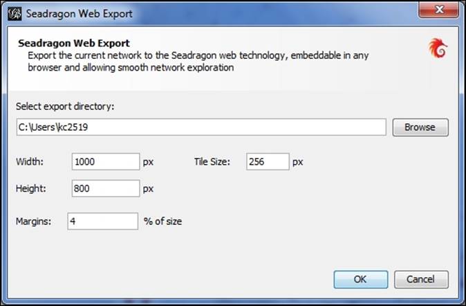
Export dialog box for Seadragon plugin
Here's where the dimensions of the graph can be specified, ideally well suited to the needs of the user. Remember that users can zoom and pan, so there is no need to make the original graph larger than necessary. After selecting the OK button, Gephi will export the project to the specified folder location.
We'll see what the output actually looks like, as well as how to interact with it in an upcoming section.
Sigma.js Exporter
If Seadragon doesn't provide the capabilities you're looking for, then it might be time to step up to SigmaExporter, which allows you to create templates that can be used as the base for multiple network instances. We'll spend plenty of time with this option, as it delivers a powerful experience for web users.
Let's assume that we wish to export an existing Gephi network to the Web using SigmaExporter. We'll begin by navigating to the File | Export | Sigma.js template menu. The template approach allows us to create specific reference text that can be used again and again, tweaking as needed. Here's what we see after making the menu selection:
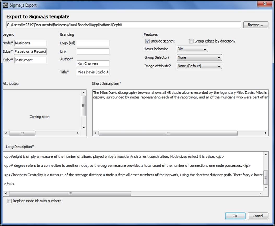
Export options for SigmaExporter
First, we need to specify where the file will be saved. Be careful not to overwrite prior exports, which will be done by default. To avoid this, you can simply add a subfolder for each export within your default directory.
As you can see, there are multiple sections where values can be set, beginning with the Legend section. Each of these settings is mandatory for good reason—they deliver critical information to the graph viewer. The options in the Legend section can be described as follows:
· In the Legend section, there are three options, starting with the Node setting, which is essential for the display. This is used to tell viewers what the nodes represent—musicians in our case, but this could just as easily be individuals, places, or dozens of other possibilities.
· The Edge setting is also required, and is used to explain what the network connections indicate. In this example, we will specify that edges indicate that musicians Played on a Recording.
· We will also use Color to encode graph information—in this case it represents the instrument a musician played.
Several Branding options (for personalizing the graph) are also offered, which are especially useful when you want to link back to your own website or use your own logo. This is also where you specify author and title information; after all, you should get some credit after you've spent time creating a great Gephi visualization.
Several selections can be made in the Features portion of the template as well. We'll summarize those here:
· Our first selection, Include search allows us to provide users with search capability, which is especially useful when deploying a large network. We'll see just how useful this can be in the next section where we will actually deploy the network graph.
· In the case where we have a directed graph, we have the ability to Group edges by direction, making it easier for users to navigate the deployed network
· There is also an option for Hover behavior, a simple setting that determines what occurs when users hover over a node. The simple choice is to dim nodes, or to leave them in a normal state. The advantage of using the dim setting is the ability to dim the unneeded sections of the network, which allows a better focus on the relevant areas.
· The Group Selector allows you to partition the network using one of the available variables. This could be done using color, centrality measures (if available), or some other categorization.
· Finally, we have an Image attribute setting, in the event your network has an image you wish to utilize, based on one of the columns in your dataset. This image will then be used in the Information Pane area of the final graph.
Let's move on to a couple more useful options in the template. First up is the Short Description text area, where we can provide users with a synopsis of what the network is about. This is where you want to be concise in explaining the network—a couple of sentences should be sufficient.
Our last selection is one where we can really customize the look and feel of the graph, by providing a useful Long Description. As you might have noted from the preceding screenshot, HTML styling can be employed here to adjust text sizes, set paragraphs, and so on. This will help give your graph a polished feel by providing essential information for users seeking further information.
In the next section we'll see how to utilize these settings to great effect as we deploy an interactive graph.
Loxa Web Site Export
Another available export choice is the Loxa tool, which uses Sigma.js while providing some alternative options not found in SigmaExporter. We'll walk through the available selections just as we did with the prior tools.
We'll begin again by initiating an export of the existing project, reviewing each of the options as we go. Navigate to the File | Export | Web site exporter menu item, which will give you the following screenshot:
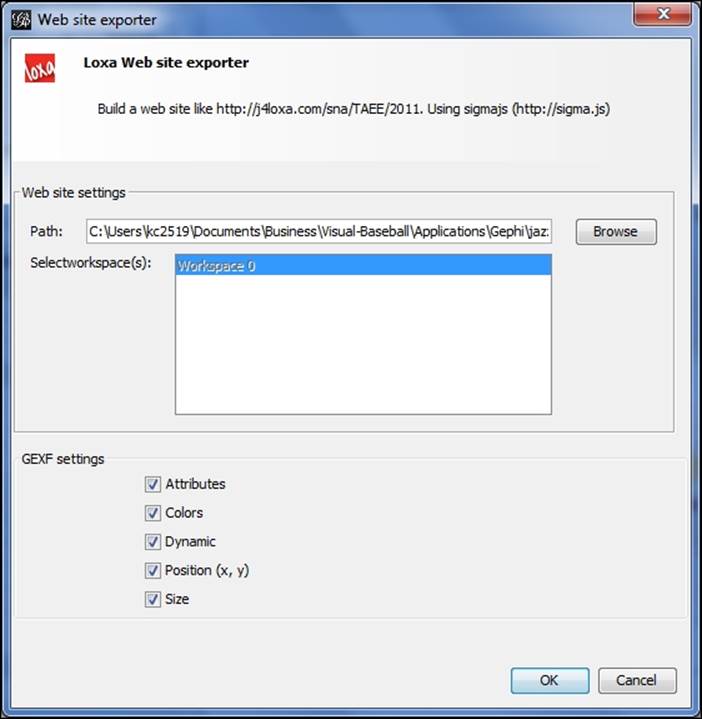
Export options for Loxa Web Site Export
You'll notice the relative lack of options compared to SigmaExporter, although there are a handful of options at the bottom of the screen you can choose to export (or not)—Attributes, Colors, Dynamic, Position, and Size.
In contrast to SigmaExporter, much of the descriptive work for Loxa projects is done behind the scenes by navigating to your project export location. There you will find not only the primary display page (index.html), but also two output pages that can be edited in any text editor. The About page lets you provide basic information about you or your organization. The Info page is where the real meat of the information is supplied, which allows you to specify sources, objectives, metrics, references, and any other information deemed essential to the display.
We'll walk through the process of creating a custom info page when we build our network graph in the next section.
Exporting a web graph
We've just learned about the three primary options for exporting an interactive graph to the Web. We'll walk through the process using each of the three choices. I'll also provide some examples of other graphs created using the SigmaExporter option, which I hope will give you an idea of the possibilities.
Let's begin with the Seadragon tool. If you want to follow along, make sure the plugin is installed in your version of Gephi. If not, download and install it using the Gephi plugins option from the Plugins menu under Tools. For this example, we'll use the familiar project I created that explores all 48 studio albums of jazz legend Miles Davis. The file can be found at https://app.box.com/s/177yit0fdovz1czgcecp.
Seadragon
Our first example will be using Seadragon. Follow the process discussed earlier to export the graph by navigating to the File | Export | Seadragon Web menu selection. Set your location, size, and margin options in the dialog screen, and create the graph. Remember that if you export the project to a local file, some browsers will not open the graph due to their restrictions on JavaScript files. If you are a Chrome user, you'll want to switch to Firefox for this example, or you can use a local web server powered by Python or Java, as two possibilities.
Let's display the finished graph in the browser:
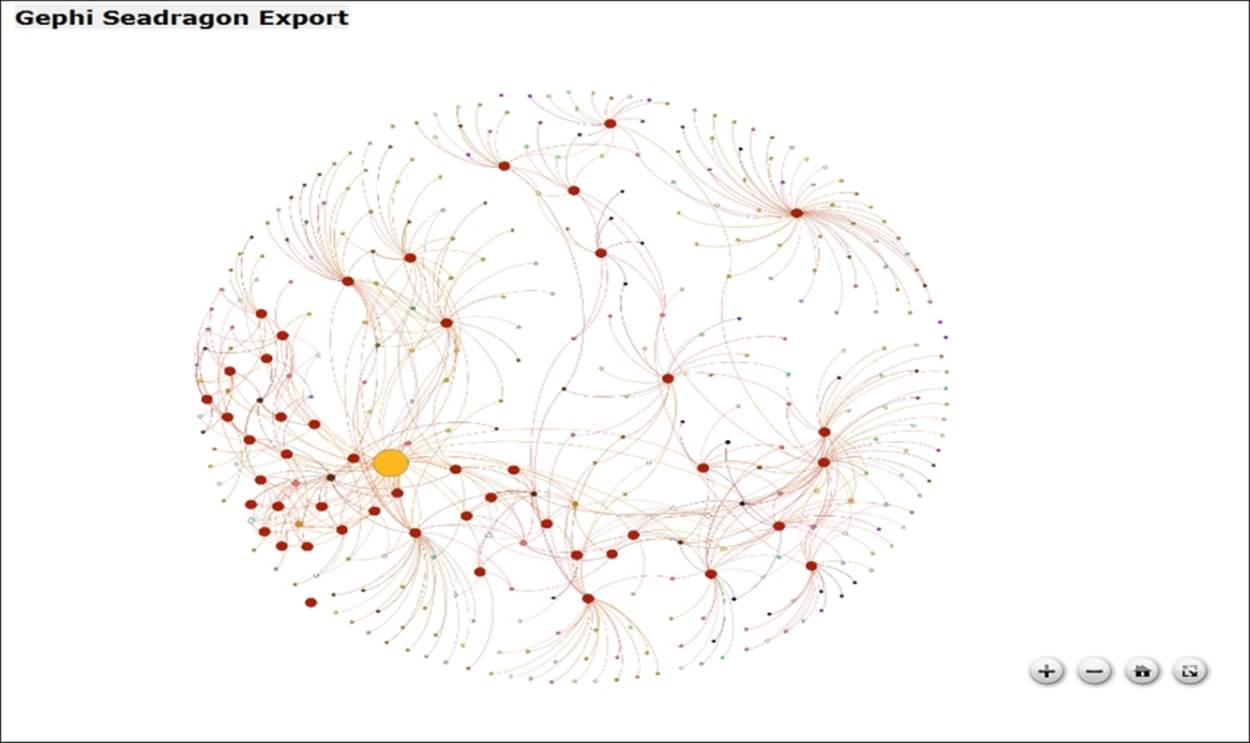
Network output in Seadragon
You can see the controls whenever you hover over the graph. The plus sign enables zooming in, while the minus sign does the reverse. The home icon will return the graph to its original centered position, and the final icon on the right lets you toggle between fullscreen and the original graph size.
Before we move on to the more powerful Sigma and Loxa options, I want to make you aware of the ability to do some style editing behind the scenes for your Seadragon file. All styling information is embedded directly in the .html file created by the Seadragon plugin, although you could create a separate CSS file to refer to if you wish. Here's what the style code snippet looked like when I first exported the above file:
<style type="text/css">
body {
margin: 0px;
}
#seadragon {
width: 800px;
height: 600px;
background-color: Black;
}
</style>
Here you see some very simple settings that instruct the browser how to display the page—simple width, height, and background color elements. If you have experience with CSS styling, feel free to add more elements using your favorite text editor, but given the relatively limited scope of Seadragon this might not be terribly useful. Perhaps a title element and a textbox or legend would be nice, but these will be easier to implement in the Sigma and Loxa solutions.
Seadragon is a fun tool for manipulating the graph, even if it falls short of the feature sets of the Sigma and Loxa exporters. However, if you want to create a quick, simple network graph for the web browser, Seadragon might be sufficient for your needs.
SigmaExporter
Earlier we saw the many choices available for exporting a network graph using the SigmaExporter tool. Now we'll follow the process right through graph creation. We'll also use the group selection, search functionality, and information pane to learn more about the network. If you wish to follow along, make sure to install the SigmaExporter tool from the available plugins list in Gephi.
So what do we get if we just pursue the initial settings shown earlier in the chapter? Here's the result:
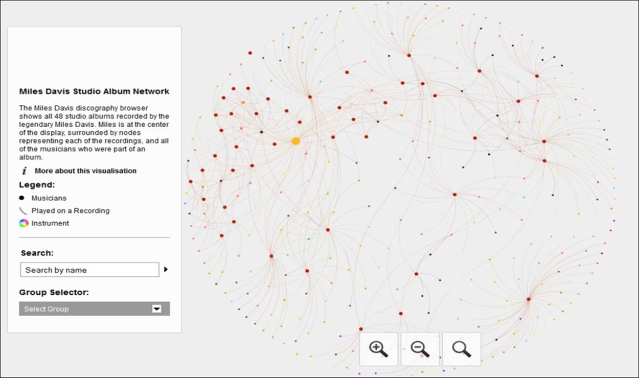
Miles Davis network in SigmaExporter
We have a nice graph that resembles what we just saw in Seadragon, but with additional information courtesy of the template we reviewed in the last section. The graph has an overview, a legend, search box, and group selector based on our partitioning decision (instruments in this case). In addition, if a user clicks on the information icon, the long description text area we saw earlier will be loaded, providing further context on the visualization. So you can begin to see the incremental power these options provide when compared with the Seadragon alternative.
Now let's see how we can tap into some of the Sigma functionality to begin traversing and filtering the network. If we click on the Group Selector drop-down menu, we'll see a host of options to choose from—in this case, they refer to specific instruments:
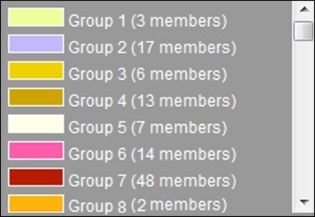
The Group Selector menu
Let's select Group 4 (13 members) and see the results in the information pane:
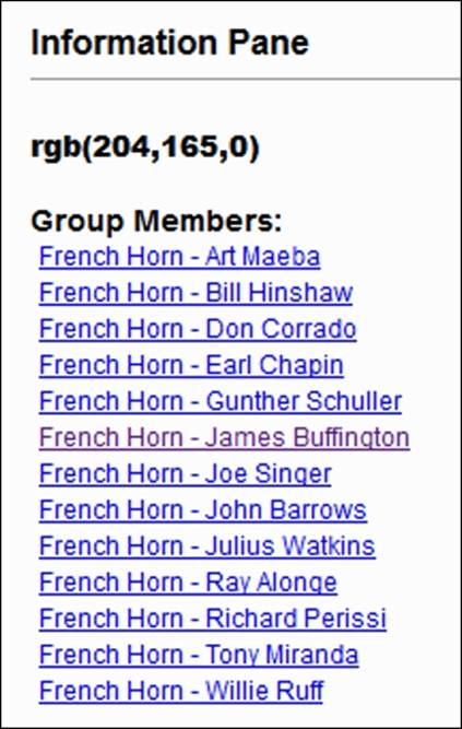
Information pane showing group results
We can now see each of the French horn players employed by Miles Davis on his albums—13 of them, as this was a commonly used instrument in some of Miles' earlier ensembles. We could select any of these musicians using either the information pane or the graph to explore the albums they played on and to which other musicians they are connected. Since this is a bipartite network, each musician is connected directly to albums only, and not other musicians. Selecting any given album will reveal all of the musicians who played on that particular recording, so it's a two-step process to see linkages between musicians.
Now let's use the search tool to learn more about a specific musician. In this example, we'll enter Wayne Shorter into the search box, which results in the following:
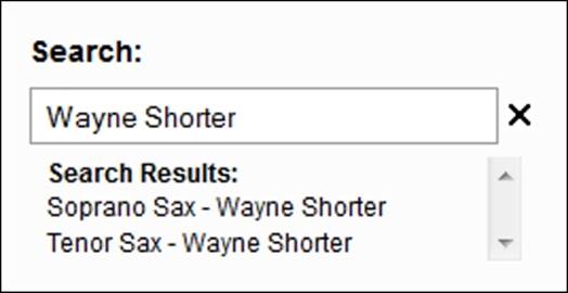
Sigma search option
We have two matches, as Wayne Shorter played both soprano and tenor saxophone on various recordings. Selecting the Soprano Sax - Wayne Shorter item results in the following information pane:
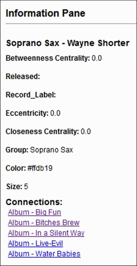
Information pane for individual musicians
Notice that some of the fields here are either empty or meaningless for our analysis. Since Wayne Shorter is a musician, the Released and Record_Label fields are null; if we select any one of the recordings in the network, those fields will be populated. Notice also that two centrality measures return values of 0; this is because of the bipartite nature of the network. We could elect to remove these fields from the final result if we so choose, by editing the underlying data.json file to remove the unnecessary elements.
We will then see the more interesting information we're after, such as the group classification, the color used for the specific group, and most importantly, each of the recordings where Wayne Shorter played soprano saxophone. Each of these album titles is clickable, which will load new information into the graph display when selected.
A moment ago, I referred to how our results would differ in the event an album (rather than a musician) was selected in the graph. Suppose we selected the album titled Walkin' by clicking on the appropriate graph node:
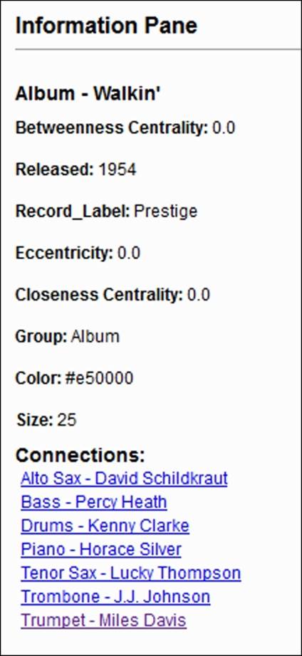
Information pane for albums
Now we will see the year the recording was released as well as the label that produced the album. We will also see each of the musicians who played on the recording, each in the form of clickable links. Selecting the Bass - Percy Heath link will then display every recording he played on, providing further insight into the network content. This ability to navigate the network from either the graph window or the information pane makes for a very powerful, easy to use visualization.
Another powerful capability within the Sigma plugin is the ability to create advanced styling. While there are a few ways to customize the output via the basic template, there are many more options behind the scenes. To access these files, go to the directory where your visualization is parked (it will be an index.html file), and locate the css folder.
Inside the css folder you will find two files—a primary file titled style.css and a second one called tablet.css. Most of your tweaking will be performed in the style.css file, where you have dozens of elements that can be adjusted. If you aren't familiar with CSS, it's worth learning the basics, as it will allow you to truly customize your output in so many ways. Let's have a look at a small snippet of CSS code from the file:
#maintitle h1 {
display: none;
}
#mainpanel {
margin-top: 50px;
margin-left: 25px;
background:#fff;
background-color:rgba(255,255,255,0.8);
border:1px solid #ccc;
z-index:20;
position:fixed;
top:0;
}
#mainpanel .b1 {
padding: 0px 0 0 0;
}
#mainpanel .col {
width: 240px;
padding: 18px 18px 18px 18px;
margin: 0;
}
#title {
font-weight: bold;
}
#titletext {
padding: 6px 0 10px 0;
}
Just in these few selections you begin to get a sense of the possibilities, such as being able to customize the width, margin, and padding for your main information panel. You could also change the positioning of the panel, adjust its coloring, and decide whether to create a border surrounding the panel. This is just a very small glimpse into the style file—there are literally hundreds of adjustments you could make to create a unique look and feel for your published visualization. Even more edits can be made within theconfig.json and sigma.js files, for instance. It is important to remember that any edits you make will be overwritten if you need to recreate the network, unless you create a new folder location for each version.
Loxa Web Site Export
We just used SigmaExporter to create multiple versions of a single network graph; now we'll follow a similar process using the Loxa plugin. If you wish to create your own graphs, make sure to install the Loxa Web Site Export tool from the available plugins list in Gephi. Our primary difference for this example will be the need to edit some of the Loxa files using a text editor, so get your favorite tool ready if you wish to do a little tweaking.
If you wish to follow along, you'll need to have the Loxa plugin installed—you should find it in your available plugins directory. The export process for the tool was detailed earlier, and is just as simple as for the other web exporters. Remember that there weren't a lot of settings to modify in the dialog screen (as there were for SigmaExporter), so we're going to proceed with the default options checked. Depending on the speed of your computer and the complexity of the network, the export could range from a few seconds to upwards of a minute. Locate the exported file and open it up in a non-Chrome local browser session. The results will be along these lines:
Default Loxa display window
Your version might have a darker background; I have adjusted the background color by editing some of the inline styling within the index.html file produced by Loxa. While more than 90 percent of the styles are set using a standalone CSS file, a few of the rudimentary elements are stationed within the main page, like so:
<style type="text/css">
label {
display: inline-block;
width: 5em;
}
/* sigma.js context : */
.sigma-parent {
position: relative;
border-radius: 4px;
-moz-border-radius: 4px;
-webkit-border-radius: 4px;
background: #666;
height: 530px;
}
.sigma-expand {
position: absolute;
width: 100%;
height: 100%;
top: 0;
left: 0;
}
.buttons-container{
padding-bottom: 8px;
padding-top: 12px;
}
</style>
The initial sigma-parent element had a background setting of #222 (almost black) which I have changed to #fff (white) for the benefit of the print settings in the book. I have also tweaked the label styling by editing the loxawebsite-0.9.1.js file (your version might differ). Node and edge styling can also be manipulated by adjusting settings within this file. Use your own discretion when making changes to the styling.
Taking a look at the Loxa display window, there are a few important items to note:
· Notice that at the top of the graph there are three tabs—the SNA page, About analysis tab, and About us page that can be customized to provide additional information about the network. The SNA page refers to the actual graph, while the About analysistab is intended for descriptive information about the project, much as the SigmaExporter template that provided descriptive fields. Finally, the About us page serves as a placeholder for information about the authors of the visualization. We'll come back to these in our next example.
· Next, there is a graph dropdown that shows all workspaces belonging to the current project. In this case, we have but a single workspace, but Loxa can accommodate multiple instances within a single project. We will discuss more on this shortly.
· Basic network information is displayed at the top of the graph, such as the numbers of nodes and edges, and whether the network is directed or undirected.
· The download image arrow will convert the network to a PDF file for offline viewing.
· Finally, there is a search box function that assumes that the search functionality is enabled
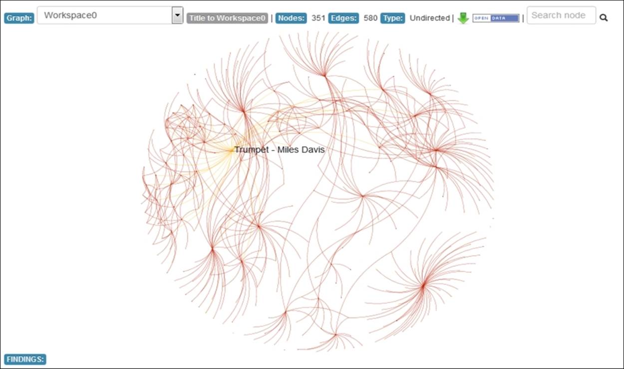
One of the outstanding features of the Loxa tool is the ability to zoom in using the scroll wheel on your mouse. Seadragon also features this option, but Loxa adds more functionality, including the ability to see node labels at different levels. So where we saw only the Miles Davis label on the initial load, watch what happens when we begin to zoom in:
Loxa display with zoom capability
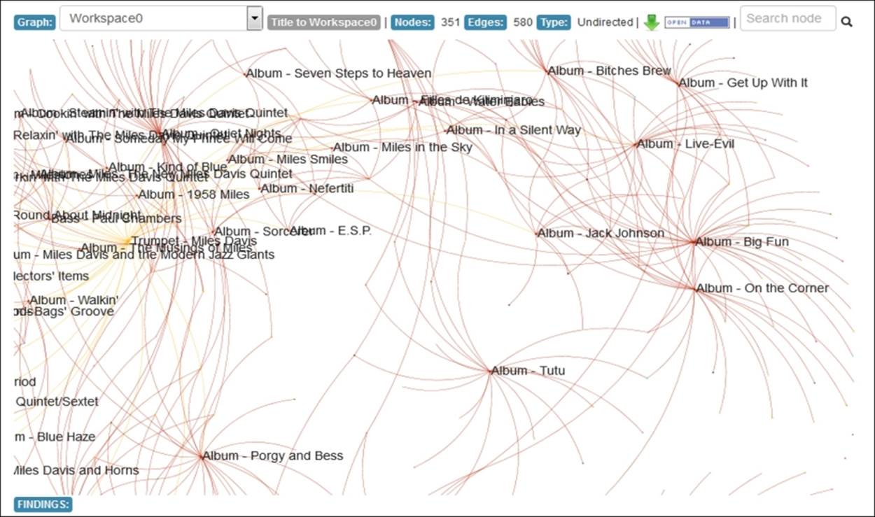
Now we are able to see each of the album titles displayed automatically, but no musicians yet as the visualization would become very crowded. Zooming in another level does just that, however, the individual musicians from each recording are now labeled along with the recordings, as shown in the following screenshot:
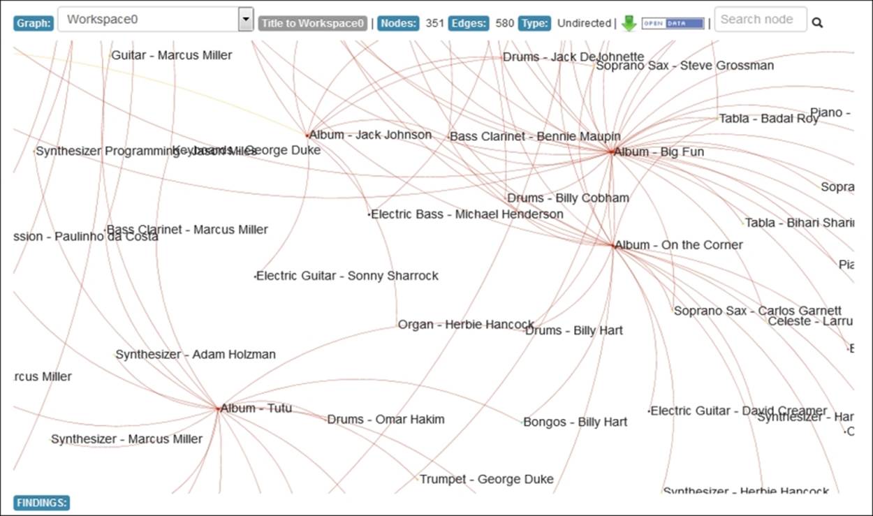
Loxa display with additional level of zoom
This capability, along with the ability to drag-and-drop the graph, makes for a very powerful, highly interactive environment that will provide a great experience for your users.
Before we conclude this chapter, I wanted to go back to a couple of the previously discussed tabs in the Loxa output and show you how these can be customized to make for a more polished visualization. In our initial example, you saw the plugin defaults, which serve as placeholders for additional information. We're now going to provide some of that information by editing the about.html and info.html files found in the project folder. These will be minor edits done in a matter of a few minutes. The capability to provide much more information is at your disposal.
Here is a look at a few of the newly customized pages, with placeholder text updated to match the project:
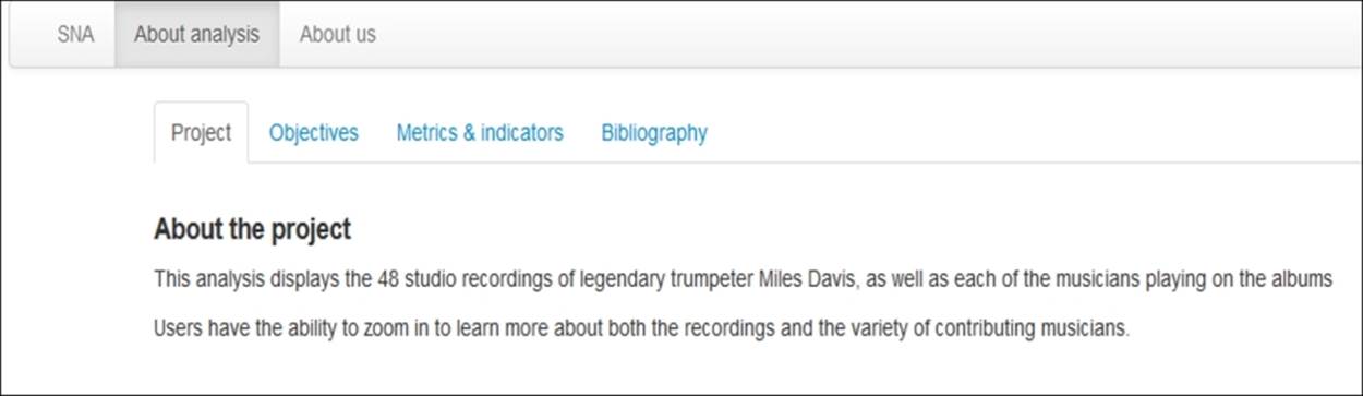
The customized About the Project page
The Objectives tab can also be customized with the goal of stating why the visualization exists, as well as any secondary aims behind the network graph:
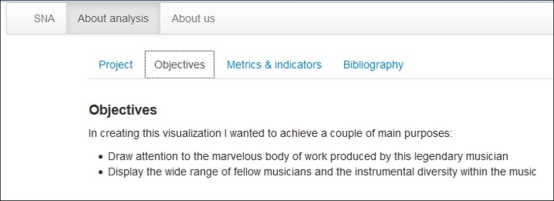
The customized Objectives page
More customization can be done on the About us tab. While I just placed a website link here, much more could be done to tell the world who you are:

The customized About us page
The sky is the limit for customizing your Loxa project—all you need is some very basic HTML and CSS skills to create a unique, informative and interactive project.
Summary
In this chapter you learned how to take advantage of the many available tools that will take your network graphs beyond the Gephi application and into the hands of external users. We learned about three main categories of exporters in Gephi.
We discussed graph file exporters, which export your network data into formats that are readily accessible by other network graph software, as well as by Gephi. We went onto discussing image exporters, which facilitate turning your graph into static files via PNG, SVG, or PDF exports. We also elaborated on web exporters, which turn your Gephi network graphs into interactive displays for the Web
We also covered how SVG and PDF exports could be further edited using a tool such as Adobe Illustrator or Inkscape and shared some examples using Inkscape.
Our final sections covered the process of creating and exporting network graphs for the Web, including sections on editing the underlying templates and source files to achieve a finished, professional look for our graphs.
In Chapter 10, Putting It All Together, we'll take a look at using the best practices from this book to begin building your own networks, and we'll also have a brief discussion about the future of network analysis.
All materials on the site are licensed Creative Commons Attribution-Sharealike 3.0 Unported CC BY-SA 3.0 & GNU Free Documentation License (GFDL)
If you are the copyright holder of any material contained on our site and intend to remove it, please contact our site administrator for approval.
© 2016-2026 All site design rights belong to S.Y.A.