Learning Highcharts 4 (2015)
Chapter 2. Highcharts Configurations
All Highcharts graphs share the same configuration structure and it is crucial for us to become familiar with the core components. However, it is not possible to go through all the configurations within the book. In this chapter, we will explore the functional properties that are most used and demonstrate them with examples. We will learn how Highcharts manages layout, and then explore how to configure axes, specify single series and multiple series data, followed by looking at formatting and styling tool tips in both JavaScript and HTML. After that, we will get to know how to polish our charts with various types of animations and apply color gradients. Finally, we will explore the drilldown interactive feature. In this chapter, we will cover the following topics:
· Understanding Highcharts layout
· Framing the chart with axes
· Revisiting the series config
· Styling the tool tips
· Animating charts
· Expanding colors with gradients
· Constructing a chart with a drilldown series
Configuration structure
In the Highcharts configuration object, the components at the top level represent the skeleton structure of a chart. The following is a list of the major components that are covered in this chapter:
· chart: This has configurations for the top-level chart properties such as layouts, dimensions, events, animations, and user interactions
· series: This is an array of series objects (consisting of data and specific options) for single and multiple series, where the series data can be specified in a number of ways
· xAxis/yAxis/zAxis: This has configurations for all the axis properties such as labels, styles, range, intervals, plotlines, plot bands, and backgrounds
· tooltip: This has the layout and format style configurations for the series data tool tips
· drilldown: This has configurations for drilldown series and the ID field associated with the main series
· title/subtitle: This has the layout and style configurations for the chart title and subtitle
· legend: This has the layout and format style configurations for the chart legend
· plotOptions: This contains all the plotting options, such as display, animation, and user interactions, for common series and specific series types
· exporting: This has configurations that control the layout and the function of print and export features
For reference information concerning all configurations, go to http://api.highcharts.com.
Understanding Highcharts' layout
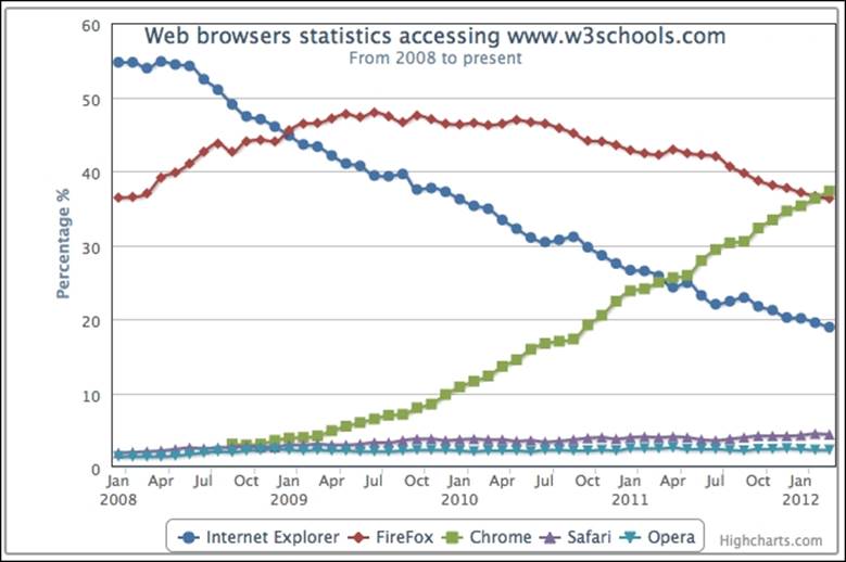
Before we start to learn how Highcharts layout works, it is imperative that we understand some basic concepts first. To do that, let's first recall the chart example used in Chapter 1, Web Charts, and set a couple of borders to be visible. First, set a border around the plot area. To do that we can set the options of plotBorderWidth and plotBorderColor in the chart section, as follows:
chart: {
renderTo: 'container',
type: 'spline',
plotBorderWidth: 1,
plotBorderColor: '#3F4044'
},
The second border is set around the Highcharts container. Next, we extend the preceding chart section with additional settings:
chart: {
renderTo: 'container',
....
borderColor: '#a1a1a1',
borderWidth: 2,
borderRadius: 3
},
This sets the container border color with a width of 2 pixels and corner radius of 3 pixels.
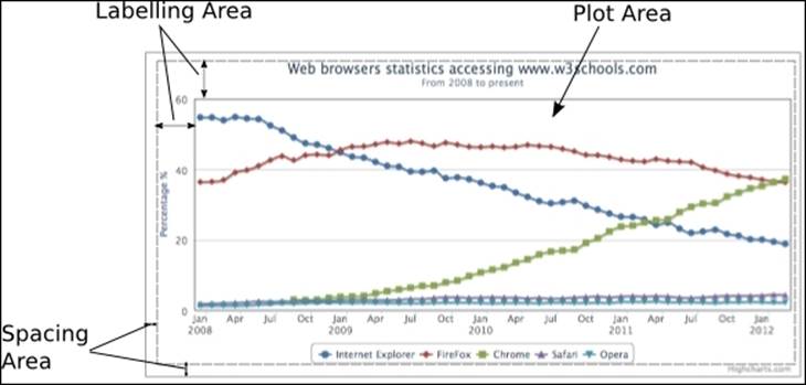
As we can see, there is a border around the container and this is the boundary that the Highcharts display cannot exceed:
By default, Highcharts displays have three different areas: spacing, labeling, and plot area. The plot area is the area inside the inner rectangle that contains all the plot graphics. The labeling area is the area where labels such as title, subtitle, axis title, legend, and credits go, around the plot area, so that it is between the edge of the plot area and the inner edge of the spacing area. The spacing area is the area between the container border and the outer edge of the labeling area.
The following screenshot shows three different kinds of areas. A gray dotted line is inserted to illustrate the boundary between the spacing and labeling areas.
Each chart label position can be operated in one of the following two layouts:
· Automatic layout: Highcharts automatically adjusts the plot area size based on the labels' positions in the labeling area, so the plot area does not overlap with the label element at all. Automatic layout is the simplest way to configure, but has less control. This is the default way of positioning the chart elements.
· Fixed layout: There is no concept of labeling area. The chart label is specified in a fixed location so that it has a floating effect on the plot area. In other words, the plot area side does not automatically adjust itself to the adjacent label position. This gives the user full control of exactly how to display the chart.
The spacing area controls the offset of the Highcharts display on each side. As long as the chart margins are not defined, increasing or decreasing the spacing area has a global effect on the plot area measurements in both automatic and fixed layouts.
Chart margins and spacing settings
In this section, we will see how chart margins and spacing settings have an effect on the overall layout. Chart margins can be configured with the properties margin, marginTop, marginLeft, marginRight, and marginBottom, and they are not enabled by default. Setting chart margins has a global effect on the plot area, so that none of the label positions or chart spacing configurations can affect the plot area size. Hence, all the chart elements are in a fixed layout mode with respect to the plot area. The margin option is an array of four margin values covered for each direction, the same as in CSS, starting from north and going clockwise. Also, the margin option has a lower precedence than any of the directional margin options, regardless of their order in the chart section.
Spacing configurations are enabled by default with a fixed value on each side. These can be configured in the chart section with the property names spacing, spacingTop, spacingLeft, spacingBottom, and spacingRight.
In this example, we are going to increase or decrease the margin or spacing property on each side of the chart and observe the effect. The following are the chart settings:
chart: {
renderTo: 'container',
type: ...
marginTop: 10,
marginRight: 0,
spacingLeft: 30,
spacingBottom: 0
},
The following screenshot shows what the chart looks like:
The marginTop property fixes the plot area's top border 10 pixels away from the container border. It also changes the top border into fixed layout for any label elements, so the chart title and subtitle float on top of the plot area. The spacingLeft property increases the spacing area on the left-hand side, so it pushes the y axis title further in. As it is in automatic layout (without declaring marginLeft), it also pushes the plot area's west border in. Setting marginRight to 0 will override all the default spacing on the chart's right-hand side and change it to fixed layout mode. Finally, setting spacingBottom to 0 makes the legend touch the lower bar of the container, so it also stretches the plot area downwards. This is because the bottom edge is still in automatic layout even though spacingBottom is set to0.
Chart label properties
Chart labels such as xAxis.title, yAxis.title, legend, title, subtitle, and credits share common property names, as follows:
· align: This is for the horizontal alignment of the label. Possible keywords are 'left', 'center', and 'right'. As for the axis title, it is 'low', 'middle', and 'high'.
· floating: This is to give the label position a floating effect on the plot area. Setting this to true will cause the label position to have no effect on the adjacent plot area's boundary.
· margin: This is the margin setting between the label and the side of the plot area adjacent to it. Only certain label types have this setting.
· verticalAlign: This is for the vertical alignment of the label. The keywords are 'top', 'middle', and 'bottom'.
· x: This is for horizontal positioning in relation to alignment.
· y: This is for vertical positioning in relation to alignment.
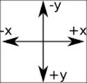
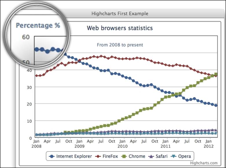
As for the labels' x and y positioning, they are not used for absolute positioning within the chart. They are designed for fine adjustment with the label alignment. The following diagram shows the coordinate directions, where the center represents the label location:
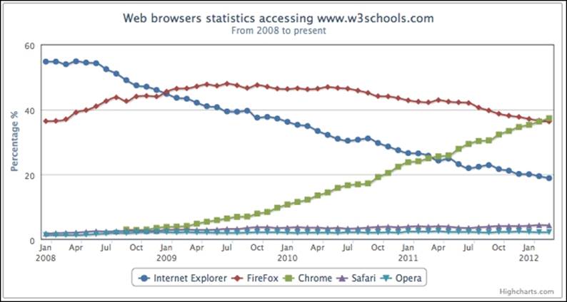
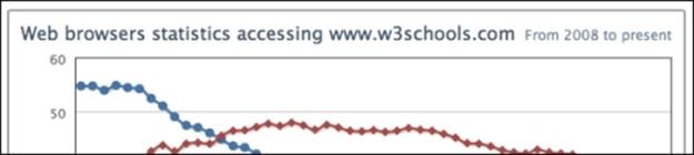
We can experiment with these properties with a simple example of the align and y position settings, by placing both title and subtitle next to each other. The title is shifted to the left with align set to 'left', whereas the subtitle alignment is set to 'right'. In order to make both titles appear on the same line, we change the subtitle's y position to 15, which is the same as the title's default y value:
title: {
text: 'Web browsers ...',
align: 'left'
},
subtitle: {
text: 'From 2008 to present',
align: 'right',
y: 15
},
The following is a screenshot showing both titles aligned on the same line:
In the following subsections, we will experiment with how changes in alignment for each label element affect the layout behavior of the plot area.
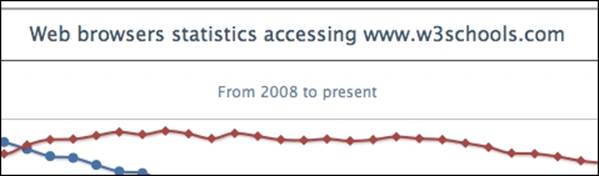
Title and subtitle alignments
Title and subtitle have the same layout properties, and the only differences are that the default values and title have the margin setting. Specifying verticalAlign for any value changes from the default automatic layout to fixed layout (it internally switches floating totrue). However, manually setting the subtitle's floating property to false does not switch back to automatic layout. The following is an example of title in automatic layout and subtitle in fixed layout:
title: {
text: 'Web browsers statistics'
},
subtitle: {
text: 'From 2008 to present',
verticalAlign: 'top',
y: 60
},
The verticalAlign property for the subtitle is set to 'top', which switches the layout into fixed layout, and the y offset is increased to 60. The y offset pushes the subtitle's position further down. Due to the fact that the plot area is not in an automatic layout relationship to the subtitle anymore, the top border of the plot area goes above the subtitle. However, the plot area is still in automatic layout towards the title, so the title is still above the plot area:
Legend alignment
Legends show different behavior for the verticalAlign and align properties. Apart from setting the alignment to 'center', all other settings in verticalAlign and align remain in automatic positioning. The following is an example of a legend located on the right-hand side of the chart. The verticalAlign property is switched to the middle of the chart, where the horizontal align is set to 'right':
legend: {
align: 'right',
verticalAlign: 'middle',
layout: 'vertical'
},
The layout property is assigned to 'vertical' so that it causes the items inside the legend box to be displayed in a vertical manner. As we can see, the plot area is automatically resized for the legend box:
Note that the border decoration around the legend box is disabled in the newer version. To display a round border around the legend box, we can add the borderWidth and borderRadius options using the following:
legend: {
align: 'right',
verticalAlign: 'middle',
layout: 'vertical',
borderWidth: 1,
borderRadius: 3
},
Here is the legend box with a round corner border:
Axis title alignment
Axis titles do not use verticalAlign. Instead, they use the align setting, which is either 'low', 'middle', or 'high'. The title's margin value is the distance between the axis title and the axis line. The following is an example of showing the y-axis title rotated horizontally instead of vertically (which it is by default) and displayed on the top of the axis line instead of next to it. We also use the y property to fine-tune the title location:
yAxis: {
title: {
text: 'Percentage %',
rotation: 0,
y: -15,
margin: -70,
align: 'high'
},
min: 0
},
The following is a screenshot of the upper-left corner of the chart showing that the title is aligned horizontally at the top of the y axis. Alternatively, we can use the offset option instead of margin to achieve the same result.
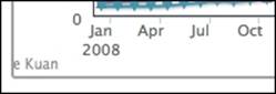
Credits alignment
Credits is a bit different from other label elements. It only supports the align, verticalAlign, x, and y properties in the credits.position property (shorthand for credits: { position: … }), and is also not affected by any spacing setting. Suppose we have a graph without a legend and we have to move the credits to the lower-left area of the chart, the following code snippet shows how to do it:
legend: {
enabled: false
},
credits: {
position: {
align: 'left'
},
text: 'Joe Kuan',
href: 'http://joekuan.wordpress.com'
},
However, the credits text is off the edge of the chart, as shown in the following screenshot:
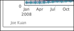
Even if we move the credits label to the right with x positioning, the label is still a bit too close to the x axis interval label. We can introduce extra spacingBottom to put a gap between both labels, as follows:
chart: {
spacingBottom: 30,
....
},
credits: {
position: {
align: 'left',
x: 20,
y: -7
},
},
....
The following is a screenshot of the credits with the final adjustments:
Experimenting with an automatic layout
In this section, we will examine the automatic layout feature in more detail. For the sake of simplifying the example, we will start with only the chart title and without any chart spacing settings:
chart: {
renderTo: 'container',
// border and plotBorder settings
borderWidth: 2,
.....
},
title: {
text: 'Web browsers statistics,
},
From the preceding example, the chart title should appear as expected between the container and the plot area's borders:

The space between the title and the top border of the container has the default setting spacingTop for the spacing area (a default value of 10-pixels high). The gap between the title and the top border of the plot area is the default setting for title.margin, which is 15-pixels high.
By setting spacingTop in the chart section to 0, the chart title moves up next to the container top border. Hence the size of the plot area is automatically expanded upwards, as follows:
Then, we set title.margin to 0; the plot area border moves further up, hence the height of the plot area increases further, as follows:
As you may notice, there is still a gap of a few pixels between the top border and the chart title. This is actually due to the default value of the title's y position setting, which is 15 pixels, large enough for the default title font size.
The following is the chart configuration for setting all the spaces between the container and the plot area to 0:
chart: {
renderTo: 'container',
// border and plotBorder settings
.....
spacingTop: 0
},
title: {
text: null,
margin: 0,
y: 0
}
If we set title.y to 0, all the gap between the top edge of the plot area and the top container edge closes up. The following is the final screenshot of the upper-left corner of the chart, to show the effect. The chart title is not visible anymore as it has been shifted above the container:
Interestingly, if we work backwards to the first example, the default distance between the top of the plot area and the top of the container is calculated as:
spacingTop + title.margin + title.y = 10 + 15 + 15 = 40
Therefore, changing any of these three variables will automatically adjust the plot area from the top container bar. Each of these offset variables actually has its own purpose in the automatic layout. Spacing is for the gap between the container and the chart content; thus, if we want to display a chart nicely spaced with other elements on a web page, spacing elements should be used. Equally, if we want to use a specific font size for the label elements, we should consider adjusting the y offset. Hence, the labels are still maintained at a distance and do not interfere with other components in the chart.
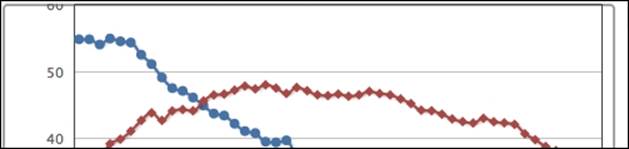
Experimenting with a fixed layout
In the preceding section, we have learned how the plot area dynamically adjusted itself. In this section, we will see how we can manually position the chart labels. First, we will start with the example code from the beginning of the Experimenting with automatic layout section and set the chart title's verticalAlign to 'bottom', as follows:
chart: {
renderTo: 'container',
// border and plotBorder settings .....
},
title: {
text: 'Web browsers statistics',
verticalAlign: 'bottom'
},
The chart title is moved to the bottom of the chart, next to the lower border of the container. Notice that this setting has changed the title into floating mode; more importantly, the legend still remains in the default automatic layout of the plot area:
Be aware that we haven't specified spacingBottom, which has a default value of 15 pixels in height when applied to the chart. This means that there should be a gap between the title and the container bottom border, but none is shown. This is because the title.yposition has a default value of 15 pixels in relation to spacing. According to the diagram in the Chart label properties section, this positive y value pushes the title towards the bottom border; this compensates for the space created by spacingBottom.
Let's make a bigger change to the y offset position this time to show that verticalAlign is floating on top of the plot area:
title: {
text: 'Web browsers statistics',
verticalAlign: 'bottom',
y: -90
},
The negative y value moves the title up, as shown here:
Now the title is overlapping the plot area. To demonstrate that the legend is still in automatic layout with regard to the plot area, here we change the legend's y position and the margin settings, which is the distance from the axis label:
legend: {
margin: 70,
y: -10
},
This has pushed up the bottom side of the plot area. However, the chart title still remains in fixed layout and its position within the chart hasn't been changed at all after applying the new legend setting, as shown in the following screenshot:
By now, we should have a better understanding of how to position label elements, and their layout policy relating to the plot area.
Framing the chart with axes
In this section, we are going to look into the configuration of axes in Highcharts in terms of their functional area. We will start off with a plain line graph and gradually apply more options to the chart to demonstrate the effects.
Accessing the axis data type
There are two ways to specify data for a chart: categories and series data. For displaying intervals with specific names, we should use the categories field that expects an array of strings. Each entry in the categories array is then associated with the series data array. Alternatively, the axis interval values are embedded inside the series data array. Then, Highcharts extracts the series data for both axes, interprets the data type, and formats and labels the values appropriately.
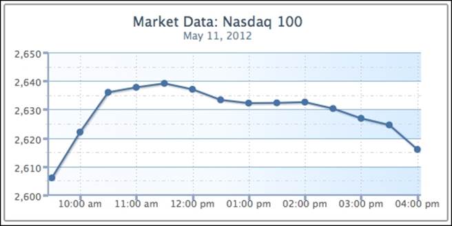
The following is a straightforward example showing the use of categories:
chart: {
renderTo: 'container',
height: 250,
spacingRight: 20
},
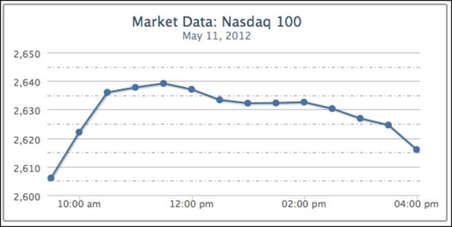
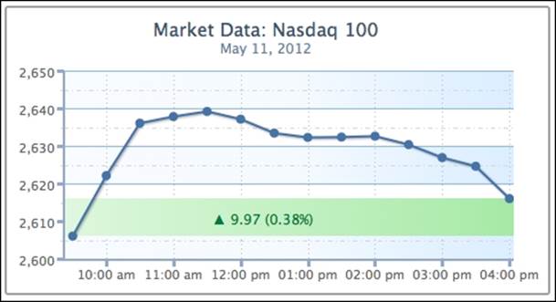
title: {
text: 'Market Data: Nasdaq 100'
},
subtitle: {
text: 'May 11, 2012'
},
xAxis: {
categories: [ '9:30 am', '10:00 am', '10:30 am',
'11:00 am', '11:30 am', '12:00 pm',
'12:30 pm', '1:00 pm', '1:30 pm',
'2:00 pm', '2:30 pm', '3:00 pm',
'3:30 pm', '4:00 pm' ],
labels: {
step: 3
}
},
yAxis: {
title: {
text: null
}
},
legend: {
enabled: false
},
credits: {
enabled: false
},
series: [{
name: 'Nasdaq',
color: '#4572A7',
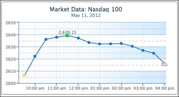
data: [ 2606.01, 2622.08, 2636.03, 2637.78, 2639.15,
2637.09, 2633.38, 2632.23, 2632.33, 2632.59,
2630.34, 2626.89, 2624.59, 2615.98 ]
}]
The preceding code snippet produces a graph that looks like the following screenshot:
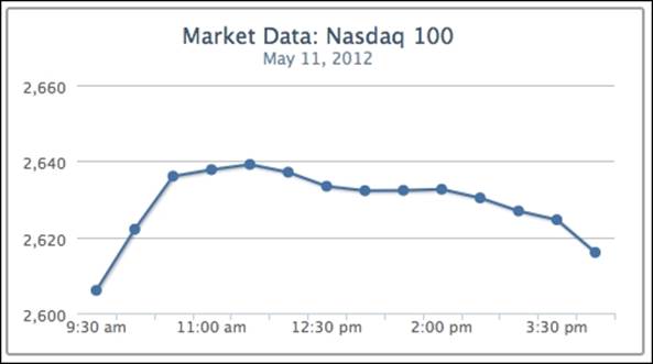
The first name in the categories field corresponds to the first value, 9:30 am, 2606.01, in the series data array, and so on.
Alternatively, we can specify the time values inside the series data and use the type property of the x axis to format the time. The type property supports 'linear' (default), 'logarithmic', or 'datetime'. The 'datetime' setting automatically interprets the time in the series data into human-readable form. Moreover, we can use the dateTimeLabelFormats property to predefine the custom format for the time unit. The option can also accept multiple time unit formats. This is for when we don't know in advance how long the time span is in the series data, so each unit in the resulting graph can be per hour, per day, and so on. The following example shows how the graph is specified with predefined hourly and minute formats. The syntax of the format string is based on the PHP strftime function:
xAxis: {
type: 'datetime',
// Format 24 hour time to AM/PM
dateTimeLabelFormats: {
hour: '%I:%M %P',
minute: '%I %M'
}
},
series: [{
name: 'Nasdaq',
color: '#4572A7',
data: [ [ Date.UTC(2012, 4, 11, 9, 30), 2606.01 ],
[ Date.UTC(2012, 4, 11, 10), 2622.08 ],
[ Date.UTC(2012, 4, 11, 10, 30), 2636.03 ],
.....
]
}]
Note that the x axis is in the 12-hour time format, as shown in the following screenshot:
Instead, we can define the format handler for the xAxis.labels.formatter property to achieve a similar effect. Highcharts provides a utility routine, Highcharts.dateFormat, that converts the timestamp in milliseconds to a readable format. In the following code snippet, we define the formatter function using dateFormat and this.value. The keyword this is the axis's interval object, whereas this.value is the UTC time value for the instance of the interval:
xAxis: {
type: 'datetime',
labels: {
formatter: function() {
return Highcharts.dateFormat('%I:%M %P', this.value);
}
}
},
Since the time values of our data points are in fixed intervals, they can also be arranged in a cut-down version. All we need is to define the starting point of time, pointStart, and the regular interval between them, pointInterval, in milliseconds:
series: [{
name: 'Nasdaq',
color: '#4572A7',
pointStart: Date.UTC(2012, 4, 11, 9, 30),
pointInterval: 30 * 60 * 1000,
data: [ 2606.01, 2622.08, 2636.03, 2637.78,
2639.15, 2637.09, 2633.38, 2632.23,
2632.33, 2632.59, 2630.34, 2626.89,
2624.59, 2615.98 ]
}]
Adjusting intervals and background
We have learned how to use axis categories and series data arrays in the last section. In this section, we will see how to format interval lines and the background style to produce a graph with more clarity.
We will continue from the previous example. First, let's create some interval lines along the y axis. In the chart, the interval is automatically set to 20. However, it would be clearer to double the number of interval lines. To do that, simply assign the tickInterval value to 10. Then, we use minorTickInterval to put another line in between the intervals to indicate a semi-interval. In order to distinguish between interval and semi-interval lines, we set the semi-interval lines, minorGridLineDashStyle, to a dashed and dotted style.
Note
There are nearly a dozen line style settings available in Highcharts, from 'Solid' to 'LongDashDotDot'. Readers can refer to the online manual for possible values.
The following is the first step to create the new settings:
yAxis: {
title: {
text: null
},
tickInterval: 10,
minorTickInterval: 5,
minorGridLineColor: '#ADADAD',
minorGridLineDashStyle: 'dashdot'
}
The interval lines should look like the following screenshot:
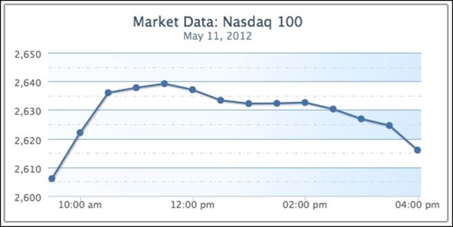
To make the graph even more presentable, we add a striping effect with shading using alternateGridColor. Then, we change the interval line color, gridLineColor, to a similar range with the stripes. The following code snippet is added into the yAxis configuration:
gridLineColor: '#8AB8E6',
alternateGridColor: {
linearGradient: {
x1: 0, y1: 1,
x2: 1, y2: 1
},
stops: [ [0, '#FAFCFF' ],
[0.5, '#F5FAFF'] ,
[0.8, '#E0F0FF'] ,
[1, '#D6EBFF'] ]
}
We will discuss the color gradient later in this chapter. The following is the graph with the new shading background:
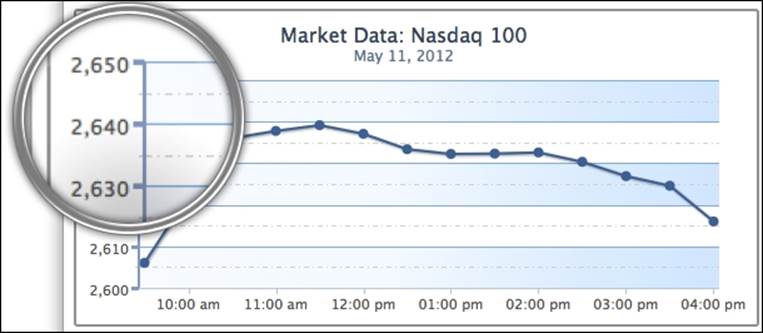
The next step is to apply a more professional look to the y axis line. We are going to draw a line on the y axis with the lineWidth property, and add some measurement marks along the interval lines with the following code snippet:
lineWidth: 2,
lineColor: '#92A8CD',
tickWidth: 3,
tickLength: 6,
tickColor: '#92A8CD',
minorTickLength: 3,
minorTickWidth: 1,
minorTickColor: '#D8D8D8'
The tickWidth and tickLength properties add the effect of little marks at the start of each interval line. We apply the same color on both the interval mark and the axis line. Then we add the ticks minorTickLength and minorTickWidth into the semi-interval lines in a smaller size. This gives a nice measurement mark effect along the axis, as shown in the following screenshot:
Now, we apply a similar polish to the xAxis configuration, as follows:
xAxis: {
type: 'datetime',
labels: {
formatter: function() {
return Highcharts.dateFormat('%I:%M %P', this.value);
},
},
gridLineDashStyle: 'dot',
gridLineWidth: 1,
tickInterval: 60 * 60 * 1000,
lineWidth: 2,
lineColor: '#92A8CD',
tickWidth: 3,
tickLength: 6,
tickColor: '#92A8CD',
},
We set the x axis interval lines to the hourly format and switch the line style to a dotted line. Then, we apply the same color, thickness, and interval ticks as on the y axis. The following is the resulting screenshot:
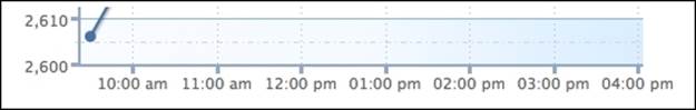
However, there are some defects along the x axis line. To begin with, the meeting point between the x axis and y axis lines does not align properly. Secondly, the interval labels at the x axis are touching the interval ticks. Finally, part of the first data point is covered by the y-axis line. The following is an enlarged screenshot showing the issues:
There are two ways to resolve the axis line alignment problem, as follows:
· Shift the plot area 1 pixel away from the x axis. This can be achieved by setting the offset property of xAxis to 1.
· Increase the x-axis line width to 3 pixels, which is the same width as the y-axis tick interval.
As for the x-axis label, we can simply solve the problem by introducing the y offset value into the labels setting.
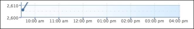
Finally, to avoid the first data point touching the y-axis line, we can impose minPadding on the x axis. What this does is to add padding space at the minimum value of the axis, the first point. The minPadding value is based on the ratio of the graph width. In this case, setting the property to 0.02 is equivalent to shifting along the x axis 5 pixels to the right (250 px * 0.02). The following are the additional settings to improve the chart:
xAxis: {
....
labels: {
formatter: ...,
y: 17
},
.....
minPadding: 0.02,
offset: 1
}
The following screenshot shows that the issues have been addressed:
As we can see, Highcharts has a comprehensive set of configurable variables with great flexibility.
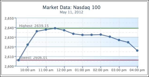
Using plot lines and plot bands
In this section, we are going to see how we can use Highcharts to place lines or bands along the axis. We will continue with the example from the previous section. Let's draw a couple of lines to indicate the day's highest and lowest index points on the y axis. TheplotLines field accepts an array of object configurations for each plot line. There are no width and color default values for plotLines, so we need to specify them explicitly in order to see the line. The following is the code snippet for the plot lines:
yAxis: {
... ,
plotLines: [{
value: 2606.01,
width: 2,
color: '#821740',
label: {
text: 'Lowest: 2606.01',
style: {
color: '#898989'
}
}
}, {
value: 2639.15,
width: 2,
color: '#4A9338',
label: {
text: 'Highest: 2639.15',
style: {
color: '#898989'
}
}
}]
}
The following screenshot shows what it should look like:
We can improve the look of the chart slightly. First, the text label for the top plot line should not be next to the highest point. Second, the label for the bottom line should be remotely covered by the series and interval lines, as follows:
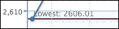
To resolve these issues, we can assign the plot line's zIndex to 1, which brings the text label above the interval lines. We also set the x position of the label to shift the text next to the point. The following are the new changes:
plotLines: [{
... ,
label: {
... ,
x: 25
},
zIndex: 1
}, {
... ,
label: {
... ,
x: 130
},
zIndex: 1
}]
The following graph shows the label has been moved away from the plot line and over the interval line:
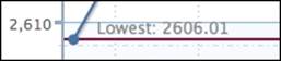
Now, we are going to change the preceding example with a plot band area that shows the index change between the market's opening and closing values. The plot band configuration is very similar to plot lines, except that it uses the to and from properties, and thecolor property accepts gradient settings or color code. We create a plot band with a triangle text symbol and values to signify a positive close. Instead of using the x and y properties to fine-tune label position, we use the align option to adjust the text to the center of the plot area (replace the plotLines setting from the above example):
plotBands: [{
from: 2606.01,
to: 2615.98,
label: {
text: '▲ 9.97 (0.38%)',
align: 'center',
style: {
color: '#007A3D'
}
},
zIndex: 1,
color: {
linearGradient: {
x1: 0, y1: 1,
x2: 1, y2: 1
},
stops: [ [0, '#EBFAEB' ],
[0.5, '#C2F0C2'] ,
[0.8, '#ADEBAD'] ,
[1, '#99E699']
]
}
}]
Note
The triangle is an alt-code character; hold down the left Alt key and enter 30 in the number keypad. See http://www.alt-codes.net for more details.
This produces a chart with a green plot band highlighting a positive close in the market, as shown in the following screenshot:
Extending to multiple axes
Previously, we ran through most of the axis configurations. Here, we explore how we can use multiple axes, which are just an array of objects containing axis configurations.
Continuing from the previous stock market example, suppose we now want to include another market index, Dow Jones, along with Nasdaq. However, both indices are different in nature, so their value ranges are vastly different. First, let's examine the outcome by displaying both indices with the common y axis. We change the title, remove the fixed interval setting on the y axis, and include data for another series:
chart: ... ,
title: {
text: 'Market Data: Nasdaq & Dow Jones'
},
subtitle: ... ,
xAxis: ... ,
credits: ... ,
yAxis: {
title: {
text: null
},
minorGridLineColor: '#D8D8D8',
minorGridLineDashStyle: 'dashdot',
gridLineColor: '#8AB8E6',
alternateGridColor: {
linearGradient: {
x1: 0, y1: 1,
x2: 1, y2: 1
},
stops: [ [0, '#FAFCFF' ],
[0.5, '#F5FAFF'] ,
[0.8, '#E0F0FF'] ,
[1, '#D6EBFF'] ]
},
lineWidth: 2,
lineColor: '#92A8CD',
tickWidth: 3,
tickLength: 6,
tickColor: '#92A8CD',
minorTickLength: 3,
minorTickWidth: 1,
minorTickColor: '#D8D8D8'
},
series: [{
name: 'Nasdaq',
color: '#4572A7',
data: [ [ Date.UTC(2012, 4, 11, 9, 30), 2606.01 ],
[ Date.UTC(2012, 4, 11, 10), 2622.08 ],
[ Date.UTC(2012, 4, 11, 10, 30), 2636.03 ],
...
]
}, {
name: 'Dow Jones',
color: '#AA4643',
data: [ [ Date.UTC(2012, 4, 11, 9, 30), 12598.32 ],
[ Date.UTC(2012, 4, 11, 10), 12538.61 ],
[ Date.UTC(2012, 4, 11, 10, 30), 12549.89 ],
...
]
}]
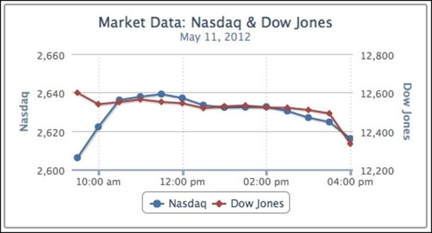
The following is the chart showing both market indices:
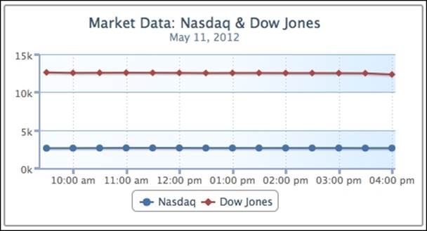
As expected, the index changes that occur during the day have been normalized by the vast differences in value. Both lines look roughly straight, which falsely implies that the indices have hardly changed.
Let us now explore putting both indices onto separate y axes. We should remove any background decoration on the y axis, because we now have a different range of data shared on the same background.
The following is the new setup for yAxis:
yAxis: [{
title: {
text: 'Nasdaq'
},
}, {
title: {
text: 'Dow Jones'
},
opposite: true
}],
Now yAxis is an array of axis configurations. The first entry in the array is for Nasdaq and the second is for Dow Jones. This time, we display the axis title to distinguish between them. The opposite property is to put the Dow Jones y axis onto the other side of the graph for clarity. Otherwise, both y axes appear on the left-hand side.
The next step is to align indices from the y-axis array to the series data array, as follows:
series: [{
name: 'Nasdaq',
color: '#4572A7',
yAxis: 0,
data: [ ... ]
}, {
name: 'Dow Jones',
color: '#AA4643',
yAxis: 1,
data: [ ... ]
}]
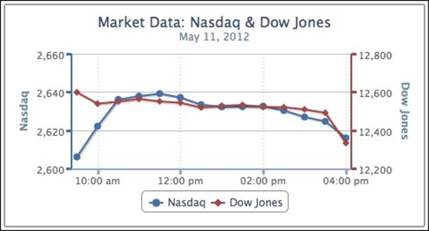
We can clearly see the movement of the indices in the new graph, as follows:
Moreover, we can improve the final view by color-matching the series to the axis lines. The Highcharts.getOptions().colors property contains a list of default colors for the series, so we use the first two entries for our indices. Another improvement is to set maxPaddingfor the x axis, because the new y-axis line covers parts of the data points at the high end of the x axis:
xAxis: {
... ,
minPadding: 0.02,
maxPadding: 0.02
},
yAxis: [{
title: {
text: 'Nasdaq'
},
lineWidth: 2,
lineColor: '#4572A7',
tickWidth: 3,
tickLength: 6,
tickColor: '#4572A7'
}, {
title: {
text: 'Dow Jones'
},
opposite: true,
lineWidth: 2,
lineColor: '#AA4643',
tickWidth: 3,
tickLength: 6,
tickColor: '#AA4643'
}],
The following screenshot shows the improved look of the chart:
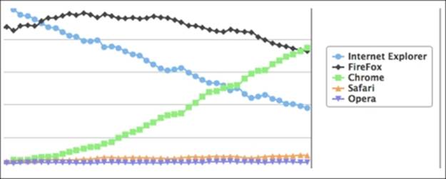
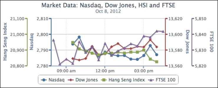
We can extend the preceding example and have more than a couple of axes, simply by adding entries into the yAxis and series arrays, and mapping both together. The following screenshot shows a 4-axis line graph:
Revisiting the series config
By now, we should have an idea of what the series property does. In this section, we are going to examine it in more detail.
The series property is an array of series configuration objects that contain data- and series-specific options. It allows us to specify single-series data and multiple-series data. The purpose of series objects is to inform Highcharts of the format of the data and how the data is presented in the chart.
All data values in the chart are specified through the data field. The data field is highly flexible and can take an array in a number of forms, as follows:
· Numerical values
· An array with x and y values
· A point object with properties describing the data point
The first two options have already been examined in the Accessing the axis data type section. In this section, we will explore the third option. Let's use the single-series Nasdaq example and we will specify the series data through a mixture of numerical values and objects:
series: [{
name: 'Nasdaq',
pointStart: Date.UTC(2012, 4, 11, 9, 30),
pointInterval: 30 * 60 * 1000,
data: [{
// First data point
y: 2606.01,
marker: {
symbol: 'url(./sun.png)'
}
}, 2622.08, 2636.03, 2637.78,
{
// Highest data point
y: 2639.15,
dataLabels: {
enabled: true
},
marker: {
fillColor: '#33CC33',
radius: 5
}
}, 2637.09, 2633.38, 2632.23, 2632.33,
2632.59, 2630.34, 2626.89, 2624.59,
{
// Last data point
y: 2615.98,
marker: {
symbol: 'url(./moon.png)'
}
}]
}]
The first and last data points are objects that have y axis values and image files to indicate the opening and closing of the market. The highest data point is configured with a different color and data label. The size of the data point is also set slightly larger than the default. The rest of the data arrays are just numerical values, as shown in the following screenshot:
Exploring PlotOptions
The plotOptions object is a wrapper object for config objects for each series type supported in Highcharts. These configurations have properties such as plotOptions.line.lineWidth, common to other series types, as well as other configurations such asplotOptions.pie.center that is only specific to the pie series type. Among the specific series, there is plotOptions.series, which is used for common plotting options shared by the whole series.
The preceding plotOptions object can form a chain of precedence between plotOptions.series, plotOptions.{series-type}, and the series configuration. For example, series[x].shadow (where series[x].type is 'pie') has a higher precedence thanplotOptions.pie.shadow, which in turn has a higher precedence than plotOptions.series.shadow.
The purpose of this is that the chart is composed of multiple different series types. For example, in a chart with multiple series of columns and a single line series, the common properties between column and line can be defined in plotOptions.series.*, whereasplotOptions.column and plotOptions.line hold their own specific property values. Moreover, properties in plotOptions.{series-type}.* can be further overridden by the same series type specified in the series array.
The following is a reference for the configurations in precedence. The higher-level ones have lower precedence, which means that configurations defined in the lower level of the chain can override properties defined in the higher level of the chain. For the series array, the preference is valid if series[x].type or the default series type value is the same as the series type in plotOptions:
chart.type
series[x].type
plotOptions.series.{seriesProperty}
plotOptions.{series-type}.{seriesProperty}
series[x].{seriesProperty}
plotOptions.points.events.*
series[x].data[y].events.*
plotOptions.series.marker.*
series[x].data[y].marker.*
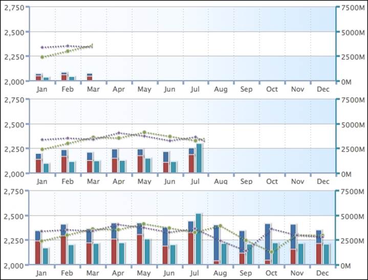
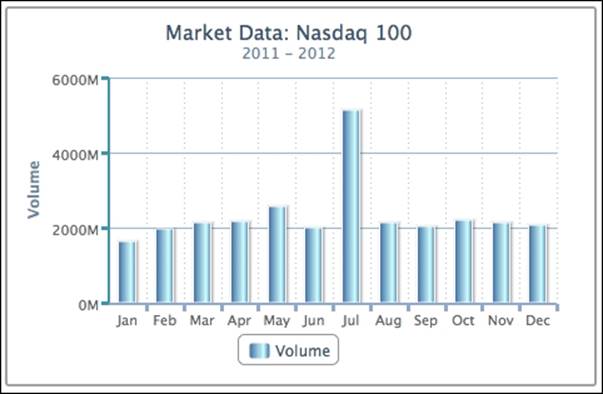
The plotOptions object contains properties controlling how a series type is presented in the chart—for example inverted charts, series colors, stacked column charts, user interactions with the series, and so on. All these options will be covered in detail when we study each type of chart. Meanwhile, we will explore the concept of plotOptions with a monthly Nasdaq graph. The graph has five different series data types: open, close, high, low, and volume. Normally, this data is used for plotting daily stock charts (OHLCV). We compact them into a single chart for the purpose of demonstrating plotOptions.
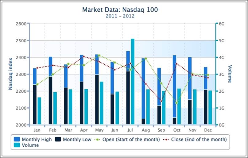
The following is the chart configuration code for generating the preceding graph:
chart: {
renderTo: 'container',
height: 250,
spacingRight: 30
},
title: {
text: 'Market Data: Nasdaq 100'
},
subtitle: {
text: '2011 - 2012'
},
xAxis: {
categories: [ 'Jan', 'Feb', 'Mar', 'Apr',
'May', 'Jun', 'Jul', 'Aug',
'Sep', 'Oct', 'Nov', 'Dec' ],
labels: {
y: 17
},
gridLineDashStyle: 'dot',
gridLineWidth: 1,
lineWidth: 2,
lineColor: '#92A8CD',
tickWidth: 3,
tickLength: 6,
tickColor: '#92A8CD',
minPadding: 0.04,
offset: 1
},
yAxis: [{
title: {
text: 'Nasdaq index'
},
min: 2000,
minorGridLineColor: '#D8D8D8',
minorGridLineDashStyle: 'dashdot',
gridLineColor: '#8AB8E6',
alternateGridColor: {
linearGradient: {
x1: 0, y1: 1,
x2: 1, y2: 1
},
stops: [ [0, '#FAFCFF' ],
[0.5, '#F5FAFF'] ,
[0.8, '#E0F0FF'] ,
[1, '#D6EBFF'] ]
},
lineWidth: 2,
lineColor: '#92A8CD',
tickWidth: 3,
tickLength: 6,
tickColor: '#92A8CD'
}, {
title: {
text: 'Volume'
},
lineWidth: 2,
lineColor: '#3D96AE',
tickWidth: 3,
tickLength: 6,
tickColor: '#3D96AE',
opposite: true
}],
credits: {
enabled: false
},
plotOptions: {
column: {
stacking: 'normal'
},
line: {
zIndex: 2,
marker: {
radius: 3,
lineColor: '#D9D9D9',
lineWidth: 1
},
dashStyle: 'ShortDot'
}
},
series: [{
name: 'Monthly High',
// Use stacking column chart - values on
// top of monthly low to simulate monthly
// high
data: [ 98.31, 118.08, 142.55, 160.68, ... ],
type: 'column',
color: '#4572A7'
}, {
name: 'Monthly Low',
data: [ 2237.73, 2285.44, 2217.43, ... ],
type: 'column',
color: '#AA4643'
}, {
name: 'Open (Start of the month)',
data: [ 2238.66, 2298.37, 2359.78, ... ],
color: '#89A54E'
}, {
name: 'Close (End of the month)',
data: [ 2336.04, 2350.99, 2338.99, ... ],
color: '#80699B'
}, {
name: 'Volume',
data: [ 1630203800, 1944674700, 2121923300, ... ],
yAxis: 1,
type: 'column',
stacking: null,
color: '#3D96AE'
}]
}
Although the graph looks slightly complicated, we will go through the code step-by-step. First, there are two entries in the yAxis array: the first is for the Nasdaq index; the second y axis, displayed on the right-hand side (opposite: true), is for the volume trade. In the series array, the first and second series are specified as column series types (type: 'column'), which override the default series type 'line'. Then the stacking option is defined as 'normal' in plotOptions.column, which stacks the monthly high on top of the monthly low column (deep blue and black columns). Strictly speaking, the stacked column chart is used for displaying the ratio of data belonging to the same category. For the sake of demonstrating plotOptions, we used the stacked column chart to show the upper and lower ends of monthly trade. To do that, we take the difference between monthly high and monthly low and substitute the differences back into the monthly high series. So in the code, we can see that the data values in the monthly high series are much smaller than the monthly low.
The third and fourth series are the market open and market close index. Both take the default line series type and inherit options defined from plotOptions.line. The zIndex option is assigned to 2 to overlay both line series on top of the fifth volume series; otherwise, both lines are covered by the volume columns. The marker object configurations are to reduce the default data point size, as the whole graph is already compacted with columns and lines.
The last column series is the volume trade, and the stacking option in the series is manually set to null, which overrides the inherited option from plotOptions.column. This resets the series back to the non-stacking option, displaying as a separate column. Finally, theyAxis index option is set to align with the y axis of the volume series (yAxis: 1).
Styling tooltips
Tool tips in Highcharts are enabled by the tooltip.enabled Boolean option, which is true by default. In Highcharts 4, the default shape of the tooltip box has been changed to callout. The following shows the new style of tooltip:
For the older style of tooltip shape, we can set the tooltip.shape option to square, which we will use in the following exercises.
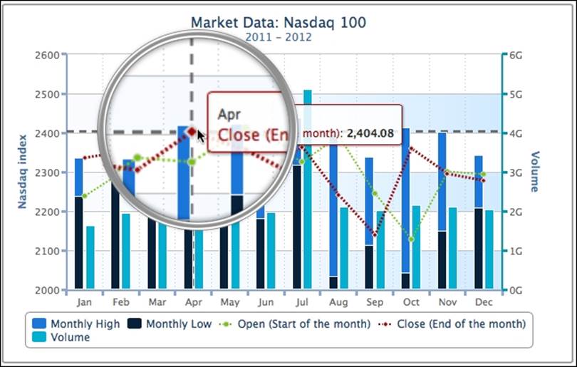
Tooltip's content formats are flexible, which can be defined via a callback handler or in the HTML style. We will continue from the example in the previous section. As the chart is packed with multiple lines and columns, we can first enable the crosshair tool tip to help us align the data points onto the axes. The crosshairs configuration can take either a Boolean value to activate the feature or an object style for the crosshair line style. The following is the code snippet to set up crosshairs with an array of x- and y-axis configurations for the gray color and dash line styles:
tooltip : {
shape: 'square',
crosshairs: [{
color: '#5D5D5D',
dashStyle: 'dash',
width: 2
}, {
color: '#5D5D5D',
dashStyle: 'dash',
width: 2
}]
},
Note
Again, the dashStyle option uses the same common line style values in Highcharts. See the crosshairs reference manual for all the possible values.
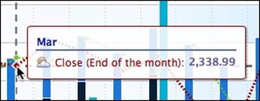
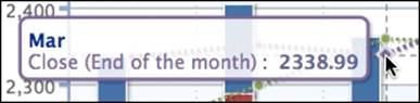
The following screenshot shows the view when hovering over a data point in the market close series. We see a tool tip box appear next to the pointer and gray crosshairs for both axes:
Formatting tooltips in HTML
Highcharts provides template options such as headerFormat, pointFormat, and footerFormat to construct the tool tip by specific template variables (or macros). These specific variables are series and point, and we can use their properties such as point.x, point.y,series.name, and series.color within the template. For instance, the default tool tip setting uses pointFormat, which has the default value of the following code snippet:
<span style="color:{series.color}">{series.name}</span>: <b>{point.y}</b><br/>
Highcharts internally translates the preceding expression into SVG text markups, so only a subset of HTML syntax can be supported, which is <b>, <br>, <strong>, <em>, <i>, <span>, <href>, and font style attributes in CSS. However, if we want to have more flexibility in polishing the content, and the ability to include image files, we need to use the useHTML option for full HTML tool tips. This option allows us to do the following:
· Use other HTML tags such as <img> inside the tool tip
· Create a tool tip in real HTML content, so that it is outside the SVG markups
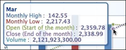
Here, we can format an HTML table inside a tool tip. We will use headerFormat to create a header column for the category and a bottom border to separate the header from the data. Then, we will use pointFormat to set up an icon image along with the series name and data. The image file is based on the series.index macro, so different series have different image icons. We use the series.color macro to highlight the series name with the same color in the chart and apply the series.data macro for the series value:
tooltip : {
useHTML: true,
shape: 'square',
headerFormat: '<table><thead><tr>' +
'<th style="border-bottom: 2px solid #6678b1; color: #039" ' +
'colspan=2 >{point.key}</th></tr></thead><tbody>',
pointFormat: '<tr><td style="color: {series.color}">' +
'<img src="./series_{series.index}.png" ' +
'style="vertical-align:text-bottom; margin-right: 5px" >' +
'{series.name}: </td><td style="text-align: right; color: #669;">' +
'<b>{point.y}</b></td></tr>',
footerFormat: '</tbody></table>'
},
When we hover over a data point, the template variable point is substituted internally for the hovered point object, and the series is replaced by the series object containing the data point.
The following is the screenshot of the new tool tip. The icon next to the series name indicates market close:
Using the callback handler
Alternatively, we can implement the tool tip through the callback handler in JavaScript. The tool tip handler is declared through the formatter option. The major difference between template options and the handler is that we can disable the tool tip display for certain points by setting conditions and returning the Boolean to false, whereas for template options we cannot. In the callback example, we use the this.series and this.point variables for the series name and values for the data point that is hovered over.
The following is an example of the handler:
formatter: function() {
return '<span style="color:#039;font-weight:bold">' +
this.point.category +
'</span><br/><span style="color:' +
this.series.color + '">' + this.series.name +
'</span>: <span style="color:#669;font-weight:bold">' +
this.point.y + '</span>';
}
The preceding handler code returns an SVG text tool tip with the series name, category, and value, as shown in the following screenshot:
Applying a multiple-series tooltip
Another flexible tooltip feature is to allow all the series data to be displayed inside the same tooltip. This simplifies user interaction by looking up multiple series data in one action. To enable this feature, we need to set the shared option to true.
We will continue with the previous example for a multiple series tooltip. The following is the new tooltip code:
shared: true,
useHTML: true,
shape: 'square',
headerFormat: '<table><thead><tr><th colspan=2 >' +
'{point.key}</th></tr></thead><tbody>',pointFormat: '<tr><td style="color: {series.color}">' +
'{series.name}: </td>' +
'<td style="text-align: right; color: #669;"> ' +
'<b>{point.y}</b></td></tr>',footerFormat: '</tbody></table>'
The preceding code snippet will produce the following screenshot:
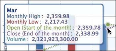
As previously discussed, we will use the monthly high and monthly low series to plot stacked columns that are actually used for plotting data within the same category. Therefore, the tooltip for the monthly high series is showing the subtracted values that we previously put in. To correct this within the tooltip, we can use the handler to apply different properties for the monthly high series, as follows:
shared: true,
shape: 'square',
formatter: function() {
return '<span style="color:#039;font-weight:bold">' +
this.x + '</span><br/>' +
this.points.map(function(point, idx) {return '<span style="color:' + point.series.color +
'">' + point.series.name +
'</span>: <span style="color:#669;font-weight:bold">' +
Highcharts.numberFormat((idx == 0) ? point.total : point.y) + '</span>';}).join('<br/>');
}
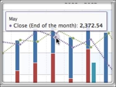
point.total is the total of the difference and the monthly low series value. The following screenshot shows the new corrected monthly high value:
Animating charts
There are two types of animations in Highcharts: initial and update animations. An initial animation is the animation that happens when the series data is ready and the chart is displayed. An update animation occurs after the initial animation, when the series data or any parts of the chart anatomy have been changed.
The initial animation configurations can be specified through plotOptions.series.animation or plotOptions.{series-type}.animation, whereas the update animation is configured via the chart.animation property.
All Highcharts animations use jQuery implementation. The animation property can be a Boolean value or a set of options. For Boolean values, it is true. Highcharts can use jQuery for swing animation. These are the options:
· duration: This is the time, in milliseconds, to complete the animation.
· easing: This is the type of animation jQuery provides. The variety of animations can be extended by importing the jQuery UI plugin. A good reference can be found at http://plugindetector.com/demo/easing-jquery-ui/.
Here, we continue the example from the previous section. We will apply the animation settings to plotOptions.column and plotOptions.line, as follows:
plotOptions: {
column: {
... ,
animation: {
duration: 2000,
easing: 'swing'
}
},
line: {
.... ,
animation: {
duration: 3000,
easing: 'linear'
}
}
},
The animations are tuned into at a much slower pace, so we can see the difference between linear and swing animations. The line series appears at a linear speed along the x axis, whereas the column series expands upwards at a linear speed and then decelerates sharply when approaching the end of the display. The following is a screenshot showing an ongoing linear animation:
Expanding colors with gradients
Highcharts not only supports single color values, but also allows complex color gradient definitions. In Highcharts, the color gradient is based on the SVG linear color gradient standard, which is composed of two sets of information as follows:
· linearGradient: This gives a gradient direction for a color spectrum made up of two sets of x and y coordinates; ratio values are between 0 and 1, or in percentages
· stops: This gives a sequence of colors to be filled in the spectrum, and their ratio positions within the gradient direction
We can use the previous stock market example with only the volume series, and redefine yAxis alternateGridColor as follows:
yAxis: [{
title: { text: 'Nasdaq index' },
....
alternateGridColor: {
linearGradient: [ 10, 250, 400, 250 ],
stops: [
[ 0, 'red' ],
[ 0.2, 'orange' ],
[ 0.5, 'yellow' ] ,
[ 0.8, 'green' ] ,
[ 1, 'lime' ] ]
}
linearGradient is an array of coordinate values that are arranged in the x1, y1, x2, y2 order. The values can be absolute coordinates, percentage strings, or ratio values between 0 and 1. The difference is that colors defined in coordinate values can be affected by the chart size, whereas percentage and ratio values avoid that.
Note
The array syntax for absolute position gradients is deprecated because it doesn't work in the same way in both SVG and VML, it also doesn't scale well with varying chart sizes.
The stops property has an array of tuples: the first value is the offset ranging from 0 to 1 and the second value is the color definition. The offset and color values define where the color is positioned within the spectrum. For example, [0, 'red' ] and [0.2, 'orange' ]mean starting with red at the beginning and gradually changing the color to orange in a horizontal direction towards the position at x = 80 (0.2 * 400), before changing from orange at x = 80 to yellow at x = 200, and so on. The following is a screenshot of the multicolor gradient:
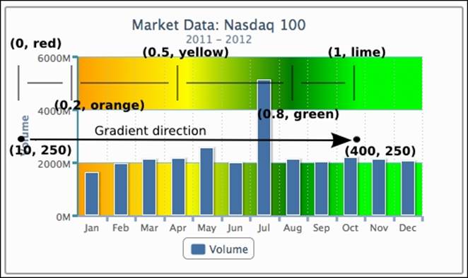
As we can see, the red and orange colors do not appear on the chart because the gradient is based on coordinates. Hence, depending on the size of the chart, the position of the y axis exceeds the red and orange coordinates in this example. Alternatively, we can specify linearGradient in terms of percentage, as follows:
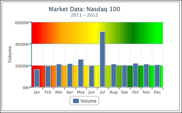
linearGradient: [ '20%', 250, '90%', 250 ]
This means linearGradient stretches from 20% of the width of the chart to 90%, so that the color bands are not limited to the size of the chart. The following screenshot shows the effect of the new linearGradient setting:
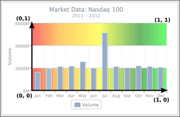
The chart background now has the complete color spectrum. As for specifying ratio values between 0 and 1, linearGradient must be defined in an object style, otherwise the values will be treated as coordinates. Note that the ratio values are referred to as the fraction over the plot area only, and not the whole chart.
linearGradient: { x1: 0, y1: 0, x2: 1, y2: 0 }
The preceding line of code is an alternative way to set the horizontal gradient.
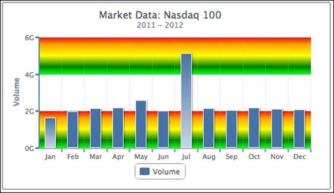
The following line of code adjusts the vertical gradient:
linearGradient: { x1: 0, y1: 0, x2: 0, y2: 1 }
It produces a gradient background in a vertical direction. We also set the 'Jan' and 'Jul' data points individually as point objects with linear shading in a vertical direction:
Moreover, we can manipulate Highcharts standard colors to trigger a color gradient in the series plot. This approach is taken from a post in a Highcharts forum experimenting with the look of 3D charts. Before plotting a chart, we need to overwrite the default series color with a gradient color. The following code snippet replaces the first series color with horizontal blue gradient shading. Note that the ratio gradient values in this example are referring to the width of the series column:
$(document).ready(function() {
Highcharts.getOptions().colors[0] = {
linearGradient: { x1: 0, y1: 0, x2: 1, y2: 0 },
stops: [ [ 0, '#4572A7' ],
[ 0.7, '#CCFFFF' ],
[ 1, '#4572A7' ] ]
};
var chart = new Highcharts.Chart({ ...
The following is a screenshot of a column chart with color shading:
Zooming data with the drilldown feature
Highcharts provides an easy way to zoom data interactively between two series of data. This feature is implemented as a separate module. To use the feature, users need to include the following JavaScript:
<script type="text/javascript"
src="http://code.highcharts.com/modules/drilldown.js"></script>
There are two ways to build an interactive drilldown chart: synchronous and asynchronous. The former method requires users to supply both top and detail levels of data in advance, and arrange both levels of data inside the configuration. Both levels of data are specified as standard Highcharts series configs, except that the zoom-in series is located inside the drilldown property. To join both levels, the top-level series must provide the option series.data[x].drilldown, with a matching name to the option drilldown.series.[y].id in the detail level.
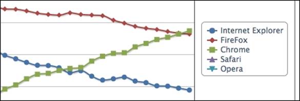
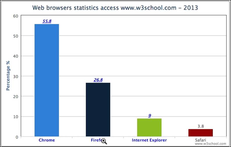
Let's revisit the web browser statistic example and plot the data in a column chart. We will go through column series in more detail later in the book. The following is the series config for the top-level data:
series: [{
type: 'column',
name: 'Web browsers',
colorByPoint: true,
data: [{
name: 'Chrome', y: 55.8, drilldown: 'chrome'
}, {
name: 'Firefox', y: 26.8, drilldown: 'firefox',
}, {
name: 'Internet Explorer', y: 9, drilldown: 'ie'
}, {
name: 'Safari', y: 3.8
}]
}],
Each column is defined with a drilldown option and assigned a specific name. Note that it is not mandatory to make all the data points zoomable. The preceding example demonstrates the Safari column without the drilldown property.
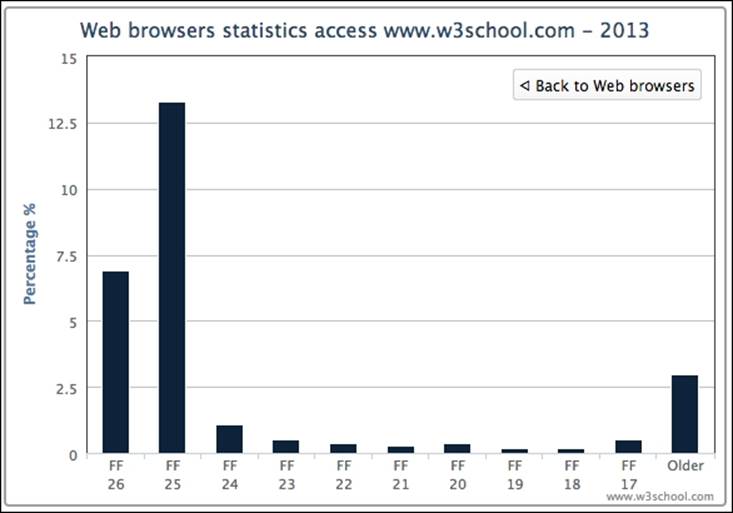
To correspond to each of the drilldown assignments, an array of series data (detail level) is configured to match against the values. The following shows the setup of the drilldown data:
drilldown: {
series: [{
id: 'chrome',
name: 'Chrome',
data: [{
name: 'C 32', y: 1
}, {
name: 'C 31', y: 49
}, {
T.
}]
}, {
id: 'firefox',
name: 'Firfox',
data: [{
name: 'FF 26', y: 6.9
}, {
name: 'FF 25', y: 13.3
}, {
w.
}]
….
}]
}
This produces the following screenshot:
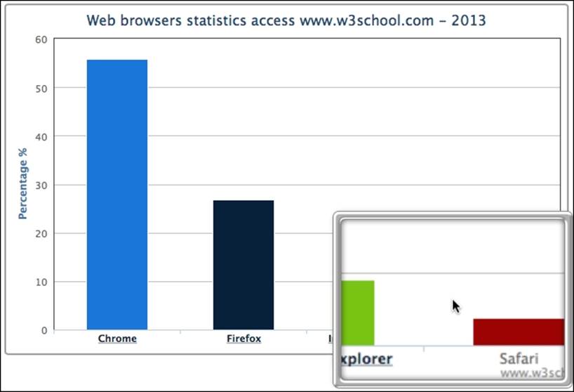
As we can see, the category labels along the x-axis are decorated in a dark color and underlined (the default style). They are clickable, and appear different when compared to the non-drilldown column, Safari. When we click on the Firefox column, or the label, the column animates and zooms into multiple columns along with a back button at the top right corner, as shown in the following screenshot:
Let's modify the chart with more styles. There are properties within the drilldown option for smartening the data labels such as activeAxisLabelStyle and activeDataLabelStyle that take a configuration object of CSS styles. In the following code, we polish the category labels with features such as hyperlinks, blue color, and underlines. Additionally, we change the cursor style into the browser-specific zoom-in icon:
Tip
webkit-zoom-in is the browser-specific cursor name for Chrome and Safari; moz-zoom-in/out is for Firefox.
plotOptions: {
column: {
dataLabels: {
enabled: true
}
}
},
drilldown: {
activeAxisLabelStyle: {
textDecoration: 'none',
cursor: '-webkit-zoom-in',
color: 'blue'
},
activeDataLabelStyle: {
cursor: '-webkit-zoom-in',
color: 'blue',
fontStyle: 'italic'
},
series: [{
....
}]
}
The following screenshot shows the new text label style as well as the new cursor icon over the category label:
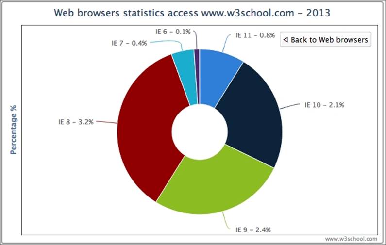
Another great flexibility in Highcharts is that the top and detail level charts are not limited to the same type of series. The drilldown series can be any series best suited for presenting the detail data. This can be accomplished by assigning a different series type in the detail level. The following is the further code update for the example, in which the Internet Explorer column is zoomed in and presented in a donut (or ring) chart. We also set the data labels for the pie chart to show both the version name and percentage value:
plotOptions: {
column: {
....
},
pie: {
dataLabels: {
enabled: true,
format: '{point.name} - {y}%'
}
}
},
drilldown: {
activeAxisLabelStyle: {
....
},
activeDataLabelStyle: {
....
},
series: [{
id: 'ie',
name: 'Internet Explorer',
type: 'pie',
innerSize: '30%',
data: [{
....
}],
}, {
....
}]
}
The following is the screenshot of the donut chart:
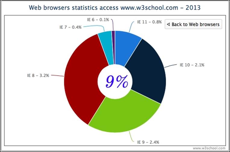
The preceding donut chart is slightly misleading because the total value of all the data labels is 9 percent, but the presentation of the donut chart gives the impression of 100 percent in total. In order to clarify that 9 percent is the total value, we can take advantage of the Highcharts Renderer engine (we will explore this further in Chapter 5, Pie Charts) to display an SVG text box in the middle of the ring. However, the drilldown option only allows us to declare series-specific options. Moreover, we would like the 9 percent text box to appear only when clicking on the 'Internet Explorer' column.
One trick to achieve that is to use Highcharts events, which will be examined further in Chapter 11, Highcharts Events. Here, we use the events specific to the drilldown action. The basic idea is that, when the drilldown event is triggered, we check the data point being clicked is Internet Explorer. If so, then we create a textbox using the chart's renderer engine. In the drillup event (triggered when the Back to … button is clicked), we remove the text box if it exists:
chart = new Highcharts.Chart({
chart: {
renderTo: 'container',
events: {
drilldown: function(event) {
// According to Highcharts documentation,
// the clicked data point is embedded inside
// the event object
var point = event.point;
var chart = point.series.chart;
var renderer = chart.renderer;
if (point.name == 'Internet Explorer') {
// Create SVG text box from
// Highcharts Renderer
// chart center position based on
// it's dimension
pTxt = renderer.text('9%',
(chart.plotWidth / 2) +
chart.plotLeft - 43,
(chart.plotHeight / 2) +
chart.plotTop + 25)
.css({
fontSize: '45px',
// Google Font
fontFamily: 'Old Standard TT',
fontStyle: 'italic',
color: 'blue'
}).add();
}
}, // drilldown
drillup: function() {
pTxt && (pTxt = pTxt.destroy());
}
}
Here is the refined chart with the textbox centered in the chart:
Summary
In this chapter, major configuration components were discussed and experimented with, and examples shown. By now, we should be comfortable with what we have covered already and ready to plot some of the basic graphs with more elaborate styles.
In the next chapter, we will explore the line, area, and scatter graphs supported by Highcharts. We will apply configurations that we have learned in this chapter and explore the series-specific style options to plot charts in an artistic style.
All materials on the site are licensed Creative Commons Attribution-Sharealike 3.0 Unported CC BY-SA 3.0 & GNU Free Documentation License (GFDL)
If you are the copyright holder of any material contained on our site and intend to remove it, please contact our site administrator for approval.
© 2016-2026 All site design rights belong to S.Y.A.