Learning Highcharts 4 (2015)
Chapter 3. Line, Area, and Scatter Charts
In this chapter, we will learn about line, area, and scatter charts and explore their plotting options in more details. We will also learn how to create a stacked area chart and projection charts. Then, we will attempt to plot the charts in a slightly more artistic style. The reason for that is to provide us with an opportunity to utilize various plotting options. In this chapter, we will cover the following:
· Introducing line charts
· Sketching an area chart
· Highlighting and raising the base level
· Mixing line and area series
· Combining scatter and area series
Introducing line charts
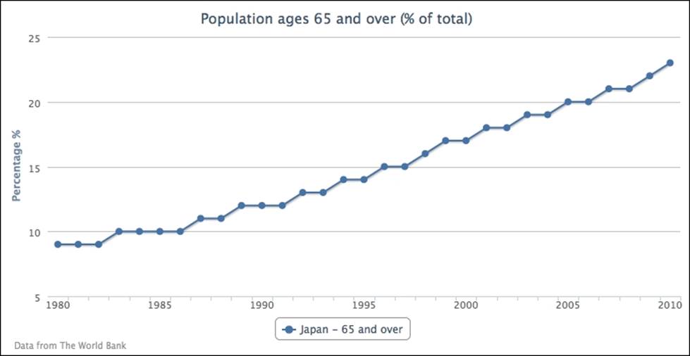
First let's start with a single-series line chart. We will use one of the many data sets provided by The World Bank organization at www.worldbank.org. The following is the code snippet to create a simple line chart that shows the percentage of population aged 65 and above in Japan for the past three decades:
var chart = new Highcharts.Chart({
chart: {
renderTo: 'container'
},
title: {
text: 'Population ages 65 and over (% of total)'
},
credits: {
position: {
align: 'left',
x: 20
},
text: 'Data from The World Bank'
},
yAxis: {
title: {
text: 'Percentage %'
}
},
xAxis: {
categories: ['1980', '1981', '1982', ... ],
labels: {
step: 5
}
},
series: [{
name: 'Japan - 65 and over',
data: [ 9, 9, 9, 10, 10, 10, 10 ... ]
}]
});
The following is the display of the simple chart:
Instead of specifying the year number manually as strings in categories, we can use the pointStart option in the series config to initiate the x axis value for the first point. So we have an empty xAxis config and series config, as follows:
xAxis: {
},
series: [{
pointStart: 1980,
name: 'Japan - 65 and over',
data: [ 9, 9, 9, 10, 10, 10, 10 ... ]
}]
Extending to multiple-series line charts
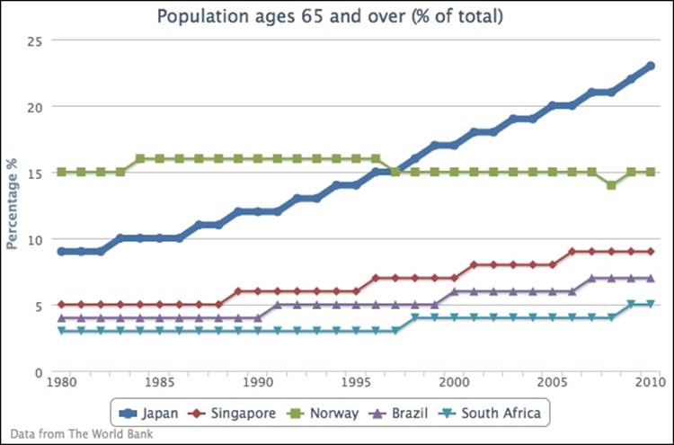
We can include several more line series and emphasize the Japan series by increasing the line width to be 6-pixels wide, as follows:
series: [{
lineWidth: 6,
name: 'Japan',
data: [ 9, 9, 9, 10, 10, 10, 10 ... ]
}, {
Name: 'Singapore',
data: [ 5, 5, 5, 5, ... ]
}, {
// Norway, Brazil, and South Africa series data...
...
}]
By making that line thicker, the line series for the Japanese population becomes the focus in the chart, as shown in the following screenshot:
Let's move on to a more complicated line graph. For the sake of demonstrating inverted line graphs, we use the chart.inverted option to flip the y and x axes to opposite orientations. Then, we change the line colors of the axes to match the same series colors as in the previous chapter. We also disable data point markers for all the series, and finally align the second series to the second entry on the y-axis array, as follows:
chart: {
renderTo: 'container',
inverted: true
},
yAxis: [{
title: {
text: 'Percentage %'
},
lineWidth: 2,
lineColor: '#4572A7'
}, {
title: {
text: 'Age'
},
opposite: true,
lineWidth: 2,
lineColor: '#AA4643'
}],
plotOptions: {
series: {
marker: {
enabled: false
}
}
},
xAxis: {
categories: [ '1980', '1981', '1982', ...,
'2009', '2010' ],
labels: {
step: 5
}
},
series: [{
name: 'Japan - 65 and over',
type: 'spline',
data: [ 9, 9, 9, ... ]
}, {
name: 'Japan - Life Expectancy',
yAxis: 1,
data: [ 76, 76, 77, ... ]
}]
The following is the inverted graph with double y axes:
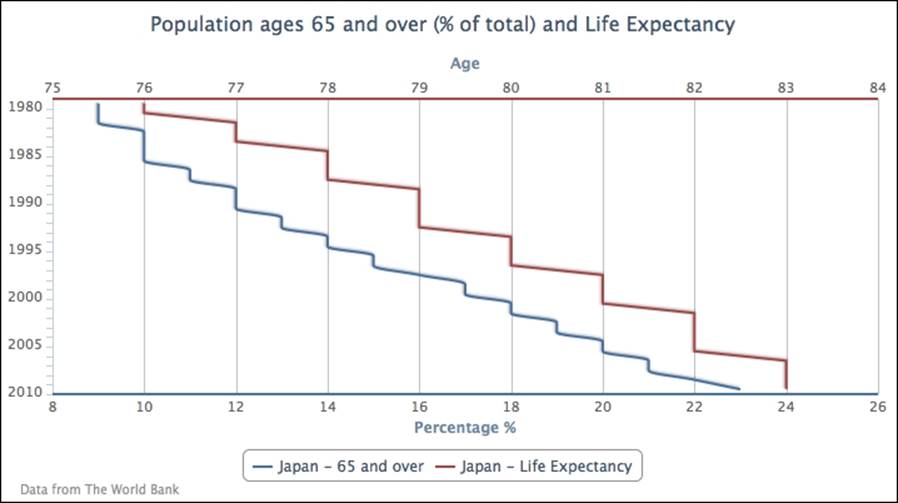
The data representation of the chart may look slightly odd as the usual time labels are swapped to the y axis and the data trend is difficult to comprehend. The inverted option is normally used for showing data in a non-continuous form and in a bar format. If we interpret the data from the graph, 12 percent of the population is 65 or over in 1990, and the life expectancy is 79.
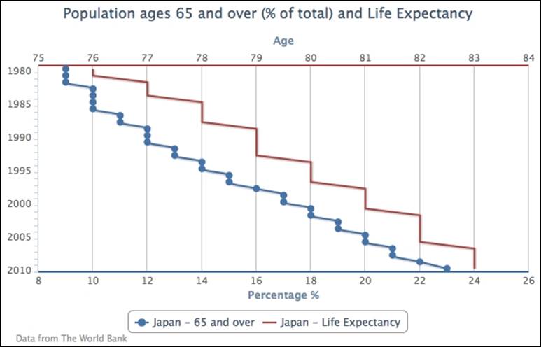
Setting plotOptions.series.marker.enabled to false switches off all the data point markers. If we want to display a point marker for a particular series, we can either switch off the marker globally and then turn the marker on for individual series, or the other way round:
plotOptions: {
series: {
marker: {
enabled: false
}
}
},
series: [{
marker: {
enabled: true
},
name: 'Japan - 65 and over',
type: 'spline',
data: [ 9, 9, 9, ... ]
}, {
The following graph demonstrates that only the 65-and-over series has point markers:
Highlighting negative values and raising the base level
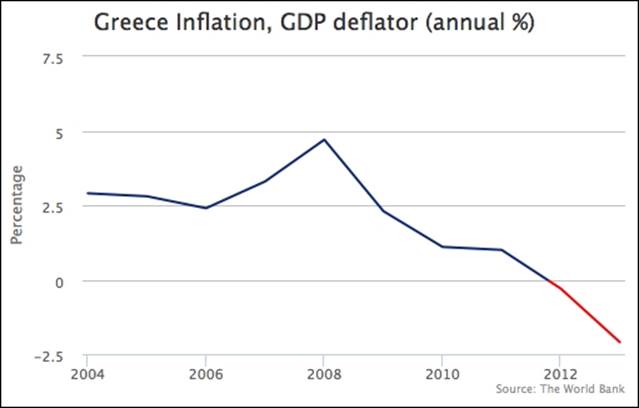
Sometimes, we may want to highlight both positive and negative regions in different colors. In such cases, we can specify the series color for negative values with the series option, negativeColor. Let's create a simple example with inflation data, containing both positive and negative data. Here is the series configuration:
plotOptions: {
line: {
negativeColor: 'red'
}
},
series: [{
type: 'line',
color: '#0D3377',
marker: {
enabled: false
},
pointStart: 2004,
data:[ 2.9, 2.8, 2.4, 3.3, 4.7,
2.3, 1.1, 1.0, -0.3, -2.1
]
}]
We assign the color red for negative inflation values and disable the markers in the line series. The line series color is defined by another color, blue, which is used for positive values. The following is the graph showing the series in separate colors:
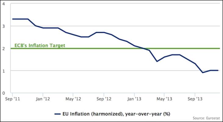
Let's create another slightly more advanced example, in which we define the negative territory in terms of the subject. We plot another inflation chart, but based on the European Central Bank (ECB) definition of healthy inflation that is 2 percent. Anything below that level is regarded as unhealthy for the economy, so we set the color below that threshold to red. Beside the color threshold, we also set up a plotline on the y-axis to indicate the cut-off level. The following is our first try to set up the chart:
yAxis: {
title: { text: null },
min: 0,
max: 4,
plotLines: [{
value: 2,
width: 3,
color: '#6FA031',
zIndex: 1,
label: {
text: 'ECB....',
....
}
}]
},
xAxis: { type: 'datetime' },
plotOptions: {
line: { lineWidth: 3 }
},
series: [{
type: 'line',
name: 'EU Inflation (harmonized), year-over-year (%)',
color: '#0D3377',
marker: { enabled: false },
data:[
[ Date.UTC(2011, 8, 1), 3.3 ],
[ Date.UTC(2011, 9, 1), 3.3 ],
[ Date.UTC(2011, 10, 1), 3.3 ],
....
We set up a green plotline along the y-axis at the value 2, 3 pixels wide. The zIndex option is to avoid the interval line appearing on top of the plot line. With the inflation line series, we disable the markers and also set the line width to 3 pixels wide. The following is the initial attempt without thresholding:
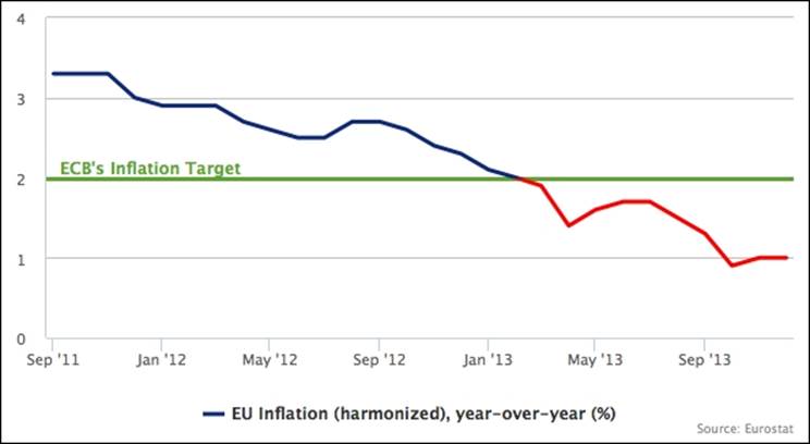
Let's apply the threshold level to the lines series. The default negative color on the y-axis level is at 0 value. As for this particular example, the base level for a negative color would be 2. To raise the base level to 2, we set the threshold property along with thenegativeColor option:
plotOptions: {
line: {
lineWidth: 3,
negativeColor: 'red',
threshold: 2
}
},
The preceding modification turns part of the line series red to indicate an alert:
Sketching an area chart
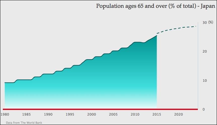
In this section, we are going to use our very first example and turn it into a more stylish graph (based on the design of a wind energy poster by Kristin Clute): an area spline chart. An area spline chart is generated using the combined properties of area and spline charts. The main data line is plotted as a spline curve and the region underneath the line is filled in a similar color with a gradient and opaque style:
First, we want to make the graph easier for viewers to look up the values for the current trend, so we move the y-axis values to the right side of the chart, where they will be closest to the most recent year:
yAxis: { ....
opposite: true
}
The next thing is to remove the interval lines and have a thin axis line along the y axis:
yAxis: { ....
gridLineWidth: 0,
lineWidth: 1,
}
Then, we simplify the y-axis title with a percentage sign and align to the top of the axis:
yAxis: { ....
title: {
text: '(%)',
rotation: 0,
x: 10,
y: 5,
align: 'high'
},
}
As for the x axis, we thicken the axis line with red and remove the interval ticks:
xAxis: { ....
lineColor: '#CC2929',
lineWidth: 4,
tickWidth: 0,
offset: 2
}
For the chart title, we move the title to the right of the chart, increase the margin between the chart and the title, and then adopt a different font for the title:
title: {
text: 'Population ages 65 and over (% of total) - Japan ',
margin: 40,
align: 'right',
style: {
fontFamily: 'palatino'
}
}
After that, we are going to modify the whole series presentation, so we first change the chart.type property from 'line' to 'areaspline'. Notice that setting the properties inside this series object will overwrite the same properties defined in plotOptions.areaspline and so on in plotOptions.series.
Since so far there is only one series in the graph, there is no need to display the legend box. We can disable it with the showInLegend property. We then smarten the area part with a gradient color and the spline with a darker color:
series: [{
showInLegend: false,
lineColor: '#145252',
fillColor: {
linearGradient: {
x1: 0, y1: 0,
x2: 0, y2: 1
},
stops:[ [ 0.0, '#248F8F' ] ,
[ 0.7, '#70DBDB' ],
[ 1.0, '#EBFAFA' ] ]
},
data: [ ... ]
}]
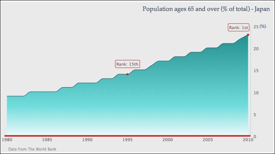
After that, we introduce a couple of data labels along the line to indicate that the ranking of old age population has increased over time. We use the values in the series data array corresponding to the year 1995 and 2010, and then convert the numerical value entries into data point objects. Since we only want to show point markers for these two years, we turn off markers globally in plotOptions.series.marker.enabled and set the marker on individually inside the point objects, accompanied by style settings:
plotOptions: {
series: {
marker: {
enabled: false
}
}
},
series: [{ ...,
data:[ 9, 9, 9, ...,
{ marker: {
radius: 2,
lineColor: '#CC2929',
lineWidth: 2,
fillColor: '#CC2929',
enabled: true
},
y: 14
}, 15, 15, 16, ... ]
}]
We then set a bounding box around the data labels with round corners (borderRadius) in the same border color (borderColor) as the x axis. The data label positions are then finely adjusted with the x and y options. Finally, we change the default implementation of the data label formatter. Instead of returning the point value, we print the country ranking:
series: [{ ...,
data:[ 9, 9, 9, ...,
{ marker: {
...
},
dataLabels: {
enabled: true,
borderRadius: 3,
borderColor: '#CC2929',
borderWidth: 1,
y: -23,
formatter: function() {
return "Rank: 15th";
}
},
y: 14
}, 15, 15, 16, ... ]
}]
The final touch is to apply a gray background to the chart and add extra space for spacingBottom. The extra space for spacingBottom is to avoid the credit label and x-axis label getting too close together, because we have disabled the legend box:
chart: {
renderTo: 'container',
spacingBottom: 30,
backgroundColor: '#EAEAEA'
},
When all these configurations are put together, it produces the chart shown in the screenshot at the start of this section.
Mixing line and area series
In this section, we are going to explore different plots including line and area series together, as follows:
· Creating a projection chart, where a single trend line is joined with two series in different line styles
· Plotting an area spline chart with another step line series
· Exploring a stacked area spline chart, where two area spline series are stacked on top of each other
Simulating a projection chart
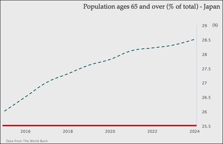
The projection chart has a spline area with the section of real data, and continues in a dashed line with the projection data. To do that we separate the data into two series, one for real data and the other for projection data. The following is the series configuration code for the data from the year 2015 to 2024. This data is based on the National Institute of Population and Social Security Research report (http://www.ipss.go.jp/pp-newest/e/ppfj02/ppfj02.pdf):
series: [{
name: 'project data',
type: 'spline',
showInLegend: false,
lineColor: '#145252',
dashStyle: 'Dash',
data: [ [ 2015, 26 ], [ 2016, 26.5 ],
... [ 2024, 28.5 ] ]
}]
The future series is configured as a spline in a dashed line style and the legend box is disabled, because we want to show both series as being part of the same series. Then we set the future (second) series color the same as the first series. The final part is to construct the series data. As we specify the x-axis time data with the pointStart property, we need to align the projection data after 2014. There are two approaches that we can use to specify the time data in a continuous form, as follows:
· Insert null values into the second series data array for padding, to align with the real data series
· Specify the second series data in tuples, an array with both time and projection data
Here we are going to use the second approach because the series presentation is simpler. The following is the screenshot for the future data series only:
The real data series is exactly the same as the graph in the screenshot at the start of the Sketching an area chart section, except without the point markers and data labels decorations. The next step is to join both series together, as follows:
series: [{
name: 'real data',
type: 'areaspline',
....
}, {
name: 'project data',
type: 'spline',
....
}]
Since there is no overlap between both series data, they produce a smooth projection graph:
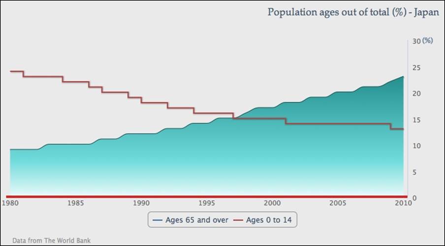
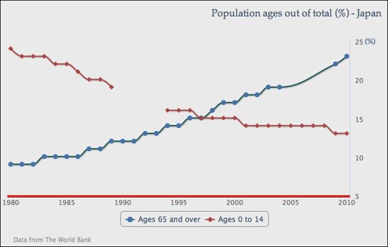
Contrasting a spline with a step line
In this section, we are going to plot an area spline series with another line series, but in step presentation. The step line transverses vertically and horizontally according to changes in series data only. It is generally used for presenting discrete data: data without continuous/gradual movement.
For the purpose of showing a step line, we will continue from the first area spline example. First of all, we need to enable the legend by removing the disabled showInLegend setting and also remove dataLabels in the series data.
Next is to include a new series—Ages 0 to 14—in the chart with the default line type. Then, we change the line style slightly into different steps. The following is the configuration for both series:
series: [{
name: 'Ages 65 and over',
type: 'areaspline',
lineColor: '#145252',
pointStart: 1980,
fillColor: {
....
},
data: [ 9, 9, 9, 10, ...., 23 ]
}, {
name: 'Ages 0 to 14',
// default type is line series
step: true,
pointStart: 1980,
data: [ 24, 23, 23, 23, 22, 22, 21,
20, 20, 19, 18, 18, 17, 17, 16, 16, 16,
15, 15, 15, 15, 14, 14, 14, 14, 14, 14,
14, 14, 13, 13 ]
}]
The following screenshot shows the second series in line step style:
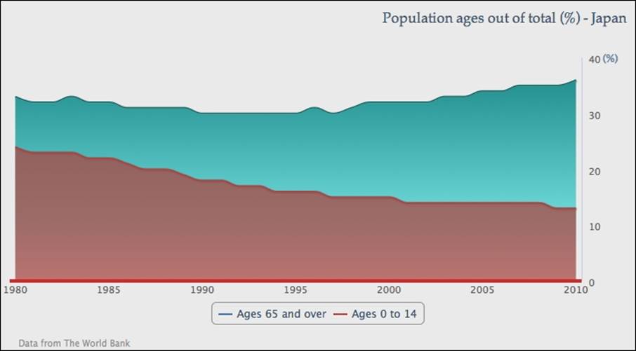
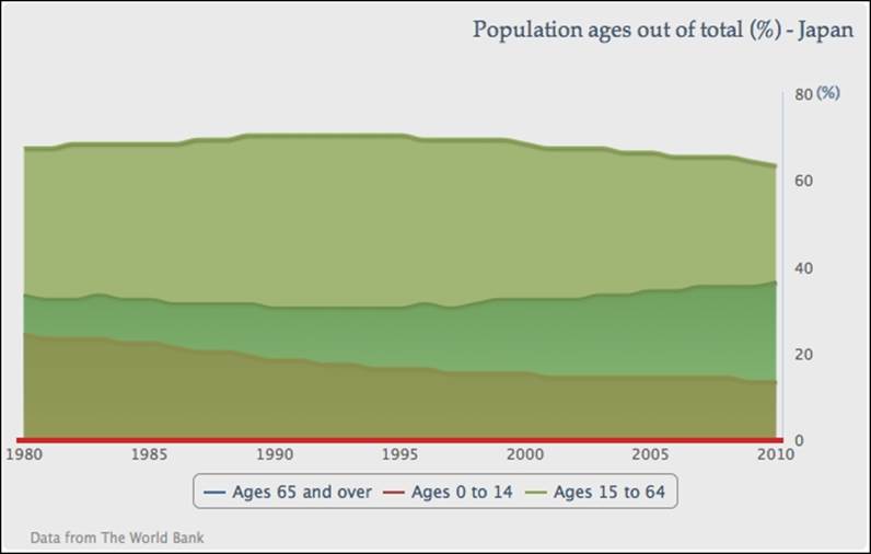
Extending to the stacked area chart
In this section, we are going to turn both series into area splines and stack them on top of each other to create a stacked area chart. As the data series are stacked together, we can observe the series quantities as individual, proportional, and total amounts.
Let's change the second series into another 'areaspline' type:
name: 'Ages 0 to 14',
type: 'areaspline',
pointStart: 1980,
data: [ 24, 23, 23, ... ]
Set the stacking option to 'normal' as a default setting for areaspline, as follows:
plotOptions: {
areaspline: {
stacking: 'normal'
}
}
This sets both area graphs stacked on top of each other. By doing so, we can observe from the data that both age groups roughly compensate for each other to make up a total of around 33 percent of the overall population, and the Ages 65 and over group is increasingly outpaced in the later stage:
Suppose we have three area spline series and we only want to stack two of them (although it is clearer to do that in a column chart rather than in an area spline chart). As described in the Exploring PlotOptions section in Chapter 2, Highcharts Configurations, we can set the stacking option in plotOptions.series to 'normal', and manually turn off stacking in the third series configuration. The following is the series configuration with another series:
plotOptions: {
series: {
marker: {
enabled: false
},
stacking: 'normal'
}
},
series: [{
name: 'Ages 65 and over',
....
}, {
name: 'Ages 0 to 14',
....
}, {
name: 'Ages 15 to 64',
type: 'areaspline',
pointStart: 1980,
stacking: null,
data: [ 67, 67, 68, 68, .... ]
}]
This creates an area spline graph with the third series Ages 15 to 64 covering the other two stacked series, as shown in the following screenshot:
Plotting charts with missing data
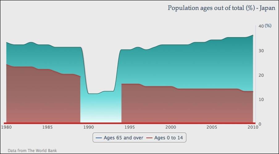
If a series has missing data, then the default action of Highcharts is to display the series as a broken line. There is an option—connectNulls—that allows a series line to continue even if there is missing data. The default value for this option is false. Let's examine the default behavior by setting two spline series with null data points. We also enable the point markers, so that we can clearly view the missing data points:
series: [{
name: 'Ages 65 and over',
connectNulls: true,
....,
// Missing data from 2004 - 2009
data: [ 9, 9, 9, ..., null, null, null, 22, 23 ]
}, {
name: 'Ages 0 to 14',
....,
// Missing data from 1989 - 1994
data: [ 24, 23, 23, ..., 19, null, null, ..., 13 ]
}]
The following is a chart with the spline series presenting missing points in different styles:
As we can see, the Ages 0 to 14 series has a clear broken line, whereas Ages 65 and over is configured by setting connectNulls to true, which joins the missing points with a spline curve. If the point marker is not enabled, we wouldn't be able to notice the difference.
However, we should use this option with caution and it should certainly never be enabled with the stacking option. Suppose we have a stacked area chart with both series and there is missing data only in the Ages 0 to 14 series, which is the bottom series. The default action for the missing data will make the graph look like the following screenshot:
Although the bottom series does show the broken part, the stack graph overall still remains correct. The same area of the top series drops back to single-series values and the overall percentage is still intact.
The problem arises when we set the connectNulls option to true and do not realize that there is missing data in the series. This results in an inconsistent graph, as follows:
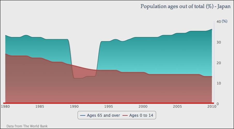
The bottom series covers a hole left from the top series that contradicts the stack graph's overall percentage.
Combining the scatter and area series
Highcharts also supports a scatter chart that enables us to plot the data trend from a large set of data samples. Here we are going to use the scatter series differently, which makes our chart a bit like a poster chart.
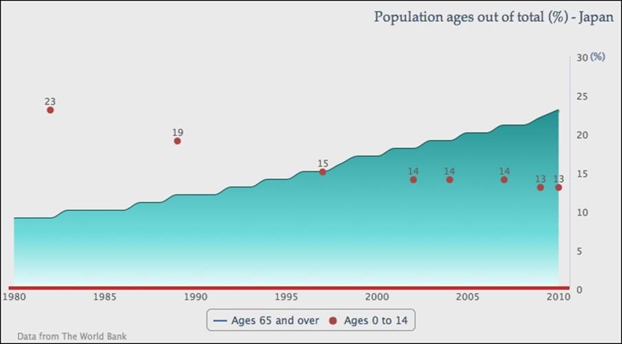
First, we are going to use a subset of the 'Ages 0 to 14' data and set the series to the scatter type:
name: 'Ages 0 to 14',
type: 'scatter',
data: [ [ 1982, 23 ], [ 1989, 19 ],
[ 2007, 14 ], [ 2004, 14 ],
[ 1997, 15 ], [ 2002, 14 ],
[ 2009, 13 ], [ 2010, 13 ] ]
Then, we will enable the data labels for the scatter series and make sure the marker shape is always 'circle', as follows:
plotOptions: {
scatter: {
marker: {
symbol: 'circle'
},
dataLabels: {
enabled: true
}
}
}
The preceding code snippet gives us the following graph:
Tip
Highcharts provides a list of marker symbols as well as allowing users to supply their own marker icons (see Chapter 2, Highcharts Configurations). The list of supported symbols contains: circle, square, diamond, triangle, and triangle-down.
Polishing a chart with an artistic style
The next step is to format each scatter point into a bubble style with the radius property and manually set the data label font size proportional to the percentage value.
Note
The reason we used the scatter series instead of the bubble series is because most of the material in this chapter was written for the first edition; this chart was created with an earlier version of Highcharts that didn't support the bubble series.
Then use the verticalAlign property to adjust the labels to center inside the enlarged scatter points. The various sizes of scatter points require us to present each data point with different attributes. Therefore, we need to change the series data definition into an array of point object configurations, such as:
plotOptions: {
scatter: {
marker: {
symbol: 'circle'
},
dataLabels: {
enabled: true,
verticalAlign: 'middle'
}
}
},
data: [ {
dataLabels: {
style: {
fontSize: '25px'
}
},
marker: { radius: 31 },
y: 23,
x: 1982
}, {
dataLabels: {
style: {
fontSize: '22px'
}
},
marker: { radius: 23 },
y: 19,
x: 1989
}, .....
The following screenshot shows a graph with a sequence of data points, starting with a large marker size and font, then gradually becoming smaller according to their percentage values:
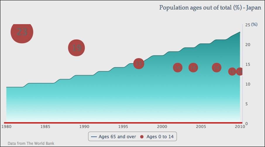
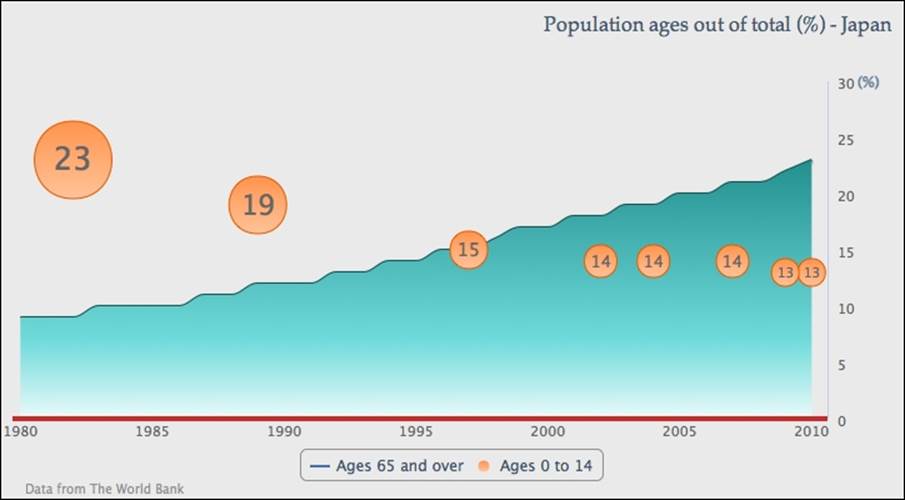
Now, we have two issues with the preceding graph. First, the scatter series color (the default second series color) clashes with the gray text labels inside the markers, making them hard to read.
To resolve this issue, we will change the scatter series to a lighter color with the gradient setting:
color: {
linearGradient: { x1: 0, y1: 0, x2: 0, y2: 1 },
stops: [ [ 0, '#FF944D' ],
[ 1, '#FFC299' ] ]
},
Then, we give the scatter points a darker outline in plotOptions, as follows:
plotOptions: {
scatter: {
marker: {
symbol: 'circle',
lineColor: '#E65C00',
lineWidth: 1
},
Secondly, the data points are blocked by the end of the axes' ranges. The issue can be resolved by introducing extra padding spaces into both axes:
yAxis: {
.....,
maxPadding: 0.09
},
xAxis: {
.....,
maxPadding: 0.02
}
The following is the new look for the graph:
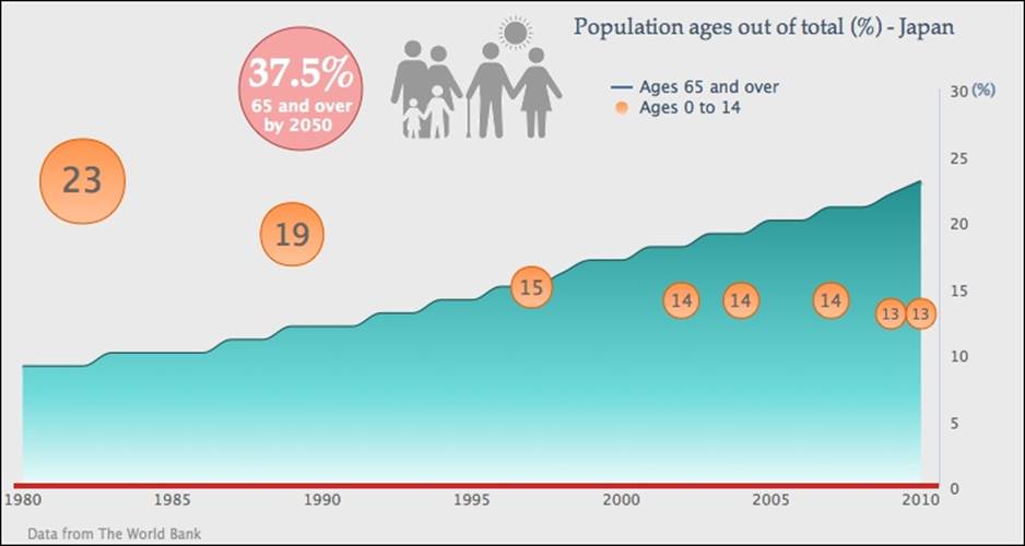
For the next part, we will put up a logo and some decorative text. There are two ways to import an image into a chart—the plotBackgroundImage option or the renderer.image API call. The plotBackgroundImage option brings the whole image into the chart background, which is not what we intend to do. The renderer.image method offers more control over the location and size of the image. The following is the call after the chart is created:
var chart = new Highcharts.Chart({
...
});
chart.renderer.image('logo.png', 240, 10, 187, 92).add();
logo.png is the URL path for the logo image file. The next two parameters are the x and y positions (starting from 0, where 0 is the upper-left corner) of the chart where the image will be displayed. The last two parameters are the width and height of the image file. The image call basically returns an element object and the subsequent .add call puts the returned image object into the renderer.
As for the decorative text, it is a red circle with white bold text in a different size. They are all created from the renderer. In the following code snippet, the first renderer call is to create a red circle with x and y locations, and radius size. Then SVG attributes are immediately set with the attr method that configures the transparency and outline in a darker color. The next three renderer calls are to create text inside the red circle and set up the text using the css method for font size, style, and color. We will revisitchart.renderer as part of the Highcharts API in Chapter 10, Highcharts APIs:
// Red circle at the back
chart.renderer.circle(220, 65, 45).attr({
fill: '#FF7575',
'fill-opacity': 0.6,
stroke: '#B24747',
'stroke-width': 1
}).add();
// Large percentage text with special font
chart.renderer.text('37.5%', 182, 63).css({
fontWeight: 'bold',
color: '#FFFFFF',
fontSize: '30px',
fontFamily: 'palatino'
}).add();
// Align subject in the circle
chart.renderer.text('65 and over', 184, 82).css({
'fontWeight': 'bold',
}).add();
chart.renderer.text('by 2050', 193, 96).css({
'fontWeight': 'bold',
}).add();
Finally, we move the legend box to the top of the chart. In order to locate the legend inside the plot area, we need to set the floating property to true, which forces the legend into a fixed layout mode. Then, we remove the default border line and set the legend items list into a vertical direction:
legend: {
floating: true,
verticalAlign: 'top',
align: 'center',
x: 130,
y: 40,
borderWidth: 0,
layout: 'vertical'
},
The following is our final graph with the decorations:
Summary
In this chapter, we have explored the usage of line, area, and scatter charts. We have seen how much flexibility Highcharts can offer to make a poster-like chart.
In the next chapter, we will learn how to plot column and bar charts with their plotting options.
All materials on the site are licensed Creative Commons Attribution-Sharealike 3.0 Unported CC BY-SA 3.0 & GNU Free Documentation License (GFDL)
If you are the copyright holder of any material contained on our site and intend to remove it, please contact our site administrator for approval.
© 2016-2026 All site design rights belong to S.Y.A.