Learning Highcharts 4 (2015)
Chapter 6. Gauge, Polar, and Range Charts
In this chapter, we will learn how to create a gauge chart step by step. A gauge chart is very different from other Highcharts graphs. We will explore the new settings by plotting something similar to a twin-dials Fiat 500 speedometer. After that, we will review the structure of the polar chart and its similarity with other charts. Then, we will move on to examine how to create a range chart by using examples from the previous chapter. Finally, we will use a gauge chart to tweak the radial gradient in stages to achieve the desired effect. In this chapter, we will cover the following topics:
· Plotting a speedometer gauge chart
· Demonstrating a simple solid gauge chart
· Converting a spline chart to a polar/radar chart
· Plotting range charts with market index data
· Using a radial gradient on a gauge chart
Loading gauge, polar, and range charts
In order to use any gauge, polar, and range type charts, first we need to include an additional file, highcharts-more.js, provided in the package:
<script type="text/javascript"
src="http://code.highcharts.com/highcharts.js"></script>
<script type="text/javascript"
src="http://code.highcharts.com/highcharts-more.js"></script>
Plotting a speedometer gauge chart
Gauge charts have a very different structure compared to other Highcharts graphs. For instance, the backbone of a gauge chart is made up of a pane. A pane is a circular plot area for laying out chart content. We can adjust the size, position, and background of the pane. Once a pane is laid out, we can then put the axis on top of it. Highcharts supports multiple panes within a chart, so we can display multiple gauges (that is, multiple gauge series) within a chart. A gauge series is composed of two specific components—a pivot and a dial.
Another distinct difference in gauge charts is that the series is actually one dimensional data: a single value. Therefore, there is only one axis, the y axis, used in this type of chart. The yAxis properties are used the same way as other series type charts which can be on a linear, datetime, or logarithmic scale, and it also responds to the tickInterval option and so on.
Plotting a twin dials chart – a Fiat 500 speedometer
So far, we have mentioned all the parts that make up a gauge chart, and their relationships. There are many selectable options that can be used with gauge charts. In order to fully utilize them, we are going to learn in stages how to construct a sophisticated gauge chart by following the design of a Fiat 500 speedometer, as follows:
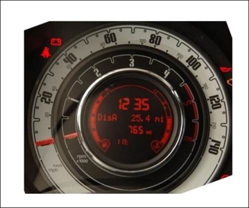
The speedometer is assembled with two dials on top of each other. The outer dial has two axes—mph and km/h. The inner dial is the rpm meter, which has a different scale and style. Another uncommon feature is that the body parts of both dials are hidden underneath: only the top needle parts are displayed. In the center of the gauge is an LED screen showing journey information. Despite all these unique characteristics, Highcharts provides enough flexibility to assemble a chart that looks very similar.
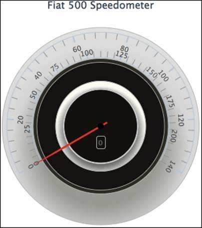
Plotting a gauge chart pane
First, let's see what a pane does in Highcharts. In order to do that, we should start by building a single dial speedometer. The following is the chart configuration code for a gauge chart with a single pane and a single axis:
chart: {
renderTo: 'container'
},
title: { text: 'Fiat 500 Speedometer' },
pane: [{
startAngle: -120,
endAngle: 120,
size: 300,
backgroundColor: '#E4E3DF'
}],
yAxis: [{
min: 0,
max: 140,
labels: {
rotation: 'auto'
}
}],
series: [{
type: 'gauge',
data: [ 0 ]
}]
The preceding code snippet produces the following gauge chart:
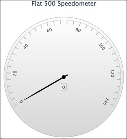
At the moment, this looks nothing like a Fiat 500 speedometer, but we will see the chart evolving gradually. The configuration declares a pane with a circular plot area from -120 to 120 degrees, with the y axis laying horizontally, whereas 0 degrees is at the 12 o'clock position. The rotation option generally takes a numerical degree value; 'auto' is the special keyword to enable the y axis labels to automatically rotate so that they are aligned with the pane angle. The little box below the dial is the default data label showing the current value in the series.
Setting pane backgrounds
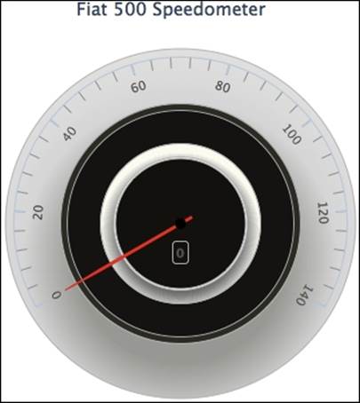
Gauge charts support more advanced background settings than just a single background color, as we saw in the previous example. Instead, we can specify another property, background, inside the pane option that accepts an array of different background settings. Each setting can be declared as an inner ring with both the innerRadius and outerRadius values defined, or as a circular background with only the outerRadius option. Both options are assigned percentage values with respect to the size of the pane. Here we set multiple backgrounds to the pane, as follows:
chart: {
type: 'gauge',
....
},
title: { .... },
series: [{
name: 'Speed',
data: [ 0 ],
dial: { backgroundColor: '#FA3421' }
}],
pane: [{
startAngle: -120,
endAngle: 120,
size: 300,
background: [{
backgroundColor: {
radialGradient: {
cx: 0.5,
cy: 0.6,
r: 1.0
},
stops: [
[0.3, '#A7A9A4'],
[0.45, '#DDD'],
[0.7, '#EBEDEA'],
]
},
innerRadius: '72%',
outerRadius: '105%'
}, {
// BG color in between speed and rpm
backgroundColor: '#38392F',
outerRadius: '72%',
innerRadius: '67%'
}, {
// BG color for rpm
.....
}]
As we can see, several backgrounds are defined, which include the backgrounds for the inner gauge: the rpm dial. Some of these backgrounds are rings and the last one is a circular background. Moreover, the needle color, series.dial.backgroundColor, is set to black by default. We are setting the dial color to red initially, so that we can still see the needle with the black background, which also more closely resembles the real-life example. Later in this section, we will explore the details of shaping and coloring the dial and pivot. As for the backgrounds with the radialGradient feature, we will examine them later in this chapter.
Managing axes with different scales
The next task is to lay a secondary y axis for the km/h scale, and we will set the new axis below the current display axis. We insert the new axis configuration as follows:
yAxis: [{
min: 0,
max: 140,
labels: {
rotation: 'auto'
}
}, {
min: 0,
max: 220,
tickPosition: 'outside',
minorTickPosition: 'outside',
offset: -40,
labels: {
distance: 5,
rotation: 'auto'
}
}],
The new axis has a scale from 0 to 220 and we use the offset option with a negative value, which pushes the axes' line towards the center of the pane. In addition, both tickPosition and minorTickPosition are set to 'outside'. This changes the interval ticks' direction to the opposite of the default settings. Both axes are now facing each other, which makes them similar to the the following figure:
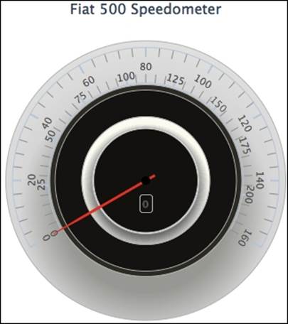
However, there is an issue that has arisen, as the scale of the top axis has been disturbed: it is no longer between 0 and 140. This is because the default action for a secondary axis is to align the intervals between multiple axes. To resolve this issue, we must set the chart.alignTicks option to false. After that, the issue is resolved and both axes are laid out as expected:
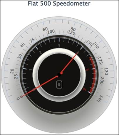
Extending to multiple panes
Since the gauge consists of two dials, we need to add an extra pane for the second dial. The following is the pane configuration:
pane: [{
// First pane for speed dial
startAngle: -120,
endAngle: 120,
size: 300,
background: [{
backgroundColor: {
radialGradient: {
.....
}]
}, {
// Second pane for rpm dial
startAngle: -120,
endAngle: 120,
size: 200
}]
The second pane's plot area starts and ends at the same angles as the first pane, but has a smaller size. Since we haven't used the center option to position any panes within the chart, the inner pane is automatically placed at the center of the outer pane. The next step is to create another axis, rpm, which has a red region marked between the values of 4.5 and 6. Then, we bind all the axes to their panes, as follows:
yAxis: [{
// axis for rpm - pane 1
min: 0,
max: 6,
labels: {
rotation: 'auto',
formatter: function() {
if (this.value >= 4.5) {
return '<span style="color:' +
'#A41E09">' + this.value +
"</span>";
}
return this.value;
}
},
plotBands: [{
from: 4.5,
to: 6,
color: '#A41E09',
innerRadius: '94%'
}],
pane: 1
}, {
// axis for mph - pane 0
min: 0,
max: 140,
.....
pane: 0
}, {
// axis for km/h - pane 0
min: 0,
max: 220,
....
pane: 0
}]
For the rpm axis, we use labels.formatter to mark up the font color in the high-revolution region and also create a plot band for the axis. The innerRadius option is to control how thick the red area appears to be. The next task is to create a new gauge series, that is, a second dial for the new pane. Since the chart contains two different dials, we need to make the dial movement relative to an axis, therefore we assign the yAxis option to bind the series to an axis. Also, we set the initial value for the new series to 4, just to demonstrate how the two dials are constructed, not superimposed on each other, as follows:
series: [{
type: 'gauge',
name: 'Speed',
data: [ 0 ],
yAxis: 0
}, {
type: 'gauge',
name: 'RPM',
data: [ 4 ],
yAxis: 2
}]
With all these additional changes, the following is the new look of the internal dial:
In the next part, we will learn how to set up the look and feel of the dial needles.
Gauge series – dial and pivot
There are a couple of properties specific to the gauge series, which are plotOptions.gauge.dial and plotOptions.gauge.pivot. The dial option controls the look and feel of the needle itself, whereas pivot is the tiny circle object at the center of the gauge attached to the dial.
First of all, we want to change the color and the thickness of the dials, as follows:
series: [{
type: 'gauge',
name: 'Speed',
....
dial: {
backgroundColor: '#FA3421',
baseLength: '90%',
baseWidth: 7,
topWidth: 3,
borderColor: '#B17964',
borderWidth: 1
}
}, {
type: 'gauge',
name: 'RPM',
....
dial: {
backgroundColor: '#FA3421',
baseLength: '90%',
baseWidth: 7,
topWidth: 3,
borderColor: '#631210',
borderWidth: 1
}
}]
The preceding code snippet results in the following output:
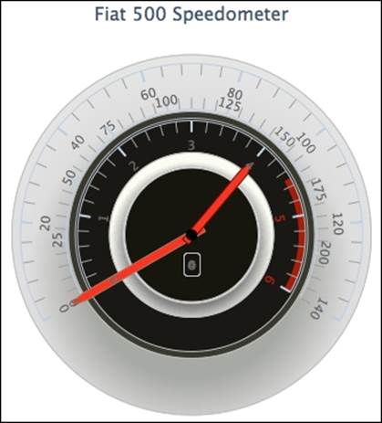
First, we widen the needle by setting the baseWidth option to 7 pixels across and 3 pixels at the end of the needle. Then, instead of having the needle narrowing down gradually to the end of the tip, we set the baseLength option to '90%', which is the position on the dial where the needle starts to narrow down to a point.
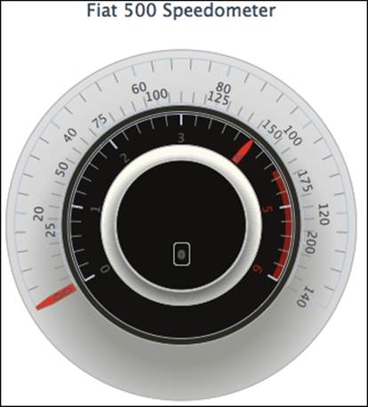
As we can see, the dials are still not quite right in that they are not long enough to reach to their axis lines, as shown in the preceding screenshot. Secondly, the rest of the dial bodies are not covered up. We can resolve this issue by fiddling with the rearLengthoption. The following are the amended series settings:
series: [{
type: 'gauge',
name: 'Speed',
.....
dial: {
.....
radius: '100%',
rearLength: '-74%'
},
pivot: { radius: 0 }
}, {
type: 'gauge',
name: 'RPM',
.....
dial: {
.....
radius: '100%',
rearLength: '-74%'
},
pivot: { radius: 0 }
}]
The trick is that instead of having a positive value like most of the gauge charts would have, we input a negative value that creates the covered-up effect. Finally, we remove the pivot by specifying the radius value as 0. The following is the final adjustment of the dials:
Polishing the chart with fonts and colors
The next step is to apply the axis options to tweak the tick intervals' color and size. The axis labels use fonts from the Google web fonts service (refer to http://www.google.com/fonts for Google web fonts). Then, we adjust the font size and color to that shown in the screenshot. There are a myriad of fonts to choose from with Google web fonts and they come with easy instructions to apply them. The following is an example of embedding the Squada One font into the <head> section of an HTML file:
<link href='http://fonts.googleapis.com/css?family=Squada One'
rel='stylesheet' type='text/css'>
We apply the new imported font to the y axis titles and labels as shown in the following example:
yAxis: [{
// axis for rpm - pane 1
min: 0,
max: 6,
labels: {
style: {
fontFamily: 'Squada One',
fontSize: 22
....
}
}
This significantly improves the look of the gauge, as follows:
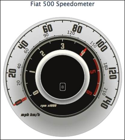
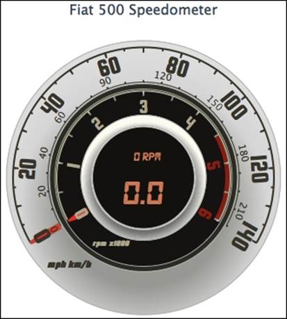
The final part is to transform the series data labels to resemble an LED screen. We will change the data labels' font size, style, and color and remove the border of the label box. The rpm data label has a smaller font size and moves above the mph data label. To make it look more realistic, we will also set the background for the data labels to a pale orange color. All the details of the tunings can be found in the online example at http://joekuan.org/Learning_Highcharts/. The following is the final look of the polished gauge chart:
Plotting the solid gauge chart
Highcharts provides another type of gauge chart, solid gauge, which has a different presentation. Instead of having a dial, the chart background is filled with another color to indicate the level. The following is an example derived from the Highcharts online demo:
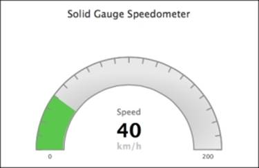
The principle of making a solid gauge chart is the same as a gauge chart, including the pane, y axis and series data, but without the dial setup. The following is our first attempt:
chart: {
renderTo: 'container',
type: 'solidgauge'
},
title: ....,
pane: {
size: '90%',
background: {
innerRadius: "70%",
outerRadius: "100%"
}
},
// the value axis
yAxis: {
min: 0,
max: 200,
title: {
text: 'Speed'
}
},
series: [{
data: [40],
dataLabels: {
enabled: false
}
}]
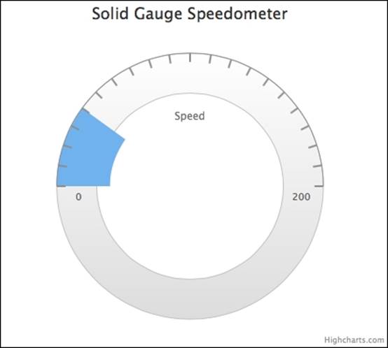
We start with pane in a donut shape by specifying the innerRadius and outerRadius options. Then, we assign the y axis range along the background pane and set the initial value to 40 for a visible gauge level. The following is the result of our first solid gauge:
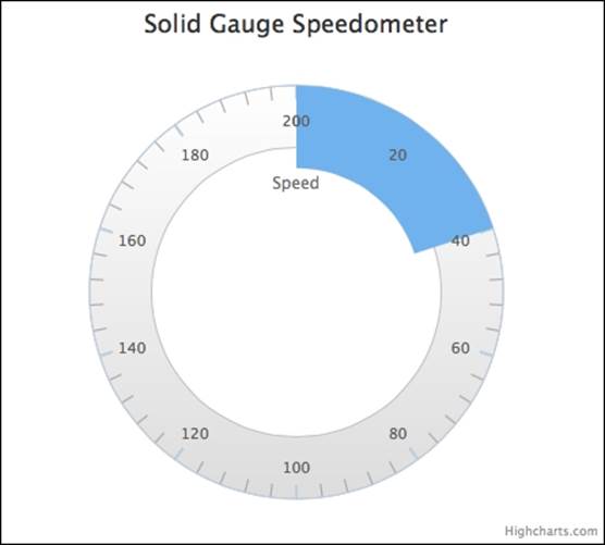
As we can see, the pane starts and ends at the 12 o'clock position with a section of the pane filled up with blue as the solid gauge dial. Let's make the axis progress clockwise from 9 o'clock to 3 o'clock and configure the intervals to become visible over the color gauge. In addition, we will increase the thickness of the intervals and only allow the first and last interval labels to be displayed. Here is the modified configuration:
chart: .... ,
title: .... ,
pane: {
startAngle: -90,
endAngle: 90,
....
},
yAxis: {
lineColor: '#8D8D8D',
tickColor: '#8D8D8D',
intervalWidth: 2,
zIndex: 4,
minorTickInterval: null,
tickInterval: 10,
labels: {
step: 20,
y: 16
},
....
},
series: ....
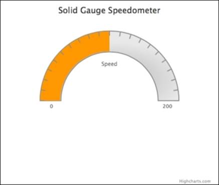
The startAngle and endAngle options are the effective start and end positions for labelling on the pane, so -90 and 90 degrees are the 9 o'clock and 3 o'clock positions respectively. Next, both lineColor (the axis line color at the outer boundary) and tickColor are applied with a darker color, so that by combining them with the zIndex option, the intervals become visible with the different levels of gauge colors.
The following is the output of the modified chart:
Next, we remove the bottom half of the background pane to leave a semi-circle shape and configure the background with shading (described in detail later in this chapter). Then, we adjust the size of the color gauge to be the same width as the background pane. We provide a list of color bands for different speed values, so that Highcharts will automatically change the gauge level from one color band to another according to the value:
chart: ...
title: ...
pane: {
background: {
shape: 'arc',
borderWidth: 2,
borderColor: '#8D8D8D',
backgroundColor: {
radialGradient: {
cx: 0.5,
cy: 0.7,
r: 0.9
},
stops: [
[ 0.3, '#CCC' ],
[ 0.6, '#E8E8E8' ]
]
},
}
},
yAxis: {
... ,
stops: [
[ 0, '#4673ac' ], // blue
[ 0.2, '#79c04f' ], // green
[ 0.4, '#ffcc00'], // yellow
[ 0.6, '#ff6600'], // orange
[ 0.8, '#ff5050' ], // red
[ 1.0, '#cc0000' ]
],
},
plotOptions: {
solidgauge: {
innerRadius: '71%'
}
},
series: [{
data: [100],
}]
The shape option, 'arc', turns the pane into an arc shape. The color bands along the y axis are provided with a stops option, which is an array of ratios (the ratio of y axis range) and the color values. In order to align the gauge level with the pane, we assign theinnerRadius value of plotOptions.solidgauge to be slightly smaller than the pane innerRadius value, so that the movement of the gauge level doesn't cover the pane's inner border. We set the series value to 100 to show that the gauge level displays a different color as follows:
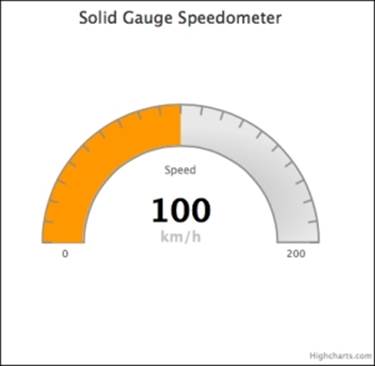
Now we have extra space in the bottom half of the chart, we can simply move the chart lower and decorate it with a data label as follows:
pane: {
.... ,
center: [ '50%', '65%' ]
},
plotOptions: {
solidgauge: {
innerRadius: '71%',
dataLabels: {
y: 5,
borderWidth: 0,
useHTML: true
}
}
},
series: [{
data: [100],
dataLabels: {
y: -60,
format: '<div style="text-align:center">' +
'<span style="font-size:35px;color:black">{y}</span><br/>' +
'<span style="font-size:16px;color:silver">km/h</span></div>'
}
}]
We set the chart's vertical position to 65 percent of the plot area height with the center option. Finally, we enable dataLabels to be shown as in HTML with textual decoration:
Converting a spline chart to a polar/radar chart
Polar (or radar) charts are generally used to spot data trends. They have a few differences from line and column type charts. Even though they may look like pie charts, they have nothing in common with them. In fact, a polar chart is a round representation of the conventional two-dimensional charts. To visualize it another way, it is a folded line or a column chart placed in a circular way with both ends of the x axis meeting.
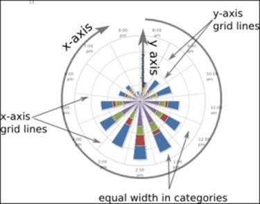
Again, we need to include highcharts-more.js in order to plot a polar chart. The following screenshot illustrates the structure of a polar chart:
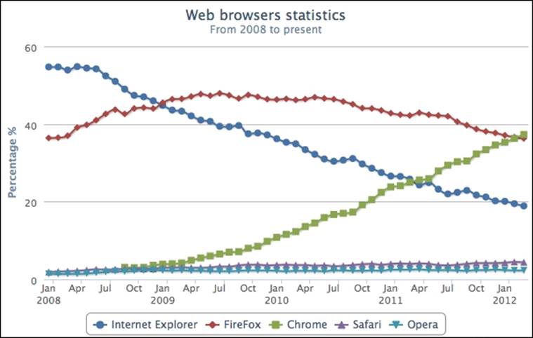
There are very few differences in principle, and the same also applies to the Highcharts configuration. Let's use our very first example of a browser usage chart in Chapter 1, Web Charts, and turn it into a radar chart. Recalling the browser line chart, we made the following:
To turn the line chart into a polar chart, we only need to set the chart.polar option to true, which transforms the orthogonal x and y coordinates into a polar coordinate system. To make the new polar chart easier to read, we set the x axis labels' rotation value to'auto', as follows:
chart: {
....,
polar: true
},
....,
xAxis: {
....,
labels: { rotation: 'auto' }
},
The following is the polar version of the line chart:
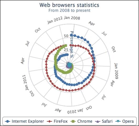
As we can see, one characteristic of a polar chart is that it reveals data trends differently compared to conventional charts. From a clockwise direction, we see the data line "spirals up" for an upward trend (Chrome) and "spirals down" for a downward trend (Internet Explorer), whereas the data line for Firefox doesn't show much movement. As for Safari and Opera, these series are essentially lost as they are completely invisible unless we enlarge the chart container, which is impractical. Another characteristic is that the last and first data points in the series are connected together. As a result, the Firefox series shows a closed loop and there is a sudden jump in the Internet Explorer series (the Chrome series is not connected because it has null values at the beginning of the series as the Chrome browser was not released until late 2008).
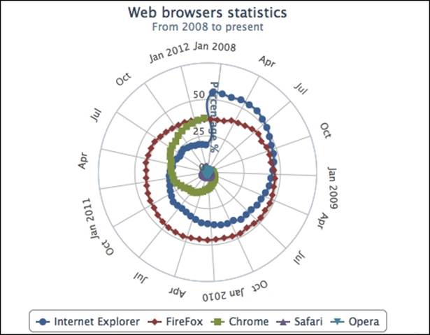
To correct this behavior, we can simply add a null value at the end of each series data array to break the continuity, which is demonstrated in the following screenshot:
Instead of having a round polar chart, Highcharts supports polygon interpolation along the y axis grid lines. This means that the grid lines are straightened and the whole chart becomes like a spider web.
For the sake of illustration, we set the width of x and y axis lines to 0, which removes the round outline from the chart. Then, we set a special option on the y axis, gridLineInterpolation, to polygon. Finally, we change the tickmarkPlacement option of the x axis to 'on'instead of the default value, between. This gets the interval ticks on the x axis to align with the start of each category. The following code snippet summarizes the changes that we need to make:
xAxis: {
categories: [ ..... ],
tickmarkPlacement: 'on',
labels: {
rotation: 'auto',
},
lineWidth: 0,
plotBands: [{
from: 10,
to: 11,
color: '#FF0000'
}]
},
yAxis: {
.....,
gridLineInterpolation: 'polygon',
lineWidth: 0,
min: 0
},
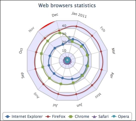
In order to demonstrate a spider web shape, we will remove most of the data samples from the previous chart (alternatively, you can enlarge the chart container to keep all the data). We will also add a couple of grid line decorations and an x-axis plot band (Nov – Dec) just to show that other axis options can still be applied to a polar chart:
Plotting range charts with market index data
Range charts are really line and column type charts presenting a series of data in range. The set of range type series can be arearange, areasplinerange, and columnrange. These series expect an array of three data points, x, y min, y max, in the data option or array of y min, y max if xAxis.cateogries has already been specified.
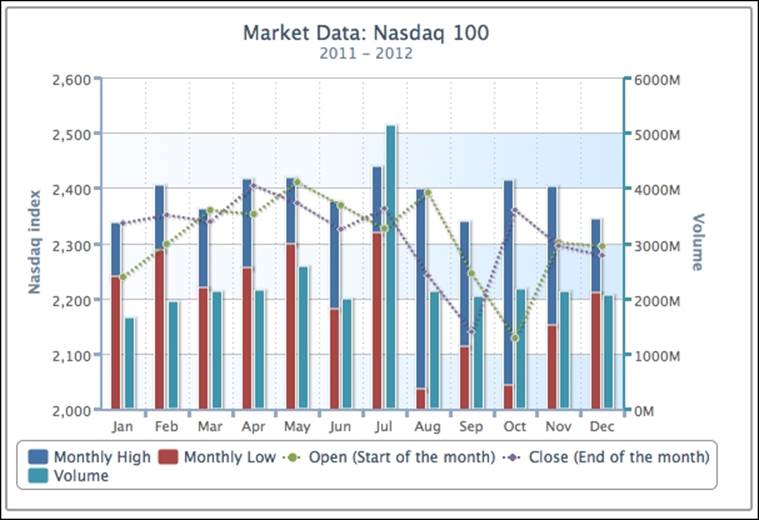
Let's use our past examples to see whether we can make an improvement to the range charts. In Chapter 2, Highcharts Configurations, we have a five-series graph showing the monthly data of Nasdaq 100: open, close, high, low, and volume, as shown in the following screenshot:
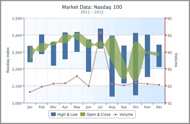
With the new range series, we sort the series data and merge the Monthly High and Monthly Low columns into a column range series, and the Open and Low columns into an area spline range series, as follows:
series: [{
type: 'columnrange',
name: 'High & Low',
data: [ [ 2237.73, 2336.04 ],
[ 2285.44, 2403.52 ],
[ 2217.43, 2359.98 ], ...... ]
}, {
type: 'areasplinerange',
name: 'Open & Close',
// This array of data is pre-sorted,
// not in Open, Close order.
data: [ [ 2238.66, 2336.04 ],
[ 2298.37, 2350.99 ],
[ 2338.99, 2359.78 ], ...... ]
}, {
name: 'Volume',
......
The following screenshot shows the range chart version:
The new chart looks much simpler to read and the graph is less packed. It is worth noting that for the column range series, it is mandatory to keep the range in min to max order. As for the area spline and area range series types, we can still plot the range series even without sorting them beforehand.
For instance, the High & Low range series have to be in min and max order, according to the natural meaning of the name of the series. However, this is not the same for the Open & Close range series as we wouldn't know which way is open or close. If we plot the Open & Close area range series by keeping keeping the range in open to close order, instead of y min to y max, the area range is displayed differently, as shown in the following screenshot:
As we can see, there are twisted bits in the area range series; these crossovers are caused by the reverse order in the data pairs. Nonetheless, we won't know whether open is higher than close or vice versa. If we only want to know how wide the range between the Open & Close series is, then the preceding area range chart achieves the goal. By keeping them as separate series, there will be no such issue. In a nutshell, this is the subtle difference when plotting range series data with ambiguous meanings.
Using a radial gradient on a gauge chart
The radial gradient setting is based on SVG. As its name implies, a radial gradient is color shading radiating outwards in a circular direction. Therefore, it requires three properties to define the gradient circle—cx, cy, and r. The gradient circle is the outermost circle for shading, such that no shading can go outside of this.
All the gradient positions are defined in ratio values between zero and one with respect to their containing elements. The cx and cy options are at the x, y center position of the outermost circle, whereas r is the radius of the outmost circle. If r is 0.5, it means the gradient radius is half the diameter of its element, the same size as the containing pane. In other words, the gradient starts from the center and goes all the way to the edge of the gauge. The stop offsets option works the same way as the linear gradient: the first parameter is the ratio position in the gradient circle to stop the shading. This controls the intensity of shading between the colors. The shorter the gap, the higher the contrast between the colors.
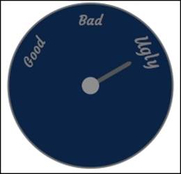
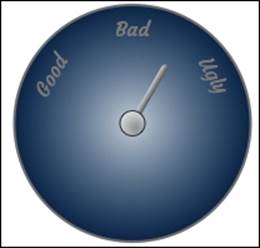
Let's explore how to set up the color gradient. The following is a mood swing detector without any color gradient:
We will apply a radial gradient to the preceding chart with the following settings:
background: [{
backgroundColor: {
radialGradient: {
cx: 0.5,
cy: 0.5,
r: 0.5
},
stops: [
[ 0, '#CCD5DE' ],
[ 1, '#002E59' ]
]
}
}]
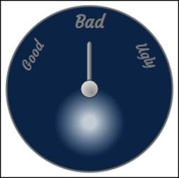
We have set cx, cy, and r to 0.5 for the gradient to start shading from the center position all the way towards the edge of the circle, as follows:
As we can see, the preceding chart shows white shading evenly radiating from the center. Let's change some of the parameters and see the effect:
backgroundColor: {
radialGradient: {
cx: 0.5,
cy: 0.7,
r: 0.25
},
stops: [
[ 0.15, '#CCD5DE' ],
[ 0.85, '#002E59' ]
]
}
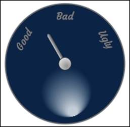
Here, we have changed the size of the gradient circle to half the size of the gauge and moved the circle down. The bright color doesn't start shading until it reaches 15 percent of the size of the gradient circle, so there is a distinct white blob in the middle, and the shading stops at 85 percent of the circle:
In the SVG radiant gradient, there are two other options, fx and fy, which are used to set the focal point position for the shading; they are also referred to as the inner circle settings.
Note
The 'fx'and 'fy' options may not work properly with Chrome and Safari browsers. At the time of writing this, only Firefox and Internet Explorer browsers are working properly with the images shown here.
Let's experiment with how the focal point can affect the shading:
backgroundColor: {
radialGradient: {
cx: 0.5,
cy: 0.7,
r: 0.25,
fx: 0.6,
fy: 1.0
},
stops: [
[ 0.15, '#CCD5DE' ],
[ 0.85, '#002E59' ]
]
}
The preceding code snippet produces the following output:
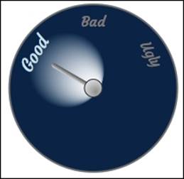
We can observe that the fx and fy options move the bright color starting from the bottom of the gradient circle and slightly to the right-hand side. This makes the shading much more directional. Let's make our final change by moving the bright spot position towards the center of the gauge chart. In addition, we align the focal directional along the Good label:
background: [{
backgroundColor: {
radialGradient: {
cx: 0.32,
cy: 0.38,
r: 0.25,
fx: 1.3,
fy: 0.95
},
stops: [
[ 0.1, '#CCD5DE' ],
[ 0.9, '#002E59' ]
]
}]
Finally, we can finish the chart by moving the bright side to where we want it to be, as follows:
Note
The fx and fy options are only for SVG, which older versions of Internet Explorer (8.0 or earlier) using VML won't support.
Summary
In this chapter, we learned about gauge, polar, and range charts. An extensive step-by-step demonstration showed how to plot a complex speedometer by utilizing most of the gauge options. We also demonstrated the differences between polar, column, and line charts with respect to principle and configuration. We used range charts to improve past chapter examples and study the subtle differences they insert into the chart. Finally, we explored how to define radial gradients by tweaking the options in stages.
In the next chapter, we will learn the structure of a bubble chart by recreating it from an online sport chart. Then, we will briefly discuss the properties of a box plot chart by transforming data from a spider chart, following with presenting the F1 race data with an error bar chart.
All materials on the site are licensed Creative Commons Attribution-Sharealike 3.0 Unported CC BY-SA 3.0 & GNU Free Documentation License (GFDL)
If you are the copyright holder of any material contained on our site and intend to remove it, please contact our site administrator for approval.
© 2016-2026 All site design rights belong to S.Y.A.