Learning Highcharts 4 (2015)
Chapter 5. Pie Charts
In this chapter, you will learn how to plot pie charts and explore their various options. We will then examine how to put multiple pies inside a chart. After that, we will find out how to create a donut chart. We will then end the chapter by sketching a chart that contains all the series types that we have learned so far—column, line, and pie. In this chapter, we will be covering the following topics:
· Understanding the relationship between chart, pie, and series
· Plotting simple pie charts – single series
· Plotting multiple pies in a chart – multiple series
· Preparing a donut chart – multiple series
· Building a chart with multiple series types
· Understanding the startAngle and endAngle options
· Creating a simplified version of the stock picking wheel chart
Understanding the relationship between chart, pie, and series
Pie charts are simple to plot: they have no axes to configure and all they need is data with categories. Generally, the term pie chart refers to a chart with a single pie series. In Highcharts, a chart can handle multiple pie series. In this case, a chart can display more than one pie: each pie is associated with a series of data. Instead of showing multiple pies, Highcharts can display a donut chart that is basically a pie chart with multiple concentric rings lying on top of each other. Each concentric ring is a pie series, similar to a stacked pie chart. We will first learn how to plot a chart with a single pie, and then later on in the chapter we will explore plotting with multiple pie series in separate pies and a donut chart.
Plotting simple pie charts – single series
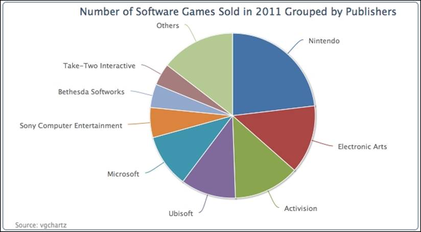
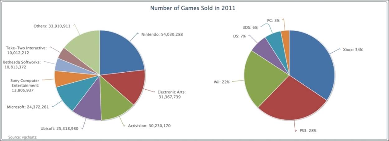
In this chapter, we are going to use video gaming data supplied by vgchartz (www.vgchartz.com). The following is the pie chart configuration, and the data is the number of games sold in 2011 according to publishers, based on the top 100 games sold. Wii Sports is taken out of the dataset because it is free with the Wii console:
chart: {
renderTo: 'container',
type: 'pie',
borderWidth: 1,
borderRadius: 5
},
title: {
text: 'Number of Software Games Sold in 2011 Grouped by Publishers',
},
credits: {
...
},
series: [{
data: [ [ 'Nintendo', 54030288 ],
[ 'Electronic Arts', 31367739 ],
... ]
}]
Here is a simple pie chart screenshot with the first data point (Nintendo) starting at the 12 o'clock position. The first slice always starts at the 12 o'clock position unless we specify a different start point with the startAngle option, which we will explore later in the chapter.
Configuring the pie with sliced off sections
We can improve the previous pie chart to include values in the labels and word wrap some of the long names of the publishers. The following is the configuration code for the pie series. The allowPointSelect option allows the users to interact with the chart by clicking on the data points. As for the pie series, this is used for slicing off a section of the pie chart (see the following screenshot). The slicedOffset option is used to adjust how far the section is sliced off from the pie chart. For word wrap labels, we set the labels style, dataLabels.style.width, to 140 pixels wide:
plotOptions: {
pie: {
slicedOffset: 20,
allowPointSelect: true,
dataLabels: {
style: {
width: '140px'
},
formatter: function() {
var str = this.point.name + ': ' +
Highcharts.numberFormat(this.y, 0);
return str;
}
}
}
},
Additionally, we would like to slice off the largest section in the initial display; its label is shown in bold type font. To do that, we will need to change the largest data point into object configuration as shown in the following screenshot. Then we put the sliced property into the object and change from the default, false, to true, which forces the slice to part from the center. Furthermore, we set dataLabels with the assignment of the fontWeight option to overwrite the default settings:
series: [{
data: [ {
name: 'Nintendo',
y: 54030288,
sliced: true,
dataLabels: {
style: {
fontWeight: 'bold'
}
}
}, [ 'Electronic Arts', 31367739 ],
[ 'Activision', 30230170 ], .... ]
}]
The following is the chart with the refined labels:
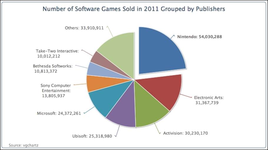
As mentioned earlier, the slicedOffset option has also pushed the sliced off section further than the default distance, which is 10 pixels. The slicedOffset option applies to all the sliced off sections, which means that we cannot control the distance of individually parted sections. It is also worth noticing that the connectors (the lines between the slice and the data label) become crooked as a result of that. In the next example, we demonstrate that the sliced property can be applied to as many data points as we want, and remove the slicedOffset option to resume the default settings to show the difference. The following chart illustrates this with three parted slices, by repeating the data object settings (Nintendo) for two other points:
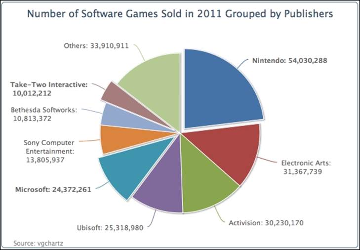
Notice that the connectors go back to being smooth lines. However, there is another interesting behavior for the sliced option. For those slices with sliced as the default setting (false), only one of them can be sliced off. For instance, the user clicks on the Otherssection and it moves away from the chart. Then, clicking on Activision will slice off the section and the Others section moves back towards the center, whereas the three configured sliced: true sections maintain their parted positions. In other words, with thesliced option set to true, this enables its state to be independent of others with the false setting.
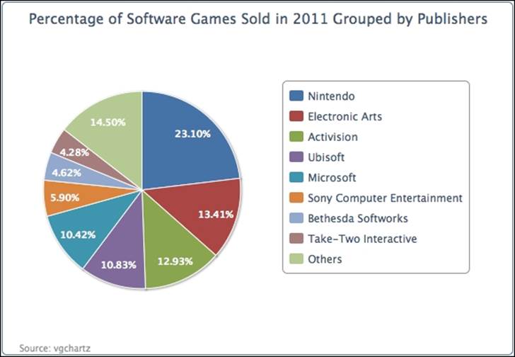
Applying a legend to a pie chart
So far, the chart contains large numbers, and it is difficult to really comprehend how much larger one section is than the other. We can print all the labels in percentages. Let's put all the publisher names inside a legend box and print the percentage values inside each slice.
The plotting configuration is redefined as follows. To enable the legend box, we set showInLegend to true. Then, we set the data labels' font color and style to bold and white respectively, and change the formatter function slightly to use the this.percentage variable that is only available for the pie series. The distance option is the distance between the data label and the outer edge of the pie. A positive value will shift the data label outside of the edge and a negative value will do the same in the opposite direction:
plotOptions: {
pie: {
showInLegend: true,
dataLabels: {
distance: -24,
color: 'white',
style: {
fontWeight: 'bold'
},
formatter: function() {
return Highcharts.numberFormat(this.percentage) + '%';
}
}
}
},
Then, for the legend box, we add in some padding as there are more than a few legend items, and set the legend box closer to the pie, as follows:
legend: {
align: 'right',
layout: 'vertical',
verticalAlign: 'middle',
itemMarginBottom: 4,
itemMarginTop: 4,
x: -40
},
The following is another presentation of the chart:
Plotting multiple pies in a chart – multiple series
With pie charts, we can do something more informative by displaying another pie chart side by side to compare data. This can be done by simply specifying two series configurations in the series array.
We can continue to use the previous example for the chart on the left-hand side and we create a new category series from the same dataset, but this time grouped by platforms. The following is the series configuration for doing so:
plotOptions:{
pie: {
....,
size: '75%'
}
},
series: [{
center: [ '25%', '50%' ],
data: [ [ 'Nintendo', 54030288 ],
[ 'Electronic Arts', 31367739 ],
.... ]
}, {
center: [ '75%', '50%' ],
dataLabels: {
formatter: function() {
var str = this.point.name + ': ' + Highcharts.numberFormat(this.percentage, 0) + '%';
return str;
}
},
data: [ [ 'Xbox', 80627548 ],
[ 'PS3', 64788830 ],
.... ]
}]
As we can see, we use a new option, center, to position the pie chart. The option contains an array of two percentage values—the first is the ratio of the x position to the whole container width, whereas the second percentage value is the y ratio. The default value is['50%', '50%'], which is in the middle of the container. In this example, we specify the first percentage values as '25%' and '75%', which are in the middle of the left- and the right-hand halves respectively. We set the size for the pie series to 75 percent withplotOptions.pie.size. This ensures that both pies are the same size, otherwise the left hand pie will appear smaller.
In the second series, we will choose to display the pie chart with percentage data labels instead of unit values. The following is the screenshot of a chart with double pies:
On the surface, this is not much different to plotting two separate pie charts in an individual <div> tag, apart from sharing the same title. The main benefit is that we can combine different series type presentations under the same chart. For instance, let's say we want to present the distribution in ratio in pie series directly above each group of multiple column series. We will learn how to do this later in the chapter.
Preparing a donut chart – multiple series
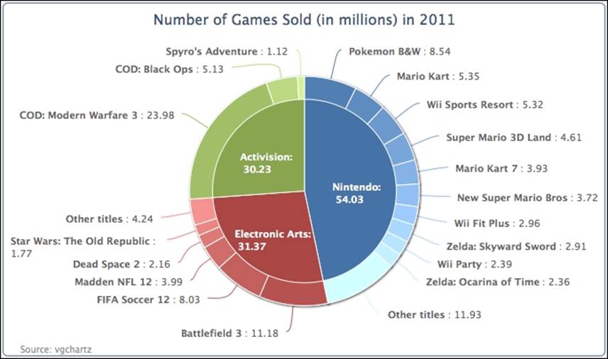
Highcharts offers another type of pie chart, a donut chart. It has the effect of drilling down on a category to create subcategories, and is a convenient way of viewing data in greater detail. This drill-down effect can be applied on multiple levels. In this section, we will create a simple donut chart that has an outer ring of subcategories (game titles) that align with the inner categories (publishers).
For the sake of simplicity, we will only use the top three games publishers for the inner pie chart. The following is the series array configuration for the donut chart:
series: [{
name: 'Publishers',
dataLabels : {
distance: -70,
color: 'white',
formatter: function() {
return this.point.name + ':<br/> ' +
Highcharts.numberFormat(this.y / 1000000, 2);
},
style: {
fontWeight: 'bold'
}
},
data: [ [ 'Nintendo', 54030288 ],
[ 'Electronic Arts', 31367739 ],
[ 'Activision', 30230170 ] ]
}, {
name: 'Titles',
innerSize: '60%',
dataLabels: {
formatter: function() {
var str = '<b>' + this.point.name + '</b>: ' +
Highcharts.numberFormat(this.y / 1000000, 2);
return str;
}
},
data: [ // Nintendo
{ name: 'Pokemon B&W', y: 8541422,
color: colorBrightness("#4572A7",
0.05) },
{ name: 'Mario Kart', y: 5349103,
color: colorBrightness('#4572A7',
0.1) },
....
// EA
{ name: 'Battlefield 3', y: 11178806,
color: colorBrightness('#AA4643',
0.05) },
....
// Activision
{ name: 'COD: Modern Warfare 3',
y: 23981182,
color: colorBrightness('#89A54E',
0.1) },
....
}]
}]
First, we have two series—the inner pie series, or the Publishers, and the outer ring series, or the Titles. The Titles series has all the data for the subcategories together, and it aligns with the Publisher series. The order is such that the values of the subcategories for the Nintendo category are before the subcategory data for Electronic Arts, and so on (see the order of data arrays in the Title series).
Each data point in the subcategories series is declared as a data point object for assigning the color in a similar range to their main category. This can be achieved by following the Highcharts demo to fiddle with the color brightness:
color: Highcharts.Color(color).brighten(brightness).get()
Basically, what this does is to use the main category color value to create a Color object and then adjust the color code with the brightness parameter. This parameter is derived from the ratio of the subcategory value. We rewrite this example into a function known as colorBrightness, and call it in the chart configuration:
function colorBrightness(color, brightness) {
return
Highcharts.Color(color).brighten(brightness).get();
}
The next part is to specify which series goes to the inner pie and which goes to the outer ring. The innerSize option is used by the outer series, Title, to create an inner circle. As a result, the Title series forms a donut/concentric ring. The value for the innerSizeoption can be either in pixels or percentage values of the plot area size.
The final part is to decorate the chart with data labels. Obviously, we want to position the data labels of the inner charts to be over the inner pie, so we assign a negative value to the dataLabels.distance option. Instead of printing long values, we define formatter to convert them into units of millions.
The following is the display of the donut chart:
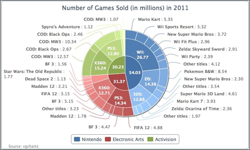
Note that it is not mandatory to put a pie chart in the center of a donut chart. It is just the presentation style of this example. We can have multiple concentric rings instead. The following chart is exactly the same example as mentioned earlier, with the addition of theinnerSize option to the inner series of Publishers:
We can even further complicate the donut chart by introducing a third series. We plot the following chart in three layers. The code is simply extended from the example with another series and includes more data. The source code and the demo are available athttp://joekuan.org/Learning_Highcharts/. The two outer series use the innerSize option. As the inner pie will become even smaller and will not have enough space for the labels, we therefore enable the legend box for the innermost series with the showInLegend option.
Building a chart with multiple series types
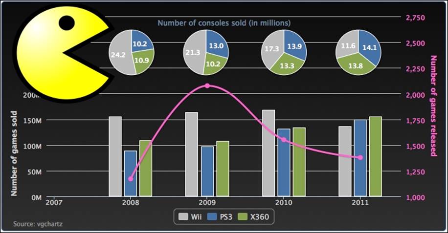
So far, we have learned about the line, column, and pie series types. It's time to bring all these different series presentations together in a single chart. In this section, we will use the annual data from 2008 through 2011 to plot three different kinds of series type: column, line, and pie. The column type represents the yearly number of games sold for each type of gaming console. The pie series shows the annual number of gaming consoles sold for each vendor. The last one is the spline series type that discloses how many new game titles there are released in total for all the consoles each year.
In order to ensure the whole graph uses the same color scheme for each type of gaming console, we have to manually assign a color code for each data point in the pie charts and the columns series:
var wiiColor = '#BBBBBB',
x360Color = '#89A54E',
ps3Color = '#4572A7',
splineColor = '#FF66CC';
We then decorate the chart in a more funky way. First, we give the chart a dark background with a color gradient:
var chart = new Highcharts.Chart({
chart: {
renderTo: 'container',
borderWidth: 1,
spacingTop: 40,
backgroundColor: {
linearGradient: { x1: 0, y1: 0,
x2: 0, y2: 1 },
stops: [ [ 0, '#0A0A0A' ],
[ 1, '#303030' ] ]
}
},
subtitle: {
floating: true,
text: 'Number of consoles sold (in millions)',
y: -5
},
Then, we need to shift the columns to the right-hand side, so that we have enough room for an image (described later) that we are going to put in the top left-hand corner:
xAxis: {
minPadding: 0.2,
tickInterval: 1,
labels: {
formatter: function() {
return this.value;
},
style: {
color: '#CFCFCF'
}
}
},
The next task is to make enough space for the pie charts to locate them above the columns. This can be accomplished by introducing the maxPadding option on both y axes:
yAxis: [{
title: {
text: 'Number of games sold',
align: 'low',
style: {
color: '#CFCFCF'
}
},
labels: {
style: {
color: '#CFCFCF'
}
},
maxPadding: 0.5
}, {
title: {
text: 'Number of games released',
style: {
color: splineColor
}
},
labels: {
style: {
color: splineColor
}
},
maxPadding: 0.5,
opposite: true
}],
Each pie series is displayed separately and aligned to the top of the columns, as well as with the year category. This is done by adjusting the pie chart's center option in the series array. We also want to reduce the display size for the pie series, as there are other types of series to share within the chart. We will use the size option and set the value in percentages. The percentage value is the diameter of the pie series compared to the size of the plot area:
series:[{
type: 'pie',
name: 'Hardware 2011',
size: '25%',
center: [ '88%', '5%' ],
data: [{ name: 'PS3', y: 14128407,
color: ps3Color },
{ name: 'X360', y: 13808365,
color: x360Color },
{ name: 'Wii', y: 11567105,
color: wiiColor } ],
.....
The spline series is defined to correspond to the opposite y axis. To make the series clearly associated with the second axis, we apply the same color scheme for the line, axis title, and labels:
{ name: "Game released",
type: 'spline',
showInLegend: false,
lineWidth: 3,
yAxis: 1,
color: splineColor,
pointStart: 2008,
pointInterval: 1,
data: [ 1170, 2076, 1551, 1378 ]
},
We use the renderer.image method to insert the image into the chart and make sure that the image has a higher zIndex, so that the axis line does not lie at the top of the image. Instead of including a PNG image, we use an SVG image. This way the image stays sharp and avoids the pixelation effect when the chart is resized:
chart.renderer.image('./pacman.svg', 0,
0, 200, 200).attr({
'zIndex': 10
}).add();
The following is the final look of the graph with a Pac-Man SVG image to give a gaming theme to the chart:
Creating a stock picking wheel
A stock picking wheel chart is a designer financial chart created by Investors Intelligence (http://www.investorsintelligence.co.uk/wheel/), and the chart provides an interactive way to visualize both the overall and detailed performance of major shares from a market index. The following is a screenshot of the chart:
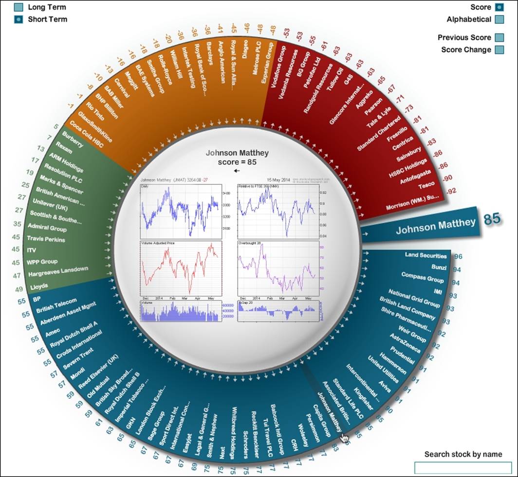
Basically, it is an open-ended donut chart. Each slice represents a blue chip company and all the slices have equal width. The slices are divided into different color bands (from red, to orange, green, and blue) based on the share performance score. When the user hovers the mouse over a company name, a bigger slice appears at the gap of the donut chart with the company name and detailed performance information. Although this impressive chart is implemented in Adobe Flash, we are going to push our luck to see whether Highcharts can produce a lookalike cousin in this section. We will focus on the donut chart and leave the middle charts as an exercise for you later.
Understanding startAngle and endAngle
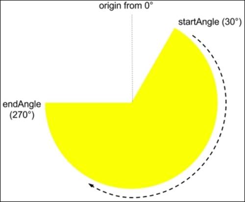
Before we start plotting a Stock Picking Wheel chart, we need to know how to create an open-ended donut chart. The options startAngle and endAngle can make a pie chart split open in any size and direction. However, we need to familiarize ourselves with these options before plotting the actual chart. By default, the starting position for the first slice is at 12 o'clock, which is regarded as 0 degrees for the startAngle option. The startAngle option starts from the origin and moves in a clockwise direction to endAngle. Let's make a simple pie chart with startAngle and endAngle assigned to 30 and 270 respectively:
plotOptions: {
pie: {
startAngle: 30,
endAngle: 270
}
},
The preceding code produces the following chart. Note that although the pie area for the series data becomes smaller, the data will still be proportionally adjusted:
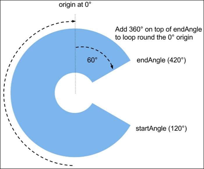
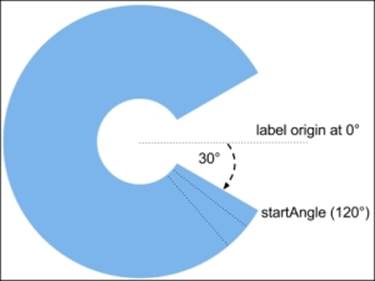
In order to display a gap at the right-hand side of the pie, the endAngle option needs to be handled slightly differently. For endAngle to end up above the startAngle option, that is, the endAngle option goes round and passes the origin at 0 degrees, the endAngle value has to exceed 360, not start from 0 degrees again. Let's set the startAngle and endAngle values to 120 and 420 respectively and increase the innerSize value to form a donut chart. Here is the new configuration:
plotOptions: {
pie: {
startAngle: 120,
endAngle: 420,
innerSize: 110,
....
}
}
We can see the endAngle option goes past the origin and ends above the startAngle option. See the following screenshot:
Creating slices for share symbols
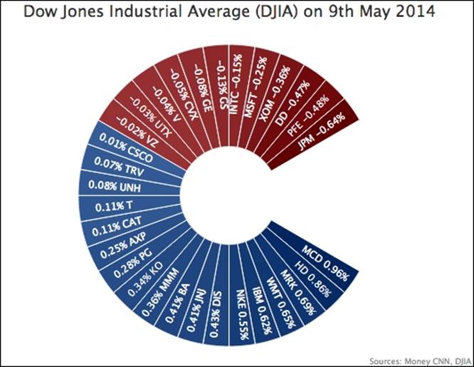
So far, we have successfully created the general shape of the stock picking wheel chart. The next task is to populate financial data labels on each slice with equal size. Instead of having a hundred shares from the FTSE index like the original chart, we will use the Dow Jones Industrial Average instead, which is composed of 30 major shares. First, we generate a series data array with share symbols in descending order of percentage change:
var data = [{
name: 'MCD 0.96%',
y: 1,
dataLabels: { rotation: 35 },
color: colorBrightness('#365D97', ratio1)
}, {
name: 'HD 0.86%',
y: 1,
dataLabels: { rotation: 45 },
color: colorBrightness('#365D97', ratio2)
}, {
....
}]
We set the y-axis value to 1 for each share symbol in order to make it the same size for all the slices. Then, we evaluate the positive and negative gradual color change based on the ratio between the percentage change of those shares and the overall maximum and minimum values respectively. We then apply this ratio value to the colorBrightness method (which we have discussed previously) to achieve the gradual change effect.
As for the label rotation, since we know where to put each share symbol and what rotation to apply in advance, we can compute the label rotation based on the company's share symbol position from the startAngle. The orientation for the dataLabel is different to thestartAngle, which starts with the 3 o'clock position as 0 degrees (because we read text horizontally). With the startAngle as 120 degrees, we can easily calculate the dataLabel rotation for the first slice as 30 degrees (we add another 5 degrees for the dataLabel to appear in the middle of the slice) and each slice is another 10 degrees of rotation more than the previous slice. The following illustrates the logic of this computation:
Our next task is to remove the connector and move the default dataLabel position (which is outside the slice) towards the center of the pie chart. We achieve that by setting the connectorWidth value to zero and assigning the distance option to a negative value to drag the dataLabel towards the center of the chart, such that the label is placed inside the slice. Here is the plotOptions.pie config:
plotOptions: {
pie: {
size: '100%',
startAngle: 120,
endAngle: 420,
innerSize: 110,
dataLabels: {
connectorWidth: 0,
distance: -40,
color: 'white',
y: 15
}
},
The following screenshot shows the result of rotating labels along the slice's orientation for a stock picking wheel effect:
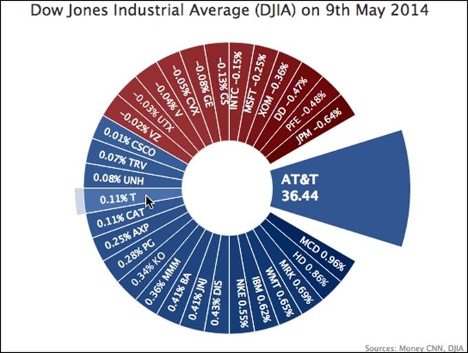
Creating shapes with Highcharts' renderer
The final missing piece for this experiment is to display an arc showing share symbol details when users hover the pointer over a slice. To do that, we make use of the Highcharts renderer engine, which provides a set of APIs to draw various shapes and text in the chart. In this exercise, we call the method arc to create a dynamic slice and position it inside the gap.
Since this is triggered by a user action, the process has to be performed inside an event handler. The following is the event handler code:
var mouseOver = function(event) {
// 'this' keyword in this handler represents
// the triggered object, i.e. the data point
// being hovered over
var point = this;
// retrieve the renderer object from the
// chart hierarchy
var renderer = point.series.chart.renderer;
// Initialise the SVG elements group
group = renderer.g().add();
// Calculate the x and y coordinate of the
// pie center from the plot dimension
var arcX = c.plotWidth/2 - c.plotLeft;
var arcY = c.plotHeight/2 + c.plotTop;
// Create and display the SVG arc with the
// same color hovered slice and add the arc
// into the group
detailArc =
renderer.arc(arcX, arcY, 230, 70, -0.3, 0.3)
.css({
fill: point.options.color
}).add(group);
// Create and display the text box with stock
// detail and add into the group
detailBox = renderer.text(sharePrice,
arcX + 80, arcY - 5)
.css({
color: 'white',
fontWeight: 'bold',
fontSize: '15px'
}).add(group);
};
plotOptions: {
pie: {
....
point: {
events: {
mouseOver: mouseOver,
mouseOut: function(event) {
group && (group = group.destroy());
}
}
In the mouse over event, we first extract the triggered data point object from the 'this' keyword inside the handler according to the Highcharts API documentation. From that, we can propagate down to restore the renderer object. Then, we create a group object with the renderer call g( ) and then call the object method add to insert it into the chart. This group handling object enables us later to gather multiple SVG elements into one group for easier handling.
We then call the arc method to generate a slice with the chart's x and y center location evaluated from the chart plot dimension. We also specify the innerRadius parameter with a nonzero value (70) to make the arc emerge as a donut chart slice. Then, we chain the call with css for the same color as the point object and chain the add method to the group. Then, we create a textbox with stock details inside the new arc; the call is chained in the same manner with css and add to the same group.
For the mouse out event, we can take advantage of the group object. Instead of removing each element individually, we can simply call the destroy method on the group object. The following screenshot shows the new slice in display:
So we have created a Highcharts look-alike of the stock picking wheel, and this proves how versatile Highcharts can be. However, for the sake of simplicity, this exercise omits some complexity, which compromises the finished look. In fact, if we push Highcharts hard enough, we can finish with a chart that looks even closer to the original. The following is such an example, with several color bands and color gradients on each slice:
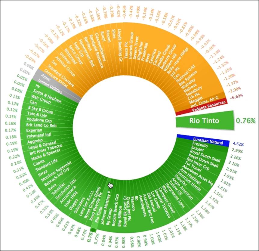
The online demo can be found at http://joekuan.org/demos/ftse_donut.
Summary
In this chapter, we have learned how to outline a pie chart and its variant, the donut chart. We also sketched a chart that included all the series types we have learned so far.
In the next chapter, we will explore the Highcharts APIs that are responsible for making a dynamic chart, such as using AJAX queries to update the chart content, accessing components in Highcharts objects, exporting charts to SVG, and so on.
All materials on the site are licensed Creative Commons Attribution-Sharealike 3.0 Unported CC BY-SA 3.0 & GNU Free Documentation License (GFDL)
If you are the copyright holder of any material contained on our site and intend to remove it, please contact our site administrator for approval.
© 2016-2026 All site design rights belong to S.Y.A.