Learning Highcharts 4 (2015)
Chapter 8. Waterfall, Funnel, Pyramid, and Heatmap Charts
In this chapter, we explore some of the more unusual charts, such as waterfall and funnel charts, by using simple sales and accounting figures. We experiment with how we can link both the charts together with related information. Then, we move on to investigate how to plot a pyramid chart and assess the flexibility of Highcharts by imitating a financial pyramid chart from a proper commercial report. Finally, we study the heatmap chart and tweak various specific options with real-life statistics in a step-by-step approach. In this chapter, we will cover the following topics:
· Constructing a waterfall chart
· Making a funnel chart
· Joining both waterfall and funnel charts
· Plotting a commercial pyramid chart
· Exploring a heatmap chart with inflation data
· Experimenting with the dataClasses and nullColor options of a heatmap chart
Constructing a waterfall chart
A waterfall chart is a type of column chart where the positive and negative values are accumulated along the x axis categories. The start and end of adjacent columns are aligned on the same level, with columns going up or down depending on the values. They are mainly used to present cash flow at a higher level.
To use a waterfall chart, the highcharts-more.js library must be included:
<script type="text/javascript"
src="http://code.highcharts.com/highcharts-more.js"></script>
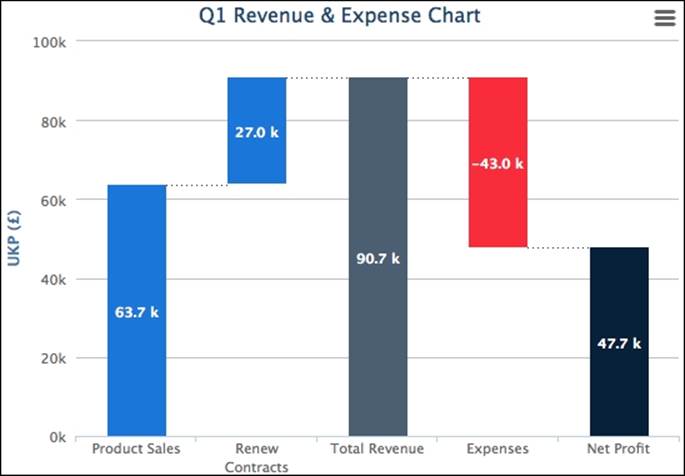
Let's start with a simple waterfall, with a couple of values for income and expenditure. The following is the series configuration:
series: [{
type: 'waterfall',
upColor: Highcharts.getOptions().colors[0],
color: '#E64545',
data: [{
name: 'Product Sales',
y: 63700
}, {
name: 'Renew Contracts',
y: 27000
}, {
name: 'Total Revenue',
isIntermediateSum: true,
color: '#4F5F70'
}, {
name: 'Expenses',
y: -43000
}, {
name: 'Net Profit',
isSum: true,
color: Highcharts.getOptions().colors[1]
}]
}]
First, we specify the series type as waterfall, then assign a color value (blue) to the upColor option, which sets the default color for any columns with positive values. In the next line, we declare another color value (red) which is for columns with negative values. The data point entries are the same as a normal column chart, except those columns representing the total sum so far. These columns are specified with the isIntermediateSum and isSum Boolean options without y axis values. The waterfall chart will display those asaccumulated columns. We specify the accumulated columns with another color since they are neither income nor expenditure.
Finally, we need to enable the data labels to show the value flow, which is the sole purpose of a waterfall chart. The following is the plotOptions setting with the data label styling and formatting:
plotOptions: {
series: {
borderWidth: 0,
dataLabels: {
enabled: true,
style: {
fontWeight: 'bold'
},
color: 'white',
formatter: function() {
return Highcharts.numberFormat(this.y / 1000, 1, '.') + ' k';
}
}
}
},
Here is a screenshot of the waterfall chart:
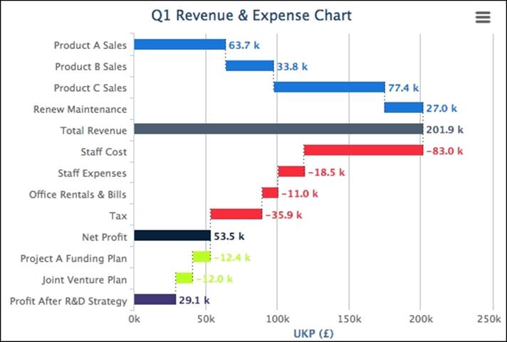
Making a horizontal waterfall chart
Let's assume that we need to plot a slightly more complicated waterfall chart, as we have a few more figures for revenue, expenses, and expenditure plans. Moreover, we need to display multiple stages of accumulated income. Instead of having a traditional waterfall chart with vertical columns, we declare the inverted option to switch the columns to horizontal. Since the columns are more compacted, the data labels may not fit inside the columns. Therefore, we put the data labels at the end of the columns. Here is a summary of the changes:
chart: {
renderTo: 'container',
inverted: true
},
....,
plotOptions: {
series: {
borderWidth: 0,
dataLabels: {
enabled: true,
inside: false,
style: {
fontWeight: 'bold'
},
color: '#E64545',
formatter: ....
}
}
},
series: [{
type: 'waterfall',
upColor: Highcharts.getOptions().colors[0],
color: '#E64545',
name: 'Q1 Revenue',
data: [{
name: 'Product A Sales',
y: 63700,
dataLabels: {
color: Highcharts.getOptions().colors[0]
}
}, {
name: 'Product B Sales',
y: 33800,
dataLabels: {
color: Highcharts.getOptions().colors[0]
}
}, {
// Product C & Renew Maintenance
....
}, {
name: 'Total Revenue',
isIntermediateSum: true,
color: '#4F5F70',
dataLabels: {
color: '#4F5F70'
}
}, {
name: 'Staff Cost',
y: -83000
}, {
// Staff Cost, Office Rental and Tax
....
}, {
name: 'Net Profit',
isSum: true,
color: Highcharts.getOptions().colors[1],
dataLabels: {
color: Highcharts.getOptions().colors[1]
}
}]
The following is the new look of the waterfall chart:
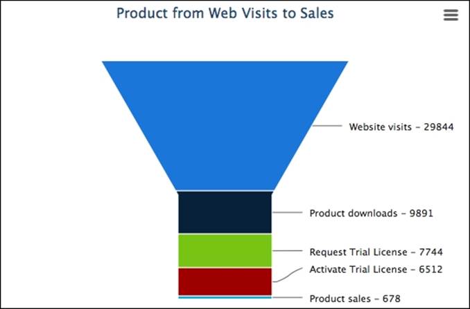
Constructing a funnel chart
As the name implies, the shape of a funnel chart is that of a funnel. A funnel chart is another way of showing how data flows in a diminished fashion. For example, it can be used to show the stages from the number of sale leads, demos, and meetings to actual sales, or the number of job applicants that pass through exams, interviews, and an offer to actual acceptance.
The funnel chart is packaged as a separate module which needs to include the JavaScript file as follows:
<script type="text/javascript" src="http://code.highcharts.com/modules/funnel.js"></script>
In this funnel chart example, we will plot a product starting from web visits and leading to product sales. Here is the series configuration:
series: [{
type: 'funnel',
width: '60%',
height: '80%',
neckWidth: '20%',
dataLabels: {
format: '{point.name} - {y}',
color: '#222'
},
title: {
text: "Product from Web Visits to Sales"
},
data: [{
name: 'Website visits',
y: 29844
}, {
name: 'Product downloads',
y: 9891
}, {
....
}]
}]
Apart from the series type option, Highcharts simply draws the set of data points in a funnel shape configuration. We use the neckWidth option to control the width of the narrow part of the funnel as a ration of the plot area. The same applies to the width and heightoptions. Here is a screenshot illustrating this:
Joining both waterfall and funnel charts
So far, we have explored both waterfall and funnel charts. Both types of chart have been used in sales data. In this section, we are going to join the previous waterfall and funnel examples together, so that when the client clicks on a horizontal bar (let's say Product B sales), the waterfall chart is zoomed into the funnel chart to show the prospect ratio of the product. To achieve that, we use the drilldown feature (described and demonstrated in Chapter 2, Highcharts Configurations).
First, we set the data point with a drilldown identifier, like productB. Then, we import the whole funnel series configuration from the previous example into the drilldown option with the matching id value. Finally, we relocate the drill up back button to the bottom of the screen. The final change should be as follows:
series: [{
type: 'waterfall',
....
data: [{
....
}, {
name: 'Product B Sales',
y: 33800,
drilldown: 'productB',
....
}]
}],
drilldown: {
drillUpButton: {
position: {
verticalAlign: 'bottom',
align: 'center',
y: -20
}
},
series: [{
type: 'funnel',
id: 'productB',
Now, we have a fully interactive chart, from a revenue breakdown waterfall chart to the product prospect funnel chart. The following is the waterfall chart with the drilldown:
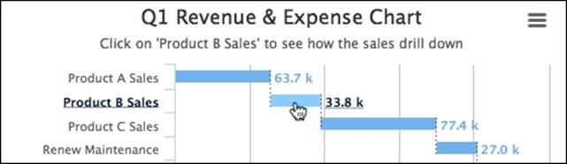
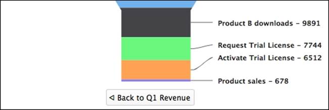
Clicking on the product B sales column, the chart transforms to a funnel to dissect the sales from product activities:
Plotting a commercial pyramid chart
A pyramid chart is the inverse of a funnel chart, but in a pyramid shape, generally used for representing a top-down hierarchical ordering of data. Since this is a part of the funnel chart module, funnel.js is required.
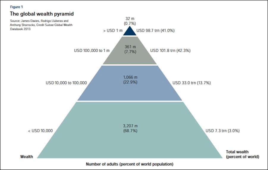
The default order for data entries is that the last entry in the series data array is shown at the top of the pyramid. This can be corrected by switching the reverse option to false. Let's take a real-life example for this exercise. The following is a picture of the Global Wealth Pyramid chart taken from the Credit Suisse Global Wealth Databook 2013:
As we can see, it looks stylish with data labels along each side as well as in the middle. Let's make an initial attempt to reproduce the chart:
title: {
text: "The global wealth pyramid",
align: 'left',
x: 0,
style: {
fontSize: '13px',
fontWeight: 'bold'
}
},
credits: {
text: 'Source: James Davies, ....',
position: {
align: 'left',
verticalAlign: 'top',
y: 40,
x: 10
},
style: {
fontSize: '9px'
}
},
series: [{
type: 'pyramid',
width: '70%',
reversed: true,
dataLabels: {
enabled: true,
format: '<b>{point.name}</b> ({point.y:,.1f}%)',
},
data: [{
name: '3,207 m',
y: 68.7,
color: 'rgb(159, 192, 190)'
}, {
name: '1,066 m',
y: 22.9,
color: 'rgb(140, 161, 191)'
}, {
name: '361 m',
y: 7.7,
color: 'rgb(159, 165, 157)'
}, {
name: '32 m',
y: 0.7,
color: 'rgb(24, 52, 101)'
}]
}]
First, we move the title and credits to the top-left corner. Then, we copy the color and percentage values into the series, which gives us the following chart:
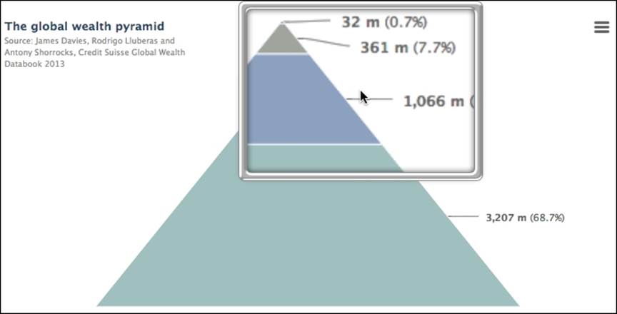
There are two main problems when compared to the original: the scale of each layer is wrong and the data labels are either missing or in the wrong place. As we can see, the reality is that the rich population is actually much smaller than the original chart showed, amusingly a single pixel. In the next section, we are going to see how far we can push Highcharts to make the financial chart.
Plotting an advanced pyramid chart
Let face it. The layers in the original chart do not reflect their true percentage, proved in the previous chart. So we need to rig the ratio values to make them similar to the original chart. Secondly, the repositioning of data labels is limited in a pyramid chart. The only way to move the data label into the center of each layer of a pyramid chart is to disable the connectors and gradually adjust the distance option in plotOptions.pyramid.dataLabels. However, this only allows us a single label per data layer and we can only apply the same positional settings to all the labels.
So how can we put extra data labels along each side of the layer and the titles along the bottom of the pyramid? The answer (after hours of trial and error) is to use multiple y axes and plotLines. The idea is to have three y axes to put data labels on the left, center, and right side of the pyramid. Then, we hide all the y axes' interval lines and their labels. We place the y axis title at the bottom of the axis line with no rotation, we only rotate for the left (Wealth) and right (Total Wealth) axes.
We disable the remaining y axis title. The trick is to use the x axis title instead for the center label (Number of adults), because it sits on top of the pyramid. Here is the code snippet for the configuration of these axes:
chart: {
renderTo: 'container',
// Force axes to show the title
showAxes: true,
....
},
xAxis: {
title: {
text: "Number of adults (percentage of world population)"
},
// Only want the title, not the line
lineWidth: 0
},
yAxis: [{
// Left Y-axis
title: {
align: 'low',
text: 'Wealth',
rotation: 0,
x: 30
},
// Don't show the numbers
labels: {
enabled: false
},
gridLineWidth: 0,
min: 0,
max: 100,
reversed: true,
....
}, {
// Center Y-axis
title: {
text: ''
},
// Same setting to hide the labels and lines
....
}, {
// Right Y-axis
opposite: true,
title: {
align: 'low',
text: 'Total Wealth <br>(percent of world)',
rotation: 0,
x: -70
},
// Same setting to hide the labels and lines
....
The following screenshot demonstrates the titles aligned at the base of pyramid chart:

The next part is to simply create a plotLine for each y-axis in each layer of the pyramid and set the label for these plotLines. Since we know the data value range of each pyramid layer, we can set the same y value for plotLines across all the y axes to display the labels on the same level. Here is an example of a plotLines option for the left y-axis:
plotLines: [{
value: 40,
label: {
text: '< USD 10,000',
x: 20
},
width: 1,
}, {
value: 30,
label: {
text: 'USD 10,000 - 100,000',
x: 35
},
width: 1
}, {
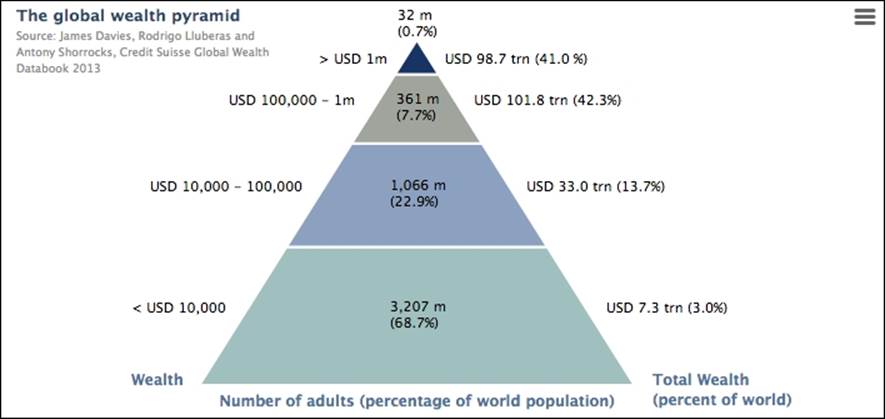
We do the same for the center labels instead of using the points' data labels. Note that the x position here caters for the data in this chart. If the graph has dynamic data, a new x position must be calculated to fit the new data. Here is the final look in Highcharts:
Exploring a heatmap chart with inflation data
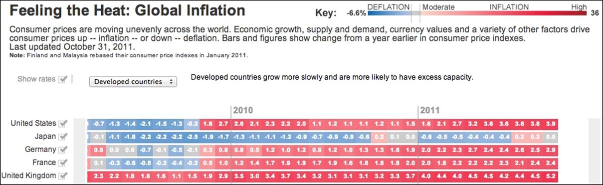
Heatmap is the latest chart addition in Highcharts 4. As its name implies, the data values are represented in temperature colors, where the data is arranged in a grid-based layout, so the chart expresses three-dimensional data. The heatmap appeals to some readers because of the instant awareness of the data trend it generates, as temperature is one of the most natural things to sense. The chart is generally used for demonstrating climate data, but it has been used for other purposes. Let's explore the heatmap chart with some real-life data. Here, we use it to show the inflation of various countries, as in this example in the Wall Street Journal (http://blogs.wsj.com/economics/2011/01/27/feeling-the-heat-comparing-global-inflation/):
In Highcharts, the heatmap module was released as part of the Highmaps extension, which can be used as part of Highmaps or as a module of Highcharts. In order to load a heatmap as a Highcharts module, it includes the following library:
<script src="http://code.highcharts.com/modules/heatmap.js"></script>
First, the months are sketched along the y axis, whereas the x axis holds the country names. So we need to invert the chart:
chart: {
renderTo: 'container',
type: 'heatmap',
inverted: true
},
The next step is to set both x and y axes as categories with specific labels. Then, we set the x axis without interval lines. As for the y axis, we position the labels at the top of the cells by assigning the opposite option to true and including an offset distance to make sure the axis lines are not too close:
xAxis: {
tickWidth: 0,
// Only show a subset of countries
categories: [
'United States', 'Japan', 'United Kingdom',
'Venezuela', 'Singapore', 'Switzerland', 'China'
]
},
yAxis: {
title: { text: null },
opposite: true,
offset: 8,
categories: [ 'Aug 2010', 'Sept', 'Oct', 'Nov', 'Dec', ...
There is one more axis that we need to configure, colorAxis (see http://api.highcharts.com/highmaps), which is specific to heatmap charts and Highmaps. The colorAxis option is similar to x/yAxis, which shares a number of options with it. The major difference is thatcolorAxis is the definition in mapping between the color and value. There are two ways to define color mapping: discrete and linear color range.
In this example, we demonstrate how to define multiple linear color ranges. As we can see, the inflation example has an asymmetric color scale, so that it ranges from -6.6 percent to 36 percent, but notice that the color between -0.1 percent and 0.1 percent is gray. In order to imitate the color scale closely, we use the stops option to define fragments of discrete spectrums. The stops option takes an array of tuples of ratio range and color, and we transform the inflation and color values from the example into a number of ratios (we take the range from -1 percent to 30 percent instead because of the subset samples):
colorAxis: {
min: -0.9,
max: 30,
stops: [
[0, '#1E579F'],
// -6.6
[0.085, '#467CBA'],
// -6
[0.1, '#487EBB'],
// -2
[0.2, '#618EC4'],
// -1
[0.225, '#7199CA'],
// -0.2
[0.245, '#9CB4D9'],
// Around 0
[0.25, '#C1C1C1'],
// Around 0.2
[0.256, '#ECACA8'],
// Around 10
[0.5, '#D02335'],
// Around 20
[0.75, '#972531'],
[1.0, '#93212E']
],
labels: {
enabled: true
}
}
Additionally, we replicate the title (top-left), color scale legend (top-right), and credits (bottom-right) as in the original chart, with the following configurations:
title: {
text: "Feeling the Heat: Global Inflation",
align: 'left',
style: {
fontSize: '14px'
}
},
subtitle: {
text: "From Aug 2010 - Aug 2011",
align: 'left',
style: {
fontSize: '12px'
}
},
legend: {
align: 'right',
verticalAlign: 'top',
floating: true,
x: -60,
y: -5
},
credits: {
text: 'Sources: CEIC Data; national statistical ....',
position: {
y: -30
}
},
The final step is to define the three-dimensional data and switch the dataLabels option on:
series: [{
dataLabels: {
enabled: true,
color: 'white'
},
// Country Category Index, Month/Year Index, Inflation
data: [
// US
[ 0, 0, 1.1 ],
[ 0, 1, 1.1 ],
....,
// Japan
[ 1, 0, -0.9 ],
[ 1, 1, -0.6 ],
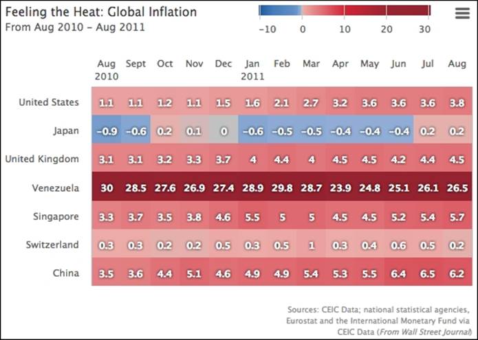
Here is the display:
Experimenting with dataClasses and nullColor options in a heatmap
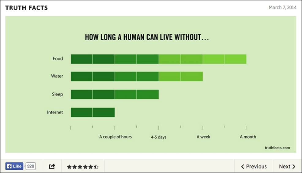
An alternative way to define the color axis is to have a specific range of values associated with a color. Let's plot another heatmap chart. In this example, we reconstruct a graph taken from http://kindofnormal.com/truthfacts, shown here:
To recreate the preceding chart, we first use an inverted heatmap to emulate it as a bar chart, but the bars itself are composed of cells with a gradual change of color. We treat each block as a unit of y axis value and every two intervals associates with a color value. Hence, the range along the y-axis is between 0 and 8. Here is the trimmed configuration:
yAxis: {
title: { text: null },
gridLineWidth: 0,
minorTickWidth: 1,
max: 8,
min: 0,
offset: 8,
labels: {
style: { .... },
formatter: ....,
Then, we specify the colorAxis with dataClasses options which divide the value range into four groups of color:
colorAxis: {
dataClasses: [{
color: '#2D5C18',
from: 0,
to: 2
}, {
color: '#3B761D',
from: 2,
to: 4
}, {
color: '#70AD28',
from: 4,
to: 6
}, {
color: '#81C02E',
from: 6,
to: 8
}]
},
In order to make the bar appear as being composed of multiple blocks, we set the border width and the border color the same as the chart background color:
plotOptions: {
heatmap: {
nullColor: '#D2E4B4',
borderWidth: 1,
borderColor: '#D2E4B4',
},
},
Notice that there is a nullColor option; this is to set the color for a data point with null value. We assign the null data point the same color as the background. We will see later what this null color can do in a heatmap.
In heatmaps, unlike column charts, we can specify the distance and grouping between columns. The only way to have a gap between categories is to fake it, hence a category with an empty title:
xAxis: {
tickWidth: 0,
categories: [ 'Food', '', 'Water', '', 'Sleep',
'', 'Internet' ],
lineWidth: 0,
....,
},
Since we are emulating a bar chart in which the change of color values correlate to y-axis values, the z-value is the same as the y-value. Here is the series data configuration for Food and Water categories:
series: [{
data: [ [ 0, 7, 7 ], [ 0, 6, 6 ], [ 0, 5, 5 ], [ 0, 4, 4 ],
[ 0, 3, 3 ], [ 0, 2, 2 ], [ 0, 1, 1 ], [ 0, 0, 0 ],
[ 2, 0, 0 ], [ 2, 1, 1 ], [ 2, 2, 2 ], [ 2, 3, 3 ],
[ 2, 4, 4 ], [ 2, 5, 5 ],
The first group of data points have zero values on the inverted x axis which is the index to the categories—Food. The group has a full range of eight data points. The next has a group of six data points (value two on the x axis because of the dummy category, seexAxis.categories in preceding code) which corresponds to six blocks in the Water category.
For the sake of demonstrating how nullColor works, instead of displaying a block of cells as in the original chart, let's change it slightly to have a fraction unit of cells. In the Sleep and Internet categories, we are going to change the values to 1.5 and 0.25 respectively. The trick to displaying a heatmap cell that is not in a full block is to use the nullColor option, that is, a fraction of the unit value is assigned to null and the color for the null value is the same as the chart background color to "hide" the rest of the unit:
[ 4, 0, 0 ],
[ 4, 1, 1 ],
[ 4, 1.5, null ],
[ 6, 0, 0 ],
[ 6, 0.25, null ]
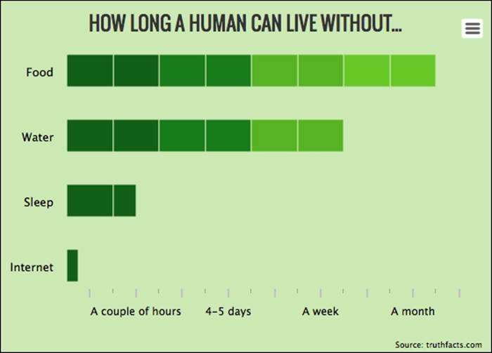
Here is a screenshot of the reproduction in Highcharts:
Summary
In this chapter, we have learned how to plot waterfall and funnel charts with fabricated sales data. We familiarized ourselves with and tested the flexibilities of Highcharts by reconstructing a pyramid chart from a financial report. We examined the construction of a heatmap chart and studied the color axis property with different examples.
In the next chapter, we will investigate that long-awaited Highcharts feature, 3D charts. We will explore how to apply 3D orientation on charts and plot a gallery of various series charts in 3D.
All materials on the site are licensed Creative Commons Attribution-Sharealike 3.0 Unported CC BY-SA 3.0 & GNU Free Documentation License (GFDL)
If you are the copyright holder of any material contained on our site and intend to remove it, please contact our site administrator for approval.
© 2016-2026 All site design rights belong to S.Y.A.