Learning Highcharts 4 (2015)
Chapter 9. 3D Charts
3D charts have been the most long awaited and the most desired feature in Highcharts. A feature that has been in the subject of heated debate within the users' community. There are users who agree, and those that disagree with the use of 3D charts. The pro camp argue for the use of 3D charts, for example in sales and marketing reports or infographics posters. The con party argue that 3D charts are misleading in terms of accuracy in data visualization and comparison, so the development resources should be focused elsewhere. As for Highcharts, it takes the pro-choice direction.
This chapter focuses on the basics of 3D configuration and shows a gallery of charts presented in 3D, as well as several specific options in each supported series. In this chapter, we will learn:
· What a 3D chart in Highcharts is and isn't
· Experimenting with 3D chart orientation: alpha, beta, depth, and viewDistance
· Configuring the 3D chart background
· Plotting the column, pie, donut, and scatter series in 3D charts
· Navigating with 3D charts
What a Highcharts 3D chart is and isn't
At the time of writing, the 3D chart feature is to display the 2D charts in a real 3D presentation, that is, we can rotate and tilt the charts in different dimensions and adjust the view distance. The 3D feature is currently only available for the column, pie, and scatter series.
What 3D charts cannot do is to construct a real three dimensional, x, y, and z axes chart, except for the scatter plot; we will even see some shortcomings in the scatter plot later. As this is the first major release of 3D charts, this limitation may be short lived.
Experimenting with 3D chart orientation
To enable the 3D feature, we first need to include the extension as follows:
<script
src="http://code.highcharts.com/highcharts-3d.js"></script>
In Highcharts, there are two levels of 3D options: chart and series. The chart level options are located in chart.options3d, which mainly deals with the orientation and the frame around the plotting area, whereas the 3D options for the series remain in the usualplotOptions area, such as plotOptions.column.depth.
Currently, Highcharts supports 2 axles of rotation: horizontal and vertical, which are the alpha and beta options in chart.options3d respectively. The values for these options are in degrees. The following diagram illustrates with arrows the direction of chart rotation as the degree value increases and decreases:
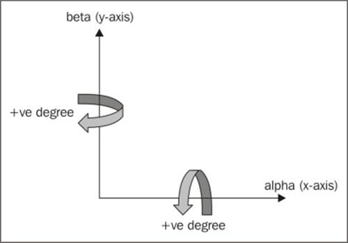
Alpha and beta orientations
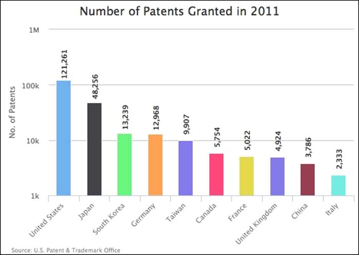
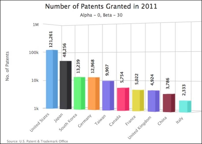
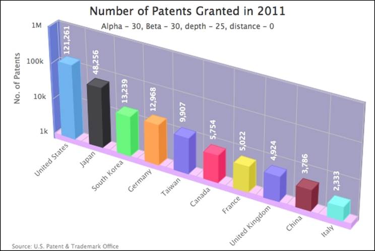
In the previous diagram, we showed the direction of orientation. Let's experiment with a column chart. We are going to use a chart from Chapter 4, Bar and Column Charts, which looks as follows:
We then add the 3D options to the chart as follows:
chart: {
renderTo: 'container',
type: 'column',
borderWidth: 1,
options3d: {
alpha: 0,
beta: 0,
enabled: true
}
},
We switch the chart to 3D display mode with the enabled option and no rotation in both axles, which produces the following chart:
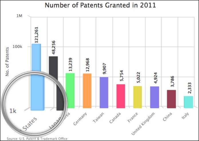
Notice that without any rotation, the chart looks almost the same as the original, as expected. When we look closer, the columns are actually constructed in 3D, with depth. Let's set the alpha axle to 30 degrees and the beta axle to remain at zero:
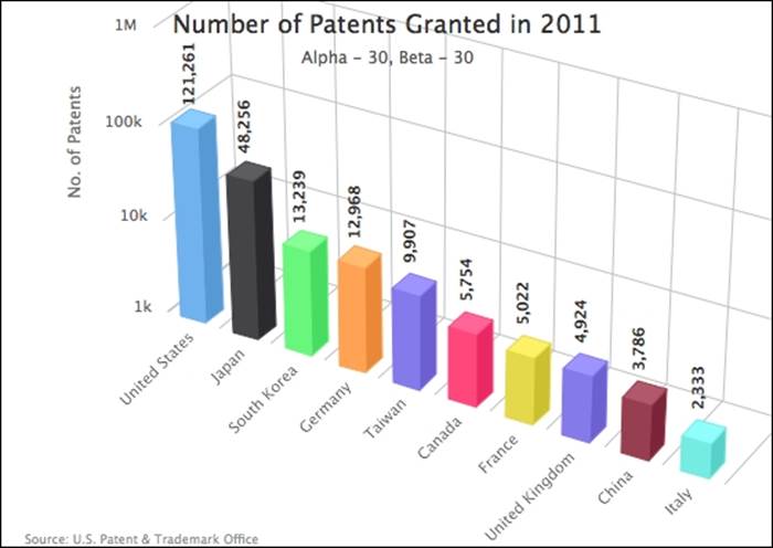
We can see the 3D structure more clearly as the alpha axle increases, as we are leaning towards a top-down view of the chart. Let's reset alpha back to zero and set the beta axle to 30 degrees:
The chart is rotated horizontally on a vertical principal axis. Note that once the chart is rotated on the beta axle, a large gap appears between the title and the y axis. We can remove the gap by positioning the title with x and y options:
yAxis: {
title: {
text: 'No. of Patents',
x: 35,
y: -80
}
},
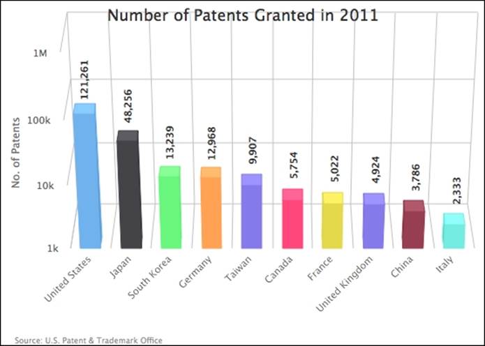
Let's set both rotations together to 30:
Notice that when we rotate a 3D chart, the plot area can interfere with other components, such as chart title and spacing on each side. In this case, we need to use the margin settings to manually accommodate the chart properly, depending on the size and view angle. Here is an example:
var chart = new Highcharts.Chart({
chart: {
....,
marginTop: 105,
marginLeft: 35,
spacingBottom: 25
}
....
The depth and view distance
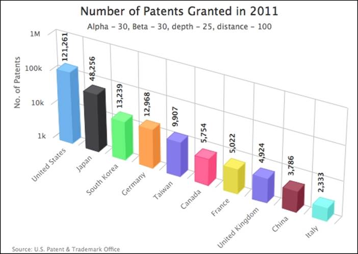
Apart from alpha and beta options, we can use the depth option to control the distance between the data display and the 3D background. Let's set the depth option to be exactly the same as the default depth of the 3D columns, which is 25 pixels deep. We also specify the viewDistance option to the default value, 100 (at the time of writing, changing the depth value also changes the viewDistance value), as follows:
options3d: {
alpha: 30,
beta: 30,
enabled: true,
viewDistance: 100,
depth: 25
}
As we can see, the columns are backed up against the background frame:
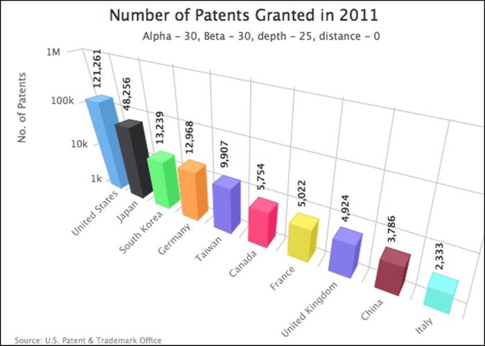
Let's change the viewDistance option to 0 for a closer perspective:
Configuring the 3D chart background
Instead of having a white background with dark labels, let's replace the side, bottom, and back frames around the plot area with different settings. In Highcharts, we can specify the color and thickness of these frames, as follows:
options3d: {
....,
frame: {
back: {
color: '#A3A3C2',
size: 4
},
bottom: {
color: '#DBB8FF',
size: 10
},
side: {
color: '#8099E6',
size: 2
}
}
}
Meanwhile, we also change the data label color to white which contrasts nicely with the new background color:
Note that if we apply a background image to the 3D chart, Highcharts doesn't automatically angle the image along the background.
Plotting the column, pie, donut, and scatter series in 3D charts
In this section, we will plot a gallery of column, pie, donut, and scatter series which are currently supported for 3D presentation. We will also examine the 3D options specific to each series. Some of the examples used here are taken from previous chapters.
3D columns in stacked and multiple series
Let's start with a multi-series stacked column chart embedded with the options3d setting:
options3d: {
alpha: 10,
beta: 30,
enabled: true
}
Here is what a multi-series grouped and stacked 3D columns chart looks like:

Column depth and Z-padding
Notice from the preceding chart, the sides of the UK/Germany stacked columns are covered by the S. Korea/Japan columns. Suppose that we want to show part of the sides of the UK/Germany columns. In order to do that, we can reduce the thickness of the S. Korea/Japan columns with the plotOptions.column.depth option, such as:
series: [{
name: 'UK',
data: ....,
stack: 'Europe'
}, {
name: 'Germany',
data: ....,
stack: 'Europe'
}, {
name: 'S.Korea',
data: ....,
stack: 'Asia',
depth: 12
}, {
name: 'Japan',
data: ....,
stack: 'Asia',
depth: 12
}]
Here, we reduce the thickness of the S. Korea/Japan columns to 12 pixels which is around half the depth of the default value. The following chart shows one group of columns thinner than the other:
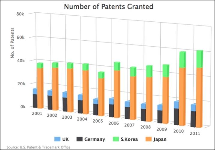
Notice that even when we have reduced the depth of one group of columns, the sides of the UK/Germany columns are still blocked. This is because the surface of the 3D columns are by default aligned along each other in Highcharts. To change that behavior, we use the groupZPadding option. In order to understand the concept of the groupZPadding option, it is best to illustrate it with a top-down view of the 3D columns in multiple series:
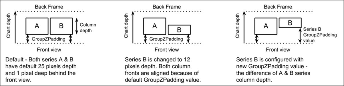
The groupZPadding option is the distance between the front view and the face of the column. In order to have the back of both series columns in line with each other, we need to increase the groupZPadding value for series B which has reduced depth, that is:
B column depth + B groupZPadding = A column depth + A groupZPadding
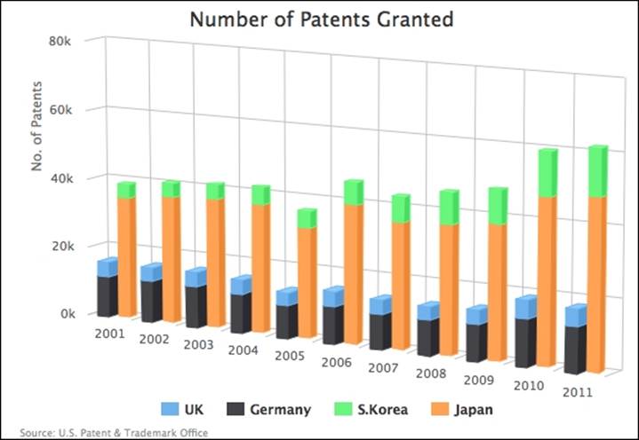
We add the groupZPadding option as follows (3D columns have a default depth of 25 pixels and default groupZPadding of 1 pixel):
series: [{
name: 'UK',
data: ....,
stack: 'Europe',
}, {
name: 'Germany',
data: ....,
stack: 'Europe',
}, {
name: 'S.Korea',
data: ....,
stack: 'Asia',
depth: 12,
groupZPadding: 14
}, {
name: 'Japan',
data: ....,
stack: 'Asia',
depth: 12,
groupZPadding: 14
}]
As expected, the S. Korea/Japan columns are pushed back and show the column sides of the other series:
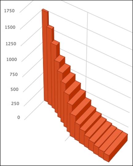
Plotting the infographic 3D columns chart
Let's see whether we can use Highcharts to plot an infographic style 3D chart. In this section, we will use the infographics designed by Arno Ghelfi and published in the Wired magazine, Geekiness at Any Price (See http://starno.com/client/wired/#geekiness-at-any-price-wired). Here is part of the infographics poster:
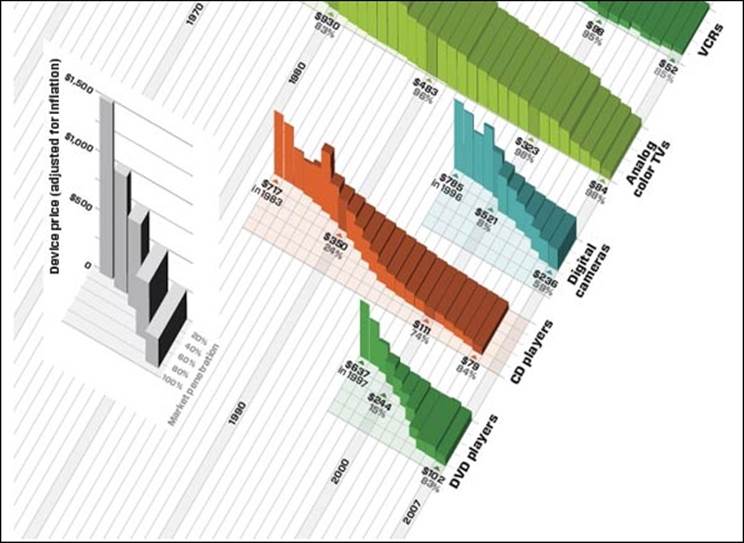
Although the chart looks difficult to comprehend, we will focus on using Highcharts to reproduce one of these special 3D style columns here. From the previous exercise, we know that we can set up the columns with increasing depth, or with decreasinggroupZPadding values to achieve the same effect. This is because the depth and groupZPadding options are from the plotOptions.column configuration which is designed on a per-series basis. Therefore, we need to put each item of data as a separate series, in order to have columns with various depths and groupZPadding values, like the following:
series: [{
data: [ 1500 ],
depth: 5,
groupZPadding: 95
}, {
data: [ 1300 ],
depth: 10,
groupZPadding: 90
}, {
data: [ 1100 ],
depth: 15,
groupZPadding: 85
}, {
Second, the columns in the example chart have no space between them. We can accomplish the same result by setting the padding spaces to zero with the groupPadding and pointPadding options. Then, we set all the columns to have the same color with the color option. Without space and with the same color for the columns will make them look indistinguishable. Fortunately, there is another specific option for 3D columns, edgeColor, which is for the color along the column edges. Here is the outcome of the configuration:
plotOptions: {
column: {
pointPadding: 0,
groupPadding: 0,
color: '#C5542D',
edgeColor: '#953A20'
}
},
Here is our attempt to create an infographic style chart with Highcharts:
Plotting 3D pie and donut charts
Plotting 3D pie and donut charts follows the same principle as the column chart. Simply include the options3d configuration for the orientation. To control the thickness of the pie chart, we use plotOptions.pie.depth in a similar fashion.
Let's use some live data to plot a 3D pie and donut charts. First, we borrow some code from a Highcharts online demo (http://www.highcharts.com/demo/pie-gradient) which turns the Highcharts standard series colors into some gradient style colors. This automatically makes the chart more appealing with light shading:
Highcharts.getOptions().colors =
Highcharts.map(Highcharts.getOptions().colors, function(color)
{
return {
radialGradient: { cx: 0.5, cy: 0.3, r: 0.7 },
stops: [
[0, color],
[1, Highcharts.Color(color).
brighten(-0.3).get('rgb')] // darken
]
};
});
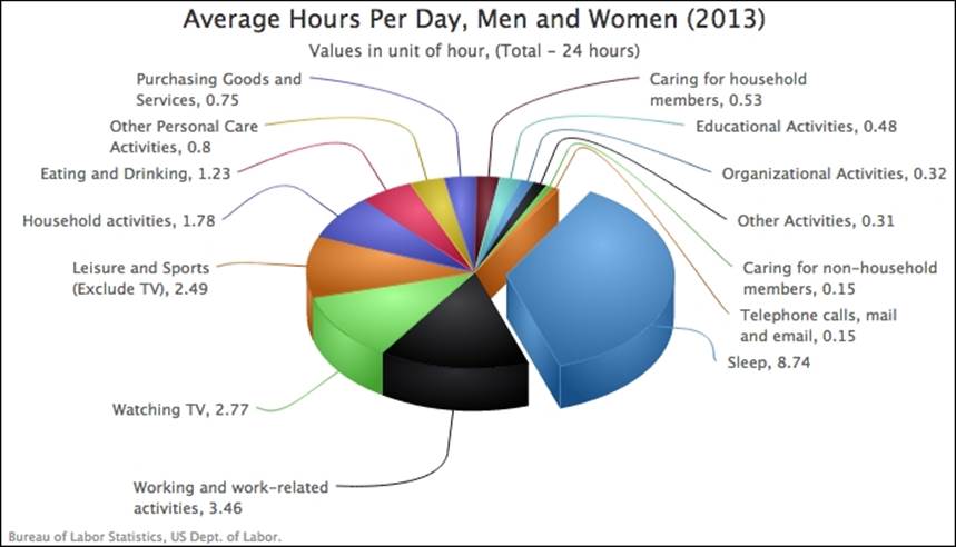
In this pie chart, we set the pie depth and alpha rotation options to 50 and 55 respectively:
chart: {
....,
options3d: {
alpha: 55,
beta: 0,
enabled: true
}
},
....,
plotOptions: {
pie: {
center: [ '50%', '45%' ],
depth: 50,
slicedOffset: 40,
startAngle: 30,
dataLabels: {
....
},
size: "120%"
}
},
series: [{
type: 'pie',
data: [ {
name: 'Sleep',
y: 8.74,
sliced: true,
}, {
name: 'Working and work-related activities',
y: 3.46
}, {
....
}]
}]
As we can see, the depth option produces a rather thick 3D pie chart with nice color shading:
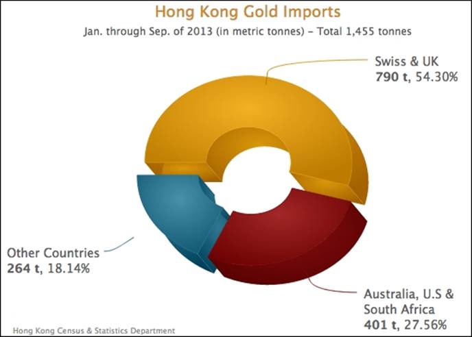
In the next donut chart, we set up all the sections to be separated with the sliced option set to true, and apply orientations:
chart: {
....
options3d: {
alpha: 50,
beta: 40,
enabled: true
}
},
....,
plotOptions: {
pie: {
depth: 40,
center: [ '50%', '44%' ],
slicedOffset: 15,
innerSize: '50%',
startAngle: 270,
size: "110%",
....
}
},
series: [{
type: 'pie',
data: [{
name: 'Swiss & UK',
y: 790,
sliced: true,
// color, dataLabel decorations
....
}, {
name: 'Australia, U.S & South Africa',
y: 401,
....
}, {
....
}]
}]
Here is a 3D donut chart with all the slices separate from each other:
The 3D scatter plot
Highcharts supports real three-dimensional scatter series, although they are rather visually obscure. Despite this, we can use the zAxis option to define the third axis range. The chart doesn't display any details along the z axis like others. Let's construct the chart with some 3D data. In order to plot a three-dimensional scatter series, apart from the options3d configuration, we need to define the data series in an array of triplets:
series: [{
name: 'China',
data: [ [ 2000, 23.32, 20.91 ],
[ 2001, 22.6, 20.48 ],
[ 2002, 25.13, 22.56 ],
....,
With a multiple three-dimensional scatter series, it looks like this:
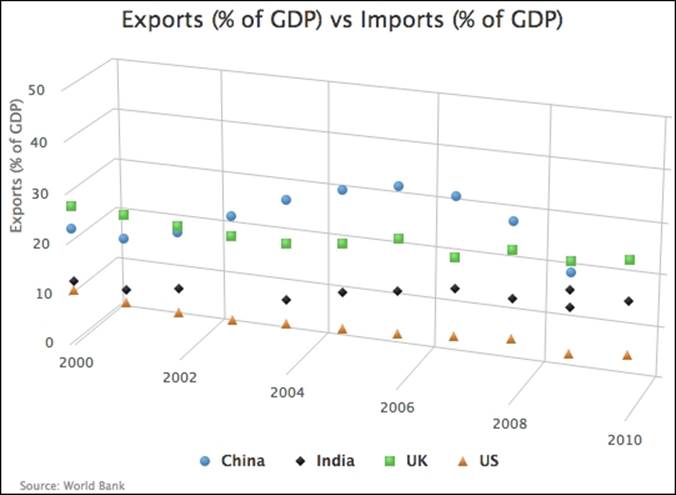
As we can see, it is difficult to make sense of the data points hanging in 3D space. Note that Highcharts currently doesn't show any intervals along the z axis. Let's add some navigation to assist the data visualization:
var orgColors = Highcharts.getOptions().colors;
// Apply color shading to Highcharts.getOptions().colors
....
chart: ....,
....,
tooltip: {
crosshairs: [ { width: 2, color: '#B84DDB' },
{ width: 2, color: '#B84DDB' },
{ width: 2, color: '#B84DDB' } ],
formatter: function() {
var color = orgColors[this.series.index];
return '<span style="color:' + color + '">\u25CF</span> ' +
this.series.name + ' - In <b>' + this.point.x +
'</b>: Exports: <b>' + this.point.y +
'%</b>, Imports: <b>' + this.point.z + '%</b><br/>';
},
shape: 'square',
positioner: function(width, height, point) {
var x = chart.plotLeft + chart.plotWidth - width + 20;
var y = 40;
return { x: x, y: y };
}
}
We change the tooltip into crosshairs for all dimensions. In order to avoid the tooltip blocking the crosshair lines, we fix the tooltip position to the top-right of the chart with the positioner option. Next, we use formatter to style the tooltip content. We borrow the tooltip formatting code from a Highcharts online demo (http://www.highcharts.com/demo/3d-scatter-draggable); the \u25CF is a dot Unicode symbol which is used as a bullet point with the series color. Since the tooltip is away from the hovered point, it is less confusing to have the tooltip in a rectangular shape rather than the default speech balloon style (callout in Highcharts). The following screenshot shows the chart with a hovered over crosshair:
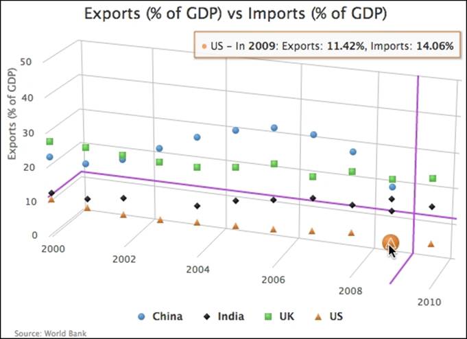
As we can see, even if we specify the crosshair in the z dimension, there is no crosshair line projected along the axis.
Navigating with 3D charts
In this section, we will investigate how you can interact with 3D charts. In Chapter 2, Highcharts Configurations, we have already explored the drill down feature and we will revisit it briefly in 3D charts. Another interaction specific to 3D charts is the impressive click-and-drag feature.
Drilldown 3D charts
Let's convert our previous drill down example into a 3D chart. First, we add the options3d option (and other positioning options):
options3d: {
enabled: true,
alpha: 25,
beta: 30,
depth: 30,
viewDistance: 100
},
Here, we have our top level 3D chart:
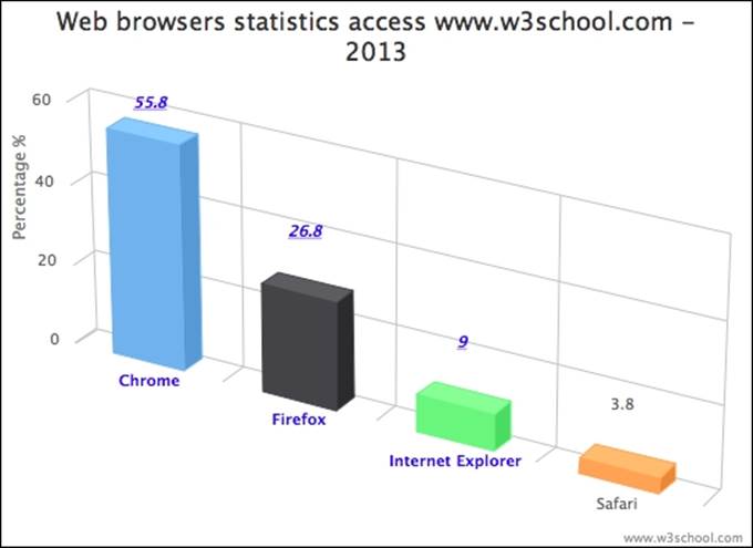
The next step is to improve our drill down pie chart in 3D with different orientation. Since the top level column is already configured in 3D, the drill down pie chart (defined in the drilldown.series option with matching id value) will also follow suit. However, we won't notice the pie in 3D because the default depth is 0. So, we need to set the thickness of the pie chart with the depth option:
plotOptions: {
pie: {
depth: 30,
....,
In order to set the drill down chart to a different rotation, we change the chart options in the drilldown event callback:
chart: {
renderTo: 'container',
....,
events: {
drilldown: function(e) {
....
if (e.point.name == 'Internet Explorer') {
// Create the '9%' string in the center of
// the donut chart
pTxt = chart.renderer.text('9%',
(chart.plotWidth / 2) + chart.plotLeft - 25,
(chart.plotHeight / 2) + chart.plotTop + 25).
css({
// font size, color and family
....,
'-webkit-transform':
'perspective(600) rotateY(50deg)'
}).add();
chart.options.chart.options3d.alpha = 0;
chart.options.chart.options3d.beta = 40;
}
},
drillup: function() {
// Revert to original orientation
chart.options.chart.options3d.alpha = 25;
chart.options.chart.options3d.beta = 30;
....
}
}
When the drilldown event is triggered from the Internet Explorer column, which zooms down to a donut chart, we set the chart with new alpha and beta orientations to 0 and 40 respectively. We use the CSS3 -webkit-transform setting on the 9% sign to make it appear to have the same rotation as the donut chart. Finally, we reset the chart to its original orientation in the drillup callback, which is triggered when the user clicks on the Back to …. button. Here is the display of the zoom down donut chart:
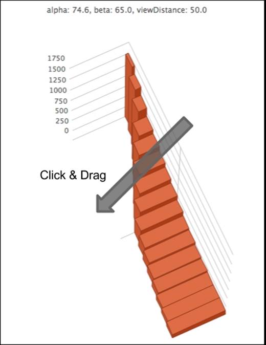
Click and drag 3D charts
Another impressive interaction with 3D charts is the click-and-drag function which we can use to drag the chart into any orientation. This interaction is actually from the Highcharts 3D scatter online demo, (http://www.highcharts.com/demo/3d-scatter-draggable). Here, we are going to explore how this is achieved. Before we do that, let's reuse our infographics example and copy the click-and-drag jQuery demo code into this exercise. The following is the click-and-drag code with minor modifications:
$(function () {
$(document).ready(function() {
document.title = "Highcharts " + Highcharts.version;
var chart = new Highcharts.Chart({
....
});
// Add mouse events for rotation
$(chart.container).bind('mousedown.hc touchstart.hc',
function (e) {
e = chart.pointer.normalize(e);
var posX = e.pageX,
posY = e.pageY,
alpha = chart.options.chart.options3d.alpha,
beta = chart.options.chart.options3d.beta,
newAlpha,
newBeta,
sensitivity = 5; // lower is more sensitive
$(document).bind({
'mousemove.hc touchdrag.hc':
function (e) {
// Run beta
newBeta =
beta + (posX - e.pageX) / sensitivity;
newBeta =
Math.min(100, Math.max(-100,
newBeta));
chart.options.chart.options3d.beta =
newBeta;
// Run alpha
newAlpha =
alpha + (e.pageY - posY) / sensitivity;
newAlpha = Math.min(100, Math.max(-100,
newAlpha));
chart.options.chart.options3d.alpha =
newAlpha;
// Update the alpha, beta and viewDistance
// value in subtitle continuously
var subtitle = "alpha: " +
Highcharts.numberFormat(newAlpha, 1) +
", beta: " +
Highcharts.numberFormat(newBeta, 1) +
", viewDistance: " +
Highcharts.numberFormat(
chart.options.chart.options3d.viewDistance, 1);
chart.setTitle(null,
{ text: subtitle }, false);
chart.redraw(false);
},
'mouseup touchend': function () {
$(document).unbind('.hc');
}
});
});
The chart container's element is bound with the mousedown and touchstart events. The event names suffixed by '.hc' mean that the event handlers are grouped into the same name space, '.hc'. This is later used to unbind the event handlers declared under the name space.
So when the user performs a mousedown or touchstart event in the chart container, it executes the handler. The function first normalizes the event object for cross-browser event compatibility. Then it records the current pointer position values (pageX, pageY) as well asalpha and beta values under the mousedown event. Further under the mousedown or touchstart events, we bind an additional handler with the mousemove and touchdrag events in the same '.hc' name space. In other words, this means that under the mousedown or touchstartaction, moving the mouse and dragging via touch will bind the second handler to the container.
The second handler implementation is to calculate the movement in x and y directions by comparing the current movement coordinates to the initial position recorded in the mousedown handler. Then, it transforms the scroll distance into orientation and updates the new alpha and beta values. The Math.max and Math.min expressions are to limit the alpha and beta into a range between -100 and 100. Note that the code doesn't restrict us to only using pageX/Y from the event object. We can use other similar properties such asscreenX/Y or clientX/Y, as long as both handlers are referring to the same.
Finally, we call chart.draw(false) to redraw the chart with the new orientation but without animation. The reason for a lack of animation is that the movement handler is being called frequently with scroll action and animation, which will require extra overhead, degrading the responsiveness of the display.
The following screenshot illustrates the chart after the click-and-drag action:
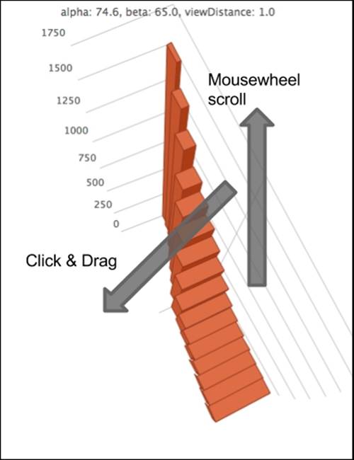
Mousewheel scroll and view distance
We can improve the experience by introducing another interaction, mousewheel, so that the view distance of the chart responds to the mousewheel actions. For the sake of a cross-browser compatibility solution, we use a jQuery mousewheel plugin by Brandon Aaron (http://github.com/brandonaaron/jquery-mousewheel/).
The following is the handler code:
// Add mouse events for zooming in and out view distance
$(chart.container).bind('mousewheel',
function (e) {
e = chart.pointer.normalize(e);
var sensitivity = 10; // lower is more sensitive
var distance =
chart.options.chart.options3d.viewDistance;
distance += e.deltaY / sensitivity;
distance = Math.min(100, Math.max(1, distance));
chart.options.chart.options3d.viewDistance = distance;
var subtitle = "alpha: " +
Highcharts.numberFormat(
chart.options.chart.options3d.alpha, 1) +
", beta: " +
Highcharts.numberFormat(
chart.options.chart.options3d.beta, 1) +
", viewDistance: " +
Highcharts.numberFormat(distance, 1);
chart.setTitle(null, { text: subtitle }, false);
chart.redraw(false);
});
In a similar fashion, deltaY is the mousewheel scroll value and we apply the change to the viewDistance option. Here is the result when we apply click-and-drag and mousewheel scroll actions:
Summary
In this chapter, we learned how to create 3D column, scatter, and pie charts, and how to manipulate the orientation and configurations specific to each series. We tested these options by producing a gallery of 3D charts. On top of that, we explored a number of user interactions for 3D charts in Highcharts.
In the next chapter, we will explore the Highcharts APIs, which are responsible for making a dynamic chart, such as using Ajax queries to update the chart content, accessing components in Highcharts objects, and exporting charts to SVG.
All materials on the site are licensed Creative Commons Attribution-Sharealike 3.0 Unported CC BY-SA 3.0 & GNU Free Documentation License (GFDL)
If you are the copyright holder of any material contained on our site and intend to remove it, please contact our site administrator for approval.
© 2016-2026 All site design rights belong to S.Y.A.