JMP Essentials: An Illustrated Guide for New Users, Second Edition (2014)
Chapter 2. Data
The first step in creating a graph or analysis is to get your data into JMP. With JMP, you can easily import data from many different sources such as Microsoft Excel or Access, or you can enter your data directly into a JMP data table. Because most readers already have data in one form or another, this section focuses on getting that data into JMP from another application. Sometimes data isn’t in the best condition when you import it. Later in this chapter, we discuss what you can do to format data or deal with missing data. JMP also now supports shape files that can be used to create maps; we will describe the special requirements of using these file types.
As mentioned in the previous chapter, we use Windows as our default system to illustrate JMP. JMP instructions for Windows and Macintosh are basically the same, though some operating system differences are noted when they occur.
Example 2.1 Big Class
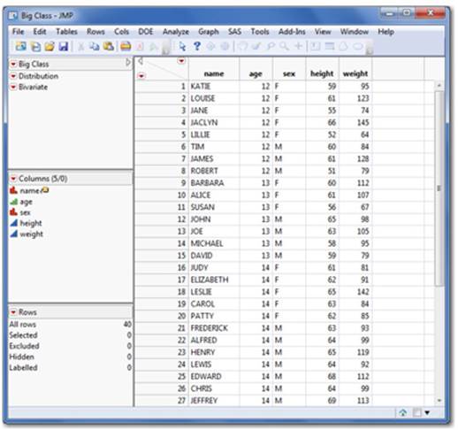
We will be using the Big Class.jmp data file to illustrate the steps in this chapter. This data set consists of 40 middle-school students and their name, height, weight, gender, and age. You can access this data set in the Sample Data folder that is installed with JMP: File ▶ Open ▶ C: ▶ Program Files ▶ SAS ▶ JMP ▶ 11 ▶ Samples ▶ Data ▶ Big Class.jmp
2.1 Getting Data into JMP
Getting your data into JMP is a familiar process. Like many other desktop applications, you can simply select File ▶ Open to import your data into JMP. JMP can handle many different data formats. Table 2.1 shows the default formats JMP recognizes. Other previously installed applications could contain proprietary formats that might also appear as import options. You can import files with these formats as well.
In this section, we show you how to open JMP data tables and how to import Microsoft Excel spreadsheets and text files in JMP. Each of these file formats follows the same basic procedure, but each has special options that allow you to import exactly what you want. JMP interfaces with databases using Open DataBase Connectivity standard (ODBC). Through the Database Open Table dialog box, you can query your data using SQL. We illustrate only the essential connectivity here; more information about querying your data is available in the JMP documentation (Help ▶ Search ▶ SQL). At the end of this section, we show you how to create a new data table in JMP.
Table 2.1
|
File Type |
File Extension |
|
JMP Files |
.jmp, .jsl, .jrn, .jrp, .jmpprj, .jmpmenu, .jmpaddin, .jmpapp |
|
JMP Data Tables |
.jmp |
|
Excel Files |
.xls, .xlsx, .xlsm |
|
Text Files |
.txt, .csv, .dat, .tsv |
|
SAS Data sets |
.sas7bdat, .xpt, .stx |
|
SAS Program files |
.sas |
|
R Code |
.r, .R |
|
MATLAB Code |
.m, .M |
|
HTML Files |
.htm, .html |
|
FACS Files |
.fcs |
|
SPSS Data Files |
.sav |
|
xBase Data Files |
.dbf |
|
Shapefiles |
.shp |
|
Minitab Worksheets |
.mtp |
|
Teradata Database |
.trd |
Opening a JMP File
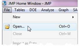
Let’s start by opening a JMP data table. At the top left of the JMP window is the File menu:
1. Select File ▶ Open (see Figure 2.1). A familiar dialog box opens (on a Mac, select File ▶ Open and locate your file in the appropriate folder).
Figure 2.1 Opening a File
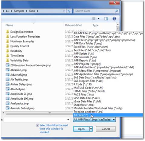
We will use the Big Class data table described earlier. Click on the Big Class.jmp file and select Open (see Figure 2.2).
Figure 2.2 Open File Dialog
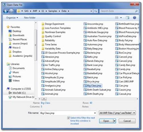
Note: To locate this file for the first time, select File ▶ Open ▶ C: ▶ Program Files ▶ SAS ▶ JMP ▶ 11 ▶ Samples ▶ Data ▶ Big Class.jmp. Alternatively, you can also select Help ▶ Sample Data ▶ Open the Sample Data Directory ▶ Big Class.jmp.
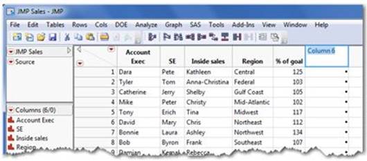
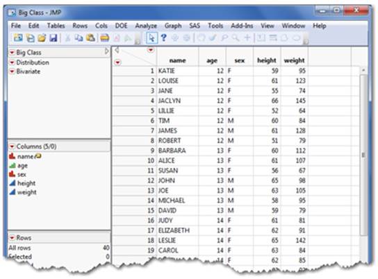
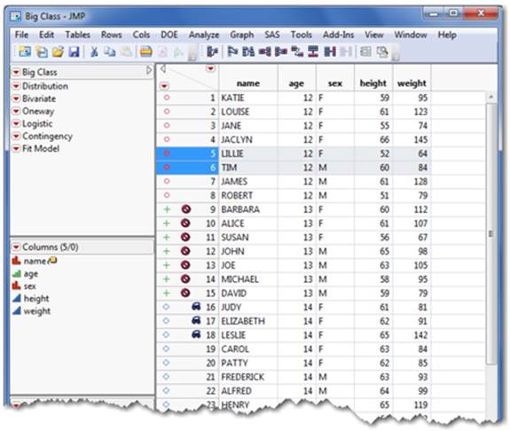
These steps open the JMP data table Big Class (see Figure 2.3). With these simple steps, you are now ready to analyze or visualize this data.
Figure 2.3 The JMP Data Table
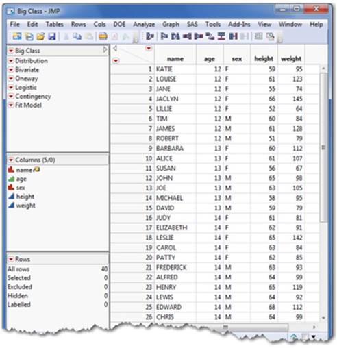
This spreadsheet-like table is referred to as the JMP data table, which is JMP’s common data format regardless of where the data comes from. Section 2.2 discusses the components of the data table.
Note: In the Big Class example, the variables (name, age, sex, height, and weight) are located as column heads and the individual sets of observations appear in rows. This structured format of the data is required. The importing examples that follow assume that your data already exists in this format. Section 2.6 introduces some tools to use if your data does not adhere to this structure.
Importing Data into JMP
Importing data into JMP from another file format is similar to opening a JMP file. Within the File ▶ Open pop-up window, the Files of Type drop-down menu indicates All JMP Files as the default.
If you are importing another file type, simply click on the down arrow and select the right type. You can also select All Files from the drop-down menu (see Figure 2.4). Select the file that you want, and then click Open. On the Mac, select File ▶ Open and available files will be highlighted.
Figure 2.4 Selecting All File Types
Note: If you know the format of your data, first select the correct format from the Files of Type drop-down menu. You will see the available files of that type within the folder. Once you’ve located the right file, select the file and click Open.
Importing an Excel File
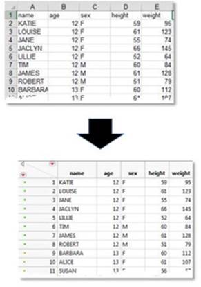
Importing an Excel file is easy, as long as your variables are in columns and your cases or sets of observations are in rows. Ideally, any variable names should appear in the row directly above the first row of data, as shown in Figure 2.5. The import process automatically opens and converts the data into a JMP data table and uses your variable names as column headings:
Figure 2.5 Importing an Excel File
1. Select File ▶ Open.
The Big Class.xls file, which is illustrated here, can be found by selecting C: ▶ Program Files ▶ SAS ▶ JMP ▶ 11 ▶ Samples ▶ Import Data ▶ Big Class.xls.
2. From the Files of Type drop-down menu, select Excel Files.
3. Select the file that you want, then select Open which will launch the Excel Import Wizard dialog with a view of your data. If it looks correctly structured, select Import.
Note: If your data isn’t structured correctly or have multiple worksheets within an Excel workbook, JMP provides additional controls in the Excel Import Wizard dialog box to select individual worksheets and to specify that your headings are placed in the right location within the JMP data table. Important note to Mac users: The Excel Import Wizard is a new feature available in JMP 12. Mac users on JMP 11 and earlier versions may open older Excel files formats with .xls or .csv file extensions, but not the newer xlsx formats (without downloading a driver to do so). You may also simply save your newer Excel files in the older .xls format and then import them.
Shortcut: If you have JMP open and an Excel worksheet or workbook on your desktop, you can simply drag the file over the JMP shortcut icon on your desktop to launch the Excel import wizard.
The Excel Import Wizard
While the previous example was simple and straightforward, a common characteristic of Excel worksheets is that data does not always adhere to the essential column/row structure that is required by JMP. For example, you may have multiple nested headers where one row might represent year and the next row contain months within that year. The new Excel Import Wizard has made importing this worksheet and maintaining the month within year structure much easier.
This wizard also provides options to specify which rows should be headers or columns, to specify hidden or merged columns, and to replicate these settings or merge data from multiple worksheets within a workbook.
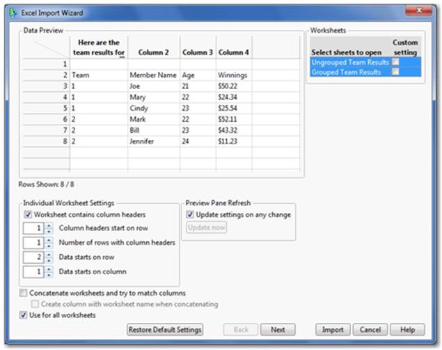
To illustrate this feature, let’s try another example with one of these characteristics. We will use the Team Results.xls worksheet from the Import Data folder. This worksheet has headers/column names that appear to be in the second row (see Figure 2.6). The Excel Import Wizard will help JMP decide how to import this data.
Figure 2.6 The Excel Import Wizard
1. Select File ▶ Open, then select an Excel workbook. In this example we are using Team Results.xls from the C: ▶ Program Files ▶ SAS ▶ JMP ▶ 11 ▶ Samples ▶ Import Data folder.
2. Select Team Results.xls ▶ Open to launch the Excel Import Wizard with an initial display of your data in the window (Figure 2.6).
3. As you can see, the column headers begin in row 3 (when you include the note that appears as a header in the preview) and the first set of observations in row 4. To get this into the right format, adjust the Individual Worksheet Settings as we’ve done in Figure 2.7.
Figure 2.7 Adjusting the Worksheet Settings
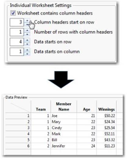
4. Once you’ve adjusted these settings, you should see your data take its proper shape in the window. Once you are satisfied with the adjustments you’ve made, select Import.
Importing a Text File
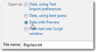
If you are importing a text file, another handy wizard is included in the Data with Preview file option. Like the Excel Import Wizard, this wizard allows you to view your data and specify how you want it to appear before importing it into a JMP data table. It also provides options to convert your text file if it is delimited by commas, tabs, or spaces:
1. Select File ▶ Open.
The Big Class.txt file, illustrated here, can be found by selecting C: ▶ Program Files ▶ SAS ▶ JMP ▶ 11 ▶ Samples ▶ Import Data ▶ Big Class.txt.
2. Select Text Files (*.txt, *.csv, *.dat, *.tsv) in the Files of Type drop-down menu. Select the file.
3. Select Data with preview (see Figure 2.8).
Figure 2.8 Data with Preview
4. Select Open.
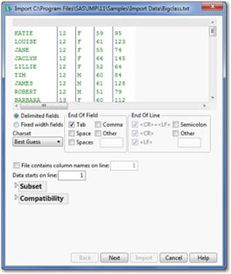
5. Choose the settings you need (see Figure 2.9). Click Next and then Import.
Figure 2.9 Text Data Preview
Importing a Database File
Options to import data extracted from a database are available through ODBC within JMP. To access this data, first connect to the database (the data source should already be defined) and then specify the table of interest. You can also query your data using Query Builder (in JMP 12) or the Advanced button. If you need more help defining your data source, select Help ▶ Books ▶ Using JMP ▶ Ch. 3 Import Data from a Database.
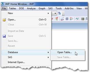
1. Select File ▶ Database ▶ Open Table (see Figure 2.10).
Figure 2.10 Database Open Menu
2. The Database Open Table window appears (see Figure 2.11). It prompts you to connect to your database and either to open a data table or to specify a query. Clicking the Connect button launches the Select Data Source window to locate and connect to your database.
Figure 2.11 Database Open Dialog
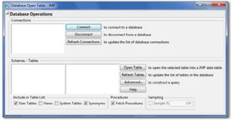
3. Locate the table of interest, highlight it, and click Open Table to import the data.
Note: You have the option of directly importing database files by selecting File ▶ Open as previously discussed (assuming these programs are installed). Using this more direct option allows you to import only a single table.
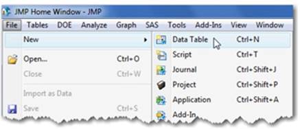
Creating a JMP Data Table from Scratch
Select File ▶ New ▶ Data Table to create a new data table (see Figure 2.12):
Figure 2.12 Creating a New Data Table
1. Double-click on the first column’s heading and type the column name (the variable name).
2. Press Enter and type the data into the first cell directly below the heading. Press Enter again, type the data, and repeat as needed. Rows within JMP are consecutively numbered as observations or cases (see Figure 2.13).
Figure 2.13 Add a New Column
3. To create another column, double-click on the next column’s heading and enter the data as you did before.
If it is more practical for you to enter a series of data for each row as you build your data table, set up all of your column headings first and then use the Tab key to move from the left columns to the right. When each column has been filled, the Tab key moves down to the beginning of the next row.
Note: JMP will recognize the type of data you are entering and assign a data type to the column, either numeric or character. It also assigns an icon next to the columns (or variables) in the box on the left. These icons are discussed in Section 2.3.
2.2 The JMP Data Table
The JMP Data Table looks very much like any spreadsheet (see Figure 2.14). In JMP, column headings indicate variables (what you’ve measured or counted) and rows indicate individual cases or sets of observations. JMP requires your data to be structured this way. If it is not, JMP can help you reformat your data (see Section 2.6).
Figure 2.14 The JMP Data Table
Data Table refers to the spreadsheet-like grid where your data resides. The three panels on the left of the data table contain information about your data (metadata). The data grid can contain any number of columns (your variables) or rows (observations or cases). In this sense, we refer to data within the JMP data table as structured data.
In addition to the data grid, notice the three panels to the left of the data table. These panels provide vital information about your data as well as options to streamline and save your analyses.
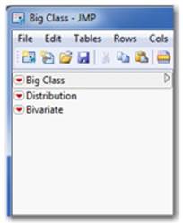
The first and upper-most panel contains the name of the data table (see Figure 2.15). This panel stores references and/or scripts. Scripts allow you to save, automate, and customize analyses. If you perform a regular analysis or a scheduled task, you will want to learn more about JMP scripts (see the JMP Scripting Guide at Help ▶ Books ▶ JMP Scripting Guide).
Figure 2.15 The Table Panel
The Columns panel (see Figure 2.16) is where your column names (or variables) appear. Each column has an icon in front of it.
Figure 2.16 The Columns Panel
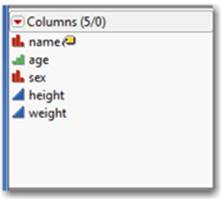
These icons correspond to the modeling type of the data in each column. As discussed in the next section, this is vitally important. JMP produces only the graphs or statistics that are appropriate for a column’s modeling type. In most cases, you can change the modeling type by simply clicking on the icon and selecting another appropriate format.
The bottom panel is the Rows panel (see Figure 2.17). The Rows panel indicates how many rows (sets of observations) are in your data table. This panel also indicates the number of selected, hidden, or excluded rows, if any.
Figure 2.17 The Rows Panel
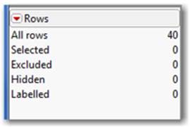
Note: When rows are hidden, the observations are not included in graphs. When rows are excluded, they are not included in analyses. This row state is effective when you want to see or analyze a subset of your data. You can also both hide and exclude specific rows, which effectively removes the row(s) from your analysis or graph, but not from your data table. Section 2.5 provides more information on row states including hiding and excluding rows.
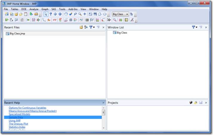
Multiple data tables can be open at any time, but only one active data table can be analyzed at a time. If you have multiple data tables open within JMP and you want to switch to another open data table, go to the Home Window (see Figure 2.18) and select the desired data table under Windows List.
Figure 2.18 The Home Window
Another special type of data table are shape files which are used to create thematic maps. These data tables consist of two tables including a “Name” and corresponding “Boundary” table. These are stored in the Maps folder: C: Program Files ▶ SAS ▶ JMP ▶ 11 ▶ Maps. Section 2.7covers some of the basics about shape files.
Note: There is no practical limit on the size of the data table you can analyze. However, because JMP runs in your computer’s local memory, the amount of RAM you have determines the upper size limit of your data table. Your computer should be equipped with at least twice as much memory as the size of the data table. Thus if you have just 2 GB of RAM, you can analyze about a 10-variable data set with 1 million rows! JMP also provides 64 bit versions (if your computer is so equipped) allowing much larger data sets to be analyzed with greater memory. More details on JMP system requirements can be found at www.jmp.com.
2.3 Data and Modeling Types
One of JMP’s great features is the ability to produce graphs and statistics that make sense for the data you are analyzing. This feature assumes that your data is correctly classified in the data table. So, what do we mean by data type and modeling type? Let’s define a few terms.
Data
refers to any values placed in the cell of a JMP data grid. Examples include numeric and/or text descriptions: 3.6, $2500, Female, Somewhat Likely, or 11/14/13.
Data type
refers to the nature of the data. The data type can be either numeric (numbers) or character (often words and letters but sometimes also numbers).
Modeling type
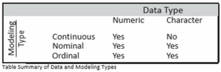
refers to how the data within a column should be used in an analysis or a graph. JMP uses three distinct modeling types: continuous, nominal, and ordinal.
• Continuous data (also referred to as quantitative, ratio or interval scale data) takes a numeric form and is often thought of as some type of measurements. For example, home selling prices, income earned, costs per square foot, and dates are all examples of continuous data. As a rule of thumb, continuous data can be used in calculations. For example, calculating the average cost per square foot would be meaningful.
• Nominal data is categorical data (also referred to as qualitative, discrete, count, or attribute data) and can take on either a character or numeric form. Nominal data fits into categories or groups such as car type, gender, department, and sales territory and also includes indicator variables like yes/no or 0/1. In nominal data, it is helpful to count the frequency of the occurrence of values, but otherwise, nominal data is not used in calculations. For example, calculating the average car type would not be meaningful.
• Ordinal data is categorical data that has an inherent order or hierarchy. For instance, Likert scales (such as levels of satisfaction) in a survey and grade levels in school (freshman, sophomore, junior, senior) are examples of ordinal data. That is, they represent categories that have some sequence or order that should be retained in any analysis. Ordinal data is less common than continuous and nominal data, but there are a few analyses designed specifically for it. In most JMP analyses, nominal and ordinal data are treated the same way.
Note: Numeric data is right justified in the data table whereas character data is left justified. This can be a useful to check whether data contains errors.
In our example, Big Class contains five variables (or columns) representing each of these modeling types (see Figure 2.19). Let’s briefly explain why they are classified by their data and modeling types:
Figure 2.19 Understanding Modeling Types in the Data Table
Name is nominal because it is a character data type and the student’s name is arbitrary.
Age is ordinal because the values are rounded down and we want to retain the six ordered age groups (12 to 17) in our analysis.
Note: Age could also be considered continuous because the values are numeric, but this would treat age differently and yield different results.
Sex is nominal because its data type is character (M or F) and it has no order.
Height and weight are continuous because they are both numeric and represent a measurement.
Note: Row State is a third data type that allows you to store and manage information about a row of data (See Section 2.5). For more information, select Help ▶ Books ▶ Using JMP ▶ Ch. 4, Enter and Edit Data ▶ Assign Characteristics to Rows and Columns.
Changing the Modeling Type
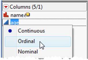
When you import data, the JMP default selects and assigns one of two modeling types based on whether the data is numeric or character. Numeric data becomes continuous and character data becomes nominal. Sometimes you might want to change the default modeling type of your data to generate results that are more meaningful.
For example, if we imported the Big Class data from Excel, age as numeric data would be imported as a continuous column. We might want to change that to ordinal. Changing the modeling type is simple in JMP. Click the column’s corresponding icon in the Columns panel in the data table and select the correct type (see Figure 2.20).
Figure 2.20 Changing the Modeling Type
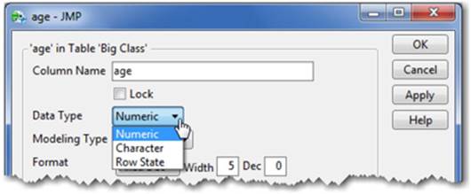
If the Continuous option is grayed out, your data type is classified as character. To change the data type, double-click on the column heading and change the data type to numeric (see Figure 2.21). In this window, you can also change the modeling type along with a host of other formatting options, which are described in the next section.
Figure 2.21 Changing the Data Type
For more information, select Help ▶ Books ▶ Using JMP ▶ Chapter 5, Set Column Properties ▶ About Data and Modeling Types.
2.4 Cleaning and Formatting Data
Sometimes data isn’t in the best shape or in the right form when it is imported. Fortunately, JMP has extensive column formatting abilities. This section focuses on the most common features, including:
• Cleaning up your data format, such as decimal places, dates, times, and currency. We will use the Column Info window to accomplish these tasks.
• Introducing the Formula Editor, which allows you to create new columns from old ones, add IF statements, and transform data using basic or more advanced functions.
We will introduce a basic example in this section. For more information, select Help ▶ Books ▶ Using JMP.
• Learning to use the RECODE command, which is a handy way to merge similar categorical responses into a single category. For example, if you have Woman, Female, and Girl as responses, you can merge these into a single response: Female.
Example 2.2 Movies
We will use the Movies.jmp data table to illustrate the concepts in this section. This data table consists of the 277 top-grossing movies released between 1937 and 2003. The columns are:
Movie name of movie
Type genre/category of movie (for example, comedy, family)
Rating US movie rating system (for example, general audience [G], adult [R])
Year year of movie release (for example, 1937)
Domestic $ US domestic revenue in $ earned by the movie in that year
Worldwide $ Worldwide revenue in $ earned by the movie in that year
Director director of movie
You can access this data table in the Sample Data folder that is installed with JMP by selecting File ▶ Open ▶ C: ▶ Program Files ▶ SAS ▶ JMP ▶ 11 ▶ Samples ▶ Data ▶ Movies.
Getting your data into a standard format is done through the Column Info window, which is accessed from the Cols menu. Options to format your data are driven by the data and modeling types specified for that column of data. You can change these types, if necessary, to meet the requirements of your analysis. Recall that changing these types affects the graphs or statistics you can generate from that column (see the previous section). Let’s begin by opening the Movies.jmp data table:
1. Open the Movies.jmp data table.
2. Select the Domestic $ column, and then select Cols ▶ Column Info.
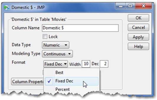
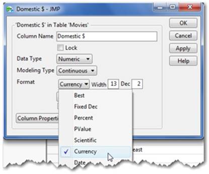
3. Because Domestic$ is a numeric value, you see the Format drop-down menu (see Figure 2.22), which leads to several options. It is also our starting point for the next items we’ll discuss. Note that if you select a Character column, the Format menu does not appear in the Column Info window.
Figure 2.22 Column Info Format Menu—Continuous Variables
Note: You can also either double-click on the column name as mentioned in the previous section, or right-click on the column head and select Column Info from the menu.
Formatting Decimal Places
To change the number of decimal places displayed in a column of data, do the following:
1. Click on the column of interest. In our example, it is Domestic$.
2. Select Cols ▶ Column Info. JMP will make a best guess on the format of the data; in our example, Currency was correctly specified (see Figure 2.23). You can easily change this format by selecting another format from the menu.
Figure 2.23 Column Info Formatting Options
3. To the right of the Format menu are two boxes, Width and Dec. Width refers to the number of characters that can be in the column, and Dec refers to the number of decimals right of the point. In our example, type “0” in the Dec box, then select Apply (see Figure 2.24).
Figure 2.24 Formatting Decimal Places
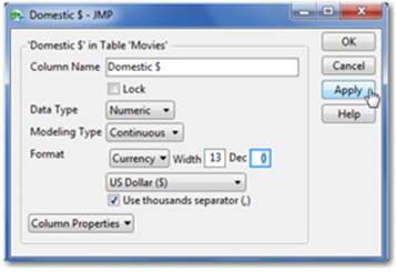
Note: This procedure applies to both Percent and Fixed Dec.
Formatting Dates, Time, and Duration
Dates are numeric values in JMP, which allows them to be transformed into other date formats and calculated for duration or elapsed time. If you are importing data that contains dates, ensure that the data type is numeric.
The Column Info (Cols ▶ Column Info) window provides the column’s information (see Figure 2.25) and several date format options, as seen on the following page. When a date is selected from the Format menu, a secondary drop-down menu for the display format appears, along with a similar drop-down menu for the input format of your imported data. The format of your imported data needs to match one of JMP’s input format options, which can then be transformed into any format among the display format options.
Figure 2.25 Column Info Window for a Date C
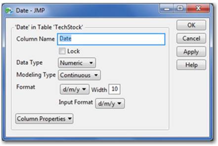
Let’s walk through a new example, TechStock, to illustrate this concept.
Example 2.3 TechStock
We will use the TechStock data table to illustrate dates in this section. This data set contains the stock price of the NASDAQ 100 (QQQ) at the high, low, and close for each trading day during the period 11/27/2000 to 2/26/2001. You can access this data set in the Sample Data folder that is installed with JMP: File ▶ Open ▶ C: ▶ Program Files ▶ SAS ▶ JMP ▶ 11 ▶ Samples ▶Data ▶ Techstock.jmp.
1. Open the TechStock.jmp data table.
2. Click on the Date column name.
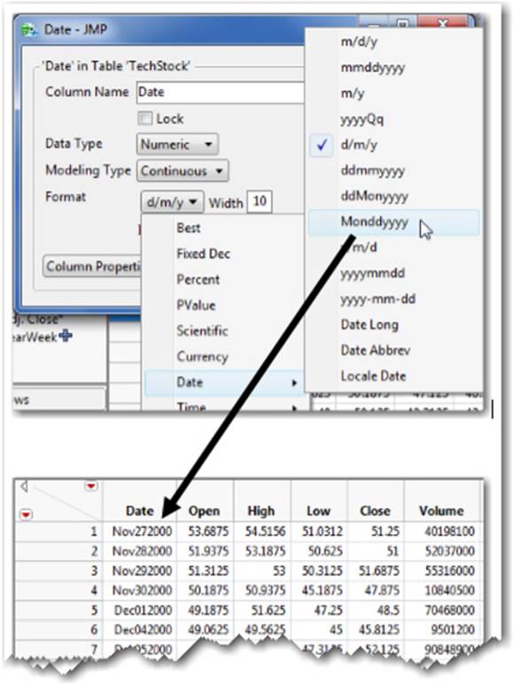
3. Select Cols ▶ Column Info. Open the Format drop-down menu and select Date, which displays how the dates will appear in the data table.
4. It is currently displayed as d/m/y (see Figure 2.26), as indicated by the check mark. Change the format to Monddyyyy. Click Apply or OK. The date is now displayed as abbreviated month, day, and year in the Date column (see lower part of Figure 2.26).
Figure 2.26 Changing the Display Format of Dates
You can also format time and duration from this window.
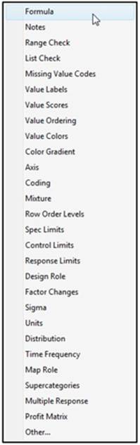
Column Properties Menu
Column Properties, another useful tool in the Column Info window (see Figure 2.27), allows you to add formulas, check ranges of values for auditing, and assign customized ordering to the data, among other tasks. These functions are described in detail in the Using JMP book (Help ▶ Books ▶ Using JMP ▶ Ch. 5 ▶ Set Column Properties).
Figure 2.27 Column Properties
Formula Editor
JMP’s formula editor is handy and flexible. Use it when you need to create a new column that contains values that are calculated or derived from existing columns in your data table. You can also transform your data, add conditional statements, and much more. Due to the advanced nature of these features, we’ll cover only the most basic features here. For more information, see Using JMP at Help ▶ Books ▶ Using JMP ▶ Ch. 5 ▶ Assign Column Properties.
One of the common operations performed with the Formula Editor is creating a new column of data that contains a calculation from existing columns. To illustrate this feature, let’s return to our Movies.jmp data table. For example, say we want to obtain the international revenues from these movies by subtracting the domestic revenues (Domestic $) from the worldwide revenues (Worldwide $).
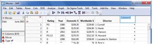
1. First, we need to create a new column. Double-click in the column head to the right of our last populated column (Director) (See Figure 2.28). Type “International $” in the heading, and press Enter. Click in the column head to highlight.
Figure 2.28 Creating a New Column
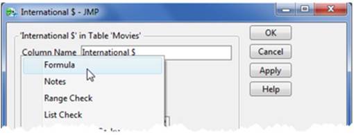
2. Select Cols ▶ Column Info. The Formula window appears in the Columns Properties menu (see Figure 2.29). Select Formula and Edit Formula. You see a list of columns or variables on the left side of the window.
Figure 2.29 Opening the Formula Editor
3. Click on the Worldwide $ column, then the “-” symbol in the center palette, and then the Domestic $ column. You see your formula take shape in the preview window* (see Figure 2.30).
Figure 2.30 Creating a Formula
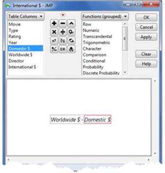
4. When you click OK, the calculated values appear in the column of your data table.
Value Ordering
Value ordering allows you to specify an order to the values of a categorical column. JMP’s built-in defaults order common ordinal columns such as months of the year or days of the week, but there are other instances when you’d like to arrange responses (values) in some logical order for graphs and analyses. For example, some surveys have a range of responses from “Not Satisfied” to “Very Satisfied,” with a few intermediate responses in between.
In the Movies.jmp data table, we want to reorder the rating of the movies to display in this order: G, PG, PG-13, and R.
1. Click on the Rating column. Select Cols ▶ Column Info, and then select Column Properties.
2. Select Value Ordering (see Figure 2.31). A new window appears with the available responses from the Rating column. Select a response and move it up or down or reverse the order, whichever is appropriate. Select Reverse for this example (see Figure 2.32).
Figure 2.31 Value Ordering--Column Properties Menu
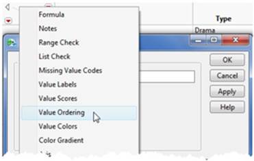
Figure 2.32 Specifying the Order of Categorical Variables
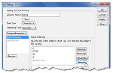
3. When you are satisfied with the order, click Apply and OK.
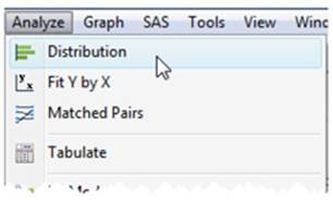
Now let’s see the results of this exercise by employing the distribution platform, which is discussed in Chapters 3 and 5. Here’s a preview:
4. Go to Analyze ▶ Distribution (see Figure 2.33).
Figure 2.33 Launching the Distribution Platform
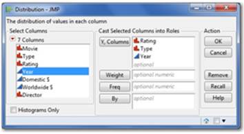
5. In the Distribution window, select Rating, Type, and Year, and click Y, Columns. Click OK (see Figure 2.34).
Figure 2.34 The Distribution Launch Dialog
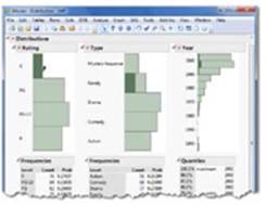
6. Three bar graphs appear side by side. Although “R” was the first response listed in the Value Ordering window, it appears last at the bottom of the Distribution graph shown at right. If we did not make this change, the order of these responses would be reversed.
7. Click on the green G bar under Rating (see Figure 2.35). The G responses are now highlighted in the G bar as well as those same responses reflected by Type and Year. This dynamic visual feature is available in all JMP graphs.
Figure 2.35 The Distribution Results Window
Recode
The Recode command is useful when you have a column of data containing values that you’d like to rename or consolidate. For example, if you have data labeled iPod, Nano, iTouch, and Shuffle, you might want to consolidate these into one response: iPod. Recoding assigns a specified new value to all of the existing responses of the original name or value.
In the Movies.jmp data table, we want to replace PG-13 movies with a PG rating because many movies made before 1985 only contained ratings of G, PG, and R.
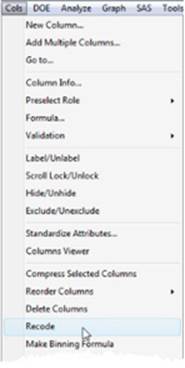
1. Select the column you want to recode, Ratings. Select Cols ▶ Recode (see Figure 2.36).
Figure 2.36 The Recode Option
2. This command generates an input window of current and unique responses, with an area to the right to specify a new value. In the box to the right of PG-13, type PG, then click OK (see Figure 2.37).
Figure 2.37 The Recode Dialog Window
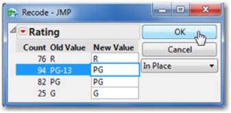
Note: Once you’ve selected a new value, you can replace that value in the same column, create a new column with these values, or even create a formula column. Be careful! If you select In Place, these values cannot be changed back because the Recode command replaces values in that column.
2.5 Selecting, Highlighting, and Filtering Data: Row States
So far we have focused on column properties; let’s now look at rows or the observations in your data. In the process of exploring or analyzing data, it is often valuable to drill-down or to see and compare subsets of your data or rows. JMP makes this task seamless and simple through a concept called Row State that assigns one or more of the following six conditions to one or more rows (or sets of observations) within a data table; Selected, Hidden, Excluded, Labeled, Marked or Colored.
• Selected will appear as a highlighted row which will correspond to a highlighted point in any corresponding graph, you can also easily subset highlighted rows.
• Hidden means that the row will not appear in any graph. A blindfold icon appears next to hidden rows because you will not see that row in any graph.
• Excluded means that the row will not be used in any calculated result. A red circle with a line through it next to its row number indicates an excluded row.
• Labels provide the columns value when the observation is selected within an appropriate graph. Labels look like a price tag and appear next to the column in the column panel.
• Markers are distinguishing symbols typically used to represent a group within a categorical variable.
• Colors are used to represent different groups in a categorical variable or as a gradient in a continuous variable within graphs. Both Colors and Markers are covered in the next section.
Figure 2.38 Row States Indicated in a Data Table
Hiding and Excluding Data: Using Data Filter
Hiding a row prevents that data from appearing in any graph (but is not excluded from any analysis). Conversely, excluding a row will remove the row from any calculated result but will still show the point in a graph. If you prefer to both hide and exclude a row, you can directly select a row or rows in your data table with your mouse, then go to Rows ▶ Hide and Exclude. This is an effective approach when you are dealing with few specific points like outliers.
When exploring data, however, it can be more efficient to hide and/or exclude entire groups or ranges within your data table, but rather than thinking about what you DON’T want to see or analyze, it is more natural to think about what you DO want to see. That is, to Show (rather than Hide) and Include (rather than Exclude).
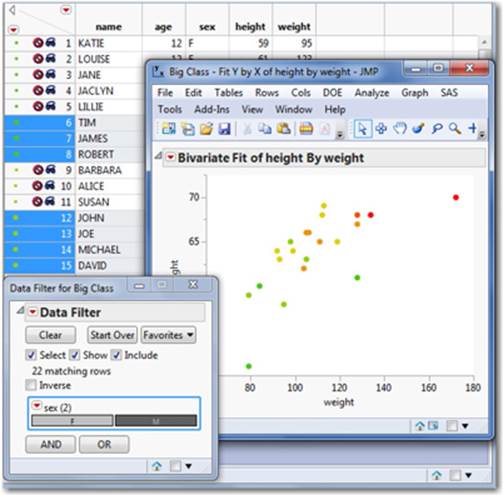
JMP’s Data Filter tool (Rows ▶ Data Filter) provides this capability and can be applied to any graph or analysis platform. The Data Filter allows you to dynamically show, include, or select groups within a column and toggle between them, or to specify a custom range within a continuous variable and create a slider to filter the graph or analysis. The Data Filter automatically hides and/or excludes values that are not selected.
In Figure 2.39, we have launched and asked the Data Filter to “Show” and “Include” the male students in our Big Class data graph. Notice that it has automatically hidden and excluded the female students in data table in the background. Data Filter will be illustrated in Chapter 6.
Figure 2.39 Using the Data Filter to Select a Group
2.6 Adding Visual Dimension to Your Data
JMP is designed to be visual. Its many useful tools help you visualize or communicate your data effectively. For example, you can use colors or unique markers to signify a range or value of another column in any appropriate graph. Any color or marker assigned to your data can be saved and used in any number of graphs. You can change these colors or markers at any time. We return to our Big Class.jmp data table to illustrate this feature:
1. The Rows menu provides access to these features. Another way to access these features is through the “Rows” red triangle in the upper left side of the data grid. (Red triangles appear throughout JMP and provide context-specific options.) In this section, we will utilize the red triangle to access these features, but note that it or the Rows menu will provide the same access (see Figure 2.40).
Figure 2.40 Color or Mark by Column
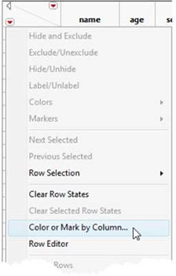
2. Select Color or Mark by Column.
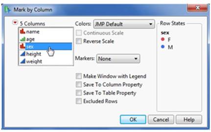
3. Select the column you’d like to distinguish with color (sex, in this example). You can see how JMP will express these values in color on the right side of the window (see Figure 2.41). Once you are satisfied, click OK and you will see colored markers preceding the row numbers in the data table.
Figure 2.41 Color by a Column
4. Alternatively in the same window, you can also distinguish points by using unique markers (for example, symbols). Like colors, unique markers can be assigned to categorical or continuous columns. Click on the Markers drop-down menu (see Figure 2.42). JMP provides many different marker types, and a submenu allows you to view and select the desired type.
Figure 2.42 Mark by a Column
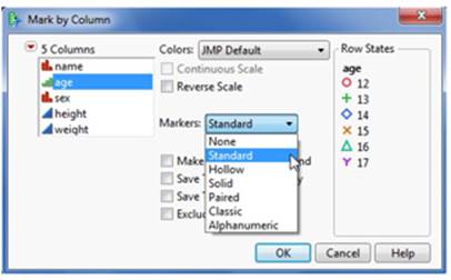
Note: You can color by one column and use distinct markers for a second column by first completing this process to apply markers on one column, then repeating this process to apply color on another column.
Adding Labels to Data
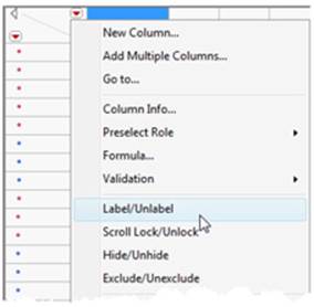
Sometimes in the process of exploring your data, it is useful to identify a point by a name, territory, or product type rather than its row number in the data table. Adding labels allows you to see these identifiers in a graph by simply clicking on a point of interest. For example, in the Big Class.jmp data table, we want to see the name of the student (rather than a row number) in a graph:
1. First, select a column by clicking on the column name in the data table. This selection activates the Label option when selecting the Columns red triangle. Select Label/Unlabel (see Figure 2.43).
Figure 2.43 Adding Labels to a Column
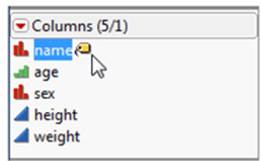
2. You then see a label or what might look like a price tag next to that column in the Columns panel of the data table (see Figure 2.44). When creating a graph, labels with the name of the student (rather than the row number) are displayed when they are selected with the mouse.
Note: You may add labels for more than one column. For example, we might want to have a label containing both the name and age of the student. Simply highlight all the columns you’d like to label first or repeat this process and add a label to “age”.
Figure 2.44 A Column to Display Labels in Graphs
2.7 Shape Files and Background Maps
Creating thematic maps is easy to do and explained step-by-step in Chapters 3 and 4. In this section, we will describe a special type of data table required to create thematic maps called shape files.
JMP includes about ten common shape files such as States and Counties of the US and Countries of the World and others. You can import or create new shape files such as sales territories, and these need not be geographic maps. Shape files could represent any space: for example, a football stadium, an assembly plant, or an office building.
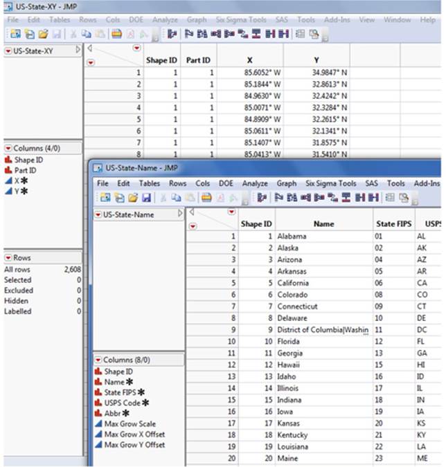
Shape files consist of two data tables, a boundary file, and a name file that share a common Shape IDs column. The boundary file (or XY file) provides the outline of the shape as a polygon that corresponds to each Shape ID. The name file provides the name (or abbreviations of the name) of the shape ID. Figure 2.45 provides an illustration of these special data tables.
Figure 2.45 Shape Files Contain Both a Name and XY Data Table
Built-in shape files are included in the Maps folder: C: ▶ Program Files ▶ SAS ▶ JMP ▶ 11 ▶ Maps. Should you wish to create or import new shape files, they must be placed in this same Maps folder.
When a column containing names (corresponding with a Shape ID) is dragged into the Shape/Map box in Graphbuilder, it will render the boundaries/shapes (see Figure 2.46).
Figure 2.46 Using Shape to Create Thematic Maps
Note: In addition to shape files, JMP contains a variety of background or reference maps that provide the base map that you can plot data upon, provided that the points you wish to plot on the background contain latitude and longitude information. OpenStreet Maps was recently added to allow you to impose points or graphs at the street address level (see section 4.2).
2.8 The Tables Menu
The Tables menu is a collection of JMP tools you’ll need to manage your data, whether you’re sorting it, transposing it, or joining multiple data tables. Put another way, if your data is not structured in a manner that fits the JMP analysis framework, you need to use these commands to improve the structure. To keep things simple, we’ll cover just a few of these features, including sorting, joining, and dealing with missing data. In this section, we learn:
• How to structure your imported data into a form you would like to see or that JMP will recognize.
• What to do when you have missing data.
Using the Big Class.jmp data table, let’s first take a quick look at the Summary option under the Tables menu. This command allows you to obtain a variety of summary statistics for any column.
• Select Tables ▶ Summary (see Figure 2.47). Choose height from Select Columns and Mean from the Statistics menu (see Figure 2.48). Click OK. This action will generate a new data table, Summary of Big Class, with a mean height of 62.6.
Figure 2.47 Summary Platform from the Tables Menu
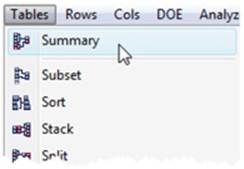
Figure 2.48 Summary Dialog Window
Sorting
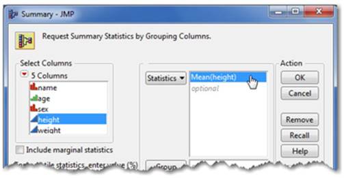
You can sort numeric columns from highest to lowest or lowest to highest. With character columns, you can sort character data by alphabetical or reverse alphabetical order. Using JMP’s sorting option keeps the rows (your sets of observations) intact. Sorting also creates a new JMP data table with the sorted values (if you check Replace table, the sorted values replace the existing data table).
1. Select Tables ▶ Sort. In the resulting window, identify which column you want to sort. Select height and click By.
2. Click on the column(s) you want to sort in the right window (height, in our example) to highlight the column.
3. Select the way you want to sort them, highest to lowest or lowest to highest, using the corresponding triangle icon (see Figure 2.49). Click OK. Each entire row is sorted according to the conditions you apply.
Figure 2.49 The Sort Launch Dialog
More information on sorting is available in Help ▶ Books ▶ Using JMP ▶ Ch. 6 Reshape Data.
Joining
The Join option from the Tables menu allows you to combine or merge two or more different data tables into one. If some of the columns in your original data have the same name and type, this is a simple process. If not, there are some handy JMP tools to help you select how two different data tables can be joined. Let’s look at a simple example:
1. First open the data tables you’d like to join. Select Tables ▶ Join.
Trial1.jmp and Trial2.jmp can be found at Help ▶ Sample Data ▶ Open the Sample Data Directory ▶ Trial1.jmp and repeat for Trial2.jmp.
2. The window indicates your active data table and prompts you to select another data table that you want to merge or join. Select the data table(s) you want to join (see Figure 2.50). The column headings of each appear in the Source Columns windows.
Figure 2.50 The Join Launch Dialog Window
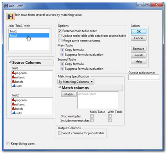
3. Decide how you want to join the data under the Matching Specification drop-down menu.
a. By Row Number joins your data side-by-side by its row number.
b. If your data has different column headings or you want to select a subset of columns, use By Matching Columns. Click on a column from each of the Source Columns windows you’d like to match and click Match. You now see each of those selected columns in the Match columns window with an “=” symbol between them.
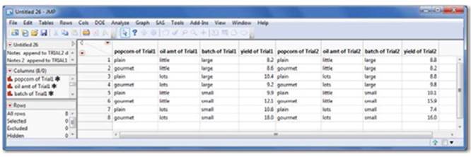
4. If you want to name the new data table, enter the name in the Output table name box (otherwise, it will be named Untitled), and click OK (see Figure 2.51). A new data table appears (see Figure 2.52).
Figure 2.51 Join by Row Number
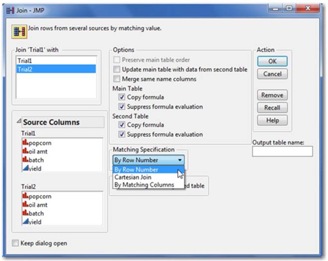
Figure 2.52 The Joined Data Table
Missing Data
The Missing Data Pattern window can help you identify the quantity of missing data or whether any patterns exist due to non- response, data importing, or data entry errors. The Missing Data Pattern feature under the Tables menu (illustrated on the left) searches your specified columns and summarizes the frequencies of missing data. To explore this feature, some values from the Big Class.jmp data table have been removed.
1. Select Tables ▶ Missing Data Pattern. This generates the window on the right (see Figure 2.53).
Figure 2.53 Missing Data Pattern Dialog
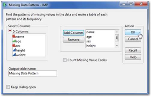
2. Select the columns in the left panel that you want to search. Select Add Columns, and then click OK.
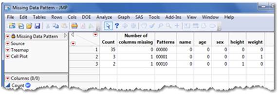
3. This command generates a new Missing Data Pattern table that contains a count of rows that have missing values and a count of rows that have the same missing values among the same column(s) (see Figure 2.54).
Figure 2.54 Missing Data Pattern Results
Note: You can proceed without addressing missing values, but JMP will by default ignore (or exclude) any rows containing missing values in most analysis platforms. JMP 11 includes “Informative Missing” options in a couple platforms that utilize rows that would otherwise be ignored (JMP Pro has this feature in several platforms). This is important if you have lots of missing data because more usable observations will generally lead to better statistical models.
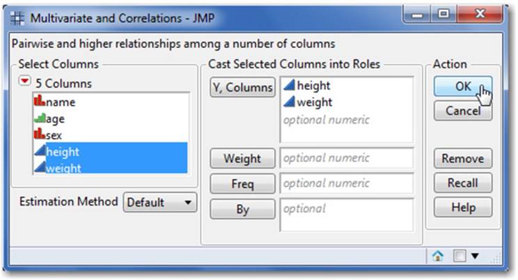
One solution to missing continuous data is to impute them. Imputing analyzes similar values in other columns and rows to estimate the missing value. JMP has an imputation feature under the red triangle within the Multivariate window. To illustrate, some values from the height and weight columns in Big Class.jmp have been removed:
1. First, run the multivariate platform. Select Analyze ▶ Multivariate Methods ▶ Multivariate. Select height and weight (the continuous columns), in the Y, Columns window, and then click OK (see Figure 2.55).
Figure 2.55 The Multivariate Platform Offers Imputation
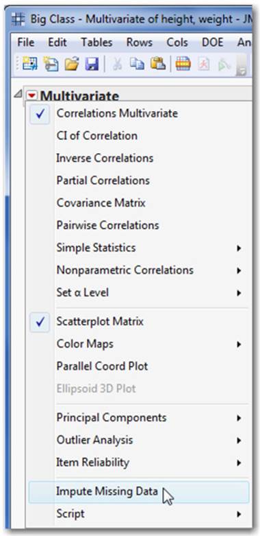
2. Click the red triangle next to Multivariate and select Impute Missing Data (see Figure 2.56). Note: Like many menu options in JMP, Impute Missing Data only appears in the menu when appropriate--in this case, when data is missing. A new data table is generated with the estimated missing values in place.
Figure 2.56 Launching the Imputation Option
3. Because you can only impute continuous values, cut and paste these columns into your original data table, which might contain other data types. (Alternatively, use Update from the Tables menu.)
Note: Methods of handling missing values are best selected with the help of an expert.
2.9 Summary
In this chapter, we covered a wide range of topics on getting your data into JMP and learning how to manage it. Because the data table not only stores your data but also stores key information that drives the appropriate analysis and graphs, it serves as the critical starting point for all exploration and visualization within JMP.
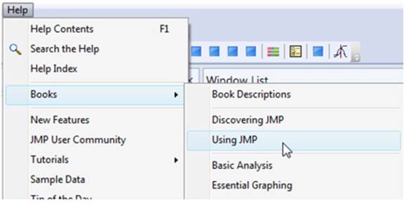
Analyzing and visualizing data often requires special features, and there are many advanced features in JMP that we didn’t address. As we’ve indicated, your copy of JMP includes extensive documentation, which you can access through the Books section under the Help menu. We recommend the Using JMP book for a complete discussion of data, data tables, and the Tables menu. Select Help ▶ Books ▶ Using JMP (see Figure 2.57).
Figure 2.57 The Using JMP Book included in Help