Pentaho Analytics for MongoDB (2014)
Chapter 8. Deploying Pentaho Analytics to the Web
The previous chapters show users how to build reports and analysis views using Pentaho Instaview and Report Designer, both of which are thick-client components. This final chapter is all about web-enabling your MongoDB data using Pentaho methods and web interfaces for connecting to and modeling and analyzing our sample clickstream data in a web browser.
The following are the topics that we will cover in this chapter:
· Publishing a Report Designer report to the Web
· An introduction to the Pentaho User Console
· Enabling your Instaview output for the Web
· Using the Data Source Wizard to model your data
· Creating Analyzer Views and Dashboard Designer dashboards
This chapter uses the Pentaho web interfaces from the Pentaho BA server installation you completed in Chapter 1, Getting Started with Pentaho and MongoDB. By the end of this chapter, you will be familiar with the web-based capabilities of the Pentaho platform and will have a couple of web-enabled analysis views combined into a single dashboard.
Publishing a Report Designer report to the Web
Pentaho makes it easy to publish a PRD report to the Business Analytics (BA) server and give users web access to the report. You simply need to choose the location for the report and the default output format, and your published report definition gets stored on the BA server in the central database repository for access via a web browser. Once published, PRD reports can be run live or scheduled for consumption over the Web or via e-mail.
Publishing the clickstream report
The following steps in this exercise guide you through publishing your existing PRD report to the BA server, which allows users to run and schedule:
1. Click on the open icon on the menu toolbar or navigate to File | Open from the main menu and browse to the chapter07_clickstream_report.prpt file that you created in Chapter 7, Pentaho Report Designer Prompting and Charting.
2. From the main menu, navigate to File | Publish..., and the Login dialog box will appear.
Tip
As an alternative to the file menu publish option, there is also a handy Publish button on the main toolbar to the right-hand side of the save document icon.
3. Confirm that the URL is http://localhost:8080/pentaho and the Version is Pentaho BI-Server 5.0.
Note
This URL is the default installation path to launch the web-based Pentaho User Console. Port 8080 is the default BA Server Tomcat web server start-up port that was created in Chapter 1, Getting Started with Pentaho and MongoDB.
4. For the login information, enter admin for User:, password for Password:, and check Remember These Settings.
5. Click on OK to log in.
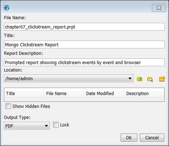
6. The Publish dialog box will appear. Enter the following information on the screen:
· Title: Mongo Clickstream Report
· Report Description: Prompted report showing clickstream events by event and browser
· Location: /home/admin
· Output Type: PDF
The following screenshot shows the entered values:
7. Click on OK to publish the report.
8. Select Yes when prompted to launch the report. The report viewer will launch the report in the PDF format inside your default web browser. Adobe Acrobat Reader is required to view PDF files.
An introduction to the Pentaho User Console
Many traditional web applications are menu-driven, with endless options to expand and navigate, making it easy to get lost in the menus and lack of perspective. Getting things done can be difficult and is intimidating for business users that crave a simple and intuitive web experience. Pentaho decided there was a better way, and built a new, modern web interface with Version 5.0. They took a successful navigation design, which started with Pentaho Mobile, and extended it into the new Pentaho User Console (PUC).
PUC is a secure, web-based interface to the BA server. It is the single location for all users to consume reports and analyze data. PUC gives power users a web-based design environment to create new analysis, interactive reports, and dashboards. In addition to the design interfaces, PUC also provides administrators with server configuration, security, and schedule management features.
PUC exposes the following web-based tools and utilities:
· Analyzer
· Interactive Reporting
· Dashboard Designer
· Data Source Wizard
· Data Source Management
· Report Schedule Management
· BA Server Administration
The following screenshot highlights the six main sections of PUC:
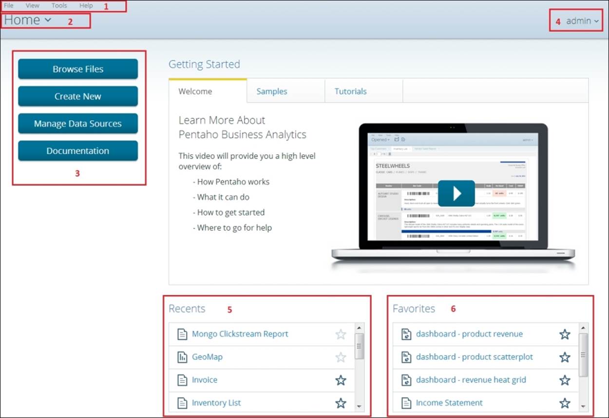
The following table provides the section name for each of the numbered squares in the preceding screenshot:
|
Section # |
Section name |
|
1 |
Main menu |
|
2 |
Perspectives |
|
3 |
Home perspective buttons |
|
4 |
Current login username |
|
5 |
Current user's recent activity |
|
6 |
Current user's favorite reports |
When you log in to PUC, your initial, default page is the Home perspective. The Home perspective provides quick access to common actions, recently viewed content, and your favorite content. The Getting Started section at the top is a place for new users to browse sample reports, analysis views, dashboards, and to watch video tutorials.
In addition to the Home perspective, there are four other perspectives in PUC including: Browse Files, Opened, Schedules, and Administration. Perspectives focus the screen on the task at hand and remove the distraction of having too many objects on your page. For example, you can have multiple reports open and accessible in the Open perspective, while simultaneously browsing files in the Browse perspective.
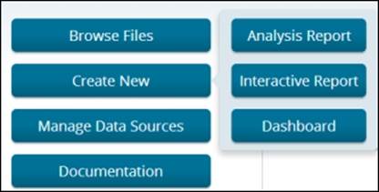
Information consumers frequently browse for report files and perform report actions on those files, such as cut-copy-paste, report execution, and report scheduling. The Browse Files button, as shown in the following screenshot, launches the browse files perspective and focuses the screen on browsing for directories and a series of file actions. The Create New button is the entry point into the web-based design tools by giving you the choice to launch into Analyzer, Interactive Reporting, and Dashboard Designer.
Running and scheduling the clickstream report
The following steps will have you browse to and open your recently published clickstream report and create a personal report schedule:
1. Launch a web browser and enter the URL http:/localhost:8080/pentaho to launch PUC.
2. Select Login as an Evaluator and click on the GO button.
3. After PUC loads, click on the Browse Files button and navigate to Home | admin.
4. Click on Mongo Clickstream Report to highlight it and notice the File Actions section that appears to the right.
5. From the list of File Actions, select Open to run the report. The report executes and renders a PDF report on a new tab in the Opened perspective. The report will run automatically when you select different prompt values.
6. After reviewing your report, close the report by clicking on the X icon on the report tab. This returns you to the Home perspective.
7. Click on Browse Files again, and Pentaho remembers your previous browsing session and returns you to the admin folder with the clickstream report automatically highlighted.
8. From the list of File Actions, select Schedule. The Schedule wizard appears to assist in creating a personal report schedule for the clickstream report.
9. Under Schedule Name type Clickstream Report.
Note
Generated Content Location is the directory where your generated report will reside. You will notice that your home directory, /home/admin, is selected by default.
10. Select the Next button twice to get to the Parameters step.
11. Select www.abc.com from the Select Referring URL drop-down list.
12. Select PDF from the Output Type drop-down list and then click on OK.
Note
Within the PUC Administration perspective, you can configure Pentaho to communicate with a mail server. If you have a mail server configured, the next step in the Schedule wizard offers the ability to set up an e-mail distribution list for this report schedule; however, because it is not configured, the wizard will end and prompt you to view your newly created schedule in the Schedules perspective.
13. Select Yes when prompted to view your list of schedules. PUC will launch you into the Schedules perspective to manage your personal report schedules.
14. In the Schedule Name column click on the Clickstream Report row to highlight it.
Note
A set of toolbar icons at the top-right corner of your screen allows you to execute, edit, or delete the highlighted report schedule:
![]()
Keep in mind that when you create a recurring schedule, the server will continue to run that schedule into the future. Each time the report schedule runs, the report's output is loaded to the BA server repository. Over time, the report output files can grow large and consume too much unnecessary space in the repository. It is a good idea to delete any schedules you create for practice. To delete the Clickstream Report, select it from the list of schedules and click on the blue X icon to delete it. Additionally, the Administrationperspective allows administrators to schedule the deletion of report output files that are older than a specified number of days.
Enabling your Instaview output for the Web
Instaview is a client-based analysis tool for single-user, agile development and analysis. Pentaho Analyzer is the OLAP analysis component embedded inside of Instaview. Analyzer works and performs well on MongoDB data because of Instaview's in-memory data cache mechanism. However, this local cache is not accessible to the BA server, so to enable web-based OLAP analysis on MongoDB data, we need to load the appropriate MongoDB data into a JDBC-compliant relational or analytical database.
If you remember, in Chapter 3, Using Pentaho Instaview, and Chapter 4, Modifying and Enhancing Instaview Transformations, Instaview automatically generated a data integration transformation, and we enhanced it to blend geographic data with MongoDB clickstream data. We want to leverage this valuable data integration work to avoid creating a new transformation from scratch. This section shows how Instaview can enable an agile development and analysis environment for users to quickly create initial analytical models that serve as a "head start" for production deployments to the Web.
We learned in Chapter 4, Modifying and Enhancing Instaview Transformations, that the Instaview build process creates a PDI transformation file to read MongoDB data, transform the data, and load the data to an in-memory cache for analysis. Instaview also gives users the ability to modify the underlying PDI transformation that is automatically generated during the initial data load process. In this section, we create a copy of that transformation and modify the output step to load to a PostgreSQL database that ships and installs automatically during the Pentaho graphical installer process.
Copying and modifying the Instaview transformation
We need to reopen our Instaview file to get access to its underlying PDI transformation. To open a saved Instaview, launch Instaview, and on the Welcome screen you will see an Open Existing button. Click on Open Existing and choose the ClickstreamInstaview you created.
1. Once in Instaview, a PDI transformation can be edited or copied by clicking on Edit in the Data Integration section of Instaview.
Note
The data integration Edit hyperlink takes you to the Data Integration perspective of PDI with the full set of available steps for creating powerful transformations. The opened transformation that you see retrieves data from MongoDB, joins the zip code data, and loads the blended data into an in-memory database for analysis.
2. From the PDI main menu, select File | Save as… and save the transformation as t_postgres_load in the Chapter 08 directory.
3. Delete the Output step on the canvas by right-clicking on it and selecting the Delete step from the menu. This deletes the Output step and the hop connected to it.
4. Under the Design tab, type table into the Steps search box and find the Table output step from the list of steps.
5. Select and drag the Table output step onto the canvas.
6. Select the Do Not Edit and Table output steps using the Lasso tool to highlight them both.
7. Right-click on one of the highlighted steps and select New Hop from the menu.
8. Make sure the From step is set to Do Not Edit and the To step is set to Table output, and then click on OK.
9. Double-click on the Table output step to edit the properties.
10. Create a new PostgreSQL database connection by clicking on the New button for Connection. This will open the Database Connection box that is used to configure your database connection.
11. In the Database Connection dialog box, fill in the information as shown:
· Connection Name: pentaho_chapter08
· Connection Type: PostgreSQL
· Host Name: localhost
· Database Name: hibernate
· Port Number: 5432
· User Name: hibuser
· Password: password
Note
The default port number for PostgreSQL is 5432. However, if PostgreSQL was already installed on your machine prior to the installation of Pentaho, you will have two instances of PostgreSQL running, and the Pentaho version will run by default on the next available number, port 5433.
The hibernate database is one of the three Pentaho BA repository databases created in PostgreSQL by Pentaho. Hibernate holds data related to audit logging. We use this database for this training exercise to reduce setup time and complexity; however, it is not recommended to use any of the BA server repository databases for storing external reporting data. Additionally, you are welcome to modify the target database connection to load to other relational database platforms or databases.
12. Your Database Connection dialog box should match the following screenshot:
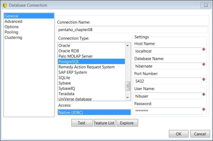
13. Click on the Test button and confirm that the test results show Connection to database [pentaho_chapter08] is OK.
14. Click on OK twice to return to the Table output properties dialog.
15. For Target table name enter mongo_clickstream.
16. Select Truncate table.
17. Click on the SQL button at the bottom of the dialog box to generate the mongo_clickstream table in PostgreSQL. The Simple SQL editor dialog will launch and show the generated SQL as follows:
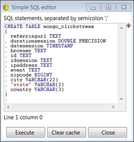
18. Click on the Execute button, and the results appear with a confirmation of the SQL executed on the PostgreSQL database.
19. Click on OK to close the results page, and then click on Close to return to the Table output properties dialog box.
20. Click on OK to return to the main canvas.
21. Click on the save icon to save your work.
22. Run your transformation by navigating to Action | Run from the main menu and then clicking on the Launch button at the bottom of the Execute a transformation dialog box.
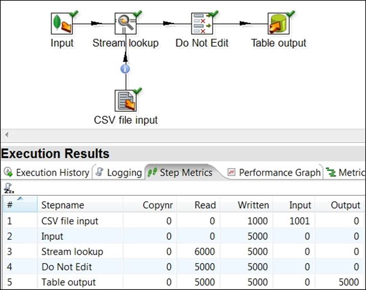
23. A successful transformation execution loads 5000 blended clickstream records to PostgreSQL, as shown in the following screenshot:
Using the Data Source Wizard to model your data
Pentaho provides a web-based Data Source Wizard in PUC to enable business users to quickly create data sources for analysis and interactive reporting. The Data Source Wizard guides you through the process of creating a connection to CSV files and JDBC-compliant data sources and creating cube and relational metadata models. The Data Source Wizard is accessed from the Manage Data Sources button on the Home perspective. Now that we have successfully loaded the blended clickstream dataset into a PostgreSQL database, we can use the wizard to access it from a browser.
Creating a JDBC connection and default metadata model
In the next exercise, we create a JDBC connection to the hibernate database and model metadata using the Data Source Wizard:
1. Launch a web browser and enter the URL http:/localhost:8080/pentaho to launch PUC.
2. Select Login as an Evaluator and Administrator, and then click on the GO button.
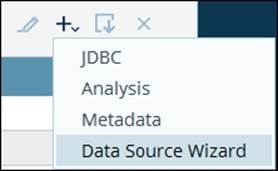
3. After PUC loads, click on the Manage Data Sources button.
4. Click on the plus icon to expand a list of data sources and select Data Source Wizard, as shown in the following screenshot:
5. Select Source Type is the first step in defining a data source. Data Source Name is the name that end users will see when creating new reports. Enter pentaho_chapter08 for Data Source Name and select Database Table(s) for Source Type.
6. The data source name is always associated with a database connection. Click on the plus icon to define the connection:

7. In the Database Connection dialog box, enter the following information:
· Connection Name: pentaho_chapter08_postgres
· Host Name: localhost
· Database Type: PostgreSQL
· Database Name: hibernate
· Port Number: 5432
· User Name: hibuser
· Password: password
8. Click on the Test button and confirm that the test results show Connection to database [pentaho_chapter08_postgres] is OK.
9. Click on OK twice to return to the Data Source Wizard. The new pentaho_chapter08_postgres data source will be highlighted in the Connection list.
10. In the Create data source for section at the bottom of the dialog box, select Reporting and Analysis.
11. Click on the Next button to proceed to the next step.
12. For the Select Tables step, click on the Schema dropdown and select public.
13. Select "public"."mongo_clickstream" from the updated list of Available Tables and then click on the right arrow icon to add it to the Selected Tables list.
14. Select "public"."mongo_clickstream" from the updated Fact Table list below.
15. Click on the Finish button to create the data source and default metadata model.
16. When prompted to customize the model, select Customize model now and then click on OK.
Customizing the metadata model
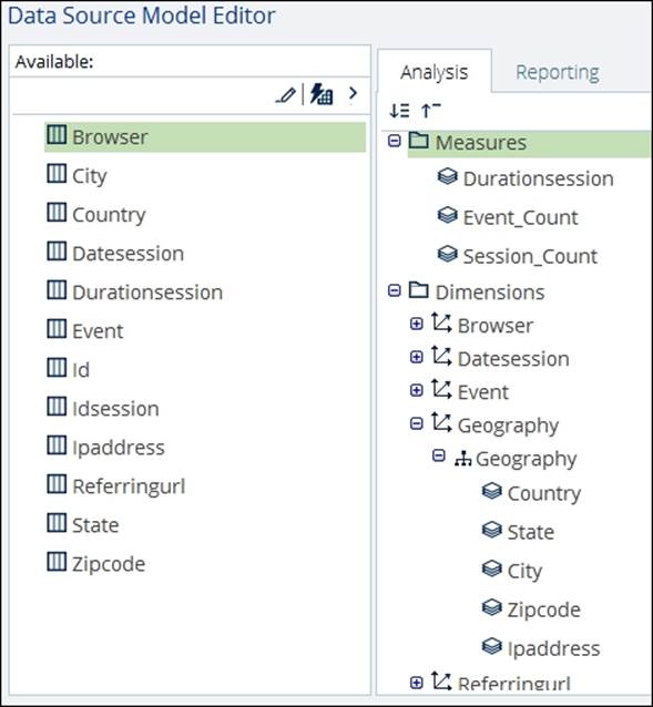
At this point, you should be at the Data Source Model Editor step of the Data Source Wizard. The model editor has three main sections for defining your model. You can drag-and-drop fields from the Available fields section on the left-hand side to the Analysisand Reporting modeling tabs section in the middle. You can also drag-and-drop existing model elements within the Metadata Models section to rearrange and design analysis and reporting models. The following screenshot highlights the three main sections of theData Source Model Editor:
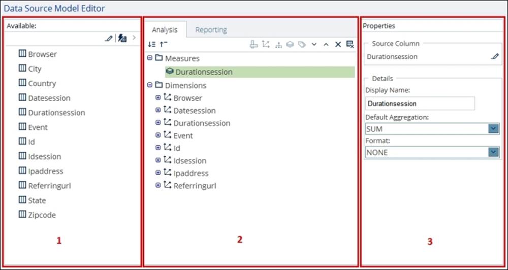
The following table provides the section name for each of the numbered squares in the previous screenshot:
|
Section # |
Section name |
|
1 |
Available data source fields |
|
2 |
Analysis and reporting metadata models |
|
3 |
Model element properties |
The steps of the following exercise will guide you through the process of making changes to the default cube model:
1. On the Reporting tab, highlight the Durationsession measure, and then select a Default Aggregation of AVERAGE in the Properties section.
2. On the Analysis tab, highlight the Durationsession dimension and click on the X icon to delete it.
3. On the Analysis tab, highlight the Id dimension and click on the X icon to delete it.
4. On the Analysis tab, highlight the Idsession dimension and click on the X icon to delete it.
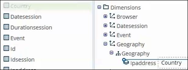
5. On the Analysis tab, highlight the Ipaddress dimension, and in the Properties section's Dimension Name entry box, rename Ipaddress to Geography.
6. Click on the Geography dimension's plus icon (+) to expand to the nested Ipaddress hierarchy.
7. Select the Ipaddress hierarchy and rename Ipaddress to Geography.
8. Click on the Geography hierarchy plus icon (+) to expand to the nested Ipaddress level.
9. Select and drag Country from the Available section to the precise area directly above the Ipaddress dimension level, as shown in the following screenshot:
Note
You can add fields as new hierarchies or new levels within an existing dimension. When dragging-and-dropping fields into a dimension as a new level, it is important to have the horizontal blue line appear directly over the level name and indented exactly, as shown in the previous screenshot. To have a field added as a new hierarchy instead of a level, the blue line should appear less indented.
10. With the Country level highlighted, change the value of Geography Type on the Properties section to Country.
11. Select and drag State from the Available section to the precise area directly above the Ipaddress dimension level.
12. With the State level highlighted, change the value of Geography Type on the Properties section to State.
13. Select and drag City from the Available section to the precise area directly above the Ipaddress dimension level.
14. With the City level highlighted, change the value of Geography Type on the Properties section to City.
15. Select and drag Zipcode from the Available section to the precise area directly above the Ipaddress dimension level.
16. With the Zipcode level highlighted, change the value of Geography Type on the Properties section to Postal Code.
17. To create a new measure to count events, select and drag Event from the Available section to the Measures folder on the Analysis tab.
18. With the Event measure highlighted, change the value of Display Name on the Properties section to Event_Count.
19. To create a new measure for counting sessions, select and drag Idsession from the Available section to the Measures folder on the Analysis tab.
20. With the Idsession measure highlighted, change the value of Display Name on the Properties section to Session_Count and Default Aggregation to COUNT_DISTINCT.
21. Compare your analysis model changes to the following screenshot:
22. Click on OK to complete your customized model and return to the Data Sources management utility.
23. Scroll through the data source list to locate the following two new entries:
· JDBC: pentaho_chapter08_postgres
· Data Source Wizard: pentaho_chapter08
Note
If you need to edit either data source entry, just highlight the entry and click on the pencil icon to make changes.
24. Click on the Close button to return to the PUC Home perspective.
Creating Analyzer Views and Dashboard Designer dashboards
By now, you must be familiar with Pentaho Analyzer because we used it within Instaview to create visualizations against Instaview's in-memory database. The only difference here is that we can now use Analyzer within a web browser to access our blended clickstream data that was loaded to a PostgreSQL database. In this last section, we create two new Analyzer views and save them to the BA server. Once saved, the Analyzer views are assembled into a two-pane Dashboard Designer dashboard.
Creating a map view in Analyzer
The following steps of the exercise will guide you through creating a Geo Map with Analyzer to view the number of web events and average session duration by country:
1. Make sure you are connected to the Internet so the Google mapping feature will work.
2. From the PUC Home perspective, click on the Create New button and then on the Analysis Report button.
3. When prompted to select a data source, scroll down the Data Sources list, select pentaho_chapter08: pentaho_chapter08, and then click on OK.
4. Drag Event_Count, to the Measures drop zone in the Layout section.
5. Drag Country to the Rows drop zone in the Layout section.
6. Drag State to the Rows drop zone in the Layout section.
7. In the View As section, click on the dropdown next to the chart icon and select Geo Map, as shown:
![]()
8. To filter Hawaii out of the map view, click on the red circle over Hawaii to highlight it and then select the Exclude button from the filter menu that appears at the top of the map.
9. Expand the small plus icon on the right edge of the map and select the Google Physical base layer.
10. Drag Durationsession to the Size By drop zone in the Layout section. Your resulting map should resemble the following screenshot:
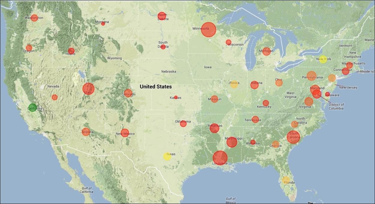
11. The resulting Google Map shown in the preceding screenshot reveals that users in California are driving the most site visits, while Minnesota and Louisiana users have the highest average session duration.
12. Click on the Save icon from the toolbar and save the view as Chapter08-GeoMap in the default /home/admin location.
13. Click on the Save button to return to the saved view.
Creating a heat grid in Analyzer
The steps of this exercise will guide you through modifying the Geo Map to create a Heat Grid with Analyzer to view the number of web events and average session duration by country.
1. Make sure you still have the Chapter08-GeoMap view open from the previous exercise.
2. In the View As section, click on the table icon to return to a table view.
![]()
3. Right-click on the Country column header and select Remove from Report.
4. Right-click on the State column header and select Remove from Report.
5. In the View As section, click on the dropdown next to the chart icon and select Heat Grid.
6. Drag Referringurl to the X-axis drop zone in the Layout section.
7. Drag Browser to the X-axis drop zone in the Layout section and place it directly beneath Referringurl.
8. Drag Event to the Y-axis drop zone in the Layout section.
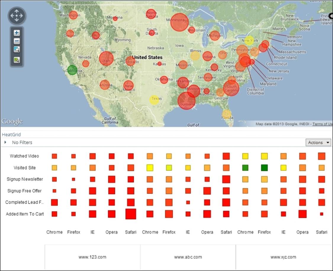
9. Compare your heat grid to the following screenshot:
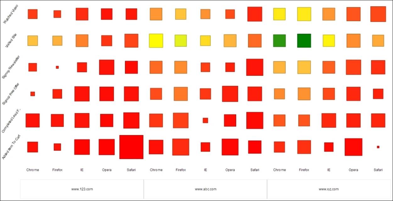
10. The resulting heat grid shown in the previous screenshot reveals that www.xyz.com is driving the most site visits from Chrome and Firefox users, while www.123.com is resulting in the highest average session duration from Safari users.
11. Click on the Save As icon from the toolbar and save the view as Chapter08-HeatGrid in the default /home/admin location.
12. Click on the Save button to return to the saved view.
13. Close the view by clicking on the X icon on the View tab:
Creating a dashboard using Dashboard Designer
Dashboard Designer gives business users the power to easily assemble their own dashboards. The web-based GUI guides users through the process of choosing a layout template, style theme, and the content for display. Dashboard Designer is best suited for displaying content from Analyzer, Interactive Reporting, or Report Designer; however, it can also natively generate its own charts and data tables or link to external web pages.
In this final exercise, you create a simple dashboard using the map and heat grid from the previous two Analyzer exercises. Perform the following steps to create a dashboard using Dashboard Designer:
1. From the PUC Home perspective, click on the Create New button, and then click on the Dashboard button. This will launch Dashboard Designer.
2. On the Templates tab at the bottom of Dashboard Designer, select the 1 over 1 template consisting of two dashboard panes stacked vertically.
3. In the Browse section on the left-hand side of your screen, expand the Home folder and select the admin folder.
4. The two Analyzer views created in the previous exercises appear in the Files section below the Browse section. Select the Chapter08-GeoMap view and drag it into the top dashboard pane called Untitled 1.
5. In the Title section, rename Untitled 1 to GeoMap and click on the Apply button.
6. Select the Chapter08-HeatGrid view and drag it into the bottom dashboard pane called Untitled 2.
7. In the Title section, rename Untitled 2 to HeatGrid and click on the Apply button.
8. Click on the Save icon from the toolbar and save the view as Chapter08-Dashboard in the default /home/admin location.
9. In the top toolbar section, click on the pencil icon ![]() to leave the edit mode and view your dashboard.
to leave the edit mode and view your dashboard.
10. Compare your dashboard to the following screenshot:
Summary
Congratulations on finishing this book and learning how to get the most of your MongoDB data with Pentaho Business Analytics! This chapter provided an introduction to Pentaho's web-based reporting and analysis capabilities for MongoDB. You are now familiar with the interfaces for connecting to, modeling, and analyzing blended MongoDB clickstream data from a web browser.
Keep in mind that we did not cover Pentaho Metadata, Pentaho Interactive Reporting, and Pentaho Mobile, or discuss the several tools and add-ins available for Pentaho Business Analytics or MongoDB. There are also many more exciting and powerful features of MongoDB, Pentaho Analyzer, and Dashboard Designer that could not be included in this book. You are encouraged to use this book as a starting point and then continue to expand your knowledge of both Pentaho and MongoDB by exploring the product documentation online at infocenter.pentaho.com and docs.mongodb.org, and by attending classroom training for both MongoDB and Pentaho.