Pentaho Analytics for MongoDB (2014)
Chapter 7. Pentaho Report Designer Prompting and Charting
The previous chapter introduced Pentaho Report Designer (PRD) by showing you how to build a simple, single-query report on the MongoDB clickstream data. Now we are going to learn some additional advanced features to enhance your report with new queries, charts, and a report prompt.
The following are the topics that we will cover in this chapter:
· Adding additional MongoDB queries
· Visualizing your data with charts
· Creating a report prompt
By the end of this chapter, you will have finished development for a professional-looking clickstream analytics report that produces queries directly from MongoDB data.
Adding additional MongoDB queries
PRD can execute multiple simultaneous queries against MongoDB. Each query can be used to populate different metrics, tables, or charts. This is an important feature when you need an operational dashboard or a briefing-book-style report with multiple views of data sourced from different data sources. Our report specifications, listed as follows, call for a dashboard-style report showing event count totals:
· Displayed as summary metrics at the top of the report
· Sorted by event_type and displayed in a column chart
· Sorted by browser and displayed in a bar chart
The PRD report you created in Chapter 6, Pentaho Report Designer Fundamentals, named chapter06_clickstream_report.prpt, has an existing MongoDB dataset connection and query. The existing query, metrics_summary_query, is used to populate the message and number-fields. In this section, we create two additional queries to populate the column and bar charts.
Adding a bar chart query
The following steps in this exercise will guide you through adding a query for the count of events by event type:
1. If you are on the Welcome screen, close it to return to the main window.
2. Click the open icon on the menu toolbar or navigate to File | Open from the main menu and browse for the chapter06_clickstream_report.prpt file that you created in Chapter 6, Pentaho Report Designer Fundamentals.
3. Click on the Data tab, right-click on the existing MongoDB dataset, and select Edit Datasource from the list.
4. While in the MongoDB Data Source dialog box, click on the green circle with a plus symbol to add a new query.
5. Rename Query 1 to bar_chart_query.
6. We now need to complete the four data source tabs starting with the Configure connection tab. Type localhost for Host name and 27017 for Port.
7. On the Input Options tab, click on Get DBs and select pentaho from the list of databases.
8. Click on Get collections and select sessions_events from the list of collections.
9. On the Query tab, type or paste the following query into the Query expression input box. This query is located in the code files provided with this book so that you can copy and paste the code:
10.{ $unwind : "$event_data" },
11.{ $group : { _id : "$event_data.event", event_count : { $sum : 1 } } },
{$sort:{event_count: -1}}
12. Be sure to check the Query is aggregation pipeline option.
13. On the Fields tab, click on Get fields. Pentaho will scan the sessions_events collection to detect the collection schema and parse the document fields defined by the query.
14. In the Name column, rename _id to event_type.
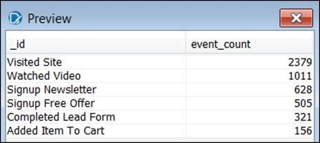
15. Click on the Preview button to run the query and view the results. Your query results should match the numbers shown in the following screenshot:
16. Click on OK to return to the workspace.
17. Navigate to File | Save As and save an updated copy as chapter07_clickstream_report.
Note
On the Data tab, notice that the MongoDB dataset now contains two queries.
Adding a pie chart query
The following steps in this exercise will guide you through adding a query for the count of events by the web browser type:
1. Click on the Data tab, right-click on the existing MongoDB dataset, and select Edit Datasource from the list.
2. While in the MongoDB Data Source dialog box, click on the green circle with a plus symbol to add a new query.
3. Rename Query 1 to pie_chart_query.
4. We now need to complete the four data source tabs starting with the Configure connection tab. Type localhost for Host name and 27017 for Port.
5. On the Input Options tab, click on Get DBs and select pentaho from the list of databases.
6. Click on Get collections and select sessions_events from the list of collections.
7. On the Query tab, type or paste the following query into the Query expression input box. This query is located in the code files provided with this book so that you can copy and paste the code:
8. { $unwind : "$event_data" },
9. { $group : { _id : "$browser", event_count : { $sum : 1 } } },
{$sort:{event_count: -1}}
10. Be sure to check the Query is aggregation pipeline option.
11. On the Fields tab, click on Get fields. Pentaho will scan the sessions_events collection to detect the collection schema and parse the document fields defined by the query.
12. In the Name column, rename _id to browser.
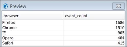
13. Click on the Preview button to run the query and view the results. Your query results should match the numbers in the following screenshot:
14. Click on OK to return to the workspace.
15. Click on the save icon to save your work.
Note
On the Data tab, notice the MongoDB dataset now contains three queries.
Visualizing your data with charts
Charts are a powerful feature for visualizing data, and PRD provides two types of charts: JFreeChart and sparkline charts. JFreeChart is a Java chart library with support for a wide range of chart types. There are 17 JFreeChart chart types available in PRD.
JFreeChart chart types
The following chart types are included out of the box in PRD.
· Bar
· Line
· Area
· Pie
· Multi-Pie
· Bar Line Combination
· Ring
· Bubble
· Scatter Plot
· XY Bar
· XY Line
· XY Area
· Extended XY Line Chart
· Waterfall
· Radar
· XY Area Line
Subreports
All charts are query-driven, and the bar and pie charts we develop will each require separate queries; however, the Master Report can only be associated with one query. Subreports are an important PRD feature because each subreport can be tied to a separate data source and query. A PRD report can contain an unlimited number of subreports, giving you the flexibility to design reports that contain multiple data points and visualizations. The clickstream Master Report is already associated with the metrics_summary_queryquery.
Note
The Master Report query can be changed by highlighting Master Report in the Structure tab and selecting a query from the Value dropdown in the Attributes tab.
We are required to add two subreports, one for each chart, because the charts are driven by two separate queries.
When you add a subreport to your Master Report, PRD will prompt you to choose between an inline or banded subreport element and pick a query to associate with that subreport. Inline subreports can be placed beside other elements, while banded subreportsoccupy 100 percent of the page width.
Chart data collectors and properties
After adding a subreport to your Master Report, you can then double-click on the subreport element to open it as another tab. This second tab is where you will add a chart. Once added, the Edit Chart dialog box presents several chart types and chart configuration options. Each chart type is associated with one or more data collectors that have different customizable properties. The following screenshot shows the main sections of the Edit Chart dialog box:
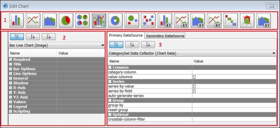
The following table lists the numbered sections of the preceding screenshot:
|
Section # |
Section name |
|
1 |
Chart Types |
|
2 |
Chart Properties |
|
3 |
Data Collectors |
Data Collectors limit your query to the columns needed for the chart, and they specify which query fields to use for chart categories, XY axis values, and series values. The typical workflow in the Edit Chart dialog box is as follows:
1. Choose a chart type.
2. Configure the data collector.
3. Preview the chart.
4. Iterate between preview and chart properties to customize the chart.
5. The following two sections step you through this workflow to add a bar chart and pie chart to your report.
Creating a bar chart
The following steps of this exercise will guide you through adding a bar chart that shows the count of events by the event type:
1. Open the chapter07_clickstream_report PRD file that you saved in the previous section.
2. Click on the subreport icon from the palette on the left-hand side and drag it directly below the Visits metric on the Details band.
3. Select Inline when prompted to choose a subreport type.
4. Select bar_chart_query when prompted by the Select Data Source dialog box.
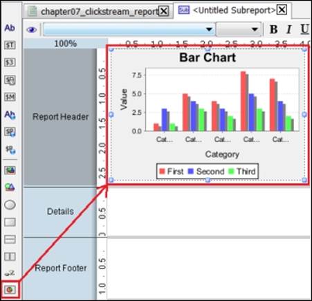
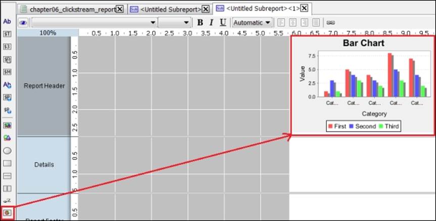
5. After choosing a query, a new tab, <Untitled Subreport>, will open. Click on the chart icon from the palette on the left-hand side and drag it onto the subreport Report Header band, as shown in the following screenshot:
Note
Subreports added to the Report Header, Report Footer, or No Data band will be executed once by the Master Report. Subreports added to the Group Header or Group Footer bands will be executed each time they are displayed. Subreports added to the Details band will be executed once for each row in the Master Report data source.
6. Double-click on the Bar Chart element you just added and the Edit Chart dialog box will appear. The Primary DataSource tab contains two Data Collector properties, category-column and value-columns, that you assign to query fields.
7. Select the Value field for category-column and choose the event_type field from the drop-down menu.
8. Select the Value field for value-columns and then click on the edit button to open the Edit Array dialog box.
9. Select event_count from the Available Items section and click on the add items arrow to add event_count to the Selected Items section.
10. Click on OK and make sure your Data Collector properties match the next screenshot:
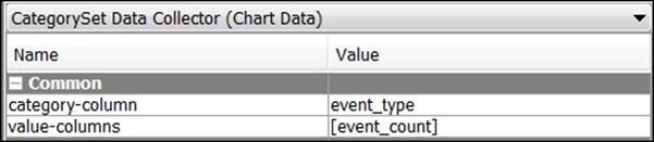
11. Click on OK again to close the Edit Chart dialog and return to your report.
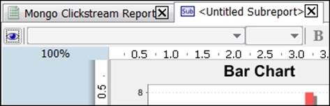
12. Click the eye icon on the tab toolbar to preview your report with the new bar chart. You should see a chart image that resembles the following screenshot:
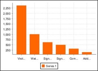
Modifying bar chart properties
As you can see from the previous screenshot, we need to make a few cosmetic changes to the bar chart. The remaining steps have you set chart properties to change the bar color, remove the legend, and rotate the bars horizontally:
1. Click on the pencil icon on the tab toolbar to return to the report edit mode.
2. Double-click on the Bar Chart element to return to the Edit Chart dialog box. The Bar Chart (Image) section contains the following properties to make the required changes: horizontal, series-color, and show-legend.
3. Select the Value field for the horizontal property and choose True from the drop-down menu.
4. Select the Value field for the series-color property and then click on the edit button to open the Edit Array dialog box.
5. In the Selected Items section, select the green color to match the MongoDB logo. Click on the yellow Move Up arrow to move your selected color to the top of the list and then click on the OK button.
6. Scroll to the bottom of the properties list to the Legend category. Select the Value field for the show-legend property and choose False from the drop-down menu.
7. Click on the eye icon on the tab toolbar to preview your report with the new bar chart. You should see a chart image that resembles the following screenshot:
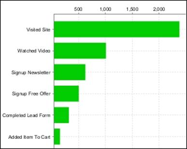
8. Click on the save icon to save your work.
Tip
You can resize both the chart and subreport elements to achieve the appropriate chart location, alignment, and sizing. It takes a little practice to get used to how the subreport sizing impacts the chart and vice versa.
Creating a pie chart
The following steps in this exercise will guide you through adding a pie chart that shows the count of events by the web browser type:
1. Open the chapter07_clickstream_report PRD file that you saved in the previous section.
2. Click on the subreport icon from the palette on the left-hand side and drag it directly below the Purchases metric on the Details band.
3. Select Inline when prompted to choose a subreport type.
4. Select pie_chart_query when prompted by the Select Data Source dialog box.
5. After choosing a query, a third tab, <Untitled Subreport><1>, will open. Click on the chart icon from the palette on the left-hand side and drag it onto the new subreport's Report Header band, as shown in the following screenshot:
6. Double-click on the Bar Chart element you just added and the Edit Chart dialog box will appear.
7. Select Pie Chart from the chart type menu.
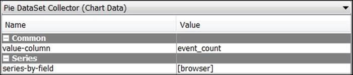
8. The Primary DataSource tab contains two Pie DataSet Collector properties, value-column and series-by-field, to assign to query fields.
9. Select the Value field for value-column and choose the event_count field from the drop-down menu.
10. Select the Value field for series-by-field and then click on the edit button to open the Edit Array dialog box.
11. Select browser from the Available Items section and click on the add items arrow to add it to the Selected Items section.
12. Click on OK and you will see a list of Pie DataSet Collector properties similar to the following screenshot:
13. The Pie Chart (Image) section contains the legend-border property removing the pie chart legend border. Scroll to the Legend properties category, select the Value field for the legend-border property, and then select False from the drop-down menu.
14. Click on OK again to close the Edit Chart dialog and return to your report.
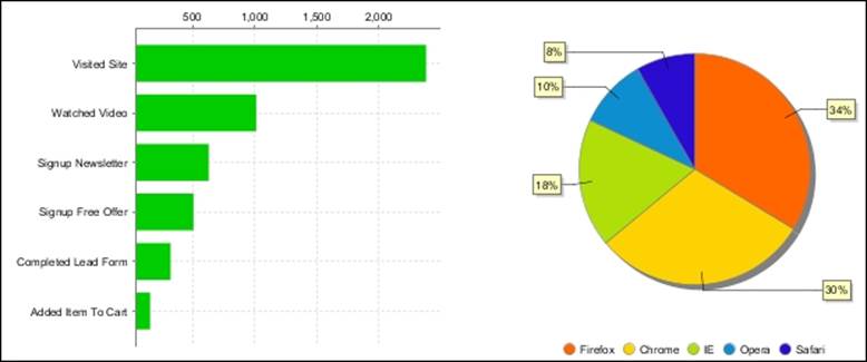
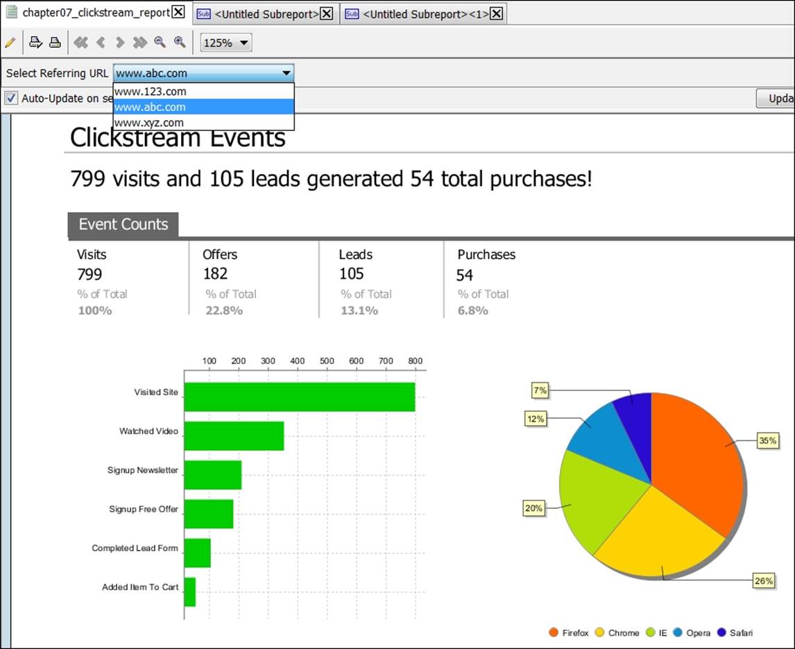
15. Click on the eye icon on the tab toolbar to preview your report with the new bar chart. You should see two chart images similar the following screenshot:
16. Click on the save icon to save your work.
Creating a report prompt
Prompts and parameterization can be used to create more flexible and dynamic PRD reports. Report prompts allow a user to filter report data based on values selected or entered in the prompt display. Query parameters accept the prompt values selected by the user and use those values to filter the report data. PRD offers different prompt display types including: value lists, radio buttons, checkboxes, selection buttons, textbox, textarea, and date picker. Prompt values can be driven by static tables or dynamic queries.
Our clickstream data contains the referring_url field with values for three referring websites: www.123.com, www.abc.com, and www.xyz.com. We want to give users the ability to filter the clickstream report by the referring website. In this section, we enhance our existing report by adding a list prompt sourced by a MongoDB query on referring_url.
Creating a new parameter
The first step is to define a new parameter. Parameters are defined in the Parameters section of the Data tab. When you add a new parameter, the Add Parameter dialog box opens with options for defining a parameter, creating a prompt query, and configuring the prompt display. Perform the following steps to create a new parameter:
1. Make sure you are on the Master Report tab, and click on the Data tab and scroll to the Parameters section at the bottom.
2. Right-click on Parameters and select Add Parameter.
3. Once in the Add Parameter dialog box, click on the green circle with a plus symbol and select MongoDB from the list. This will launch the MongoDB Data Source dialog box.
4. Click on the green circle with a plus symbol to add a new query.
5. Rename Query 1 to referringurl_prompt.
6. We now need to complete the four data source tabs starting with the Configure connection tab. Type localhost for Host name and 27017 for Port.
7. On the Input Options tab, click on Get DBs and select pentaho from the list of databases.
8. Click on Get collections and select sessions_events from the list of collections.
9. On the Query tab, type or paste the following query into the Query expression input box. This query is located in the code files provided with this book so that you can copy and paste the code:
10.{$group: {_id:"$referring_url"}},
{$sort:{_id:1}}
11. Be sure to check the Query is aggregation pipeline option.
12. On the Fields tab, click on Get fields. Pentaho will scan the sessions_events collection to detect the collection schema and parse the document fields defined by the query.
13. In the Name column, rename _id to referring_url.
14. Click on the Preview button to run the query and view the results. Your query results should match the numbers given in the following screenshot:
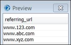
15. Close the Preview box and click on OK to return to the workspace.
Note
On the Data tab, notice that the MongoDB dataset now contains four queries.
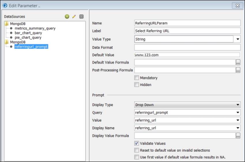
16. Select the new referringurl_prompt query from the list.
17. Complete the parameter and prompt fields as follows:
1. In the Name field, enter ReferringURLParam. This is the parameter name that will be used to filter the report queries.
2. In the Label field, enter Select a Referring URL:.
3. In the Default Value field, enter www.123.com.
4. In the Display Type field, select Drop Down from the list.
18. Compare your Edit Parameter dialog box to the one shown in the following screenshot:
Adding parameters to existing report queries
Now that you have defined a parameter and prompt display, the next step is to modify the three existing report queries by adding the ReferringURLParam parameter to each query. Perform the following steps to add parameters to existing report queries:
1. Click on the Data tab, right-click on the existing MongoDB dataset, and select Edit Datasource from the list.
2. While in the MongoDB Data Source dialog box, highlight the first query, metrics_summary_query, and click on the Query tab to edit the query.
3. On the Query tab, add only the highlighted line of code shown in the following code to the top row of the existing query. Even though the syntax for PRD parameterization looks similar to the MongoDB syntax, the two are unrelated.
4. { $match : {referring_url : "${ReferringURLParam}"}},
5. { $unwind : "$event_data" },
6. { $group : { _id : "$browser", event_count : { $sum : 1 } } },
{$sort:{event_count: -1}}
7. While still in the MongoDB Data Source dialog box, highlight the second query, bar_chart_query, and click on the Query tab to edit the query.
8. On the Query tab, add the same highlighted line of code shown as follows to the top row of the existing query:
9. { $match : {referring_url : "${ReferringURLParam}"}},
10.{ $unwind : "$event_data" },
11.{ $group : { _id : "$event_data.event", event_count : { $sum : 1 } } },
{$sort:{event_count: -1}}
12. Highlight the third query, pie_chart_query, and click on the Query tab to edit the query.
13. On the Query tab, add the same highlighted line of code to the top row of the existing query:
14.{ $match : {referring_url : "${ReferringURLParam}"}},
15.{ $unwind : "$event_data" },
16.{ $group : { _id : "$browser", event_count : { $sum : 1 } } },
{$sort:{event_count: -1}}
17. Click on OK to close the MongoDB Data Source dialog box and return to the report.
Creating subreport import parameters
The subreport queries contain parameters for the referring URL, and the prompt control on the Master Report will need to pass the referring URL into each of the subreport for the charts to function properly. We define import parameters to handle the passing of parameters from parent reports to subreports. The following steps have you define an import parameter in each subreport to handle the passing of the referring URL from master to subreport:
1. Make sure you are on the bar chart subreport tab by double-clicking on the bar chart image on the Master Report to open the associated subreport, as shown in the following screenshot:
2. Click on the Data tab and scroll to the Parameters section at the bottom.
3. Right-click on Parameters and select Edit Subreport Parameters.
4. Once in the Subreport Parameters dialog box, you will see the Import Parameters and Export Parameters sections.
5. Click on the green circle with a plus symbol in the Import Parameter section, and a drop-down list will appear under each column.
Note
The Outer Name column refers to the name this parameter is going to be exported as, while the Inner Name column refers to the name of the property in the Master Report.
6. Select ReferringURLParam from the dropdown for both the Outer Name and Inner Name columns.
7. Click on OK to return to the Subreport tab.
8. Select the pie chart subreport to create an identical import parameter.
9. Right-click on Parameters and select Edit Subreport Parameters.
10. Click on the green circle with a plus symbol in the Import Parameter section.
11. Select ReferringURLParam from the dropdown for both the Outer Name and Inner Name columns.
12. Click on OK to return to the Subreport tab so that you can test the report.
13. Click on the eye icon on the tab toolbar to preview your report.
14. You will see the new prompt at the top of your report with a label that reads, Select Referring URL. From the prompt drop-down list, select www.abc.com.
15. Your report should run for www.abc.com and match the numbers shown in the following screenshot:
Summary
The result of your hard work over the last two chapters is a PRD dashboard-style report that queries data from MongoDB. Your finished report contains four queries, four summary metrics, two charts, and a prompt; all of which were developed in PRD, a thick-client report authoring tool. Now your report is ready to be shared with and used by others who may not have PRD installed on their computers. Pentaho makes it easy to share your PRD report by publishing it to the Pentaho BA server so that users can run the report in a web browser. The next chapter is all about web-enablement and how to get the content you developed throughout this book into a web browser.