R Recipes: A Problem-Solution Approach (2014)
Chapter 6. Working with Tables
R provides a variety of ways to work with data arranged in tabular form. Previous chapters covered vectors, matrices, lists, factors, and data frames. This chapter expands on this and covers how to work with tables. We will start with simple frequency tables in which we summarize the frequencies of observations in each level of a categorical variable. We will then consider two-dimensional tables and higher-order tables. You will learn how to create, display, and analyze tabular data. We will limit ourselves to categorical data, but we will discuss frequency distributions for scale (interval and ratio) data in Chapter 7.
The table() function returns a contingency table, which is an object of class table and is an array of integer values. The integer values can be arranged in multiple rows and columns, just as a vector can be made into a matrix. As an example, the HairEyeColor data included with R are in the form of a three-way table, as the following code demonstrates:
> data(HairEyeColor)
> HairEyeColor
, , Sex = Male
Eye
Hair Brown Blue Hazel Green
Black 32 11 10 3
Brown 53 50 25 15
Red 10 10 7 7
Blond 3 30 5 8
, , Sex = Female
Eye
Hair Brown Blue Hazel Green
Black 36 9 5 2
Brown 66 34 29 14
Red 16 7 7 7
Blond 4 64 5 8
> class(HairEyeColor)
[1] "table"
Recipe 6-1. Working with One-Way Tables
Problem
Researchers often collect and enter data in haphazard order. We can sort the data to make more sense of it, but a frequency table makes even more sense, and is often one of the first things we will do when we have numbers that are not in any particular order. If we count the frequencies of each raw data value, we have created a simple frequency distribution, also known as a frequency table. If there is only one categorical variable, the table() function will return a one-way table. For those unfamiliar with this method of describing tables, a one-way table has only one row or column of data.
Solution
The following data came from the larger plagiarism study I conducted. For 21 students, the major source of the material they plagiarized was determined though Turnitin originality reports as being the Internet, other student papers, or publications such as articles in journals. The data were not in any particular order. The table() function makes it easy to determine the Internet and other student papers were the most popular sources of plagiarized material. Incidentally, many students tell me when confronted that they did not know it was wrong to paste material from web sites into their papers without attribution of the source. One even told me she had done this throughout her entire master’s degree program and no one had ever corrected her.
> Source
[1] "Internet" "Internet" "Publication" "StudentPapers"
[5] "Internet" "Internet" "Internet" "Internet"
[9] "StudentPapers" "Publication" "StudentPapers" "Internet"
[13] "StudentPapers" "StudentPapers" "StudentPapers" "Internet"
[17] "StudentPapers" "StudentPapers" "Internet" "Internet"
[21] "StudentPapers"
> table(Source)
Source
Internet Publication StudentPapers
10 2 9
You can also make a table from summary data if you have such data already collected. For example, the following data are from a class exercise in which I have students count the colors of the paint finishes on the first 100 cars and trucks they find in a parking lot or passing through an intersection. The table can be made directly by use of the as.table() function. The names will default to letters of the alphabet, but you can overwrite those with more meaningful names. To conserve space, we will use the first letter or the first two letters of the color names.
> carColors <- as.table(c(19,16,17,16,6,7,4,6,6,3))
> carColors
A B C D E F G H I J
19 16 17 16 6 7 4 6 6 3
> row.names(carColors) <- c("W","B","S","G","R","Bl","Br","Y","G","O")
> carColors
W B S G R Bl Br Y G O
19 16 17 16 6 7 4 6 6 3
When presenting one-way frequency distributions visually, you should use either a pie chart or a bar chart. The categories are separate, and there is no underlying continuum, so the bars in a bar chart should not touch. To make the graphics more meaningful, you can color the bars or pie slices to match the colors represented in the table. Chapter 8 covers data visualization in more depth. For now, let’s just create a bar plot of the car color data and give the bars the appropriate colors (see Figure 6-1). You can find the named colors that R supports by doing a quick Internet search. In the following code, see that the x- and y-axis labels can be specified by use of the xlab and ylab arguments.
> myColors <- c("white","black","gray","gray50","red","blue","brown","yellow","green","khaki")
> barplot(carColors, col = myColors, xlab = "Color", ylab = "Frequency", main = "Automotive + Paint Color Preferences")
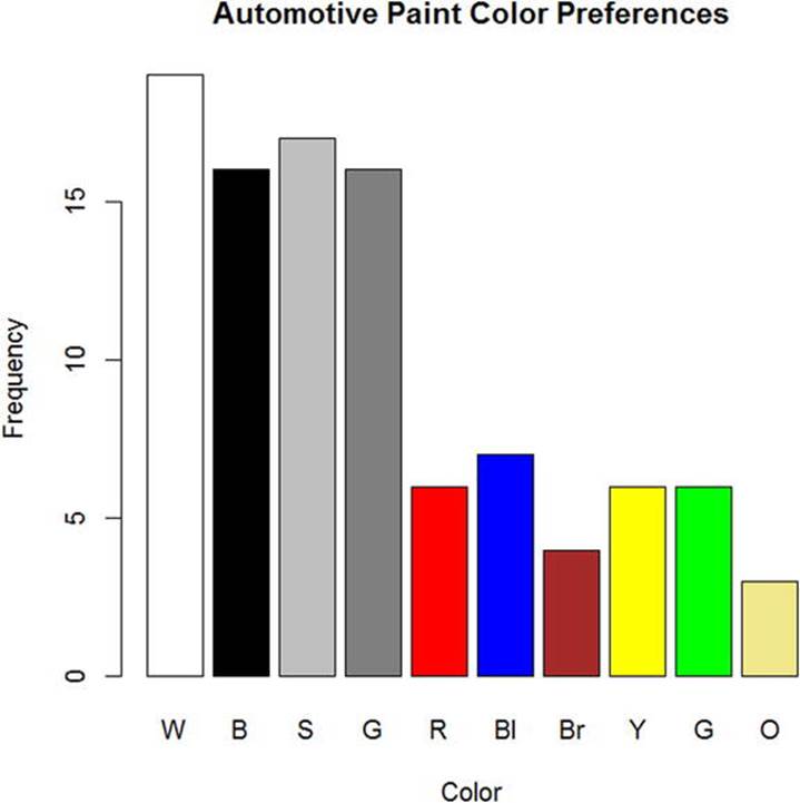
Figure 6-1. Automotive paint color preferences
We can also determine whether the frequencies in a table are distributed on the basis of chance, or if they conform to some other expectation. The most common way of doing this for one-way tables is the chi-square test we will discuss in greater detail in Chapter 10.
Recipe 6-2. Working with Two-Way Tables
Problem
The analysis of cross-classified categorical data occupies a prominent place in statistics and data analysis. A wide variety of biological, business, and social science data take the form of cross-classified contingency tables. Although a commonly used practice in the analysis of contingency tables is the chi-square test, modern alternatives are available, in particular log-linear models. In Recipe 6-2, you will learn how to create and display two-way tables.
Solution
Until the recent past, the statistical and computational techniques for analyzing cross-classified data were limited, and the typical approach to analyzing higher order tables was to do a series of analyses of two-dimensional marginal totals. The chi-square test has stood the test of time, but the recent development of log-linear models makes it possible to overcome the limitations of the two-dimensional approach when there are tables with more than two categories.
As with one-way tables, you can create a contingency table from raw data, or you can create a table from summary data with the as.table() function. I will illustrate both options. Let us return to the mouse weight dataset discussed in Chapter 2. The strain of the mouse and the sex of the mouse are both categorical data. We will use the table() function to create a two-way table of sex by strain. Then, we will produce a nice-looking clustered barplot of the data for visualizing the distribution of sex by strain. The strains have been labeled A, B, C, and D.
> counts <- table(mouseWeights$sex,mouseWeights$strain)
> counts
A B C D
F 62 178 137 41
M 36 198 131 61
> barplot(counts, col = c("gray","antiquewhite"), ylab = "Count",xlab = "Strain",
+ main = "Mouse Strain by Sex", legend = rownames(counts), beside=T)
The clustered or “side-by-side” bar graph is shown in Figure 6-2.
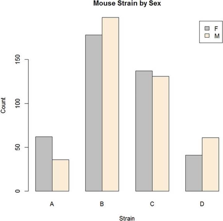
Figure 6-2. Clustered bar graph of mouse sex by strain
Now, let’s create a two-way table from summary data. We’ll return to the GSS data and make a two-way table that compares the job satisfaction scores from 1 to 7 for males and females (labeled 1 and 2, respectively). Here is the table:
1 2 3 4 5 6 7
1 66 144 116 29 25 10 5
2 56 120 144 25 15 3 4
We will use the as.table() function once again to create the two-way contingency table. To make the table, I first created a vector, then turned the vector into a matrix, and finally made the matrix into a table. As before, the default row and column names are successive letters of the alphabet, but it is easy to change those to the correct labels, in this case, numbers.
> newTable <- c(66, 144, 116, 29, 25, 10, 5, 56, 120, 144, 25, 15, 3, 4)
> newTable <- matrix(newTable, ncol = 7, byrow = T)
> newTable
[,1] [,2] [,3] [,4] [,5] [,6] [,7]
[1,] 66 144 116 29 25 10 5
[2,] 56 120 144 25 15 3 4
> newTable <- as.table(newTable)
> newTable
A B C D E F G
A 66 144 116 29 25 10 5
B 56 120 144 25 15 3 4
> rownames(newTable) <- 1:2
> colnames(newTable) <- 1:7
> newTable
1 2 3 4 5 6 7
1 66 144 116 29 25 10 5
2 56 120 144 25 15 3 4
As before, we can make a barplot to show the distribution of job satisfaction by sex (see Figure 6-3).
> barplot(newTable, beside = T, xlab = "Job Satisfaction", ylab = "Frequency",
+ legend = rownames(newTable))
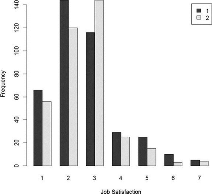
Figure 6-3. Job satisfaction scores by sex (source: GSS)
Recipe 6-3. Analyzing One- and Two-Way Tables
Problem
A very common problem is determining whether the observed frequencies in one- or two-way tables differ significantly from expectation. We determine an expected frequency based on some null hypothesis, and then compare the observed and expected frequencies to determine whether the observed frequencies are due to chance (sampling error) or due to significant departures from the expected frequencies. The most frequently used tool for this kind of tabular analysis is the chi-square test.
The chi-square test comes in two varieties. When we analyze a one-way table, we use a chi-square test of goodness of fit. Two-way tables are analyzed with a chi-square test of independence (also known as a test of association). For the goodness-of-fit test, the expected frequencies may be equal or unequal, depending on the null hypothesis. The test of independence, on the other hand, uses the observed frequencies to calculate the expected frequencies. I will explain and illustrate both tests.
Solution
The German geodist Friedrich Robert Helmert discovered the chi-square distribution in 1876. Helmert found that the sample variance for a normal distribution followed a chi-square distribution. Helmert’s discovery was touted in his own books, as well as other German texts, but was not known in English. The chi-square distribution was independently rediscovered in 1900 when Karl Pearson developed his goodness-of-fit test. R. A. Fisher and William S. Gosset (“Student”) later made the connection to the sample variance.
The chi-square distribution was applied to tests of goodness of fit by Pearson. R—along with many statistical packages, such as SPSS—labels the test “Pearson’s Chi-Square.” The chi-square distribution has a single parameter, known as the degrees of freedom. Unlike other distributions, the chi-square distribution’s degrees of freedom are based on the number of categories rather than the sample size. Pearson had difficulty applying the concept of degrees of freedom correctly to his own chi-square tests, and was subsequently corrected by Fisher on this matter. The degrees of freedom are the number of categories minus 1. The total of the observations, N, and the total of the number of categories, k, are both constrained. The N objects must be placed in the k categories in such a way that the probability totals 1, and each object fits into one (and only one) of the categories. These are the conditions of mutual exclusivity and exhaustiveness. Interestingly, from a mathematical standpoint, the expected value of chi-square when the null hypothesis is true is the degrees of freedom. As the value of chi-square increases, it becomes less probable that the observed values came from the distribution specified by the null hypothesis.
We will do a chi-square goodness-of-fit test for the car color preference data. Assuming the 10 colors would be distributed evenly if each color was equally preferred, we would expect each color to occur 10 times in the sample of 100 cars. To calculate chi-square, we subtract the expected frequency from the observed frequency for each category, square this deviation score, divide the squared deviation by the expected frequency, and sum these values across categories. As explained earlier, the degrees of freedom for this particular test would be 10 – 1 = 9. Clearly, the colors are not equally popular, as is shown by the p value, which is substantially lower than .05, the customary alpha level.
> carColors
W B S G R Bl Br Y G O
19 16 17 16 6 7 4 6 6 3
> chisq.test(carColors)
Chi-squared test for given probabilities
data: carColors
X-squared = 34.4, df = 9, p-value = 7.599e-05
For the chi-square test of independence, the expected frequencies are calculated by multiplying the marginal (row and column) totals for each cell, and then dividing that product by the overall sample size. The resulting values are the frequencies that would be expected if there were no association between the two categories. It is customary to identify the two-way contingency table as r × c (row-by-column), and the degrees of freedom for the chi-square test of independence are calculated as the number of rows minus 1 times the number of columns minus 1, or (r – 1)(c – 1).
Let us determine if the sexes of the mice in our dataset are equally distributed across the four strains. Once again, the p value lower than .05 makes it clear that there are unequal numbers of male and female mice across the strains.
> chisq.test(mouseWeights$sex, mouseWeights$strain)
Pearson's Chi-squared test
data: mouseWeights$sex and mouseWeights$strain
X-squared = 11.9429, df = 3, p-value = 0.007581
The expected frequency for each cell, as I mentioned, is calculated by multiplying the marginal row total and the marginal column total for that cell, and dividing the product by the overall sample size. Here is the table with the marginal totals added:
> newTable
A B C D rowMargins
F 62 178 137 41 418
M 36 198 131 61 426
colMargins 98 376 268 102 844
As an example, the expected number of female mice for strain A would be found by multiplying 418 by 98, and dividing the product, 40964, by the number of mice, 844. The resulting value of 48.54 is the expected frequency if the sex and strain of the mice were not associated. With a little matrix algebra, it is easy to calculate all the expected frequencies at once:
> rowMargins <- matrix(c(418,426)rowMargins)
> rowMargins
[,1]
[1,] 418
[2,] 426
> colMargins <- matrix(c(93,376,268,102))
> colMargins
[,1]
[1,] 93
[2,] 376
[3,] 268
[4,] 102
> colMargins <- t(colMargins)
> expected <- (rowMargins %*% colMargins)/844
> expected
[,1] [,2] [,3] [,4]
[1,] 48.53555 186.218 132.7299 50.51659
[2,] 49.46445 189.782 135.2701 51.48341
Recipe 6-4. Working with Higher-Order Tables
Problem
As mentioned at the beginning of this chapter, the traditional way to analyze three-way or higher tables was to separate the table into a series of two-way tables and then perform chi-square tests of independence for each two-way table. Log-linear modeling of contingency tables has essentially supplanted the use of chi-square analysis for three-way and higher tables. I will illustrate using the aforementioned HairEyeColor table that ships with R. Here are the numbers:
> HairEyeColor
, , Sex = Male
Eye
Hair Brown Blue Hazel Green
Black 32 11 10 3
Brown 53 50 25 15
Red 10 10 7 7
Blond 3 30 5 8
, , Sex = Female
Eye
Hair Brown Blue Hazel Green
Black 36 9 5 2
Brown 66 34 29 14
Red 16 7 7 7
Blond 4 64 5 8
The customary way of handling this sort of data would be to do a chi-square test of independence for each sex to determine if there is an association between hair color and eye color. This, of course, omits the consideration of the possible interactions between sex and the other two categorical variables.
Solution
The log-linear model provides the ability to analyze the three-way table as a whole. Log-linear models range from the simplest model, in which the expected frequencies are all equal, to the most complex (saturated model), in which every component is included.
To do a log-linear analysis, we load the data and the MASS package. The log-linear analysis produces both a Pearson’s chi-square and a likelihood-ratio chi-square. We are testing the same null hypothesis that we do in a two-way chi-square, namely that the three or more categorical variables are independent.
We build a formula to indicate the categorical variables in our analysis, and we use different signs to indicate how we want to combine these variables. The tilde (~) indicates the beginning of the formula. The plus signs indicate an additive model; that is, one in which we are not interested in examining interactions. By contrast, a multiplicative model uses asterisks (*) to indicate a model with interactions. Here is the additive model for the hair, sex, and eye color data:
> data(HairEyeColor)
> library(MASS)
> dimnames(HairEyeColor)
$Hair
[1] "Black" "Brown" "Red" "Blond"
$Eye
[1] "Brown" "Blue" "Hazel" "Green"
$Sex
[1] "Male" "Female"
> indep <- loglm(~Hair + Eye + Sex, data = HairEyeColor)
> summary(indep)
Formula:
~Hair + Eye + Sex
attr(,"variables")
list(Hair, Eye, Sex)
attr(,"factors")
Hair Eye Sex
Hair 1 0 0
Eye 0 1 0
Sex 0 0 1
attr(,"term.labels")
[1] "Hair" "Eye" "Sex"
attr(,"order")
[1] 1 1 1
attr(,"intercept")
[1] 1
attr(,"response")
[1] 0
attr(,".Environment")
<environment: R_GlobalEnv>
Statistics:
X^2 df P(>X^2)
Likelihood Ratio 166.3001 24 0
Pearson 164.9247 24 0
With p-values of approximately zero, both hypothesis tests show that the model departs significantly from independence.
A fully-saturated model would include the main effects along with all the interactions, and would not provide useful information, as the saturated model uses all the components and produces a likelihood-ratio statistic of zero:
> summary(indep2)
Formula:
~Hair * Eye * Sex
attr(,"variables")
list(Hair, Eye, Sex)
attr(,"factors")
Hair Eye Sex Hair:Eye Hair:Sex Eye:Sex Hair:Eye:Sex
Hair 1 0 0 1 1 0 1
Eye 0 1 0 1 0 1 1
Sex 0 0 1 0 1 1 1
attr(,"term.labels")
[1] "Hair" "Eye" "Sex" "Hair:Eye" "Hair:Sex"
[6] "Eye:Sex" "Hair:Eye:Sex"
attr(,"order")
[1] 1 1 1 2 2 2 3
attr(,"intercept")
[1] 1
attr(,"response")
[1] 0
attr(,".Environment")
<environment: R_GlobalEnv>
Statistics:
X^2 df P(>X^2)
Likelihood Ratio 0 0 1
Pearson 0 0 1
We use an iterative process to find the least complex model that best explains the associations among the variables. This can be a hit-or-miss proposition. For example, the model ~ Eye + Hair * Sex stipulates that hair color and sex are dependent (associated), while eye color is independent of both hair color and sex.
> indep3 <- loglm(Eye ~ Hair * Sex, data = HairEyeColor)
> summary(indep3)
Formula:
Eye ~ Hair * Sex
attr(,"variables")
list(Eye, Hair, Sex)
attr(,"factors")
Hair Sex Hair:Sex
Eye 0 0 0
Hair 1 0 1
Sex 0 1 1
attr(,"term.labels")
[1] "Hair" "Sex" "Hair:Sex"
attr(,"order")
[1] 1 1 2
attr(,"intercept")
[1] 1
attr(,"response")
[1] 1
attr(,".Environment")
<environment: R_GlobalEnv>
Statistics:
X^2 df P(>X^2)
Likelihood Ratio 299.4790 24 0
Pearson 334.0596 24 0
You can see that this model is more effective than the initial additive one. We can use backward elimination, in which the highest-order interactions are successively removed from the saturated model until the reduced model no longer accurately describes the data. Although this process is not built into the loglm function, it is possible to build the saturated model and then use the step() function to with the direction set to backward:
> saturated <- loglm( ~ Hair * Eye * Sex, data = HairEyeColor)
> step(saturated, direction = "backward")
Start: AIC=64
~Hair * Eye * Sex
Df AIC
- Hair:Eye:Sex 9 52.761
<none> 64.000
Step: AIC=52.76
~Hair + Eye + Sex + Hair:Eye + Hair:Sex + Eye:Sex
Df AIC
- Eye:Sex 3 51.764
<none> 52.761
- Hair:Sex 3 58.327
- Hair:Eye 9 184.678
Step: AIC=51.76
~Hair + Eye + Sex + Hair:Eye + Hair:Sex
Df AIC
<none> 51.764
- Hair:Sex 3 53.857
- Hair:Eye 9 180.207
Call:
loglm(formula = ~Hair + Eye + Sex + Hair:Eye + Hair:Sex, data = HairEyeColor,
evaluate = FALSE)
Statistics:
X^2 df P(>X^2)
Likelihood Ratio 11.76372 12 0.4648372
Pearson 11.77059 12 0.4642751
AIC is the Akaike Information Criterion. Smaller AIC values are better. In two steps, R has first eliminated the three-way interaction term, and then the two-way interaction between eye color and sex. Our most parsimonious model includes hair color, eye color, sex, and the interactions of hair and eye color and hair color and sex.