R Recipes: A Problem-Solution Approach (2014)
Chapter 7. Summarizing and Describing Data
In this chapter, you learn how to summarize and describe data measured at the interval or ratio level. We will lump interval and ratio measures together and call the combination “scale” data because these types of measurement have equal intervals between successive data values.
Chapter 6 showed how to summarize categorical data using the table() function. This function works in the same fashion for scale data to produce simple frequency tables. With small datasets, simple frequency tables are fine, but with larger datasets, we need a way to group the data by intervals to keep the frequency table from being too long to be of any use.
In addition to simple and grouped frequency distributions, you will learn how to calculate the common descriptive statistics for scale data, including measures of central tendency, variability, skewness, and kurtosis. We will quickly outgrow the statistical prowess of the base R distribution and find that several packages will help us (and keep us from having to write custom functions). We will explore the usefulness of the fBasics and prettyR packages, in particular. The chapter ends with a description of how to calculate various quantiles for a data distribution.
Recipe 7-1. Creating Simple Frequency Distributions
Problem
We are awash in a sea of data. The volume of data is doubling approximately every 18 months. Raw data are not particularly helpful because it is hard to detect patterns. In addition to summarizing categorical data, tables are also very useful for summarizing the frequencies of interval and ratio data.
Solution
Tables help to make order from chaos. As mentioned, we use the table() function to create a simple frequency distribution. The simple frequency distribution tells us a great deal about the shape of the data, whether there is a modal value (or even multiple modes), and the range of data values. As mentioned, simple frequency distributions are limited to small datasets.
The ages in years of the recipients of the Oscar for Best Actress and Best Actor since the beginning of the Academy Awards in 1928 are in the data frame called oscars. I created the data frame from information available on Wikipedia. Interested readers can retrieve a copy of this data frame from the companion web site for this book.
> head(oscars)
award name
1 Actress Janet Gaynor
2 Actress Mary Pickford
3 Actress Norma Shearer
4 Actress Marie Dressler
5 Actress Helen Hayes
6 Actress Katharine Hepburn
movie years days
1 Seventh Heaven, Street Angel, and Sunrise: A Song of Two Humans 22 222
2 Coquette 37 360
3 The Divorcee 28 87
4 Min and Bill 63 1
5 The Sin of Madelon Claudet 32 39
6 Morning Glory 26 308
> tail(oscars)
award name movie years days
169 Actor Sean Penn Milk 48 189
170 Actor Jeff Bridges Crazy Heart 60 93
171 Actor Colin Firth The King's Speech 50 170
172 Actor Jean Dujardin The Artist 39 252
173 Actor Daniel Day-Lewis Lincoln 55 301
174 Actor Matthew McConaughey Dallas Buyers Club 44 118
We can construct a frequency table of the ages in years of the winners of Best Actress as follows:
> actress <- subset(oscars, award == "Actress")
> table(actress$years)
21 22 24 25 26 27 28 29 30 31 32 33 34 35 36 37 38 39 41 42 44 45 48 49 54 60
1 2 2 4 5 4 4 8 3 3 4 6 3 5 2 2 4 2 6 2 1 2 1 2 1 1
61 62 63 74 80
3 1 1 1 1
Let’s do the same thing for the actors:
> actor <- subset(oscars, award == "Actor")
> table(actor$years)
29 30 31 32 34 35 36 37 38 39 40 41 42 43 44 45 46 47 48 49 50 51 52 53 54 55
1 2 1 3 3 2 4 5 5 5 3 4 5 5 2 5 1 4 3 4 2 2 2 2 1 1
56 57 60 62 76
1 2 3 3 1
With 87 people in each subset, we are beginning to see the limits of the simple frequency distribution. With this many data points, it seems a grouped frequency distribution would be more helpful (see Recipe 7-2).
Recipe 7-2. Creating Grouped Frequency Distributions
Problem
Simple frequency distributions are not appropriate for large datasets. The “granularity” of the data at the level of the individual values presents a “forest versus trees” dilemma (see Recipe 7-1 for tables that are not particularly useful, where we get lost in the trees and forget we are in a forest). The grouped frequency distribution is what we need to see where we are in the forest so that we can get out safely. Recipe 7-2 teaches you how to create a grouped frequency distribution, and you learn that you have control over the interval width so that you can specify an effective class interval size for your distribution.
Solution
The range in ages of the Oscar-winning actors and actresses is 21–80. Let us establish 12 intervals from 20 to 80 by setting breaks at 5 years. First, establish breaks by using the seq() function. Then use the cut() function to separate the data into the intervals. Because we do not want any overlap, we close each interval on the left and leave it open on the right. This is accomplished by using the right = FALSE argument. You can use the trick of an extra pair of parentheses to create the table and print it at the same time.
> breaks <- seq(20, 80, by = 5)
> ageIntervals <- cut(oscars$years, breaks, right = FALSE)
> (ages <- table(ageIntervals))
ageIntervals
[20,25) [25,30) [30,35) [35,40) [40,45) [45,50) [50,55) [55,60) [60,65) [65,70)
5 26 28 36 28 22 10 4 12 0
[70,75) [75,80)
1 1
Recipe 7-3. Calculating Summary Statistics
Problem
Frequency distributions are helpful, but they still leave us with unanswered questions about our data and its properties. These questions include the precise values for measures of the central tendency, variability, skewness, and kurtosis of a dataset. In particular, if data consist of more than one variable, tables become less useful, and we need statistics such as chi-square or likelihood ratios to describe the relationships among the variables. In Recipe 7-3, you learn how to use R base, as well as the contributed package fBasics to find the these summary statistics. We also explore the usefulness of the prettyR package for describing numerical data, as well as for frequency tables and crosstabulations.
Solution
Base R provides most of the common statistical indexes, but a few are missing. For example, though I have in my possession a book that claims the mode() function locates the modal value in a dataset, that is clearly not the case. The mode() function, as you have already seen, shows the storage class of an R object.
Table 7-1 lists the commonly used statistical functions in the base R distribution, which does not have functions for the mode, skewness, or kurtosis.
Table 7-1. Commonly Used Statistical Functions in R
|
Function |
Calculates This |
|
mean() |
Arithmetic average |
|
median() |
Median |
|
min() |
Minimum value |
|
max() |
Maximum value |
|
range() |
Shows minimum and maximum values |
|
IQR() |
Interquartile range |
|
sd() |
Standard deviation, treating data as a sample |
|
var() |
Variance, treating data as a sample |
|
length() |
Counts the number of data points |
|
sum() |
The total of the data points |
|
summary() |
Five-number summary plus the mean |
Here are the summary statistics for the 174 ages in the oscars data frame.
> mean(oscars$years)
[1] 40.08046
> median(oscars$years)
[1] 38
> min(oscars$years)
[1] 21
> max(oscars$years)
[1] 80
> range(oscars$years)
[1] 21 80
> IQR(oscars$years)
[1] 13.75
> sd(oscars$years)
[1] 11.05396
> var(oscars$years)
[1] 122.19
> length(oscars$years)
[1] 174
> sum(oscars$years)
[1] 6974
> summary(oscars$years)
Min. 1st Qu. Median Mean 3rd Qu. Max.
21.00 32.00 38.00 40.08 45.75 80.00
A histogram shows that the ages are positively skewed (see Figure 7-1). Use the breaks argument to specify five-year intervals for the histogram, as follows:
> hist(oscars$years, breaks = seq(20,80, by = 5))
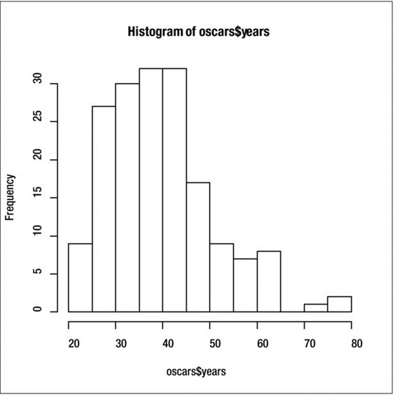
Figure 7-1. The age distribution is positively skewed
Many R packages add statistical functionality missing from the base version of R. One of the best of these is the fBasics package. Install fBasics and use the package for summary statistics.
> install.packages("fbasics")
> library(fBasics)
Loading required package: MASS
Loading required package: timeDate
Loading required package: timeSeries
Attaching package: 'fBasics'
The following object is masked from 'package:base':
norm
> basicStats(oscars$years)
X..oscars.years
nobs 174.000000
NAs 0.000000
Minimum 21.000000
Maximum 80.000000
1. Quartile 32.000000
3. Quartile 45.750000
Mean 40.080460
Median 38.000000
Sum 6974.000000
SE Mean 0.837999
LCL Mean 38.426442
UCL Mean 41.734477
Variance 122.190021
Stdev 11.053959
Skewness 0.876438
Kurtosis 0.794613
This summary confirms the positive skew in the distribution of ages. The skewness coefficient would be zero if the data were completely symmetrical. Similarly, the data are positively kurtotic, meaning the distribution of ages is “peaked.” In addition to the coefficients for skewness and kurtosis, we get the number of missing values (in this case none), the standard summary descriptive statistics, the standard error of the mean, and the lower and upper limits of a 95% confidence interval for the mean. In Chapter 12, you will learn some contemporary statistical methods for dealing with data such as these that depart from a normal distribution.
Another useful package is prettyR. It provides many options, including formatting R output for web display, the missing mode function we discussed earlier, and the ability to describe various data objects, including numeric and logical values.
> library(prettyR)
> describe(oscars$years)
Description of structure(list(x = c(22, 37, 28, 63, 32, 26, 31, 27, 27, 28, 30, 26, 29, 24, 38, 25, 29, 41, 30, 35, 32, 33, 29, 38, 54, 24, 25, 48, 41, 28, 41, 39, 29, 27, 31, 38, 29, 25, 35, 60, 61, 26, 35, 34, 34, 27, 37, 42, 41, 36, 32, 41, 33, 31, 74, 33, 49, 38, 61, 21, 41, 26, 80, 42, 29, 33, 36, 45, 49, 39, 34, 26, 25, 33, 35, 35, 28, 30, 29, 61, 32, 33, 45, 29, 62, 22, 44, 44, 41, 62, 53, 47, 35, 34, 34, 49, 41, 37, 38, 34, 32, 40, 43, 48, 41, 39, 49, 57, 41, 38, 39, 52, 51, 35, 30, 39, 36, 43, 49, 36, 47, 31, 47, 37, 57, 42, 45, 42, 45, 62, 43, 42, 48, 49, 56, 38, 60, 30, 40, 42, 37, 76, 39, 53, 45, 36, 62, 43, 51, 32, 42, 54, 52, 37, 38, 32, 45, 60, 46, 40, 36, 47, 29, 43, 37, 38, 45, 50, 48, 60, 50, 39, 55, 44)), .Names = "x", row.names = c(NA, -174L), class = "data.frame")
Numeric
mean median var sd valid.n
x 40.08 . 38 122.2 11.05 174
> Mode(oscars$years)
[1] "41"
> mode(oscars$years)
[1] "numeric"
Remember R’s case sensitivity. The Mode() function in prettyR finds the mode, while the mode() function returns the storage class. The prettyR package also “prettifies” frequency tables and crosstabulations. It also provides a very useful function to break down a numeric variable by one or more grouping variables. Let us examine the brkdn() function first. You must enter a formula showing the variable to be analyzed, the grouping variable, the data source, the number of grouping levels, the numeric description you want, and the number of places to round the results. The formatting is very effective. Examine the means and variances for the ages of the male and female Oscar winners. It appears there may be some age discrimination against females.
> require(prettyR)
> brkdn(years ~ award, data = oscars, maxlevels = 2, num.desc = c("mean", "var"),
+ vname.width = NULL, width = 10, round.n = 2)
Breakdown of years by award
Level mean var
Actor 44.03 78.08
Actress 36.13 136.1
An independent-samples t test confirms the suspicion that the average ages for male and female winners are significantly different.
> t.test(oscars$years ~ oscars$award)
Welch Two Sample t-test
data: oscars$years by oscars$award
t = 5.0402, df = 160.244, p-value = 1.244e-06
alternative hypothesis: true difference in means is not equal to 0
95 percent confidence interval:
4.809494 11.006598
sample estimates:
mean in group Actor mean in group Actress
44.03448 36.12644
Now, look at a frequency distribution and a crosstabulation formatted by prettyR. Because the age range is so great for the entertainers’ ages, we will us a smaller dataset. See how much more informative the table produced by freq() in prettyR is than the one from the table()function is?
> freq(studentComplete$Quiz1)
Frequencies for studentComplete$Quiz1
89 92 75 76 83 79 82 84 85 86 87 88 90 NA
3 3 2 2 2 1 1 1 1 1 1 1 1 0
% 15 15 10 10 10 5 5 5 5 5 5 5 5 0
%!NA 15 15 10 10 10 5 5 5 5 5 5 5 5
> table(studentComplete$Quiz1)
75 76 79 82 83 84 85 86 87 88 89 90 92
2 2 1 1 2 1 1 1 1 1 3 1 3
Using the plagiarism data frame from Chapter 6 (see Recipe 6-1), we crosstabulate the student’s sex and whether he or she plagiarized the first assignment in the class. Compare the output from the prettyR calculate.xtab() function to that of the table() function in base R. It is obvious that prettyR wins that comparison.
> calculate.xtab(plagiarism$Sex,plagiarism$Plagiarized1)
Crosstabulation of plagiarism$Sex by plagiarism$Plagiarized1
plagiarism$Plagiarized1
... No Yes
F 27 4 31
87.1 12.9 -
67.5 80 68.89
M 13 1 14
92.86 7.14 -
32.5 20 31.11
40 5 45
88.89 11.11 100
odds ratio = 0.52
relative risk (plagiarism$Sex-M) = 0.55
> table(plagiarism$Sex,plagiarism$Plagiarized1)
No Yes
F 27 4
M 13 1
Although the calculate.xtab() function is more informative than the table() function, the output is still not what you might see from the pivot table command in a commercial spreadsheet like Excel. The delim.xtab() function formats a crosstabulation with counts and percentages. You can specify whether to display the column of percentages next to the row of counts, or to display them separately. We will format the crosstabulation we just produced. By setting the interdigitate argument to F or FALSE, you will get the rows of counts and totals separately from the rows and totals of percentages—a more appealing alternative to me, at least, in terms of the visual appearance of the tables.
> delim.xtab(crosstab, interdigitate = F)
crosstab
No Yes Total
F 27 4 31
M 13 1 14
Total 40 5 45
crosstab
No Yes Total
F 87.1% 12.9% 100%
M 92.9% 7.1% 100%
Total 88.9% 11.1% 100%
For purposes of comparison, I show the pivot table produced by Excel 2013 for the same data, followed by the output from SPSS (see Figures 7-2 and 7-3).
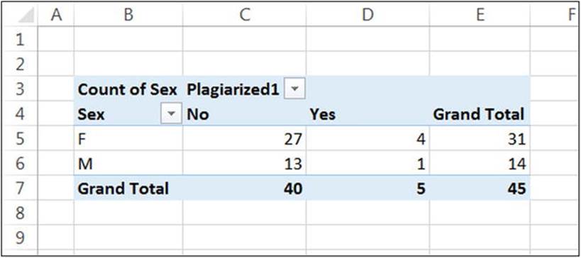
Figure 7-2. A pivot table in Excel 2013
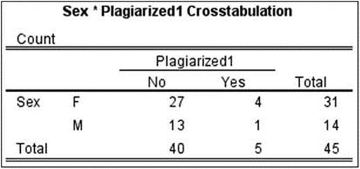
Figure 7-3. SPSS output of the crosstablulation
Recipe 7-4. Working with Quantiles
Problem
We often find it useful to use intervals to represent the separation of data into more or less distinct categories. The most easily recognized of these is the percentile. By dividing a distribution into smaller groups of equal sizes, we are better able to visualize the location of an individual score in the data distribution. Quantile is a rather strange word, and not one on the tips of most people’s tongues. Technically, quantiles are points taken at regular intervals from the cumulative density function (CDF) of a random variable. If we have q quantiles, we will thus divide the dataset into qequally sized subsets. Percentiles (also known as centiles) cut a distribution into 100 equal groups. Another common example is quartiles, which as the name implies, cut a distribution into fourths. The usefulness of these breakdowns is that they give us an idea of “how high” or “low” a given score is. The first quartile is also the 25th percentile, the second quartile is the 50th percentile (or the median), and the third quartile is the 75th percentile.
Solution
Although the definition of a quantile is fairly simple, the calculation of one is a bit problematic. For example, there are five different methods of determining quartiles in SAS. R’s own quantile() function has nine different definitions (types) for calculating quantiles. Type ?quantile at the command prompt to learn more about these types. The default is type 7, which is consistent with that of the S language. When I was an R newbie, I was perplexed that my TI-84 calculator, Excel, SPSS, Minitab, and R were inconsistent in reporting values for quartiles. Since then, I have learned a lot more about R, and Microsoft has even patched up its quartile function so Excel produces the correct values according to the National Institute of Standards and Technology (NIST).
Continuing with our data on Oscar winners, let’s look at the quartiles. Observe the use of a vector of probabilities between 0 and 1 to establish which quantiles to report. We could just as easily report deciles (tenths) if we desired to. R reports the minimum value as the 0th percentile and the maximum value as the 100th percentile. Even that is a matter of controversy, as many statisticians (myself among them) argue that the 0th and 100th percentiles are undefined.
quantile(oscars$years, prob = seq(0, 1, 0.25))
0% 25% 50% 75% 100%
21.00 32.00 38.00 45.75 80.00
> quantile(oscars$years, prob = seq(0, 1, 0.10))
0% 10% 20% 30% 40% 50% 60% 70% 80% 90% 100%
21.0 27.3 30.0 33.0 36.0 38.0 41.0 44.0 48.4 55.7 80.0
All materials on the site are licensed Creative Commons Attribution-Sharealike 3.0 Unported CC BY-SA 3.0 & GNU Free Documentation License (GFDL)
If you are the copyright holder of any material contained on our site and intend to remove it, please contact our site administrator for approval.
© 2016-2026 All site design rights belong to S.Y.A.