Statistics Done Wrong: The Woefully Complete Guide (2015)
Chapter 4. The P Value and the Base Rate Fallacy
You’ve seen that p values are hard to interpret. Getting a statistically insignificant result doesn’t mean there’s no difference between two groups. But what about getting a significant result?
Suppose I’m testing 100 potential cancer medications. Only 10 of these drugs actually work, but I don’t know which; I must perform experiments to find them. In these experiments, I’ll look for p < 0.05 gains over a placebo, demonstrating that the drug has a significant benefit.
Figure 4-1 illustrates the situation. Each square in the grid represents one drug. In reality, only the 10 drugs in the top row work. Because most trials can’t perfectly detect every good medication, I’ll assume my tests have a statistical power of 0.8, though you know that most studies have much lower power. So of the 10 good drugs, I’ll correctly detect around 8 of them, shown in darker gray.

Figure 4-1. Each square represents one candidate drug. The first row of the grid represents drugs that definitely work, but I obtained statistically significant results for only the eight darker-gray drugs. The black cells are false positives.
Because my p value threshold is 0.05, I have a 5% chance of falsely concluding that an ineffective drug works. Since 90 of my tested drugs are ineffective, this means I’ll conclude that about 5 of them have significant effects. These are shown in black.
I perform my experiments and conclude there are 13 “working” drugs: 8 good drugs and 5 false positives. The chance of any given “working” drug being truly effective is therefore 8 in 13—just 62%! In statistical terms, my false discovery rate—the fraction of statistically significant results that are really false positives—is 38%.
Because the base rate of effective cancer drugs is so low (only 10%), I have many opportunities for false positives. Take this to the extreme: if I had the bad fortune of getting a truck-load of completely ineffective medicines, for a base rate of 0%, then I have no chance of getting a true significant result. Nevertheless, I’ll get a p < 0.05 result for 5% of the drugs in the truck.
The Base Rate Fallacy
You often see news articles quoting low p values as a sign that error is unlikely: “There’s only a 1 in 10,000 chance this result arose as a statistical fluke, because p = 0.0001.” No! This can’t be true. In the cancer medication example, a p < 0.05 threshold resulted in a 38% chance that any given statistically significant result was a fluke. This misinterpretation is called the base rate fallacy.
Remember how p values are defined: the p value is the probability, under the assumption that there is no true effect or no true difference, of collecting data that shows a difference equal to or more extreme than what you actually observed.
A p value is calculated under the assumption that the medication does not work. It tells me the probability of obtaining my data or data more extreme than it. It does not tell me the chance my medication is effective. A small p value is stronger evidence, but to calculate the probability that the medication is effective, you’d need to factor in the base rate.
When news came from the Large Hadron Collider that physicists had discovered evidence for the Higgs boson, a long-theorized fundamental particle, every article tried to quote a probability: “There’s only a 1 in 1.74 million chance that this result is a fluke,” or something along those lines. But every news source quoted a different number. Not only did they ignore the base rate and misinterpret the p value, but they couldn’t calculate it correctly either.
So when someone cites a low p value to say their study is probably right, remember that the probability of error is actually almost certainly higher. In areas where most tested hypotheses are false, such as early drug trials (most early drugs don’t make it through trials), it’s likely that moststatistically significant results with p < 0.05 are actually flukes.
A Quick Quiz
A 2002 study found that an overwhelming majority of statistics students—and instructors—failed a simple quiz about p values.1 Try the quiz (slightly adapted for this book) for yourself to see how well you understand what p really means.
Suppose you’re testing two medications, Fixitol and Solvix. You have two treatment groups, one that takes Fixitol and one that takes Solvix, and you measure their performance on some standard task (a fitness test, for instance) afterward. You compare the mean score of each group using a simple significance test, and you obtain p = 0.01, indicating there is a statistically significant difference between means.
Based on this, decide whether each of the following statements is true or false:
1. You have absolutely disproved the null hypothesis (“There is no difference between means”).
2. There is a 1% probability that the null hypothesis is true.
3. You have absolutely proved the alternative hypothesis (“There is a difference between means”).
4. You can deduce the probability that the alternative hypothesis is true.
5. You know, if you decide to reject the null hypothesis, the probability that you are making the wrong decision.
6. You have a reliable experimental finding, in the sense that if your experiment were repeated many times, you would obtain a significant result in 99% of trials.
You can find the answers in the footnote.[9]
The Base Rate Fallacy in Medical Testing
There has been some controversy over the use of mammograms to screen for breast cancer. Some argue that the dangers of false positive results—which result in unnecessary biopsies, surgery, and chemotherapy—outweigh the benefits of early cancer detection; physicians groups and regulatory agencies, such as the United States Preventive Services Task Force, have recently stopped recommending routine mammograms for women younger than 50. This is a statistical question, and the first step to answering it to ask a simpler question: if your mammogram turns up signs of cancer, what is the probability you actually have breast cancer? If this probability is too low, most positive results will be false, and a great deal of time and effort will be wasted for no benefit.
Suppose 0.8% of women who get mammograms have breast cancer. In 90% of women with breast cancer, the mammogram will correctly detect it. (That’s the statistical power of the test. This is an estimate, since it’s hard to tell how many cancers we miss if we don’t know they’re there.) However, among women with no breast cancer at all, about 7% will still get a positive reading on the mammogram. (This is equivalent to having a p < 0.07 significance threshold.) If you get a positive mammogram result, what are the chances you have breast cancer?
Ignoring the chance that you, the reader, are male,[10] the answer is 9%.
How did I calculate this? Imagine 1,000 randomly selected women chose to get mammograms. On average, 0.8% of screened women have breast cancer, so about 8 women in our study will. The mammogram correctly detects 90% of breast cancer cases, so about 7 of the 8 will have their cancer discovered. However, there are 992 women without breast cancer, and 7% will get a false positive reading on their mammograms. This means about 70 women will be incorrectly told they have cancer.
In total, we have 77 women with positive mammograms, 7 of whom actually have breast cancer. Only 9% of women with positive mammograms have breast cancer.
Even doctors get this wrong. If you ask them, two-thirds will erroneously conclude that a p < 0.05 result implies a 95% chance that the result is true.2 But as you can see in these examples, the likelihood that a positive mammogram means cancer depends on the proportion of women who actually have cancer. And we are very fortunate that only a small proportion of women have breast cancer at any given time.
How to Lie with Smoking Statistics
Renowned experts in statistics fall prey to the base rate fallacy, too. One high-profile example involves journalist Darrell Huff, author of the popular 1954 book How to Lie with Statistics.
Although How to Lie with Statistics didn’t focus on statistics in the academic sense of the term—it was perhaps better titled How to Lie with Charts, Plots, and Misleading Numbers—the book was still widely adopted in college courses and read by a public eager to outsmart marketers and politicians, turning Huff into a recognized expert in statistics. So when the US Surgeon General’s famous report Smoking and Health came out in 1964, saying that tobacco smoking causes lung cancer, tobacco companies turned to Huff to provide their public rebuttal.[11]
Attempting to capitalize on Huff’s respected status, the tobacco industry commissioned him to testify before Congress and then to write a book, tentatively titled How to Lie with Smoking Statistics, covering the many statistical and logical errors alleged to be found in the surgeon general’s report. Huff completed a manuscript, for which he was paid more than $9,000 (roughly $60,000 in 2014 dollars) by tobacco companies and which was positively reviewed by University of Chicago statistician (and paid tobacco industry consultant) K.A. Brownlee. Although it was never published, it’s likely that Huff’s friendly, accessible style would have made a strong impression on the public, providing talking points for watercooler arguments.
In his Chapter 7, he discusses what he calls overprecise figures—those presented without a confidence interval or any indication of uncertainty. For example, the surgeon general’s report mentions a “mortality ratio of 1.20,” which is “statistically significant at the 5 percent level.” This, presumably, meant that the ratio was significantly different from 1.0, with p < 0.05. Huff agrees that expressing the result as a mortality ratio is perfectly proper but states:
It does have an unfortunate result: it makes it appear that we now know the actual mortality ratio of two kinds of groups right down to a decimal place. The reader must bring to his interpretation of this figure a knowledge that what looks like a rather exact figure is only an approximation. From the accompanying statement of significance (“5 percent level”) we discover that all that is actually known is that the odds are 19 to one that the second group truly does have a higher death rate than the first. The actual increase from one group to the other may be much less than the 20 percent indicated, or it may be more.
For the first half of this quote, I wanted to cheer Huff on: yes, statistically significant doesn’t mean that we know the precise figure to two decimal places. (A confidence interval would have been a much more appropriate way to express this figure.) But then Huff claims that the significance level gives 19-to-1 odds that the death rate really is different. That is, he interprets the p value as the probability that the results are a fluke.
Not even Huff is safe from the base rate fallacy! We don’t know the odds that “the second group truly does have a higher death rate than the first.” All we know is that if the true mortality ratio were 1, we would observe a mortality ratio larger than 1.20 in only 1 in 20 experiments.
Huff’s complaint about overprecise figures is, in fact, impossibly precise. Notably, K.A. Brownlee read this comment—and several similar remarks Huff makes throughout the manuscript—without complaint. Instead, he noted that in one case Huff incorrectly quotes the odds as 20 to 1 rather than 19 to 1. He did not seem to notice the far more fundamental base rate fallacy lurking.
Taking Up Arms Against the Base Rate Fallacy
You don’t have to be performing advanced cancer research or early cancer screenings to run into the base rate fallacy. What if you’re doing social research? Say you’d like to survey Americans to find out how often they use guns in self-defense. Gun control arguments, after all, center on the right to self-defense, so it’s important to determine whether guns are commonly used for defense and whether that use outweighs the downsides, such as homicides.
One way to gather this data would be through a survey. You could ask a representative sample of Americans whether they own guns and, if so, whether they’ve used the guns to defend their homes in burglaries or themselves from being mugged. You could compare these numbers to law enforcement statistics of gun use in homicides and make an informed decision about whether the benefits of gun control outweigh the drawbacks.
Such surveys have been done, with interesting results. One 1992 telephone survey estimated that American civilians used guns in self-defense up to 2.5 million times that year. Roughly 34% of these cases were burglaries, meaning 845,000 burglaries were stymied by gun owners. But in 1992, there were only 1.3 million burglaries committed while someone was at home. Two-thirds of these occurred while the homeowners were asleep and were discovered only after the burglar had left. That leaves 430,000 burglaries involving homeowners who were at home and awake to confront the burglar, 845,000 of which, we are led to believe, were stopped by gun-toting residents.3
Whoops.
One explanation could be that burglaries are dramatically underreported. The total number of burglaries came from the National Crime Victimization Survey (NCVS), which asked tens of thousands of Americans in detailed interviews about their experiences with crime. Perhaps respondents who fended off a burglar with their firearms didn’t report the crime—after all, nothing was stolen, and the burglar fled. But a massive underreporting of burglaries would be needed to explain the discrepancy. Fully two-thirds of burglaries committed against awake homeowners would need to have gone unreported.
A more likely answer is that the survey overestimated the use of guns in self-defense. How? In the same way mammograms overestimate the incidence of breast cancer: there are far more opportunities for false positives than false negatives. If 99.9% of people did not use a gun in self-defense in the past year but 2% of those people answered “yes” for whatever reason (to amuse themselves or because they misremembered an incident from long ago as happening in the past year), the true rate of 0.1% will appear to be nearly 2.1%, inflated by a factor of 21.
What about false negatives? Could this effect be balanced by people who said “no” even though they gunned down a mugger just last week? A respondent may have been carrying the firearm illegally or unwilling to admit using it to a stranger on the phone. But even then, if few people genuinely use a gun in self-defense, then there are few opportunities for false negatives. Even if half of gun users don’t admit to it on the phone survey, they’re vastly outnumbered by the tiny fraction of nonusers who lie or misremember, and the survey will give a result 20 times too large.
Since the false positive rate is the overwhelming error factor here, that’s what criminologists focus on reducing. A good way to do so is by conducting extremely detailed surveys. The NCVS, run by the Department of Justice, uses detailed sit-down interviews where respondents are asked for details about crimes and their use of guns in self-defense. Only respondents who report being victimized are asked about how they defended themselves, and so people who may be inclined to lie about or misremember self-defense get the opportunity only if they also lie about or misremember being a victim. The NCVS also tries to detect misremembered dates (a common problem) by interviewing the same respondents periodically. If the respondent reports being the victim of a crime within the last six months, but six months ago they reported the same crime a few months prior, the interviewer can remind them of the discrepancy.
The 1992 NCVS estimated a much lower number than the phone survey—something like 65,000 incidents per year, not millions.4 This figure includes not only defense against burglaries but also robberies, rapes, assaults, and car thefts. Even so, it is nearly 40 times smaller than the estimate provided by the telephone survey.
Admittedly, people may have been nervous to admit illegal gun use to a federal government agency; the authors of the original phone survey claimed that most defensive gun use involves illegal gun possession.5 (This raises another research question: why are so many victims illegally carrying firearms?) This biases the NCVS survey results downward. Perhaps the truth is somewhere in between.
Unfortunately, the inflated phone survey figure is still often cited by gun rights groups, misinforming the public debate on gun safety. Meanwhile, the NCVS results hold steady at far lower numbers. The gun control debate is far more complicated than a single statistic, of course, but informed debate can begin only with accurate data.
If At First You Don’t Succeed, Try, Try Again
The base rate fallacy shows that statistically significant results are false positives much more often than the p < 0.05 criterion for significance might suggest. The fallacy’s impact is magnified in modern research, which usually doesn’t make just one significance test. More often, studies compare a variety of factors, seeking those with the most important effects.
For example, imagine testing whether jelly beans cause acne by testing the effect of every single jelly bean color on acne, as illustrated in Figure 4-2.
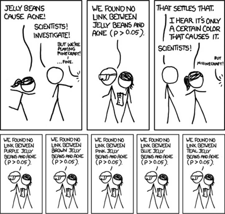
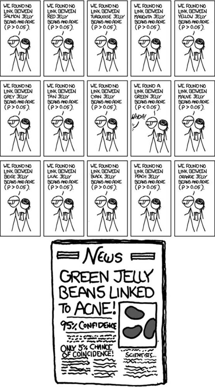
Figure 4-2. Cartoon from xkcd, by Randall Munroe (http://xkcd.com/882/)
As the comic shows, making multiple comparisons means multiple chances for a false positive. The more tests I perform, the greater the chance that at least one of them will produce a false positive. For example, if I test 20 jelly bean flavors that do not cause acne at all and look for a correlation at p < 0.05 significance, I have a 64% chance of getting at least one false positive result. If I test 45 flavors, the chance of at least one false positive is as high as 90%. If I instead use confidence intervals to look for a correlation that is nonzero, the same problem will occur.
NOTE
The math behind these numbers is fairly straightforward. Suppose we have n independent hypotheses to test, none of which is true. We set our significance criterion at p < 0.05. The probability of obtaining at least one false positive among the n tests is as follows:
P(false positive) = 1 – (1 – 0.05)n
For n = 100, the false positive probability increases to 99%.
Multiple comparisons aren’t always as obvious as testing 20 jelly bean colors. Track the symptoms of patients for a dozen weeks and test for significant benefits during any of those weeks: bam, that’s 12 comparisons. And if you’re checking for the occurrence of 23 different potential dangerous side effects? Alas! You have sinned.
If you send out a 10-page survey asking about nuclear power plant proximity, milk consumption, age, number of male cousins, favorite pizza topping, current sock color, and a few dozen other factors for good measure, you’ll probably find that at least one of those things is correlated with cancer.
Particle physicists call this the look-elsewhere effect. An experiment like the Large Hadron Collider’s search for the Higgs boson involves searching particle collision data, looking for small anomalies that indicate the existence of a new particle. To compute the statistical significance of an anomaly at an energy of 5 gigaelectronvolts,[12] for example, physicists ask this: “How likely is it to see an anomaly this size or larger at 5 gigaelectronvolts by chance?” But they could have looked elsewhere—they are searching for anomalies across a large swath of energies, any one of which could have produced a false positive. Physicists have developed complicated procedures to account for this and correctly limit the false positive rate.6
If we want to make many comparisons at once but control the overall false positive rate, the p value should be calculated under the assumption that none of the differences is real. If we test 20 different jelly beans, we would not be surprised if one out of the 20 “causes” acne. But when we calculate the p value for a specific flavor, as though each comparison stands on its own, we are calculating the probability that this specific group would be lucky—an unlikely event—not any 1 out of the 20. And so the anomalies we detect appear much more significant than they are.7
A survey of medical trials in the 1980s found that the average trial made 30 therapeutic comparisons. In more than half the trials, the researchers had made so many comparisons that a false positive was highly likely, casting the statistically significant results they did report into doubt. They may have found a statistically significant effect, but it could just have easily been a false positive.8 The situation is similar in psychology and other heavily statistical fields.
There are techniques to correct for multiple comparisons. For example, the Bonferroni correction method allows you to calculate p values as you normally would but says that if you make n comparisons in the trial, your criterion for significance should be p < 0.05/n. This lowers the chances of a false positive to what you’d see from making only one comparison at p < 0.05. However, as you can imagine, this reduces statistical power, since you’re demanding much stronger correlations before you conclude they’re statistically significant. In some fields, power has decreased systematically in recent decades because of increased awareness of the multiple comparisons problem.
In addition to these practical problems, some researchers object to the Bonferroni correction on philosophical grounds. The Bonferroni procedure implicitly assumes that every null hypothesis tested in multiple comparisons is true. But it’s almost never the case that the difference between two populations is exactly zero or that the effect of some drug is exactly identical to a placebo. So why assume the null hypothesis is true in the first place?
If this objection sounds familiar, it’s because you’ve heard it before—as an argument against null hypothesis significance testing in general, not just the Bonferroni correction. Accurate estimates of the size of differences are much more interesting than checking only whether each effect could be zero. That’s all the more reason to use confidence intervals and effect size estimates instead of significance testing.
Red Herrings in Brain Imaging
Neuroscientists do massive numbers of comparisons when performing functional MRI (fMRI) studies, where a three-dimensional image of the brain is taken before and after the subject performs some task. The images show blood flow in the brain, revealing which parts of the brain are most active when a person performs different tasks.
How exactly do you decide which regions of the brain are active? A simple method is to divide the brain image into small cubes called voxels. A voxel in the “before” image is compared to the voxel in the “after” image, and if the difference in blood flow is significant, you conclude that part of the brain was involved in the task. Trouble is, there are tens of thousands of voxels to compare and therefore many opportunities for false positives.
One study, for instance, tested the effects of an “open-ended mentalizing task” on participants. Subjects were shown “a series of photographs depicting human individuals in social situations with a specified emotional valence” and asked to “determine what emotion the individual in the photo must have been experiencing.” You can imagine how various emotional and logical centers of the brain would light up during this test.
The data was analyzed, and certain brain regions were found to change activity during the task. Comparison of images made before and after the “mentalizing task” showed a p = 0.001 difference in an 81mm3 cluster in the brain.
The study participants? Not college undergraduates paid $10 for their time, as is usual. No, the test subject was a 3.8-pound Atlantic salmon, which “was not alive at the time of scanning.”[13]
Neuroscientists often attempt to limit this problem by requiring clusters of 10 or more significant voxels with a stringent threshold of p < 0.005, but in a brain scan with tens of thousands of voxels, a false positive is still virtually guaranteed. Techniques like the Bonferroni correction, which control the rate of false positives even when thousands of statistical tests are made, are now common in the neuroscience literature. Few papers make errors as serious as the ones demonstrated in the dead salmon experiment. Unfortunately, almost every paper tackles the problem differently. One review of 241 fMRI studies found that they used 207 unique combinations of statistical methods, data collection strategies, and multiple comparison corrections, giving researchers great flexibility to achieve statistically significant results.9
Controlling the False Discovery Rate
As I mentioned earlier, one drawback of the Bonferroni correction is that it greatly decreases the statistical power of your experiments, making it more likely that you’ll miss true effects. More sophisticated procedures than Bonferroni correction exist, ones with less of an impact on statistical power, but even these are not magic bullets. Worse, they don’t spare you from the base rate fallacy. You can still be misled by your p threshold and falsely claim there’s “only a 5% chance I’m wrong.” Procedures like the Bonferroni correction only help you eliminate some false positives.
Scientists are more interested in limiting the false discovery rate: the fraction of statistically significant results that are false positives. In the cancer medication example that started this chapter, my false discovery rate was 38%, since fully one-third of my statistically significant results were flukes. Of course, the only reason you knew how many of the medications actually worked was because I told you the number ahead of time. In general, you don’t know how many of your tested hypotheses are true; you can compute the false discovery rate only by guessing. But ideally, you’d find it out from the data.
In 1995, Yoav Benjamini and Yosef Hochberg devised an exceptionally simple procedure that tells you which p values to consider statistically significant. I’ve been saving you from mathematical details so far, but to illustrate just how simple the procedure is, here it is:
1. Perform your statistical tests and get the p value for each. Make a list and sort it in ascending order.
2. Choose a false-discovery rate and call it q. Call the number of statistical tests m.
3. Find the largest p value such that p ≤ iq/m, where i is the p value’s place in the sorted list.
4. Call that p value and all smaller than it statistically significant.
You’re done! The procedure guarantees that out of all statistically significant results, on average no more than q percent will be false positives.10 I hope the method makes intuitive sense: the p cutoff becomes more conservative if you’re looking for a smaller false-discovery rate (smaller q) or if you’re making more comparisons (higher m).
The Benjamini–Hochberg procedure is fast and effective, and it has been widely adopted by statisticians and scientists. It’s particularly appropriate when testing hundreds of hypotheses that are expected to be mostly false, such as associating genes with diseases. (The vast majority of genes have nothing to do with a particular disease.) The procedure usually provides better statistical power than the Bonferroni correction, and the false discovery rate is easier to interpret than the false positive rate.
TIPS
§ Remember, p < 0.05 isn’t the same as a 5% chance your result is false.
§ If you are testing multiple hypotheses or looking for correlations between many variables, use a procedure such as Bonferroni or Benjamini–Hochberg (or one of their various derivatives and adaptations) to control for the excess of false positives.
§ If your field routinely performs multiple tests, such as in neuroimaging, learn the best practices and techniques specifically developed to handle your data.
§ Learn to use prior estimates of the base rate to calculate the probability that a given result is a false positive (as in the mammogram example).
[9] I hope you’ve concluded that every statement is false. The first five statements ignore the base rate, while the last question is asking about the power of the experiment, not its p value.
[10] Being male doesn’t actually exclude you from getting breast cancer, but it’s far less likely.
[11] The account that follows is based on letters and reports from the Legacy Tobacco Documents Library, an online collection of tobacco industry documents created as a result of the Tobacco Master Settlement Agreement.
[12] Physicists have the best unit names. Gigaelectronvolts, jiffies, inverse femtobarns—my only regret as a physicist who switched to statistics is that I no longer have excuses to use these terms.
[13] “Foam padding was placed within the head coil as a method of limiting salmon movement during the scan, but proved to be largely unnecessary as subject motion was exceptionally low.”