Statistics Done Wrong: The Woefully Complete Guide (2015)
Chapter 6. Double-Dipping in the Data
Earlier, we discussed truth inflation, a symptom of the overuse of significance testing. In the quest for significance, researchers select only the luckiest and most exaggerated results since those are the only ones that pass the significance filter. But that’s not the only way research gets biased toward exaggerated results.
Statistical analyses are often exploratory. In exploratory data analysis, you don’t choose a hypothesis to test in advance. You collect data and poke it to see what interesting details might pop out, ideally leading to new hypotheses and new experiments. This process involves making numerous plots, trying a few statistical analyses, and following any promising leads.
But aimlessly exploring data means a lot of opportunities for false positives and truth inflation. If in your explorations you find an interesting correlation, the standard procedure is to collect a new dataset and test the hypothesis again. Testing an independent dataset will filter out false positives and leave any legitimate discoveries standing. (Of course, you’ll need to ensure your test dataset is sufficiently powered to replicate your findings.) And so exploratory findings should be considered tentative until confirmed.
If you don’t collect a new dataset or your new dataset is strongly related to the old one, truth inflation will come back to bite you in the butt.
Circular Analysis
Suppose I want to implant electrodes in the brain of a monkey, correlating their signals with images I’ll be projecting on a screen. My goal is to understand how the brain processes visual information. The electrodes will record communication between neurons in the monkey’s visual cortex, and I want to see whether different visual stimuli will result in different neuronal firing patterns. If I get statistically significant results, I might even end up in news stories about “reading monkeys’ minds.”
When implantable electrodes were first available, they were large and could record only a few neurons at a time. If the electrode was incorrectly placed, it might not detect any useful signal at all, so to ensure it clearly recorded neurons that had something to do with vision, it would be slowly moved as the monkey viewed a stimulus. When clear responses were seen, the electrode would be left in place and the experiment would begin. Hence, the exploratory analysis was confirmed by a full experiment.
Placing the electrode is an exploratory analysis: let’s try some neurons until one of them seems to fire whenever the monkey views an image. But once the electrode is in place, we collect a new set of data and test whether, say, the neuron firing rate tells us whether the monkey is viewing a green or purple image. The new data is separate from the old, and if we simply got a lucky correlation when placing the electrode, we would fail to replicate the finding during the full experiment.
Modern electrodes are much smaller and much more sophisticated. A single implant the size of a dime contains dozens of electrodes, so we can implant the chip and afterward select the electrodes that seem to give the best signals. A modern experiment, then, might look something like this: show the monkey a variety of stimuli, and record neural responses with the electrodes. Analyze the signal from every electrode to see whether it showed any reaction above the normal background firing rate, which would indicate that it is picking up signals from a neuron we’re interested in. (This analysis may be corrected for multiple comparisons to prevent high false positive rates.)
Using these results, we discard data from the electrodes that missed their targets and analyze the remaining data more extensively, testing whether the firing patterns varied with the different stimuli we presented. It’s a two-stage procedure: first pick out electrodes that have a good signal and appear related to vision; then determine whether their signals vary between different stimuli. It’s tempting to reuse the data we already collected, since we didn’t have to move the electrodes. It’s essentially a shotgun approach: use many small electrodes, and some are bound to hit the right neurons. With the bad electrodes filtered out, we can test whether the remaining electrodes appear to fire at different rates in response to the different stimuli. If they do, we’ve learned something about the location of vision processing in monkey brains.
Well, not quite. If I went ahead with this plan, I’d be using the same data twice. The statistical test I use to find a correlation between the neuron and visual stimulus computes p assuming no correlation—that is, it assumes the null hypothesis, that the neuron fires randomly. But after the exploratory phase, I specifically selected neurons that seem to fire more in reaction to the visual stimuli. In effect, I’d be testing only the lucky neurons, so I should always expect them to be associated with different visual stimuli.1 I could do the same experiment on a dead salmon and get positive results.
This problem, double-dipping in the data, can cause wildly exaggerated results. And double-dipping isn’t specific to neural electrodes; here’s an example from fMRI testing, which aims to associate activity in specific regions of the brain with stimuli or activities. The MRI machine detects changes in blood flow to different parts of the brain, indicating which areas are working harder to process the stimulus. Because modern MRI machines provide very high-resolution images, it’s important to select a region of interest in the brain in advance; otherwise, we’d be performing comparisons across tens of thousands of individual points in the brain, requiring massive multiple comparison correction and lowering the study’s statistical power substantially. The region of interest may be selected on the basis of biology or previous results, but often there is no clear region to select.
Suppose, for example, we show a test subject two different stimuli: images of walruses and images of penguins. We don’t know which part of the brain processes these stimuli, so we perform a simple test to see whether there is a difference between the activity caused by walruses and the activity when the subject sees no stimulus at all. We highlight regions with statistically significant results and perform a full analysis on those regions, testing whether activity patterns differ between the two stimuli.
If walruses and penguins cause equal activation in a certain region of the brain, our screening is likely to select that region for further analysis. However, our screening test also picked out regions where random variations and noise caused greater apparent activation for walruses. So our full analysis will show higher activation on average for walruses than for penguins. We will detect this nonexistent difference several times more often than the false positive rate of our test would suggest, because we are testing only the lucky regions.2 Walruses do have a true effect, so we have not invented a spurious correlation—but we have inflated the size of its effect.
Of course, this is a contrived example. What if we chose the region of interest using both stimuli? Then we wouldn’t mistakenly believe walruses cause greater activation than penguins. Instead, we would mistakenly overstate both of their effects. Ironically, using more stringent multiple comparisons corrections to select the region of interest makes the problem worse. It’s the truth inflation phenomenon all over again. Regions showing average or below-average responses are not included in the final analysis, because they were insufficiently significant. Only areas with the strongest random noise make it into further analysis.
There are several ways to mitigate this problem. One is to split the dataset in half, choosing regions of interest with the first half and performing the in-depth analysis with the second. This reduces statistical power, though, so we’d have to collect more data to compensate. Alternatively, we could select regions of interest using some criterion other than response to walrus or penguin stimuli, such as prior anatomical knowledge.
These rules are often violated in the neuroimaging literature, perhaps as much as 40% of the time, causing inflated correlations and false positives.2 Studies committing this error tend to find larger correlations between stimuli and neural activity than are plausible, given the random noise and error inherent to brain imaging.3 Similar problems occur when geneticists collect data on thousands of genes and select subsets for analysis or when epidemiologists dredge through demographics and risk factors to find which ones are associated with disease.4
Regression to the Mean
Imagine tracking some quantity over time: the performance of a business, a patient’s blood pressure, or anything else that varies gradually with time. Now pick a date and select all the subjects that stand out: the businesses with the highest revenues, the patients with the highest blood pressures, and so on. What happens to those subjects the next time we measure them?
Well, we’ve selected all the top-performing businesses and patients with chronically high blood pressure. But we’ve also selected businesses having an unusually lucky quarter and patients having a particularly stressful week. These lucky and unlucky subjects won’t stay exceptional forever; measure them again in a few months, and they’ll be back to their usual performance.
This phenomenon, called regression to the mean, isn’t some special property of blood pressures or businesses. It’s just the observation that luck doesn’t last forever. On average, everyone’s luck is average.
Francis Galton observed this phenomenon as early as 1869.5 While tracing the family trees of famous and eminent people, he noticed that the descendants of famous people tended to be less famous. Their children may have inherited the great musical or intellectual genes that made their parents so famous, but they were rarely as eminent as their parents. Later investigation revealed the same behavior for heights: unusually tall parents had children who were more average, and unusually short parents had children who were usually taller.
Returning to the blood pressure example, suppose I pick out patients with high blood pressure to test an experimental drug. There are several reasons their blood pressure might be high, such as bad genes, a bad diet, a bad day, or even measurement error. Though genes and diet are fairly constant, the other factors can cause someone’s measured blood pressure to vary from day to day. When I pick out patients with high blood pressure, many of them are probably just having a bad day or their blood pressure cuff was calibrated incorrectly.
And while your genes stay with you your entire life, a poorly calibrated blood pressure cuff does not. For those unlucky patients, their luck will improve soon enough, regardless of whether I treat them or not. My experiment is biased toward finding an effect, purely by virtue of the criterion I used to select my subjects. To correctly estimate the effect of the medication, I need to randomly split my sample into treatment and control groups. I can claim the medication works only if the treatment group has an average blood pressure improvement substantially better than the control group’s.
Another example of regression to the mean is test scores. In the chapter on statistical power, I discussed how random variation is greater in smaller schools, where the luck of an individual student has a greater effect on the school’s average results. This also means that if we pick out the best-performing schools—those that have a combination of good students, good teachers, and good luck—we can expect them to perform less well next year simply because good luck is fleeting. As is bad luck: the worst schools can expect to do better next year—which might convince administrators that their interventions worked, even though it was really only regression to the mean.
A final, famous example dates back to 1933, when the field of mathematical statistics was in its infancy. Horace Secrist, a statistics professor at Northwestern University, published The Triumph of Mediocrity in Business, which argued that unusually successful businesses tend to become less successful and unsuccessful businesses tend to become more successful: proof that businesses trend toward mediocrity. This was not a statistical artifact, he argued, but a result of competitive market forces. Secrist supported his argument with reams of data and numerous charts and graphs and even cited some of Galton’s work in regression to the mean. Evidently, Secrist did not understand Galton’s point.
Secrist’s book was reviewed by Harold Hotelling, an influential mathematical statistician, for the Journal of the American Statistical Association. Hotelling pointed out the fallacy and noted that one could easily use the same data to prove that business trend away from mediocrity: instead of picking the best businesses and following their decline over time, track their progress from before they became the best. You will invariably find that they improve. Secrist’s arguments “really prove nothing more than that the ratios in question have a tendency to wander about.”5
Stopping Rules
Medical trials are expensive. Supplying dozens of patients with experimental medications and tracking their symptoms over the course of months takes significant resources, so many pharmaceutical companies develop stopping rules, which allow investigators to end a study early if it’s clear the experimental drug has a substantial effect. For example, if the trial is only half complete but there’s already a statistically significant difference in symptoms with the new medication, the researchers might terminate the study rather than gathering more data to reinforce the conclusion. In fact, it is considered unethical to withhold a medication from the control group if you already know it to be effective.
If poorly done, however, dipping into the data early can lead to false positives.
Suppose we’re comparing two groups of patients, one taking our experimental new drug Fixitol and one taking a placebo. We measure the level of some protein in their bloodstreams to see whether Fixitol is working. Now suppose Fixitol causes no change whatsoever and patients in both groups have the same average protein levels. Even so, protein levels will vary slightly among individuals.
We plan to use 100 patients in each group, but we start with 10, gradually recruiting additional pairs to place in the treatment and control groups. As we go along, we do a significance test to compare the two groups and see whether there is a statistically significant difference between average protein levels. We’ll stop early if we see statistical significance. We might see a result like the simulation in Figure 6-1.
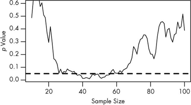
Figure 6-1. The results of a significance test taken after every pair of new patients is added to the study. There is no genuine difference between groups. The dashed line indicates the p = 0.05 significance level.
The plot shows the p value of the difference between groups as we collect more data, with the dashed line indicating the p = 0.05 level of significance. At first, there appears to be no significant difference. But as we collect more and more data, the p value dips below the dashed line. If we were to stop early, we’d mistakenly conclude that there is a significant difference between groups. Only as we collect even more data do we realize the difference isn’t significant.
You might expect that the p value dip shouldn’t happen since there’s no real difference between groups. After all, taking more data shouldn’t make our conclusions worse, right? It’s true that if we run the trial again, we might find that the groups start out with no significant difference and stay that way as we collect more data or that they start with a huge difference and quickly regress to having none. But if we wait long enough and test after every data point, we will eventually cross any arbitrary line of statistical significance. We can’t usually collect infinite samples, so in practice this doesn’t always happen, but poorly implemented stopping rules still increase false positive rates significantly.6
Our intent in running the experiment is important here. Had we chosen a fixed group size in advance, the p value would be the probability of obtaining more extreme results with that particular group size. But since we allowed the group size to vary depending on the results, the p value has to be calculated taking this into account. An entire field of sequential analysis has developed to solve these problems, either by choosing a more stringent p value threshold that accounts for the multiple testing or by using different statistical tests.
Aside from false positives, trials with early stopping rules also tend to suffer disproportionately from truth inflation. Many trials that are stopped early are the result of lucky patients, not brilliant drugs. By stopping the trial, researchers have deprived themselves of the extra data needed to tell the difference. In fact, stopped medical trials exaggerate effects by an average of 29% over similar studies that are not stopped early.7
Of course, we don’t know the Truth about any drug being studied. If we did, we wouldn’t be running the study in the first place! So we can’t tell whether a particular study was stopped early because of luck or because the drug really was good. But many stopped studies don’t even publish their original intended sample size or the stopping rule used to justify terminating the study.8 A trial’s early stoppage is not automatic evidence that its results are biased, but it is suggestive.
Modern clinical trials are often required to register their statistical protocols in advance and generally preselect only a few evaluation points at which to test their evidence, rather than after every observation. Such registered studies suffer only a small increase in the false positive rate, which can be accounted for by carefully choosing the required significance levels and other sequential analysis techniques.9 But most other fields do not use protocol registration, and researchers have the freedom to use whatever methods they feel appropriate. For example, in a survey of academic psychologists, more than half admitted to deciding whether to collect more data after checking whether their results were significant, usually concealing this practice in publications.10 And given that researchers probably aren’t eager to admit to questionable research practices, the true proportion is likely higher.
TIPS
§ If you use your data to decide on your analysis procedure, use separate data to perform the analysis.
§ If you use a significance test to pick out the luckiest (or unluckiest) people in your sample of data, don’t be surprised if their luck doesn’t hold in future observations.
§ Carefully plan stopping rules in advance and adjust for multiple comparisons.
/sup>14] And because standard error bars are about half as wide as the 95% confidence interval, many papers will report “standard error bars” that actually span two standard errors above and below the mean, making a confidence interval instead.