Business statistics with Excel and Tableau (2015)
2. Visualization and Tableau: telling (true) stories with data
In this book, we’ll work on gaining insights from data by visual- ization and quantitative analysis, and then presenting the results to others. Recently a powerful new tool called Tableau has become available. TableauPublic¹ is a free version. But be careful with your data because when you publish to the web, as you must do with Tableau Public, then your data also becomes available to anybody. If you require that your data beprotected, you can pay for the private version. Tableau 9 has just been made available.
Many of the worked examples in this book are accompanied by a link to a completed Tableau workbook, showing how you could have used Tableau to present your findings. Tableau cannot perform easily the more technical hypothesis-testing aspects of statistics such as regression, but it can help you to get your point across clearly. Tableau has also provided a useful White Paper² on visual best practices which is well worthreading
In business intelligence we are generally interesting in detecting patterns and relationships. This might seem obvious, because as humans we are always looking for these phenomena. I’d just like to add that theabsence of a pattern or relationship might be just as informative as finding one. An excellent first step is to take a look at your data with an expository graph before moving on to more formal data analysis. Below areexamples of the types of charts or graphs most commonly used in either examining data first off,
![]()
¹http://www.tableausoftware.com/public/ ²http://www.tableausoftware.com/whitepapers/visual-analysis-everyone
9
just to ‘see how it looks’. Checking an expository graph shows up problems that might throw you off later: missing data, outliers or, more excitingly, unexpected and intriguing relationships.
Histograms
Histograms break the data into classes and show the distribution of the data. Which classes (sometimes known as bins) are most common. The histogram shows us the ‘shape’ of the data. Are there many small measurements, or does the data look as though it is normally distributed and consequently mound-shaped. See Distribution in the Glossary for more on this. The plot below is of deaths in car accidents on a weeklybasis in the United States over the period 1973-1978. The histogram shows only the distribution and not the sequence.
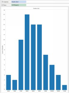 From the histogram only, we could say that the most common number of deaths in a week isbetween 8000 and 9000, be- cause the bars of the histogram arehighest there. They are high- est because they count the number oftimes in the time-period that there have been (for example 8000 deaths occurred in 15 weeks).
What the histogram doesn’t show is that
deaths have actually been decreasing since
Histogram of car deaths, reported weekly
about 1976. There is probably a simple explanation for this: compul- sory seatbelts perhaps? The take-home from this is that expository graphs are really easy to do, and that you should try different methods withthe same data to tease out the insights.
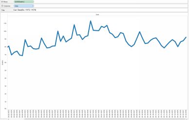
Car deaths over time
Scatterplots
The most common and most useful graph is probably the scatter- plot. It is used when we have two continuous variables, such as two quantities (weight of car and mileage) and we want to see the relationship between them. The scatterplot is also useful for plotting time series, where time is one of the variables.
You can use Excel for this, and also Tableau. In Excel, arrange the columns of your data so that the variable which you want on the horizontal x axis is the one on the left. This is the independent variable. Put the othervariable, the dependent variable, on the vertical y axis. It is usual practice to put the variable which we think is doing the explaining on the x axis and the response variable on
the y axis. Here is a scatterplot of European Union Expenditure per student as a percentage of GDP:
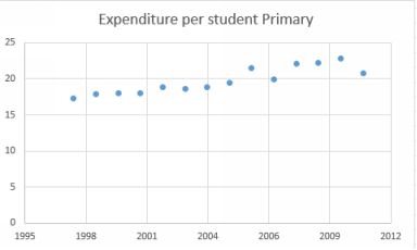
EU % of GDP spent on Primary Education
There is a gradual increase over the years 1996 to 2011 as one would expect; educational expenditures tend to remain a relatively fixed share of the budget. However, there was a blip in 2006 which is interesting.Because the data is percentage of GDP, the drop might have been caused by an increase in GDP or alternatively by an actual educational spending decrease. We’d need to look at GDP figures for the period. I gotEuropean GDP figures per capita and using Tableau put them on the same plot, with different axes of course. The result is below
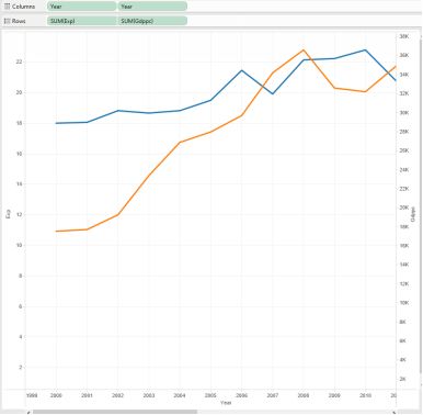
European GDP and Primary Expenditures
GDP dropped around 2008/2009 because of the world financial crisis. The blip in primary expenditures is still unexplained.
Maps
Tableau makes the display of spatial data relatively easy, provided you tell Tableau which of your dimensions contain the geographical variable. The plot below shows changes in greenhouse gas emis- sions fromagriculture in the European Union. I linked world bank data by country. The workbook is here³.
![]()
³https://public.tableausoftware.com/views/EuropeanGHGfromAgriculture2010- 2011/Sheet1?:embed=y&:display_count=no
Unfortunately, not all geographic entities are available for linkage in Tableau. States and counties in the United States are certainly available and provinces in Canada, as well as countries in Europe. There are waysto import ArcGIS shapefiles into Tableau. A shape- file is a list of vertices which delimit the polygons that define the geographical entity.
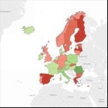
GHG emissions from agriculture in the European Union