Business statistics with Excel and Tableau (2015)
5. Testing whether quantities are the same
This chapter concerns testing whether the population means of two or more quantities are the same or not: and if they are in fact different, whether any variable can be identified as being associated with the difference.The test we will use is ANOVA, (Analysis of Variance). The test was developed by the British statistician Sir Ronald Fisher, and the F-test which ANOVA uses is named in his honor. Fisher also developed much of thetheoretical work behind experiment design during his time at the Rothamsted Research Station in England.
5.1 ANOVA Single Factor
The most straightforward application of ANOVA is when we simply want to test whether or not two or more means are the same. In this worked example, we have three different types of wheat fertilizer (Wolfe, Whiteand Korosa) and we would like to know whether their application produces equal or different yields.
As the section on experimental design in Chapter 3 emphasized, the experiment must be designed to isolate the effect of the fertilizer, and this is achieved by randomization. To control for differences in site-specificgrowing qualities, we select plots of land which are as similar as possible: exposure to sunlight, drainage, slope and other relevant qualities. We randomly assign fertilizers to plots, and the yields are measured. Thefirst few lines of a typical data set appear below.
23
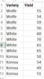
The fertilizer dataset
There are two columns in the dataset: thefactor, which is the name of the fertilizer, and the yield attributed to each plot. In this case, each fertilizer was tested on four plots, providing 3 x 4 = 12 observations. Later,when using Excel to run the ANOVA test, it will be necessary to change the format so that the yields are grouped under each factor.
A good first step is to visualize the data. Here is a boxplot drawn with Tableau.
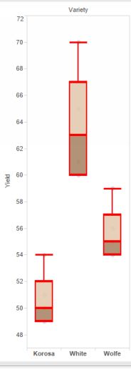
Fertilizer boxplot
I’ll make a frank admission right now: it took me the best part of a morning to get the technique of drawing a boxplot in Tableau down, so hopefully this YouTube will help you to avoid spending so much time on this.
The boxplot reveals these useful measurements: the smallest and largest observation, or the range. The median, which is the hori- zontal line within the box; and the 25% quartile (upper line of the box; and 75%quartile, lower line of the box. Therefore 50% (75-25) of the data are contained within the box. The ‘whiskers’ mark off data which are outliers, meaning that any datapoint which is outside a whisker is an outlier. Thisdoesn’t mean to say that it is somehow wrong: perhaps some of the most interesting discoveries come from looking at outliers. However, an outlier might also be the result of careless data entry and should thereforebe checked. It is clear from the plots that the yields are by no means the same.
In this example, we are measuring only one factor: the effect of the fertilizer on the mean yield of each plot, and so the test we want to conduct is single factor ANOVA with a completely randomized design. It iscompletely randomized because the allocation of fertil- izer to plot was random. We want any differences to be due to the fertilizer and the fertilizer alone.
Because our test is whether the means are the same or different, the hypothesis is:
Ho:µ1 =µ2 =µ3 =..= µn
with the alternative hypothesis that not all the means are the same. That isn’t the same as saying that they are all different; just that at least one is different from the others.
The rejection rule states that if the p value which comes out of the test is smaller than 0.05, then we reject the null hypothesis. If we reject the null, then we must accept the alternative hypothesis.
We test the hypothesis using the ANOVA Single Factor tool within Data Analysis. First, the two-column structure of the data has to be transformed into columns for each of the three fertilizers. That is easilyaccomplished using the PIVOT TABLE function.
The result are below.
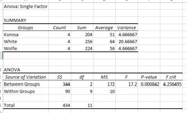
ANOVA output for fertilizer test
The key statistic is the p-value. It is much smaller than 0.05 and so we reject the null hypothesis. The means are not all the same. They are different. The summary output tells us that White has the largest mean yield andthis agrees with the boxplot. In this case, separation of results into a ranking of yield is relatively easy because they are so distinct. Unfortunately Excel lacks a way of easily testing whether any other pair are the sameor different. All we can say for sure is that they are not all the same.
Here is a slightly more complicated and realistic example. You are designing an advertising campaign and you have models with different eye colors: blue, brown, and green, and also one shot in
![]()
5.2 ANOVA: with more than one factor
The Fertilizer test above showed how to test the effect of a single factor. The ANOVA results showed that the means were not the same. By inspecting the boxplot and also the Excel output, it is clear that the varietyWHITE has a higher yield. What might be interesting is finding whether another factor also has a statistically significant effect on yields, and whether the two factors interacted together.
The case in question involves preparation for the GMAT, an exam required by some graduate schools. The GMAT is a test of logical thinking and is therefore not dependent on specific prior learning. We know the testscores of some applicants, and whether those students came from Business, Engineering or Arts and Sciences faculties. The students had also taken preparation courses, ranging from a 3-hour review to a 10-weekcourse. The question is: did taking the preparation course matter; and did faculty matter? Here we have two factors: faculty and preparation course. The data is already arranged in columns and so we can go straight inwith a two-way with replication. Look at the data⁵. It is replicated because there are two sets of observations for each preparation type. The output is here:
![]()
⁵https://dl.dropboxusercontent.com/u/23281950/testscores.xlsx
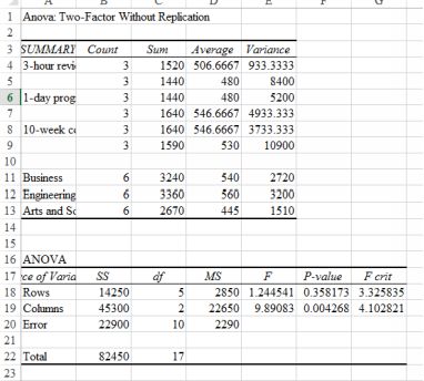
Test scores ANOVA output
We have the preparation type in the rows, and the relevant p value there is 0.358, so we fail to reject the null. We cannot say that there is any difference in scores as a result of preparation course type; in other words,there is no effect on scores resulting from preparation course type. However, for faculty (in columns) there is distinct difference, with a p value of 0.004. From the summary output, it looks as those in the Engineeringfaculty had the highest score.