Business statistics with Excel and Tableau (2015)
6. Regression: Predicting with continuous variables
This chapter is about discovering the relationships that might or (equally well) might not exist between the variables in the dataset of interest. Here’s a typical if rather simplistic example of regression in action: theoperator of some delivery trucks wants to predict the average time taken by a delivery truck to complete a given route. The operator needs this information because he charges by the hour and needs to be able to providequotations rapidly. The customer provides the distance to be driven, and the number of stops en route. The task is to develop a model so that the truck operator can predict the time taken given that information.Regression provides a mathematical ‘model’ or equation from which we can very quickly predict journey times given relevant information such as the distance, and number of stops. This is extremely useful when quoting for jobs or for audit purposes.
We know the size of the input variables—the distance and the deliveries, but we don’t know the rate of change between them and the dependent or response variable: what is the effect on time of increasing distance bya certain amount? Or adding one more stop? Using the technique ofregression, we make use of a set of historical records, perhaps the truck’s log-book, to calculate the average time taken by the truck to cover anygiven distance. As with any attempt to predict the future based on the past, the predictions from regression depend on unchanged conditions: no new road works (which might speed up or delay the journey), no change in the skills of the driver.
31
In the language of regression, the time taken in the truck example is theresponseordependentvariable, and the distance to be driven is the explanatory or independent variable. While we will only ever have just one response variable, the number of explanatory variables is unlimited. The number of stops the truck has to make will impact journey time, as will variables such as the age of the truck, weather conditions, andwhether the journey is urban or rural. If we know these variables, we also can include them in the model and gain deeper insights into what does (and equally important does not) affect journey time.
Regression models are used primarily for two tasks: to explain events in the past; and to make predictions. Regression provides coefficients which provide the size and direction of the change in the response variablefor a one unit change in one or more of the explanatory variables.
Regression makes a prediction for how long a truck will take to make a certain number of deliveries and also states how accurate the prediction will be. With a regression model in hand, we can make quotationsaccurately and quickly. In addition, we can detect anomalies in records and reports because we can calculate how long a journey should have taken under various what-if conditions.
Here I have used a straightforward example of calculating a time problem for a trucking firm, but regression is much more powerful than that. Some form of regression underlies a great deal of applied research. Whenyou read about increased risk due to smoking (or whatever else is the latest danger) that risk was calculated with regression. In this chapter, we’ll calculate the difference between used and new marioKart sales on ebay,estimate stroke risk factors, and gender inequalities in pay, all with regression.
Regression is not very difficult to do, but the problem is that everybody does it. Ordinary Least Squares (OLS), linear regression’s proper name, rests on some assumptions which should be checked for validity, butoften aren’t. We cover the assumptions, and what
to do if they’re not met, in the following chapter. This chapter is about the hands-on applications of regression.
6.1 Layout of the chapter
The chapter begins with some background on how regression works. We’ll illustrate the theory with the trucking example men- tioned above, before going on to adding more explanatory variables to improve theaccuracy of the prediction.
Particularly useful explanatory variables are dummy variables, which take on a categorical values, typically zero or 1. For example, we could code employees as male and female, and discover from this whether there isa gender difference in pay, and calculate the effect. In a worked example in the text, we analyze the sales of marioKart on ebay, and use dummy variables to find the average difference in cost between a new and a usedversion.
Sometimes two variables interact: higher or lower levels in one variable change the effect of another variable. In the text, we show that the effect of advertising changes as the list price of the item increases.
Finally, we’ll discuss curvilinearity. The relationship between salary and experience is non-linear. As people get older and more expe- rienced, their salaries first move quickly upwards, and then flatten out or plateau. We cancapture that non-linear function to make prediction more accurate.
6.2 Introducing regression
At school you probably learned how to calculate the slope of a line as ‘rise over run’. Let’s say you want to go to Paris for a vacation. You have up to a week. There are two main expenses, the airfare and the cost of accommodation per night. The airfare is fixed and
stays the same no matter whether you go for one night or seven. The hotel (plus your meal charges etc) is $200 per night. You could write up a small dataset and graph it like this:
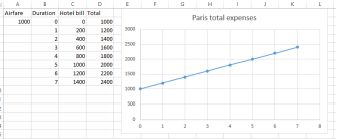
Total Paris trip expenses
The equation for is: Total expenses = 1000 + 200*Nights
Basically, you have just written your first regression model. The model contains two coefficients of interest:
• the intercept which is the value of the response variable (cost) when the explanatory variable is zero. Here the intercept is
$1000. That is the expense with zero nights. It is the point on the vertical y axis where the trend line cuts through it, where x =0. You still have to pay the airfare regardless of whether you stay zeronights or more.
• the slope of the line which is $200. For every one unit increase in the explanatory variable (nights) the dependent variable (total cost) increases by this amount.
In regression, we usually know the dependent variable and the independent variable, but we don’t know the coefficients. We use regression to extract those coefficients from the data so that we can make predictions.
How do we know whether the slope of the regression line reflects the data? Try this thought experiment: if you plotted the data and
the trend line was flat, what would that mean? No relationship. You could stay in Paris forever, free! A flat line has zero slope, and so an extra night would not cost any more.
More formally, the hypothesis testing procedure tests the null hypothesis that the slope is zero. If we can reject the null, then we are required to accept the alternative hypothesis, which is that the slope is not zero. If it isn’t zero (the trend line could slope up or down) then we have something to work with. We test the hypothesis using the data found from the sample, and Excel gives us a p value. If the p value is smaller than 0.05,we reject the null hypothesis. If we reject the null we can say that there is a slope and the analysis is worthwhile.
The Paris example had only one independent variable (number of nights) but regression can include many more, as the trucking example below will show. If there is more than one variable, we cannot show therelationship with one trend line in two dimen- sions. Instead, the relationship is a hyperplane or surface. The plot below shows the effect on taste ratings (the dependent variable) of increasing amounts of lactic acid andH2S in cheese samples.
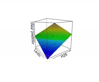
3D hyperplane for responses to cheese
Here is another example. We have the data on the size of the population of some towns and also pizza sales. How can we predict sales given population. Pizza YouTube here¹
6.3 Trucking example
The records of some journeys undertaken are available in an Excel file named ‘trucking’².
Take a look at the data. As I mentioned at the beginning of the book, it is always a good idea to begin with at least a simple exploratory plot of the variables of interest in your data. With Excel we can quickly draw a roughplot so that we can see what is going on. What we want to do is predict time when we know the distance. The
![]()
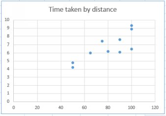
Trucking scatterplot
Time is the dependent variable and distance is the independent variable. The independent variable goes on the horizontal x axis, the dependent variable on the vertical y axis.
From the plot it is clear that there is a positive relationship between the two variables. As the distance increases, then so does the time. This is hardly a surprise. But we want more than this: we want to quantify therelationship between the time taken and the distance traveled. If we can model this relationship that will be useful when customers ask for quotations.
The data set contains one further variable, which is the number of deliveries on the route. We’ll use that later on. For now we’ll use just the time and the distance.
To build our model, we want to build an equation which looks like this in symbolic form
yˆ =bo+b1x1 +...bnxn+ e
yhat (spoken ‘y hat’) is the dependent variable. It is called ‘hat’ because it is an estimate. b0 is the intercept, or the point where the trend line (also called the regression line) passes through the vertical y axis. This isthe point where the independent variable is zero. You perhaps remember a similar equation from school: y = mx
+b.
In the trucking example, the intercept (b0) might be the time taken warming up the truck and checking documentation. Time is running, but the truck is not moving. b1 is the ‘coefficient’ for the independentvariable because it provides the change in the dependent variable for a one-unit change in the independent variable. x1 is the independent variable, in this case distance. We want to be able to plug in some value ofthe independent variable and get back a predicted time for that distance.
The b and the x both have a subscript of 1 because they are the first (and so far only independent variable). I have put in more variables just to indicate that we could have many.
The coefficient, b1, provides the rate of change of the dependent variable for a one unit change in the independent variable. You can think of this as the slope of the line: a steeper slope means a greater increase in y for aone-unit increase in x.
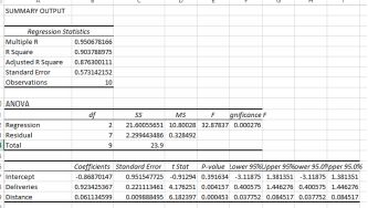
We can now find the estimated regression equation using the regression application in Excel. First, we use the regress function in Excel’s data analysis tool to regress distance on time.
The regression output is as below:
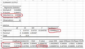
The regression output
I have marked some of the key results in red, and I explain them below.
6.4 How good is the model? —r-squared
There is a red circle around the adjusted r-squared value, here 0.622. r-squared is a measure of how good the model is. r-squared goes from 0 to 1, with a 1 meaning a perfect model, which is extremely rare inapplied work such as this. Zero means there is no relationship at all. The result here of 0.62 means that 62% of the variance in the dependent variable is explained by the model. This isn’t bad, but it’s not great either. Below, we’ll add more independent variables and show how the accuracy of the model improves. The adjusted r-squared takes into account the number of variables in the regression equation and also the sample size,which is why it is slightly smaller than the r-squared value. It doesn’t have quite the same interpretation as r-squared, but it is very useful when comparing models. Like r-squared, we want as high a value as possible:higher is better because it means that the model is doing a more accurate job.
Also circled are the words intercept and distance. These give us the
coefficients we need to write the model. Extracting the coefficients from the Excel output, we can write the estimated regression model.
yˆ = 1.274 + 0.068 ∗ Dist
where yhat is the estimated or predicted response time. If you took a very large number of journeys of the same distance, this would be the average of the time taken.
The intercept is a constant, it doesn’t change. It is the amount of time taken before a single kilometer has been driven. The distance coefficient of 0.068 is the piece of information that we really want. This is the rate ofchange of time for a one unit change in the dependent variable, distance. An increase of one kilometer in distance increases the predicted time by 0.0678 hours, and vice- versa of course. Do the math and you’ll seethat the average speed is 14.7 mph.
6.5 Predicting with the model
A model such as this makes estimating and quoting for jobs much easier. If a manager wanted to know how long it would take for a truck to make a journey of 2.5 kms for example, all he or she would need to do is toplug 2.5 into distance and get:
predicted time = 1.27391 + 0.06783*2.5 = 1.4435 hours.
multiply this result by the cost per hour of the driver, add the miscellaneous charges and you’re done.
It is unwise the extrapolate. Only make predictions within the range of the data with which you calculated your model (see also Chapter 4 on this.
6.6 How it works: Least-squares method
The method we just used to find the coefficients is called the method of least squares. It works like this: the software tries to find a straight line through the points that minimizes the vertical distance between the predicted y value for each x (the value provided by the trend line) and the actual or observed value of each y for that x. It tries to go as close as it can to all of the points. The vertical distance is squared so that the amountsare always positive.
The plot below is the same as the one above, except that I have added the trend line.
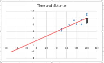
The black line illustrates the error
The slope of the trend line is the coefficient 0.0678. That is the rate of change of the dependent variable for a one-unit change in the independent variable. Think “rise over run”. I extended the trend line backwards toillustrate the meaning of intercept. The value of the intercept is 1.27391, which is the value of y when x is zero. This is actually a form of extrapolation, and because we have no observations of zero distance, this is anunreliable estimate.
Now look at the point where x = 100. There are several y values representing time taken for this distance. I have drawn a black line
between one particular y value and the trend line. This vertical distance represents an error in prediction: if the model was perfect, all the observed points would lie along the trend line. The method of least squares works by minimizing the vertical distance. It is possible to do the calculations by hand, but they are tedious and most people use software for practical use. The gap between predicted and observed is known as aresidual and it is the ‘e’ term in the general form equation above.
The error discussed just above is the vertical distance between the predicted and the observed values for every x value. The amount of error is indicated by the r-squared value. r-squared runs from 0 ( a completelyuseless model) to 1 ( perfect fit).
In the glossary, under Regression, I have written up the math that underpins these results.
6.7 Adding another variable
The r-squared of 0.66 we found with one independent variable is reasonable in such circumstances, indicating that our model explains 66% of the variability in the response variable. But we might do better by addinganother variable to explain more of the variability.
The trucking dataset also provides the number of deliveries that the driver has to make. Clearly, these will have an effect on the time taken. Let’s add deliveries to the regression model.
Note that you’ll need to cut and paste so that the explanatory variables are adjacent to each other. It doesn’t matter where the response variable is, but the explanatory variables must be adjacent in one block. The newresult is below:
Now with deliveries
Note that the r-squared has increased to 0.903, so the new model explains about 25% more of the variation in time. The improved model is:
yˆ = −0.869 + 0.06 ∗ Dist + 0.92 ∗ Del
A few things to note here: the values of the coefficients have changed. This is because the interpretation of the coefficients in a multiple model like this is based on only one variable changing. For example, thecoefficient of distance is 0.92, almost one hour for each delivery assuming that the distance doesn’t also change. We should interpret the coefficients under the assumption that all the other variables are ‘held steady’, apart from the coefficient of interest.
6.8 Dummy variables
Above, we saw how adding a further variable has dramatically improve the accuracy of a model. A dummy variable is an additional variable but one that we construct ourselves as a result of dividing data into twoclasses, for example by gender. Dummy variables are
powerful because they allow us to measure the effect of a binary variable, known as a dummy or sometimes indicator variable. A dummy variable takes on a value of zero or one, andthus partitions the data into two classes. One class is coded with a zero, and is called the reference group. The other classes are coded with a one and successive numbers.
There may be more than two groups, but there will always be one reference group. We are generating an extra variable, so the regression equation looks like this:
yˆ = b0 + b1x1 + b2x2
In the case of observations which have been coded x1=0 (the reference group), then the b1 term will disappear because it is multiplied by zero. The b2 term remains. For thereference group, the estimated regression equation then simplifies to
yˆref erence = b0 + b2x2
while for the non-reference group, it is
yˆnonref erence = b0 + b1x1 + b2x2
The size of b1x1 represents the difference between the average size of the reference level and whatever group is the non-reference group. Let’s work through an example. Creating adummy variable⁵
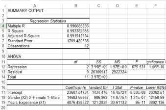
The dataset [‘gender’] (https://dl.dropboxusercontent.com/u/23281950/gender.xlsx) contains records of salaries paid, years of experience and gender.
We might want to know whether men and women receive the same salary given the same years of experience. Load the data, then run a linear regression of Salary on Years ofExperience, using years of experience as the sole explanatory variable. The result is below:
![]()
The gender regression
The interpretation is that the intercept of $30949 is the aver- age starting salary, with years of experience zero. The coefficient
$4076 means that every additional year of experience increases the worker’s salary by this amount.
The r-squared is 0.83, so the simple one-variable model explains about 83% of the variation in the dependent variable, salary. We have one more variable in the dataset, gender. Add this as a dummy variable and runthe regression again. Note that you will have to cut and paste the variables so that the explanatory variables are adjacent.
With the gender dummy added
The r-squared has increased to nearly 1, so our new model with the inclusion of gender is very accurate. The important new variable is gender, coded as female = 0 and male = 1. Nothing sexist aboutthis, we could equally well have reversed the coding. If you are female, then the model for your salary is: 23607.5 + 4076*Years
if you are male, then the model for your salary is 23607.5 + 114683.67 + 4076Years
Each extra year of experience provides the same salary increase, but on average males receive $14683.67 more earnings.
Here is another example, using the maintenance dataset. Dummy variable⁶
Another dummy variable example and a cautionary tale
The mariokart dataset came from [OpenIntro Statistics] (www.openintro.org) a wonderful free textbook for entry level students. The dataset
contains information on the price of Mario Kart in ebay auctions. First let’s test whether condition ‘new’ or ‘used’ makes difference. Construct a new column called CONDUMMY, coded new = 1 and used = 0. Nowrun a regression with your new dummy variable against total price. The output is below
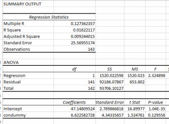
The condition dummy results
This result is tremendously bad. The p value is 0.129, meaning that condition is not a statistically significant predictor of price. Surely the condition must have some significant effect? Wait—we forgot to do somevisualization. To the right is a histogram of the total price variable.
Looks like we might have a problem with outliers…some of the observations are much larger than the others. Take another look with a barchart at the higher prices.
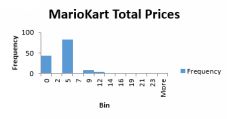
marioKart total prices
We can identify these outliers using z scores (see the Glossary). Or we could just sort them by size and then make
a value judgement based on the description. That’s what I have done in this YouTube. Outlier removal and regres- sion⁷

The total prices as a bar chart
It seems that two of the items listed were for grouped items which were quite different from the others. There is therefore a legitimate reason for excluding them. Below are the new results:
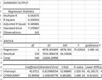
Corrected marioKart output
The estimated regression equation is
yˆ = 42.87 + 10.89 ∗ CONDUMMY
The condition dummy was coded as new = 1, used = 0. If a mariokart is used, then its average price is 42.87, if it new then the average price is 42.87 + 10.89. The average difference in price between old and new is nearly$11. Makes sense.
Take-home: check your data before doing the regression.
6.9 Several dummy variables
The gender and the marioKart examples above contained just one dummy variable. But it is possible to have more. For example, your sales territory contains four distinct regions. If you make one of the four thereference level, and then divide up the data with dummies
for the remaining three regions, you can compare performance in each of the regions both to each other and to the reference level.
The dataset maintenance contains two variables which you can convert to dummies, following this YouTube.
6.10 Curvilinearity
So far, we have assumed that the relationship between the depen- dent variable and the independent variable was linear. However, in many situations this assumption does not hold. The plot below shows ethanolproduction in North America over time.
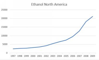
North American ethanol production. Source: BP
The source of the data is BP. It is clear that production of ethanol is increasing yearly but in a non-linear fashion. Just drawing a straight line through the data will miss the increasing rate of production. We can capturethe increasing rate with a quadratic term, which is simply the time element squared. I have created a new variable which indexes the years, which I have called t, and a further variable
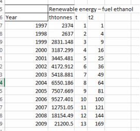
The dataset with an index for time. Source: BP
A regression of t against output has an r-squared value of 0.797. Inclusion of the t squared term increases the r-squared markedly to
0.98. The regression output is below.
Regression output with the quadratic term
We would write the estimated regression equation as
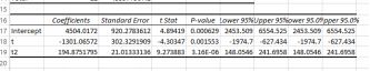
yˆ = 4504 − 1301t + 194.9t2
Notice that for early smaller values of t, the effect of the quadratic
erm is negligible. As t gets larger then the quadratic swamps the linear t term.
Making a prediction. Let’s predict ethanol production after 5 years. Then
yˆ = 4505 − 1301 ∗ 5 + 194.9 ∗ 25 = 2872.5
The plot below shows predicted against observed values. While the fit is clearly imperfect, it is certainly better than a straight line.
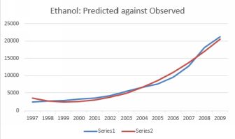
Predicted against observed ethanol production.
6.11 Interactions
Increasing the price of a good usually reduces sales volume (al- though of course profit might not change if the price increases sufficiently to offset the loss of sales. Advertising also usually increases sales, otherwisewhy would we do it?
What about the joint effect of the two variables? How about reducing the price and increasing the advertising? The joint effect is called an interaction and can easily be included in the explanatory variables as anextra term. The output below is the result of
regressing sales on Price and Ads for a luxury toiletries company. The estimated regression model is
yˆ = 864 − 281P + 4.48Ads
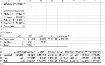
Regression output for just price and ads
So far so good. The signs of the coefficients are as we would expect from economic theory. Sales go down as price rises (negative sign on the coefficient). Sales go up with advertising (positive sign on the coefficient). Caution: do not pay too much attention to the absolute size of the coefficients. The fact that price has a much larger coefficient than advertising is irrelevant. The coefficient is also related to the choiceof units used.
Now create another term which is price multiplied by ads. Call this term PAD. The first few lines of the dataset are below.
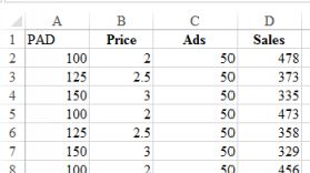
First few lines with the new interaction variable
Now do the regression again, including the new term.
Inclusion of the interaction term
The new term is statistically significant and the r-squared has increased to 0.978109. The new model does a better job of explaining the variability. How come price is now positive and the interaction term isnegative? We have to look at the results as a whole remembering that the signs work when all the other terms are ‘held constant’. The explanation: as the price increases, the effect of advertising on sales is LESS.You might want to lower the price and see if the increased volume compensates.
Another interaction example
Here’s another example, this one relating to gender and pay. The dataset is called ‘paygender’ and contains information on the gen- der of the employee, his/her review score (performance), years of experience andpay increase. We want to know:
• Is there a gender bias in awarding salary increases?
• In there a gender bias in awarding salary increases based on the interaction between gender and review score?
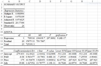
First, let’s regress salary increases on the dummy variable of gender and also Review. My results are below (I have created a new variable which I have called G. It is just the gender variable coded with male
= 0 and female = 1.
G dummy and Review
Nothing very surprising here: women get paid on average 233.286 less than men. And—holding gender steady–each point increase in Review gives an increase in salary of 2.24689.
How do I know that women are paid less than men? The estimated regression equation is:
yˆ = 204.5061−233.286∗(x = 1ifF) − 233.286 ∗ (x = 0ifM) + 2.24689 ∗ Review
Remember how we coded men and women? The x = 0 if M term disappears, so we are left with this equation for men:
yˆ = 204.5061 + 2.24689 ∗ Review
and this one for women (I’ve done the subtraction) to give
yˆ = −28.779 + 2.24689 ∗ Review
Conclusion: there is a gender bias against women. For the same Review standard, on average women are paid 233.286 less than men.
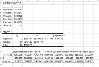
How about the second question — possibility that the gender bias increases with Review level? We can test this with an interaction variable. Multiply together your gender dummy and the Review score to create a new variable called Interact. Then do the regression again with salary regressed against G, Review and Interact. My output is below.
Interaction output
For men, the equation is Salary = 59.94472 + 4.848995 (because the G and Interact terms go to zero because we coded Male=0. So for every extra increase in Review, a man’s salary increases by 4.848995.
For women, the equation is Salary = 59.94472 -29.714 - 1*(4.848995- 4.05468) so for every one increase in Review, a women’s salary increases by only 4.848995-4.05468=0.79. Notice that the adjusted r- squared forthis model is higher (it is 0.927339 compared to 0.810309) than the model with just G and Review. So the interaction is both statistically significant, p value 0.000316) and has the meaning that for women, improving theReview score doesn’t increase the salary as much as for men.
Conclusion The analysis showed that women are being treated unfairly. There is a gender bias against them in average salaries for the same performance review; and each increase in review points earn themconsiderably less in salary than for the equivalent male. Caution: this conclusion is based solely on the limited evidence provided by this small dataset.
6.12 The multicollinearity problem
Multicollinearity refers to way in which two or more variables ‘explain’ the same aspect of the dependent variable. For example, let’s say that we had a regression model which was explaining someone’s salary.Employees tend to get paid more as they get older and also as their years of experience increases. So if we had both age and years of experience in the list of independent variables we would almost certainly suffer frommulticollinearity.
Multicollinearity can lead to some frustrating and perplexing re- sults. You run a regression. One of the variables has a p value larger than 0.05, so you decide to take it out. You run the regression again and—-the sign and/or significance of another variables changes. This happens because the two variables were explaining the same aspect of the dependent variable jointly.
How to solve this problem: check the correlation of the independent variables first, before putting them into your model. Chapter 14 has a section on correlation. If you find that the correlation of any two variables ishigher than 0.7, be suspicious. These two may bring your some grief!
6.13 How to pick the best model
You will be trying out different formulations, adding and removing variables to try to capture as much explanatory power as you can. How you do decide if one model is better than another? There are two approaches:
• Look only at the adjusted r-squared value, even if your model contains variables with a p value larger than 0.05. If the adjusted r-squared value goes up, leave such variables in.
• Prune your model so that it contains only variables with a p value <= 0.05. You still want as high an adjusted r-squared as
you can get, but you also want all your explanatory variables to be statistically significant.
I take the latter approach. You usually have fewer variables but all of them have a reason (statistical significance) for being in your model and you can interpret their meaning intelligently. A parsimonious model is betterthan a complex model that fits your data very well. Simple and robust is good. The dataset that you used to fit your model is only a sample from a population. An overly complex model may not work well whenpresented with a different sample from the population.
6.14 The key points
• Think through your model before you start including vari- ables. What variables do you think will have an effect on the dependent variable and in which direction (plus or minus). It istempting to just put in everything and hope for the best but this rarely works. Some software is able to do stepwise regression, pulling out insignificant variables for you, but Excel is not one ofthem.
• Keep your model as simple as possible. Complicated models rarely work well.
• Visualise your data first, even with a simple scatter plot as we have done throughout this chapter.
• Check whether you have all the variables that you might need. If you were trying to predict whether a shop selling expensive jewellery would make sufficient sales, you might want to know theaverage income of residents. If you don’t have it—get it. There is a huge amount of data lying about which you can obtain either free or quite cheaply. I’ve included a very brief list of URLs inChapter 12.
6.15 Worked examples
1. The estimated regression equation for a model with two independent variables and 10 observations is as follows:
yˆ = 29 + 0.59x1 + 4.9x2
What are the interpretations of b1 and b2 in this estimated regres- sion equation?
Answer: the dependent variable changes by on average 0.59 when x1 change by one unit, holding x2 constant. Similarly for b2.
Predict the value of the independent variable when x1 is 175 and x2 is290 :
yˆ = 29 + 0.59(175) + 4.9(290) = 1553.25