Business statistics with Excel and Tableau (2015)
8. Time Series Introduction and Smoothing Methods
A time series is a set of observations on the same variable measured at consistent intervals of time. The variable of interest might be monthly sales volume, website hits or any other data of relevance to the business. Using time series analysis we can detect patterns and trends and–just possibly–make forecasts. Forecasting is tricky because (of course!) we only have historical data to go on and there is no assurance that the same pattern will repeat itself. Despite all this, time series analysis has developed into a huge topic, fortunately with a large number of freely available data-sets to use. Links to some of these data-sets are provided at the endof the data chapter (Chapter 3).
There are two basic approaches: thesmoothingapproach and the regression method. Both methods attempt to eliminate the background noise. This chapter covers smoothing methods, the following chapter the regression approach.
8.1 Layout of the chapter
Here we will
1. identify the four components that make up a time series
2. introduce the naive, moving average methods and exponen- tially weighted smoothing methods to make a forecast
3. discuss ways in which the accuracy of the forecasts can be calculated
76
8.2 Time Series Components
There are four potential components of a time series. One or more of the components may co-exist. The components are: trend compo- nent; seasonal component; cyclical component; random component.
• trend component: the overall pattern apparent in a time series. The plot below shows French military expenditure as a percentage of GDP. The downward trend is apparent.
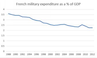
French military expenditure as a percentage of GDP
• seasonal component: sales of skis or Christmas decorations are clearly higher in the winter months, while ice cream and suntan cream move more quickly in the summer. If we know the seasonal component, then we can use this information for prediction. The time between the peaks of a seasonal component is known as the period. Note here that season doesn’t necessarilymean the season of the year.
The plot below shows sales of TV sets by quarter. Here there is a constant upward trend because more people are buying TV sets, but there is also a seasonal effect.
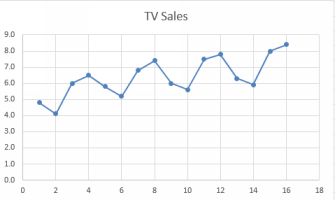
TV Sales by quarter
• cyclical component: some time series have periods last- ing longer than one year. Business cycles such as the 50- year Kondratieff Wave are an example. These are almost impossible tomodel, but that doesn’t stop the hopeful from trying. Kondratieff himself ended up a victim of Joseph Stalin because his suggestion that capitalist economies went in waves undermined Stalin’sview that capitalism was doomed, and he was executed in 1938.
• random component: the random component is just that: the noise or bits left over after we have accounted for everything else. The tell-tale signs of a random component are: a con- stant mean; nosystematic pattern of observations; constant level of variation.
8.3 Which method to use?
In the next two chapters, we’ll work through the two basic ap- proaches: the smoothing approach and the regression approach. How to decide which to use?
First step as usual is to make a simple scatter plot of your data, with time on the horizontal x axis and the variable of interest on the vertical y axis. If the result is something resembling a straight line, for example theFrench military expenditure, then use a smoothing approach. If there is evidence of some seasonality, such as with the TV sales data, then regression is the way to go. This is especially the case if you want to calculatethe size of the seasonal effect.
8.4 Naive forecasting and measuring error
Forecasting is just that: an educated guess about what might happen at some point in the future. Forecasts are based on historical events, and we are hoping that some pattern of behavior will repeat itself which will makethe forecast ‘true’. The best that we can do is to try out different forecasting methods and work out how well they predicted data which we already knew about. Then we take a leap into the dark and hope that the bestof those methods will do a good job on data that we don’t know about. This section concerns the measurement of forecasting accuracy.
We’re going to construct a naive forecast and use that forecast to demonstrate two common methods of accuracy checking: the Mean Squared Error (MSE)and the Mean Absolute Deviation (MAD) approaches.
A naive forecast assumes that the value of the variable at t+1 will be the same as at t. The values are just carried forward by one time period. Here is an example:
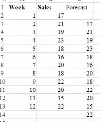
Image Gas prices with naive forecast
The naive approach is sometimes surprisingly effective, perhaps because of its simplicity. In general simple models perform well perhaps because of their lack of assumptions about the future. Now we will measurethe accuracy of the Naive Forecast with MAD and MSE. In both methods the error is calculated by subtracting the forecast or predicted value from the observed value. The methods differ in what is done with thoseerrors.
MAD measures the absolute size of the errors, sums them and then divides by the number of forecasts. The absolute value of the error is just its size, without the sign. In Excel, you can find an absolute value with=ABS(F1 - F3) where FI is the observed value and FE the predicted value. Use the little corner of the formula box to drag it down. Then find the sum and divide by the n, which is the number of observations. In math thisis
MAD =
∑ (abserror)
![]()
n
In MSE, the error is squared before being summed and divided.
Squaring the error removes the problem of the negative numbers, but creates another one: large errors are given more weighting because of the squaring. This can distort the accuracy of the results. The maths for theMSE is below
MSE =
∑ (error)2
![]()
n
The plot below shows the errors associated with the naive forecast- ing, the absolute values of the errors and the MAD. In Excel, use
=abs( ) to convert to an absolute value.
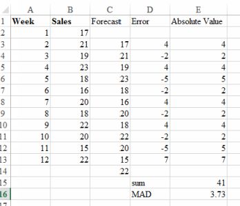
Image Errors and Mean Absolute Deviation
8.5 Moving averages
Slightly more complex than the naive approach is the moving average approach, which relies on the fact that the mean has less
variance than individual observations. By focusing on the mean, we can see the general trend, less distracted by noise.
The analyst decides how far back in time the average will go. The longer back in time, then the more values of the observation are averaged, resulting in a flatter more smoothed result. This is good for observing long-term trends, but less satisfactory if you are interested in more recent history.
The number of observations which are to be averaged is known as k, and this number is chosen by the analyst based on experience. In Excel’s Data Analysis Toolpak there is a Moving Average tool which can do all thework. Positioning the output is slightly tricky. There are k time periods being used for the calculation of the first forecast; so the first forecast should be at k+1 because k time periods are being used to find the first value.Where exactly to put the first cell of the output is a bit fiddly. If there are k time periods being used, place the first cell at k-1. Excel provides a chart output, example below. There is a YouTube here¹
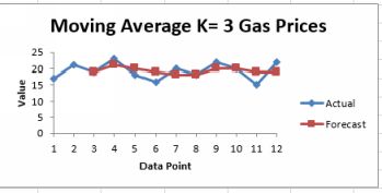
Image Moving average with k=3 for gas prices
The moving average technique is used by investors to detect the ‘golden cross’ and the ‘death cross’. They examine 50 day and 200 day moving averages. When the 50 day moving average is above
the 200 day moving average this point is the so-called golden cross and a signal to buy. By contrast, when the opposite happens this is the ‘death cross’…time to get out!
8.6 Exponentially weighted moving averages
The exponential smoothing method (EWMA) is a further step forward from the naive and the moving average approaches. The moving average forgets data older than the k time periods specified, while the EWMA incorporates both the most recent and more historical observations to construct a forecast. In the Glossary you’ll find more detailed math showing how the EWMA brings forward all past history. In general the furtherback in time you get, the less influence the observations have.
Using EWMA we choose a smoothing constant, alpha, which sets the weight given to the most recent observation against previous forecasts. If we thought that the forecast (t+1) would be similar to the currentobservation (t=0) and we thought that older forecasts were of little value, then we would choose a high value of alpha. Alpha runs from 0 to 1. The EWMA formula is
Ft+1 = αYt + (1 − α)Ft
where F is the forecast, and Y is the actual value of the variable. alpha is the smoothing constant, ranging in value between 0 and 1, and chosen by the analyst.
In words, this equation means that the forecast value (at t+1) is the smoothing constant alpha multiplying the actual value at t=0 plus (1-alpha) times the forecast at t=0. So if the previous forecast was totally correct,the error would be zero and the forecast would be exactly what we have today. It turns out that the exponential
smoothing forecast for any period is constructed from a weighted average of all the previous actual values of the time series.
The equation above shows that the size of alpha, the smoothing constant, controls the balance between weighting given to the most previous observation and previous observations. If the alpha is small, then theamount of weight given to Y at t=0 is small and the weight given to previous observations is large and vice-versa. If alpha = 1, then previous observations are given no weight at all, and we assume that the future is thesame as the past. This achieves the same result as naive forecasting discussed above. Typically quite small value of alpha are used, such as 0.1.
##Application of Excel’s exponential smoothing tool
An exponential smoothing tool is available in the Analysis ToolPak. We’ll use Canadian Gross Domestic Product per capita as an example. Here is the data plotted on its own. Youtube²
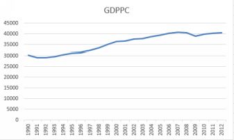
Canadian GDP Per Capita
There is a steady upwards trend, but with a dip in 2009 due to the world financial crisis. Excel asks for a damping factor. This is 1 - alpha. I have done the forecasts twice, once with an alpha of 0.1
and again with an alpha of 0.9. Therefore the damping factors were
0.9 and 0.1. The result for alpha = 0.9 is shown below.
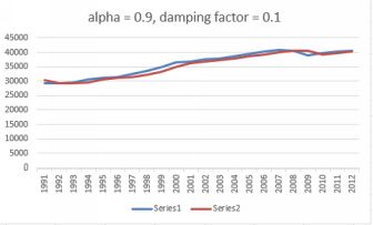
Forecast with alpha = 0.9
This is pretty good forecast, with the forecast tracking the actual observations closely.
The plot below shows sheep numbers as counts by head in Canada from 1961 to 2006. First, let’s plot this using 0.3 as alpha (arbitrarily chosen). The plot is below, with a damping factor of 1-0.3 = 0.7.
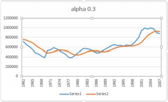
Sheep numbers with alpha = 0.3
All materials on the site are licensed Creative Commons Attribution-Sharealike 3.0 Unported CC BY-SA 3.0 & GNU Free Documentation License (GFDL)
If you are the copyright holder of any material contained on our site and intend to remove it, please contact our site administrator for approval.
© 2016-2026 All site design rights belong to S.Y.A.