Business statistics with Excel and Tableau (2015)
7. Checking your regression model
It isn’t difficult to build a regression model as the previous chapter has shown. But that is part of the problem: everybody does it. But not everybody takes the trouble to check the results. Checking the results is animportant step for two reasons: first, to make sure your calculations and predictions are correct; and secondly to show third parties that your work is solid. In this chapter we’ll work on doing just that. To decidewhether the models we have been working on are any good we need to look at two areas:
• Is your model statistically significant?
• Are the assumptions behind the least squares method met? In particular, linearity and residual distribution.
The first area is easier to work through than the second, which is probably why one doesn’t always see residual analysis discussed when results are presented. This is a shame because there is a great deal to be learnedfrom picking through residuals. Your analysis will be greatly improved by a close attention to this area.
Below we’ll work through statistical significance and then test the assumptions.
7.1 Statistical significance
The regression trend line displays a rate of change between two variables. The line slopes upwards when the dependent variable increases for a one-unit increase in the independent variable (
61
positive relationship) and vice-versa (negative relationship). What we want to know is this: did that slope upwards or downwards occur by chance; if we took another sample from the population would we achieve a similar result? Key point: we are usually working with a sample drawn from a population. The sample in the trucking example was the firm’s log book.
The null hypothesis is that there is no slope; with the alternative that there is in fact a slope. The hypotheses (see the Glossary for help on hypotheses) to test whether there is a statistically significant slope are:
The null:
Ho:β= 0
and the alternative:
Ha:β̸= 0
where
β
is the symbol for the coefficients of the population parameter of the independent variable of interest. In words, the hypothesis is testing whether beta is zero or not. If it is zero, then we are ‘flatlining’ and there is nopoint in continuing with the analysis. If however we can reject the null, then we accept the alternative which is that beta is not zero. It might be negative or positive, that doesn’t matter: what matters is whether it is zeroor not. Note that we use a Greek letter when discussing a population parameter which will probably never be accurately known. We use the Latin letter ‘b’ when we have estimated it using a sample drawn from thepopulation.
Excel does all the testing of statistical significance for us in two ways.
First, it tests the individual variables and provides a p value. Below is the result from the first trucking regression we did. Note that the p value for distance is 0.004. It is customary to use a cut-off of 0.05. The meaning ofthis result is that, following the rejection rule, we reject the null if the p value is smaller than 0.05. Because 0.004 is smaller than 0.05, we reject the null we therefore conclude that there is in fact a statistically significantslope. In summary, we tested the hypothesis that the slope was zero, and rejected it. Therefore we accept the alternative which is that there is a slope of some sort.
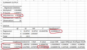
The trucking regression output
This test tells us that there is a statistically significant slope. It doesn’t tell us the sign of the slope (up or down) or its magnitude. But the fact that there is a significant slope is important information. It is worth carryingon with the analysis because the variables actually mean something. By the way, ignore the p value for the intercept. It usually has no substantive meaning.
The second way that Excel tests the validity of the model is to test whether the model as a whole is significant. The test is called the F test after the statistician RA Fisher. For the trucking example, look under significanceF. The result is a p value, in this case the same
p value for the variable DISTANCE. We have only one explanatory variable and so the p value will be the same. We hope that the p value is smaller than 0.05, which enables us to conclude that at least one of the slopesis non-zero.
The section above examined the first of the tests, which was for the statistical significance of the model. Now we move on to the second area.
7.2 The standard error of the model
The standard error in Excel is found just under the adjusted r- squared output. It is the estimated standard deviation of the amount of the dependent variable which is not explainable by the model. In other words, it is thestandard deviation of the residuals.
Under the assumption that the model is correct, it is the lower bound on the standard deviation of any of the model’s forecast errors. The figure below shows the output of regression estimating risk of a stroke (multipliedby 100) against blood pressure and age, with a dummy variable for smoking or not.
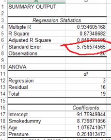
Excel output for stroke likelihood
The standard error is 6 (rounded up). For a normally-distributed variable, 95% of the observations will be within two standard deviations of the mean. For our purposes that means that 2 x 6 = 12 should be addedor subtracted to the predicted value to find a confidence interval for predictions. The estimated regression equation from the stroke model above is:
yˆ = −91 + 1.08Age + 0.25 Pr essure + 8.74Smokedummy
An imaginary person who smokes, is aged 68 and has a blood pressure of 175 will have a risk of 34 (all figures rounded). We can be 95% confident that this estimate will fall somewhere between 34 - 12 and 34 + 12or 22 to 46. These are rather wide confidence intervals and so we might want to work at improving the model by for example increasing the sample size or adding more explanatory variables.
7.3 Testing the least squares assumptions
There are two key assumptions that the least squares method relies on which we need to check. After checking we’ll work through ways of retrieving the situation should the assumptions be violated. The assumptionsare:
• The relationship between the dependent and the independent variables is linear. Fortunately this is easy to check and also to fix if it isn’t satisfied.
• The residuals have a non-constant variance. (You’ll some- times see in other statistics textbooks other stricter require- ments, such as the residuals being normally distributed and with a mean ofzero. For most purposes just checking for non-constant variance is enough). What does non-constant variance mean? We’ll work through this by defining a resid- ual and identifying whether ornot the assumption has been met. And finally what to do about it. But first, checking for linearity.
Checking for linearity
The relationship between the dependent variable and the indepen- dent variable is assumed to be linear. This is important because the model gives us a rate of change: the coefficient shows the change in the dependentvariable for a one-unit change in the independent variable. If the relationship is non-linear, that coefficient will not be valid in some portions of the range of the variables.
We want to see a straight line (either up or down) on a scatter plot. Put the dependent variable on the vertical y axis, and one of the independent variables on the horizontal x axis. If you include the trend line, you canobserve how closely the observed values match the predicted.
We can also check for linearity by plotting the predicted values and the observed values. The plot below does this for risk of stroke:
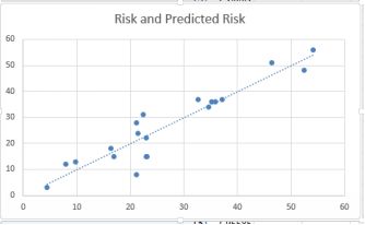
Predicted against observed risk
This is a reasonable result, indicating that the linearity condition is met. Most of the points are in a straight line, although I would be concerned about the lower risk levels, especially around risk = 20. There appears to beconsiderable variance at this point.
7.4 Checking the residuals
A residual is the difference between the observed value of y for any given x value, and the predicted value of y for that same x value. It is therefore a prediction error, and is given the notation e for the Greek letter‘epsilon’. It is the vertical distance between the actual and predicted values of the dependent variable for the same value of the independent variable. We discussed this in the previous chapter in connection with the leastsquares method, where we wrote the estimation equation:
yˆ =b0 + b1x
The hat on y, the dependent variable, indicates that it is an estimate of the dependent variable. We know that the estimate cannot be correct unless all the predicted values and the observed values match up exactly. If theydon’t, then there are residuals. If we call the errors ε (epsilon) which is the Greek letter matching our letter e, then we can rewrite the regression equation as:
y = βo + β1x + ε
The errors have now been absorbed into epsilon and so we can remove the hat from y. It is the behavior of epsilon that is of interest, because the least-squares method rests on the assumption that the errors absorbed into epsilon have a non-constant variance. This means that there no relationship between the size of the error term and the size of the independent variable. Therefore, if we plotted the errors against the independentvariables, we should see no clear pattern. How to do this is described below.
7.5 Constructing a standardized residuals plot
Excel provides what is calls standard residuals as part of its regres- sion output, and we will use these. Note however that these are not ‘true’ standardized residuals, but they are probably close enough. Make sure youcheck the Standardized Residuals box when setting up your regression.
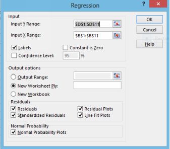
Check the standardized residuals box
We want to plot the standard residuals against the predicted value yhat. We will create a new column to the left of the column Standard Residuals, and copy the column of predicted times into that new column. Thencreate a scatter plot of predicted time and standard residuals. You should end up with the image below. Standardized residual plot¹
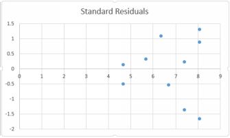
Standard residuals
The Y axis indicates the number of standard deviations that each residual is away from the mean, plotted against the predicted values on the horizontal axis. None of the residuals are more that 2 standard deviationsaway from the mean of zero, so the results are generally satisfactory, although there is one observation in excess of 1.5. We still have a worrying fan shape which would seem to indicate non-constant variance: we canobserve a pattern.
Let’s run the regression again, but now including the second vari- able, which is deliveries. The residuals plot is obtained in the same way, and here is the result.
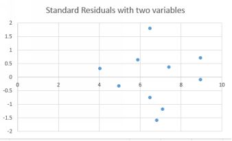
Standardized residuals with two variables
The fan problem seems to have improved a little. The r-squared of the model with two variables was higher, meaning that the residuals were smaller (because there is less unexplained error).
7.6 Correcting when an assumption is violated
Above, we examined possible violations of two of the assumptions underlying linear regression: linearity and non-constant variance. Now let’s look at what to do when these assumptions are found to have beenviolated. First some good news: linear regression is quite robust to such violations, and even so they are quite easy to correct for. We’ll deal with the problems in the same order: linearity and non-constant variance.
7.7 Lack of linearity
The first check is to look at a scatter plot of the dependent variable against the independent variable. The plot below shows volume of sales and length of time employed, together with a trend line.
A curvilinear relationship
There are several different ways in which a linear relationship can be achieved so that we can use the least squares method. A common method is to include a quadratic term. This means adding the squared value of theindependent variable to the list of independent variables. This is easily done by creating another column, consisting of squared values of the first variable.
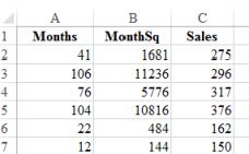
A new column of the independent variable squared
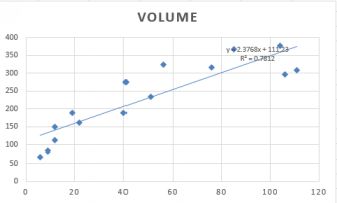
To do this, create a new column and then label it. Click on the first value in the variable which you want to square, and add ˆ2. Enter. Then drag downwards. The plot below shows the predicted and observed sales. Themodel is clearly superior.
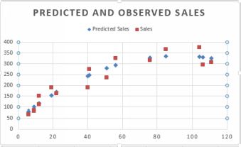
Predicted and observed after inclusion of quadratic term
If the dependent variable has a large number of low values, and is heavily skewed to the right, then a good solution is to transform the dependent variable into its natural logarithm.
7.8 What else could possibly go wrong?
Regression is a very commonly used analytical tool and you are most likely either going to use it yourself or examine the work of others who have used regression. Below is a list of common mistakes to watch for.And if I have made them somewhere in this book, I’m sure you’ll be the first to let me know!
7.9 Linearity condition
Regression assumes that the relationship between the variables is linear: the trend line that the software tries to find to minimize the squared difference between the observed and predicted values is straight. So if youtry to run a regression on non-linear data, you’ll get a result but it will be meaningless.
Action: always visualize the data before doing any analysis. If you see that the data is non-linear, you may be able to transform it using the techniques described in the previous chapter. As an example: the curvilinearexample which was transformed by including a quadratic term as an explanatory variable.
7.10 Correlation and causation
Regression is a special case of correlation, and as we all know correlation doesn’t mean causation (see the Glossary). In regression, no matter how good the model, all that we have been able to show is that a changein an explanatory variable is associated by a change in the dependent variable. For example, you record the hours you put into studying and your grades. Surprise! More studying = better grades? Or perhaps not….could have been a better instructor. We cannot say that one caused the other. So when writing up results or interpreting those of others, be very careful not to claim more than you are able to.
There is a related problem which is ‘reverse causation’. You study more, your grades go up. Tempting to think that one possibly caused the other. But perhaps it is the other way round? Your grades were poor, youstudied harder? Or you had good grades and then led you into taking the course seriously.
Action: try not to include explanatory variables which are affected by the dependent variable. You could also try to ‘lag’ one variable. Cut and paste the hours of studying variable so that it is one time- period behind thegrades and then run the regression again.
7.11 Omitted variable bias
Under Correlation in the Glossary I give some examples of lurking variables. Regression, like correlation, is susceptible to the same problem. Example: you notice that in hotter weather there are more
deaths by drowning. Did the hotter weather cause the drownings? Well no, the extra swimming caused by the heat presented more risk scenarios. The lurking variable is hours spent swimming rather than temperature.Try to get to the real variable if you can.
7.12 Multicollinearity
When predicting the price of a house, square footage and number of rooms are likely to be highly correlated because they are both ex- plaining the same thing. This problem results in unusual behavior in the regressionmodel.
Action: correlate your explanatory variables BEFORE doing any regression. Watch out if you have a pair which has an r value of
0.7 or higher. This doesn’t mean that you shouldn’t use them, but it’s a red flag. This is what might happen. You take out on one the variables in a regression, the one that’s left reverses its sign or suddenly becomes statistically insignificant.
If you do run the regression and you get an unlikely result, choose the variable with the highest t value (or smallest p value) and ditch the other.
7.13 Don’t extrapolate
The coefficients from the regression are calculated based on the data you provided. If you try to predict for a value beyond the range of that data, the results will be unreliable if not totally wrong.
In the years of experience and salary example in Chapter 5, the co- efficient for years of experience provided the change in salary that an extra year of experience would give. Would you feel comfortable predicting thesalary of someone with 95 years of experience?
Action: before running the numbers, check that the inputs are within the range for which you calculated the model.
All materials on the site are licensed Creative Commons Attribution-Sharealike 3.0 Unported CC BY-SA 3.0 & GNU Free Documentation License (GFDL)
If you are the copyright holder of any material contained on our site and intend to remove it, please contact our site administrator for approval.
© 2016-2026 All site design rights belong to S.Y.A.