Thinking with Data (2014)
Chapter 6. Putting It All Together
We should look at some extended examples to see the method of full problem thinking in action. By looking at the scoping process, the structure of the arguments, and some of the exploratory steps (as well as the wobbles inevitably encountered), we can bring together the ideas we have discussed into a coherent whole.
The goal of this chapter is not to try to use everything in every case, but instead to use these techniques to help structure our thoughts and give us room to think through each part of a problem. These examples are composites, lightly based on real projects.
Deep Dive: Predictive Model for Conversion Probability
Consider a consumer product company that provides a service that is free for the first 30 days. Its business model is to provide such a useful service that after 30 days, as many users will sign up for the continued service as possible.
To bring potential customers in to try its product, the company runs targeted advertisements online. These ads are focused on groups defined by age, gender, interests, and other factors. It runs a variety of ads, with different ad copy and images, and is already optimizing ads based on who tends to click them, with more money going toward ads with a higher click rate. Unfortunately, it takes 30 days or so to see whether a new ad has borne fruit. In the meantime, the company is spending very large amounts of money on those ads, many of which may have been pointlessly displayed. The company is interested in shrinking this feedback loop, and so asks a data scientist to find a way to shrink it. What can we suggest?
First, let us think a bit about what actions the company can take. It constantly has new users coming in, and after some amount of time, it can evaluate the quality of the users it has been given and choose whether to pull the plug on the advertisement. It needs to be able to judge quality sooner, and compare that quality to the cost of running the ad.
Another way of phrasing this is that the company needs to know the quality of a user based on information gathered in just the first few days after a user has started using the service. We can imagine some kind of black box that takes in user behavior and demographic information from the first few days and spits out a quality metric.
For the next step, we can start to ask what kind of behavior and what kind of quality metric would be appropriate. We explore and build experience to get intuition. Suppose that by either clicking around, talking to the decision makers, or already being familiar with the service, we find that there are a dozen or so actions that a user can take with this service. We can clearly count those, and break them down by time or platform. This is a reasonable first stab at behavior.
What about a quality metric? We are interested in how many of the users will convert to paid customers, so if possible, we should go directly for a probability of conversion. But recall that the action the company can take is to decide whether to pull the plug on an advertisement, so what we are actually interested in is the expected value of each new user, a combination of the probability of conversion and the lifetime value of a new conversion. Then we can make a cost/benefit decision about whether to keep the ad. In all, we are looking to build a predictive model of some kind, taking in data about behavior and demographics and putting out a dollar figure. Then, we need to compare that dollar figure against the cost of running the ad in the first place.
What will happen after we put the model out? The company will need to evaluate users either once or periodically between 1 and 30 days to judge the value of each user, and then will need some way to compare that value information to the cost of running the advertisement. It will need a pipeline for calculating the cost of each ad per person that the ad is shown to. Typical decisions would be to continue running an advertisement, to stop running one, or to ramp up spending on one that is performing exceptionally well.
It is also important to measure the causal efficacy of the model on improving revenue. We would like to ensure that the advertisements that are being targeted to be cut actually deserve it. By selecting some advertisements at random to be spared from cutting, we can check back in 30 days or so to see how accurately we have predicted the conversion to paid users. If the model is accurate, the conversion probabilities should be roughly similar to what was predicted, and the short-term or estimated lifetime value should be similar as well.
Context
A consumer product company with a free-to-try model. It wants people to pay to continue to use its product after the free trial.
Need
The company runs a number of tightly targeted ads, but it is not clear until around 30 days in whether the ads are successful. In the meantime, it’s been spending tons of money to run ads that might have been pointless. How can it tighten up the feedback loop and decide which ads to cut?
Vision
We will make a predictive model based on behavior and demographics that uses information available in the first few days to predict the lifetime value of each incoming user. Its output would be something like, “This user is 50% less likely than baseline to convert to being a paid user. This user is 10% more likely to convert to being a paid user. This user….etc. In aggregate, all thousand users are 5% less likely than baseline to convert. Therefore, it would make sense to end this advertisement campaign early, because it is not attracting the right people.”
Outcome
Deliver the model to the engineers, ensuring that they understand it. Put into place a pipeline for aggregating the cost of running each advertisement. After engineering has implemented the model, check back once after five days to see if the proportions of different predicted groups match those from the analysis. Select some advertisements to not be disrupted, and check back in one month to see if the predicted percentages or dollar values align with those of the model.
What is the argument here? It is a policy argument. The main claim is that the model should be used to predict the quality of advertisements after only a few days of running them. The “Ill” is that it takes 30 days to get an answer about the quality of an ad. The “Blame” is that installation probability (remember that we were already tracking this) is not a sufficient predictor of conversion probability. The “Cure” is a cost-predictive model and a way of calculating the cost of running a particular advertisement. And the “Cost” (or rather, the benefit) is that, by cutting out advertisements at five days, we will not spend 25 days worth of money on unhelpful advertisements.
To demonstrate that the Cure is likely to be as we say it is, we need to provisionally check the quality of the model against held-out data. In the longer term, we want to see the quality of the model for advertisements that are left to run. In this particular case, the normal model quality checks (ROC curves, precision and recall) are poorly suited for models that have only 1–2% positive rates. Instead, we have to turn to an empirical/predicted probability plot (Figure 6-1).
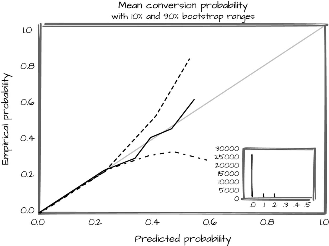
Figure 6-1. Predicted probability plot
To demonstrate the Cost, we need some sense of the reliability of the model compared to the cost range of running the ads. How does our predicted lifetime value compare to the genuine lifetime value, and how often will we overshoot or undershoot? Finally, is the volume of money saved still positive when we include the time cost of developing the model, implementing it, and running it? If the model is any good, the answer is almost certainly yes, especially if we can get a high-quality answer in the first few days. The more automated this process is, the more time it will take up front—but the more time it will save in the long run. With even reasonable investment, it should save far more than is spent.
In the end, what is the audience (in this case, the decision makers who will decide whether to proceed with this project and whether to approve the build-out) actually going to dispute? The Ill, Blame, and Cost may already be apparent, so the discussion may center on the Cure (how good is the model?). But if we were unaware of the possibility that there could be other things to discuss (besides the quality of the model), it would be easy to be caught unaware and not be prepared to coherently explain the project when pointed questions are asked by, for example, higher levels of management.
Deep Dive: Calculating Access to Microfinance
Microfinance is the provision of traditional bank services (loans, lines of credit, savings accounts, investments) to poor populations. These populations have much smaller quantities of money than typical bank customers. The most common form of microfinance is microloans, where small loans are provided as startup capital for a business. In poorer countries, the average microloan size is under $500. Most microloan recipients are women, and in countries with well-run microfinance sectors, the vast majority of loans are repaid (the most widely admired microfinance programs average over 97% repayment).
There is a nonprofit that focuses on tracking microfinance around the world. It has a relationship with the government of South Africa, which is interested in learning how access to microfinance varies throughout their country. At the same time, the nonprofit is interested in how contemporary tools could be brought to bear to answer questions like this.
From talking to the organization, it is clear that the final outcome will be some kind of report or visualization that will be delivered to the South African government, potentially on a regular basis. Having some summary information would also be ideal.
Context
There has been an explosion of access to credit in poor countries in the past generation. There is a nonprofit that tracks information about microfinance across the world and advises governments on how they can improve their microfinance offerings.
Needs
The South African government is interested in where there are gaps in microloan coverage. The nonprofit is interested in how new data sets can be brought to bear on answering questions like this.
Vision
We will create a map that demonstrates where access is lacking, which could be used to track success and drive policy. It will include one or more summary statistics that could more concisely demonstrate success. There would be bright spots around remote areas that were heavily populated. Readers of the map should be able to conclude where the highest priority places are, in order to place microfinance offices (assuming they were familiar with or were given access to a map displaying areas of high poverty in South Africa).
Outcome
Deliver the maps to the nonprofit, which will take them to the South African government. Potentially work with the South African government to receive regularly updated maps and statistics.
Some immediate challenges present themselves. What does access mean? If a loan office is more than a half-day’s journey away, it will be difficult for a lendee to take advantage of the service. Walking in rural areas for several hours probably progresses at around 3 kilometers per hour (about 1.86 miles per hour). If we figure that three or four hours is a reasonable maximum distance for a walk in each direction, we get about 10 kilometers as a good maximum distance for access to a microfinance office.
What do we mean when we say microfinance offices? In this particular case, the microfinance tracking organization has already collected information on all of the registered microfinance offices across South Africa. These include private groups, post office branches, and nonprofit microfinance offices. For each of these, we start with an address; it will be necessary to geocode them into latitude and longitude pairs.
What about population? A little digging online reveals that there are approximate population maps available for South Africa (using a 1 km scale). They are derived from small-scale census information. Without these maps, the overall project would be much more difficult—we would need to define access relative to entire populated areas (like a town or village) that we had population and location information from. This would add a tremendous amount of overhead to the project, so thankfully such maps can easily be acquired. But keep in mind that their degree of trustworthiness, especially at the lowest scale, is suspect, and any work we do should acknowledge that fact.
We are also faced with some choices about what to include on such a map. In practice, only a single quantity can be mapped with color on a given map. Is it more important to show gradations in access or the number of people without access? Would some hybrid of people-kilometers be a valid metric? After some consideration, demonstrating the number of people is the smarter decision. It makes prioritization simpler.
The overall argument is as follows. We claim that “has access to microfinance” can be reasonably calculated by seeing, for each square kilometer, whether that square kilometer is within 10 kilometers of a microloan office as the crow flies. This is a claim of definition. To justify it, we need to relate it to the understanding about access and microfinance already shared by the audience. It is reasonable to restrict “access” to mean foot access at worst, given the level of economic development of the loan recipients. Using the list of microfinance institutions kept by the microfinance tracking nonprofit is also reasonable, given that they will be the ones initially using this map and that they have spent years perfecting the data set.
This definition is superior to the alternative of showing degrees of access, because there is not much difference between a day’s round-trip travel and a half-day’s round-trip travel. Only a much smaller travel time, such as an hour or so, would be a major improvement over a day’s round-trip travel. However, such density is not achievable at present, nor is it going to provide a major discontinuity from mere half-day accessibility. As such, for our purposes, 10 kilometer distance to a microloan office is a sufficient cutoff.
We claim that a map of South Africa, colored by population, masked to only those areas outside of 10 kilometers distance to a microloan office, is a good visual metric of access. This is a claim of value. The possible competing criteria are legibility, actionability, concision, and accuracy. A colored map is actionable; by encouraging more locations to open where the map is currently bright (and thus more people are deprived of access to credit), the intensity of the map will go down. It is a bit less legible than it is actionable, because it requires some expertise to interpret. It is fairly accurate, because we are smoothing down issues like actual travel distance by using bird’s-eye distance, but is otherwise reasonably reliable on a small scale. It is also a concise way to demonstrate accessibility, though not as concise as per-province summaries or, at a smaller level of organization (trade-off of accuracy for concision!), per-district and per-metropolitan area summaries.
To remedy the last issue, we can join our map with some summary statistics. Per-area summary statistics, like a per-district or per-metropolitan percentage of population that is within 10 kilometers of a microloan office, would be concise and actionable and a good complement to the maps. To achieve this, we need district-level administrative boundaries and some way to mash those boundaries up with the population and office location maps.
With this preliminary argument in mind, we can chat with the decision makers to ensure that what we are planning to do will be useful. A quick mockup drawing, perhaps shading in areas on a printout of a map of South Africa, could be a useful focal point. If this makes sense to everyone, more serious work can begin.
From a scaffolding perspective, it pays to start by geocoding the microloan offices, because without that information we will have to fall back on a completely different notion of access (such as one based on town-to-town distances). It pays to plot the geocoded microloan offices on a map alongside the population density map to get a sense of what a reasonable final map will look like. It is probably wise to work out the logic for assigning kilometer squares to the nearest microloan office, and foolish to use any technique other than brute force, given the small number of offices and the lack of time constraints on map generation.
After much transformation and alignment, we have something useful. At this point the map itself can be generated, and shared in a draft form with some of the decision makers. If everyone is still on the same page, then the next priority should be calculating the summary statistics and checking those again with the substantive experts. At this point, generating a more readable map (including appropriate boundaries and cities to make it interpretable) is wise, as is either plotting the summary statistics on a choropleth map or arranging them into tables separated by district.
Final copies in hand, we can talk again with the decision makers, this time with one or more documents that lay out the relevant points in detail. Even if our work is in the form of a presentation, if the work is genuinely important, there should be a written record of the important decisions that went into making the map and summary statistics. If the work is more exploratory and temporary, a verbal exchange or brief email exchange is fine—but if people will be making actual decisions based on the work we have done, it is vitally important to leave behind a comprehensive written record. Edward Tufte has written eloquently about how a lack of genuine technical reports, eclipsed instead by endless PowerPoints, was a strong contributing factor to the destruction of the space shuttle Columbia.
Wrapping Up
Data science, as a field, is overly concerned with the technical tools for executing problems and not nearly concerned enough with asking the right questions. It is very tempting, given how pleasurable it can be to lose oneself in data science work, to just grab the first or most interesting data set and go to town. Other disciplines have successfully built up techniques for asking good questions and ensuring that, once started, work continues on a productive path. We have much to gain from adapting their techniques to our field.
We covered a variety of techniques appropriate to working professionally with data. The two main groups were techniques for telling a good story about a project, and techniques for making sure that we are making good points with our data.
The first involved the scoping process. We looked at the context, need, vision, and outcome (or CoNVO) of a project. We discussed the usefulness of brief mockups and argument sketches. Next, we looked at additional steps for refining the questions we are asking, such as planning out the scaffolding for our project and engaging in rapid exploration in a variety of ways. What each of these ideas have in common is that they are techniques designed to keep us focused on two goals that are in constant tension and yet mutually support each other: diving deep into figuring out what our goals are and getting lost in the process of working with data.
Next, we looked at techniques for structuring arguments. Arguments are a powerful theme in working with data, because we make them all the time whether we are aware of them or not. Data science is the application of math and computers to solve problems of knowledge creation; and to create knowledge, we have to show how what is already known and what is already plausible can be marshaled to make new ideas believable.
We looked at the main components of arguments: the audience, prior beliefs, claims, justifications, and so on. Each of these helps us to clarify and improve the process of making arguments. We explored how explicitly writing down arguments can be a very powerful way to explore ideas. We looked at how techniques of transformation turn data into evidence that can serve to make a point.
We next explored varieties of arguments that are common across data science. We looked at classifying the nature of a dispute (fact, definition, value, and policy) and how each of those disputes can be addressed with the right claims. We also looked at specific argument strategies that are used across all of the data-focused disciplines, such as optimization, cost/benefit analysis, and casual reasoning. We looked at causal reasoning in depth, which is fitting given its prominent place in data science. We looked at how causal arguments are made and what some of the techniques are for doing so, such as randomization and within-subject studies. Finally, we explored some more in-depth examples.
Data science is an evolving discipline. But hopefully in several years, this material will seem obvious to every practitioner, and a clear place to start for every beginner.