The Android Developer’s Cookbook: Building Applications with the Android SDK, Second Edition (2013)
Chapter 5. User Interface Layout
The Android UI consists of screen views, screen touch events, and key presses. The framework for specifying the UI is constructed to support the various Android devices. This chapter focuses on the utilization of this framework for the initial graphical layout and its changes. Chapter 6, “User Interface Events,” handles key presses and gestures.
Resource Directories and General Attributes
The UI display uses developer-generated resource files, some of which are discussed in Chapter 2, “Application Basics: Activities and Intents,” in the context of the directory structure of an Android project. For completeness, the entire set of resource directories is summarized here:
 res/anim/—Frame-by-frame animation or tweened animation objects.
res/animator/—eXtensible Markup Language (XML) files used for property animations.
res/color/—XML files specifying a state list for colors.
res/drawable/—Image resources (bitmap, nine-patch, shapes, animations, state lists, etc.). Note that these images can be modified and optimized during compilation.
res/layout/—XML files specifying screen layouts.
res/menu/—XML files that are used to specify menus.
res/values/—XML files with resource descriptors. As with other resource directories, filenames are arbitrary, but common ones, as used in this book, are arrays.xml, colors.xml, dimens.xml, strings.xml, and styles.xml.
res/xml/—Other arbitrary XML files not covered previously.
res/raw/—Other arbitrary resources not covered previously, including images that should not be modified or optimized.
Each UI object has three definable attributes that customize the look and feel of the UI: the dimension of the object, text in the object, and the color of the object. The possible values for these three general UI attributes are summarized in Table 5.1. Note that for dimension, it is best to usedp or sp for device-independent compliance.
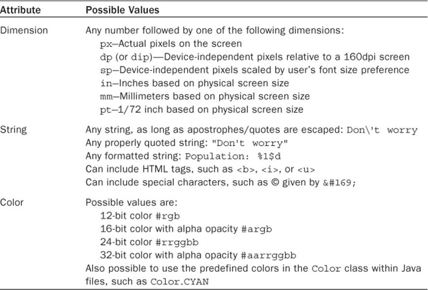
Table 5.1 Possible Values for the Three General UI Attributes
To unify the look and feel of the application, a global resource file can be used for each of these attributes. This is also useful in that it is easy to redefine the attributes later, as they are all collected in three files:
Measurements and dimensions of items are declared in the XML resource file res/values/dimens.xml. For example:
XML declaration—<dimen name="large">48sp</dimen>
XML reference—@dimen/large
Java reference—getResources().getDimension(R.dimen.large)
Labels and text of items are declared in the XML resource file res/values/strings.xml. For example:
XML declaration—<string name="start_pt">I\'m here</string>
XML reference—@string/start_pt
Java reference—getBaseContext().getString(R.string.start_pt)
Colors of items are declared in the XML resource file res/values/colors.xml. For example:
XML declaration—<color name="red">#f00</color>
XML reference—@color/red
Java reference—getResources().getColor(R.color.red)
Recipe: Specifying Alternate Resources
The resources described in the previous section provide a generic configuration that Android can use by default. The developer has the ability to specify different values for specific configurations distinguished by various qualifiers.
To support multiple languages, the strings can be translated and used in different language values directories. For example, American English, British English, French, simplified Chinese (used in mainland China), traditional Chinese (used in Taiwan), and German strings are added using the following:
res/values-en-rUS/strings.xml
res/values-en-rGB/strings.xml
res/values-fr/strings.xml
res/values-zh-rCN/strings.xml
res/values-zh-rTW/strings.xml
res/values-de/strings.xml
Not all strings need to be redefined in these files. Any missing strings from the selected language file fall back to the default res/values/strings.xml file, which should contain a complete set of all strings used in the application. If any drawables contain text and require a language-specific form, a similar directory structure should also apply to them (such as res/drawables-zh-hdpi/).
To support multiple screen pixel densities, the drawables and raw resources (as needed) can be scaled and used in different dpi value directories. For example, an image file can belong to each of the following directories:
res/drawable-ldpi/
res/drawable-mdpi/
res/drawable-hdpi/
res/drawable-nodpi/
The low-, medium-, and high-density screens are defined as 120dpi, 160dpi, and 240dpi. Not all dpi choices need to be populated. At run-time, Android determines the closest available drawables and scales them appropriately. The nodpi choice can be used with bitmap images to prevent them from being scaled. In case both a language and a dpi choice are specified, the directory can contain both qualifiers: drawable-en-rUS-mdpi/.
The various types of screens available for Android devices are discussed in Chapter 1, “Overview of Android.” It is often useful to define separate XML layouts for the different screen types. The most often used qualifiers are:
Portrait and landscape screen orientations: -port and -land
Regular (QVGA, HVGA, and VGA) and wide aspect ratios (WQVGA, FWVGA, and WVGA): -notlong and -long
Small (up to 3.0-inch diagonal), normal (up to 4.5-inch diagonal), and large (above 4.5-inch diagonal) screen sizes: -small, -normal, and -large
If screen orientation or aspect ratio is not defined, the Android system autoscales the UI for the screen (although not always elegantly). However, if layouts for different screens are defined, a special element should be added to the AndroidManifest.xml file at the application element level to ensure proper support:
<supports-screens
android:largeScreens="true"
android:normalScreens="true"
android:smallScreens="true"
android:resizable="true"
android:anyDensity="true" />
Note that if android:minSdkVersion or android:targetSdkVersion is 3 (Android 1.5), by default only android:normalScreens (the screen for the G1) is set to true. Therefore, it is useful to explicitly declare the supports-screens element for the application so more recent phones have a properly scaled UI.
It should also be noted that starting with Android 3.2, some tablets that are 7 inches fit the same category for screen dimensions as 5-inch devices (which would normally use the large layout). To compensate for this, several new options have been added: smallest width (sm<N>dp), available screen width (w<N>dp), and available screen height (h<N>dp), where <N> is the size of dp values to be supported.
Views and ViewGroups
The basic building block of a graphical layout is a view. Each view is described by a View object, which is responsible for drawing a rectangular area and handling events in that area. The View is a base class for objects that interact with the user; they are called widgets. Examples of widgets are buttons and check boxes.
A ViewGroup object is a type of View that acts as a container to hold multiple Views (or other ViewGroups). For example, a ViewGroup object can hold a vertical or horizontal placement of views and widgets, as shown in Figure 5.1. ViewGroup is a base class for screen layouts.
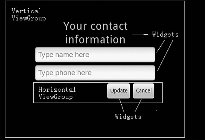
Figure 5.1 View example that contains ViewGroups and widgets
The layout defines the user interface elements, their positions, and their actions. It can be specified from either XML or Java. Most often, an initial base layout is declared in XML and any run-time changes are handled in Java. This combines the ease of developing the overall position ofView and ViewGroup objects using XML and the flexibility to change any component within the application using Java.
Another benefit of separating the XML layout from the Java activity is that the same Android application can produce a different behavior depending on the screen orientation, type of device (such as phone versus tablet), and locale (such as English versus Chinese). These customizations can be abstracted into various XML resource files without cluttering the underlying activity.
Recipe: Building Layouts in the Eclipse Editor
A quick way to get started with layouts is to use the handy graphical layout editor in Eclipse. Take a new activity and open its layout resource XML file. Here, it is the main.xml file. Then, click the Layout tab. This shows how the layout would look graphically. Click the black screen and remove everything to start from scratch. Then, follow these steps:
1. Click and drag a layout from the Layouts Selector to the screen area. For example, choose TableLayout, which holds multiple Views or ViewGroups in a column.
2. Click and drag any other layouts to nest them inside the first one. For example, choose TableRow, which holds multiple Views or ViewGroups along a row. Add three of these for this example.
3. Right-click each TableRow in the Outline view and add view elements from the Views Selector. For example, add a Button and CheckBox to the first TableRow, two TextViews to the second, and a TimePicker to the third.
4. Add a Spinner and VideoView view below the TableRow elements.
The result looks like Figure 5.2, and the landscape and portrait view can be toggled to see the difference in the layout. Clicking the main.xml tab shows XML code like that shown in Listing 5.1. This provides a simple method to build UIs with the Android look and feel.
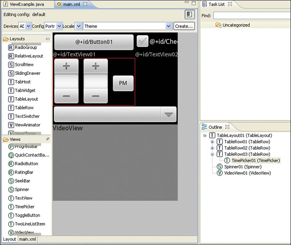
Figure 5.2 Android layout builder example, as seen in Eclipse
Listing 5.1. main.xml
<?xml version="1.0" encoding="utf-8"?>
<TableLayout android:id="@+id/TableLayout01"
android:layout_width="match_parent"
android:layout_height="match_parent"
xmlns:android="http://schemas.android.com/apk/res/android">
<TableRow android:id="@+id/TableRow01"
android:layout_width="wrap_content"
android:layout_height="wrap_content">
<Button android:text="@+id/Button01"
android:id="@+id/Button01"
android:layout_width="wrap_content"
android:layout_height="wrap_content" />
<CheckBox android:text="@+id/CheckBox01"
android:id="@+id/CheckBox01"
android:layout_width="wrap_content"
android:layout_height="wrap_content" />
</TableRow>
<TableRow android:id="@+id/TableRow02"
android:layout_width="wrap_content"
android:layout_height="wrap_content">
<TextView android:text="@+id/TextView01"
android:id="@+id/TextView01"
android:layout_width="wrap_content"
android:layout_height="wrap_content" />
<TextView android:text="@+id/TextView02"
android:id="@+id/TextView02"
android:layout_width="wrap_content"
android:layout_height="wrap_content" />
</TableRow>
<TableRow android:id="@+id/TableRow03"
android:layout_width="wrap_content"
android:layout_height="wrap_content">
<TimePicker android:id="@+id/TimePicker01"
android:layout_width="wrap_content"
android:layout_height="wrap_content" />
</TableRow>
<Spinner android:id="@+id/Spinner01"
android:layout_width="wrap_content"
android:layout_height="wrap_content" />
<VideoView android:id="@+id/VideoView01"
android:layout_width="wrap_content"
android:layout_height="wrap_content" />
</TableLayout>
Another way to view the layout is by using the Hierarchy Viewer. Running an application in the emulator, the hierarchyviewer command can be run from the command line. It resides in the tools/ directory of the SDK installation. For security reasons, this works only with the emulator as the device because running the Hierarchy Viewer on an actual device might reveal secure settings. Click the window of interest and select Load View Hierarchy. This produces a relational view of the different layouts. The result for this recipe is shown in Figure 5.3.
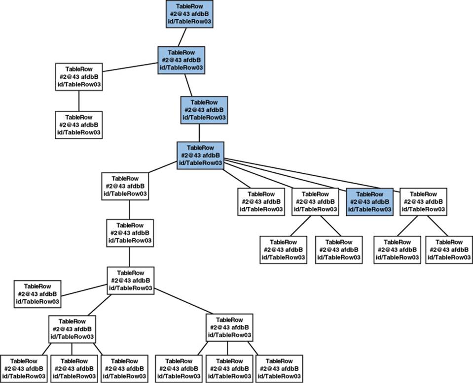
Figure 5.3 Android Hierarchy Viewer for the example in Listing 5.1
Recipe: Controlling the Width and Height of UI Elements
This recipe shows how specifying the width and height of UI elements changes the overall layout. Each View object must specify a total width (android:layout_width) and total height (android:layout_height) in one of three ways:
Exact dimension—Provides control, but does not scale to multiple screen types well.
wrap_content—Just big enough to enclose the contents of the element plus padding.
match_parent—Size maximized to fill the element’s parent, including padding. This replaced fill_parent, which was deprecated in Android 2.2.
Padding is the blank space surrounding an element, and it defaults to zero if it is not specified. It is part of the size of a UI element and must be specified as an exact dimension, but it can be specified using one of two types of attributes:
padding—Sets padding equal on all four sides of an element
paddingLeft, paddingRight, paddingTop, paddingBottom—Sets padding on each side of an element separately
Some developers confuse padding with margins; margins are the spaces around an element but are not included in the size of the UI element.
Another attribute is android:layout_weight, which can be assigned an integral number value. It provides the Android system with a way to determine relative importance based on the value for how spacing is handled between different elements of a layout.
Listing 5.2 shows the main layout file as a linear layout with four buttons. This aligns them horizontally on the screen, as shown in Figure 5.4.

Figure 5.4 LinearLayout with four buttons aligned horizontally, as shown in Listing 5.2
Listing 5.2. res/layout/main.xml
<?xml version="1.0" encoding="utf-8"?>
<LinearLayout xmlns:android="http://schemas.android.com/apk/res/android"
android:layout_width="match_parent"
android:layout_height="match_parent">
<Button android:text="add"
android:layout_width="wrap_content"
android:layout_height="wrap_content"
/>
<Button android:text="subtract"
android:layout_width="wrap_content"
android:layout_height="wrap_content"
/>
<Button android:text="multiply"
android:layout_width="wrap_content"
android:layout_height="wrap_content"
/>
<Button android:text="divide"
android:layout_width="wrap_content"
android:layout_height="wrap_content"
/>
</LinearLayout>
If the height of the “add” button is changed to match_parent, the button fills the vertical space of its parent while keeping the words aligned. If the width of any button is changed to match_parent, all subsequent buttons in the horizontal layout are washed out. These are shown in Figure 5.5.
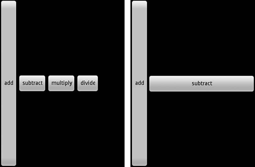
Figure 5.5 The match_parent in height keeps the horizontal alignment, but a match_parent in width washes out the remaining buttons.
Also note in Figure 5.6 that the “multiply” and “divide” buttons have a portion of the last letter cut off in two of the button configurations. This can be fixed by appending a space to the text, such as “multiply” and “divide”. However, a more general method to resolve this uses the layout. Take a look at the various button formats in Figure 5.6.
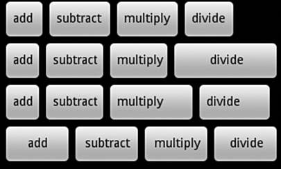
Figure 5.6 Various methods to tweak the layout of four buttons
The four rows of buttons in Figure 5.6 are as follows:
The first row is the same as what was created in Listing 5.2, but with spaces appended to the end of each word.
In the second row, the layout width is changed to match_parent for the last button, providing the space needed for the button, but it cannot be used for the earlier buttons on the line as evidenced by the right part of Figure 5.5:
<Button android:text="divide"
android:layout_width="match_parent"
android:layout_height="wrap_content"
/>
In the third row, padding is added to the “multiply” button to make the button bigger, but it does not add this space to the word itself because it was declared as wrap_content:
<Button android:text="multiply"
android:layout_width="wrap_content"
android:layout_height="wrap_content"
android:paddingRight="20sp"
/>
In the fourth row, all buttons use match_parent but also add layout_weight and assign it the same value for all buttons. This gives the most satisfying layout:
<Button android:text="add"
android:layout_width="match_parent"
android:layout_height="wrap_content"
android:layout_weight="1"
/>
<Button android:text="subtract"
android:layout_width="match_parent"
android:layout_height="wrap_content"
android:layout_weight="1"
/>
<Button android:text="multiply"
android:layout_width="match_parent"
android:layout_height="wrap_content"
android:layout_weight="1"
/>
<Button android:text="divide"
android:layout_width="match_parent"
android:layout_height="wrap_content"
android:layout_weight="1"
/>
Recipe: Setting Relative Layout and Layout ID
Sometimes it is more convenient to set the layout relative to a starting object or parent object rather than according to absolute rules. Also, if the UI starts nesting LinearLayouts, it might become inefficient, and it may become simpler to use relative layouts. This can be done using aRelativeLayout view, as shown in Listing 5.3. The layout is shown in Figure 5.7.

Figure 5.7 Four text views from the RelativeLayout example
Listing 5.3. RelativeLayout
<?xml version="1.0" encoding="utf-8"?>
<RelativeLayout xmlns:android="http://schemas.android.com/apk/res/android"
android:layout_width="match_parent"
android:layout_height="match_parent">
<TextView android:id="@+id/mid" android:text="middle"
android:layout_width="wrap_content"
android:layout_height="wrap_content"
android:layout_centerInParent="true"/>
<TextView android:id="@+id/high" android:text="high"
android:layout_width="wrap_content"
android:layout_height="wrap_content"
android:layout_above="@id/mid"/>
<TextView android:id="@+id/low" android:text="low"
android:layout_width="wrap_content"
android:layout_height="wrap_content"
android:layout_centerHorizontal="true"
android:layout_below="@id/mid"/>
<TextView android:id="@+id/left" android:text="left"
android:layout_width="wrap_content"
android:layout_height="wrap_content"
android:layout_alignBottom="@id/high"
android:layout_toLeftOf="@id/low"/></RelativeLayout>
The explanation of these attributes and a list of the different available rules for relative layout are collected in Table 5.2. Because every layout can have portions declared in XML files and other portions in Java code, both methods of referring to layouts are shown. The first three rows of the table show attributes that need to point to a view ID, and the last two rows show attributes that are Boolean.
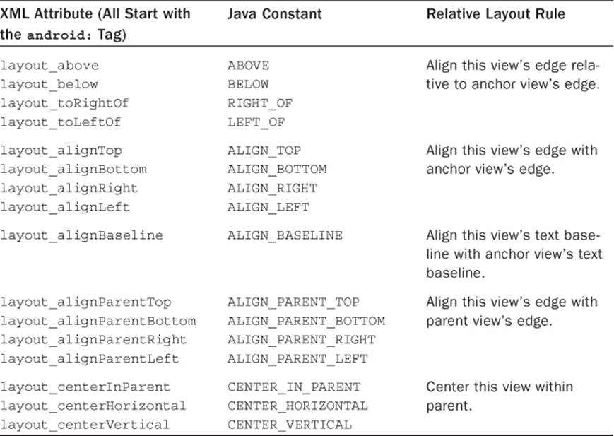
Table 5.2 Possible Rules for Children in a Relative Layout
Recipe: Declaring a Layout Programmatically
The XML layout framework in Android is the preferred method for enabling general device changes and simple development. However, sometimes it is useful to change some layout aspects programmatically—using Java, for example. In fact, the entire layout can be declared using Java. For illustration, a portion of the previous recipe’s layout is shown implemented as Java code in Listing 5.4.
It should be stressed that not only is coding layout in Java cumbersome, but it is also discouraged. It does not take advantage of the modular approach to resource directories where a layout can be changed simply without modification of Java code, as discussed in the “Specifying Alternate Resources” recipe.
Listing 5.4. src/com/cookbook/programmaticlayout/ProgrammaticLayout.java
package com.cookbook.programmatic_layout;
import android.app.Activity;
import android.os.Bundle;
import android.view.ViewGroup;import android.view.ViewGroup.LayoutParams;import android.widget.RelativeLayout;import android.widget.TextView;
public class ProgrammaticLayout extends Activity {
private int TEXTVIEW1_ID = 100011;
@Override
public void onCreate(Bundle savedInstanceState) {
super.onCreate(savedInstanceState);
//Here is an alternative to: setContentView(R.layout.main);
final RelativeLayout relLayout = new RelativeLayout( this );
relLayout.setLayoutParams( new RelativeLayout.LayoutParams(
LayoutParams.MATCH_PARENT,
LayoutParams.MATCH_PARENT ) );
TextView textView1 = new TextView( this );
textView1.setText("middle");
textView1.setTag(TEXTVIEW1_ID);
RelativeLayout.LayoutParams text1layout = new
RelativeLayout.LayoutParams( LayoutParams.WRAP_CONTENT,
LayoutParams.WRAP_CONTENT );
text1layout.addRule( RelativeLayout.CENTER_IN_PARENT );
relLayout.addView(textView1, text1layout);
TextView textView2 = new TextView( this );
textView2.setText("high");
RelativeLayout.LayoutParams text2Layout = new
RelativeLayout.LayoutParams( LayoutParams.WRAP_CONTENT,
LayoutParams.WRAP_CONTENT );
text2Layout.addRule(RelativeLayout.ABOVE, TEXTVIEW1_ID );
relLayout.addView( textView2, text2Layout );
setContentView( relLayout );
}
}
Recipe: Updating a Layout from a Separate Thread
As discussed in Chapter 3, “Threads, Services, Receivers, and Alerts,” when a time-consuming activity is being run, care must be taken to ensure that the UI thread stays responsive. This is done by creating a separate thread for the time-consuming task and letting the UI thread continue at high priority. If the separate thread subsequently needs to update the UI, a handler can be used to post updates to the UI thread.
This recipe uses a button to trigger a time-consuming computation in two parts and updates to the screen when each part is done. The layout, represented by the XML in Listing 5.5, consists of status text called computation_status and a trigger button called action. It uses the strings defined in strings.xml, as shown in Listing 5.6.
Listing 5.5. res/layout/main.xml
<?xml version="1.0" encoding="utf-8"?>
<LinearLayout
xmlns:android="http://schemas.android.com/apk/res/android"
android:orientation="vertical"
android:layout_width="match_parent"
android:layout_height="match_parent">
<TextView android:id="@+id/computation_status"
android:layout_width="match_parent"
android:layout_height="wrap_content"
android:text="@string/hello" android:textSize="36sp"
android:textColor="#000" />
<Button android:text="@string/action"
android:id="@+id/action"
android:layout_width="wrap_content"
android:layout_height="wrap_content" />
</LinearLayout>
Listing 5.6. res/layout/strings.xml
<?xml version="1.0" encoding="utf-8"?>
<resources>
<string name="hello">Hello World, HandlerUpdateUi!</string>
<string name="app_name">HandlerUpdateUi</string>
<string name="action">Press to Start</string>
<string name="start">Starting...</string>
<string name="first">First Done</string>
<string name="second">Second Done</string>
</resources>
The steps to update the UI from a background thread follow:
1. Initialize a handler to the UI object that updates by the background thread. (Here, it is called av.)
2. Define a runnable function (here, it is called mUpdateResults) that updates the UI as needed.
3. Declare a handler to handle the messages between threads. (Here, it is called mHandler.)
4. In the background thread, set flags as appropriate to communicate the change in status. (Here, textString and backgroundColor are to be changed.)
5. In the background thread, have the handler post the UI update function to the main thread.
The activity created by these steps is shown in Listing 5.7.
Listing 5.7. src/com/cookbook/handler_ui/HandlerUpdateUi.java
package com.cookbook.handler_ui;
import android.app.Activity;
import android.graphics.Color;
import android.os.Bundle;
import android.os.Handler;
import android.view.View;
import android.widget.Button;
import android.widget.TextView;
public class HandlerUpdateUi extends Activity {
TextView av; //UI reference
int textString = R.string.start;
int backgroundColor = Color.DKGRAY;
final Handler mHandler = new Handler();
// Create runnable for posting results to the UI thread
final Runnable mUpdateResults = new Runnable() {
public void run() {
av.setText(textString);
av.setBackgroundColor(backgroundColor);
}
};
@Override
public void onCreate(Bundle savedInstanceState) {
super.onCreate(savedInstanceState);
setContentView(R.layout.main);
av = (TextView) findViewById(R.id.computation_status);
Button actionButton = (Button) findViewById(R.id.action);
actionButton.setOnClickListener(new View.OnClickListener() {
public void onClick(View view) {
doWork();
}
});
}
//example of a computationally intensive action with UI updates
private void doWork() {
Thread thread = new Thread(new Runnable() {
public void run() {
textString=R.string.start;
backgroundColor = Color.DKGRAY;
mHandler.post(mUpdateResults);
computation(1);
textString=R.string.first;
backgroundColor = Color.BLUE;
mHandler.post(mUpdateResults);
computation(2);
textString=R.string.second;
backgroundColor = Color.GREEN;
mHandler.post(mUpdateResults);
}
});
thread.start();
}
final static int SIZE=1000; //large enough to take some time
double tmp;
private void computation(int val) {
for(int ii=0; ii<SIZE; ii++)
for(int jj=0; jj<SIZE; jj++)
tmp=val*Math.log(ii+1)/Math.log1p(jj+1);
}
}
Text Manipulation
In views that incorporate text, such as TextView, EditText, and Button, the text is represented in the XML layout file by the android:text element. As discussed in the beginning of this chapter, it is good practice to initialize this with a string defined in the strings.xml file, so that all strings are contained in a single place. Therefore, a way to add text to a UI element, such as TextView, looks like the following:
<TextView android:text="@string/myTextString"
android:id="@+id/my_text_label"
android:layout_width="wrap_content"
android:layout_height="wrap_content" />
The default font depends on the Android device and user preferences. To specify the exact font, use the elements shown in Table 5.3. The default values are shown in bold in the fourth column.
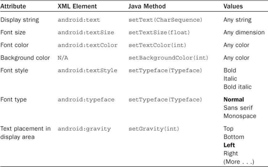
Table 5.3 Useful TextView Attributes
Recipe: Setting and Changing Text Attributes
This recipe changes the color of displayed text when a button is clicked. It can easily be extended to change the font size or style instead, as discussed at the end of the recipe.
The main layout is simply a TextView and Button arranged in a vertical LinearLayout, as shown in Listing 5.8. The text is identified as mod_text and displays the string changed_text defined in the strings.xml file, as shown in Listing 5.9. The button is identified as change and displays the string button_text from the string’s XML file.
Listing 5.8. res/layout/main.xml
<?xml version="1.0" encoding="utf-8"?>
<LinearLayout xmlns:android="http://schemas.android.com/apk/res/android"
android:orientation="vertical"
android:layout_width="match_parent"
android:layout_height="match_parent">
<TextView android:text="@string/changed_text"
android:textSize="48sp"
android:id="@+id/mod_text"
android:layout_width="wrap_content"
android:layout_height="wrap_content" />
<Button android:text="@string/button_text"
android:textSize="48sp"
android:id="@+id/change"
android:layout_width="wrap_content"
android:layout_height="wrap_content" />
</LinearLayout>
Listing 5.9. res/values/strings.xml
<?xml version="1.0" encoding="utf-8"?>
<resources>
<string name="app_name">ChangeFont</string>
<string name="changed_text">Rainbow Connection</string>
<string name="button_text">Press to change the font color</string>
</resources>
The activity shown in Listing 5.10 uses the main.xml layout and identifies the TextView handler to the mod_text ID. Then the button’s OnClickListener method is overridden to set the text color as described in Table 5.3.
Listing 5.10. src/com/cookbook/change_font/ChangeFont.java
package com.cookbook.change_font;
import android.app.Activity;
import android.os.Bundle;
import android.view.View;
import android.widget.Button;
import android.widget.TextView;
public class ChangeFont extends Activity {
TextView tv;
private int colorVals[]={R.color.start, R.color.mid, R.color.last};
int idx=0;
/** called when the activity is first created */
@Override
public void onCreate(Bundle savedInstanceState) {
super.onCreate(savedInstanceState);
setContentView(R.layout.main);
tv = (TextView) findViewById(R.id.mod_text);
Button changeFont = (Button) findViewById(R.id.change);
changeFont.setOnClickListener(new View.OnClickListener() {
public void onClick(View view) {
tv.setTextColor(getResources().getColor(colorVals[idx]));
idx = (idx+1)%3;
}
});
}
}
The possible color resources are defined in a global colors.xml file, as shown in Listing 5.11. As defined, the colors are red, green, and blue, but they are named functionally as start, mid, and last. This provides an easy way to change the colors later without needing to change their handler names.
Listing 5.11. res/values/colors.xml
<?xml version="1.0" encoding="utf-8"?>
<resources>
<color name="start">#f00</color>
<color name="mid">#0f0</color>
<color name="last">#00f</color>
</resources>
This recipe can be modified to change the text size (or text style) easily. For example, colorVals[] would change to sizeVals[] and point to the R.dimen resources:
private int sizeVals[]={R.dimen.small, R.dimen.medium, R.dimen.large};
tv.setTextSize(getResources().getDimension(sizeVals[idx]));
Also, instead of the colors.xml file, the dimens.xml file would be used, as shown in Listing 5.12.
Listing 5.12. Similar Usage for the dimens.xml File
<?xml version="1.0" encoding="utf-8"?>
<resources>
<dimen name="start">12sp</dimen>
<dimen name="mid">24sp</dimen>
<dimen name="last">48sp</dimen>
</resources>
To change the text string instead, colorVals[] would change to textVals[] and point to the R.string resources as follows:
private int textVals[]={R.string.first_text,
R.string.second_text, R.string.third_text};
tv.setText(getBaseContext().getString(textVals[idx]));
The strings.xml file would then be used, as shown in Listing 5.13.
Listing 5.13. Similar Usage for the strings.xml File
<?xml version="1.0" encoding="utf-8"?>
<resources>
<string name="app_name">ChangeFont</string>
<string name="changed_text">Rainbow Connection</string>
<string name="buttoN_text">Press to Change the Font Color</string>
<string name="first_text">First</string>
<string name="second_text">Second</string>
<string name="third_text">Third</string>
</resources>
Recipe: Providing Text Entry
The EditText class provides a simple view for user input. It can be declared just like a TextView with the most useful attributes shown in Table 5.4. Although each does have a corresponding Java method, it is less illuminating to show those here. Again, the default values are in bold in the last column.
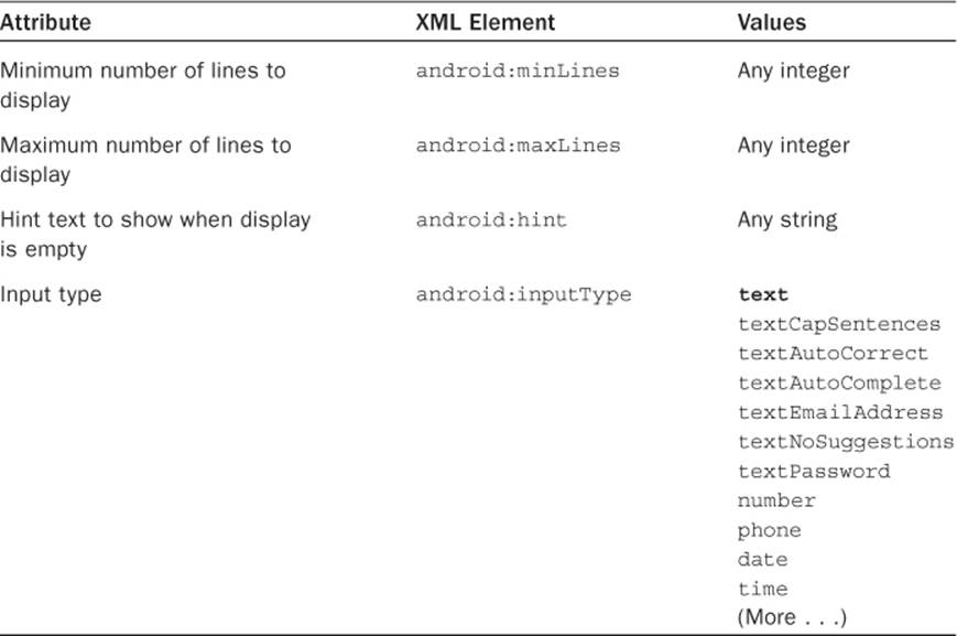
Table 5.4 Useful EditText Attributes
For example, using the following XML code in a layout file shows a text entry window with Type text here displayed in grayed-out text as a hint. On devices without a keyboard or on those where the keyboard is hidden, selecting the Edit window brings up the soft keyboard for text entry, as shown in Figure 5.8.
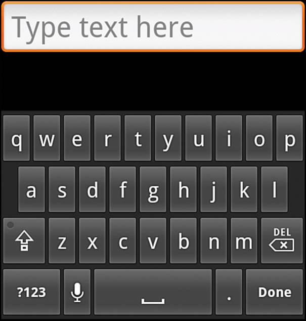
Figure 5.8 Text entry with soft keyboard
<EditText android:id="@+id/text_result"
android:inputType="text"
android:textSize="30sp"
android:hint="Type text here"
android:layout_width="match_parent"
android:layout_height="wrap_content" />
By using android:inputType="phone" or ="textEmailAddress", the soft keyboard for phone number entry or the soft keyboard for email address entry displays when the user selects the Input window. These are shown in Figure 5.9 with appropriately changed hint text.
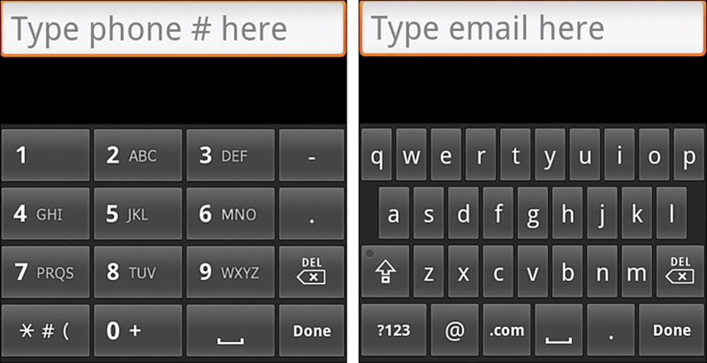
Figure 5.9 Using soft keyboards when inputText is set as "phone" or "textEmailAddress"
One more note: The text entry method can be specified as shown in Table 5.4 to automatically capitalize each sentence as typed, automatically correct mistyped words, or turn off word suggestions during typing. Control over these choices might be useful depending on the text entry situation.
Recipe: Creating a Form
A form is a graphical layout with areas that can take text input or selection. For text input, an EditText object can be used. After it is declared, some Java code needs to capture the text entry at run-time. This is done as shown in Listing 5.14. Note that the content of the text entry textResult in this example should not be modified. A copy of the content can be made in case modification is needed.
Listing 5.14. Capturing Text from an EditText Object
CharSequence phoneNumber;
EditText textResult = (EditText) findViewById(R.id.text_result);
textResult.setOnKeyListener(new OnKeyListener() {
public boolean onKey(View v, int keyCode, KeyEvent event) {
// Register the text when "enter" is pressed
if ((event.getAction() == KeyEvent.ACTION_UP) &&
(keyCode == KeyEvent.KEYCODE_ENTER)) {
// Grab the text for use in the activity
phoneNumber = textResult.getText();
return true;
}
return false;
}
});
Returning true from the onKey method indicates to the super function that the key press event was consumed (used), and there is no need to process further.
To provide user selection of different options normally used in forms, standard widgets such as check boxes, radio buttons, and drop-down selection menus are implemented using widgets as shown in the next section.
Other Widgets: From Buttons to Seek Bars
The Android system provides some standard graphical widgets that developers can use to create a cohesive user experience across applications. The most common ones are:
Button—A rectangular graphic that registers when the screen is touched within its bounds. It can contain user-provided text or images.
CheckBox—A button with a check mark graphic and description text that can be toggled on or off when touched. The ToggleButton is similar and also discussed here.
RadioButton—A button with a dot graphic that can be selected when touched but cannot then be turned off. Multiple radio buttons can be grouped together into a RadioGroup (as a LinearLayout), which allows only one radio button of the group to be selected at a time.
Spinner—A button showing the current selection and an arrow graphic to denote a drop-down menu. When the spinner is touched, the list of possible values displays, and when a new selection is made, it is displayed in the spinner.
ProgressBar—A bar that lights up to visually indicate the percentage of progress (and optionally secondary progress) in an operation. It is not interactive. If a quantitative measure of progress cannot be determined, the ProgressBar can be set in indeterminate mode, which shows a rotating circular motion instead.
SeekBar—An interactive progress bar that allows progress to be dragged and changed. This is useful to show media playback, for example. It can show how much of the media has been played, and a user can drag to move to an earlier or later place in the file.
The following recipes provide some practical examples of these widgets.
Recipe: Using Image Buttons in a Table Layout
Buttons were introduced in Chapter 2, “Application Basics: Activities and Intents.” Like any view, a background image can be added to a button using the android:background attribute. However, using the special ImageButton widget provides some additional layout flexibility. It specifies an image using the android:src attribute as follows:
<ImageButton android:id="@+id/imagebutton0"
android:src="@drawable/android_cupcake"
android:layout_width="wrap_content"
android:layout_height="wrap_content" />
When used in this way, the image shows on top of a Button widget. The ImageButton widget inherits image placement from the ImageView widget using android:scaleType. Possible values and how they modify a given image are illustrated in Figure 5.10.
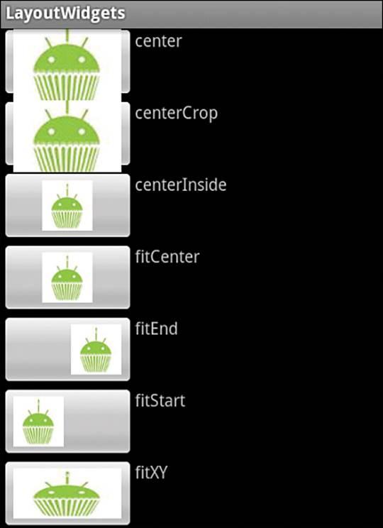
Figure 5.10 Example results of android:scaleType for image views
Following are some additional possible manipulations used with image buttons:
Using android:padding to keep buttons from overlapping or to add space between them
Setting android:background to null (which is @null in the XML layout file) to hide the button and show only the image
When the button is hidden, by default, there is no visual feedback that an image button was pressed. This can be rectified by creating a drawable XML file that contains just a selector element:
<?xml version="1.0" encoding="utf-8"?>
<selector xmlns:android="http://schemas.android.com/apk/res/android">
<item android:drawable="@drawable/myimage_pressed"
android:state_pressed="true" />
<item android:drawable="@drawable/myimage_focused"
android:state_focused="true" />
<item android:drawable="@drawable/myimage_normal" />
</selector>
This specifies three different images depending on whether the button is pressed, in focus, or just in a normal state. The three different images for these cases should also reside in the drawable resource directory (such as res/drawable-mdpi/). Then, the selector file can be specified as theandroid:src attribute of an ImageButton.
When multiple image buttons are placed together in a layout, it is often useful to use the table layout, which is also shown in this recipe. The TableLayout view group is similar to a LinearLayout with vertical orientation. Then, multiple rows can be specified using the TableRow view group for each row. The example layout shown in Listing 5.15 specifies an ImageButton and TextView in each row, producing the screen layout shown in Figure 5.11.
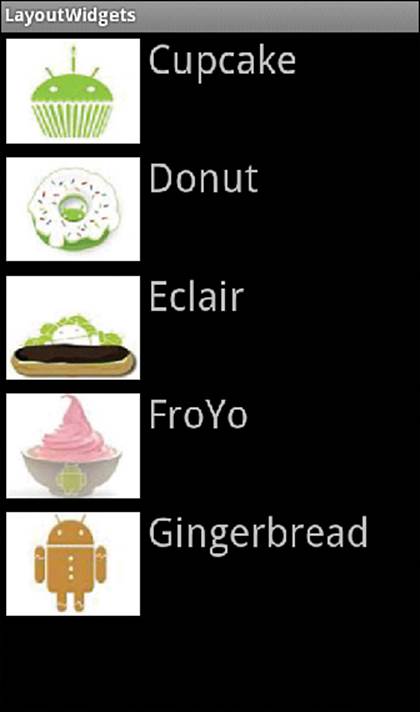
Figure 5.11 TableLayout of ImageButtons and TextViews
Listing 5.15. res/layout/ibutton.xml
<?xml version="1.0" encoding="utf-8"?>
<TableLayout
xmlns:android="http://schemas.android.com/apk/res/android"
android:layout_width="match_parent"
android:layout_height="match_parent">
<TableRow>
<ImageButton android:id="@+id/imagebutton0"
android:src="@drawable/android_cupcake"
android:scaleType="fitXY"
android:background="@null"
android:padding="5dip"
android:layout_width="wrap_content"
android:layout_height="90dip" />
<TextView android:text="Cupcake"
android:layout_width="wrap_content"
android:layout_height="wrap_content" />
</TableRow>
<TableRow>
<ImageButton android:id="@+id/imagebutton1"
android:src="@drawable/android_donut"
android:scaleType="fitXY"
android:background="@null"
android:padding="5dip"
android:layout_width="wrap_content"
android:layout_height="90dip" />
<TextView android:text="Donut"
android:layout_width="wrap_content"
android:layout_height="wrap_content" />
</TableRow>
<TableRow>
<ImageButton android:id="@+id/imagebutton2"
android:src="@drawable/android_eclair"
android:scaleType="fitXY"
android:background="@null"
android:padding="5dip"
android:layout_width="wrap_content"
android:layout_height="90dip" />
<TextView android:text="Eclair"
android:layout_width="wrap_content"
android:layout_height="wrap_content" />
</TableRow>
<TableRow>
<ImageButton android:id="@+id/imagebutton3"
android:src="@drawable/android_froyo"
android:scaleType="fitXY"
android:background="@null"
android:padding="5dip"
android:layout_width="wrap_content"
android:layout_height="90dip" />
<TextView android:text="FroYo"
android:layout_width="wrap_content"
android:layout_height="wrap_content" />
</TableRow>
<TableRow>
<ImageButton android:id="@+id/imagebutton4"
android:src="@drawable/android_gingerbread"
android:scaleType="fitXY"
android:background="@null"
android:padding="5dip"
android:layout_width="wrap_content"
android:layout_height="90dip" />
<TextView android:text="Gingerbread"
android:layout_width="wrap_content"
android:layout_height="wrap_content" />
</TableRow></TableLayout>
Recipe: Using Check Boxes and Toggle Buttons
Check boxes have a predetermined check mark graphic, colors for selection, and colors for behavior when pressed. This provides a unifying look and feel across Android applications. However, if a custom graphic to denote selection is required, the setButtonDrawable() method can be used.
Sticking with the check box example here, the CheckBox widget needs to be declared in a layout file, as shown in Listing 5.16. The android:text attribute displays as a label after the check box. For illustration, a few text views are also added to the layout.
Listing 5.16. res/layout/ckbox.xml
<?xml version="1.0" encoding="utf-8"?>
<LinearLayout
xmlns:android="http://schemas.android.com/apk/res/android"
android:orientation="vertical"
android:layout_width="match_parent"
android:layout_height="match_parent">
<CheckBox android:id="@+id/checkbox0"
android:text="Lettuce"
android:layout_width="wrap_content"
android:layout_height="wrap_content" />
<CheckBox android:id="@+id/checkbox1"
android:text="Tomato"
android:layout_width="wrap_content"
android:layout_height="wrap_content" />
<CheckBox android:id="@+id/checkbox2"
android:text="Cheese"
android:layout_width="wrap_content"
android:layout_height="wrap_content" />
<TextView android:text="Lettuce, Tomato, Cheese choices:"
android:layout_width="wrap_content"
android:layout_height="wrap_content" />
<TextView android:id="@+id/status"
android:layout_width="wrap_content"
android:layout_height="wrap_content" />
</LinearLayout>
The views in the layout file can be associated with view instances in the Java file, as shown in Listing 5.17. Here, a private inner class is used to register the toppings of a sandwich. All three check boxes have an onClickListener method, which keeps track of the changes to the toppings, and this is updated to the text view as an example. The final output with some sample selections is shown in Figure 5.12.
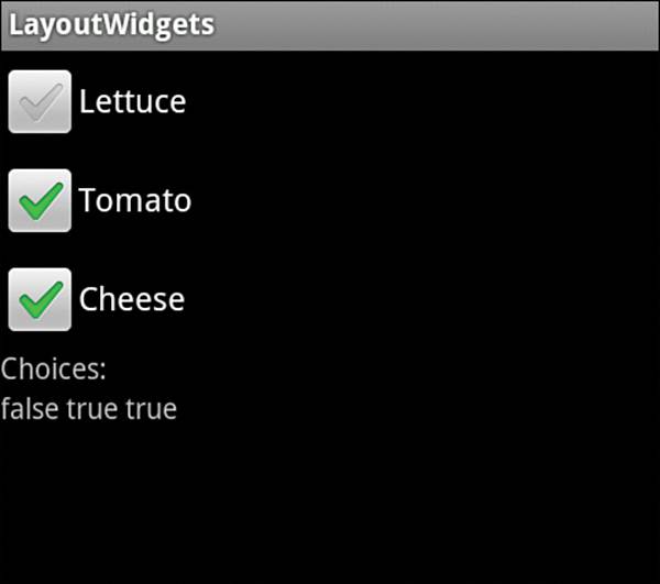
Figure 5.12 CheckBox example showing unselected and selected widgets
Listing 5.17. src/com/cookbook/layout_widgets/CheckBoxExample.java
package com.cookbook.layout_widgets;
import android.app.Activity;
import android.os.Bundle;
import android.view.View;
import android.view.View.OnClickListener;
import android.widget.CheckBox;
import android.widget.TextView;
public class CheckBoxExample extends Activity {
private TextView tv;
@Override
public void onCreate(Bundle savedInstanceState) {
super.onCreate(savedInstanceState);
setContentView(R.layout.ckbox);
tv = (TextView) findViewById(R.id.status);
class Toppings {private boolean LETTUCE, TOMATO, CHEESE;}
final Toppings sandwichToppings = new Toppings();
final CheckBox checkbox[] = {
(CheckBox) findViewById(R.id.checkbox0),
(CheckBox) findViewById(R.id.checkbox1),
(CheckBox) findViewById(R.id.checkbox2)};
checkbox[0].setOnClickListener(new OnClickListener() {
@Override
public void onClick(View v) {
if (((CheckBox) v).isChecked()) {
sandwichToppings.LETTUCE = true;
} else {
sandwichToppings.LETTUCE = false;
}
tv.setText(""+sandwichToppings.LETTUCE + " "
+sandwichToppings.TOMATO + " "
+sandwichToppings.CHEESE + " ");
}
});
checkbox[1].setOnClickListener(new OnClickListener() {
@Override
public void onClick(View v) {
if (((CheckBox) v).isChecked()) {
sandwichToppings.TOMATO = true;
} else {
sandwichToppings.TOMATO = false;
}
tv.setText(""+sandwichToppings.LETTUCE + " "
+sandwichToppings.TOMATO + " "
+sandwichToppings.CHEESE + " ");
}
});
checkbox[2].setOnClickListener(new OnClickListener() {
@Override
public void onClick(View v) {
if (((CheckBox) v).isChecked()) {
sandwichToppings.CHEESE = true;
} else {
sandwichToppings.CHEESE = false;
}
tv.setText(""+sandwichToppings.LETTUCE + " "
+sandwichToppings.TOMATO + " "
+sandwichToppings.CHEESE + " ");
}
});
}
}
Toggle buttons are similar to check boxes but use a different graphic. In addition, the text is incorporated into the button rather than put alongside. Listing 5.16 (and Listing 5.17 for that matter) can be modified to replace each CheckBox with a ToggleButton:
<ToggleButton android:id="@+id/ToggleButton0"
android:textOff="No Lettuce"
android:textOn="Lettuce"
android:layout_width="wrap_content"
android:layout_height="wrap_content" />
Note that the android:text element is replaced by an android:textOff (defaults to "OFF" if not specified) and android:textOn (defaults to "ON" if not specified) element for display depending on the selection state of the toggle button. An example output is shown in Figure 5.13.
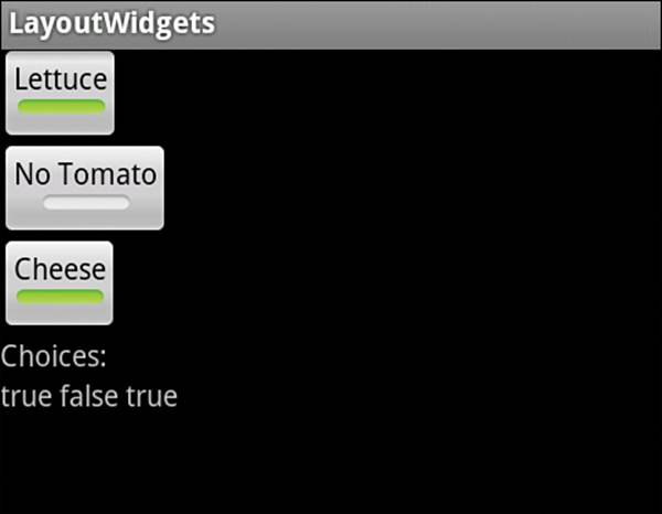
Figure 5.13 ToggleButton example with unselected and selected widgets
Recipe: Using Radio Buttons
A radio button is like a check box that cannot be unchecked. Selecting one radio button unselects a previously selected one. Usually a group of radio buttons is put into a RadioGroup view group that ensures that only one button of the collection is selected at a time. This is shown in the layout file in Listing 5.18.
Listing 5.18. res/layout/rbutton.xml
<?xml version="1.0" encoding="utf-8"?>
<RadioGroup android:id="@+id/RadioGroup01"
android:layout_width="wrap_content"
android:layout_height="wrap_content">
<RadioButton android:text="Republican"
android:id="@+id/RadioButton02"
android:layout_width="wrap_content"
android:layout_height="wrap_content" />
<RadioButton android:text="Democrat"
android:id="@+id/RadioButton03"
android:layout_width="wrap_content"
android:layout_height="wrap_content" />
<RadioButton android:text="Independent"
android:id="@+id/RadioButton01"
android:layout_width="wrap_content"
android:layout_height="wrap_content" />
</RadioGroup>
This example activity is similar to the example shown in Listing 5.17, but with CheckBox replaced by RadioButton. Listing 5.18’s layout is shown in Figure 5.14.
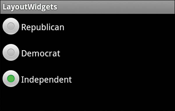
Figure 5.14 RadioGroup example showing three radio buttons
Recipe: Creating a Spinner
A drop-down menu is called a spinner. It is a widget defined in a normal screen layout such as the one shown in Listing 5.19.
Listing 5.19. res/layout/spinner.xml
<?xml version="1.0" encoding="utf-8"?>
<LinearLayout
xmlns:android="http://schemas.android.com/apk/res/android"
android:layout_width="wrap_content"
android:layout_height="wrap_content">
<Spinner android:id="@+id/spinner"
android:prompt="@string/oceaN_prompt"
android:layout_width="wrap_content"
android:layout_height="wrap_content" />
</LinearLayout>
The title of the drop-down menu can be specified with the android:prompt attribute. It needs to be defined in a strings.xml file, for example:
<string name="ocean_prompt">Choose your favorite ocean</string>
The spinner also needs a separate layout defined for the drop-down menu appearance, such as Listing 5.20 for the spinner_entry.xml.
Listing 5.20. res/layout/spinner_entry.xml
<?xml version="1.0" encoding="utf-8"?>
<TextView
xmlns:android="http://schemas.android.com/apk/res/android"
android:gravity="center"
android:textColor="#000"
android:textSize="40sp"
android:layout_width="match_parent"
android:layout_height="wrap_content">
</TextView>
Note that the spinner entry layout is not limited to text but can include images or any object supported in layouts.
The activity to call the spinner needs to declare an Adapter constructor to fill the drop-down menu with the view from the spinner entry layout file. An example of such an activity is shown in Listing 5.21.
Listing 5.21. src/com/cookbook/layout_widgets/SpinnerExample.java
package com.cookbook.layout_widgets;
import android.app.Activity;
import android.os.Bundle;
import android.widget.ArrayAdapter;import android.widget.Spinner;
public class SpinnerExample extends Activity {
private static final String[] oceans = {
"Pacific", "Atlantic", "Indian",
"Arctic", "Southern" };
@Override
protected void onCreate(Bundle savedInstanceState) {
super.onCreate(savedInstanceState);
setContentView(R.layout.spinner);
Spinner favoriteOcean = (Spinner) findViewById(R.id.spinner);
ArrayAdapter<String> mAdapter = new
ArrayAdapter<String>(this, R.layout.spinner_entry, oceans);
mAdapter.setDropDownViewResource(R.layout.spinner_entry);
favoriteOcean.setAdapter(mAdapter);
}
}
In the previous example, the spinner entries are defined by the string array oceans[], which is passed to the ArrayAdapter constructor. This implementation assumes the spinner entries do not change during run-time. To specify a more general case where spinner entries can be added or manipulated, mAdapter needs to be built using its add() method. The bold part of code in the onCreate() method would then become the following:
Spinner favoriteOcean = (Spinner) findViewById(R.id.spinner);ArrayAdapter<String> mAdapter = new
ArrayAdapter<String>(this, R.layout.spinner_entry);mAdapter.setDropDownViewResource(R.layout.spinner_entry);for(int idx=0; idx<oceans.length; idx++)
mAdapter.add(oceans[idx]);favoriteOcean.setAdapter(mAdapter);
This ArrayAdapter constructor allows the add(), remove(), and clear() methods to change the selection list during run-time, and getView() to improve performance speed by reusing layout views for each spinner entry.
Recipe: Using a Progress Bar
This recipe demonstrates the usage of a progress bar by taking Listing 5.7, which used text to show progress in a computation, and showing the progress graphically instead. This is done by adding a progress bar object to the layout, such as:
<ProgressBar android:id="@+id/ex_progress_bar"
style="@android:attr/progressBarStyleHorizontal"
android:layout_width="270dp"
android:layout_height="50dp"
android:progress="0"
android:secondaryProgress="0" />
As the progress changes, the android:progress attribute can change to show a colored bar going across the screen. The optional android:secondaryProgress attribute shows a lighter-colored bar that can be used to indicate a progress milestone, for example.
The activity to update the progress bar is shown in Listing 5.22. It is similar to Listing 5.7, but it uses ProgressBar instead of changing background colors. Here, the update results function updates the progress attribute from Java.
Listing 5.22. src/com/cookbook/handler_ui/HandlerUpdateUi.java
package com.cookbook.handler_ui;
import android.app.Activity;
import android.os.Bundle;
import android.os.Handler;
import android.view.View;
import android.widget.Button;
import android.widget.ProgressBar;
public class HandlerUpdateUi extends Activity {
private static ProgressBar m_progressBar; //UI reference
int percentDone = 0;
final Handler mHandler = new Handler();
// Create runnable for posting results to the UI thread
final Runnable mUpdateResults = new Runnable() {
public void run() {
m_progressBar.setProgress(percentDone);
}
};
@Override
public void onCreate(Bundle savedInstanceState) {
super.onCreate(savedInstanceState);
setContentView(R.layout.main);
m_progressBar = (ProgressBar) findViewById(R.id.ex_progress_bar);
Button actionButton = (Button) findViewById(R.id.action);
actionButton.setOnClickListener(new View.OnClickListener() {
public void onClick(View view) {
doWork();
}
});
}
//example of a computationally intensive action with UI updates
private void doWork() {
Thread thread = new Thread(new Runnable() {
public void run() {
percentDone = 0;
mHandler.post(mUpdateResults);
computation(1);
percentDone = 50;
mHandler.post(mUpdateResults);
computation(2);
percentDone = 100;
mHandler.post(mUpdateResults);
}
});
thread.start();
}
final static int SIZE=1000; //large enough to take some time
double tmp;
private void computation(int val) {
for(int ii=0; ii<SIZE; ii++)
for(int jj=0; jj<SIZE; jj++)
tmp=val*Math.log(ii+1)/Math.log1p(jj+1);
}
}
If the updates need to be shown more often, use the postDelayed method of the handler instead of the post method and add postDelayed to the end of the runnable update results function (similar to what was used in “Scheduling a Runnable Task from the Main Thread” recipe in Chapter 3, “Threads, Services, Receivers, and Alerts”).
Recipe: Using a Seek Bar
A seek bar is similar to a progress bar, but it can take user input to change the amount of progress. Current progress is indicated by a small sliding box called a thumb. A user can click and drag the thumb to visually indicate the new place to set the progress. The main activity is shown inListing 5.23.
Listing 5.23. src/com/cookbook/seekbar/SeekBarEx.java
package com.cookbook.seekbar;
import android.app.Activity;
import android.os.Bundle;
import android.widget.SeekBar;
public class SeekBarEx extends Activity {
private SeekBar m_seekBar;
boolean advancing = true;
@Override
public void onCreate(Bundle savedInstanceState) {
super.onCreate(savedInstanceState);
setContentView(R.layout.main);
m_seekBar = (SeekBar) findViewById(R.id.SeekBar01);
m_seekBar.setOnSeekBarChangeListener(new
SeekBar.OnSeekBarChangeListener() {
public void onProgressChanged(SeekBar seekBar,
int progress, boolean fromUser) {
if(fromUser) count = progress;
}
public void onStartTrackingTouch(SeekBar seekBar) {}
public void onStopTrackingTouch(SeekBar seekBar) {}
});
Thread initThread = new Thread(new Runnable() {
public void run() {
show_time();
}
});
initThread.start();
}
int count;
private void show_time() {
for(count=0; count<100; count++) {
m_seekBar.setProgress(count);
try {
Thread.sleep(100);
} catch (InterruptedException e) {
e.printStackTrace();
}
}
}
}
The widget declaration in the layout XML file is shown in Listing 5.24. Note that rather than using the default thumb button, a cupcake image is used, as shown in Figure 5.15.
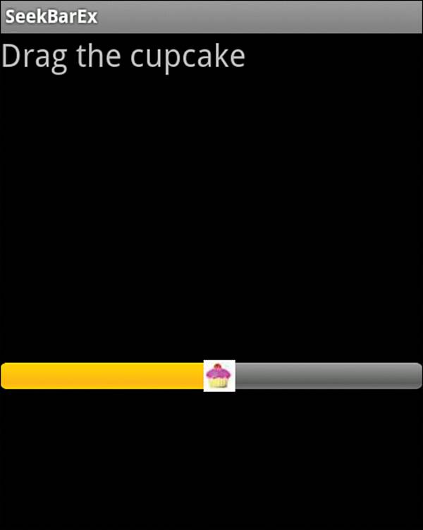
Figure 5.15 SeekBar example with a custom picture of a cupcake as the thumb
Listing 5.24. res/layout/main.xml
<?xml version="1.0" encoding="utf-8"?>
<RelativeLayout
xmlns:android="http://schemas.android.com/apk/res/android"
android:layout_width="match_parent"
android:layout_height="match_parent">
<TextView android:layout_width="match_parent"
android:layout_height="wrap_content"
android:textSize="24sp" android:text="Drag the cupcake"
android:layout_alignParentTop="true" />
<SeekBar android:id="@+id/SeekBar01"
android:layout_centerInParent="true"
android:layout_width="match_parent"
android:layout_height="wrap_content"
android:thumb="@drawable/pink_cupcake_no_bg" />
</RelativeLayout>
All materials on the site are licensed Creative Commons Attribution-Sharealike 3.0 Unported CC BY-SA 3.0 & GNU Free Documentation License (GFDL)
If you are the copyright holder of any material contained on our site and intend to remove it, please contact our site administrator for approval.
© 2016-2025 All site design rights belong to S.Y.A.