Android Programming: The Big Nerd Ranch Guide (2015)
Chapter 33. Material Design
The biggest change in Android 5.0 Lollipop was the introduction of a new design style: material design. This new visual language made a big splash and was accompanied by a wonderfully exhaustive style guide.
Of course, as developers we are usually only peripherally concerned with questions of design. Our job is to get it done, no matter what “it” is. However, material design introduces some new interface concepts in addition to design sensibilities. If you familiarize yourself with them, you will find it much easier to implement these new designs.
This final chapter is a little different from previous chapters. You can think of it as an enormous For The More Curious section. There is no example app to work through, and most of this information is not required reading.
For designers, material design emphasizes three big ideas:
· Material is the metaphor: The pieces of the app should act like physical, material objects.
· Bold, graphic, and intentional: App designs should jump off the page like they would in a well-designed magazine or book.
· Motion provides meaning: The app should animate in response to actions taken by the user.
The only one of these that our book has nothing to say about is bold, graphic, and intentional. This is a designer’s responsibility. If you are designing your own app, check out the material design guidelines to see what they mean by that.
For the material is the metaphor part, designers need your help to build out the material surfaces. You will need to know how to position them in three dimensions using z-axis properties, and you will need to know how to use two new material widgets: floating action bars and snackbars.
Finally, to live up to the directive that motion provides meaning, you can learn a new set of animation tools: state list animators, animated state list drawables (yes, you read that right – they are different from state list animators), circular reveals, and shared element transitions. These can be used to add the visual interest that bold designers crave.
Material Surfaces
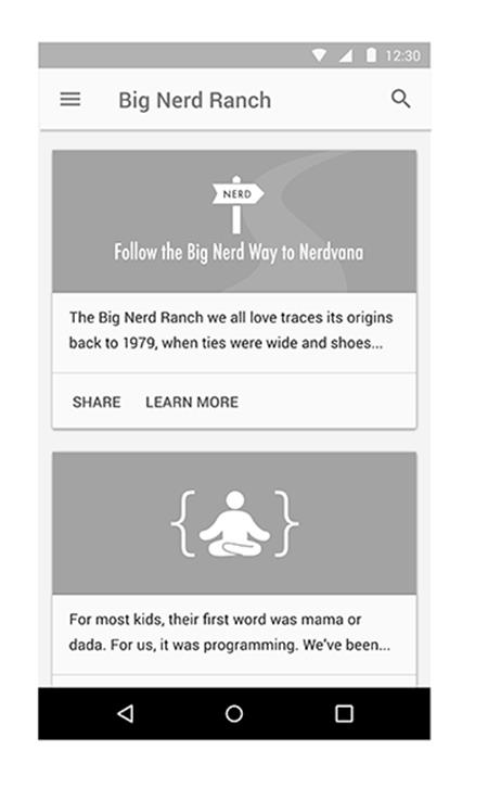
As a developer, the single most important idea you should be familiar with in material design is the idea of material surfaces. Designers think of these as 1dp thick bits of cardstock. These bits of cardstock act like magically changeable bits of paper and ink: they can grow, they can show animated pictures, they can show changing text (Figure 33.1).
Figure 33.1 An interface with two material surfaces
However, as magical as they may be they still behave like real pieces of paper. For example, one sheet of paper cannot move right through another. The same logic applies when you animate material surfaces: they cannot animate through one another.
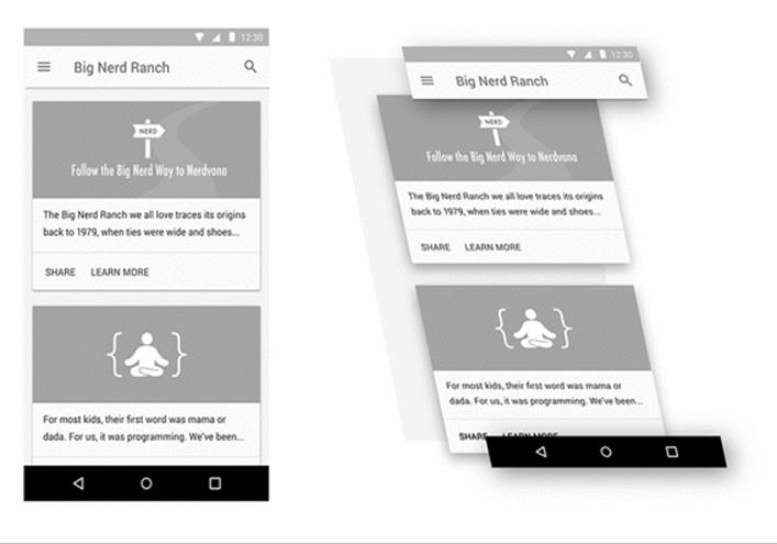
Instead, surfaces exist and maneuver around one another in a three-dimensional space. They can move up toward your finger, or down and away (Figure 33.2).
Figure 33.2 A material design in 3-D space
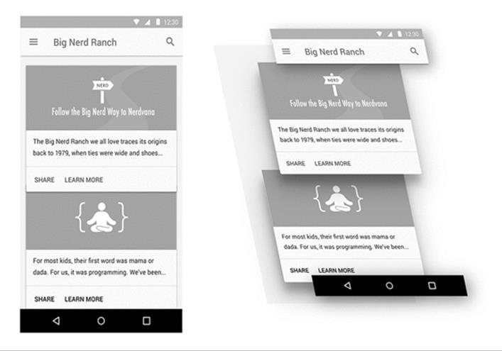
To animate one surface across another, you move it up and across the other surface (Figure 33.3).
Figure 33.3 Animating one surface over another
Elevation and Z values
The most apparent way users will see the depth in your interface is by seeing how elements of your app cast shadows on one another. Some might think that a perfect world would be one where the designers worry about drawing those shadows and we developers go eat bagels. (Opinions differ on what a perfect world looks like.)
But doing that with a variety of surfaces in play – while animating, no less – is not possible for designers to do by themselves. Instead, you let Android take care of drawing the shadows by giving each of your Views an elevation.
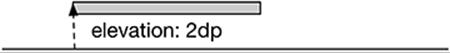
Lollipop introduced a z-axis to the layout system, allowing you to specify where a view lives in 3-D space. Elevation is like the coordinates assigned to your view in layout: you can animate your view away from this position, but this is where it naturally lives (Figure 33.4).
Figure 33.4 Elevation on the Z plane
To set the elevation value, you can either call the View.setElevation(float) method or set the value in your layout file.
Listing 33.1 Setting elevation on a view in a layout file
<?xml version="1.0" encoding="utf-8"?>
<Button xmlns:android="http://schemas.android.com/apk/res/android"
xmlns:tools="http://schemas.android.com/tools"
android:id="@+id/button"
android:layout_width="wrap_content"
android:layout_height="wrap_content"
android:elevation="2dp"/>
Because this is intended to be your baseline Z value, using the XML attribute is preferred. It is also easier to use than setElevation(float), because the elevation attribute is silently ignored on older versions of Android, so you do not need to worry about compatibility.
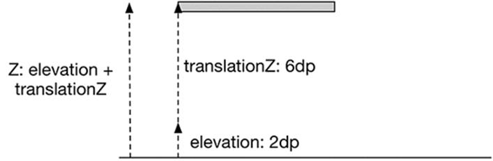
To change a View’s elevation, you use the translationZ and Z properties. These work exactly like translationX, translationY, X, and Y, which you saw in Chapter 30. Z’s value is always elevation plus translationZ. If you assign a value to Z, it will do the math to assign the right value totranslationZ (Figure 33.5).
Figure 33.5 Z and translationZ
State list animators
Material applications are often designed with many animated user interactions. Press a button on Lollipop to see one example: the button will animate up on the z-axis to meet your finger. When you release your finger, it will animate back down.
To make implementing these animations easier, Lollipop introduced state list animators. State list animators are the animation counterpart to the state list drawable: instead of switching out one drawable for another, they animate the view into a particular state. To implement an animation that raises the button up when you press it, you can define a state list animator that looks like this in res/animator:
Listing 33.2 An example state list animator
<?xml version="1.0" encoding="utf-8"?>
<selector xmlns:android="http://schemas.android.com/apk/res/android">
<item android:state_pressed="true">
<objectAnimator android:propertyName="translationZ"
android:duration="100"
android:valueTo="6dp"
android:valueType="floatType"
/>
</item>
<item android:state_pressed="false">
<objectAnimator android:propertyName="translationZ"
android:duration="100"
android:valueTo="0dp"
android:valueType="floatType"
/>
</item>
</selector>
This is great if you need to use a property animation. If you want to perform a framed animation, you need to use another tool: the animated state list drawable.
The name “animated state list drawable” is a little confusing. It sounds similar to “state list animator,” but the purpose is totally different. Animated state list drawables allow you to define images for each state, like a normal state list drawable, but they also allow you to define frame animation transitions between those states.
Back in Chapter 21, you defined a state list drawable for BeatBox’s sound buttons. If a sadistic designer (like our own Kar Loong Wong) wanted to have a multiframe animation each time the button was pressed, you could modify your XML to look like Listing 33.3. This version would need to live inside res/drawable-21 because this feature is not supported prior to Lollipop.
Listing 33.3 An animated state list drawable
<?xml version="1.0" encoding="utf-8"?>
<animated-selector xmlns:android="http://schemas.android.com/apk/res/android">
<item android:id="@+id/pressed"
android:drawable="@drawable/button_beat_box_pressed"
android:state_pressed="true"/>
<item android:id="@+id/released"
android:drawable="@drawable/button_beat_box_normal" />
<transition
android:fromId="@id/released"
android:toId="@id/pressed">
<animation-list>
<item android:duration="10" android:drawable="@drawable/button_frame_1" />
<item android:duration="10" android:drawable="@drawable/button_frame_2" />
<item android:duration="10" android:drawable="@drawable/button_frame_3" />
...
</animation-list>
</transition>
</animated-selector>
Here, each item in the selector gets an ID. You can then define a transition between different IDs to play a multiframe animation. If you want to provide an animation when you release the button, too, that requires an additional transition tag.
Animation Tools
Material design has many nifty new animations. Some of them can be achieved quickly. Others require more work, but Android provides some tools to help you out.
Circular reveal
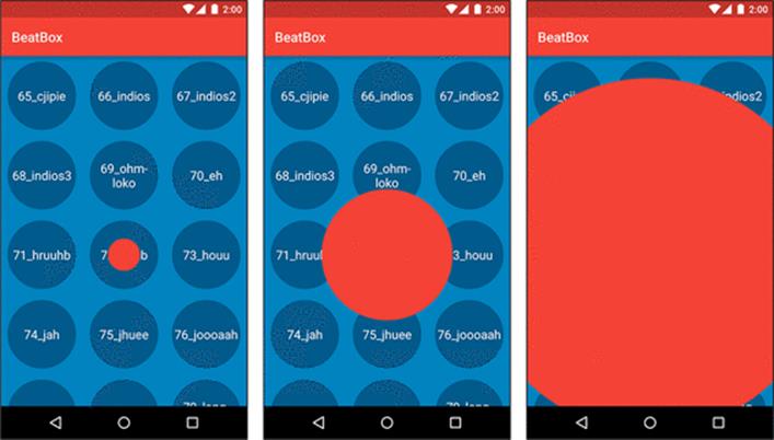
The circular reveal animation is used in material design to look like an ink flood-fill. A view or piece of content is progressively revealed outward from a point of interaction, usually a point pressed by the user. Figure 33.6 gives you an idea of what a circular reveal can bring to the party.
Figure 33.6 Circular reveal from pressing an item in BeatBox
You may remember using a simple version of this way back in Chapter 6, where you used it to hide a button. Here we will talk about another way to use circular reveal that is slightly more involved.
To create a circular reveal animation, you call the createCircularReveal(…) method on ViewAnimationUtils. This method takes in quite a few parameters:
static Animator createCircularReveal(View view, int centerX, int centerY,
float startRadius, float endRadius)
The View passed in is the View you would like to reveal. In Figure 33.6, this view is a solid red view that is the same width and height of the BeatBoxFragment. If you animate from a startRadius of 0 to a large endRadius, this view will start out being completely transparent, and then slowly be revealed as the circle expands. The circle’s origin (in terms of the View’s coordinates) will be centerX and centerY. This method returns an Animator, which works exactly like the Animator you used back in Chapter 30.
The material design guidelines say that these animations should originate from the point where the user touched the screen. So your first step is to find the screen coordinates of the view that the user touched, as in Listing 33.4.
Listing 33.4 Finding screen coordinates in a click listener
@Override
public void onClick(View clickSource) {
int[] clickCoords = new int[2];
// Find the location of clickSource on the screen
clickSource.getLocationOnScreen(clickCoords);
// Tweak that location so that it points at the center of the view,
// not the corner
clickCoords[0] += clickSource.getWidth() / 2;
clickCoords[1] += clickSource.getHeight() / 2;
performRevealAnimation(mViewToReveal, clickCoords[0], clickCoords[1]);
}
Then you can perform your reveal animation (Listing 33.5).
Listing 33.5 Making and executing a reveal animation
private void performRevealAnimation(View view, int screenCenterX, int screenCenterY) {
// Find the center relative to the view that will be animated
int[] animatingViewCoords = new int[2];
view.getLocationOnScreen(animatingViewCoords);
int centerX = screenCenterX - animatingViewCoords[0];
int centerY = screenCenterY - animatingViewCoords[1];
// Find the maximum radius
Point size = new Point();
getActivity().getWindowManager().getDefaultDisplay().getSize(size);
int maxRadius = size.y;
if (Build.VERSION.SDK_INT >= Build.VERSION_CODES.LOLLIPOP) {
ViewAnimationUtils.createCircularReveal(view, centerX, centerY, 0, maxRadius)
.start();
}
}
Important note: the View must already be in the layout for this method to work.
Shared element transitions
Another kind of animation that is new to material design is the shared element transition, or hero transition. This transition is meant for a specific situation: where two screens display some of the same things.
Think back to your work on CriminalIntent. In that application, you had a thumbnail view of a picture you took in CrimeDetailFragment. In one of the challenges, you were asked to construct another view that zoomed in to a full-size visual of that picture. Your solution might have looked something like Figure 33.7.
Figure 33.7 A zoomed-in picture view
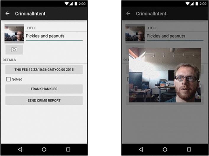
This is a common interface pattern: you press one element and the next view provides more detail for that element.
A shared element transition is an animation for any situation where you are transitioning between two screens that are displaying some of the same elements. In this case, both the big image on the right and the small one on the left are displaying the same picture. The picture, in other words, is a shared element.
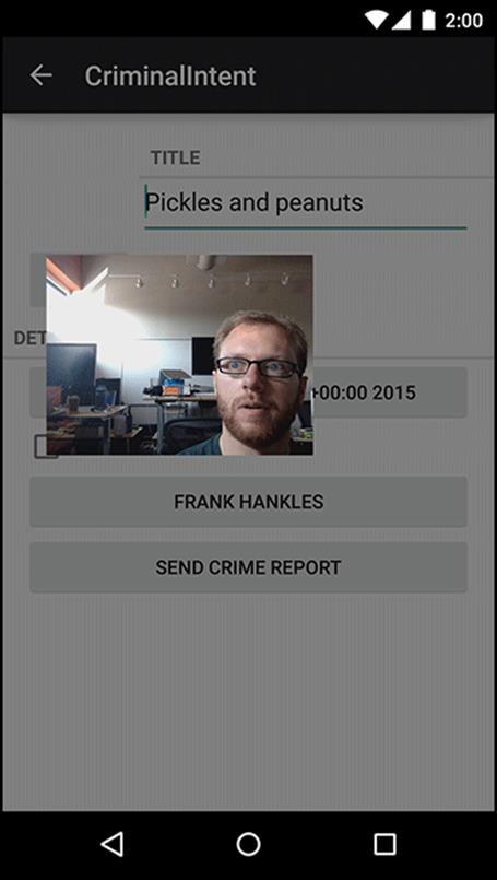
In Lollipop, Android provides techniques for accomplishing a transition between activities or between fragments. Here, we will show you how it works with activities. The middle of the animation looks like Figure 33.8.
Figure 33.8 Shared element transition
For activities, the basic implementation is a three-step process:
1. Turn on activity transitions.
2. Set transition name values for each shared element view.
3. Start your next activity with an ActivityOptions that will trigger the transition.
First, you have to turn on activity transitions. If your activity uses the AppCompat theme used elsewhere in the book, then you can skip this step. (AppCompat inherits from the Material theme, which turns on activity transitions for you.)
In our example, we gave our activity a transparent background by using @android:style/Theme.Translucent.NoTitleBar. This theme does not inherit from the Material theme, so it does not have activity transitions turned on. They have to be turned on manually, which can happen in either of two ways. One option is to add a line of code to the activity, as in Listing 33.6.
Listing 33.6 Turning on activity transitions in code
@Override
public void onCreate(Bundle savedInstanceState) {
getWindow().requestFeature(Window.FEATURE_ACTIVITY_TRANSITIONS);
super.onCreate(savedInstanceState);
...
}
The other way is to tweak the style the activity uses and set the android:windowActivityTransitions attribute to true.
Listing 33.7 Turning on activity transitions in a style
<resources>
<style name="TransparentTheme"
parent="@android:style/Theme.Translucent.NoTitleBar">
<item name="android:windowActivityTransitions">true</item>
</style>
</resources>
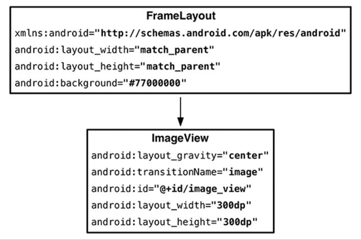
The next step in the shared element transition is to tag each shared element view with a transition name. This is done in a property on View introduced in API 21: transitionName. You can set it in either XML or in code; depending on the circumstance, one or the other might be appropriate. In our case, we set the transition name for the zoomed-in image by setting android:transitionName to image in our layout XML, as in Figure 33.9.
Figure 33.9 Zoomed-in image layout
Then we defined a static method startWithTransition(…) (Listing 33.8) to set the same transition name on a view to animate from.
Listing 33.8 Start with transition method
public static void startWithTransition(Activity activity, Intent intent,
View sourceView) {
ViewCompat.setTransitionName(sourceView, "image");
ActivityOptionsCompat options = ActivityOptionsCompat
.makeSceneTransitionAnimation(activity, sourceView, "image");
activity.startActivity(intent, options.toBundle());
}
ViewCompat.setTransitionName(View, String) is there to help out on older versions of Android, where View will not have a setTransitionName(String) implementation.
In Listing 33.8, you can see the final step, too: making an ActivityOptions. The ActivityOptions tells the OS what the shared elements are and what transitionName value to use.
There is a lot more to know about transitions and shared element transitions. They can also be used for fragment transitions, for example. For more information, check out Google’s documentation for the transitions framework: https://developer.android.com/training/transitions/overview.html.
View Components
Lollipop’s new material design guidelines specify a few new kinds of view components. The Android team provides implementations of many of these components. Let’s take a look at a few of the views you are likely to run into.
Cards
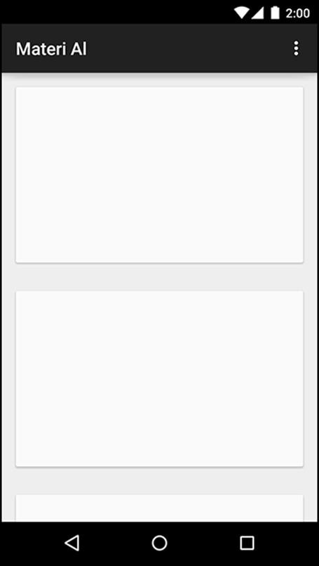
The first new widget is a frame for other widgets: cards (Figure 33.10).
Figure 33.10 Cards
A card is a container for other kinds of content. It is elevated slightly, with a shadow behind it, and its corners are slightly rounded.
This is not a design book, so we cannot provide advice on when and where to use cards. (See Google’s material design documentation on the web if you are curious: http://www.google.com/design/spec.) We can tell you how to make them, though: by using CardView.
CardView is a class provided in its own v7 support library, much like RecyclerView. You can include it in your project by adding a dependency on com.android.support:cardview-v7 to your module.
Once you do that, you can use CardView like any other ViewGroup in a layout. It is a FrameLayout subclass, so you can use any of FrameLayout’s layout params for CardView’s children.
Listing 33.9 Using CardView in a layout
<LinearLayout xmlns:android="http://schemas.android.com/apk/res/android"
xmlns:tools="http://schemas.android.com/tools"
android:layout_width="match_parent"
android:layout_height="match_parent"
android:orientation="vertical"
tools:context=".MainActivity">
<android.support.v7.widget.CardView
android:id="@+id/item"
android:layout_width="match_parent"
android:layout_height="200dp"
android:layout_margin="16dp"
>
...
</android.support.v7.widget.CardView>
</LinearLayout>
Because CardView is a support library class, it gives you some nice compatibility features on older devices. Unlike other widgets, it will always project a shadow. (On older versions, it will simply draw its own – not a perfect shadow, but close enough.) See CardView’s documentation for other minor visual differences, if you are interested.
Floating action buttons
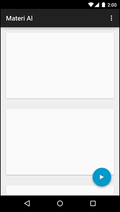
Another component you will often see is the floating action button, or FAB. You can see one in Figure 33.11.
Figure 33.11 A floating action button
An implementation of the floating action button is available in Google’s design support library. You can include this library in your project with this dependency on your module: com.android.support:design:22.2.0.
Floating action buttons are little more than a solid-color circle with a custom circular shadow, provided by an OutlineProvider. The FloatingActionButton class, a subclass of ImageView, takes care of the circle and shadow for you. Simply place a FloatingActionButton in your layout file and set itssrc attribute to the image that you want to display in your button.
While you could place your floating action button in a FrameLayout, the design support library also includes the clever CoordinatorLayout. This layout is a subclass of FrameLayout that changes your floating action button’s position based on the movement of other components. Now, when you display a Snackbar, your FAB will move up so that the Snackbar does not cover it. This will look like Listing 33.10.
Listing 33.10 Laying out a floating action button
<android.support.design.widget.CoordinatorLayout
xmlns:android="http://schemas.android.com/apk/res/android"
xmlns:tools="http://schemas.android.com/tools"
xmlns:app="http://schemas.android.com/apk/res-auto"
android:layout_width="match_parent"
android:layout_height="match_parent">
[... main content here ...]
<android.support.design.widget.FloatingActionButton
android:id="@+id/floating_action_button"
android:layout_width="wrap_content"
android:layout_height="wrap_content"
android:layout_gravity="bottom|right"
android:layout_margin="16dp"
android:src="@drawable/play"/>
</android.support.design.widget.CoordinatorLayout>
This code will place the button over the rest of the content in the bottom right, without interfering with any of it.
Snackbars
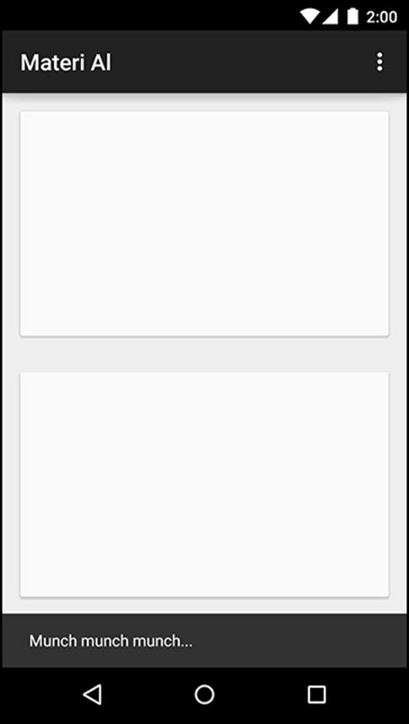
Snackbars are a bit more involved than floating action buttons. They are little interaction components that appear at the bottom of the screen (Figure 33.12).
Figure 33.12 A snackbar
Snackbars animate up from the bottom of the screen. After a certain period of time, or after another interaction on the screen, they automatically animate back down. Snackbars are similar in purpose to Toasts, but unlike Toasts they are a part of your app’s own interface. A Toast appears above your app and will stick around even if you navigate away. Also, snackbars let you provide a button so that the user can take immediate action.
Like floating action buttons, Android provides an implementation of snackbars in the design support library.
Snackbars are constructed and displayed in a similar way as Toasts (Listing 33.11).
Listing 33.11 Having a snack(bar)
Snackbar.make(container, R.string.munch, Snackbar.LENGTH_SHORT).show();
When constructing a Snackbar, pass in the view where the snackbar will be displayed, the text to display, and the length of time that the snackbar should be visible for. Finally, call show() to display the snackbar.
Snackbars can optionally provide an action on the right side. This is handy if the user performs a destructive action, like deleting a crime, and you want to provide a way for the user to undo that action.
More on Material Design
In this chapter, we presented what amounts to a big grab bag of tools. Those tools are hardly any fun if you let them sit and gather dust. So keep an eye out for ways to spiff up your application with some depth or new animations.
One great place to look for inspiration is the material design specification itself, which is full of great ideas: http://www.google.com/design/spec/material-design/introduction.html. You can also look in Google Play to see what other apps are doing, and ask yourself: How would I do that in my own app? You might end up with a niftier program than what you initially imagined.
All materials on the site are licensed Creative Commons Attribution-Sharealike 3.0 Unported CC BY-SA 3.0 & GNU Free Documentation License (GFDL)
If you are the copyright holder of any material contained on our site and intend to remove it, please contact our site administrator for approval.
© 2016-2026 All site design rights belong to S.Y.A.