HTML5 APPLICATIONS DEVELOPMENT MANUAL (2016)
15 - Managing Content
Content Flow
The content flow can be managed in an HTML document using inline flow and block flow properties in CSS.
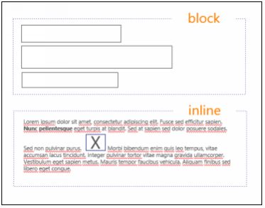
With block flow an element occupies the entire width available. With inline flow an element occupies only the available width. We could say that inline flow “fits” and block flow “separates” .
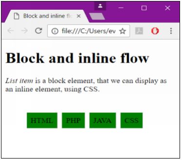
For example the <li> list item element, is a block element.
<!doctype html>
<html>
<head>
<title>Block and inline flow</title>
<link href="example.css" rel="stylesheet" type="text/css">
</head>
<body>
<h1>Block and inline flow</h1>
<p><em>List item</em> is a block element, that we can display as an inline element, using CSS. </p></br>
<ul class="toolbar">
<li>HTML</li>
<li>PHP</li>
<li>JAVA</li>
<li>CSS</li>
</ul>
</body>
</html>
Using CSS, we can display it as an inline element.
.toolbar li {
display:inline;
background-color: green;
border: 1px solid;
border-color: #F3F3F3 #BBB #BBB #F3F3F3;
margin: 2px;
padding: .5em;
}
Positioning
The position property specifies the type of positioning method used for an element (static, relative, absolute or fixed).
|
static |
positions an element within its normal flow |
|
relative |
positions an element in relation to where it would normally be positioned in the flow of content |
|
absolute |
ensures that the positioning of an element doesn’t impact other content |
|
fixed |
positions an element in relation to the browser window and stays in the same place |
|
initial |
sets this property to its default value |
|
inherit |
inherits this property from its parent element |
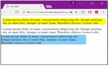
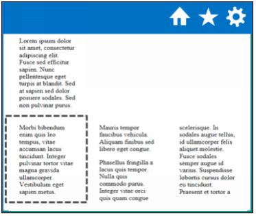
An absolute position of an element it means that it is positioned relative to the nearest ancestor.
<!doctype html>
<html>
<head>
<title>No title</title>
<link href="example.css" rel="stylesheet" type="text/css">
</head>
<body>
<p id="col1">=Lorem ipsum dolor sit amet, consectetuer adipiscing elit. Integer pretium dui sit amet felis. Integer sit amet diam. Phasellus ultricesviverra velit. </p>
<p id="col2">Lorem ipsum dolor sit amet, consectetuer adipiscing elit. Integer pretium dui sit amet felis. Integer sit amet diam. Phasellus ultrices viverra velit.</p>
<p id="col3"> Lorem ipsum dolor sit amet, consectetuer adipiscing elit. Integer pretium dui sit amet felis. Integer sit amet diam. Phasellus ultrices viverra velit.</p>
</body>
</html>
The origin (0,0 coordinate point) is the upper left corner of the window or object that contains the element positioned absolutely.
#col1 {
position: absolute;
bottom: 100px;
right: 100px;
background-color: lightskyblue;
}
#col2 {
background-color: yellow;
}
Resize the window and see how the three different paragraphs adjust.
Floating Elements
The float property allows you to move an element all the way to the left or right of a page, other content will wrap around the floated content. The value of float is commonly set to left or right.
|
none |
The element is not floated, and will be displayed just where it occurs in the text |
|
left |
The element floats to the left |
|
right |
The element floats the right |
|
initial |
Sets this property to its default value |
|
inherit |
Inherits this property from its parent element |
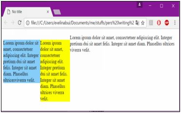
Float positioning often is useful when a layout is in columns.
<!doctype html>
<html>
<head>
<title>No title</title>
<link href="example.css" rel="stylesheet" type="text/css">
</head>
<body>
<p id="col1">Lorem ipsum dolor sit amet, consectetuer adipiscing elit. Integer pretium dui sit amet felis. Integer sit amet diam. Phasellus ultrices viverra velit.</p>
<p id="col2">Lorem ipsum dolor sit amet, consectetuer adipiscing elit. Integer pretium dui sit amet felis. Integer sit amet diam. Phasellus ultrices viverra velit.</p>
<p id="col3">Lorem ipsum dolor sit amet, consectetuer adipiscing elit. Integer pretium dui sit amet felis. Integer sit amet diam. Phasellus ultrices viverra velit.</p>
</body>
</html>
In the browser, col1 and col2 appear as two fixed-width columns, and col3 fills up any remaining space.
Clearing a Float
Use the clear property to prevent other floating elements from touching the left or right hand sides of an element. The value of the clear property can be left, right, both, or none.
- left clears the left side
- right clears the right side
- both clears both sides
- none allows other elements to touch
Overflow
Every HTML element on a page occupies a rectangular space called a bounding box. With CSS, you can modify the height or width of the bounding box.
If an element doesn’t fit inside of its bounding box, then that content is called overflow.
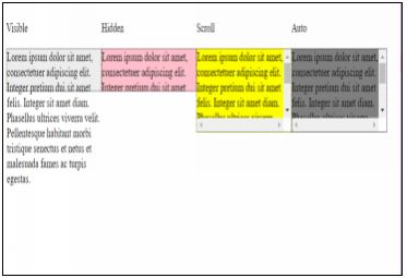
The overflow property specifies whether to clip content or to add scrollbars when the content of an element is too big to fit in a specified area.
The overflow property has the following values:
- visible - Default. The overflow is not clipped. It renders outside the element's box
- overflow - The overflow is clipped, and the rest of the content will be invisible
- scroll - The overflow is clipped, but a scrollbar is added to see the rest of the content
- auto - If overflow is clipped, a scrollbar should be added to see the rest of the content
<!DOCTYPE html>
<html>
<head>
<title></title>
<style>
div {
float: left;
}
#col1 {
background-color: #eee;
width: 200px;
height: 50px;
border: 1px dotted black;
overflow: visible;
}
#col2 {
background-color: pink;
width: 200px;
height: 50px;
border: 1px dotted black;
overflow: hidden;
}
#col3 {
background-color: yellow;
width: 200px;
height: 100px;
border: 1px dotted black;
overflow: scroll;
}
#col4 {
background-color: grey;
width: 200px;
height: 100px;
border: 1px dotted black;
overflow: scroll;
}
</style>
</head>
<body>
<div>
<p>Visible</p>
<p id="col1">Lorem ipsum dolor sit amet, consectetuer adipiscing elit. Integer pretium dui sit amet felis. Integer sit amet diam. Phasellus ultrices viverra velit. Pellentesque habitant morbi tristique senectus et netus et malesuada fames ac turpis egestas.</p>
</div>
<div>
<p>Hidden</p>
<p id="col2">Lorem ipsum dolor sit amet, consectetuer adipiscing elit. Integer pretium dui sit amet felis. Integer sit amet diam. Phasellus ultrices viverra velit. Pellentesque habitant morbi tristique senectus et netus et malesuada fames ac turpis egestas.</p>
</div>
<div>
<p>Scroll</p>
<p id="col3">Lorem ipsum dolor sit amet, consectetuer adipiscing elit. Integer pretium dui sit amet felis. Integer sit amet diam. Phasellus ultrices viverra velit. Pellentesque habitant morbi tristique senectus et netus et malesuada fames ac turpis egestas.</p>
</div>
<div>
<p>Auto</p>
<p id="col4">Lorem ipsum dolor sit amet, consectetuer adipiscing elit. Integer pretium dui sit amet felis. Integer sit amet diam. Phasellus ultrices viverra velit. Pellentesque habitant morbi tristique senectus et netus et malesuada fames ac turpis egestas.</p>
</div>
</body>
</html>
All materials on the site are licensed Creative Commons Attribution-Sharealike 3.0 Unported CC BY-SA 3.0 & GNU Free Documentation License (GFDL)
If you are the copyright holder of any material contained on our site and intend to remove it, please contact our site administrator for approval.
© 2016-2026 All site design rights belong to S.Y.A.