HTML5 APPLICATIONS DEVELOPMENT MANUAL (2016)
18 - Managing the Graphical Interface
CSS3 enables you to create stunning graphical elements for Web sites and applications, which ratchet up the satisfaction of the user experience.
You can create graphics effects such as rounded corners and drop shadows, and apply 2D and 3D transformations like rotations and7scaling.
Transitions and animations, performed completely with HTML and CSS3, bring life to otherwise static images, boxes, and text.
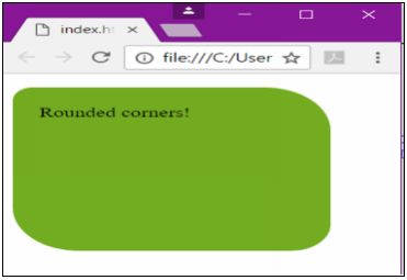
Rounded Corners
In CSS3, you can add rounded corners to layout elements, including headers, footers, sidebars, and images. Use the border-radius property along with a length value, such as pixels, ems, or a percentage.
- the higher the value, the more rounded a corner will be
- some browsers have problems rendering a percentage value
You can round individual corners with the following properties:
- border-top-left-radius
- border-top-right-radius
- border-bottom-right-radius
- border-bottom-left-radius
<!DOCTYPE html>
<html>
<head>
<title></title>
<style>
#rcorners {
border-radius: 15px 50px 30px;
background: #73AD21;
padding: 20px;
width: 200px;
height: 150px;
}
</style>
</head>
<body>
<p id="rcorners">Rounded corners!</p>
</body>
</html>
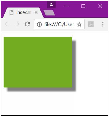
Creating Shadows
Add drop shadows to elements using the box-shadow property. A drop shadow is a visual effect that makes an object appear like it is floating above other objects on a document.
There are six attributes that can be modified when using the box-shadow property: h-shadow, v-shadow, blur, spread, color, and inset.
The h-shadow and v-shadow attributes must be included, while the others are optional.
<!DOCTYPE html>
<html>
<head>
<titile></titile>
<style>
#box {
box-shadow: 10px 10px 5px #808080;
background: #73AD21;
padding: 20px;
width: 150px;
height: 100px;
}
</style>
</head>
<body>
<p id="box"></p>
</body>
</html>
box-shadow Attributes
|
Value |
Description |
|
none |
Default value. No shadow is displayed |
|
h-shadow |
Required. The position of the horizontal shadow. Negative values are allowed |
|
v-shadow |
Required. The position of the vertical shadow. Negative values are allowed |
|
blur |
Optional. The blur distance |
|
spread |
Optional. The size of shadow. Negative values are allowed |
|
color |
Optional. The color of the shadow. The default value is black. Look at CSS Color Values for a complete list of possible color values. |
|
Note: In Safari (on PC) the color parameter is required. If you do not specify the color, the shadow is not displayed at all. |
|
|
inset |
Optional. Changes the shadow from an outer shadow (outset) to an inner shadow |
|
initial |
Sets this property to its default value. Read about initial |
|
inherit |
Inherits this property from its parent element. Read about inherit |
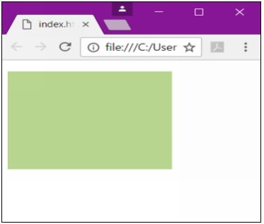
Transparency
Apply the effect of transparency with the opacity property. Opacity determines how transparent an object appears.
The syntax for applying a transparency to an image or other element is:
opacity: value
The value for the opacity object is a number between 0.0 and 1.0.
*1.0 means that the object is entirely opaque, while 0.0 means that it is entirely transparent.
<!DOCTYPE html>
<html>
<head>
<title></title>
<style>
#box {
opacity: .5;
background: #73AD21;
padding: 20px;
width: 150px;
height: 100px;
}
</style>
</head>
<body>
<p id="box"></p>
</body>
</html>
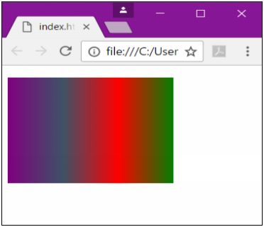
Background Gradients
A gradient is a smooth transition from one color to another.
In CSS3, you can apply gradients to a number of objects, such as headers, footers, buttons, and more.
Gradients are applied through the background property with one of the methods:
- linear-gradient: Creates a gradient from top to bottom or vice versa, or from corner to corner
- radial-gradient: Creates a gradient that radiates out from a central point
- repeating-linear-gradient: Creates a repeating linear gradient, which results in straight bands of gradient color
- repeating-radial-gradient: Creates a repeating radial gradient, which results in circular bands of gradient color
Linear Gradients
To create a linear gradient, you must define at least two-color stops. Color stops are the colors you want to render smooth transitions among. You can also set a starting point and a direction (or an angle) along with the gradient effect.
Syntax:
background: linear-gradient(direction, color stop1, color-stop2, ...);
<!DOCTYPE html>
<html>
<head>
<style>
#box {
background: linear-gradient(to right, purple, #3D5266, red, green);
padding: 20px;
width: 150px;
height: 100px;
}
</style>
</head>
<body>
<p id="box"></p>
</body>
</html>
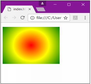
Radial Gradients
A radial gradient is defined by its center. To create a radial gradient, you must also define at least two color stops.
Syntax
background: radial-gradient(shape size at position, start-color, ..., last-color);
By default, shape is ellipse, size is farthest-corner, and position is center.
<!DOCTYPE html>
<html>
<head>
<title></title>
<style>
#box {
background: radial-gradient(circle, red, yellow, green);
padding: 20px;
width: 150px;
height: 100px;
}
</style>
</head>
<body>
<p id="box"></p>
</body>
</html>
Transformations
In HTML5/CSS3, you can now transform 2D and 3D objects.
A transform is an effect that lets you change the size, shape, and position of an element. This includes rotating, scaling, stretching, spinning and moving elements.
To add transformations, use the transform property with one of its methods.
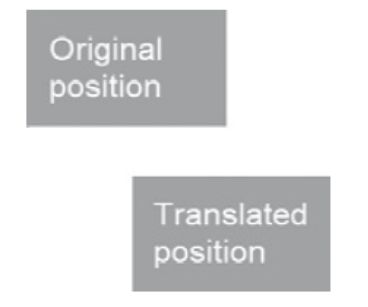
2D Translations
A translation moves an element without rotating, skewing, or turning the image.
To translate an object, use the transform property in combination with the translate() method.
The translate() method accepts two values: one to adjust its position on the x-axis and another on the y-axis.
transform: translate(100px,50px);
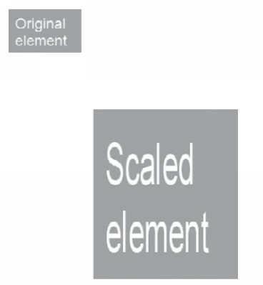
2D Scaling
Scaling an element will increase or decrease its size. To scale an object, use the transform property in combination with the scale() method.
The scale() method accepts two values: a factor to adjust its width and another to adjust its height.
transform: scale(2,4);
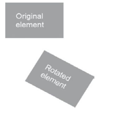
2D Rotation
Rotating an element will turn it clockwise or counterclockwise. To rotate an object, use the transform property in combination with the rotate() method.
The rotate() method accepts one value: the number of degrees to rotate the object.
transform: rotate(30deg);
3D Rotation
3D rotation will rotate an element around its x-axis or y-axis. To 3D rotate an object, use the transform property in combination with the rotateX() or rotateY() methods.
The rotateX() and rotateY() methods accepts one value: the number of degrees to rotate the object around an axis.
transform: rotateX(180deg);
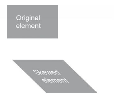
2D and 3D Skewing
Skewing an element will stretch it one or more directions. To skew an object, use the transform property in combination with the skew() method.
The skew() method accepts two values: the number of degrees to turn the object around the x-axis and another for the y-axis
transform: skewX(45deg);
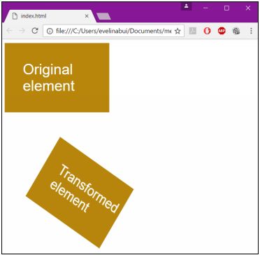
3D perspective
Perspective, in terms of drawings and illustrations, is the convergence of lines that give the
illusion of depth. The CSS3 3D perspective property defines how a browser renders the depth of a 3D transformed element. The perspective property takes on a number value: lower values (in the range of 1 to 1000) create a more pronounced effect than higher values.
perspective: number;
<!doctype html>
<html>
<head>
<title></title>
<style type="text/css">
div {
padding: 40px 40px;
background: #B8860B;
width: 150px;
color: #fff;
font-family: sans-serif;
font-size: xx-large;
}
div#div2 {
margin: 100px;
perspective: 600;
margin: 100px 0 0 50px;
-ms-perspective: 600;
margin: 100px 0 0 50px;
-moz-perspective: 600;
margin: 100px 0 0 50px;
-o-perspective: 600;
margin: 100px 0 0 50px;
-webkit-perspective: 600;
margin: 100px 0 0 50px;
transform: rotate3d(0, 1, 1, 45deg);
-ms-transform: rotate3d(0, 1, 1, 45deg);
-moz-transform: rotate3d(0, 1, 1, 45deg);
-o-transform: rotate3d(0, 1, 1, 45deg);
-webkit-transform: rotate3d(0, 1, 1, 45deg);
}
</style>
</head>
<body>
<div>Original element</div>
<div id="div2">Transformed element</div>
</body>
</html>
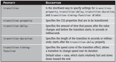
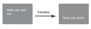
Transitions
In CSS3, a transition is a visible movement from one state to another on screen. To create a transition, use the transition property.
Set the value as the property that you would like to change. You must also set the duration, the delay, and the timing function.
This can be done with the transition property or by using specific properties for each.
<!doctype html>
<html>
<head>
<title></title>
<style type="text/css">
#wrapper {
transition-property: opacity;
transition-duration: 3s;
transition-delay: 1s;
transition-timing-function: linear;
}
#wrapper #before, #wrapper:hover #after {
opacity: 1;
}
#wrapper:hover #before, #wrapper #after {
opacity: 0;
}
</style>
</head>
<body>
<div id="wrapper">
<div id="before">Now you see me</div>
<div id="after">Now you don't</div>
</div>
</body>
</html>
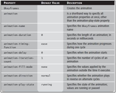
Animations
Animations move static images in a way that makes them appear as though they are moving.
Unlike transitions, animations use the @keyframes rule, which allows you to adjust the timings of an animation.
You can dictate when an action occurs by using a percent. i.e. 50% of the way through this animation, the element should be yellow.
<!doctype html>
<html>
<head>
<title></title>
<style type="text/css">
div {
width: 200px;
height: 200px;
background: limegreen;
animation: a1 3s;
}
@keyframes a1 {
from {
background: limegreen;
}
to {
background: dodgerblue;
}
}
</style>
</head>
<body>
<div></div>
</body>
</html>
All materials on the site are licensed Creative Commons Attribution-Sharealike 3.0 Unported CC BY-SA 3.0 & GNU Free Documentation License (GFDL)
If you are the copyright holder of any material contained on our site and intend to remove it, please contact our site administrator for approval.
© 2016-2026 All site design rights belong to S.Y.A.