Beginning HTML5 & CSS3 For Dummies® (2013)
Part IV
Adopting CSS Style
 To find out more about CSS markup and best practices, visit www.dummies.com/extras/beginninghtml5css3. Find the examples for these chapters at www.html4dummies.com/html5cafe in the sections labeled Ch11 through Ch13.
In this part . . .
 Understanding the oh-so-crucial distinction between content and appearance
Working your way through CSS units of measure
Digging into CSS syntax and structure by using selectors and declarations
Using classes and IDs to focus style on elements or instances
Working with inline, internal, and external style sheets
Resolving multiple style selectors through the CSS cascade
11
Advantages of Style Sheets
In This Chapter
 Understanding the role of style sheets
Discovering Cascading Style Sheets (CSS)
Understanding the viewport
Using different types of measurement units
Cascading Style Sheets (CSS) is the language web page authors use to tell a browser (or another user agent) how to format an HTML document. Remember: HTML5 is primarily a language for defining the structure (like the bones and muscles) of a document. The structural elements of a page, such as headings (<h1> through <h6>) and body text, don't affect how those elements look. By applying styles to those elements, though, you can specify an element's layout on the page and add design attributes (such as fonts, colors, and text indentation). CSS is the tool that lets you add skin (and even fancy clothing) to the structure created by your HTML markup and content.
Style sheets give you precise control over how structural elements appear on a web page. Better yet, you can create one style sheet for an entire website to keep the layout and look of your content consistent from page to page. And here’s the icing on this cake: Style sheets are easy to build and even easier to integrate into web pages. In fact, with style sheets, you can
Add style markup to individual HTML elements (called inline style).
Create sequences of style instructions in the head of an HTML document (called an internal style sheet).
Refer to a separate stand-alone style sheet via a link or other reference (called an external style sheet) inside your HTML document.
Style an HTML document differently depending on whether it’s being viewed on a desktop computer or a mobile phone.
In short, you can add style to a web page in lots of ways.
In the early days of HTML, you could add style and lay out an HTML document by using presentational HTML elements or by using certain HTML elements for purposes other than what they were designed for. Presentational HTML elements specify how content should look. You may occasionally still see some old HTML code that uses these presentational elements to do things that are better done with CSS. For example, prior to CSS, the only way to arrange elements in a grid was by using the <table> element. Today, CSS provides much more flexible ways to lay out a page (as we show you in Chapter 14). The <font> element (which is no longer a part of the HTML specification) used to be the only way to change the font face or size of HTML text. As the next few chapters demonstrate, designers can use CSS to do everything that the old <font>element used to do, and much, much more.
 In HTML5, presentational elements and attributes were officially deprecated (made obsolete). As a result, there is no guarantee that certain old HTML4 and earlier presentational elements will continue to work in the future — not that you would ever consider using them anyway, right? We discuss deprecated markup in more detail on this book's website at www.dummieshtml.com.
Most modern browsers handle CSS3 well, but a few tricks are necessary in certain cases. We stick mostly to the safe stuff here, but we give you a taste of some of the cutting-edge features that are coming soon to a browser near you. Where necessary, we point you to resources on the web and tools that you can use to make sure that your web pages work correctly on nearly every web browser that is in use today.
Advantages of Style Sheets
HTML’s formatting capabilities are limited by design. When you want tight control over the display of your web pages, style sheets are the way to go:
Style sheets give you more flexibility than markup can.
HTML5 no longer includes display-oriented (or presentational) elements and attributes, and these may cease to be supported by browsers in the future.
Style sheets supply lots of tools to format web pages with precise controls. With style sheets, you can
Control every aspect of page display. Specify the amount of space between lines, character spacing, page margins, image placement, and more. You can also specify positioning of elements on your pages.
Apply changes globally. Ensure consistent design across an entire website by applying the same style sheet to every web page.
 You can modify the look and feel of an entire site by changing just one document (the style sheet) instead of the markup on every page. Need to change the look for a heading? Redefine that heading’s style attributes in the style sheet and save the sheet. The heading’s look changes throughout your site.
Instruct browsers to control appearance. Provide web browsers with more information about how you want your pages to appear than you can communicate using HTML.
Create dynamic pages. With CSS3, anyone can easily animate HTML elements with just a couple lines of simple code.
The four steps to style
The gist of how style sheets work is as follows:
1. Select elements in a document (using selectors) that you want to add style to.
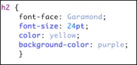
2. Write declarations that apply to the selectors. Each declaration consists of a property name and a value. The declarations specify how you want the selected markup to be styled.
For example, you could specify that every first-level heading (<h1>) be displayed in yellow Garamond 24-point type with a purple background (not that you would, but you could).
3. Link style rules and markup.
4. The browser does the rest.
The combination of at least one selector and at least one declaration is called a style rule. Listing 11-1 shows a simple style rule that contains one selector and four declarations:
Listing 11-1: A Simple Style Rule
Understanding the C in CSS
Cascading is the process that browsers use to determine which style will apply to an element. Imagine, for example, that one style rule declares that paragraph text should be yellow, and then another rule declares that paragraph text should be purple. Through a somewhat complex set of rules, browsers decide which rule will actually apply to any single paragraph.
To visualize how cascading works, you can picture HTML elements falling down steps on their way to the viewer’s browser. Along the way, they pick up styles such as size, color, weight, and so forth. All other things being equal, styles that the HTML element picks up later will be of higher importance to the browser.
When it’s all said and done, the cascading rules are decided and the browser decides how to display a web page. Although the details of how the cascade works aren’t important right now, it’s very important for the web developer to know that every web browser follows the same rules (the cascading rules) in the event of conflicting styles.
What CSS can do for a web page
You can accomplish a (growing) list of tasks with CSS. You can:
Specify font type, size, color, and effects.
Set background colors and images.
Control many aspects of text layout, including alignment and spacing.
Set margins and borders.
Control list display.
Define table layout and display.
Automatically generate content for standard page elements, such as counters and footers.
Control cursor display.
Create transitions.
Animate the values of CSS properties by using keyframe animation.
Design multicolumn layouts.
Use any of thousands of fonts in your web pages.
Define aural style sheets for text-to-speech readers.
Styling a Document with CSS
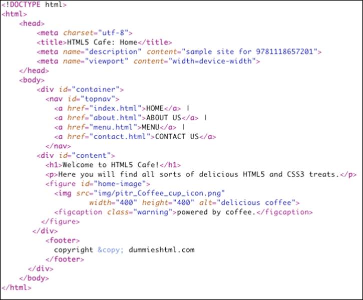
Listing 11-2 shows the HTML markup for the home page of the HTML5 Cafe. Notice that all the markup describes the purpose of the content — not how it should be presented.
Listing 11-2: A Simple Semantic HTML5 Document
Figure 11-1 shows the markup from Listing 11-2 rendered in a web browser. Notice that it’s a very plain document with no styles applied other than the defaults.
 It's not quite true to say that an HTML document with no CSS styles applied is unstyled. Even though you may not have applied styles to the document, each web browser contains a built-in style sheet that is called the default style sheet. This default style sheet is similar between browsers but not necessarily identical. The default style sheet sets the baseline styles that you can modify with your own CSS document. The default style sheet specifies that content in an <h1> element is bolded and 2em in size, for example.
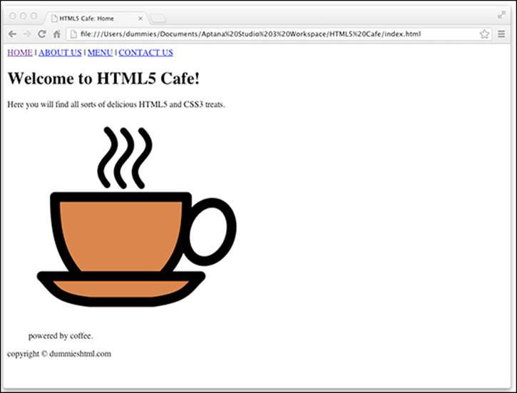
Figure 11-1: An unstyled HTML document uses the default browser styles.
Using HTML5 Boilerplate
For HTML5Cafe.com, we borrowed heavily from an open source project called HTML5 Boilerplate (www.html5boilerplate.com). HTML5 Boilerplate is a template for creating HTML5 websites. It combines the experience and knowledge of hundreds of web developers in order to make web development easier. Did we mention that it’s free?
Normalize before you stylize
The default styles are meant to serve as a baseline from which you can add your own styles. However, you might notice something peculiar about these default styles: They’re not very attractive! Also, some browsers don’t quite follow the same rules as everyone else. (We’re looking straight at you, Internet Explorer 6 and 7!) So, it’s a good idea to establish your own baseline that fixes some of the ugliness of the default styles and addresses many of the inconsistencies between browsers.
Once again, our friends in the open source community came through with the perfect solution: normalize.css, a style sheet that seeks to eliminate many of the differences between browsers' default styles. You can download normalize.css from http://git.io/normalize. (It's also part of the HTML5 Boilerplate.) We don't explain the details of how normalize.css works, although you can certainly open it in Aptana Studio or any text editor and analyze it to your heart's content. The main thing about it is that it just works.
After you've saved a copy of normalize.css into your project, you can use an HTML <link> element to apply it to your web page. We talk more about the <link> element and the different ways to apply styles to a web page in the next few chapters. To apply normalize.css to the HTML5 Cafe home page, we simply add this element within the <head> element of the document:
<link rel="stylesheet" href="css/normalize.css">
After applying normalize.css to our web page, it looks like Figure 11-2.
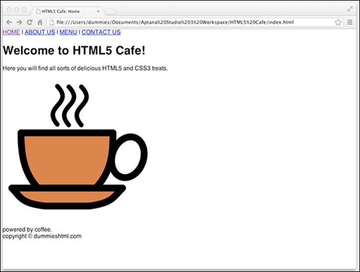
Figure 11-2: The HTML5 Cafe's index.html with normalize.css applied.
If you compare Figure 11-4 with Figure 11-3, you can find a number of significant differences:
The margins around the edges of the page are removed.
The font has been changed to a sans-serif font. (Much easier on the eyes, don’t you think?)
The left margin has been removed from the image and its caption.
The space has been removed from under the image caption.
What normalize.css does is give us a blank canvas upon which we can add our own styles. So, in this next step, we add styles!
HTML5 Boilerplate provides another style sheet in addition to normalize.css that's called main.css. This style sheet includes a few more styles that make a default web page look a bit better. Before you even add any of your own styles, simply including main.css in your document will make it look better. The main.css file also includes some helper CSS rules. Helper CSS rules define handy styles that are used fairly commonly in many different websites.
To include main.css, we use the following <link> element within the <head> element of index.html:
<link rel="stylesheet" href="css/main.css">
The result of adding the default main.css style sheet is shown in Figure 11-3.
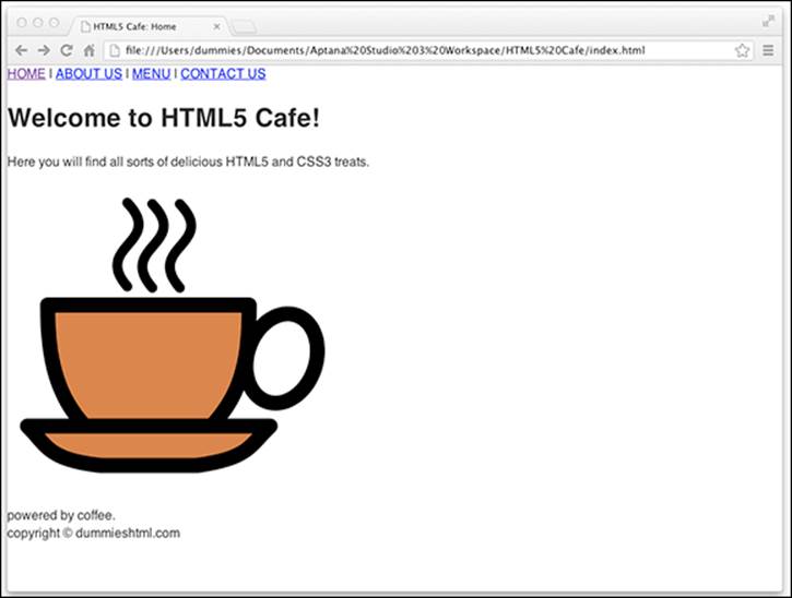
Figure 11-3: HTML5 Cafe's index.html with HTML5 Boilerplate's default main.css applied.
The differences here are a bit more subtle than between Figure 11-4 and Figure 11-3. The main thing that happened is that the line height has been adjusted slightly. Other changes that were made affect only HTML elements that aren’t currently used by HTML5 Cafe’s home page.
Now (finally!) it's time to get to the good stuff: adding your own style to the web page. If you open up main.css in your code editor and scroll down a bit, you see a section labeled Author's Custom Styles. That's you it's talking about! This is where you can put your own CSS and really make HTML5 Cafe sparkle.
Figure 11-4 shows the CSS markup that we added to the custom styles section of main.css.
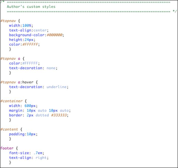
Figure 11-4: Our custom styles for HTML5 Cafe's index.html
Although we haven’t yet talked about the syntax of CSS style rules, if you look at it for a moment, you can see that it’s mostly pretty readable.
We get into much more detail about CSS selectors and properties in the next chapter. For now, just look it over and marvel at the results, as shown in Figure 11-5.
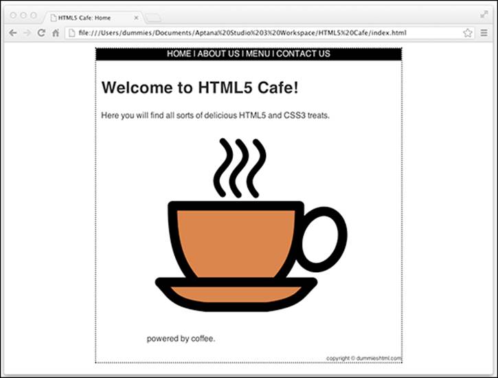
Figure 11-5: HTML5 Cafe’s index.html with our custom styles applied.
What you can do with CSS
You have a healthy collection of properties to work with as you write your style rules. You can control just about every aspect of a page’s display — from borders to font sizes and everything inbetween:
Background properties control the background colors associated with blocks of text and with images. You can also use these properties to attach background colors to your page or to individual elements, such as horizontal rules.
Border properties control borders associated with a page, lists, tables, images, and block elements (such as paragraphs). You can specify border width, color, style, and distance from element content.
Float and Alignment properties control how elements (such as images) flow on the page relative to other elements. You can use these properties to integrate images and tables with the text on your page.
List properties control how lists appear on your page, such as
• Managing list markers
• Using images in place of bullets
Margin properties control the margins of the page and margins around block elements, tables, and images. These properties extend ultimate control over the white space on your page.
Padding properties control the amount of white space around any block element on the page. When you use these with margin and border properties, you can create complex layouts.
Positioning properties control where elements sit on the page; you can use them to put elements in specific places on the page.
Size properties control how much space (in height and width) your elements (both text and images) take up on your page. They’re especially handy for limiting the size of text boxes and images.
Table properties control the layout of tables. You can use them to control cell spacing and other table-layout specifics.
Text properties control how text appears on a page. You can set such properties as font size, font family, height, text color, letter and line spacing, alignment, and white space. These properties give you more control over text with style sheets than the font HTML element can.
Transition properties create effects in which the value of another style changes smoothly over time. For example, with transitions you can specify that a button should grow when a user takes a certain action, or that an element should change colors, or appear to fade-in.
Transform properties control rotation, skewing, scaling, and translation (or positioning) of 2D and 3D objects. Figure 11-6 shows an example of something that can be done with transform properties.

Figure 11-6: You can use transform properties to modify objects in 2D and 3D.
Entire books and websites are devoted to the fine details of using each and every property in these categories. We suggest one of these references:
CSS Web Design For Dummies by Richard Mansfield
The Book of CSS3 by Peter Gasston
CSS: The Definitive Guide by Eric A. Meyer
Jens Meiert's continuously updated CSS properties references on the web at http://meiert.com/en/indices/css-properties
 Although CSS syntax is straightforward, combining CSS styles with markup to fine-tune a page layout can get a little complicated. To become a CSS guru, you just need to:
Know how the different properties work.
Experiment to observe how different browsers handle CSS.
Practice conveying your message on the web using CSS.
Putting CSS in Its Place
Before we go any further, we need to explain a few things about the environment in which CSS lives and does its work. CSS is most often used to apply styles to a web page when it’s displayed in a web browser — whether that browser is on a desktop computer, a laptop computer, a tablet computer, or a mobile phone.
You can also use CSS to format HTML for printing, for text-to-speech devices, for projectors, or for any device that can read HTML content.
Because you’ll most often be formatting HTML for display on some sort of screen, we focus on this scenario here. But, keep in mind that CSS is not limited to working just with screens.
Pixels, points, and dots — Oh my!
Except for their sizes, desktop, laptop, and mobile devices are all pretty similar. They all display text and images on color screens by changing the colors of tiny dots of light, called pixels. In fact, if you look closely enough at your computer’s monitor (or perhaps use a magnifying glass if you have a very high-resolution monitor), you can probably see the individual pixels that make up every image your monitor or screen displays.
Even though the images on screens are made up of pixels, the size and the proximity of each dot to its neighbor (this is called the pixel density) varies between devices and monitors.
In addition, it’s possible, and quite common, for computer users to change the number of pixels, known as the resolution, displayed on their screens. You may be familiar with the concept of resolution from adjusting it while setting up your computer or from purchasing a TV. Common resolution settings are 640 x 480, 800 x 600, and 1024 x 768. The first number typically refers to the width (in pixels) of the device, and the second refers to the height.
If you’re following along, you may be wondering now how a device with a fixed number of physical pixels can sometimes display 800 x 600 pixels and sometimes 1024 x 768 pixels. The key is in a concept called display pixels, or, for our purposes, CSS pixels.
CSS pixels are a layer on top of the actual physical dots of light that make up images on your screen and the dots as they are presented to you. When you make a picture on your screen be 300 pixels wide, you’re talking about CSS pixels. This distinction is good to know, especially when you’re working with mobile devices, where it’s common to zoom in or out on content. An object that is 300 display pixels wide may actually be 600 device pixels wide if the user’s zoom level is 200 percent.
Display pixels are also sometimes referred to as points or dots, but we encourage you to not use these terms, because they’re typically used to describe sizes for printing and only cause confusion on the web.
Fully understanding all the inner workings of display resolution and pixel density and the like isn’t necessary in order to write CSS, or even to be a very good web designer. We mention these concepts here so that you’re aware of them and so that you know that when we talk about pixels, we’re not actually talking about the physical dots of light on your monitor (device pixels), but rather, a unit of measurement equal to at least one device pixel, but usually more — depending on the user’s device.
Now that you know the difference between a device pixel and a CSS pixel, we talk briefly about how to measure things on the web.
Understanding the viewport
The viewport is the window through which a person sees your awesome web pages. In its simplest terms, it’s the area of the web browser in which web pages are displayed. Like a window, the viewport is just a space through which you can view something else (a web page, in this case).
There are two big differences between how physical windows work and how the viewport works, however:
On a desktop computer, users can resize the viewport by resizing the browser window. This would be like changing the size of a window in your home based on how much of the scene outside you want to be able to see at any time. (Another option would be to move closer to or farther away from the window, which is called zooming in the web browser world.)
The viewport tells the web page its width, which allows the web page to rearrange itself to fit the window. Imagine rearranging objects outside and resizing them so that you can see them from within your room. It’s like that.
Newer ways of laying out web pages depend on knowing the viewport width and rearranging elements in the browser dynamically to provide a great user experience to people using differently sized viewports. Using viewports and dynamic arrangement of elements is the main idea behind a type of web design called responsive design.
Responsive design came about in response to the increasing number of people who are surfing the web with their smartphones or tablet computers. The idea is that rather than forcing the user to resize or zoom in on your web page, the web page itself should respond to the size of the device viewing it and dynamically reflow content to improve the reading experience on a wider variety of devices.
Property measurement values
Many HTML properties use measurement values. We tell you which measurement values go with which properties throughout this book. Standard property measurements dictate the size of a property in two ways: absolute value measurements and relative value measurements.
Absolute value measurements dictate a specific length or height using one of these values:
Inches, such as .5in
Centimeters, such as 3cm
Millimeters, such as 4mm
Picas, such as 1pc
There are six picas in an inch.
Points, such as 16pt. As previously mentioned, pt is a unit that is typically used for print, and you should refrain from using it in CSS that is styling HTML displayed on a screen.
There are 12 points in a pica.
Pixels, such as 13px. (Defined as the smallest possible visible point of light that can be displayed, the pixel maps to at least 1 physical pixel on your screen.)
Keep in mind that a measurement of 1in does not necessarily mean 1 inch on the screen. The CSS specification defines an inch to be 96 device pixels. If your screen has a resolution lower than 96 pixels per inch, such as the very common 72 pixels per inch, a CSS inch won't actually be a screen inch.
The most commonly used absolute method for specifying widths and heights, as well as for positioning elements on the screen is px, and that's what we recommend. Although you can use inches or centimeters, it's best to stay away from them when you're designing for the web.
Relative value measurements base length or height on the current value of the element being measured. Relative values have the ability to scale based on factors such as the user’s browser size or default font size, so using them for font sizes is considered a best practice . Relative values include the following:
p%: A percentage of the current font-size value, such as 150%.
For example, you can define a font size of 75% for all paragraphs. The default style sheet for most browsers defined the base font size as 16px. So, a setting of 75 percent would cause the paragraph font size to be 12px (16 × 0.75=12).
ex: A value that is relative to the x-height of the current font. An x-height is the equivalent of the height of the lowercase character of a font, such as 1.5ex.
em: A value that is relative to the current font size, such as 2em. For any given typeface, 1em is equivalent to its point size. (Thus, a 16pt font has an em size of 16pt. Get it?)
In fact, both 1em and 100% equal the current font size.
When you’re specifying the size of type in your web pages, we recommend sticking with using relative sizes specified with em, which we discuss further in the “A clever em trick” sidebar.
 A clever em trick
To make em easier to work with and to calculate, many professional web developers use a clever trick. Employ this trick, and you will be among the font size elite.
Recall that the default base font size in the browser is equal to 16px. In other words, if you don't apply any styling to a document, text in paragraphs will be 16 pixels tall. So, by default, 1em is equal to 16px. This is way too large for most web page designs. Most web pages are designed with a base font size of 12px or 10px. If you want to specify a10px font size using ems, you can say .625em. This requires math, however. Math is hard.
An easier way is to simply adjust the value of 1em to be 10px. You can do this by globally adjusting the size of the base font to 62.5 percent using the following CSS rule:
body {font-size:62.5%;}
Now, you can use em measurements just as a designer might use px measurements, but just shift the decimal point over one spot to the left. For example, if you want <h1> elements to be 24px, that will be 2.4em (2.4 times the base font size of 10px).
This approach to font sizing gives you the best of both worlds: the ability to know exactly how large your fonts will be and to work with them easily in relation to absolutely sized objects on the screen, while also making sure that users who want or need to increase the font size will have the ability to do so.
About the CSS3 Standard
Whereas both CSS1 and CSS2 were proposed, debated, and finally recommended as big, monolithic standards for Cascading Style Sheets, CSS3 is a collection of many individual modules. If you visit the CSS Level 3 (the formal name for what we and others blithely call CSS3 instead) works-in-progress page at the W3C website (www.w3.org/Style/CSS/current-work.html), you can see a list of all the CSS modules in various levels of completion. In Table 11-1, we present these modules with brief descriptions.
Table 11-1 CSS Level 3 Modules, Descriptions, and Standards Status
|
Name |
Description |
|
Grid Template Layout |
Describes a new method for positioning elements using constraints on their mutual alignment and flexibility of motion, where a layout grid defines the basic template |
|
CSS Speech |
An audio module that enables authors to control how documents are rendered using speech synthesis |
|
Backgrounds and Borders |
Describes background colors and images and describes border styles, including background image stretch, images for borders, rounded corners, and shadows |
|
Basic User Interface |
Features for styling interactive, dynamic web page aspects, including form element appearance to denote state, plus cursors and colors for GUI use |
|
Box Model |
Describes block-level content in normal flow, where document elements are laid out as rectangular boxes in sequence or nested orders that together comprise a horizontal or vertical (for Chinese and Japanese) flow |
|
Marquee |
Contains properties to control speed and direction of a marquee area, a scrolling mechanism that moves text through a region with no user intervention involved; used mostly on mobile devices |
|
Cascading and Inheritance |
Describes how values are assigned to properties, where cascading describes how multiple style sheets are combined, and inheritance involves parent value assignments or initial value settings |
|
Color |
Specifies color-related CSS controls, including transparency and notations for the color value-type |
|
Fonts |
Properties to select and adjust fonts, including emboss and outline effects, kerning, smoothing, and anti-aliasing |
|
Generated Content for Paged Media |
Advanced printing properties that go beyond the Paged Media module, including creating footnotes, cross-references, and generation of running headers from section titles |
|
Image Values and Replaced Content |
Defines how to deposit content on a page before, after, or instead of some element, where content can be text or an image or some other external object |
|
Hyperlink Presentation |
Properties to control how hyperlinks are presented, including controls on which hyperlinks are active, where targets are shown when a user traverses a link, and more |
|
Line Layout |
Describes alignment of text and other boxes on a line; expands vertical-align property for CSS1/2 to support alignment of multiple script types, including non-Roman alphabets and ideographs |
|
Lists |
Properties for styling lists, especially for bullet types, numbering systems, and use of images (especially for bullets) within list displays |
|
Math |
Properties for styling mathematical formulae, based on the presentational elements in the XML-based MathML application |
|
Multicolumn Layout |
New properties to flow content into flexibly defined columnar layouts |
|
Namespaces |
Explains how CSS selectors can be extended to select elements based on XML-derived namespaces that can distinguish among multiple uses of the same element name from one another across multiple style sheets |
|
Object Model |
The Document Object Model (DOM) specifies functions used in programming libraries and web browsers to manipulate HTML, XML, and CSS documents; addresses functions for adding and deleting rules and changing properties in CSS style sheets, for APIs called the CSS Object Model or CSSOM |
|
CSSOM View Module |
Tool APIs to enable authors to inspect and manipulate document view information, including position data for element layout boxes, width of script viewports, and element scrolling |
|
Paged Media |
Extends print control properties from CSS2 with controls for running headers, footers, and page numbers |
|
Positioning |
Covers properties for absolute, fixed, and relative positioning of elements, to take them out of normal document flow and place them elsewhere on a page |
|
Presentation Levels |
Tools for stepping forward and backward through multiple renderings of a document, especially useful for slide presentations, outline views, and so forth |
|
Ruby |
Properties to manipulate Ruby positions, for small annotations on top of or next to ideograms or words in Chinese and Japanese (often used to hint pronunciation or meaning for difficult ideograms) |
|
Style Attribute Syntax |
Rules for expressing CSS markup as part of HTML and other markup language attributes (SVG) |
|
Syntax |
Generic, forward-compatible grammar which all levels of CSS must follow; value syntax restrictions for specific properties are addressed in other modules |
|
Tables |
Table layout controls, including rows, columns, cells, captions, borders, and alignment (same as in CSS2 but described in more detail in CSS3) |
|
Text |
Text-related properties from CSS2 with new properties for dealing with text in different languages and scripts with special emphasis on International Layout; text properties also covered in the Text Layout and Line Grid modules |
|
Line Grid |
Describes text where symbols in a line are aligned to an invisible grid, so all symbols line up vertically, commonly used for text composed of ideographs as in Japanese |
|
Values and Units |
Describes common values and units associated with CSS properties, along with describing how specified values from a style sheet get processed into computed values or actual values at runtime |
|
Fonts |
Describes how to download fonts for use within a document (also used within SVG, an XML-based stroke graphics rendering markup application) |
|
Behavioral Extensions |
Defines the binding property from the XML-based XML Binding Language, or XBL, to CSS, for associating elements in a document with scripts, event handlers, and CSS |
|
Flexible Box Layout |
Defines the box and inline-box keywords for the CSS display property, which causes an element to be displayed as a row or column of child elements, with controls over order and space distribution |
|
Transforms |
Defines properties to apply rotations, translations, or other visual transformations to an element box (same as in SVG) |
|
Transitions |
Properties to animate transitions between pseudo-classes, as when an element enters or leaves the hover state, with values for delay and value transitions between pairs of values (old/new, on/off, and so on) |
|
Animations |
Specifies properties that change their values during an animation, what sequence of values they take, and how long they hold each value |
If you're interested in more information about current work on CSS3 (or other related efforts), please visit the W3C's Current Work page at www.w3.org/Style/CSS/current-work.html.