Beginning HTML5 & CSS3 For Dummies® (2013)
Part IV
Adopting CSS Style
12
CSS Structure and Syntax
In This Chapter
 Using selectors and declarations
Creating style rules
Discovering CSS properties
Understanding inheritance and the style cascade
In this chapter, we talk about the rules, or syntax, of CSS. Once you understand how CSS goes about locating elements and applying styles to them, we’ll get into more details about the important topic of cascading. So far, we’ve only touched on the topic of cascading but it’s vital to understanding how to use CSS.
Exploring CSS Structure and Syntax
A style sheet is made of style rules. Each style rule has two parts:
 Selector: Specifies the markup element to which style rules apply
Declaration: Specifies how content described by the markup looks
You use a set of punctuation marks and special characters to define a style rule. The syntax for a style rule always follows this pattern:
selector {declaration;}
A semicolon always follows each declaration to make it easier for computers to distinguish them. As we explain later in this chapter, a single selector may include one or more declarations. Furthermore, each declaration breaks down into two subitems:
Properties are aspects of how the computer displays text and graphics (for example, font size or background color).
Values provide data to specify how you want text and images to look on your page (for example, a 24pt font size or a yellow background).
You separate the property from the value in a declaration with a colon, and each declaration ends with a semicolon:
selector {property: value;}
The CSS specification lists exactly which properties you work with in your style rules and the different values they take. Most properties are pretty self-explanatory (color and border, for example). See Chapter 11 for a quick rundown of properties included in CSS.
Style sheets override a browser’s internal (default) display rules; your style declarations affect the final appearance of the page in the user’s browser. This means that you control how your content looks and create a more consistent and appropriate experience for visitors.
Figure 12-1 shows a simple HTML page with all three heading levels (plus some body text) without the style sheet applied. The browser uses its default settings to display the headings in different font sizes.
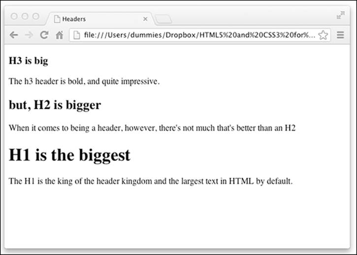
Figure 12-1: An HTML page without style specifications.
To spruce things up a bit, you might apply the following style rules to this page:
body {font-family: Arial;}
h1 {color: teal;
font-size: 3em;}
h2 {color: maroon;
font-size: 2em;}
h3 {color: black;
font-size: 1.5em;}
p {font-style: italic;}
Figure 12-2 shows the same web page with the styles applied. Things look very different because the body text is changed to a sans-serif font, header titles are set for different colors, paragraph text is italic, and heading sizes are magnified beyond their usual settings.
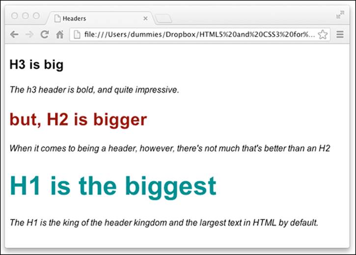
Figure 12-2: An HTML page with custom style rules in effect.
 Users can change their preferences so that their browsers ignore your style sheets (although most users will use your sheets). For example, a person who has trouble reading small text may override your style sheet to make the text larger. If you don’t anticipate this in your design, a larger font size may cause your site to look bad or even to not work at all. Test web pages with style sheets turned off to be sure they look good (or acceptable) without your style sheets.
For detailed instructions on disabling or altering style sheets, see Jim Thatcher's discussion "Reading Web Pages without CSS" at www.jimthatcher.com/webcourseb.htm. The instructions vary by web browser, but you can use accessibility plug-ins to manage or disable style sheets.
Font family
When assigning values to the font-family property, you can use a list of comma-separated font names. These names must match fonts available to a user's web browser. If a font name includes spaces — such as Times New Roman — enclose it in quotation marks.
h1 {font-family: Verdana, "Times New Roman", serif;}
In the preceding rule, the browser knows to use Verdana first; if that’s not available, it looks for Times New Roman, and then it uses a generic serif font as its last option. Chapter 17 covers the use of fonts in CSS.
Selectors and declarations
You probably want a style rule to affect the display of more than one property for any given selector. You can create several style rules for a single selector, each with one declaration, like this:
h1 {color: teal;}
h1 {font-family: Arial;}
h1 {font-size: 3em;}
However, such a large collection of style rules can be hard to manage. CSS allows you to combine several declarations in a single style rule that affects multiple display characteristics for a single selector, like this:
h1 {color: teal;
font-family: Arial;
font-size: 3em;}
All the declarations for the h1 selector are within the same set of brackets ({}) and are separated by semicolons (;). You can put as many declarations as you want in a style rule; just end each declaration with a semicolon.
 From a purely technical standpoint, white space is irrelevant in style sheets (just as it is in HTML), but you should use a consistent spacing scheme to make it easy to read and edit your style sheets. One exception to this white space rule occurs when you declare multiple font names in the font-family declaration. See the "Font family" sidebar for more information.
You can make the same set of declarations apply to a collection of selectors, too: You just separate the selectors with commas. The following style rule applies the declarations for text color, font family, and font size to the h1, h2, and h3 selectors:
h1, h2, h3 {color: teal;
font-family: Arial;
font-size: 2.5em;}
Style sheet syntax relies heavily on punctuation, so mind your colons and commas or a style rule might not work exactly as you expect. If that happens, make sure that you're not using a semicolon where you need a colon, or a parenthesis where you need a curly bracket. Watch out for semicolons, too! Validation tools help catch these lapses: Use them. The W3C CSS validation service at http://jigsaw.w3.org/css-validator helps find problems in your style sheets.
The selectors
Before you can style an element, you need to tell the browser which element you want to style. This is where the selector comes in. CSS contains several ways to select elements, ranging from the very broad (select everything) to the very specific (select only one particular instance of an element).
The universal selector
The most basic selector of all is the universal selector. The universal selector matches any element type. The symbol for the universal selector is the asterisk (*). Here's the universal selector being used to set the margin on every element in the document to 0:
* {margin: 0px;}
The universal selector is useful as a tool for taking a shortcut through the thickets of complex selectors that are sometimes required to address elements that are nested deep within a document. For example, suppose it’s St. Patrick’s Day and you want to change the color of every element to green. You can do this, and override the base color of every element, by using a universal selector:
* {color: green;}
That’s some powerful stuff! To see the universal selector in action, follow these steps:
1. Open Aptana Studio if it isn’t already open.
2. Open index.html for editing.
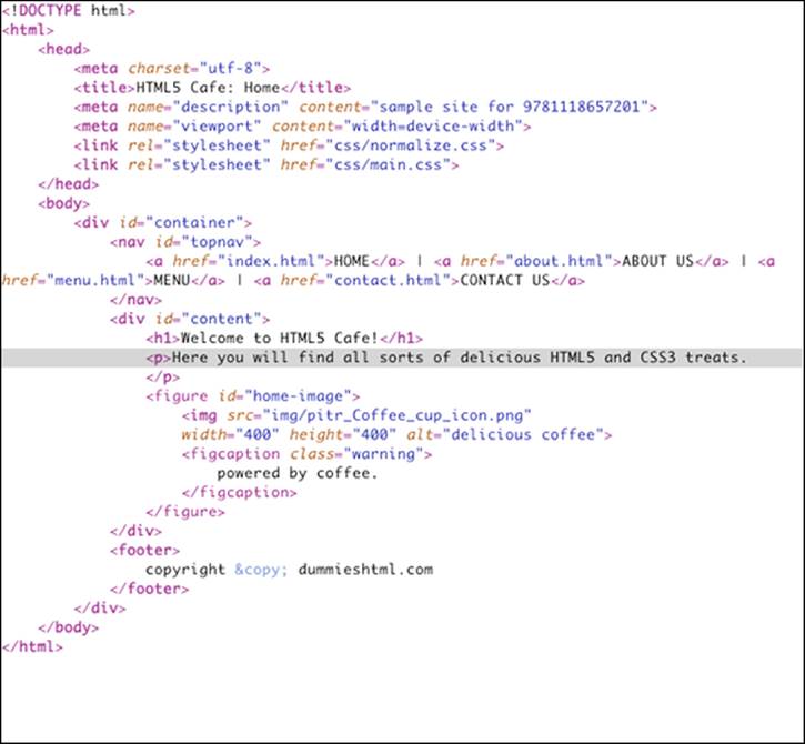
This is the home page of the HTML5 Cafe site, and it should look something like the markup in Listing 12-1.
Listing 12-1: The HTML Markup for the HTML5 Cafe Home Page
If you preview the home page in a browser at this point, it should resemble Figure 12-3.
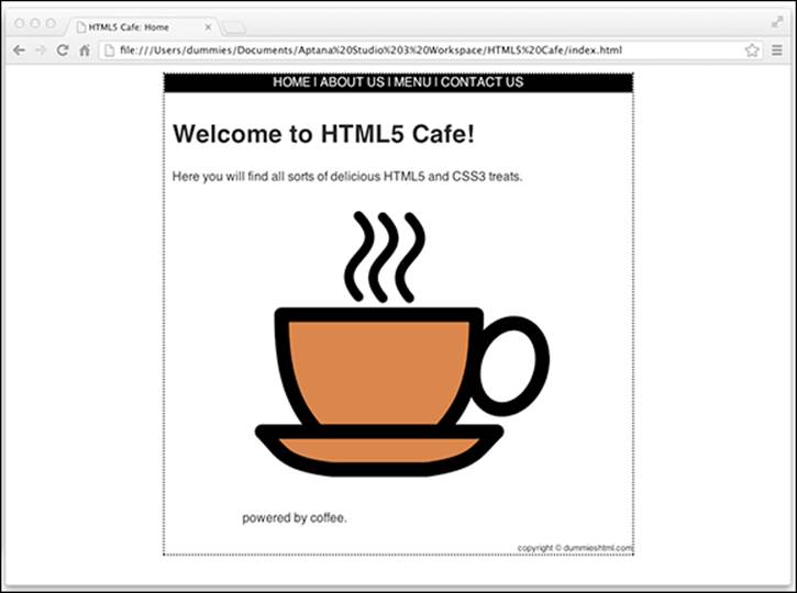
Figure 12-3: The HTML5 Cafe home page.
3. Insert a new line right before </head>.
4. Type the following:
<style>
* {color: green;}
</style>
5. Save your changes to index.html and open the file in your web browser.
You see something similar to Figure 12-4.
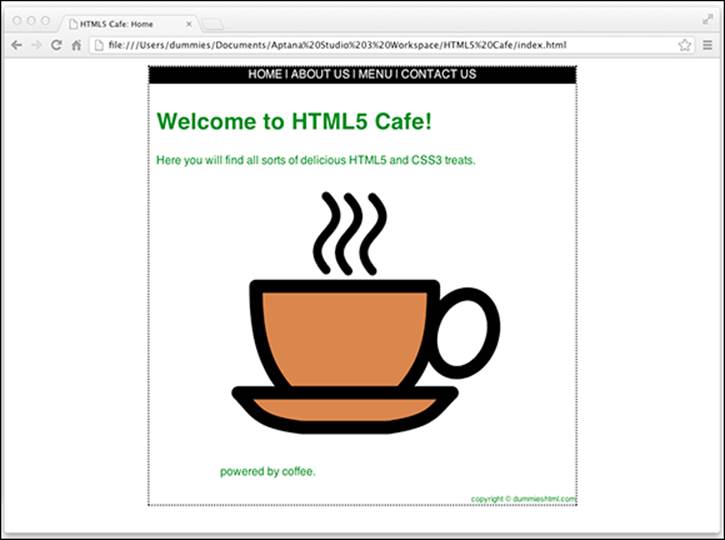
Figure 12-4: Top o’ the mornin’ to ya! That’s a lot of green.
You may be surprised that more things didn’t turn green in Figure 12-5. For example, the border around the page and the navigation links kept their old colors. The reason is in the definition of the universal selector:
The universal selector selects any element type.
In other words, styles rules with the universal selector are applied to every element, but any element in the document may be styled differently if you use one of the other, more specific, selectors. This is what’s happening here.
Here’s a more interesting example of the universal selector. In this example, we add a CSS transform effect to every element in the document:
1. Assuming that you still have index.html open in Aptana Studio, delete the previous CSS rule you created (but leave the beginning and ending <style> tags in place).
2. Type the following rule between the <style> and </style> tags.
* {-webkit-transform: rotate(100deg);
-moz-transition: rotate(100deg);
-ms-transition: rotate(100deg);
-o-transition: rotate(100deg);}
This rule rotates every element in the document 100 degrees. When you preview the document in your browser, you now see something like the web page in Figure 12-5.
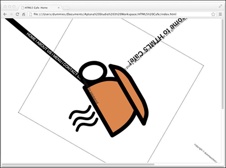
Figure 12-5: Who jumbled up the web page?
The universal selector is the most blunt tool in our shed. For more precise CSS work, additional selectors are available.
 You may occasionally see CSS declarations containing property:value pairs that are identical except for a few characters at the beginning that start with a dash, as in the last example.
-webkit-transform: rotate(100deg);
-moz-transition: rotate(100deg);
-ms-transition: rotate(100deg);
-o-transition: rotate(100deg);
These characters — such as webkit and moz — at the beginning of the property name are called browser prefixes. Because some of the CSS3 properties are not yet final, browser creators implemented their own versions of these CSS3 features, and named them with browser prefixes to indicate that they aren't the standard versions of the properties.
Each declaration in the preceding rule is targeted at a different web browser, or type of web browser. The first browser prefix, -webkit, is used with Google Chrome and Apple Safari (among others). The second browser prefix, -moz, is used by Mozilla's Firefox browser. The -o prefix belongs to the Opera browser. The -ms prefix is for Microsoft's Internet Explorer.
In most cases, vendor-specific properties work the same (or close to the same) as one another, and as the latest version of the unfinished standard property. As CSS3 properties become standards, browser prefixes will become unnecessary. For now, however, it’s a good idea, and required in many cases, to use them for certain CSS3 properties.
Element type selectors
Element type selectors select a particular type of element. For example, you may want to change the size of every <h1> element in your document or change the font style of paragraph text. Here's an example of an element type selector in a rule that changes the font size of the <h1>element to 3em.
h1 {font-size: 3em;}
The element type selector works the same as the universal selector, except only with one element type. For example, if you wanted to only rotate the coffee cup image on the HTML5 Cafe home page, you could do so by simply changing the universal selector from the previous example toimg. Here's the new declaration:
img {-webkit-transform: rotate(100deg);
-moz-transition: rotate(100deg);
-ms-transition: rotate(100deg);
-o-transition: rotate(100deg);}
When you preview the page, it looks like Figure 12-6.
But, what if you had multiple images on this page and wanted only one of them to be rotated? For that, you need yet another, more specific, selector.
ID selectors
ID selectors select an element according to its ID attribute. Because the ID attribute is designed to be unique within an HTML document, the ID selector is a good way to address just one particular element.
For example, if you look at the HTML for the HTML5 Cafe home page, you see that it contains two <div> elements. One of these elements encloses the entire contents of the <body> and has an ID value of container. The other element surrounds just the center content area (excluding the navigation and the footer) and has an ID value of content.
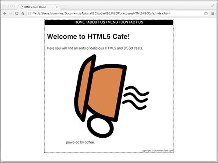
Figure 12-6: The cup spilleth over.
To use an ID selector, you preface the value of the ID you want to select with a # symbol. For example, if you want to change the background color on the div with the ID of content, you would use the following declaration:
#content {background-color: aquamarine;}
Class selectors
Sometimes you need style rules that apply only to specific instances of an HTML markup element. For example, if you want a style rule that applies only to paragraphs that hold copyright information, you need a way to tell the browser that a rule has a limited scope.
To target a style rule closely, combine the class attribute with a markup element. The following examples show HTML for two kinds of paragraphs:
A regular paragraph (without a class attribute)
This is a regular paragraph.
A class attribute with the value of copyright
<p class="copyright">This is a paragraph of class copyright © 2013.</p>
To create a style rule that applies only to the copyright paragraph, follow the paragraph selector in the style rule with
A period (.)
The value of the class attribute, such as copyright
The resulting rule looks like this:
p.copyright {font-family: Arial;
font-size: 12px;
color: white;
background: teal;}
By combining an element type selector (p) with a class selector (.copyright), we can specify that the following rules apply only to p elements with this class attribute. This style rule specifies that all paragraphs of class copyright display white text on a teal background in 12px Arial font.
To test out this new copyright class, add a paragraph tag with a copyright class to the copyright info in the footer of HTML5 Cafe's index.html:
<footer>
<p class="copyright">copyright © dummieshtml.com</p>
</footer>
Figure 12-7 shows how a browser applies this style only to a paragraph where class equals copyright and not to the other paragraph on the page.
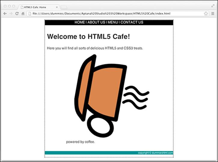
Figure 12-7: Classes can target your style rules more precisely.
You can also create style-rule classes that aren’t associated with any element, like the following example:
.warning {color: red;
font-weight: bold;
font-size: 1.5em;}
You can use this style class with any element by adding class="warning" to that element. Figure 12-8 shows how a browser applies the warning style to the paragraph and heading, but not to the block quote, as in this HTML:
<p>This is a paragraph without the warning class applied.</p>
<blockquote>This is a block quote without a defined class.</blockquote>
<h1 class="warning">Warnings</h1>
<p class="warning">This is a paragraph with the warning class applied.</p>
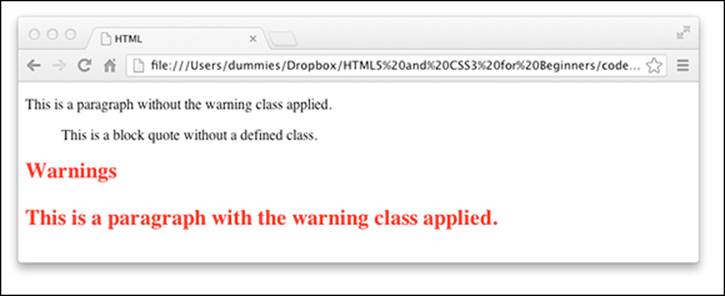
Figure 12-8: You can use class selectors to create style rules that work with any element.
You can also use the span element to selectively apply custom styles to inline content (or to create arbitrary content containers that extend from the opening <span> tag to its closing </span> counterpart):
<p>This is a paragraph without the <span class="warning">warning class</span> applied only to the words "warning class."</p>
To see this declaration in action, add it inside the <style> element in index.html and then place class="warning" within the starting tag of one of the elements containing text in index.html.
<figcaption class="warning">powered by coffee.</figcaption>
When you preview the document in a browser, the text inside of <figcaption> should now be red, bold, and larger, as shown in Figure 12-9.
Other selectors
CSS includes other selector types as well, which are somewhat more advanced and less commonly used than the four we cover in the preceding sections. These are:
Adjacent sibling selector: Selects elements only when they are next to another specified element.
h1 + p {font-style: italic; }
The preceding example applies to any <p> that directly follows an <h1>.
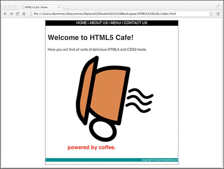
Figure 12-9: Using a class selector to apply style to an element.
Attribute selector: Selects elements based on the values of their attributes.
img[src="chris.jpg"] {border: 6px solid purple;}
This rule applies a thick purple border to any <img> with a src attribute equal to chris.jpg.
Child selector: Selects elements that are a direct child of another element. For example, in this HTML, the <em> is a direct child of <p>, but the <a> is not.
<p>It is <em>important</em> to remember this <a href="picture.jpg">picture</a>.</p>
To use a child selector, type > between the parent and its direct child that you want to target.
p>em {color:red;}
Descendant selector: Selects elements that are lower on the document tree than a specified element. For example, this rule targets any <p> that is nested within a <footer>:
footer p {font-size: 50%;}
Note that descendant selectors apply to all descendants that match the selector, not just to the first descendant. So, the preceding example matches the <p> in this HTML:
<footer><p>copyright 2013</p></footer>
as well as the one in this HTML:
<footer><div><p>copyright 2013</p></div></footer>
Pseudo-classes: Selects elements based on properties that aren’t in the document tree. For example, you can use a pseudo-class to apply a style to an element when the user hovers the mouse over the element, or to change the style of a link that has been visited previously.
a:hover{text-decoration:none;}
In this example, the underline is removed from links when the user points at the link with the mouse.
The list of possible pseudo-classes includes the following:
• :first-child
• :link
• :visited
• :hover
• :active
• :focus
• :lang(n)
Inheriting styles
A basic concept in HTML (and markup in general) is nesting tags:
Every valid HTML document nests within <html> and </html> tags.
Everything a browser displays in a window is nested within <body> and </body> tags. (That's just the beginning, really.)
The CSS specification recognizes that you often nest one element inside another and wants to be sure that styles associated with the parent element find their way to the child element. This mechanism is called inheritance.
When you assign a style to an element, the same style applies to all elements nested inside that element. For example, a style rule for the body element that sets page background, text color, font size, font family, and margins looks like this:
body {background: teal;
color: white;
font-size: 18px;
font-family: Garamond;
margin-left: 72px;
margin-right: 72px;
margin-top: 72px;}
Pay attention to inheritance!
When you build complex style sheets to guide the appearance of every aspect of a page, keep inheritance in mind. For instance, if you set margins for a page in a body style rule, all margins you set for every other element on the page are based on margins set for the body. If you know how your style rules work together, you can use inheritance to minimize style rule repetition and create a cohesive display for your page.
This chapter covers basic CSS syntax, but you can fine-tune your style rules with advanced techniques. A complete overview of CSS syntax rules is available in the "CSS Structure and Rules" tutorial by the Web Design Group at www.htmlhelp.com/reference/css/structure.html.
To set style rules for the entire document, set them in the body element. Changing the font for the entire page, for example, is much easier to do that way; it beats changing every single element one at a time.
When you link the following HTML to the preceding style rule, which applies only to the body element, that formatting is inherited by all subordinate elements:
<body>
<p>This paragraph inherits the page styles.</p>
<h1>As does this heading</h1>
<ul>
<li>As do the items in this list</li>
<li>Item</li>
<li>Item</li>
</ul>
</body>
Understanding the Cascade
Multiple style sheets can affect page elements and build upon each other. It’s like inheriting styles within a web page. This is the cascading part of CSS.
Cascading is how CSS deals with situations in which two or more style rules have declarations that apply to the same element and property. The three principles of cascading to keep in mind are:
Origin: Did the user specify one of the style rules? If so, this is the most important one and wins in a conflict.
Specificity: ID selectors beat class selectors. Class selectors beat element type selectors.
Proximity: How close is the style to the element being styled? The next chapter shows you that there are three places where style rules can be defined. The one that’s closest to the element being styled, or that is read last by the browser, wins in a conflict.
For example, here’s a simple bit of HTML markup with a couple of elements:
<body>
<div id="content">
<p class="information">This is the content.</p>
</div>
</body>
Here’s part of a style sheet that’s applied to this HTML:
body {font-family: Arial;}
div {color: green;}
p {font-size: 18px;
color: blue;}
.information {font-size: 16px;}
Notice that these style rules apply two different font sizes and two different colors to the <p> element. The browser needs to resolve this conflict, and it does so by using the principles of origin, specificity, and proximity. In this particular case, after all the conflicts are resolved the text inside the <p> element has the following rules applied to it:
font-family: Arial;
color: blue;
font-size: 16px;
Even though two different font sizes and two different colors apply to the paragraph text in this example, text can only be one color and one size at a time. By applying the three principles of the cascade, the browser has resolved the conflict and the winning styles have been chosen.