Beginning HTML5 & CSS3 For Dummies® (2013)
Part V
Enhancing Your Pages’ Look and Feel
 To access some great CSS resources for buttons, colors, fonts, and text effects, visit www.dummies.com/extras/beginninghtml5css3. Also, all links and markup examples are available online at www.dummieshtml.com/html5cafe in the sections labeled Ch14 through Ch19.
In this part . . .
 Breaking into CSS box models for HTML elements
Perfecting HTML element positioning with CSS markup
Building page elements with CSS buttons, borders, and backgrounds
Working with color in CSS to add contrast, drama, and readability to your pages
Managing typography on web pages with CSS
Crafting careful and dramatics text effects with CSS
Creating animations with CSS, including using colors and objects
14
Managing Layout and Positioning
In This Chapter
 Understanding the box model
Positioning objects on a page
Floating elements
Using a layout generator
It’s time to start getting the details of how CSS helps you format a web page. In this chapter, we cover the important issue of how to position elements in a web page. We also discuss the two categories of elements where CSS is concerned. Finally, we show you an online tool that you can use to create complex website layouts easily.
If you need a refresher on CSS style rules and properties, read Chapter 12 (a high-level overview of CSS and how it works). Then you can return to this chapter and put CSS into action.
Managing Layout
You can use CSS to lay out your pages so that images and blocks of text
Appear exactly where you want them to.
Fit exactly within the amount of space you want them to occupy.
As is the case with every CSS change you make to a web page, positioning elements is all about changing the default behavior of HTML elements in the browser.
Tiny boxes
CSS treats each visible element in an HTML document as a rectangle. A line of text is a rectangle. An image of a circle is a rectangle. A picture of your cat is a rectangle. Figure 14-1 illustrates this point by drawing rectangles on a web page in approximately the places where CSS does.
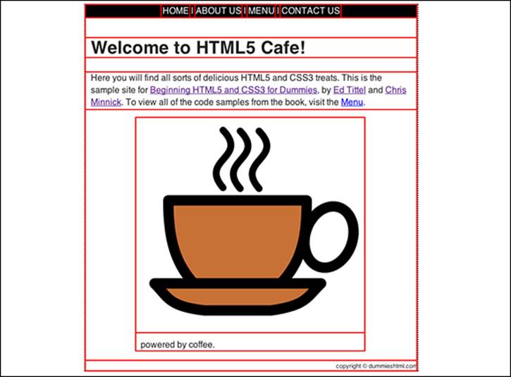
Figure 14-1: CSS draws a rectangular box around each element.
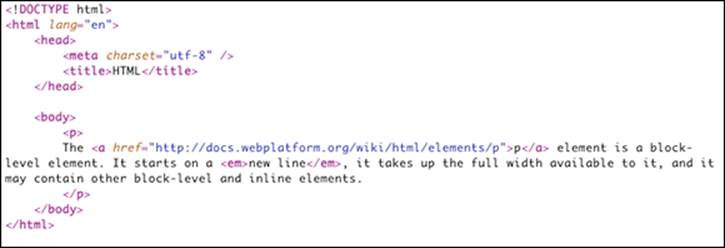
If you ever want to see the box that an HTML element lives in, one way is by putting a border on it using CSS. Figure 14-2 shows a <p> element with a red 2-pixel wide border around it. For convenience, and so we can show you everything in the same screen, we've used inline styling here.
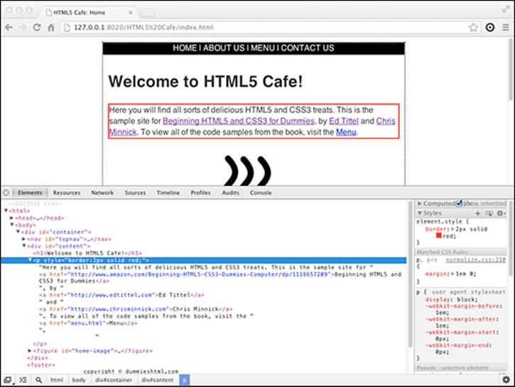
Figure 14-2: A paragraph element with a border.
 In Figure 14-2 and Figure 14-3, we’re using the Chrome DevTools, which are built into Google’s Chrome web browser, to show the markup and the browser window at the same time. The Chrome DevTools are extremely helpful for testing, debugging, analyzing, and building web pages. If you want to see and work with the tools, you can press Ctrl+Shift+I in Windows or Option+Control+I on the Mac OS when you have the Chrome browser open.
Figure 14-3 shows a red border around another element — the <a> element around Chris Minnick's name.
Well, now. That’s certainly interesting. Notice that the border around Chris Minnick wraps from one line to the next. The rectangle is there, but it’s been broken into two parts.
To understand what’s going on here, we need to explain the difference between inline and block-level elements.
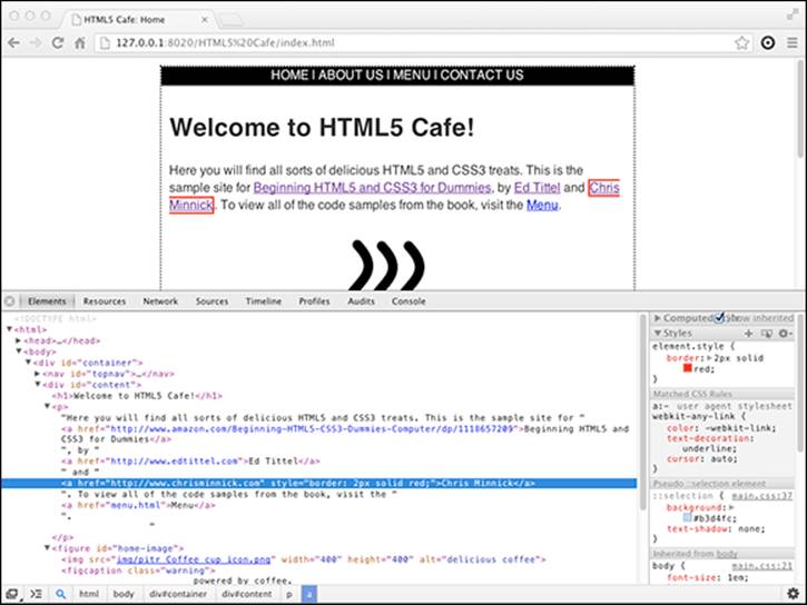
Figure 14-3: A border around an a element.
Block versus inline elements
For the purpose of laying out a web page, HTML elements that get displayed in a browser all fall into one of two categories:
Block elements, such as <p> and <div>, form a block on the page. They take up the full width available to them and begin on a new line. Block-level elements may contain other block-level elements as well as inline elements.
Inline elements, such as <span> and <a> do not start a new line. They are used inside of block elements. It's not valid HTML to put block-level elements within inline elements.
There is a third basic type of element where the elements aren't displayed. This list includes <meta>, <link>, and other elements that serve a function in the web page but don't show up when you view it in a browser.
Listing 14-1 shows a block-level element, <p>, with several inline elements inside of it.
Listing 14-1: Block-Level Elements May Contain Inline Elements
In HTML5, the terms block-level and inline have been replaced with a more complex set of categories. HTML5’s equivalent term for block-level is flow content, and inline elements correspond to HTML5’s phrasing content. HTML5 has several other categories of content that aren’t important as we talk about CSS layout.
CSS uses the terms block and inline, and so even though HTML no longer contains these terms, it’s still the best way to understand and group HTML elements for the purpose of arranging them in a browser.
Table 14-1 lists all of HTML5’s block-level elements.
Table 14-1 HTML5’s Block-Level Elements
|
<address> |
<figure> |
<hr> |
|
<article> |
<footer> |
<noscript> |
|
<aside> |
<form> |
<ol> |
|
<audio> |
<form> |
<output> |
|
<blockquote> |
<h1> |
<p> |
|
<br> |
<h2> |
<pre> |
|
<canvas> |
<h3> |
<section> |
|
<dd> |
<h4> |
<table> |
|
<div> |
<h5> |
<tfoot> |
|
<dl> |
<h6> |
<ul> |
|
<fieldset> |
<header> |
<video> |
|
<figcaption> |
<hrgroup> |
Table 14-2 lists all of the inline elements.
Table 14-2 HTML5’s Inline Elements
|
<a> |
<em> |
<small> |
|
<abbr> |
<i> |
<span> |
|
<b> |
<kbd> |
<strong> |
|
<bdi> |
<mark> |
<sub> |
|
<bdo> |
<q> |
<sup> |
|
<br> |
<rp> |
<time> |
|
<cite> |
<rt> |
<u> |
|
<code> |
<ruby> |
<var> |
|
<data> |
<s> |
<wbr> |
|
<dfn> |
<samp> |
 For complete details on what each of these elements does, visit the HTML reference at dev.w3.org/html5/html-author/.
By default, with no CSS applied by the web pages’ author, HTML elements appear on the screen in the same order as you type them into your markup in what’s called normal flow, which we discuss next.
Normal flow
Normal flow specifies that blocks are stacked upon each other vertically, starting at the top of the block that contains them. Inline elements flow horizontally from left to right.
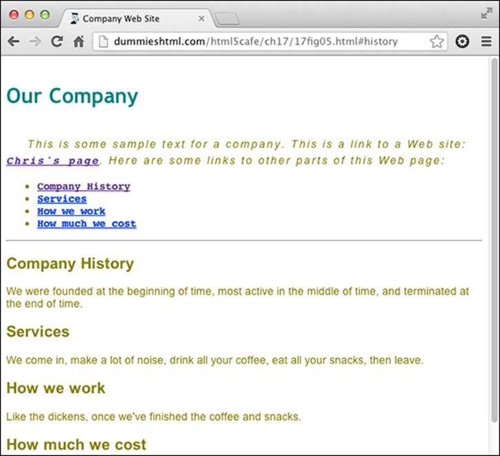
Figure 14-4 illustrates normal flow.
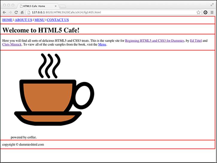
Figure 14-4: An example of normal flow.
If normal flow is how you want your page to be laid out, you’re in luck: There’s nothing more that you need to do than to just write your HTML markup, then stand back and admire the logic and simplicity of normal flow.
There are many times, however, when normal flow just won’t cut it. For that, CSS provides plenty of tools for overriding and readjusting elements in an HTML page. Much of the rest of this chapter is dedicated to demonstrating non-normal flow, or out of flow elements.
Compare the section of the home page of www.nasa.gov as shown in Figure 14-5 with the same section, minus all of the CSS shown in Figure 14-6. Can you see how the elements in the plain version match up with the elements in the styled version?
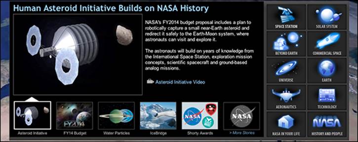
Figure 14-5: An example of what’s possible by taking elements out of flow.
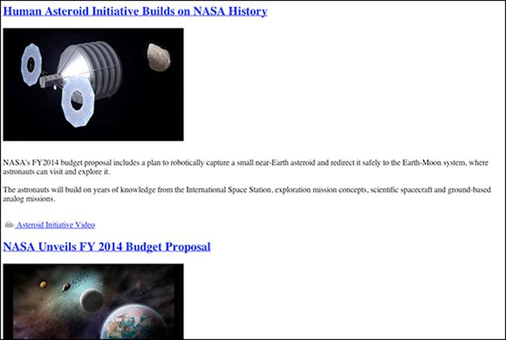
Figure 14-6: Remove the CSS, and everything flows normally, if not beautifully or efficiently.
The HTML5 Cafe website is much less complicated than the NASA site (it’s not rocket science, after all), and it was designed to work pretty well even without any external style sheets, as shown in Figure 14-6.
However, if you compare Figure 14-7 with the styled version of the page in Figure 14-8, it’s clear that we did some work to a few of the elements to position them just where we want them on the page:
The content block has been centered in the window.
The navigation has been centered in the content block.
The coffee cup image and its caption have been centered in the content block.
The copyright statement has been right-aligned in the content block.
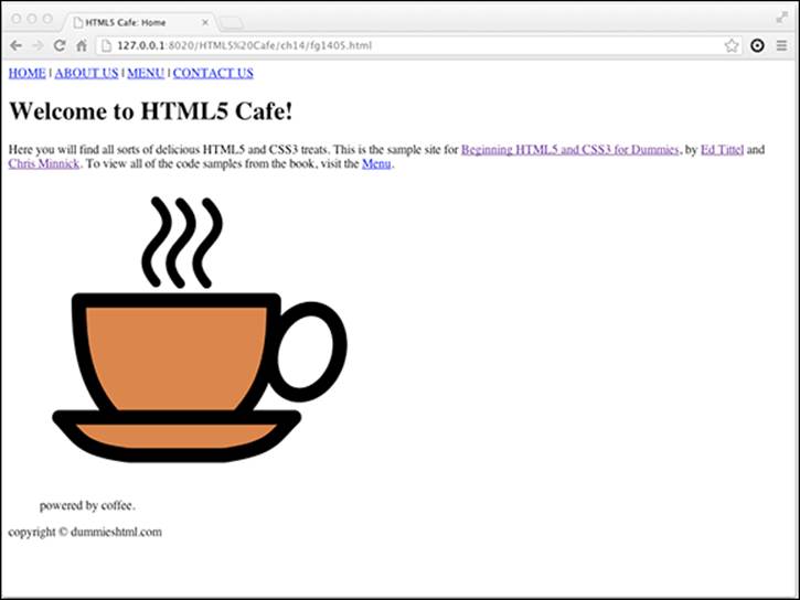
Figure 14-7: The normal flow version of HTML5 Cafe.
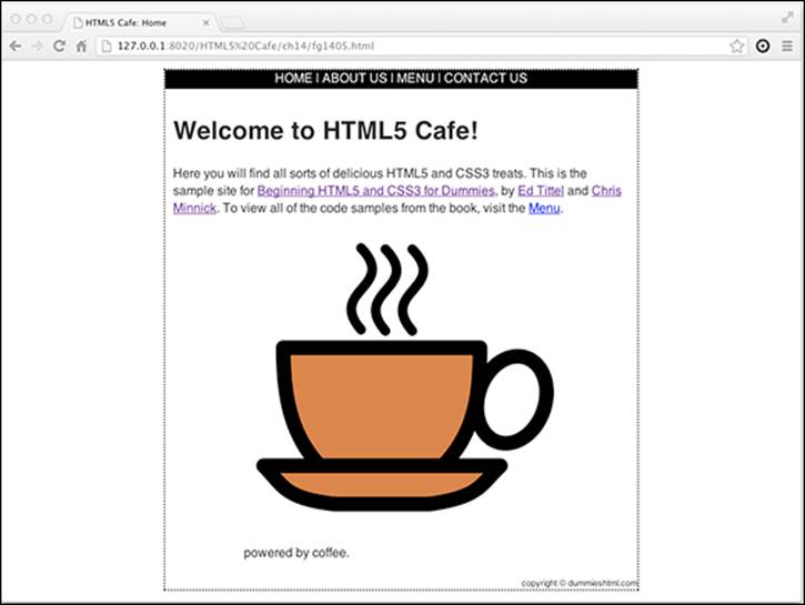
Figure 14-8: The styled version of HTML5 Cafe.
Putting absolute and relative in perspective
Think about how you might answer the question “Where are you?” There are several ways to answer this question (besides with “None of your business!”, of course.)
The first way is by telling your location in regards to something else. For example, you might say,
“Walking my dog.”
or
“In my car.”
This type of location information is relative to something else (your dog or your car, in these examples). When the dog and car move, you move.
The other type of location information that you might give is an actual address or a specific, unchanging location. For example, you could say,
“In San Jose.”
or even
“At 1313 Mockingbird Lane.”
This type of information is absolute. You’re at this location, and the location is a fixed place on the map.
Of course, we can get philosophical on you here and remind you that everything is relative and that there are no absolutes — and it’s just a matter of what it’s relative to. In the first case (“walking my dog”), your position is relative to the dog. In the second case (“1313 Mockingbird Lane”), your position is relative to the city. In another case (“California”), your position is relative to the United States.
Keep this example in mind as we go through this chapter. CSS positioning works much the same way.
Before we move on to explaining just how these elements were positioned (which we do in Chapter 15), we need to explain how CSS positioning works.
Managing Positioning
CSS provides several ways to specify exactly where an element should appear on a page. The kinds of properties involved are discussed in the following sections.
How a browser positions an element in a browser is determined by the position property. Position has 5 possible values:
static: Static is the default. When position is set to static, elements flow according to the rules of normal flow.
inherit: Specifies that the current element should use the same value for position as its parent element.
fixed: Specifies that the element should be fixed to the background and not move, even if the page is scrolled.
absolute: The element is positioned relative to its first positioned ancestor element.
relative: The element is positioned relative to its normal position.
CSS positioning is a little tricky to understand at first, but when you get it, it's very powerful. So we spend a bit of time explaining the position element, and specifically its two most important values: relative and absolute.
About coordinates and offsets
When you position an object using fixed, absolute, or relative positioning, you do so by specifying an offset. The offset tells the browser the distance to move the object. The four offset properties — top, right, bottom, and left — correspond with the four edges of the box that you’re positioning.
Relative positioning
When you use relative positioning, you're offsetting the element from its current position, relative to its parent element. To demonstrate relative positioning, Figure 14-9 shows a document with a <div> element containing text that's relatively positioned within another <div>.
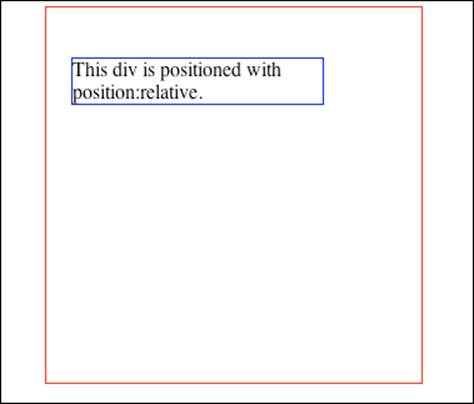
Figure 14-9: The paragraph is positioned relative to its parent element.
Listing 14-2 shows the HTML markup for this page.
Listing 14-2: The HTML Markup for Figure 14-9
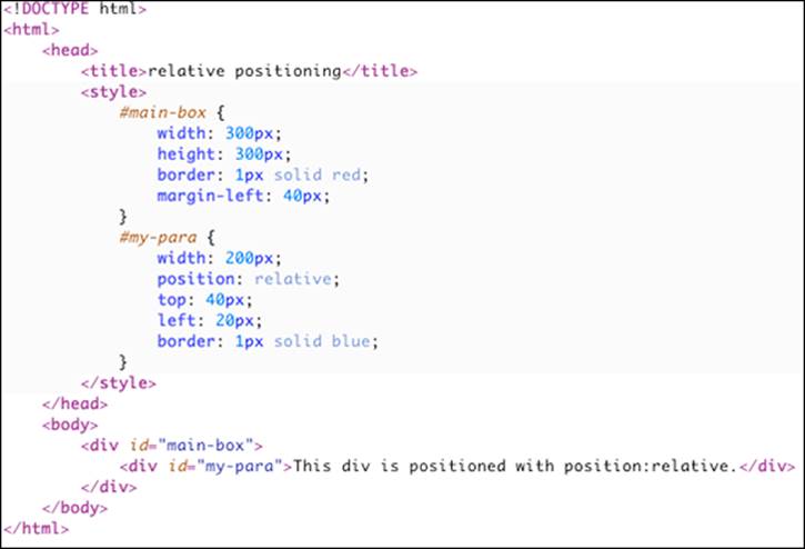
Notice that the inside box (containing text) has been moved down and to the left of the upper-left corner of the containing box (with the id="main-box" attribute).
If you were to move the outside (containing) box in this example by changing the value of the margin property or through another means, the resulting configuration of these two elements would remain the same. They would just be in a different place in the browser window.
Absolute positioning
Sometimes, you just want to position something in a particular location on your web page, not relative to another element. This is the function of position: absolute.
Take a look at the CSS in Listing 14-3. This is the same markup we show you in Listing 14-2, except with the value of the position property changed to absolute.
Listing 14-3: The Position Has Been Changed to Absolute
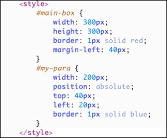
When viewed in a browser, the result is Figure 14-10. Notice that the inner box is now positioned relative to the upper-left corner of the browser window, not the parent <div>. In fact, the parent <div> has no effect on the positioned <div> at all here. We can move the parent <div>completely out of the picture, and the absolutely positioned <div> stays right where it's at.
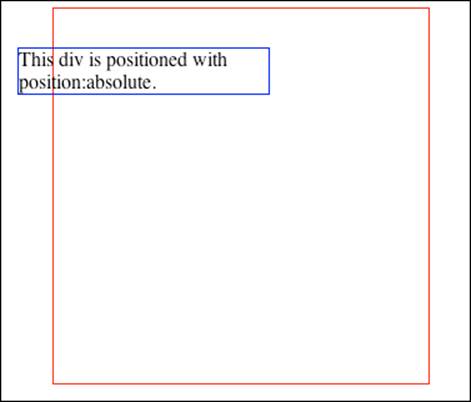
Figure 14-10: The inner box is now absolutely positioned.
Floating
Another way to take boxes out of the normal flow of the web page is by using the float property. You can float a box to the left or to the right, which will take the box out of the normal flow and push it as far as possible in the specified direction. Because it's no longer in the normal flow, objects and text that are still in the normal flow will flow around it. The About Us page on the HTML5 Cafe website uses the float property to wrap text around the author pictures, as shown in Figure 14-11.
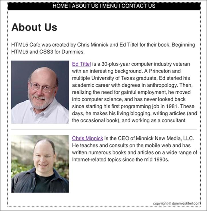
Figure 14-11: The float property can be used to wrap text around images.
The float property has four possible values:
float: left moves the selected element as far left as possible and forces other content to wrap to the right of it.
float: right moves the selected element as far right as possible and forces other content to wrap to the left of it.
float: none is the default setting and specifies that the element will follow the normal flow.
float: inherit specifies that the element should be floated the same as its parent element.
Remember that block elements take up as much horizontal space as they have available to them, unless you specifically set the width property. This fact has caused many web developers hours and hours of problems while they try to figure out why a floated element doesn't work the way they expect. Simply remember to always specify a width when you float an element, and you'll thank us later.
Using a Layout Generator
By combining CSS positioning and floats, you can do amazing things with web page layouts. For example, you might want to have a website with a left or right column for navigation. Or, you might want to have a three-column layout with the main content in the middle of the page. Or, you might want to use a grid system so that you can position elements pretty much where ever you want in the browser.
Each of these different options is shown in Figure 14-12.
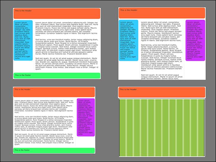
Figure 14-12: Examples of different types of web page layouts.
All of these are possible and are commonly done with CSS. Because they're so common, people have created tools, called layout generators, for automatically generating the CSS necessary to create different layouts. One such layout generator is the one created by Generate It!, which resides at www.generateit.net/layout-generator.
Figure 14-13 shows the interface for the Generate It! Layout Generator.
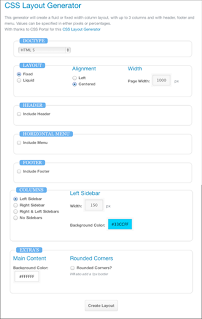
Figure 14-13: An example of a CSS layout generator.
This layout generator uses a series of forms where you can specify different attributes of the layout that you want to generate. These include the following:
Whether the layout should be fixed (always the same width), or liquid (the width changes based on the width of the browser)
Whether the layout should be left-aligned in the browser window, or centered (if it’s set to a fixed width)
The default width of the layout
Whether to include a header, horizontal menu, and footer as well as the attributes of each
The number of columns in the layout
The width of each of the columns
Background colors for the columns and the page as a whole
When you’re done filling out the form, click the Create Layout button, and the CSS and HTML for the layout you designed appear, as shown in Figure 14-14.
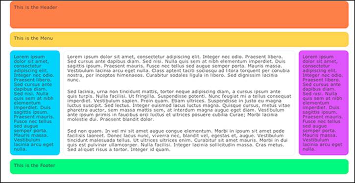
Figure 14-14: A layout generated by the layout generator.
If you're happy with this layout (and who wouldn't be happy, with all those happy colors?), click the Download Layout link and download a .zip file containing starter HTML and CSS files. You can customize these and insert your own content, and away you go!
All materials on the site are licensed Creative Commons Attribution-Sharealike 3.0 Unported CC BY-SA 3.0 & GNU Free Documentation License (GFDL)
If you are the copyright holder of any material contained on our site and intend to remove it, please contact our site administrator for approval.
© 2016-2026 All site design rights belong to S.Y.A.