Beginning HTML5 & CSS3 For Dummies® (2013)
Part V
Enhancing Your Pages’ Look and Feel
15
Building with Boxes, Borders, and Buttons
In This Chapter
 Working with the CSS box model
Positioning blocks
Aligning text
Indenting text
Creating buttons with CSS
Chapter 14 describes the difference between block and inline elements, and how to arrange both in the browser window. In this chapter, we go inside those elements to show you how to change the spacing between elements, change the spacing inside of elements, assign borders to elements, align the content of elements, and more!
Meeting the Box Model
As we show you in Chapter 14, each element in an HTML document is represented as a rectangular box. You also see how these boxes stack up depending on whether they’re inline or block-level elements. In this section, we talk about those rectangles and the ways in which you can change them using CSS.
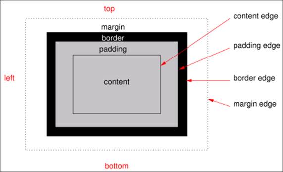
Figure 15-1 shows what is known as the CSS box model.
The box model has four types of space, or to put it another way, four edges. These four spaces/edges are as follows:
 Content: Content is the rectangle that’s filled up by your text, image, video, or whatever.
Padding: Padding is the space between the edge of your content and the border. You can control the width of the padding with the padding-top, padding-right, padding-bottom, and padding-left properties or with the shorthand padding property, as you see shortly.
Border: The border area lies beyond the padding. To change the width of the border, you use the border-width property or the shorthand border property.
Margin: Margin is outside of the element's border and is what separates one box from another. To control the width of the margin, you use the margin-top, margin-right, margin-bottom, and margin-left properties or the shorthand margin property.
Figure 15-2 makes it all real by showing how it applies to a picture of a cute cat on a web page. Throughout the rest of this chapter, we show you how to implement elements of the box model.
www.w3.org/TR/css3-background Copyright © 24 July 2012 World Wide Web Consortium, (Massachusetts Institute of Technology, European Research Consortium for Informatics and Mathematics, Keio University). All Rights Reserved. www.w3.org/Consortium/Legal/2002/copyright-documents-20021231
Figure 15-1: A diagram of the CSS box model.
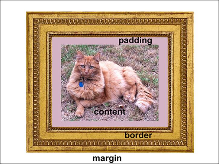
Figure 15-2: The CSS box model in practice.
Putting the Box Model into Practice
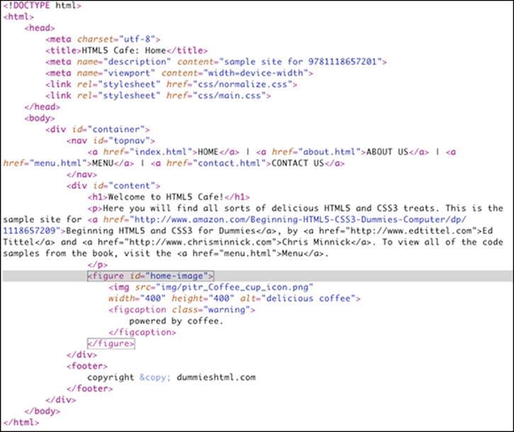
To demonstrate the box model, we once again visit the HTML5 Cafe. Look again at the markup for the home page, shown in Listing 15-1. Find the <figure> element, which we've highlighted for you.
As you may recall from Chapter 14, <figure> is a block-level element.
The coffee cup image and its caption are the content of the <figure> element. Content takes up as much space as is needed to draw a rectangle around it. In this case, the image is 400 pixels wide and 400 pixels tall. Below the image, the caption has a certain line height, which is determined by the size of the caption text and the value of the line height. The total height of the <figcaption> element in this case is 22px. The combined height of the coffee cup image and the caption, then, is 422px. The width of the figure is still 400px.
Listing 15-1: The Markup for the HTML Café Home Page
The actual amount of space taken up by the figure element is greater than 400px, however. Remember that figure is a block-level element and that block-level elements take up the entire width available to them if you don’t explicitly specify a width.
So, the width of the figure element here is actually determined by the width of the <div> element that holds it.
Figure 15-3 shows your good friend the Chrome DevTools Elements Panel with the <figure> element highlighted. Notice that the coffee cup picture has been highlighted in two colors and that a tiny box model diagram appears in the lower-right corner of the screen.
If you match the colors overlaid on and around the coffee cup image with the colors in the box model diagram, you find that the coffee cup icon represents the most inner part of the box model (the content), as we already determined. The space around the coffee cup matches up with the margin color in the box model.
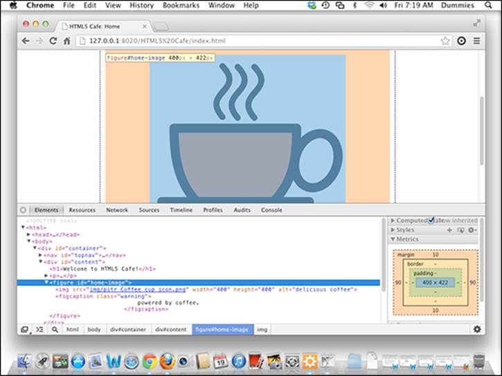
Figure 15-3: The <figure> element inside the Chrome DevTools.
The top and bottom margins around the image are set to 10px. This is a direct result of the style rule that we applied to the figure element (by selecting its ID):
#home-image {width: 400px;
margin: 10px auto;}
 In this case, we chose to apply the style to the coffee cup by selecting its ID, home-image. It would have also worked to select this image using an element type selector, figure. If we had selected it that way, however, these styles would be applied to every figure element on the site, which may not be exactly what we want. A combination of an element selector and an ID selector would perhaps be the most complete way to select this particular image. The resulting selector would be figure#home-image.
Notice also that the border and padding colors are missing from around the coffee cup. Because we haven’t set a border or padding on the figure element, they are set to 0.
We can add a border and padding to the coffee cup picture by adding a couple of new declarations:
#home-image {width: 400px;
margin: 10px auto;
padding: 10px 10px 10px 10px;
border: 10px solid black;}
With a border and padding added to the #home-image CSS rule, the box model diagram in Chrome DevTools changes, as shown in Figure 15-4.
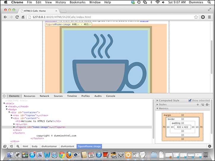
Figure 15-4: The <figure> element with padding and a border.
 Note that several properties in the previous CSS rule, called shorthand properties, take multiple values, such as margin and padding. Shorthand properties collect values from multiple related CSS properties (such as margin-top, margin-right, margin-bottom, and margin-left, for example). As far as CSS is concerned, there is no difference between writing a separate declaration for each of the properties in a shorthand property, or using the shorthand property. If you learn and use the shorthand properties consistently, you save yourself some typing, and your CSS files will be somewhat smaller. We show you some of the shorthand properties in this chapter and the next as they come up.
Specifying padding and margin widths
Padding and margin are both names for spacing around content. margin creates an empty zone around the box (outside of the border), and padding defines the space between the border of the box and the content inside the box.
Margin
The margin of an element is the space between the element and another element. It can be set as a fixed length, as a percentage, or as auto. These are the important things to know about margin:
The margin doesn’t have a background color.
The margin is outside of the border.
Margins “collapse” in certain cases.
Margin collapsing is the property of margins when two elements are stacked on top of each other, only one of the margins will actually be used. For example, if two <div> elements — each with the top and bottom margins set to 10px — are stacked on top of each other, you would expect the margin between the bottom of the first element and the top of the second element to be 20px, as shown in Figure 15-5.
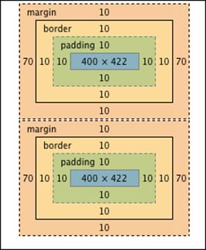
Figure 15-5: What you would expect. But, not what happens!
In reality, however, what happens by default is that only the larger margin will be used. In this case, both margins are 10px, so the combined margin will be 10px, as shown in Figure 15-6.
Figure 15-6: What actually happens. The smaller margin collapses.
But, if the first element had a 20px bottom margin and the second element had a 40px margin, the combined margin on the touching edge would be 40px wide.
 Collapsing margins seems like a simple enough concept. But, as always, there are some exceptions to the rule and complicating scenarios. Margins collapse only for block-level elements that are in the normal flow of the document. So, if an element is absolutely positioned or floated, margin collapse doesn’t happen. Also, if one element has a negative top or bottom margin, the negative and positive margins will be added together to come up with the final combined margin. Confused yet? Don’t worry about it. It actually will make sense after you practice and gain experience working with margins.
Each element has four margin properties, which correspond to the four edges of the element’s box model:
margin-top specifies the top margin.
margin-right specifies the right margin.
margin-bottom specifies the bottom margin.
margin-left specifies the left margin.
A value of auto for any of the margin properties causes the browser to calculate the margin width automatically, depending on the space available.
You can use the auto value of the margin property to center elements horizontally. The trick is to set both the right and left margins of the element to auto. The browser splits the available space between them, which leaves the element centered in its container. Cool trick, huh?
Padding
Padding is the space between an element’s content and its border. If a background color or image is set for an element, padding takes on the background.
You can specify the amount of padding for each edge of an element as a fixed measurement or as a percentage.
As with margin, there are four individual properties, which correspond to each of the four edges:
padding-top sets the padding on the top.
padding-right sets the padding on the right.
padding bottom sets the padding on the bottom.
padding-left sets the padding on the left.
Shortcut properties
Padding and margin both have shorthand properties that can save you a bit of typing. The shorthand property for setting the margins is simply margin. The shorthand property for setting the padding is padding.
The following rules explain how to set shorthand properties for padding and margin:
If all the sides have the same value, a single value works. For example, margin: 10px; sets the values of margin-top, margin-right, margin-bottom, and margin-left to 10px.
If top and bottom margins are the same, and if left and right margins are also the same, you can use just two numbers for the margin or padding shortcut. For example: margin: 10px 20px; sets the top and bottom margins to 10px and the right and left margins to 20px.
If the top and bottom values are different but the right and left values are the same, you can use three values. For example, padding: 10px 30px 20px; sets the top padding to 10px, the right and left padding to 30px, and the bottom padding to 20px.
All other cases require you to use four values with the shorthand property. For example, padding: 3px 2px 18px 4px; sets the padding on each side of the content to one of the values. Of course, it's always fine to use four values, even if it's not required. For example, there's nothing wrong with writing padding: 3px 3px 3px 3px;, even though it would be shorter to write just padding: 3px;.
To remember what's what, think of the edges of an element box in clockwise order, starting with the top edge: top, right, bottom, and then left. One easy way to remember the order of the edges in shortcut properties is to remember that the first letters are the consonants in the word TRouBLe. As in, "You'll be in big TRBL if you don't remember the order of the edges correctly!"
Here are some examples of margin and padding rules and the effect they have in the Chrome DevTools box model diagram. First, set top and bottom padding to 0px and left and right padding to 10px:
padding: 0px 10px;
Figure 15-7 shows the resulting diagram for the element containing this declaration.
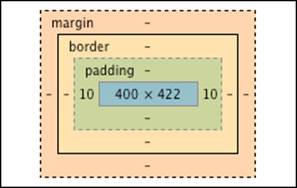
Figure 15-7: The result of using the padding shortcut property with two values.
Next, here’s how you would set the top and bottom margins to 20px and 40px, respectively, and set the left and right margins to 15px:
margin: 20px 15px 40px;
Figure 15-8 shows the resulting diagram for the element containing this declaration.
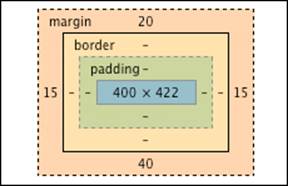
Figure 15-8: The result of using the margin shortcut property with three values.
And how about if you want to set all of the margins to 12px? That’s easy:
margin: 12px;
Figure 15-9 shows the resulting diagram for the element containing this declaration.
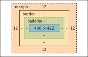
Figure 15-9: The result of using the margin shortcut property with one value.
Adding borders
Between the padding and the margin is the border. Borders are like a picture frame for your content. They can be very simple — perhaps just a thin black line — or they can be quite ornate. With CSS3, you can even use images for borders and create rounded corners on you borders!
The simplest way to create a border is by using the three basic border properties: border-width, border-style, and border-color.
border-width
border-width is a shorthand property for the four longhand properties that determine the thickness of the border: border-top-width, border-right-width, border-bottom-width, and border-left-width.
You can set the border width using a keyword or an explicit value. The three keywords that you can use to set the border width are
thin.
medium.
thick.
If you require more precision than just what a certain browser decides is thin, medium, or thick, you can set the border-width property in pixels, ems, or another measurement unit.
border-style
border-style is a shorthand for the four properties used to set border styles: border-top-style, border-right-style, border-bottom-style, and border-left-style. By using the border-style property, you can set them all at one time, just as you did with the margin and padding shorthand properties. The border-style property has nine possible values. The following list describes how each border looks, as shown in Figure 15-10:
border-style: none: The border has no style. In other words, it isn't displayed.
border-style: dotted: The border is made up of dots. This is the style of border used on the HTML5 Cafe website.
border-style: dashed: The border is made up of dashes. Dashes are similar to dots, but longer.
border-style: solid: The border is a solid line.
border-style: double: The border is made up of two lines that add up to the total width of the border you set.
border-style: groove: The border has a 3D groove effect. It's the opposite of the ridge style.
border-style: ridge: The border has a 3D ridge effect. It will appear to come out of the page.
border-style: inset: The border makes the box appear to be inset, or embedded.
border-style: outset: The border makes the box appear to be raised up, or embossed.
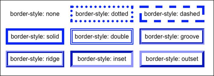
Figure 15-10: Each of the different styles of border.
As with the padding and margin properties, it's possible to have different border widths and border styles on each of the four sides of a box. You can accomplish this by setting the longhand properties for each edge separately or by using multiple values in the shorthand property. For example, border-style: solid dotted; puts a solid border on the top and bottom of the box, and a dotted border on the left and right.
border-color
As with the previous two properties, border-color is actually a shorthand combination of the four longhand properties: border-top-color, border-right-color, border-bottom-color, and border-left-color.
You can specify the color using any one of the ways to name colors in CSS (which we talk about in detail in Chapter 16).
The border shorthand property
If three separate border-related properties are too many for you, you're in luck! The border property is a super shorthand property that lets you set the border-width, border-style, and border-color all at once.
Here’s the format for the border property:
border: width style color;
So, if you wanted a blue, 1 pixel wide, solid border, you could use the following declaration:
border: 1px solid blue;
Easy as that! The border shorthand property comes in very handy when you just need a simple border.
Aligning text
If you examine the CSS that's responsible for styling the center-aligned content in the HTML5 Cafe style sheet, a pattern emerges. Here's the CSS for the navigation:
#topnav {width:100%;
text-align: center;
background-color: #000000;
height: 24px;
color: #FFFFFF;}
Here’s the CSS for the coffee cup image:
#logo {font-size: 2em;
text-transform: uppercase;
font-weight: bold;
text-align: center;}
Here’s the CSS for the copyright notice:
footer {font-size: .7em;
text-align: right;}
Notice that in each of these three cases, the text-align property is present and responsible for the positioning of the element.
The text-align property does just what it sounds like — it aligns text within another element. The truth, however, is that CSS doesn't much care whether content is text, images, video, or another type of content when it comes to how the text-align property works. The text-alignproperty just aligns all of the content in a block, horizontally, in one of four ways, depending on the value that you give the property. You may also just tell the current element to do the same thing as its parent element. Here are all the possible values of text-align:
text-align: left aligns content with the left edge of the block.
text-align: center centers content in the block.
text-align: right aligns content with the right edge of the block.
text-align: justify stretches lines of text so that each line has an equal length.
text-align: inherit specifies that the current element should have the same text-align value as its parent element.
Indenting text
You can define the amount of space that should precede the first line of a paragraph by using the text-indent property.
Using the text-indent property doesn't indent the whole paragraph, only the first line. To accomplish indenting a whole paragraph, you need to use CSS box properties, such as margin-left and margin-right.
Syntax for indenting text
The style declaration used to indent text is
selector {text-indent: value;}
Here, value must be one of the standard length-property measurement values (listed in Chapter 11).
Markup for indenting text
To create a class that can be used to indent quotations by 2em, you may write a CSS rule like the following:
.quotation {font-style: italic; text-indent: 2em;}
Creating buttons with CSS
CSS, and especially CSS3, is capable of doing many jobs that you previously needed to use images for. One of these is the job of making really good-looking buttons.
CSS3 has several great new properties for rounding box corners, creating gradient effects, and adding shadows to boxes and text. We show you some of the great new capabilities and how they work in the next chapters. Right now, however, we take a look at what they’re capable of doing.
As we show with the layout generator in Chapter 14, there are services on the web that make the job of creating complex CSS effects very easy. Another such service is a button generator. The button generator that we look at here is the CSS3 Button Generator at http://css3button.net. When you first arrive at http://css3button.net, a random button color and style is presented to you, as shown in Figure 15-11.
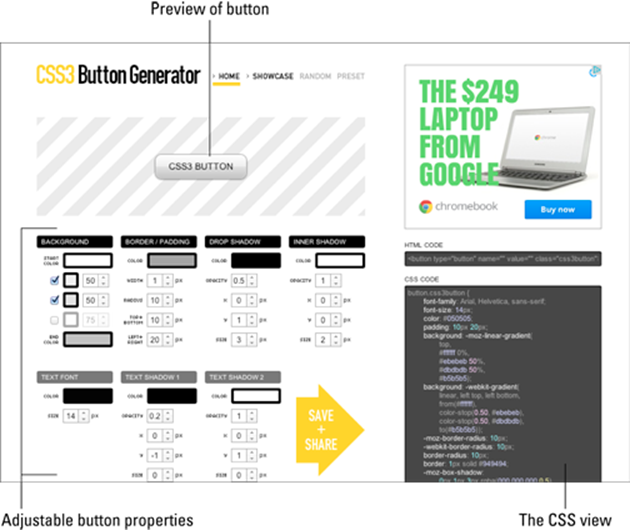
Figure 15-11: The home screen for http://css3button.net.
The upper-left portion of the interface shows a preview of your button. The site presents the button on a background to make it easier to see light-colored borders and shadows.
Below the preview are the various properties of the button that you can adjust. When you change any of these properties, the button preview is instantly updated. Go ahead and try changing some of them!
The best part of the CSS Button Generator is in a dark gray box in the lower right: the CSS view. When you’re happy with your button, you can select and copy the HTML and CSS for the button and paste them into your own HTML and CSS documents. Because it’s just CSS, you can reuse this button style over and over in your website for different buttons with only a minimal effect on page load time.
Figure 15-12 shows the CSS markup for a custom button that we came up with. Figure 15-13 shows several instances of that button with different labels on them.
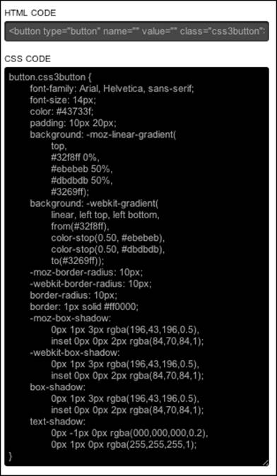
Figure 15-12: The CSS for our wild and crazy button.
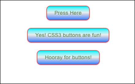
Figure 15-13: Our wild and crazy button in action.
All materials on the site are licensed Creative Commons Attribution-Sharealike 3.0 Unported CC BY-SA 3.0 & GNU Free Documentation License (GFDL)
If you are the copyright holder of any material contained on our site and intend to remove it, please contact our site administrator for approval.
© 2016-2026 All site design rights belong to S.Y.A.